

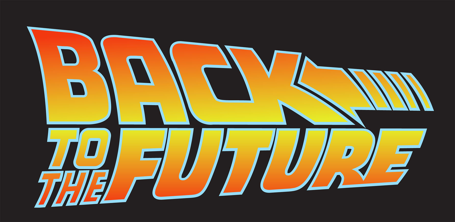
 ‘Back To The Future’ is a fitting example for a design trend that has just recently resurfaced today, perhaps most notably in Instagram’s logo redesign in 2016 and Spotify’s dual tone playlist icon. Gradients have become increasingly popular in the user interface design world, and for good reason—they inject depth and texture to the interface. They serve unique, even conflicting roles: gradients realistically mimic the colors we see around us (rarely do we encounter single tones in the real world), but they can also be used to create color patterns we’ve never seen before.
[pullquote]When used improperly, gradients spell out a design disaster[/pullquote]
The gradient is a powerful design technique, and with great power comes great responsibility. When used improperly, gradients spell out a design disaster. They can muddle a layout, distract the user, and ruin an interface’s entire aesthetic. In this article (with the help of my trusty team of UX designers), we reveal the secret to crafting a gradient that elevates your interface to the next echelon, rather than remind the user of 1997.
‘Back To The Future’ is a fitting example for a design trend that has just recently resurfaced today, perhaps most notably in Instagram’s logo redesign in 2016 and Spotify’s dual tone playlist icon. Gradients have become increasingly popular in the user interface design world, and for good reason—they inject depth and texture to the interface. They serve unique, even conflicting roles: gradients realistically mimic the colors we see around us (rarely do we encounter single tones in the real world), but they can also be used to create color patterns we’ve never seen before.
[pullquote]When used improperly, gradients spell out a design disaster[/pullquote]
The gradient is a powerful design technique, and with great power comes great responsibility. When used improperly, gradients spell out a design disaster. They can muddle a layout, distract the user, and ruin an interface’s entire aesthetic. In this article (with the help of my trusty team of UX designers), we reveal the secret to crafting a gradient that elevates your interface to the next echelon, rather than remind the user of 1997.
Start With a Strong Foundation
Whether it’s dual tone or multi-tone, every gradient is only as strong as its base colors. And just like all color-based design choices, we can refer to the color wheel for guidance when selecting the correct ones. Don’t worry, you don’t need to be an expert on color theory to make prudent selections for your gradient. The general rule of thumb is to choose colors that are close to each other, thus allowing them to blend more naturally. UX Planet includes a great diagram—look how seamless the transition from yellow to orange is compared to the green-purple.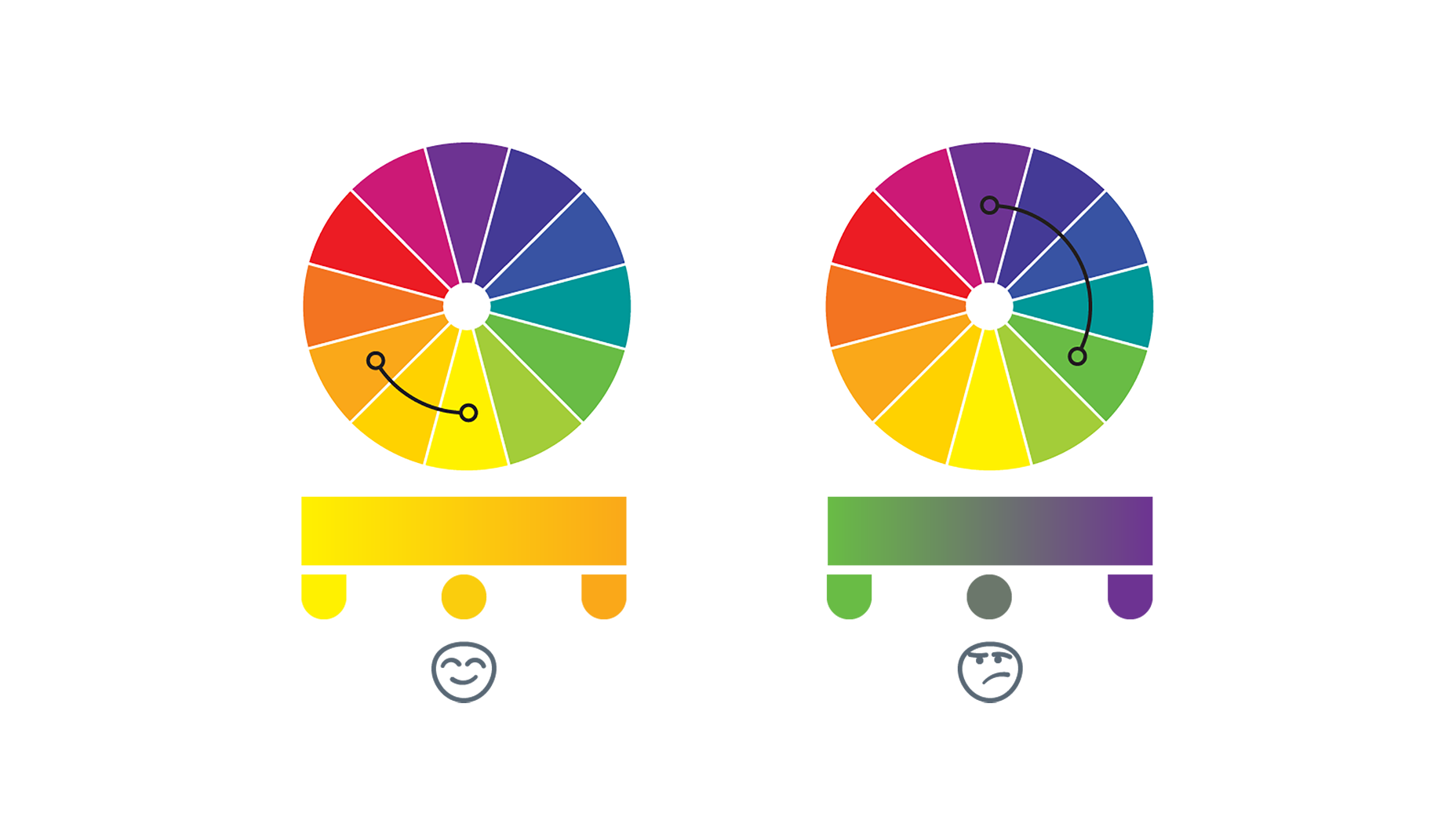 Why are colors in proximity on the wheel so visually appealing? Perhaps it’s because those are the gradients that naturally occur so often. Which brings us to an excellent trade secret for UI designers: turning to nature as a source for inspiration.
Gradients In Nature
We constantly encounter gradients in our day-to-day lives: the sky, sunsets, bodies of water. No matter where we are in the world, the sky especially serves as excellent source material. Just take a look at the breathtaking natural tableaus designer Anna Grenn showcases, complete with their accompanying color makeups.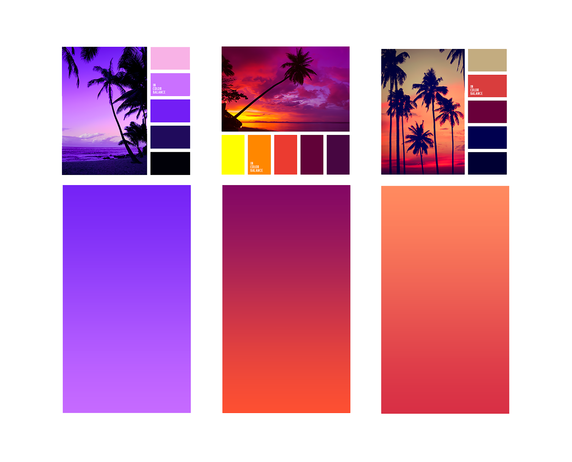 And while the sky may be the most common source material, there’s no end to examples. There’s probably a natural gradient around you right now. The color of the real life does not neatly fill inside the lines, but rather blends.
Taking it to the Next Level
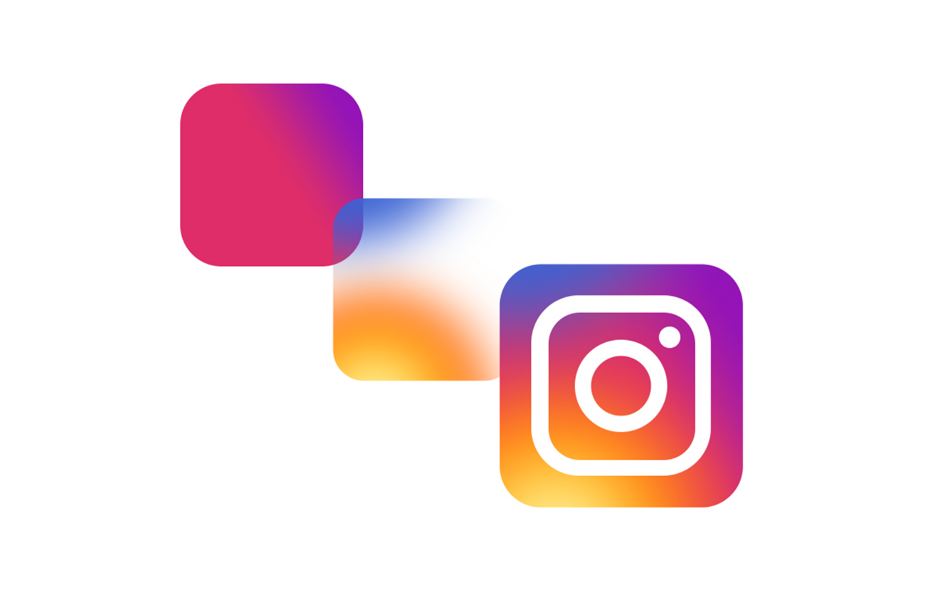
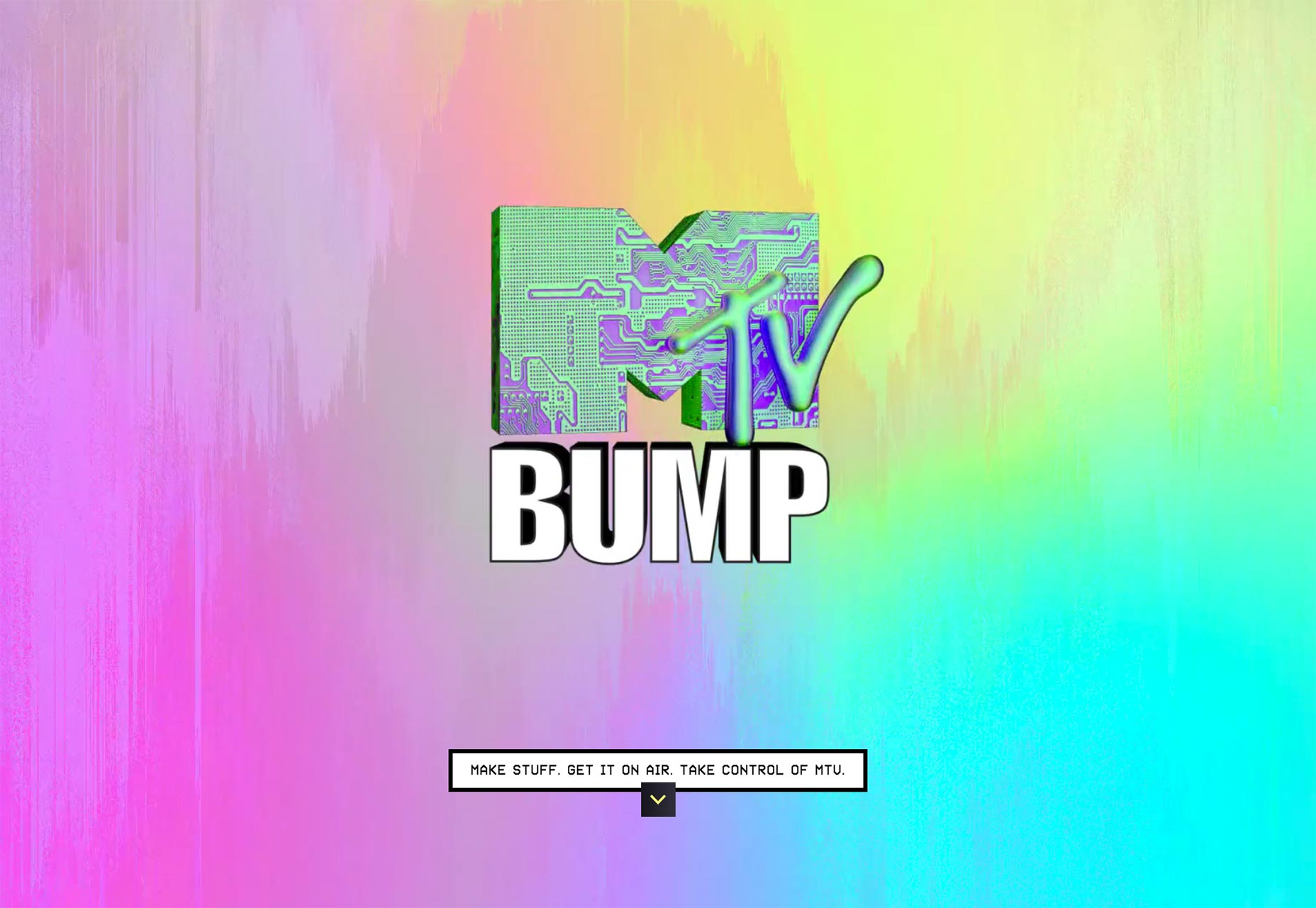
So let’s say your existing brand’s colors aren’t exactly conducive to gradients. Or maybe your standard two-tone gradient simply isn’t cutting it. Never fear: injecting additional hues to the gradient is a great way to enhance its visual interest and distinguish your UI even more. As you’d imagine, additional colors are going to flow best when they fall in between the start and end color on the color wheel. Revisiting the same diagram from UX Planet: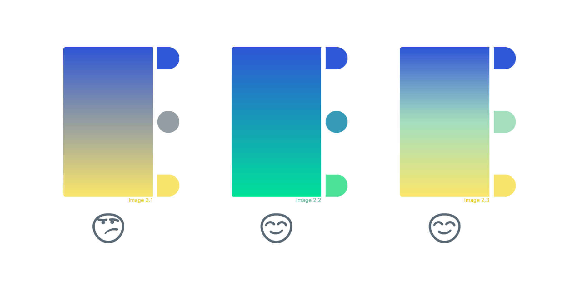 Just be warned: the more colors you add, the more complex your gradient, and the more difficult a design balancing-act you’ll have to perform. You could aim high and shoot for a multi-layered gradient like Instagram’s logo, but go overboard and you could end up with something closer to this deliberately ugly MTV web design.
Light Source & Shape
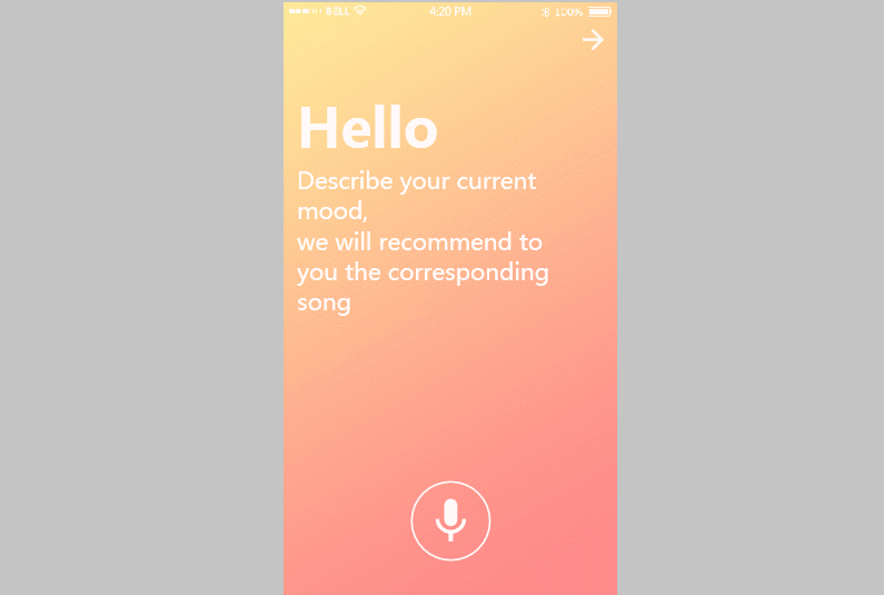
Even after nailing down the perfect color combination, there’s still the matter of actually implementing it into the design. First, some of the basics: Gradients should align with their containers, contouring to the layout and directing where the user’s eyeballs should be pointed. For x-sided polygons (squares, triangles, rectangles, pentagons, etc.) this usually means a linear gradient; rounder areas call for a radial direction.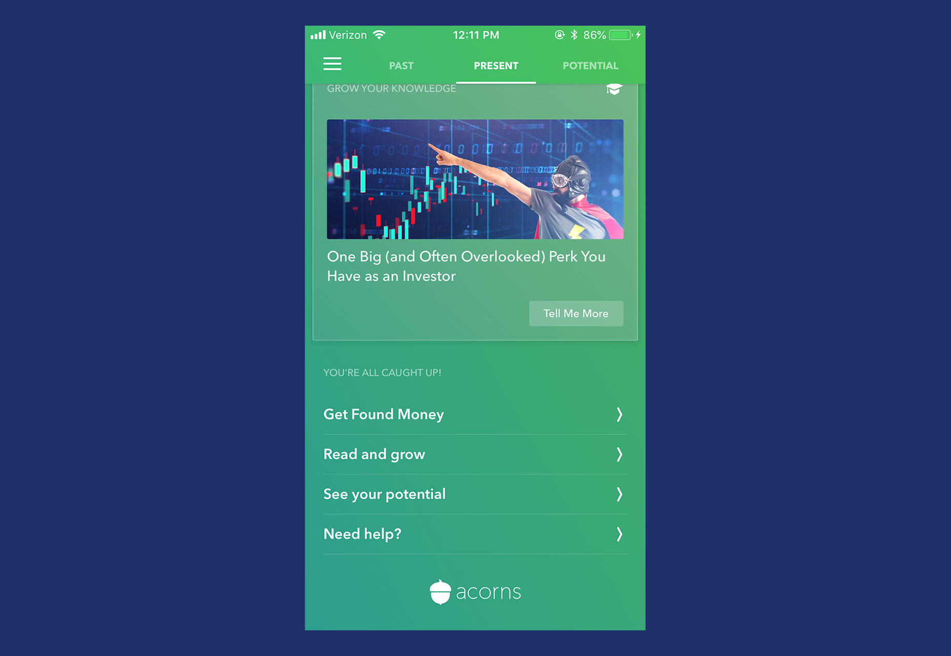 Some UI designers like to assign an imaginary ‘light source’ for the page they’re working on, the same way an artist painting a landscape might. This helps them decide how to orient the gradient—the lighter side should obviously be closer to the source, the darker side farther away. Assigning a light source can also help inform other graphic elements of the page, and act as a focal point too.
 Note the light source in the upper-left hand corner for this music app’s interface.
When all of these individual elements are chosen properly, they coalesce into a gorgeous, eye-popping gradient. And that, in turn, serves as a huge boon to the interface as a whole.
Note the light source in the upper-left hand corner for this music app’s interface.
When all of these individual elements are chosen properly, they coalesce into a gorgeous, eye-popping gradient. And that, in turn, serves as a huge boon to the interface as a whole.
Where Do Gradients Go From Here?
Including a gradient in your UI is an excellent, easy way to modernize your platform. By following the tips discussed here, you can ensure you’re wielding this powerful design tool properly. To recap:- Select the appropriate base tones using a combination of your brand and the color wheel
- When in doubt, turn to the natural world for inspiration
- Kick things up by adding more hues, but be careful not to overdo it
- Choose the correct shape and placement within your interface. Remember: our eyes follow the gradient!
Sean McGowan
Sean is a technical researcher & writer at Codal, authoring blog posts on topics ranging from UX design to the Internet of Things. Working alongside developers, designers, and marketers, Sean helps support the writing team to ensure Codal produces engaging web content of the highest quality. When not writing about the latest innovations in app design, Sean can be found cooking, watching old movies, or complaining about the shortcomings of his favorite Philadelphia sports teams.


Read Next

15 Best New Fonts, July 2024
Welcome to our monthly roundup of the best fonts we’ve found online in the last four weeks. This month, there are fewer…
By Ben Moss

20 Best New Websites, July 2024
Welcome to July’s round up of websites to inspire you. This month’s collection ranges from the most stripped-back…

Top 7 WordPress Plugins for 2024: Enhance Your Site's Performance
WordPress is a hands-down favorite of website designers and developers. Renowned for its flexibility and ease of use,…
By WDD Staff

Exciting New Tools for Designers, July 2024
Welcome to this July’s collection of tools, gathered from around the web over the past month. We hope you’ll find…

3 Essential Design Trends, July 2024
Add some summer sizzle to your design projects with trendy website elements. Learn what's trending and how to use these…

15 Best New Fonts, June 2024
Welcome to our roundup of the best new fonts we’ve found online in the last month. This month, there are notably fewer…
By Ben Moss

20 Best New Websites, June 2024
Arranging content in an easily accessible way is the backbone of any user-friendly website. A good website will present…

Exciting New Tools for Designers, June 2024
In this month’s roundup of the best tools for web designers and developers, we’ll explore a range of new and noteworthy…

3 Essential Design Trends, June 2024
Summer is off to a fun start with some highly dramatic website design trends showing up in projects. Let's dive in!

15 Best New Fonts, May 2024
In this month’s edition, there are lots of historically-inspired typefaces, more of the growing trend for French…
By Ben Moss

How to Reduce The Carbon Footprint of Your Website
On average, a web page produces 4.61 grams of CO2 for every page view; for whole sites, that amounts to hundreds of KG…
By Simon Sterne

20 Best New Websites, May 2024
Welcome to May’s compilation of the best sites on the web. This month we’re focused on color for younger humans,…