 At the heart of this massive change is a new logotype, design, and colors. All of this can be viewed on its newly designed website.
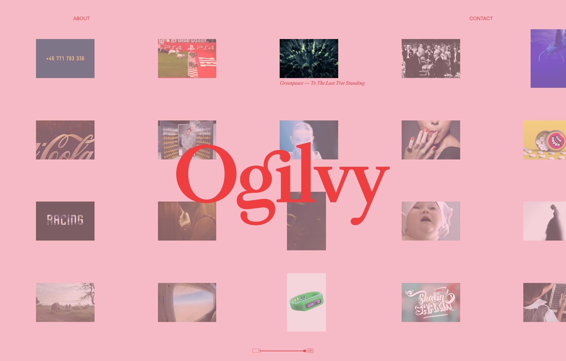
When you visit the website, the new logotype is front and center. You’ll quickly be drawn into the moving images that are gracefully moving from right to left as you navigate through the new site. Each image now represents a case study of work. It’s also added an image resizing bar at the bottom, so you can get as few as two stories at a time on the page, or as many as a couple dozen. As if that’s not detailed enough, when you hover your mouse over any story, it changes the background to a random color, and the logo from black to red.
Brian Collins, founder and CCO at Collins design firm (and the former CCO of Brand Integration Group at Ogilvy), worked closely with Ogilvy to help create this new look:
The Ogilvy experience is about the relentless pursuit of excellence…Its [Ogilvy’s] clients, its team members, its partners—they all feel the same drive that ignites the whole company.
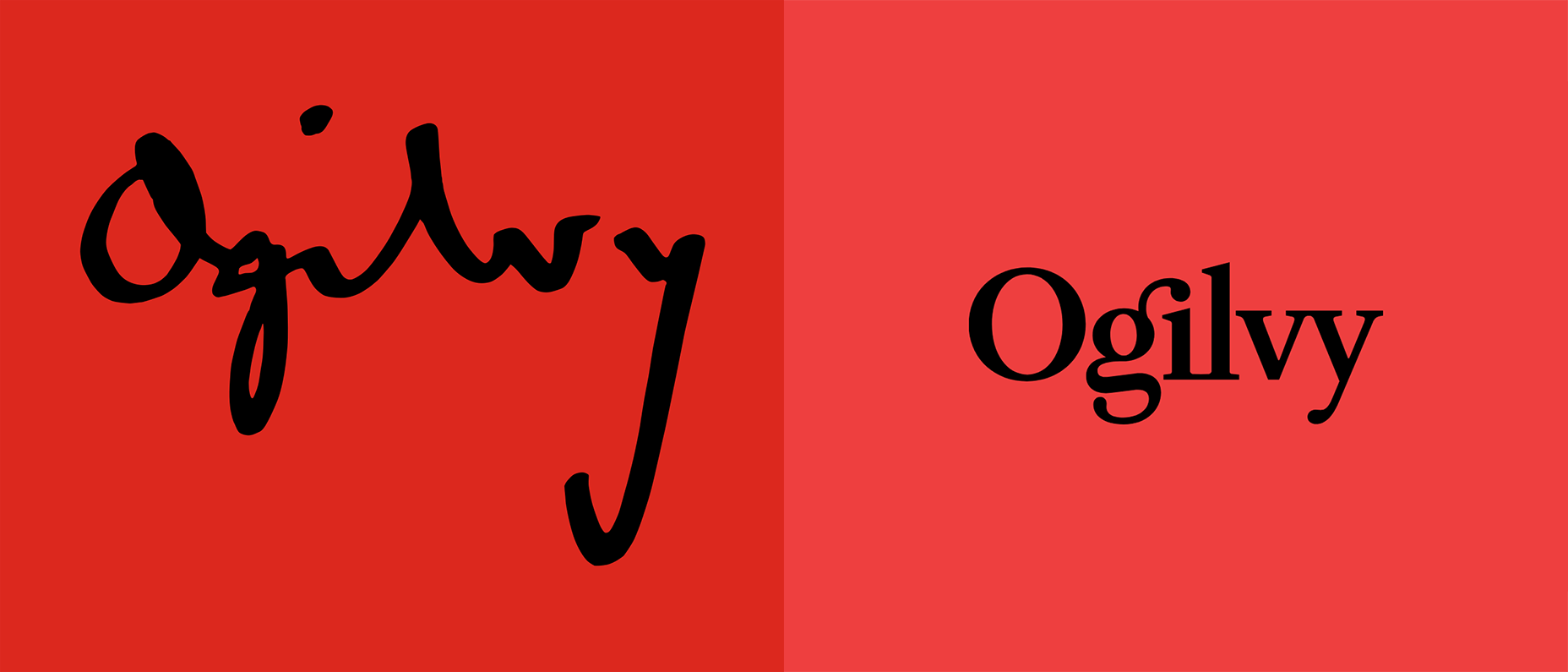
 The old Ogilvy logo (left) and the new (right).
The lettering has changed from cursive, complex lettering to a more modern, more legible serif typeface. The colors have changed from a bright, vibrant red, to a more relaxed and calm red. According to its press release, this is to symbolize Olgilvy’s desire to be more modern while also paying tribute to the principles that got it where it is.
With all of this visual change came new principles. Ogilvy and Collins worked diligently to create the new positions based on five key values. These principles helped them determine the values of leadership within the newly branded company.
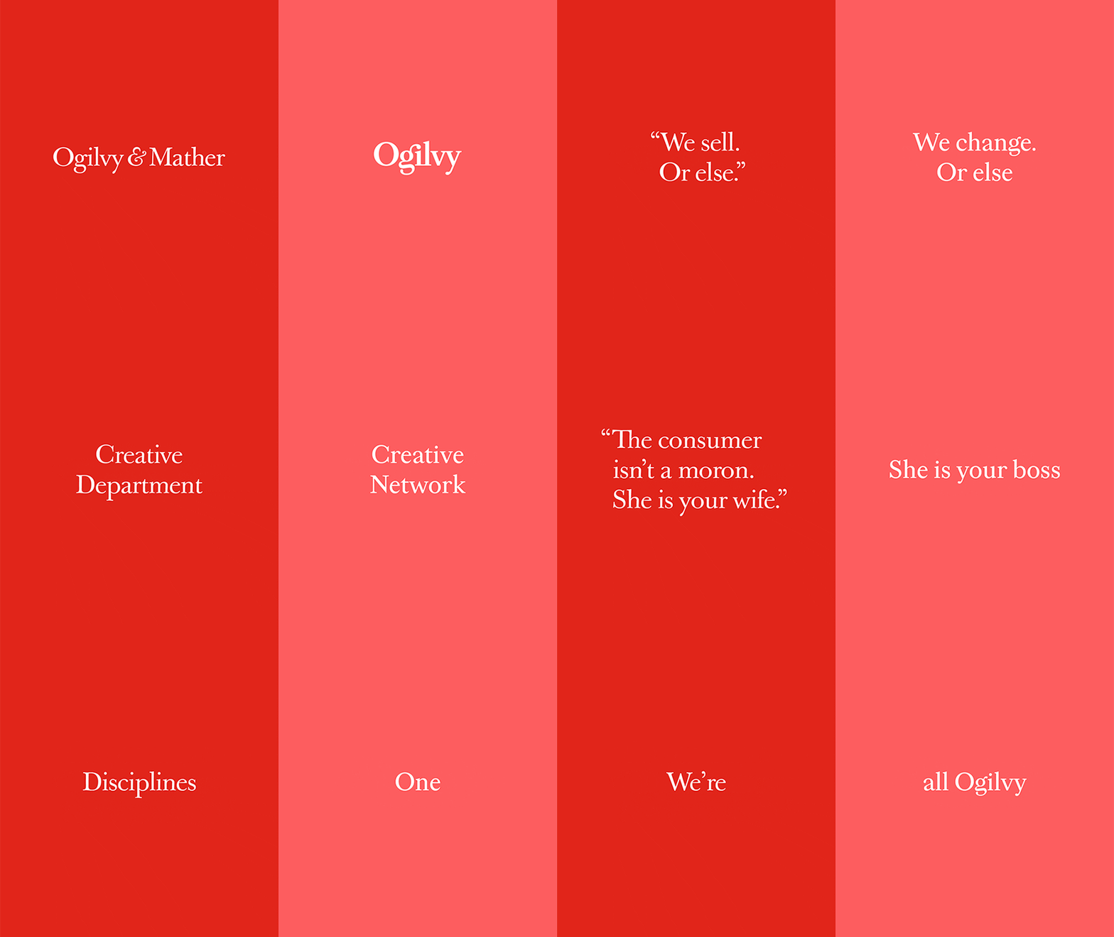
The change didn’t stop there. Many of the company’s sub-brands have been collected under one name. Among the absorbed names are OgilvyOne, Ogilvy PR, Social@Ogilvy and Ogilvy CommonHealth Worldwide.
To replace these divisions, the company has created 12 “crafts” (Creative, Strategy, Delivery, Client Service, Data, Finance, Technology, Talent, Business Development, Marketing and Communications, Administrative, and Production) and six “core capabilities” (Brand Strategy, Advertising, Customer Engagement and Commerce, PR and Influence, Digital Transformation, and Partnerships) that act as characteristics, values, and guidelines.
Now, the company operates as one. They’ve combined all of their marketing divisions. Ogilvy Enterprises, the successor to OgilvyRED will continue to work across all parts of the newly reworked organization.
 “This is the next chapter, not the last chapter,” said worldwide chairman and CEO John Seifert. “This isn’t the Ogilvy you know,” he said, referring to how different the company will be after all the changes. According to him, there were much needed changes due to how complicated the organization had become.
[pullquote]14 specialists would walk into a room with slightly different Ogilvy business cards[/pullquote]
Seifert explained that he wants the company to be centralized like it’s never been before. He said that it really reached the point of needed change when “14 specialists would walk into a room with slightly different Ogilvy business cards”, of course referring to how out-of-touch everyone was with the goal and the heritage of the company.
The company has also promised to bring more women on board. According to Seifert, Ogilvy’s looking to hire a substantial number of women all across the board in order to close the gender-gap.
Tham Khai Meng, current CCO of Ogilvy summarized it by saying this:
We are building on the creative heritage of David Ogilvy to fuel our future.It’s very clear that Ogilvy aims to be better and more focused than ever before. From a design standpoint, their new logotype and website are now more visually appealing. It’s simple, yet effective. The new rebranding has been a huge success and will keep the company at the vanguard of design for years to come. It’s a daunting task to change a company from the inside out, but Ogilvy appears to have accomplished it beautifully, and it will only benefit from the ambitious change.
Andrei Tiburca
Read Next
15 Best New Fonts, July 2024
Welcome to our monthly roundup of the best fonts we’ve found online in the last four weeks. This month, there are fewer…
By Ben Moss
20 Best New Websites, July 2024
Welcome to July’s round up of websites to inspire you. This month’s collection ranges from the most stripped-back…
Top 7 WordPress Plugins for 2024: Enhance Your Site's Performance
WordPress is a hands-down favorite of website designers and developers. Renowned for its flexibility and ease of use,…
By WDD Staff
Exciting New Tools for Designers, July 2024
Welcome to this July’s collection of tools, gathered from around the web over the past month. We hope you’ll find…
3 Essential Design Trends, July 2024
Add some summer sizzle to your design projects with trendy website elements. Learn what's trending and how to use these…
15 Best New Fonts, June 2024
Welcome to our roundup of the best new fonts we’ve found online in the last month. This month, there are notably fewer…
By Ben Moss
20 Best New Websites, June 2024
Arranging content in an easily accessible way is the backbone of any user-friendly website. A good website will present…
Exciting New Tools for Designers, June 2024
In this month’s roundup of the best tools for web designers and developers, we’ll explore a range of new and noteworthy…
3 Essential Design Trends, June 2024
Summer is off to a fun start with some highly dramatic website design trends showing up in projects. Let's dive in!
15 Best New Fonts, May 2024
In this month’s edition, there are lots of historically-inspired typefaces, more of the growing trend for French…
By Ben Moss
How to Reduce The Carbon Footprint of Your Website
On average, a web page produces 4.61 grams of CO2 for every page view; for whole sites, that amounts to hundreds of KG…
By Simon Sterne
20 Best New Websites, May 2024
Welcome to May’s compilation of the best sites on the web. This month we’re focused on color for younger humans,…


