

1. Design for a Specific Audience
Visualization is used to reveal patterns, provide context, and describe relationships within data. While a designer holds no influence over the patterns and relationships within a given set of data, she can choose how much data to display, and what context to provide, based on the needs of the audience. After all, just like with any other product, a visualization is meaningless if its viewer can’t use it. Visualizations for novices should be structured, unambiguous, and engaging. They should spell out directly, in words, what viewers should take away from the data.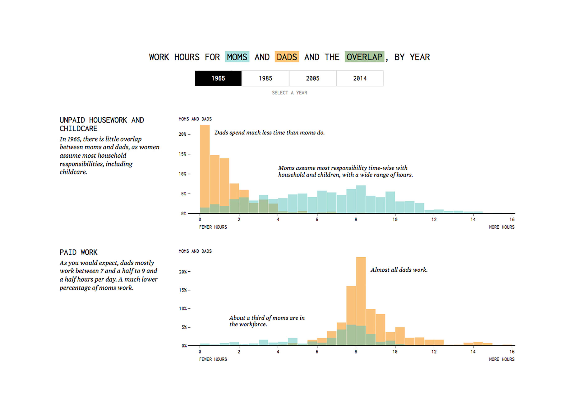 Visualizations for expert audiences, on the other hand, can show a more granular view of the data to allow for reader-driven exploration and discovery. Detail and data-density should trump simplicity and clarity.
2. Use (but Don’t Rely on) Interactivity to Facilitate Exploration
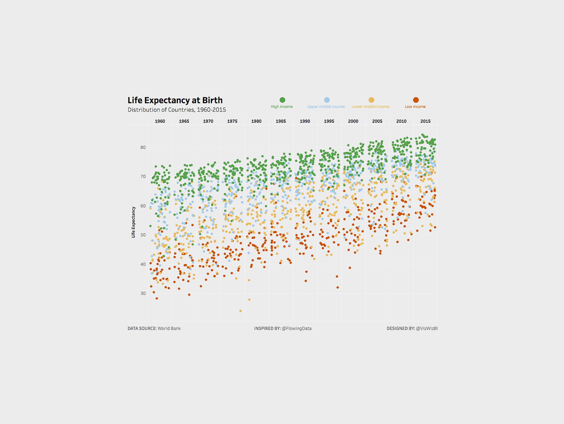
Here’s a sobering number: only 10-15% of visitors to interactive visualizations on the New York Times website actually click buttons. The New York Times graphics team produces some of the best work in the business, and hardly anyone interacts with them! [pullquote]The New York Times graphics team produces some of the best work in the business, and hardly anyone interacts with them![/pullquote] What this suggests about interactive visualization design is that we cannot rely on interaction for building understanding. Key data must not be hidden behind interactive elements, and instead should be available without interaction. What interaction is great for, however, is allowing for the integration of additional data (that might otherwise be excluded), to allow interested viewers to explore a dataset more deeply. Nathan Yau of Flowing Data has cornered the market on this style of interactive visualization, as seen in his graphics on causes of death and life expectancy. Alternatively, interaction can be used as a hook; an attention grabber that gets your audience personally invested in the project before they can navigate far, far away. Check out this playful piece on handwriting and culture from Quartz. The piece kicks off by asking readers to simply draw a circle, before going on to outline an analysis of cultural shape-drawing that features some simple, but effective, visualizations.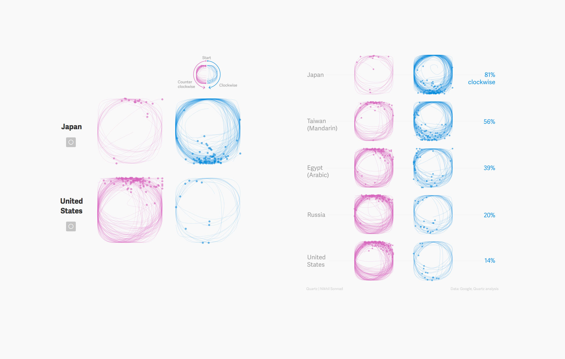 Similarly, The Pudding recently released a interactive visualization to teach readers about the birthday paradox. While most non-statisticians probably find the birthday paradox, a standard problem in probability theory, quite dry and unintuitive, this visualization makes it seem downright fascinating. The way the creator incorporates the interactions of recent users makes the whole experience quite relatable.
Both of these interactive examples work because they allow the viewer to participate in the data, without requiring interaction for understanding.
Similarly, The Pudding recently released a interactive visualization to teach readers about the birthday paradox. While most non-statisticians probably find the birthday paradox, a standard problem in probability theory, quite dry and unintuitive, this visualization makes it seem downright fascinating. The way the creator incorporates the interactions of recent users makes the whole experience quite relatable.
Both of these interactive examples work because they allow the viewer to participate in the data, without requiring interaction for understanding.
3. Use Visual Salience to Focus Attention and Guide the Experience
Visual salience, the characteristic that makes a visual element stand out against its surroundings, is a powerful tool in data visualization. It can be used to guide the user’s attention to the most important information in a visualization, to help prevent information overload. By using visual salience to highlight some details and suppress others, we can make our designs clearer and more easily understood. A few visual variables—color and size, primarily—are our keys to creating and controlling visual salience. Color schemes are key to great data visualizations because color, as we all know, is particularly good at breaking camouflage. We can use warm, highly saturated colors to highlight key data points, and apply cool, desaturated colors to push less important information into the background.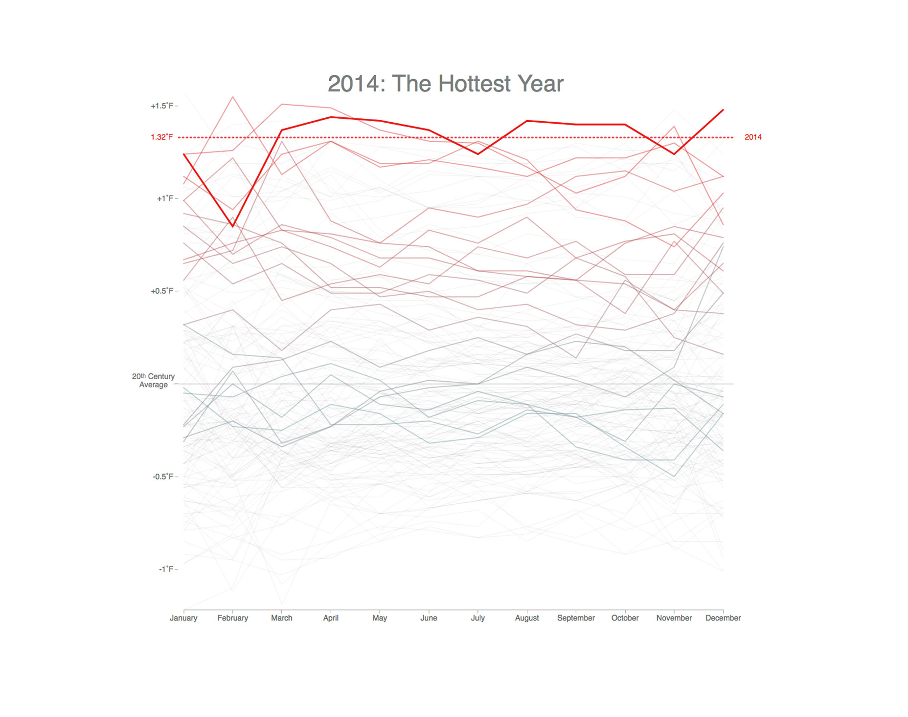 Size is also pretty self-explanatory. Large elements demand more attention than small elements, so scale up elements that you’d like viewers to read first, and scale down text and elements that are less pertinent.
4. Use Position and Length to Encode Quantitative Information and Use Color to Encode Categorical Information
Cleveland and McGill’s well-known work on information visualization investigated the effectiveness of visual encodings (i.e. the mapping of data dimensions to visual properties). In their findings, they ranked different types of visual encoding according to how accurately we perceive them, giving us this (simplified) list:- Position along a common scale
- Length
- Angle
- Area
- Color
5. Make Structural Elements Like Tick Marks and Axes Clear but Inconspicuous
Whether or not you support Edward Tufte’s extreme approach to minimalism in design, do yourself a favor and strip the visual clutter from your charts. Make your data shine by creating visual contrast between data elements and non-data elements, like Nadieh Bremer has done in her award winning visualization on birth times in America.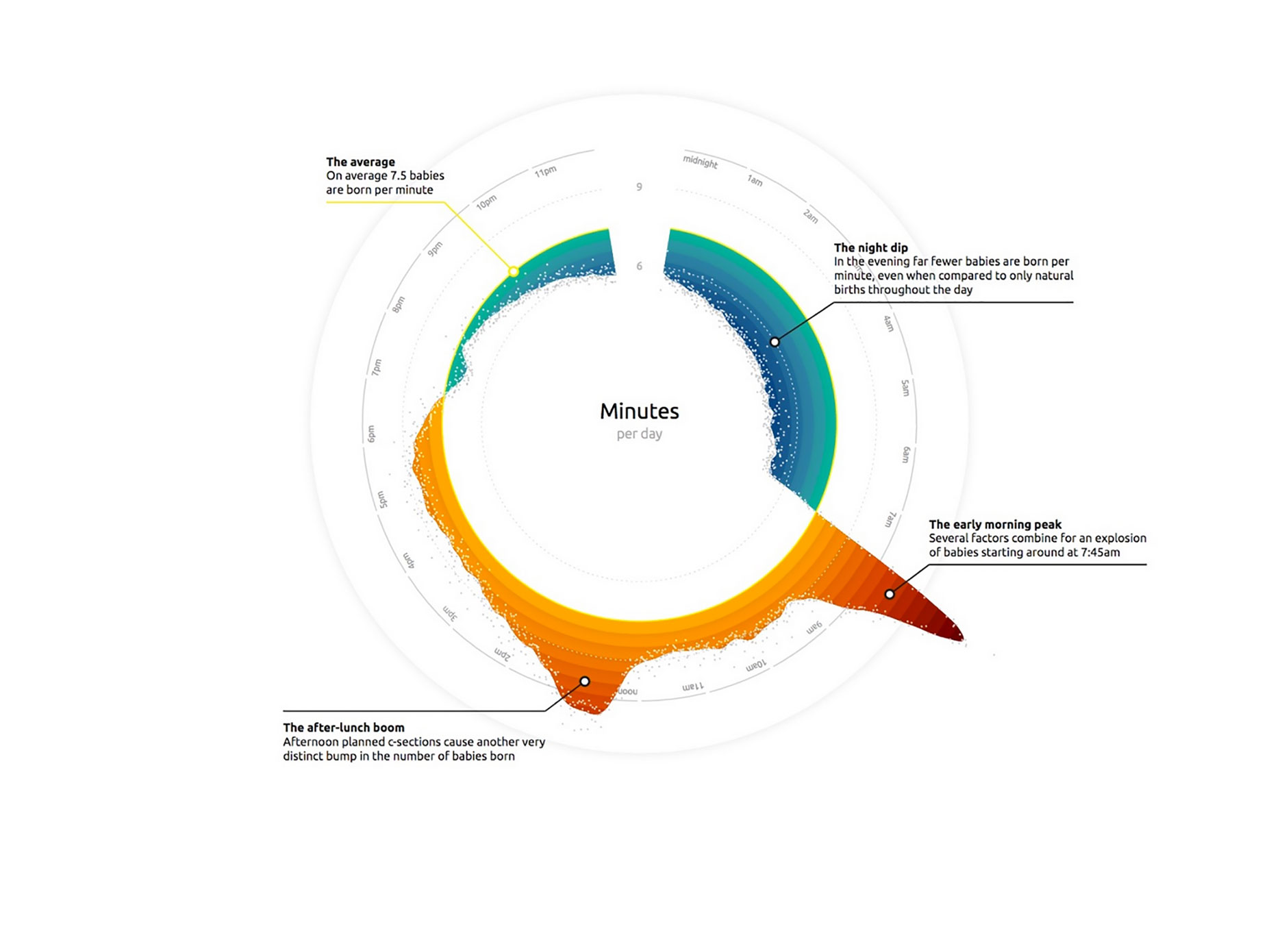 Remove any structural elements (like backgrounds, lines, and borders) that don’t work to clarify the data. Attenuate essential structural elements (like axes, grids, and tick marks) that would otherwise compete with your data for attention. Style grids in light grey at a maximum weight of 0.5 pt, and style axes in black or grey with a maximum weight of 1 pt.
6. Directly Label Data Points
Every visual element that encodes some data needs to be labelled, so that the viewer understands what it represents. Simple, right? Wrong. Far too many designers rely on legends to tell readers which symbols or colors represent which data series in their charts. Legends, while easy on the designer, are hard on the reader. They force readers to scan back and forth between the legend and the data, putting unnecessary strain on readers’ working memories. A better alternative is to label data series directly on the chart. It’s often more of a challenge, but hey, you’re the designer. Your job is to do the work so the reader doesn’t have to. In the example below, Nathan Yau has done the work to avoid using a legend, creating an interactive small multiples display with lots of direct labeling.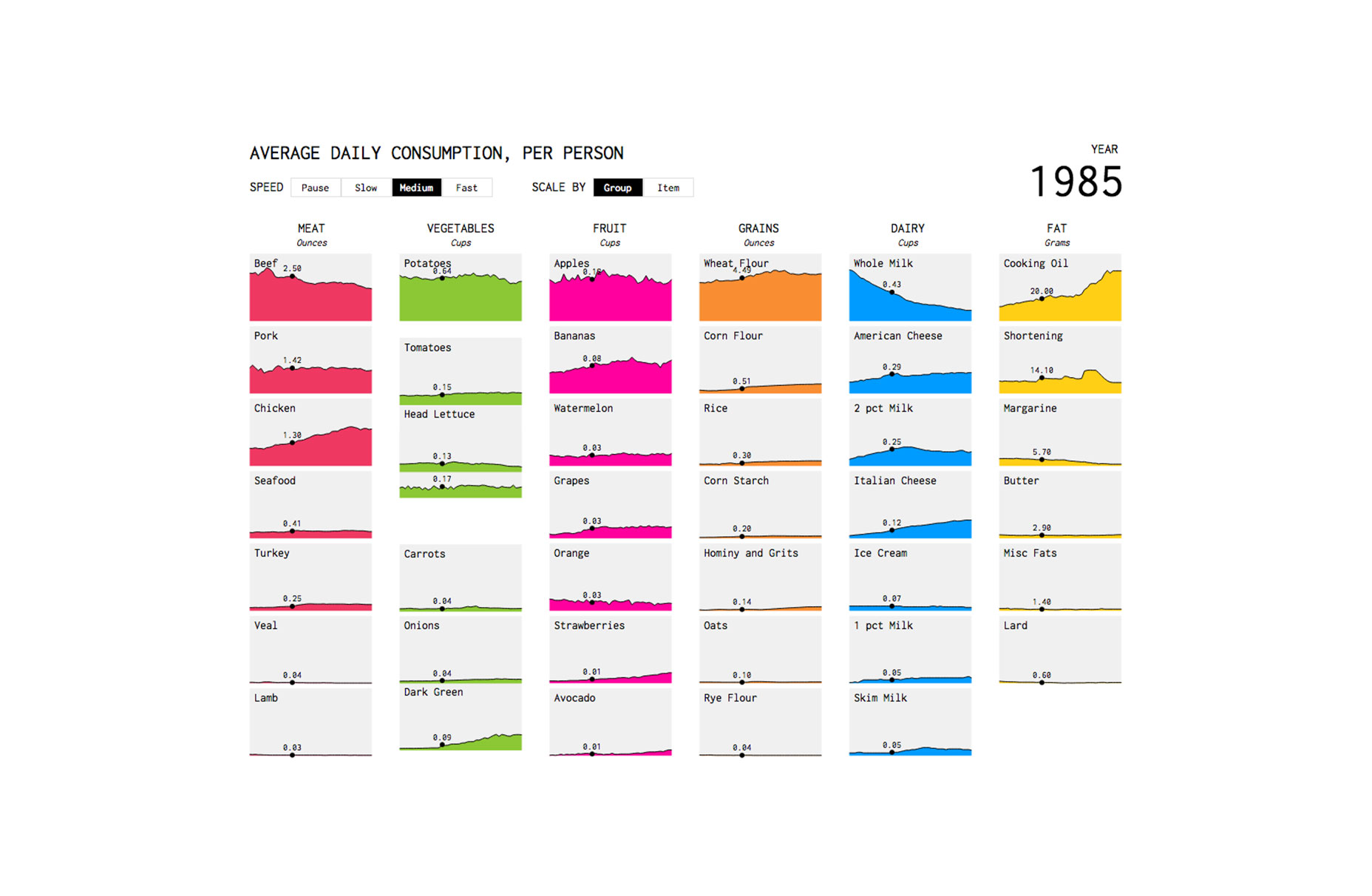
7. Use Messaging and Visual Hierarchy to Create a Narrative Flow
The best visualizations tell compelling stories. These stories emerge from the trends, correlations, or outliers in the data, and are reinforced by the elements that surround the data. These stories turn raw data into useful information. At face value it might seem like data visualization is all about the numbers, but a great data story cannot be told without words. Messaging, with a clear visual hierarchy, can be used to lead the reader, step by step, through the data. The title of a visualization, for example, should kick off the narrative by explicitly stating the single key insight the reader should take away from the visualization. Tiny annotations scattered amongst the data can provide support to that narrative by drawing attention to outliers or trends. What I’m trying to say here is: give the viewer a hand and tell them exactly what to look for in the data!
8. Overlay Contextual Information Directly onto the Chart
As I just mentioned, we can use annotations in a visualization to help create a narrative flow. Sometimes we can add graphical elements to make those annotations even more meaningful—to connect that information to our data more directly. Take this graphic from Susie Lu, for example. The “Summer Blockbusters” and “Oscar Season” overlays give meaning to peaks and valleys that might otherwise seem random. They help the viewer understand the significance of the data in a way that’s more direct than captions or annotations alone.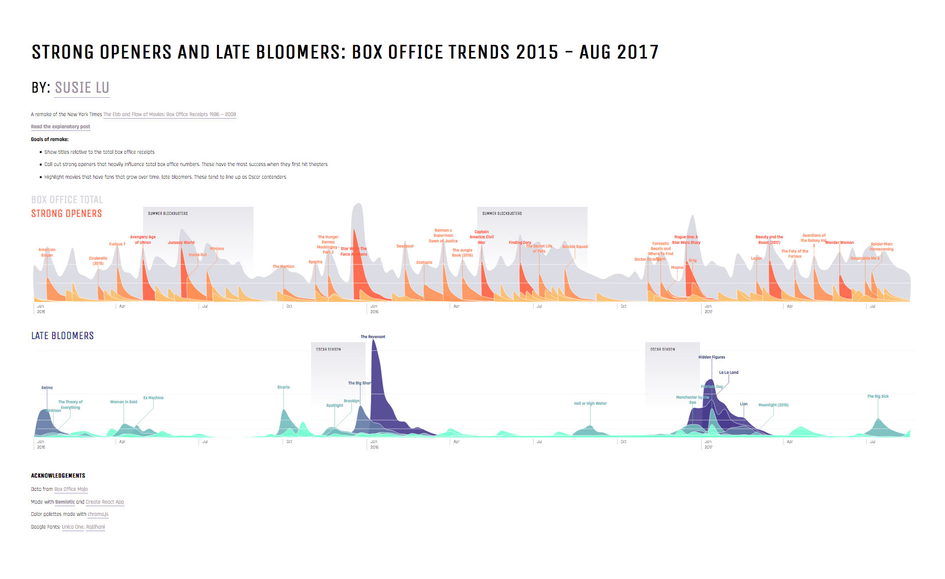
9. Design for the Mobile Experience
Static visualizations, typically published in bitmap image formats like JPG and PNG pose an obvious challenge for mobile viewers. The beauty of many data visualizations lies in their visual details—in tiny data points and subtle encodings—and many of these details are lost on small screens in static formats. Case in point: Accurat studio’s beautifully complex work on Nobel prizes, which looks fabulous full-size in print and on a high-resolution retina display, is next to illegible on a mobile device.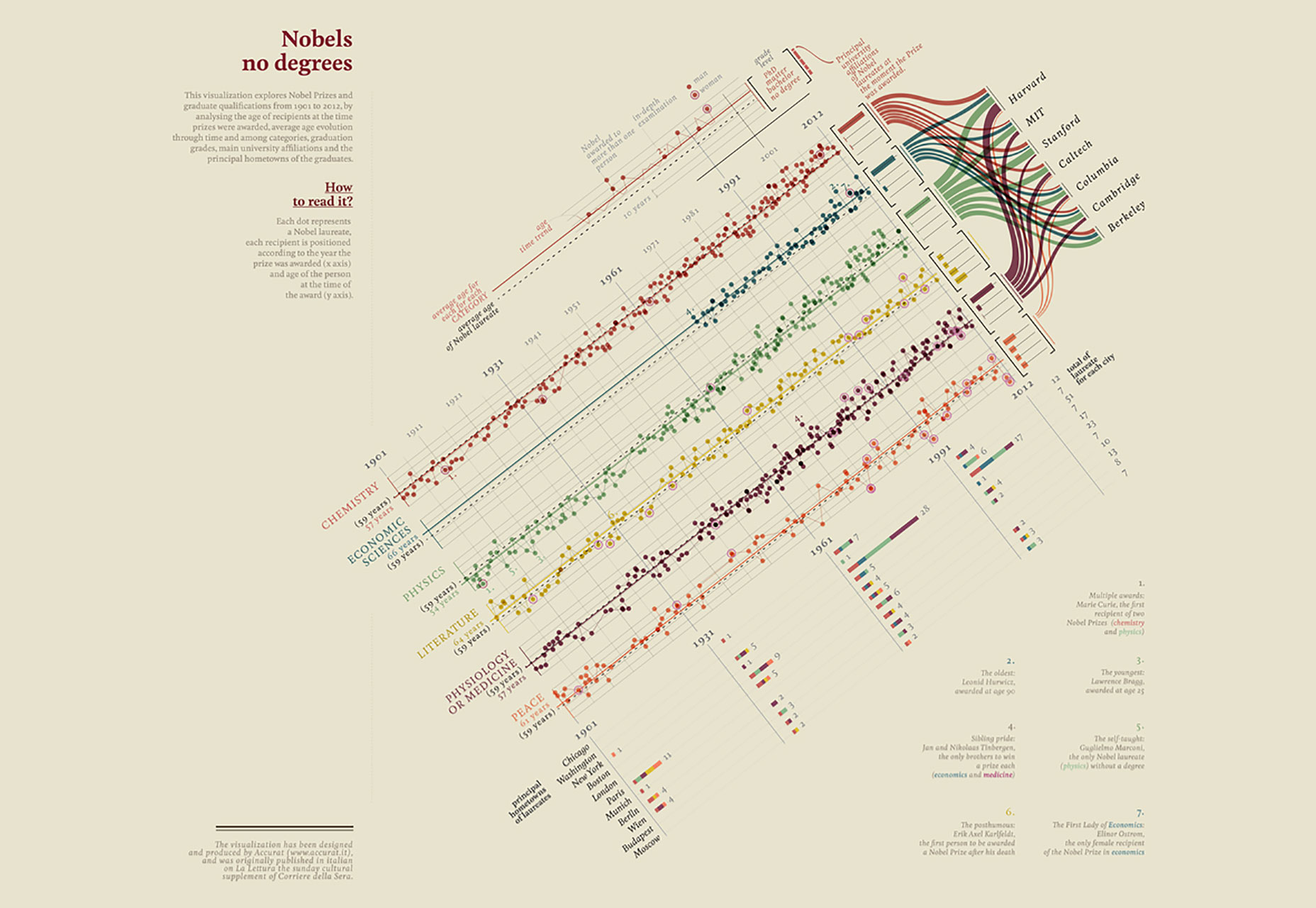 To design for the mobile experience, either build responsive visualizations with a JavaScript visualization library like D3.js or Highcharts, or create multiple variations of the same static visualization for print, desktop, and mobile.
10. Balance Complexity with Clarity to Foster Understanding
All of the best practices I’ve touched on today boil down to one thing: finding the right balance between complexity and clarity that aligns with the needs of your audience. It’s always tempting to make a beautifully detailed, subtle, exploratory visualization, but that’s rarely the most appropriate approach. Be considerate when designing your graphics—allow the knowledge and goals of the audience to dictate which and how much data should be included, and curate the data to tell the story you want to tell.Midori Nediger


Read Next

15 Best New Fonts, July 2024
Welcome to our monthly roundup of the best fonts we’ve found online in the last four weeks. This month, there are fewer…
By Ben Moss

20 Best New Websites, July 2024
Welcome to July’s round up of websites to inspire you. This month’s collection ranges from the most stripped-back…

Top 7 WordPress Plugins for 2024: Enhance Your Site's Performance
WordPress is a hands-down favorite of website designers and developers. Renowned for its flexibility and ease of use,…
By WDD Staff

Exciting New Tools for Designers, July 2024
Welcome to this July’s collection of tools, gathered from around the web over the past month. We hope you’ll find…

3 Essential Design Trends, July 2024
Add some summer sizzle to your design projects with trendy website elements. Learn what's trending and how to use these…

15 Best New Fonts, June 2024
Welcome to our roundup of the best new fonts we’ve found online in the last month. This month, there are notably fewer…
By Ben Moss

20 Best New Websites, June 2024
Arranging content in an easily accessible way is the backbone of any user-friendly website. A good website will present…

Exciting New Tools for Designers, June 2024
In this month’s roundup of the best tools for web designers and developers, we’ll explore a range of new and noteworthy…

3 Essential Design Trends, June 2024
Summer is off to a fun start with some highly dramatic website design trends showing up in projects. Let's dive in!

15 Best New Fonts, May 2024
In this month’s edition, there are lots of historically-inspired typefaces, more of the growing trend for French…
By Ben Moss

How to Reduce The Carbon Footprint of Your Website
On average, a web page produces 4.61 grams of CO2 for every page view; for whole sites, that amounts to hundreds of KG…
By Simon Sterne

20 Best New Websites, May 2024
Welcome to May’s compilation of the best sites on the web. This month we’re focused on color for younger humans,…