

Have you performed a mobile speed test lately? How does your website rank? A slow website can turn mobile users away. Ideally, you want your design to load just as quickly for 3G users on phones as it does for desktop users on Wi-Fi. (That’s a pretty big ask, but there are things you can go to make it happen.)
First, test your mobile speed. And then use these tips to improve your performance, and keep more users on your site longer.
1. Optimize Images
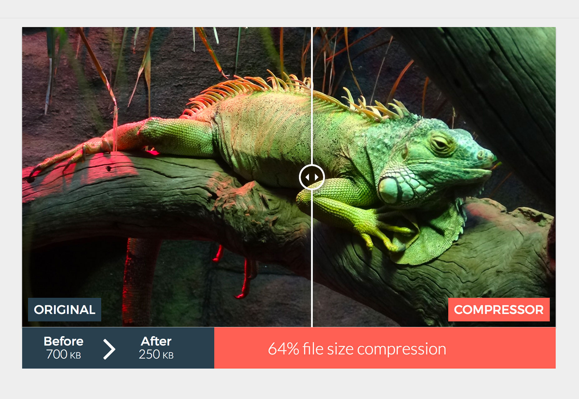
One of the biggest problems with website speed is image size. Images can actually account for most of the downloaded data on a page and by formatting and saving images the right way, you can seriously cut down on the number of bytes required to serve this information.
The easiest way to optimize images is to work with them before upload. Crop images to the necessary size and save for the web before adding them to your content management system. Then compress images to get that file size as tiny as possible.
We have a great summary of the best image compression tools here. They can help you optimize your images before you upload.
2. Hosting Matters
The cheapest hosting plan is not right for every website. Slow hosting is an oft-hidden problem and is common with websites that have grown steadily over time, but not upped their hosting plans.
To ensure that your hosting plan is built for speed, opt for a dedicated server option. If you need something a little more budget-friendly, the next best option is VPS hosting, where you have shared hosting with dedicated server resources.
Then, think about load killers such as video content. Host those files using external tools when possible. Services like YouTube are perfect for this. (And it might be something you are doing already.) Essentially, you link to these files in their native locations rather than adding them to your site files.
3. Pay Attention to JS
JavaScript powers many of the cool effects and things that happen on websites. There’s not much of a way to get around it.
Take care with how you use JavaScript and it won’t slow down your website for mobile users.
- Put JavaScript at the bottom of files: Browsers won’t load other elements while JavaScript is loading. Solve this problem by moving JS scripts to the bottom of the page when you can. That way HTML content renders first and you can use a visual cue to let users know more data is coming if necessary.
- Optimize and minify: Smaller files load faster. Don’t forget this applies to code as well.
- Use asynchronous JavaScript: Opt for asynchronous JS loading until after the first render for all non-critical elements. This allows scripts to load at the same time rather than one-by-one.
4. Use Lazy Loading
Logically, it just makes sense to load content from top to bottom, right?
Lazy loading allows the content on the screen to load first and then load everything else. (Google likes this option when it comes to speed and search engine optimization.)
There are plenty of WordPress plugins that can help you do this that are simple and pretty lightweight. Try something like Lazy Load or WP Rocket.
5. Make Use of Caching
From Google: “Caching allows a browser to store frequently requested files on the user’s device for a set period of time. When caching is enabled, subsequent page loads can be more efficient.”
Enabling caching is one of the most-recommended options for boosting page speed. Users will thank you.
6. Cut Down on Redirects
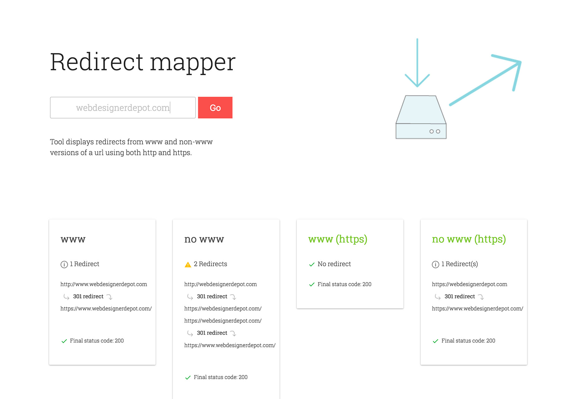
Do you know how many redirects are on your website? While redirects can be useful for a number of reasons, they will slow your site down. The best advice when it comes to redirects is to eliminate unnecessary ones.
The biggest speed eater is a 301 redirect, which gets users from an outdated page to a new version. Think about your content and if this action is still necessary. A redirect audit might be in order.
Varvy’s Redirect Mapper can help you figure out where to start.
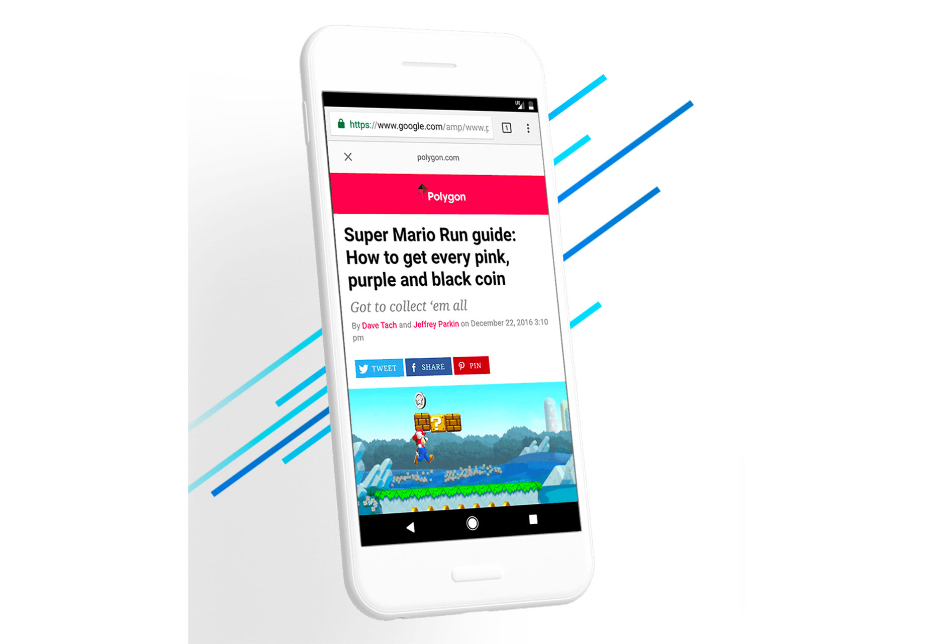
7. Try Accelerated Mobile Pages
Accelerated Mobile Pages is an open-source Google imitative that is designed to create pages the load quickly on mobile devices.
Create AMP versions of landing pages to make best use of the technology. These pages use the AMP HTML format and AMP JavaScript and it’s an ideal solution for websites that do a lot of online advertising or send users to specific locations.
The big bonus is that AMP pages load pretty much instantly. The downside is that it’s a little more work on the back end.
There’s plenty of information about the AMP Project available.
8. Remove Tap Delays
Have you ever noticed that there’s a slight delay between when you tap something and when the action happens on a mobile device? This delay was designed originally to make it easier for devices to recognize a double-tap. (That function is pretty much obsolete.)
Here’s the fix. Just put it in the page header.
<meta name="viewport" content="width=device-width">
From Google’s Jake Archibald about the simple change: “The performance difference is huge! Having a UI that responds instantly means the user can quickly press each button with confidence, rather than pausing and waiting for a response.”
9. Consider Progressive Web Apps
If you have a website with plenty of interactive content and dynamic features a progressive web app might be the solution.
PWAs are websites that work like apps (but without the download).
What’s nice about PWAs is that they are searchable like websites, there’s no install or updating required. They also tend to work offline and allow for push notifications and they are super fast because of the method of caching used.
The tricky part is that this is a developer-only option and not for a beginning website builder. But it is definitely worth looking into if your website requires content that’s always changing and isn’t as fast as it should be.
Not convinced? Play around with some interesting Progressive Web Apps.
10. Delete All Those Plugins
Plugins have a lot of value in creating website functionality. But because they are so easy to find and install, many websites have a ton of unused plugins running in the background.
That’s adding weight and code to the design. That’s more stuff the user has to download before they see the design. And it is slowing your website down.
When it comes to plugins, only keep what you need and are actually using. Deactivate and delete everything else. Then make sure you are keeping plugins updated. Outdated, unsupported or misconfigured plugins are speed killers.
Think about plugins that do the same thing – read descriptions and documentation with updates – and get rid of redundancies here.
Finally, get rid of plugins for things that you can do manually (font installations, header tag insertion, analytics etc.).
Carrie Cousins


Read Next

15 Best New Fonts, July 2024

20 Best New Websites, July 2024

Top 7 WordPress Plugins for 2024: Enhance Your Site's Performance

Exciting New Tools for Designers, July 2024

3 Essential Design Trends, July 2024

15 Best New Fonts, June 2024

20 Best New Websites, June 2024

Exciting New Tools for Designers, June 2024

3 Essential Design Trends, June 2024

15 Best New Fonts, May 2024

How to Reduce The Carbon Footprint of Your Website
