

1. Elaborate Illustrations
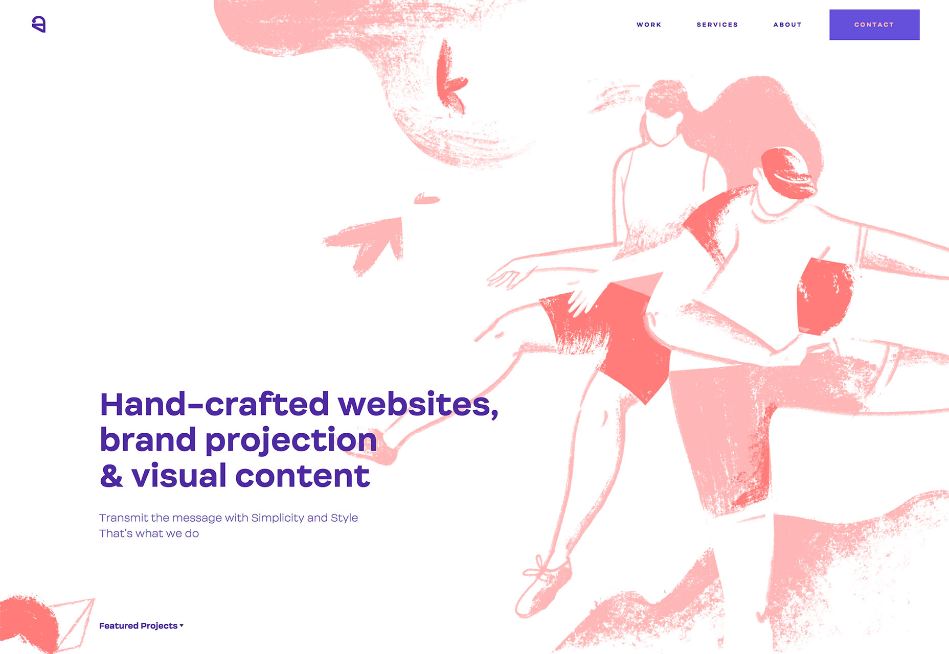
There’s just something about an elaborate illustration that draws the eye into a design. There’s a need to see all of the details and understand the intricacy of each line. Whether it’s a “designer thing” or not, illustrations are an interesting way to draw users into a website design. The more elaborate the illustration, the more custom and unique it can feel as well. This is an effective way to create a one-of-a-kind project. And there are so many different ways to do it. Growcase uses icon-style illustrations to draw users into the portfolio. Emit Ayouni has a distinct style with each of the creations that makes users want to scroll and explore. Ester Digital uses a sketch-style illustration and builds on it with subtle animation and additional parts as the user scrolls. Again, the feel here is complete customization – the perfect vibe for a creative agency.
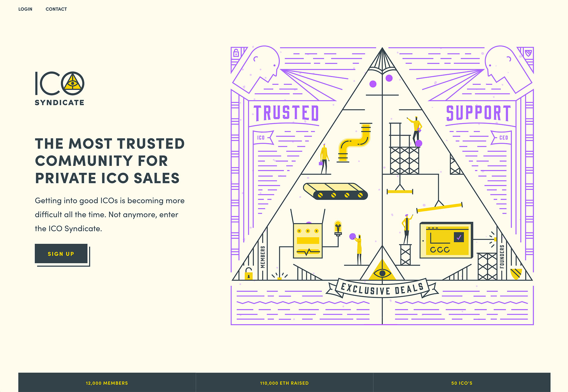
 ICO Syndicate also features an illustration with animated elements, but it is right on the homepage. The illustration features clean lines and simple coloring but there is so much to look at. Each little scene is part of a bigger picture that engages. (Try not to watch the purple balls drop and move throughout the drawing.)
2. Distinct Panels
When talking about website projects, do you catch yourself referring to things in “screens?” This concept is becoming more common and the designs reflect it. More websites feature distinct panels that fit on the screen or come pretty close. These screens help contain and organize bits of content as well as provide a methodology for stacking and reorganizing content on different screen sizes. These panels make it all look seamless to the user. Adaptable uses a series of panels that alternative between full width and split screen. Note that you get a glimpse of the next set of panels from the current location. Van Cutsem uses panels to create content hierarchy.
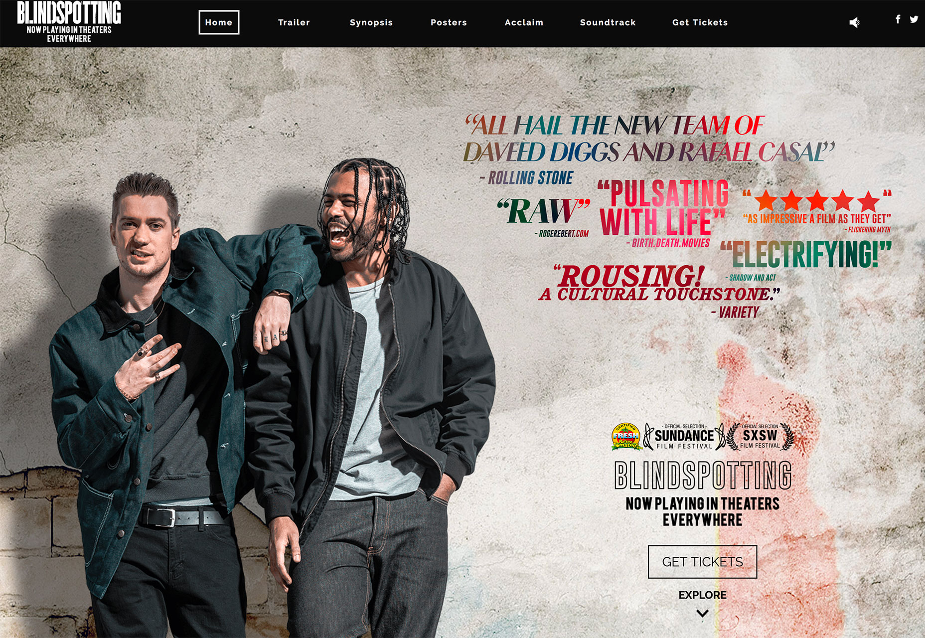
 Blindspotting uses panels to highlight different information for an upcoming movie. There’s a mix of full screen panels and smaller stacks as well and content that features still images and video.
3. The Color Purple
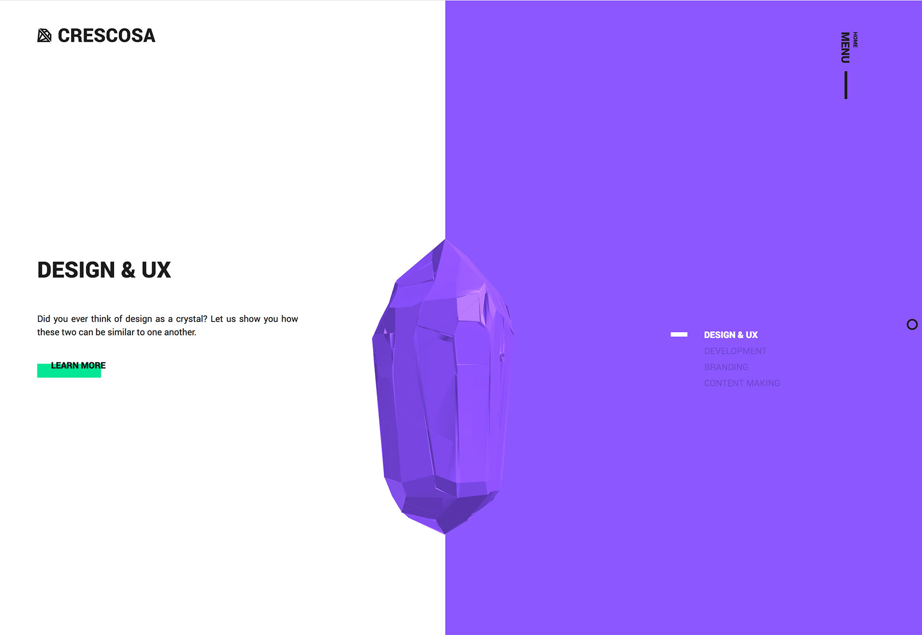
Extravagance, regality, creativity, wisdom, dignity, mystery and independence. These are all words that describe the color purple. People often have a distinct emotional connection to this hue – they either love it or hate it. Because of this, it’s not a widely used color in a lot of design projects. Designers tend to stay away from colors that some people just don’t like. But there is a certain something to projects that feature purple elements as the examples below show. With the right messaging and content, using the color purple can be a powerful design tool that helps communicate just the right thing. When using purple — whether as a background, accent or foreground element — make sure to think about how the color communicates in relationship to what the design should say overall. Do the messages match? If so, then purple might be just the right design trend for your projects. Each of these websites uses the trend exceptionally well: Colorz uses a purple circle to help users “peek” into the background. The element is really just a focal point to draw users into the messaging.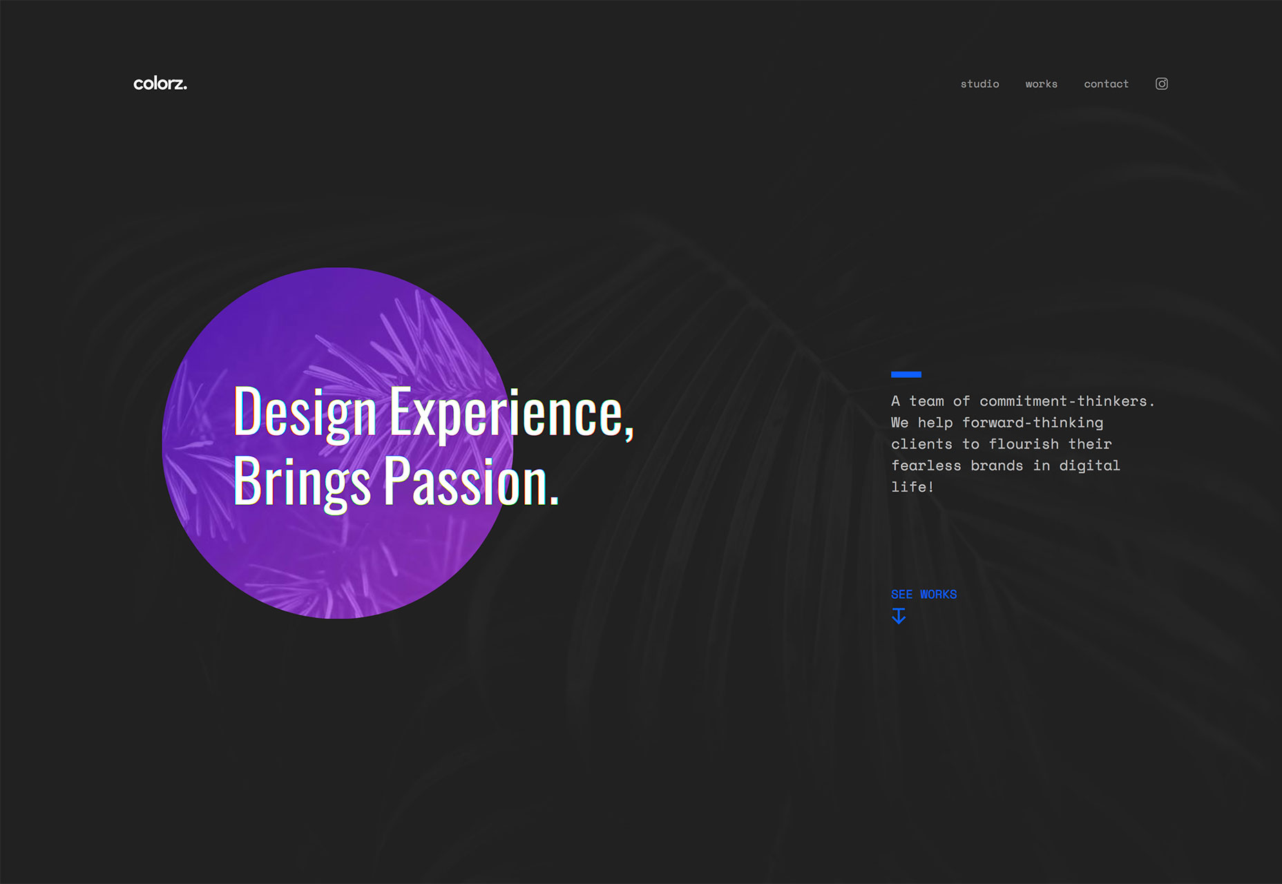 Crescosa features a split screen with a purple side that contains an oversized navigation element. (There’s also a cool floating purple rock or gem in the center of the screen to help draw attention across the design.) Again, the color is used to create a focal point and help users understand how to interact with the design.
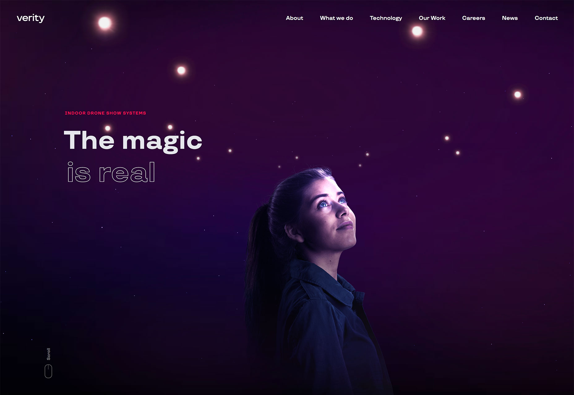
 Verity features a deep purple background with animated lights. The image looks like the night sky (a common use for purple imagery and backgrounds). What works about purple and this design is the connection between imagery, color and copy. The headline “The magic is real” mirrors the emotional connection you would expect from purple. It’s a perfect fit.
Conclusion
The websites featured above are a great examples of how many design trends work with each other. Many of the most successful trends aren’t wide-scale use of elements or design techniques but subtle strokes. Click through the examples and you’ll see quite quickly how many of these design feature multiple trends without being overwhelming or “too trendy.” What trends are you loving (or hating) right now? I’d love to see some of the websites that you are fascinated with. Drop me a link on Twitter; I’d love to hear from you.Carrie Cousins
Carrie Cousins is a freelance writer with more than 10 years of experience in the communications industry, including writing for print and online publications, and design and editing. You can connect with Carrie on Twitter @carriecousins.


Read Next

15 Best New Fonts, July 2024
Welcome to our monthly roundup of the best fonts we’ve found online in the last four weeks. This month, there are fewer…
By Ben Moss

20 Best New Websites, July 2024
Welcome to July’s round up of websites to inspire you. This month’s collection ranges from the most stripped-back…

Top 7 WordPress Plugins for 2024: Enhance Your Site's Performance
WordPress is a hands-down favorite of website designers and developers. Renowned for its flexibility and ease of use,…
By WDD Staff

Exciting New Tools for Designers, July 2024
Welcome to this July’s collection of tools, gathered from around the web over the past month. We hope you’ll find…

3 Essential Design Trends, July 2024
Add some summer sizzle to your design projects with trendy website elements. Learn what's trending and how to use these…

15 Best New Fonts, June 2024
Welcome to our roundup of the best new fonts we’ve found online in the last month. This month, there are notably fewer…
By Ben Moss

20 Best New Websites, June 2024
Arranging content in an easily accessible way is the backbone of any user-friendly website. A good website will present…

Exciting New Tools for Designers, June 2024
In this month’s roundup of the best tools for web designers and developers, we’ll explore a range of new and noteworthy…

3 Essential Design Trends, June 2024
Summer is off to a fun start with some highly dramatic website design trends showing up in projects. Let's dive in!

15 Best New Fonts, May 2024
In this month’s edition, there are lots of historically-inspired typefaces, more of the growing trend for French…
By Ben Moss

How to Reduce The Carbon Footprint of Your Website
On average, a web page produces 4.61 grams of CO2 for every page view; for whole sites, that amounts to hundreds of KG…
By Simon Sterne

20 Best New Websites, May 2024
Welcome to May’s compilation of the best sites on the web. This month we’re focused on color for younger humans,…