

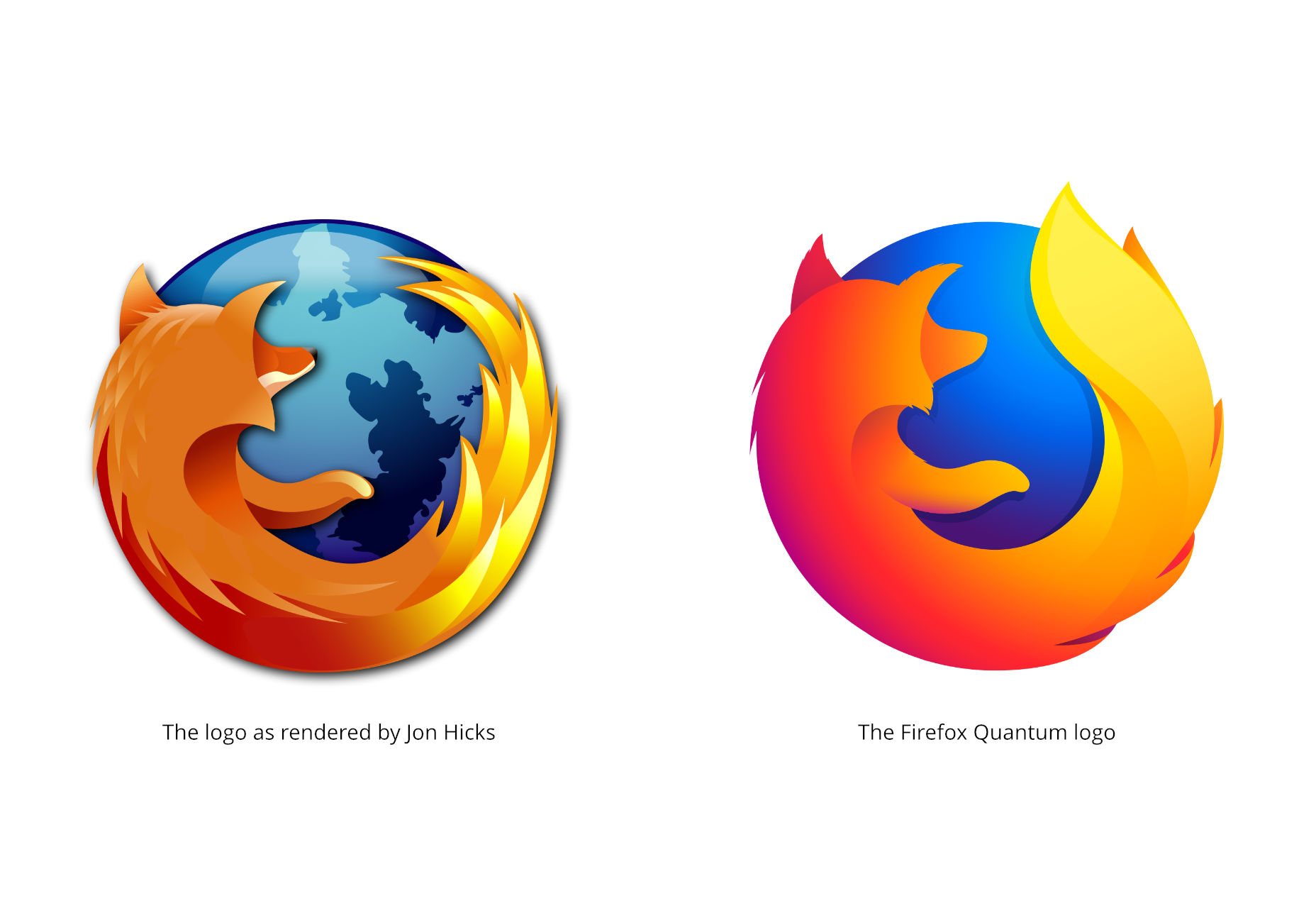
 Since a product family needs to more or less match, visually speaking, Firefox’s logo needs to change to allow more flexibility. It needs to be adaptable to other software. To this end, the branding team at Mozilla has come up with two different branding systems, and is looking for feedback on them.
To have your say, leave them a comment on the blog post linked above.
Note that neither of these systems are anywhere close to finalized. Mozilla even refers to them as “a work of fiction” at this point, which should tell you about how close they are to being implemented. Every icon has yet to undergo quite a bit of iteration before any decisions are made.
Since a product family needs to more or less match, visually speaking, Firefox’s logo needs to change to allow more flexibility. It needs to be adaptable to other software. To this end, the branding team at Mozilla has come up with two different branding systems, and is looking for feedback on them.
To have your say, leave them a comment on the blog post linked above.
Note that neither of these systems are anywhere close to finalized. Mozilla even refers to them as “a work of fiction” at this point, which should tell you about how close they are to being implemented. Every icon has yet to undergo quite a bit of iteration before any decisions are made.
System 1
This first system emphasizes thick geometric shapes, and a strongly yellow-to-red palette, though there is some variation in the color. Of the two, this almost feels a bit more “classic Firefox”.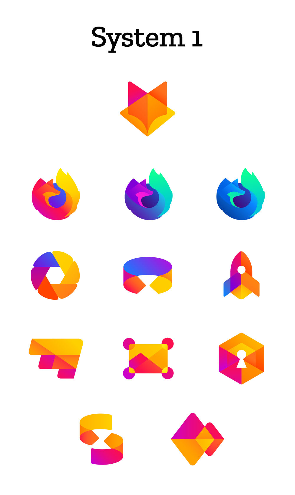
System 2
The second system introduces a bit more color variation, with thinner lines.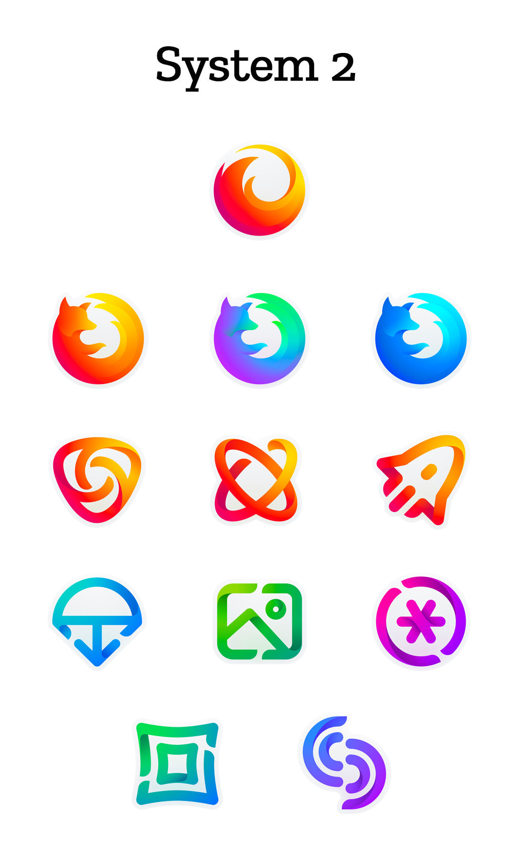
My Opinion
These design systems both seem very, very corporate, which I suppose is appropriate, now. I do not think, however, that they are devoid of personality or history like some other recent logo redesigns have been. This is an actual evolution of the brand, rather than a surgical removal of everything fun and/or dated. Like many in the comment section of the original post on Mozilla’s blog, I think the Firefox icons from System 2 should be combined with the other icons from System 1. It just seems to fit better that way. The only thing that worries me a little is this quote at the end: “With your input, we’ll have a final system that will make a Firefox product recognizable out in the world even if a fox is nowhere in sight.” I don’t think they actually have any plans to remove the fox imagery; but if that question ever comes up, here’s my community feedback: Keep the damn fox, mmmkay?Ezequiel Bruni
Ezequiel Bruni is a web/UX designer, blogger, and aspiring photographer living in Mexico. When he’s not up to his finely-chiselled ears in wire-frames and front-end code, or ranting about the same, he indulges in beer, pizza, fantasy novels, and stand-up comedy.


Read Next

3 Essential Design Trends, May 2024
Integrated navigation elements, interactive typography, and digital overprints are three website design trends making…

How to Write World-Beating Web Content
Writing for the web is different from all other formats. We typically do not read to any real depth on the web; we…
By Louise North

20 Best New Websites, April 2024
Welcome to our sites of the month for April. With some websites, the details make all the difference, while in others,…

Exciting New Tools for Designers, April 2024
Welcome to our April tools collection. There are no practical jokes here, just practical gadgets, services, and apps to…

How Web Designers Can Stay Relevant in the Age of AI
The digital landscape is evolving rapidly. With the advent of AI, every sector is witnessing a revolution, including…
By Louise North

14 Top UX Tools for Designers in 2024
User Experience (UX) is one of the most important fields of design, so it should come as no surprise that there are a…
By Simon Sterne

What Negative Effects Does a Bad Website Design Have On My Business?
Consumer expectations for a responsive, immersive, and visually appealing website experience have never been higher. In…

10+ Best Resources & Tools for Web Designers (2024 update)
Is searching for the best web design tools to suit your needs akin to having a recurring bad dream? Does each…
By WDD Staff

3 Essential Design Trends, April 2024
Ready to jump into some amazing new design ideas for Spring? Our roundup has everything from UX to color trends…

How to Plan Your First Successful Website
Planning a new website can be exciting and — if you’re anything like me — a little daunting. Whether you’re an…
By Simon Sterne

15 Best New Fonts, March 2024
Welcome to March’s edition of our roundup of the best new fonts for designers. This month’s compilation includes…
By Ben Moss

LimeWire Developer APIs Herald a New Era of AI Integration
Generative AI is a fascinating technology. Far from the design killer some people feared, it is an empowering and…
By WDD Staff