

Display Specifics
iPhone X has a new high-resolution, rounded, edge-to-edge Super Retina display has a resolution of 1125×2436px. While it gives designers more space for display content and allows them to create a genuinely immersive experience, there are a few things that should be considered when designing for this device:1. 3x Image Scale Factor
iPhone X has 3x image scale factors (@1x,@2x, and @3x). When rasterized images are needed, be sure to include both 2x and 3x image resolutions in your app image resolution catalog. Also, it’s recommended to use SVGs for glyphs and other flat artwork that requires high-resolution scaling because they are resolution-independent.2. New Display Dimensions: More Screen Space, More Content
iPhone’s X display dimensions are 375pt width * 812 pt tall. On a 3x display this equals 1,125 px @3x width * 2,436 px @3x tall. In portrait orientation, the width of the display on iPhone X matches the width of the 4.7" displays of iPhone 6, iPhone 7, and iPhone 8 so there shouldn’t be any difference in the amount of information presented along with the narrow dimensions of these devices. But the display has a different height: the 812pt height is 145pt taller that 667pt of 4.7” displays. This additional height of iPhone X provides 20% more space for content.3. Consider Aspect Ratio When Creating Background Images
When designing background images keep in mind that iPhone X also has different aspect ratio than a 4.7” display. Background graphics created for iPhone’s 8 16:9 aspect ratio needs to be adjusted to satisfy the technical requirements of iPhone X . To prevent the negative outcome, it’s better to compose images so that critical visual information remains visible regardless of display aspect ratio.4. Don’t Position Elements In Display’s Edge Corners
Rounded corners bring another challenge for designers: every element that is positioned too close to the viewport’s edges may get clipped or covered by the sensor housing. It’s critical to inset controls and other elements to avoid this.5. Use Safe Area Layout To Display Content
Safe Area layout helps avoid underlapping system UI elements when positioning content and controls. On iPhone 8 the Safe Area is the same size as the viewport when no bars are visible. On iPhone X the Safe Area layout is inset from the top and bottom of the screen edges even when no bars are visible on the screen. This helps you to prevent interface elements from getting clipped or covered. However, there two exception for the Safe Area: the app’s background and vertically scrollable views. Vertically scrollable views, such as tables and collections, should extend all the way to the bottom of the display and extend to the edges rather than be constrained to the Safe Area zone.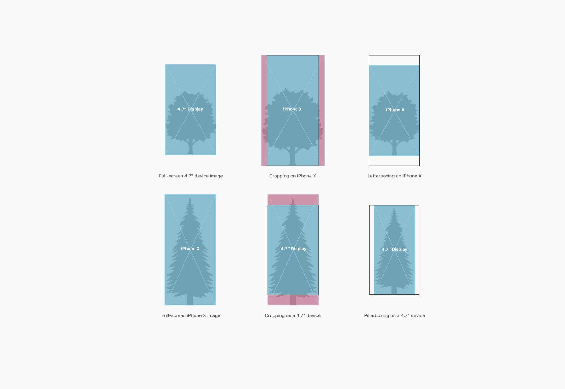
6. Don’t Worry About Native Components
If your app uses native iOS component (such as navigation bars, tables, collection views, tab bars, etc.) and you worry about how they’ll be adapted for the iPhone X, don’t worry! They will be inset and positioned automatically.Home Indicator
iPhone X changed one of the iPhone’s interactions basics, the home button is legacy now. Before iPhone X users who wanted to access the app switcher or the Home screen clicked the iPhone’s home button to do that. For iPhone X the same process is available when users swipe up anywhere along the bottom edge along the display. Swipes are the new clicks. In the attempt to replace the home button with a gesture and make it intuitive, Apple offers information about the interaction in the format of an indicator at the bottom edge along the display; a small line that lives on the bottom of a screen. This indicator is displayed over iPhone X app’s interface. You’ll need to account for this when designing your app.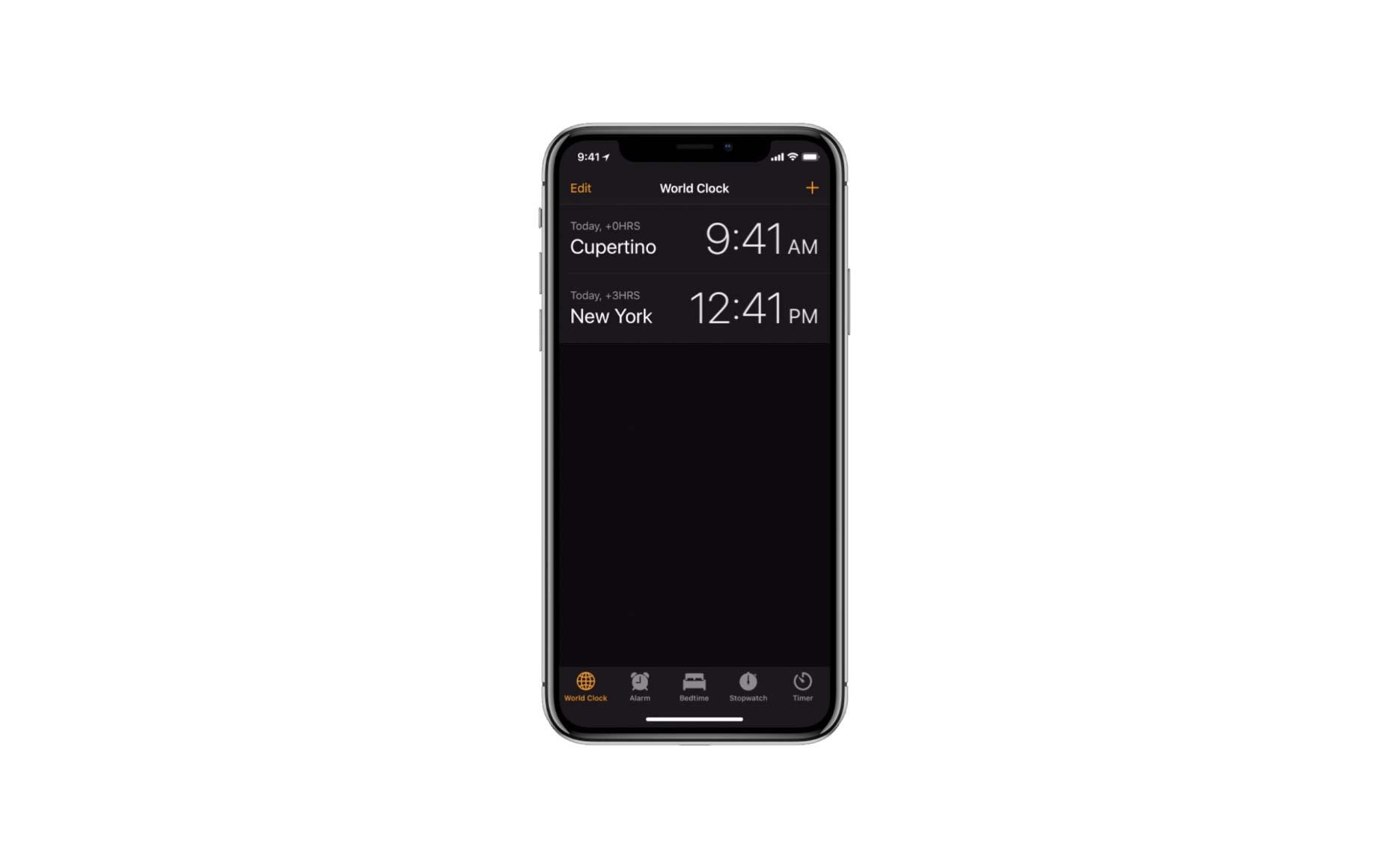 Notice a white line at the bottom, that’s the new home indicator. It notifies you that you can swipe up to go back to your Home screen or into multitasking.
7. Avoid Placing Interactive Elements Near the Home Indicator
It’s best to avoid placing interactive elements such as buttons in close proximity to the indicator or you’ll risk having them overlapped with the Home indicator. Simply leave some whitespace near the home indicator by placing non-scrollable elements within the safe area.8. Don’t Draw Special Attention To Home Indicator
The home indicator isn’t a decorative element. Don’t mask it, and don’t call special attention to it.9. Use Auto-Hide For Full-Screen Experiences
When presenting full-screen visual content such as videos, it’s possible to use auto-hide to hide the Home Indicator.
Notch Area
The notch area is perhaps the most controversial part of the iPhone X design. Some people think it’s visually appealing; others think it’s ugly. But as designers, we can use the screen space available in the notch area for good.10. Don’t Mask the Notch
Some designers try to make the experience on iPhone X look like similar to the experience on iPhone 8; they place black bars at the top to make it look like an old-school app. It’s better to avoid that - this will only make your app feel inconsistent with other apps on iPhone X. Your app or game should always fill the entire display it runs on.11. Don’t Hide the Status Bar
If you currently hide the status bar in your app, it’s better to reconsider this decision. Since the status bar area is taller (previously is was 20pt high, now it’s 44pt) and you have more estate to display your content. Add content that is useful for your users.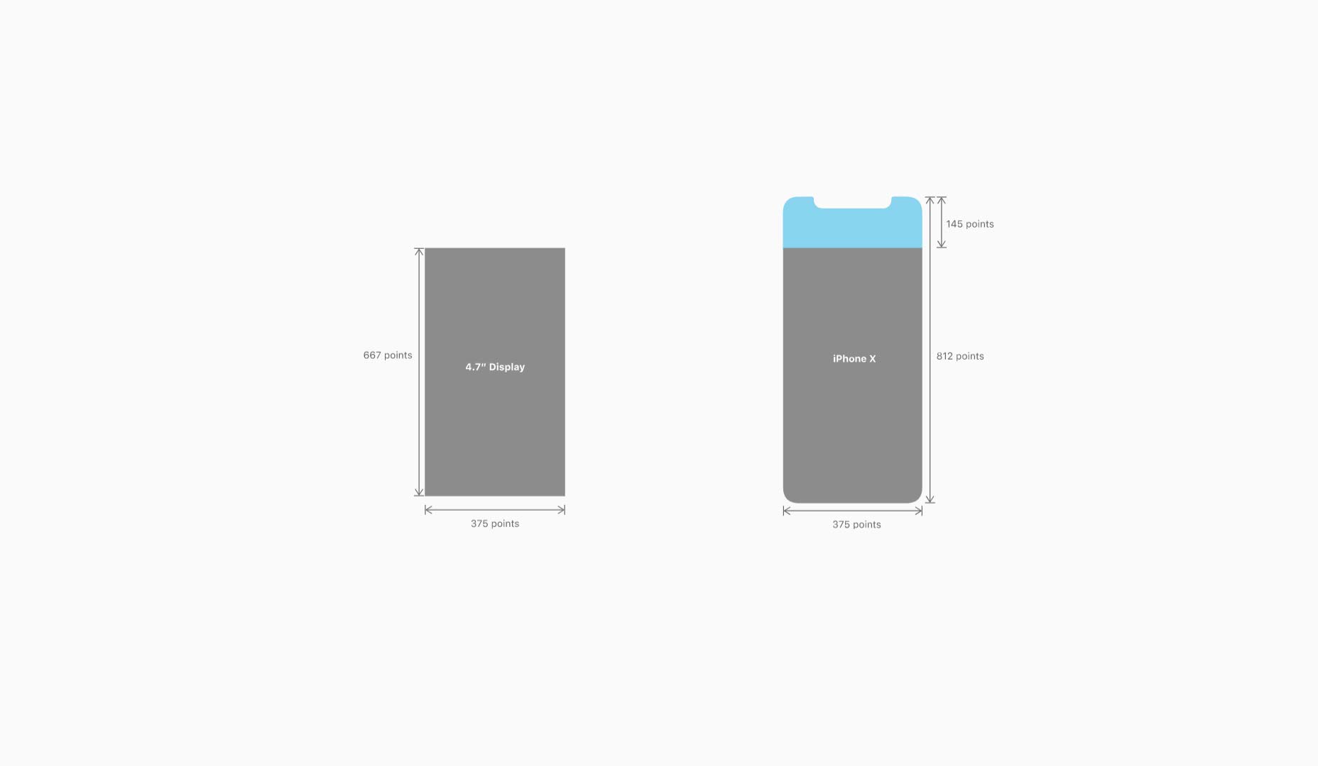
Nick Babich
Fireart Studio is a design studio passionate about creating beautiful design for startups & leading brands. We pay special attention to nuances all the time to create professional while cool products that will not only meet all expectations, but exceed them.


Read Next

15 Best New Fonts, July 2024
Welcome to our monthly roundup of the best fonts we’ve found online in the last four weeks. This month, there are fewer…
By Ben Moss

20 Best New Websites, July 2024
Welcome to July’s round up of websites to inspire you. This month’s collection ranges from the most stripped-back…

Top 7 WordPress Plugins for 2024: Enhance Your Site's Performance
WordPress is a hands-down favorite of website designers and developers. Renowned for its flexibility and ease of use,…
By WDD Staff

Exciting New Tools for Designers, July 2024
Welcome to this July’s collection of tools, gathered from around the web over the past month. We hope you’ll find…

3 Essential Design Trends, July 2024
Add some summer sizzle to your design projects with trendy website elements. Learn what's trending and how to use these…

15 Best New Fonts, June 2024
Welcome to our roundup of the best new fonts we’ve found online in the last month. This month, there are notably fewer…
By Ben Moss

20 Best New Websites, June 2024
Arranging content in an easily accessible way is the backbone of any user-friendly website. A good website will present…

Exciting New Tools for Designers, June 2024
In this month’s roundup of the best tools for web designers and developers, we’ll explore a range of new and noteworthy…

3 Essential Design Trends, June 2024
Summer is off to a fun start with some highly dramatic website design trends showing up in projects. Let's dive in!

15 Best New Fonts, May 2024
In this month’s edition, there are lots of historically-inspired typefaces, more of the growing trend for French…
By Ben Moss

How to Reduce The Carbon Footprint of Your Website
On average, a web page produces 4.61 grams of CO2 for every page view; for whole sites, that amounts to hundreds of KG…
By Simon Sterne

20 Best New Websites, May 2024
Welcome to May’s compilation of the best sites on the web. This month we’re focused on color for younger humans,…