

45royale
45royale is one of those sites that combines minimalism with a healthy love of gradients.The layouts are simple, and the type is good, but it’s the use of color that truly makes this site stand out. Platform: WordPress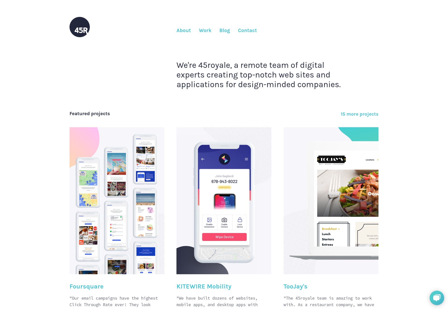
RedElegant
RedElegant embraces a classic and more corporate-client-friendly aesthetic with just a touch of that material design feel. It’s the sort of design you’d expect to see at a bank. Interesting side note, the WordPress theme used seems to be a heavily customized version of the Twenty Seventeen default WordPress theme. The extent of the customization makes this site impressive, as I would never have guessed this if I hadn’t looked at the source. Platform: WordPress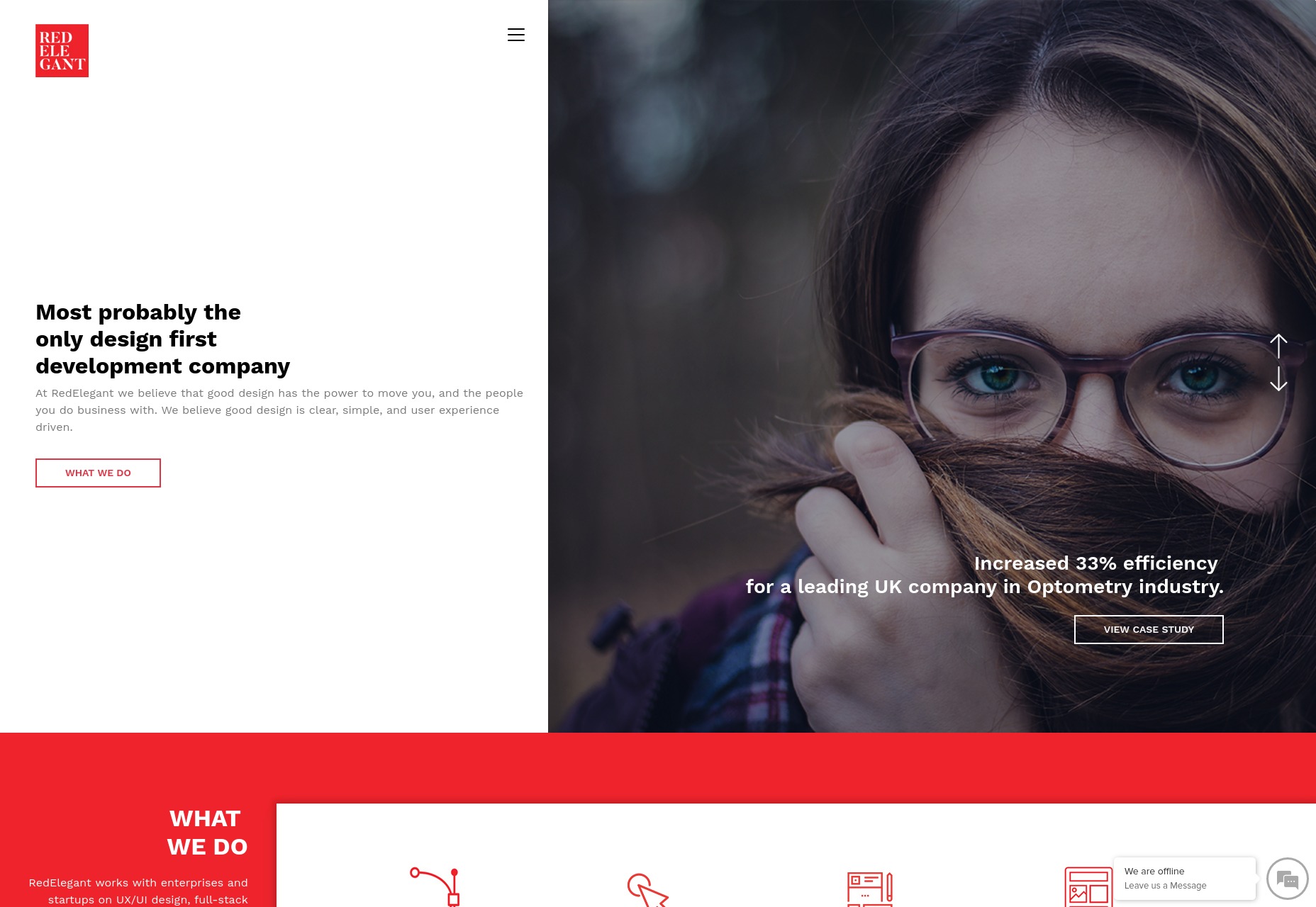
5e Rue
5e Rue combines a fairly minimalist and classical feel with light hints of more modern artistic flourish, and a bold use of blue. The serif heading type overlaps with illustration-style bits in a way that creates a beautiful yet staid experience. It puts me in mind of a classic Parisian café, and not just because the studio itself is in Paris, okay? Platform: Static Site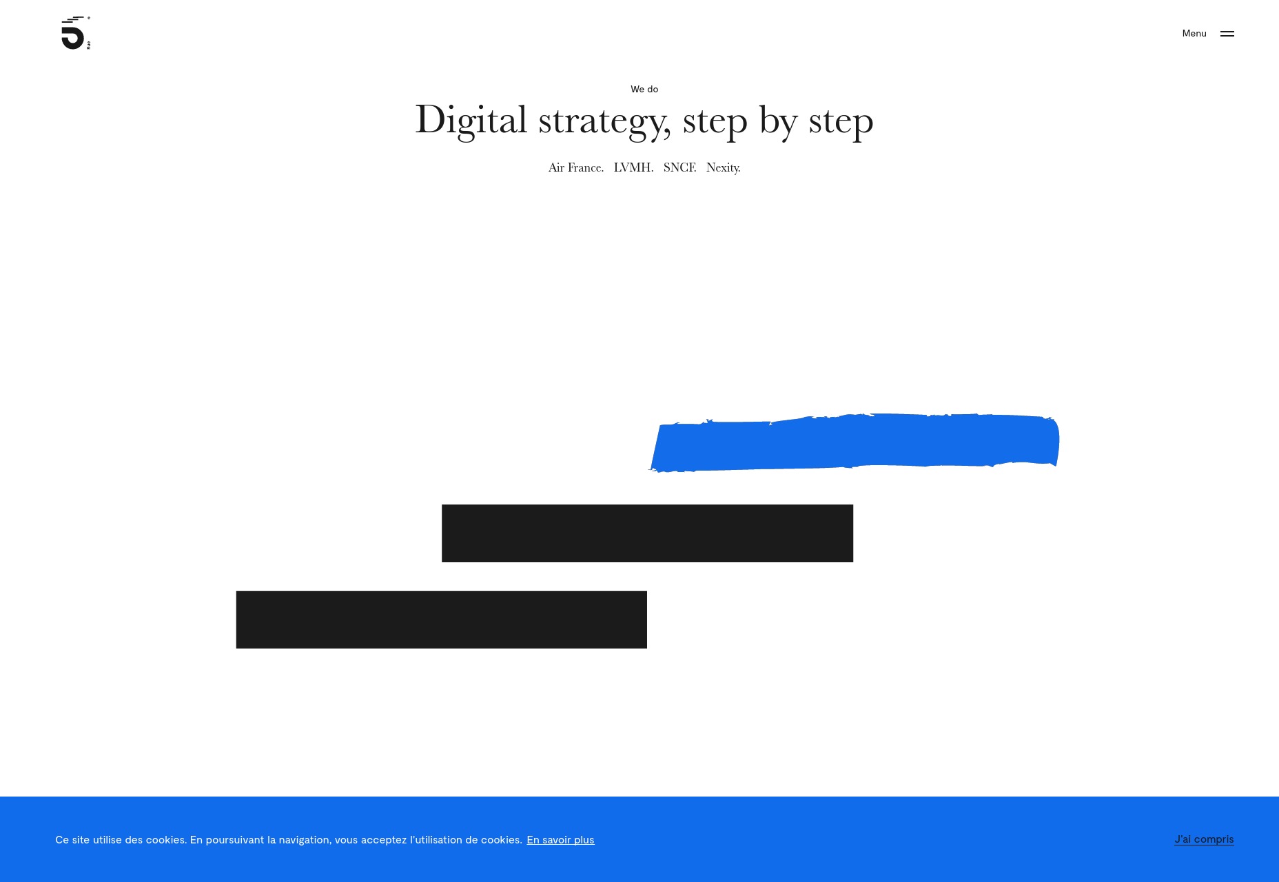
Co-Partnership
Co-Partnership has gone for the solid background with the big sans-serif text, and just a little bit of asymmetry. Well, there’s nothing at all wrong with using a tried and true formula. I particularly like what they do with their logotype. The ever-shifting branding is a nice touch of art direction on an otherwise very simple site. Platform: WordPress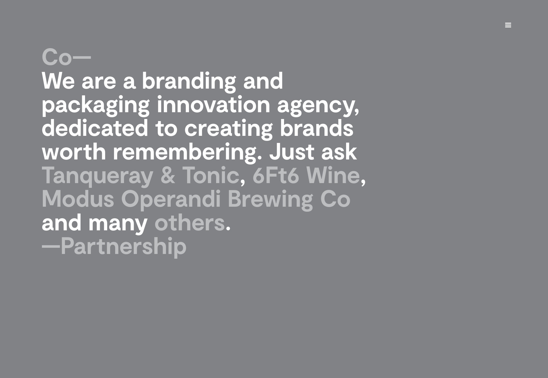
Object
Object goes hard on the use of color as art direction. Just about every page has a different palette, and the overall effect is quite pleasing. While I’ll admit that the “hero” section on their home page is a bit of an eye-gouger, the overall effect is a pleasant one. Platform: WordPress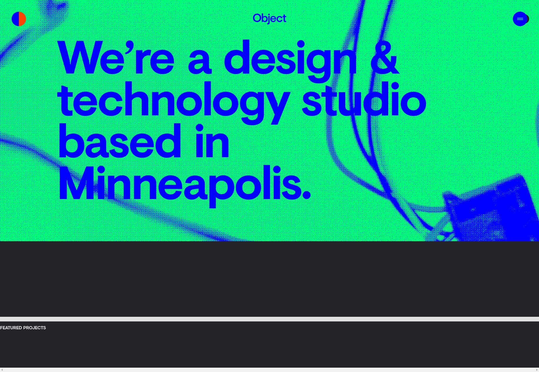
60fps
60fps specializes in motion design, so it’s to be expected that their site will be a bit JavaScript-heavy. Even so, the animation used feels understated, even while making its presence known so clearly. With unique-feeling layouts and good typography, the whole experience is one of the better ones I’ve seen in the “presentation site” category. I just wish they would stop with the scroll-jacking. I’m not a fan. Platform: Static Site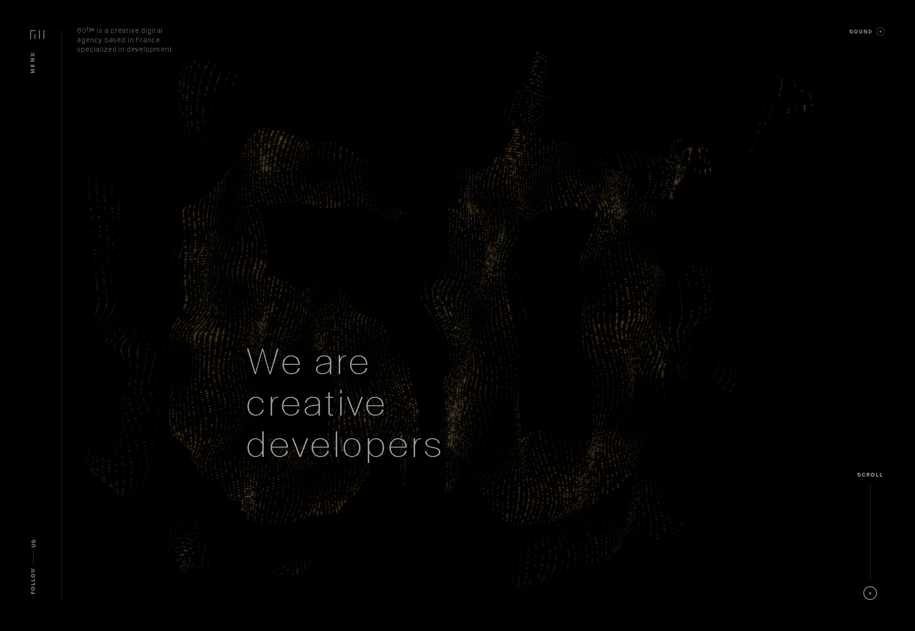
Hochburg
Hochburg uses a very light touch with animation and a very simple, minimalist, and grid-based look. One thing I do rather like about the home page is this very light animated static effect to highlight portfolio pieces when you hover on them. It’s just a good-looking plain old dark layout, and I love it. Platform: Contao CMS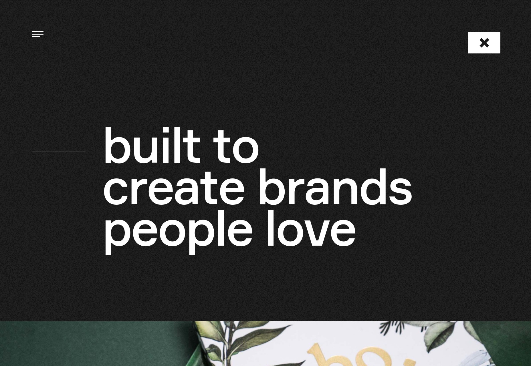
Rimini Berlin
Rimini Berlin is interesting for in that the entire site is an accordion element. Sure, the implementation is a bit too JS-dependent for my taste, but it does preserve navigational context on this one-page site in a fairly clever way. Give me a pure CSS implementation, or at least some simple fallbacks, and I’d have nothing to complain about. Platform: WordPress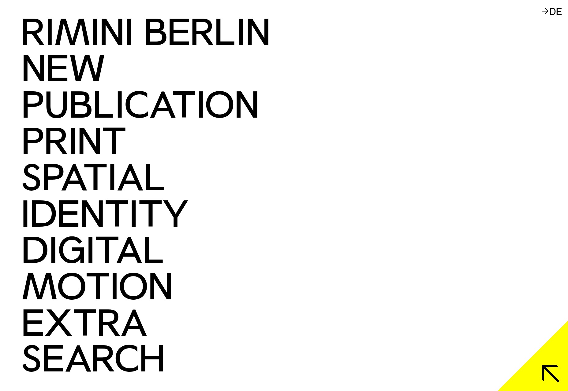
ED.
ED. goes for full minimalism, and a classic three-ish-column approach. In fact, I’m kind of a fan of the way the columns shift around a bit when you click on a project, even if I’m unsure about this trend of letting your branding clip onto the content of your site. It’s a simple effect, but it works, and allows for a certain flexibility in this simple layout. Platform: WordPress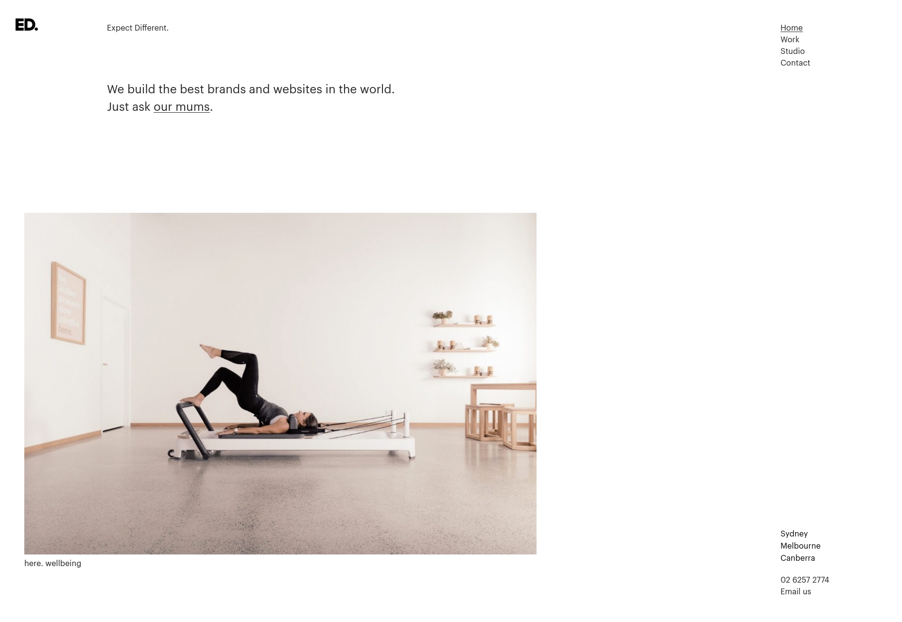
Intervaro
Intervaro goes for full minimalism with a touch of material design, by which I guess I mean drop shadows and a fixed navigation bar. That’s Material Design, right? And Material Design is the new corporate aesthetic? Whatever, it’s a simple and good-looking portfolio site. Bonus points: they implemented a rather fantastic-looking dark mode for users who find that easier on their eyes. Platform: WordPress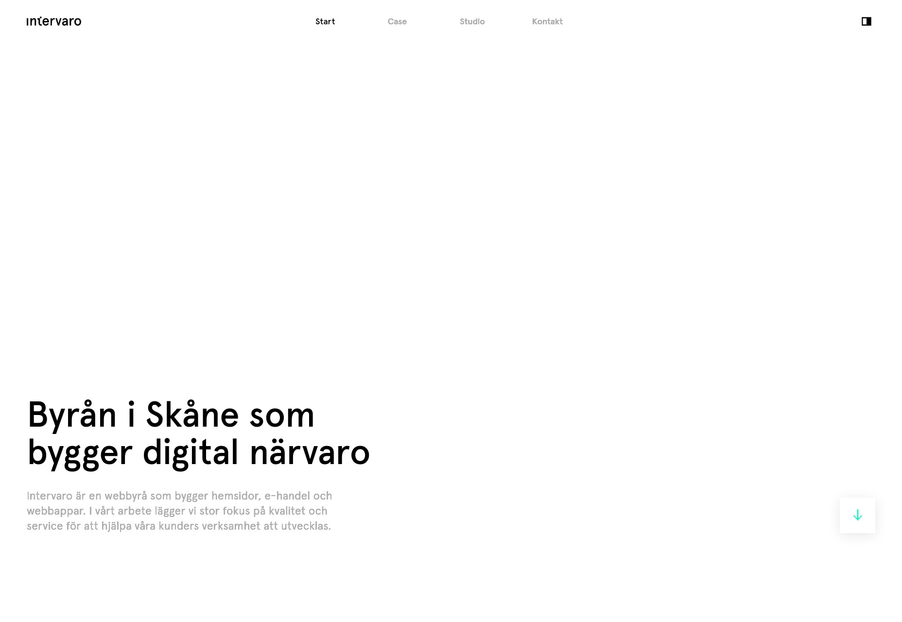
Modest Department
I find myself fascinated by the choices made on Modest Department’s portfolio site because they went with very intentionally small thumbnails for everything. Is it to fit with the name? Is it to save people’s bandwidth? Either way, it does both. The small thumbnails and wide spacing naturally draw the eye in and make you really look at what they’re showing you. It would be inadvisable for an extended browsing experience, but it’s great for a quick portfolio. It’s not great for those with visual impairments, but they could zoom in, and clicking on a thumbnail gets you a full-sized video in any case. Platform: WordPress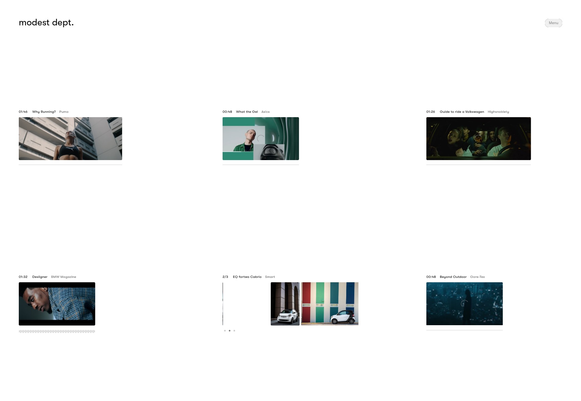
Koto
Koto’s studio portfolio has gone with a one-column portfolio site, relying on their use of color and branding to help them stand out. And it works. Every element feels very intentionally placed despite the almost extreme simplicity. And I can’t fault the way they use illustration-style elements. Platform: WordPress
Jane Studios
With all of the comparably simple sites on this list so far, we were due for another artsy one. Enter Jane Studios, a site so minimalist, artsy, and generally PowerPoint-like, we might have reached peak modern design. I’ll never be a fan of that in-all-the-corners navigation, but the rest of the site is an excellent example of its kind, Platform: WordPress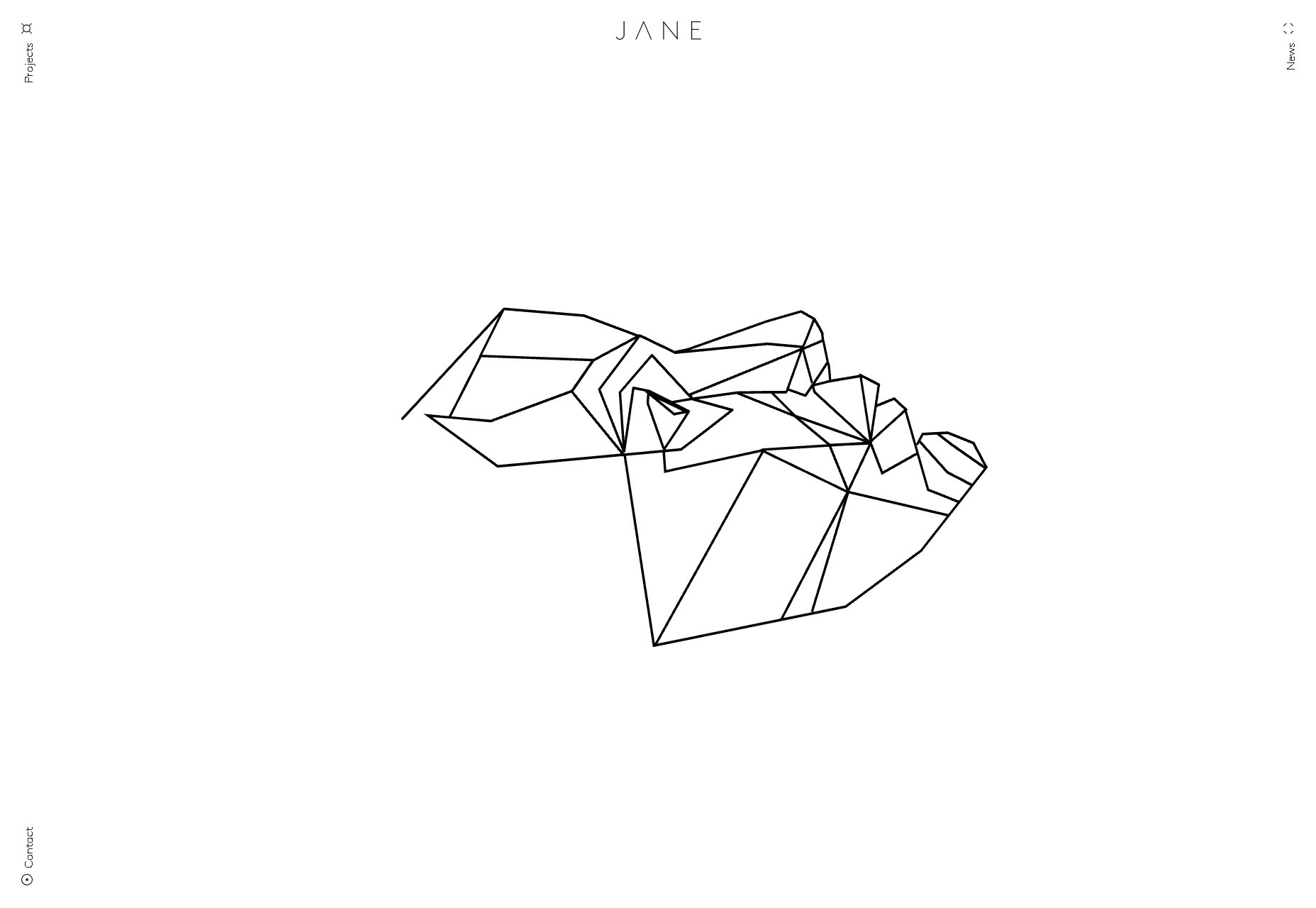
Raxo
Raxo gets a spot on this list only partly because I’m a sucker for horizontal layouts like the one they have on their home/landing page. The rest of the site is a fairly simple and business-like affair with a strong but not overwhelming use of solid red. Once again, I’m going to complain a bit about the navigation, though. Hamburger icons are bad enough on a desktop site, but it’s not even a hamburger icon anymore. It’s a circle. Come on. The rest is pretty good, though. Platform: Static Site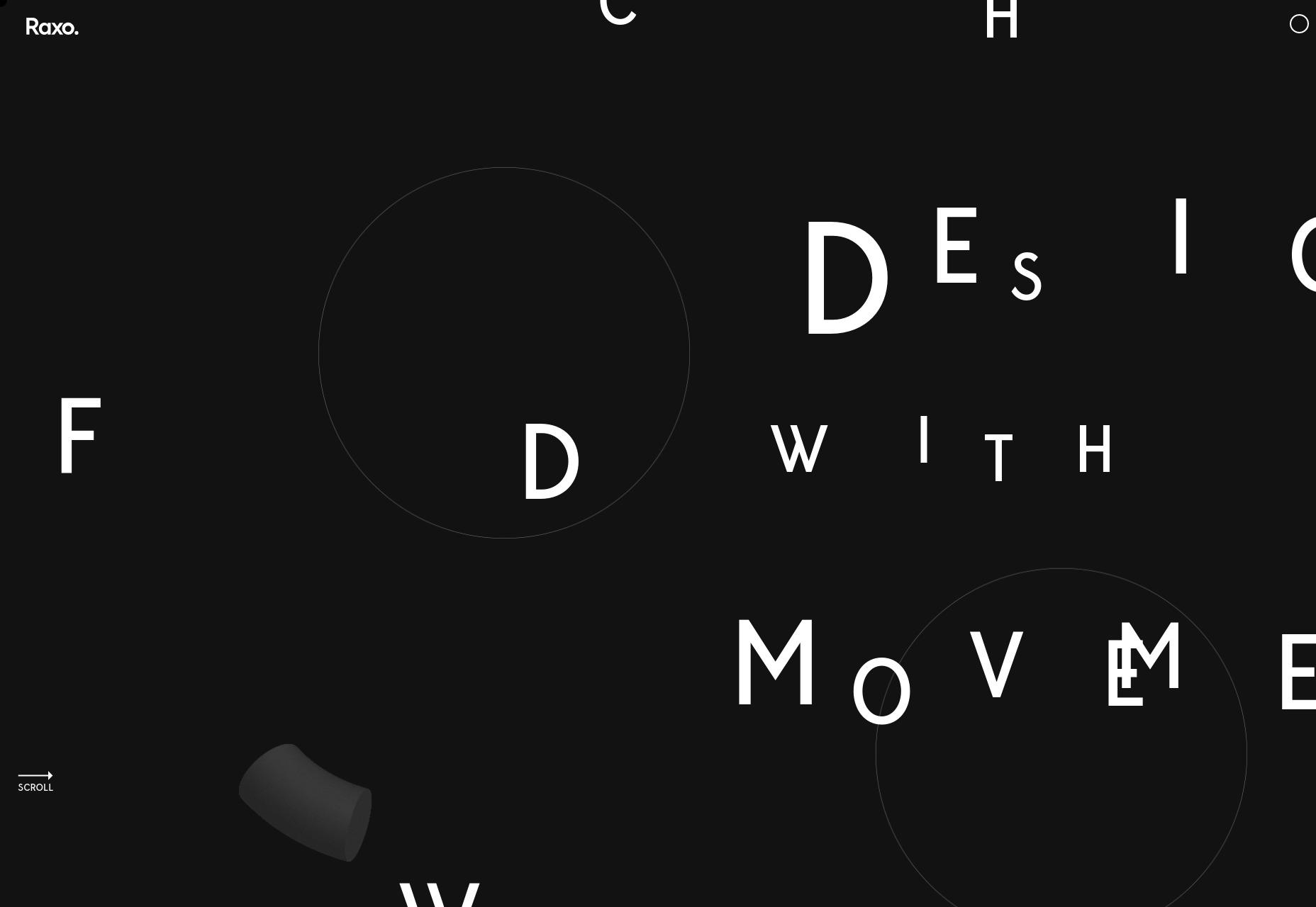
RubyAnne Designs
RubyAnne Designs, which is abbreviated very awesomely as “RAD”, is an architecture firm. Unlike many architecture sites, this one skips a lot of the fluff and just shows you the houses already. The aesthetic is nearly brutalist, but don’t let that stop you from checking it out. It’s a fantastic example of a simple, clean, and not at all overdone architecture portfolio. Platform: SquareSpace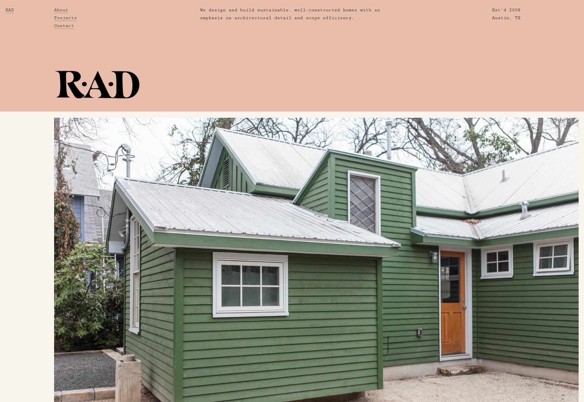
Robin Mastromarino
Robin Mastromarino is an interaction designer, which means you should expect lots of animation. The animation is fairly low-key, though, and doesn’t detract from this delightfully clean and well-structured site. The click-and-drag slideshow probably works better on mobile than it does on the desktop. Well, mobile is a huge market, so that works. Platform: Static Site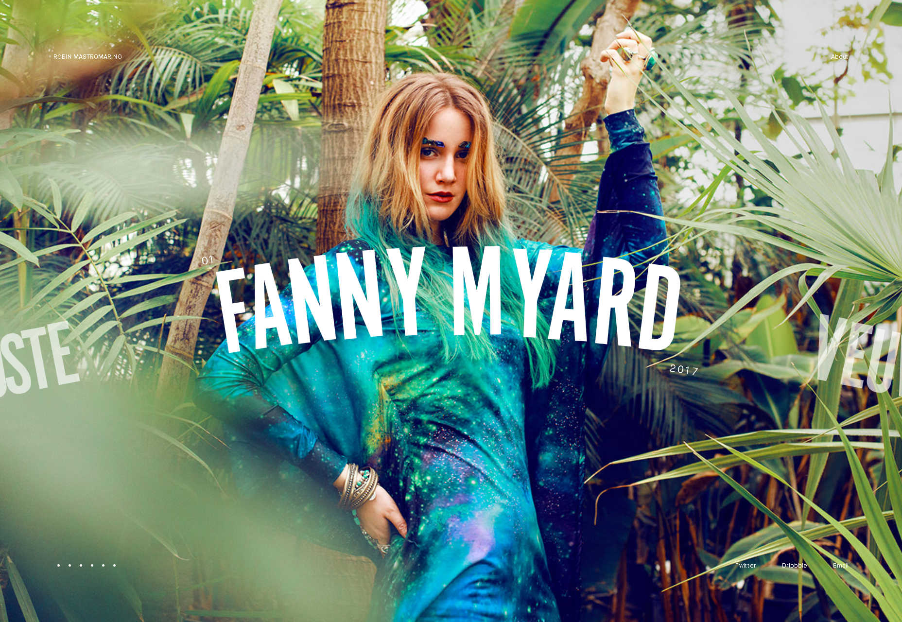
Célia Lopez
Célia Lopez’ portfolio lands squarely in artsy territory with lots of 3D-ish graphics and that aesthetic form that’s just so “modern” that I feel like inventing a new word for it. Supermodern? Anyway, as presentation sites go, this one looks absolutely lovely. I love the heading type, especially. Platform: JS App(?)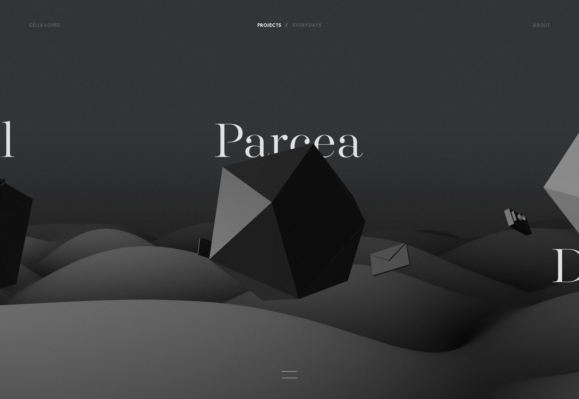
Hamish Stephenson
Hamish Stephenson’s flim and photography portfolio is dark, simple, and… smooth? Look, it feels smooth. Maybe that’s just because Samuel L. Jackson stares out at you from the portrait section of the site, but it just looks “cool”, in that dark and honey-voiced narrator sense of the word. Like old jazz. Man, blurry background elements have never gotten so much praise, but here we are. Platform: WordPress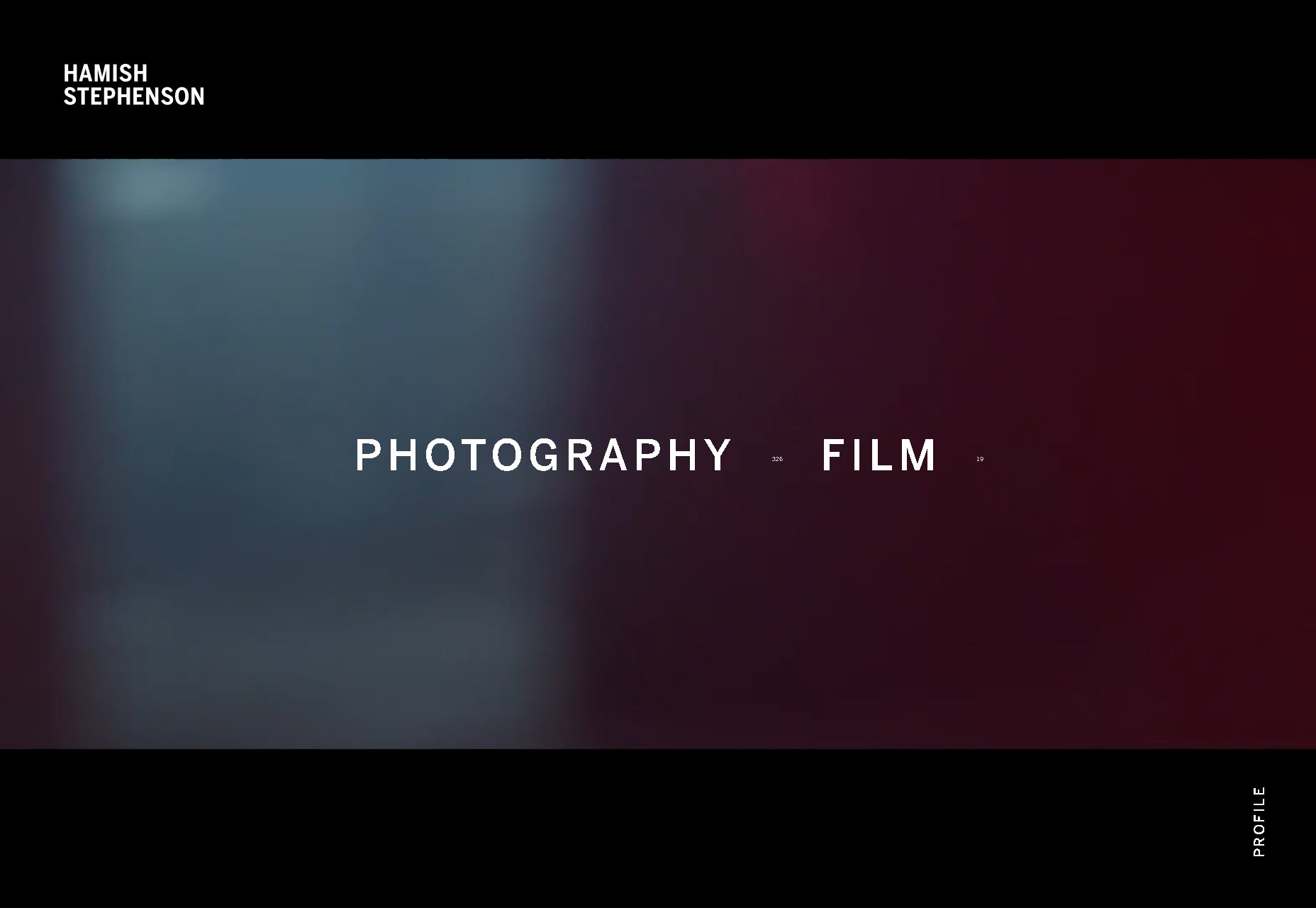
Sebastian Chen Speier
Sebastian Chen Speier’s one-page portfolio is fairly post-modern, minimalist, and basically defines the phrase “dead simple”. It does that whole hover-over-text-to-see-a-preview thing, but with a twist: click, and you’ll get different preview images. It’s not the most intuitive setup, but it’s worth checking out for the novelty alone. Platform: Static Site
Helder
The Helder agency site is of that school of thought that holds bold text in high regard. It’s all bold. All of it. Then there’s the strong color changes (that still somehow work), the stark imagery… it’s just a design that doesn’t hold back. And yet, it still looks kind of reserved for all that. Platform: WordPress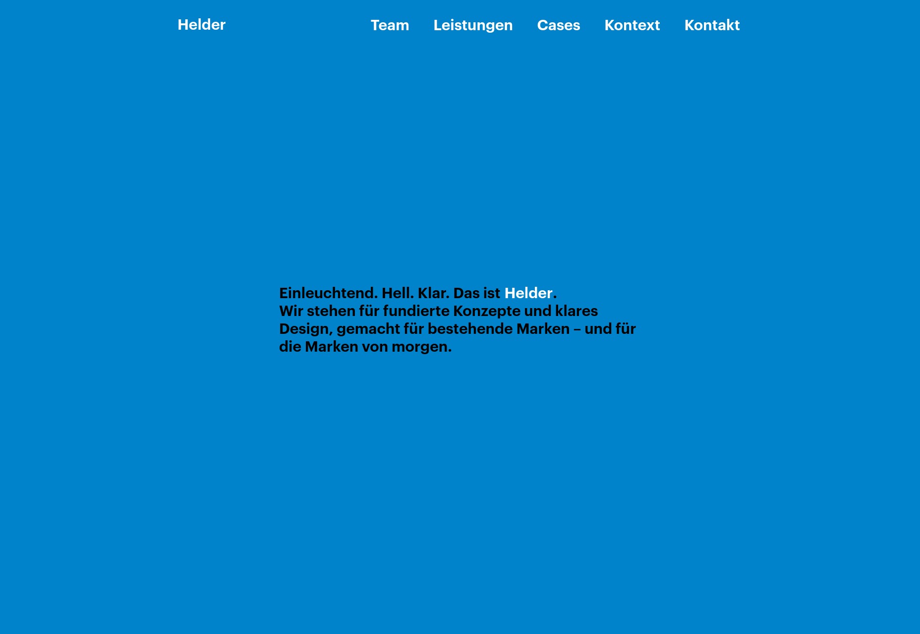
Ezequiel Bruni
Ezequiel Bruni is a web/UX designer, blogger, and aspiring photographer living in Mexico. When he’s not up to his finely-chiselled ears in wire-frames and front-end code, or ranting about the same, he indulges in beer, pizza, fantasy novels, and stand-up comedy.


Read Next

15 Best New Fonts, July 2024
Welcome to our monthly roundup of the best fonts we’ve found online in the last four weeks. This month, there are fewer…
By Ben Moss

20 Best New Websites, July 2024
Welcome to July’s round up of websites to inspire you. This month’s collection ranges from the most stripped-back…

Top 7 WordPress Plugins for 2024: Enhance Your Site's Performance
WordPress is a hands-down favorite of website designers and developers. Renowned for its flexibility and ease of use,…
By WDD Staff

Exciting New Tools for Designers, July 2024
Welcome to this July’s collection of tools, gathered from around the web over the past month. We hope you’ll find…

3 Essential Design Trends, July 2024
Add some summer sizzle to your design projects with trendy website elements. Learn what's trending and how to use these…

15 Best New Fonts, June 2024
Welcome to our roundup of the best new fonts we’ve found online in the last month. This month, there are notably fewer…
By Ben Moss

20 Best New Websites, June 2024
Arranging content in an easily accessible way is the backbone of any user-friendly website. A good website will present…

Exciting New Tools for Designers, June 2024
In this month’s roundup of the best tools for web designers and developers, we’ll explore a range of new and noteworthy…

3 Essential Design Trends, June 2024
Summer is off to a fun start with some highly dramatic website design trends showing up in projects. Let's dive in!

15 Best New Fonts, May 2024
In this month’s edition, there are lots of historically-inspired typefaces, more of the growing trend for French…
By Ben Moss

How to Reduce The Carbon Footprint of Your Website
On average, a web page produces 4.61 grams of CO2 for every page view; for whole sites, that amounts to hundreds of KG…
By Simon Sterne

20 Best New Websites, May 2024
Welcome to May’s compilation of the best sites on the web. This month we’re focused on color for younger humans,…