

Critical Mass
Critical Mass is one of those design agencies you’d just love to work for. Their new site is a homage to themselves, telling a success story from their roots in Calgary, to 11 different offices around the world, with some exceptional work along the way.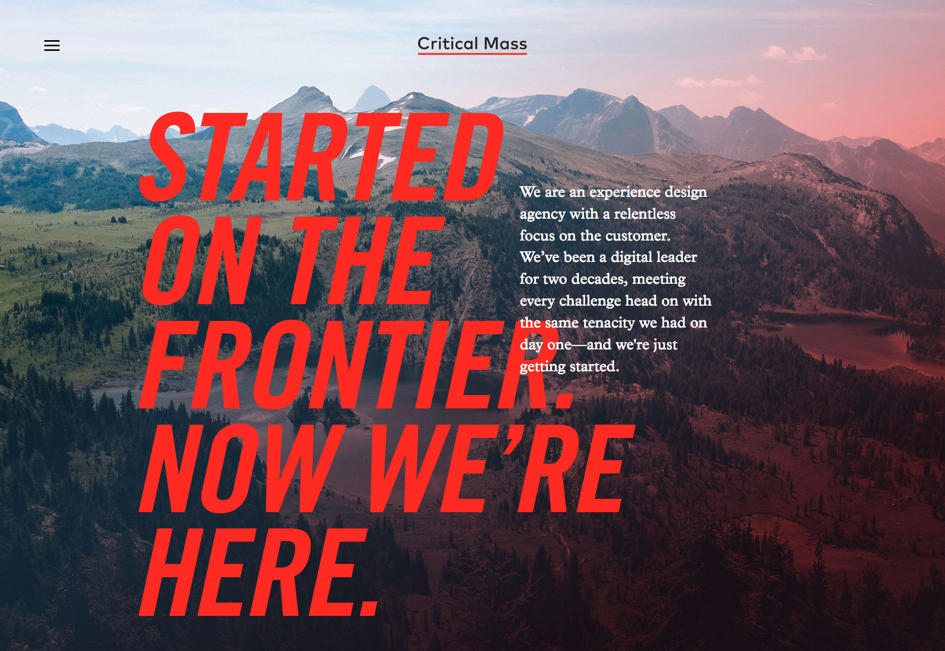
Genesis
Genesis is a London eatery specializing in organic, healthy food. Their site is ever so slightly bizarre. Entirely black and white, with mystic-inspired illustrations, the site definitely makes me want to eat there, at least once.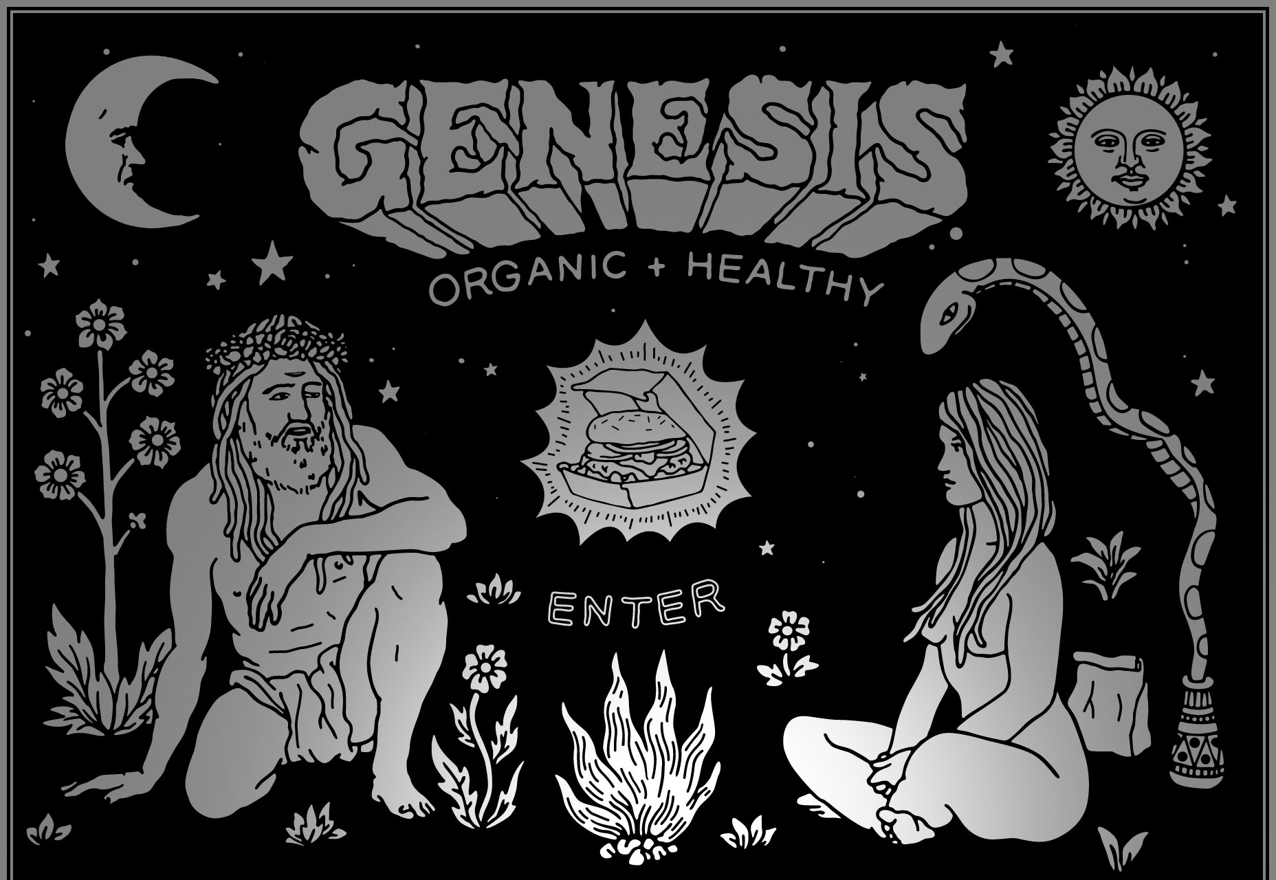
Libratone
With bold color blocking, an unconventional grid, and one of the more interesting slideshows you’ll see, Libratone’s site is walking the walk by exuding confidence, sophistication, and a sense of freedom. A great site the perfectly encapsulates its brand identity.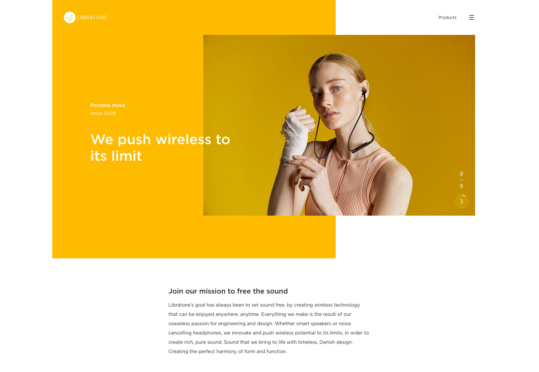
Marc Jacobs
Marc Jacobs is one of the world’s most productive fashion labels, selling a dizzying array of products through this site. Despite the vast range of goods, there’s still time for careful details if you look, check out the animated bag for example.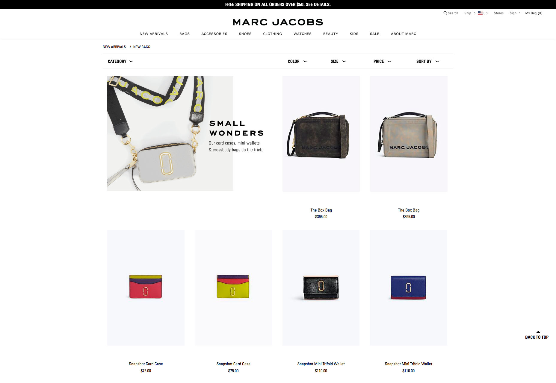
Tao Tajima
Filmmaker Tao Tajima’s site features fullscreen clips of his work. What makes this site stand out is the liquid-style transition that segues between projects as you scroll. The way the video flexes is a magical effect perfectly in keeping with Tajima’s work.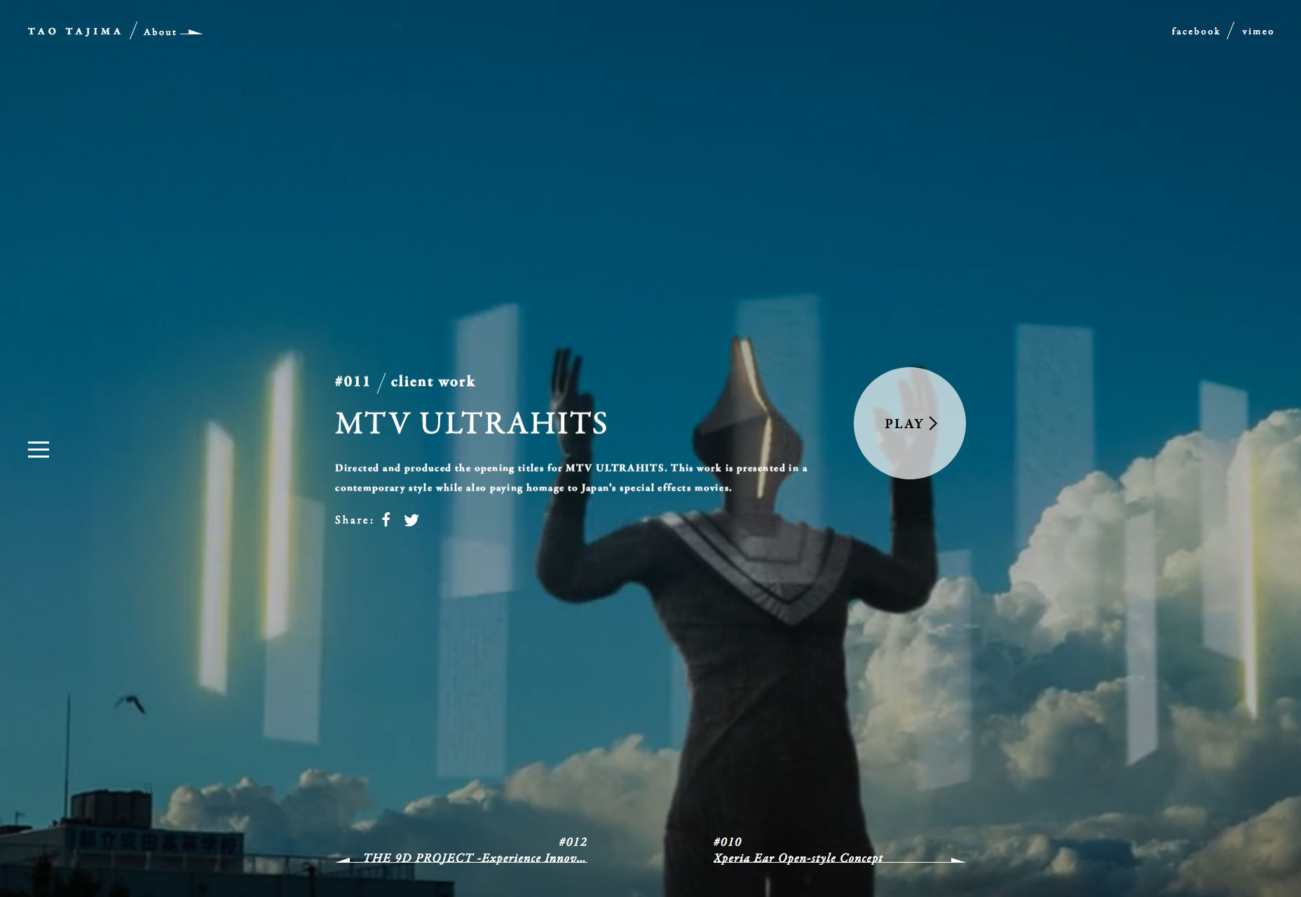
GT Zirkon
Following the fashion for typefaces to get their own websites, GT Zirkon is a fantastic deep-dive into the design features of this sans-serif typeface. Entirely black and white, the animated noodle details continue to grow, creating a unique sense of time.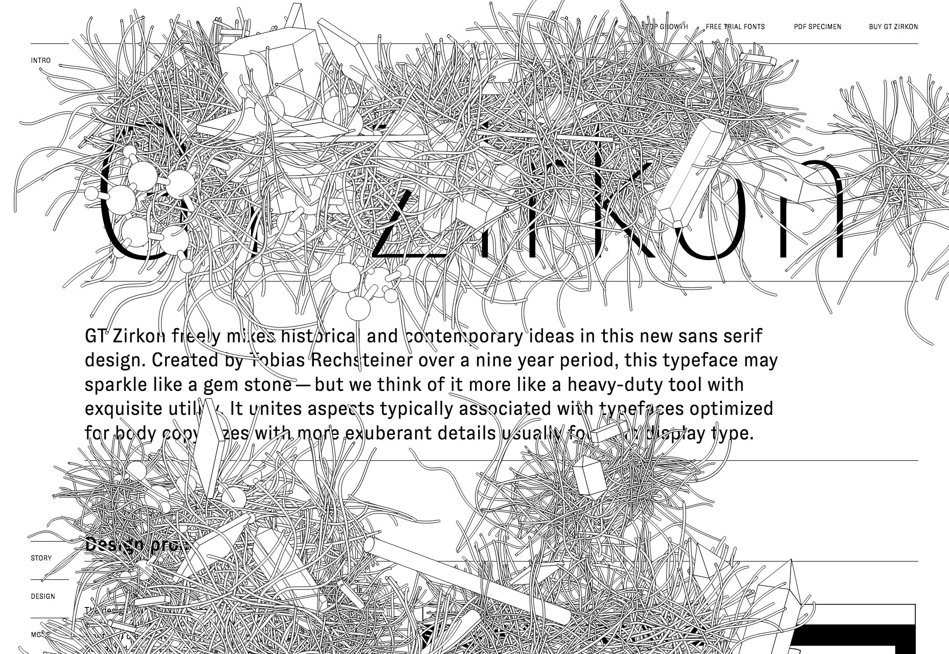
Porter & Pals
Feeding our dogs a healthy diet is super important to all owners. Porter & Pals wants you to trust them with your pooch’s diet, they’re different, and they want you to know it. Not convinced? Just keep refreshing the homepage for some hilarious pictures.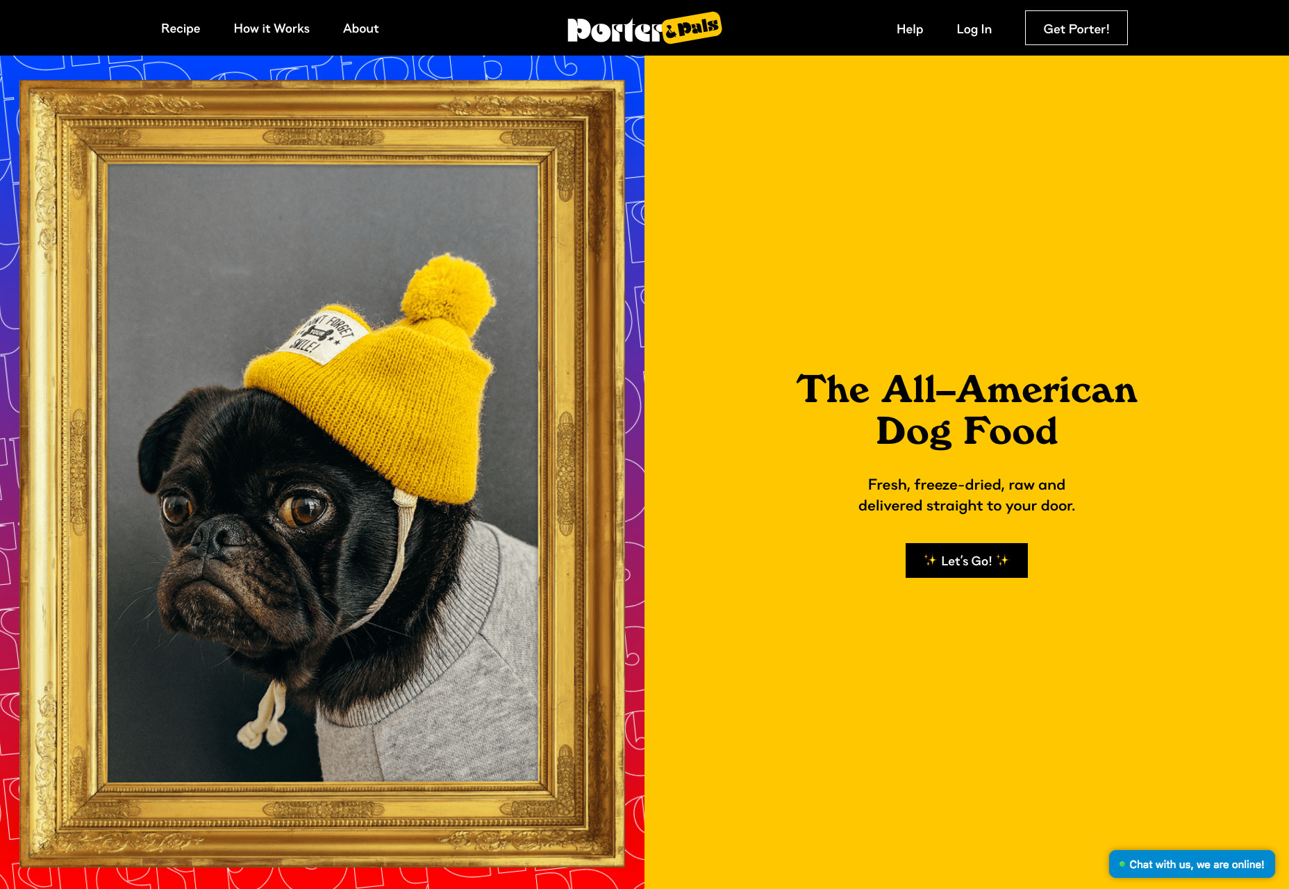
Alberta Ferretti
At first glance, Alberta Ferretti’s site looks much the same as any other minimal, grid-based fashion site. Where this site stands out is the playful use of the grid to create unexpected shapes and counter-intuitive alignment.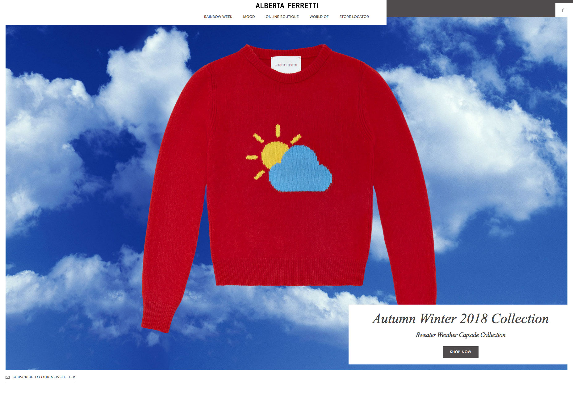
DAD
Dad is a design agency based in the Netherlands. Scroll through its colorful site and the work scrolls vertically, while the background type scrolls horizontally. Somehow, it works. If they don’t win a D&AD award there really is no poetry in the world.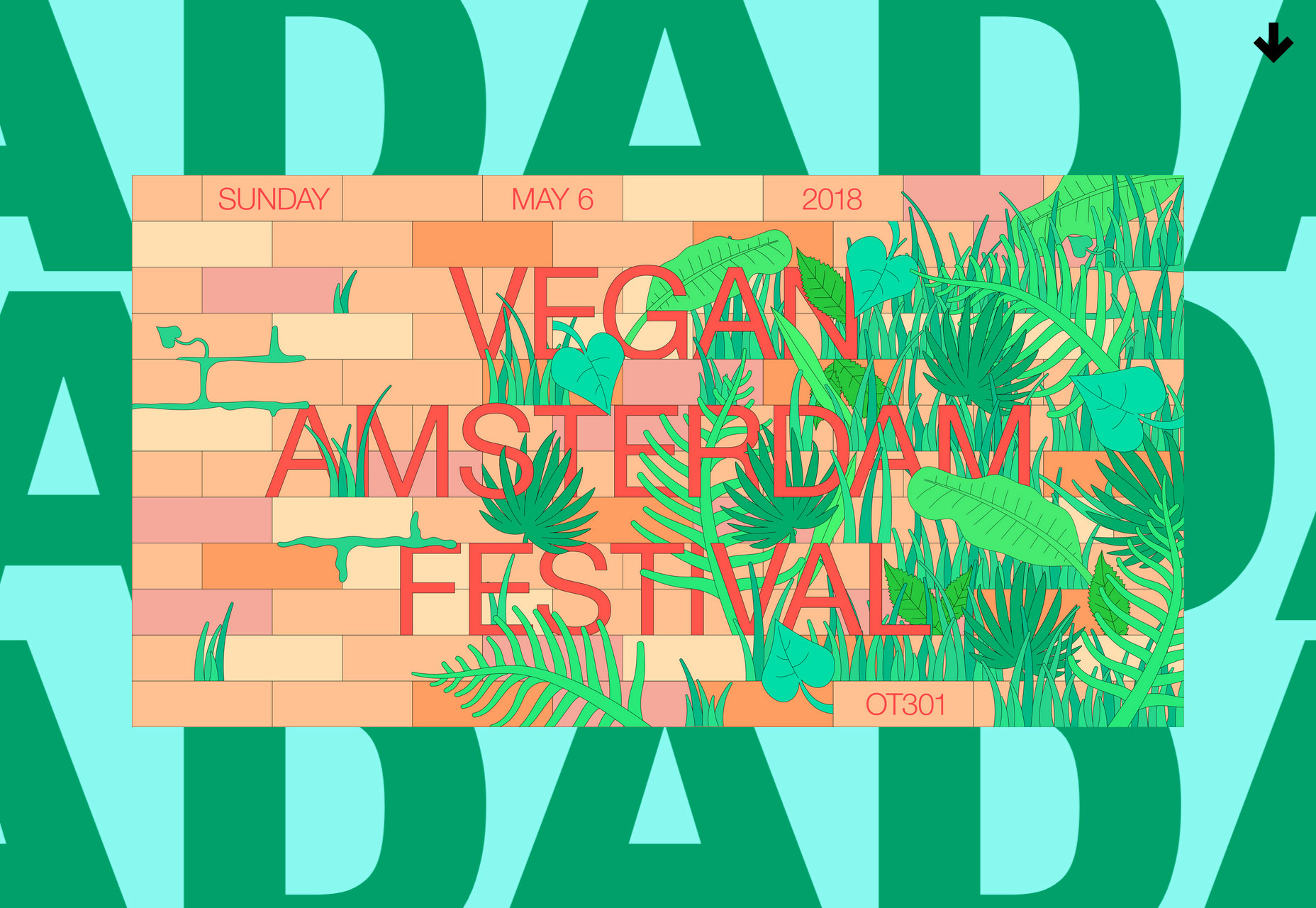
Hourly App
Hourly is yet another time-tracking app for iOS, so far, so dull. But what sets Hourly apart is the 80s style typography and color palette. The bold choice is reflected in the app’s site, and delivers an impactful, and ultimately individual design.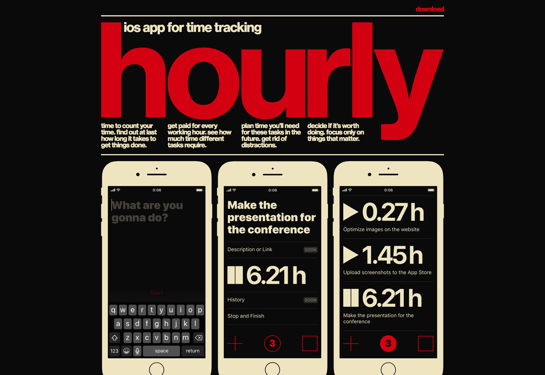
Studio.Build
Studio.Build is a creative digital and branding agency that believes in big statements made simply. The site features a slideshow of selected work to scroll through, but click-through to the full portfolio for some exceptional design work.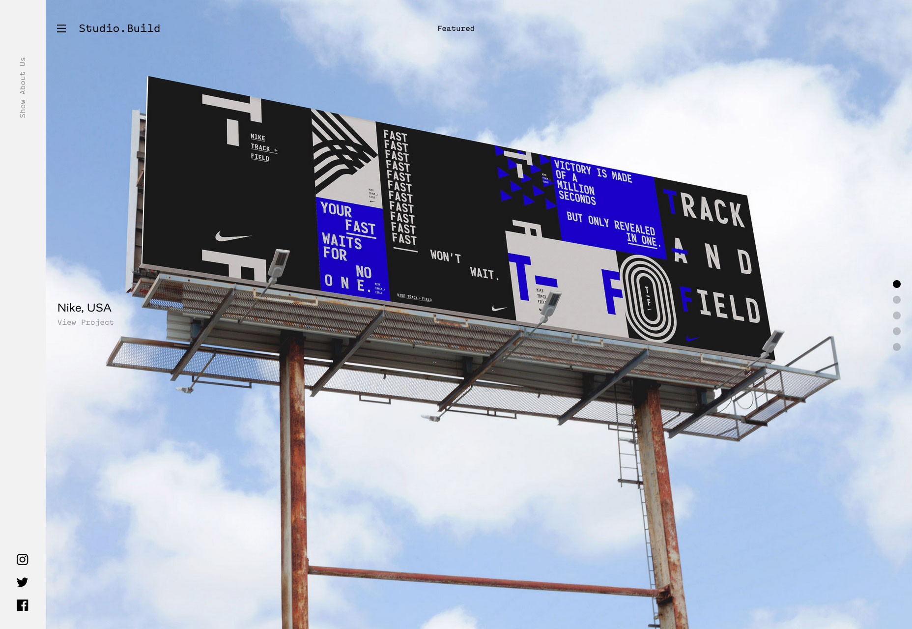
Siri
Apple’s brand new site for its flagship AI product is predictably Apple-like, with a whole ton of mysterious black, gigantic sized type, and some lovely subtle gradients. Rarely does color-coding sections feel so exclusive.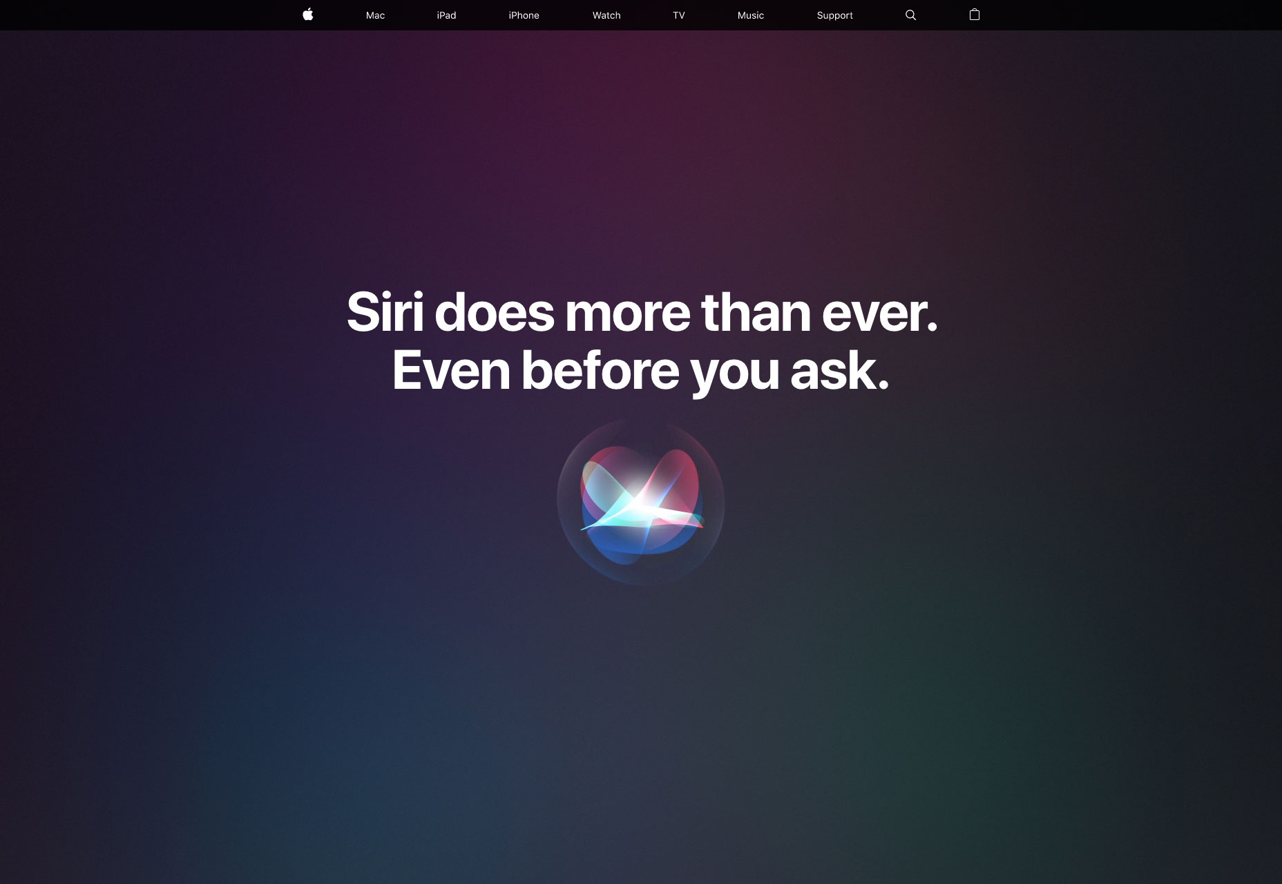
Fred Perry
Fred Perry’s site is a perfect demonstration of how to do parallax right. Used to highlight the size of the product range, and the free shipping options, rather than simply to add interest, it’s an engaging effect on this site.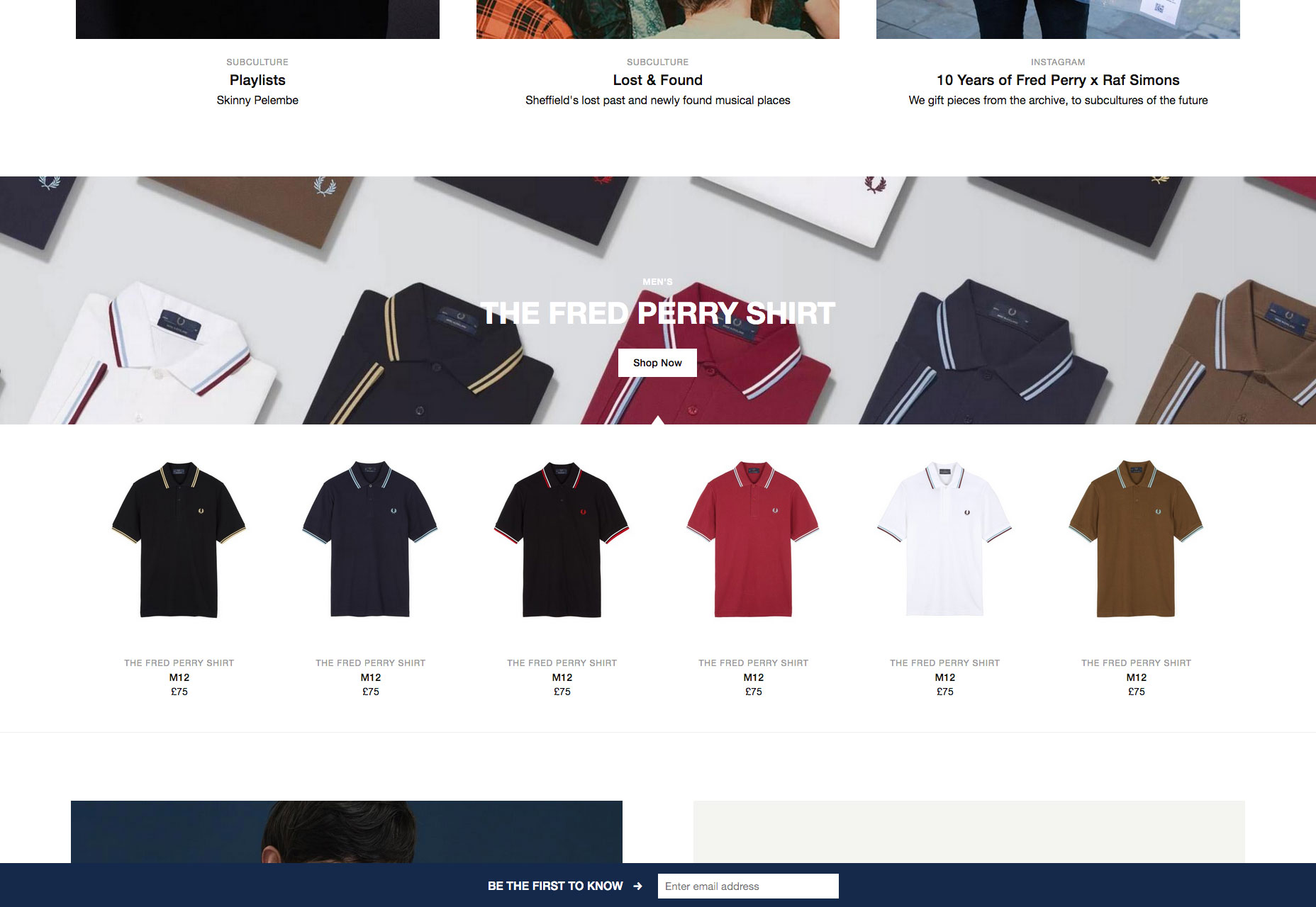
Sudtipos
Some type foundries focus on black and white to pull us in. Sudtipos have gone in completely the other direction, draping their site in colors inspired by their native Argentina. It’s a fitting approach for a colorful design collective.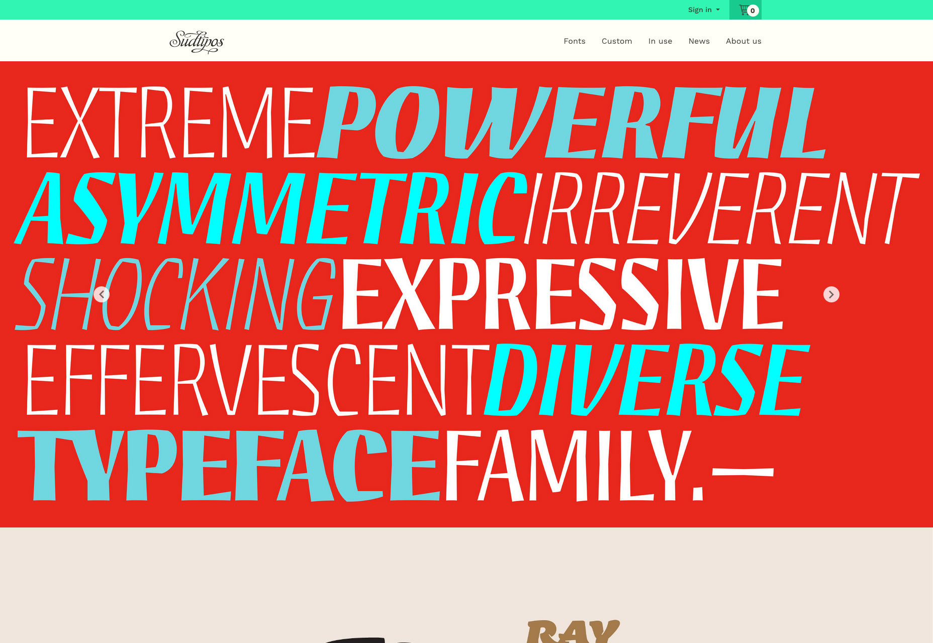
The Wing
The Wing is a co-working space with a difference: it’s women-only. With its roots in community activism in the 19th and 20th centuries, The Wing has four spaces in NY and DC, and has plans for six more. It’s a site targeting women, with none of the clichés.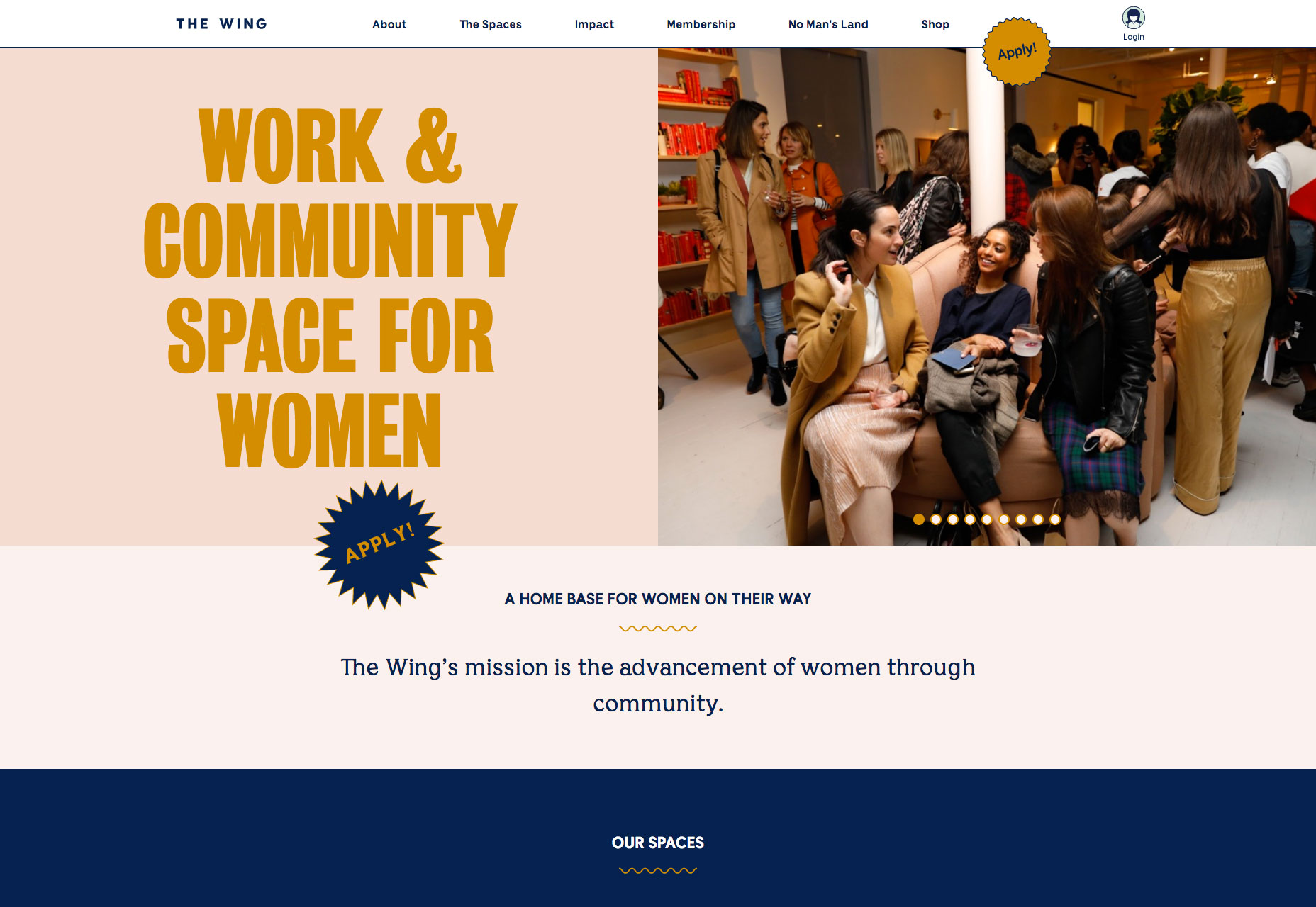
Swallowtail Tea
Swallowtail Tea’s art direction features heavy use of Photoshop’s noise filter, giving the site a nostalgic feel—plus the added benefit of much smaller image files, delivering a faster, more pleasant browsing experience.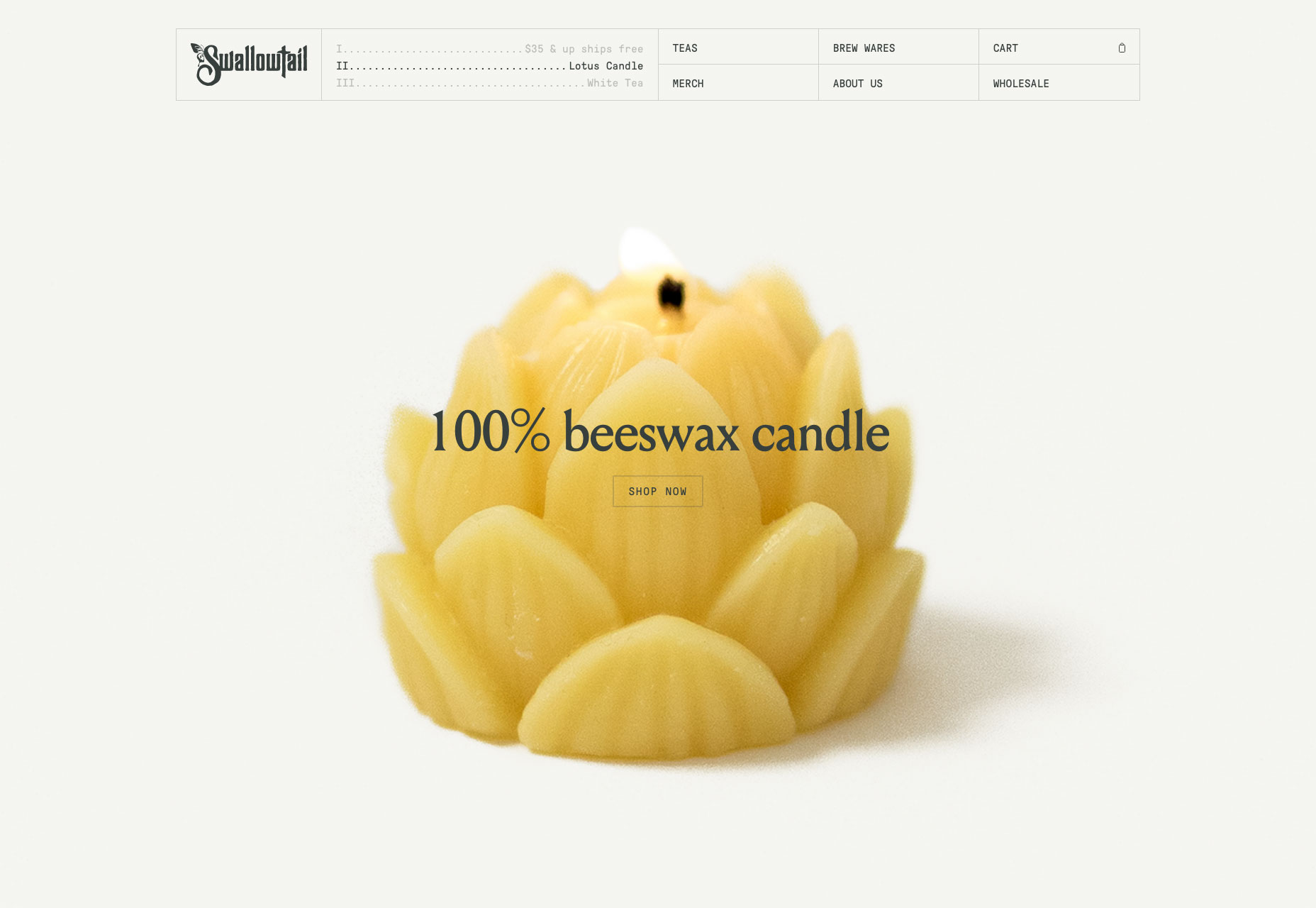
Foster Type
Fittingly for a site showcasing type and lettering design, the online portfolio of Dave Foster features some exceptionally well-set type. For lovers of detailed design, it’s a pleasure to browse through and admire.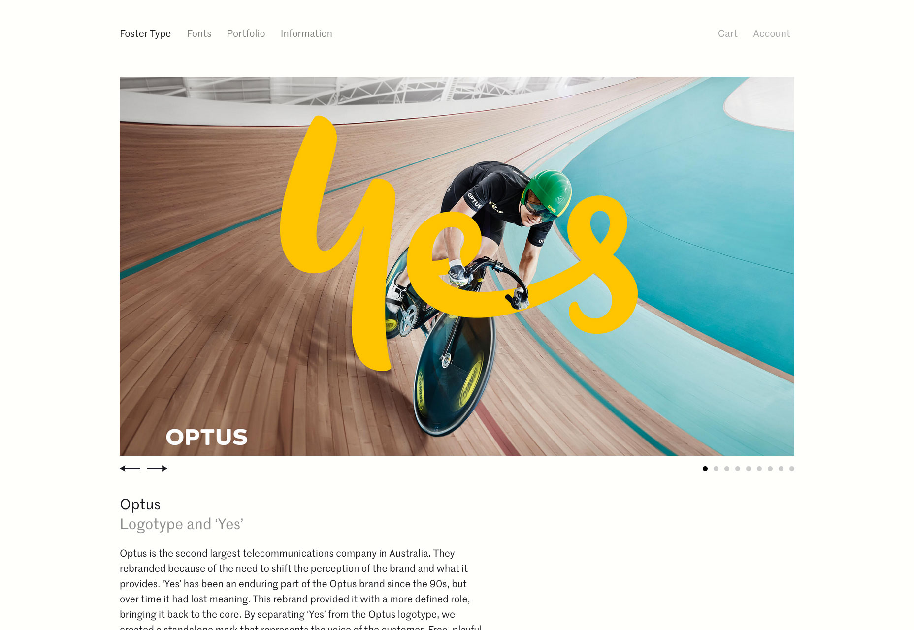
The Disconnect
The Disconnect is a unique approach to publishing on the web, they want you to disconnect in order to view the content. Just browse over and then turn off your wi-fi. Only on its second issue, it’s great, distraction-free journalism.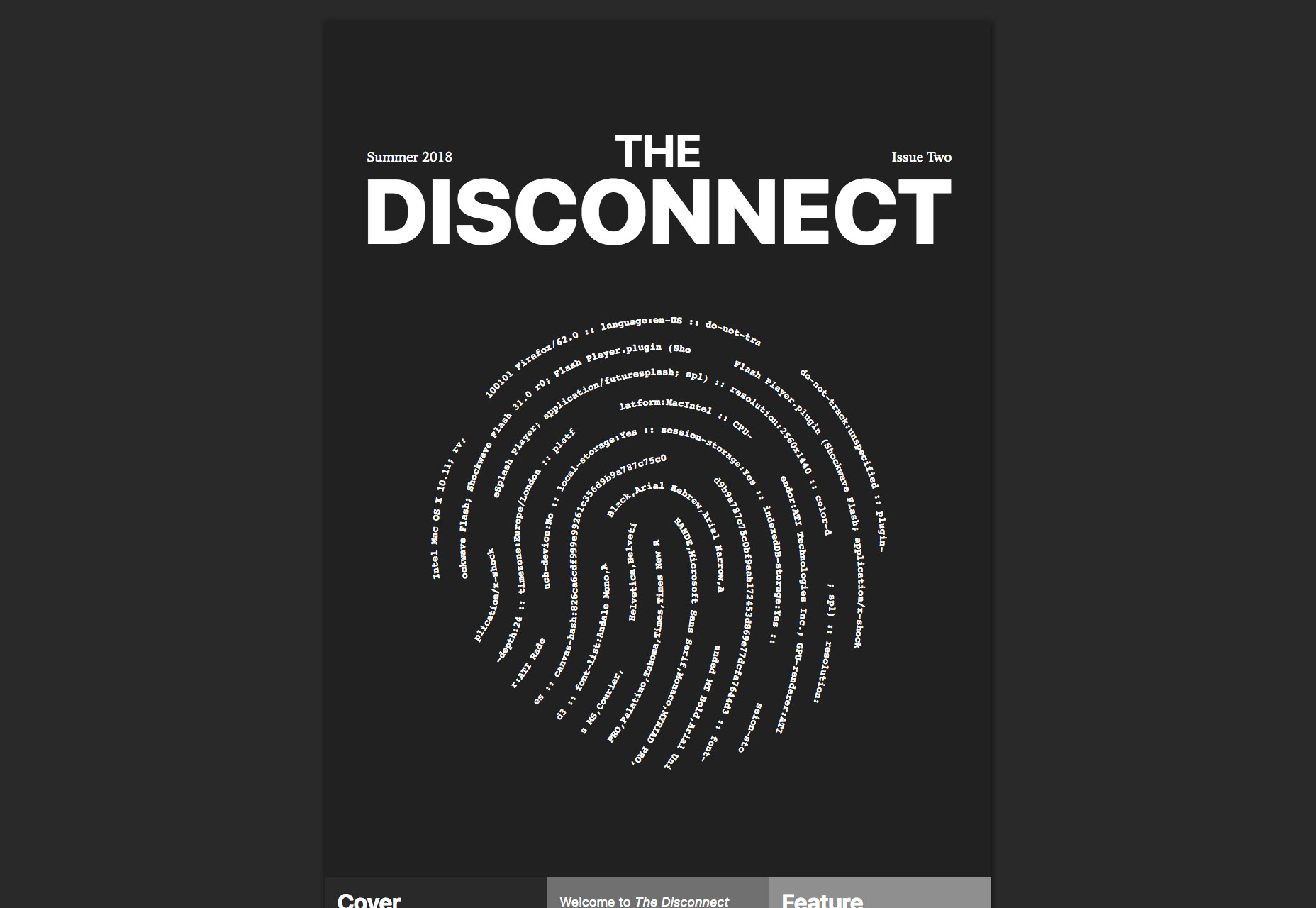
The Floral Society
Who doesn’t love flowers? The Floral Society sells high-quality products for amateur florists. From a Christmas wreath workshop, to DIY wedding flowers. It’s a delightful site put together on Squarespace, proving that anyone really can design a website.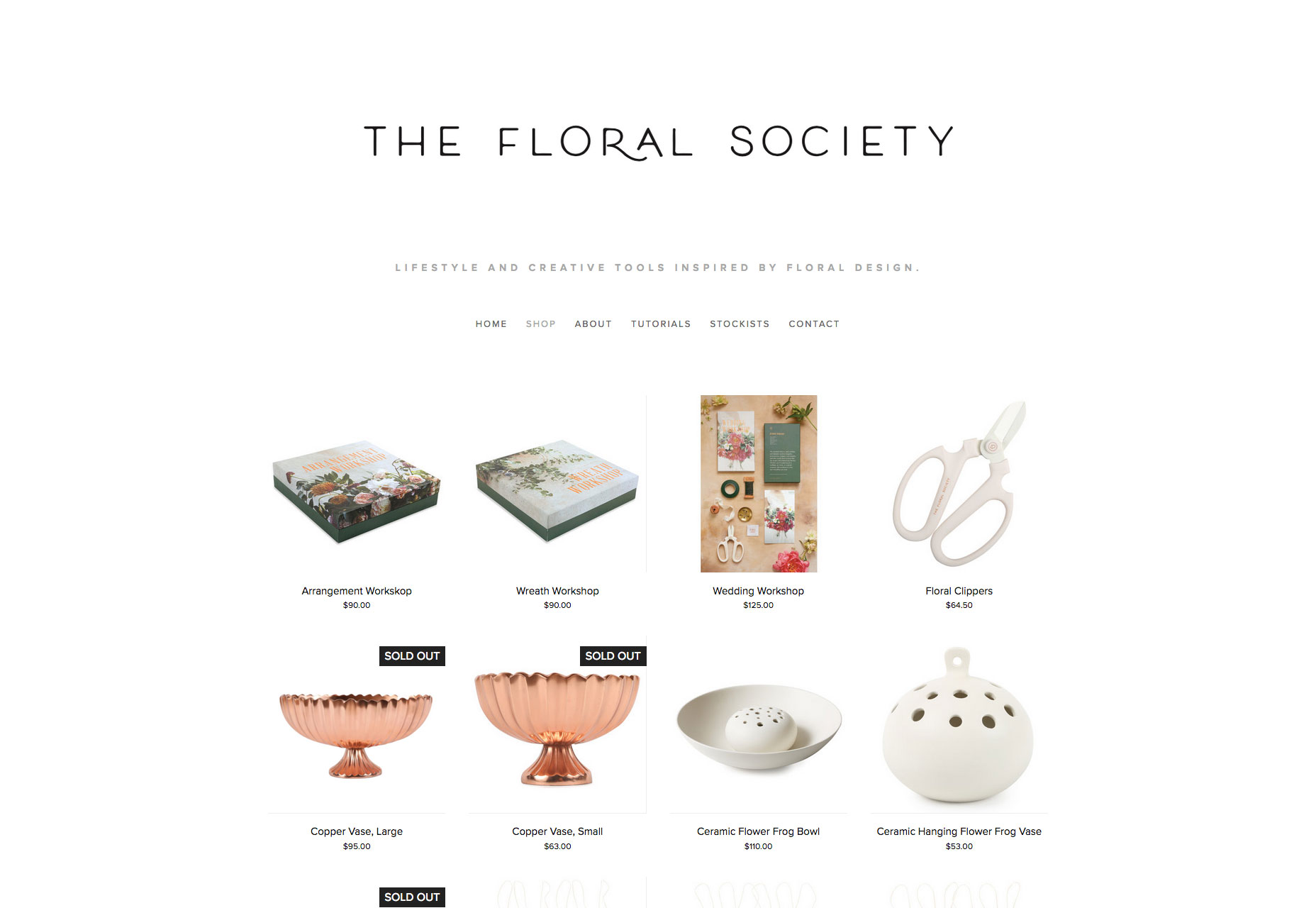
The D. E. Shaw Group
A superlative example of an animation that transforms as you scroll, the D. E. Shaw Group’s site is a modern, abstract depiction of investment banking. As a way to illustrate a non-tangible product, it’s difficult to beat.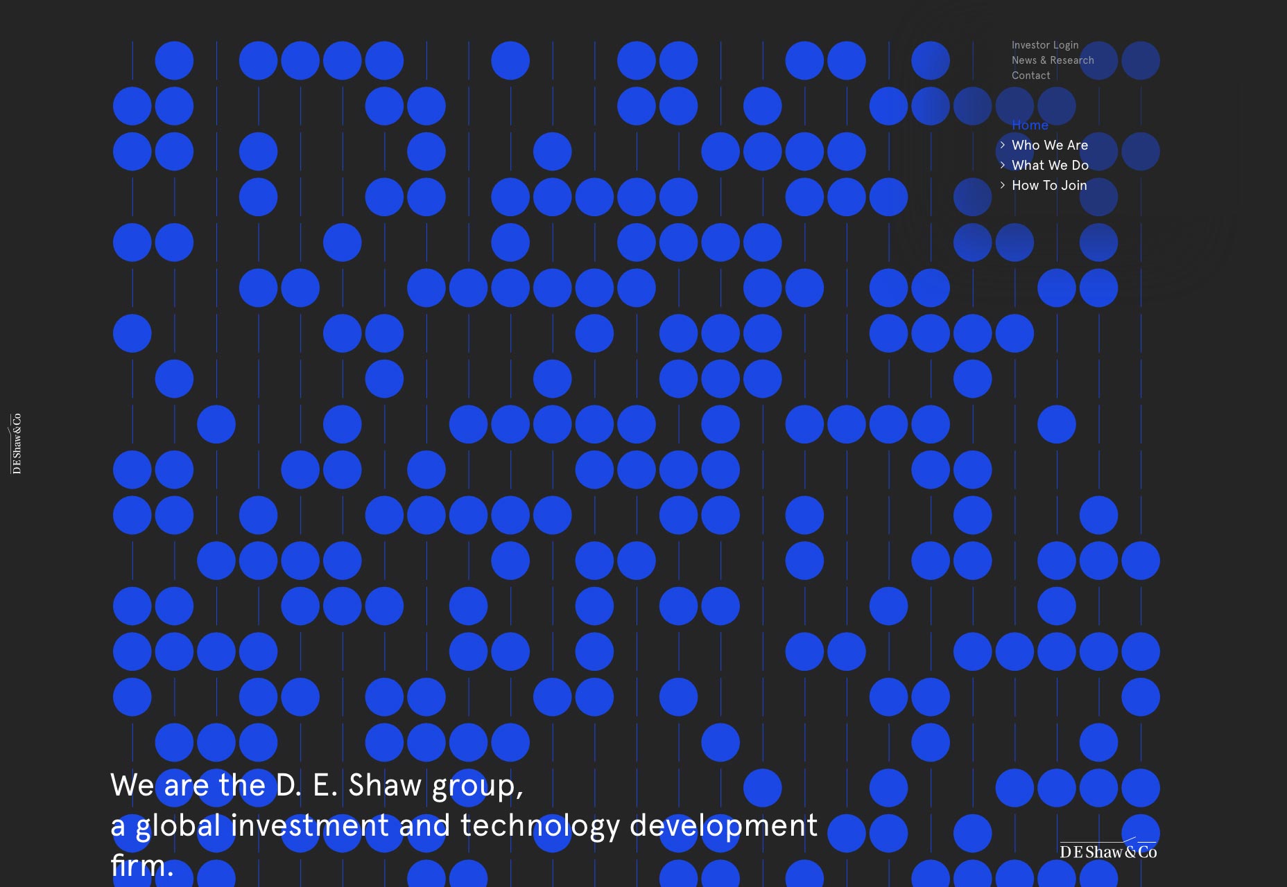
Paddi MacDonnell
Paddi MacDonnell is a designer and entrepreneur from Northern Ireland, follow her on Twitter.


Read Next

15 Best New Fonts, July 2024
Welcome to our monthly roundup of the best fonts we’ve found online in the last four weeks. This month, there are fewer…
By Ben Moss

20 Best New Websites, July 2024
Welcome to July’s round up of websites to inspire you. This month’s collection ranges from the most stripped-back…

Top 7 WordPress Plugins for 2024: Enhance Your Site's Performance
WordPress is a hands-down favorite of website designers and developers. Renowned for its flexibility and ease of use,…
By WDD Staff

Exciting New Tools for Designers, July 2024
Welcome to this July’s collection of tools, gathered from around the web over the past month. We hope you’ll find…

3 Essential Design Trends, July 2024
Add some summer sizzle to your design projects with trendy website elements. Learn what's trending and how to use these…

15 Best New Fonts, June 2024
Welcome to our roundup of the best new fonts we’ve found online in the last month. This month, there are notably fewer…
By Ben Moss

20 Best New Websites, June 2024
Arranging content in an easily accessible way is the backbone of any user-friendly website. A good website will present…

Exciting New Tools for Designers, June 2024
In this month’s roundup of the best tools for web designers and developers, we’ll explore a range of new and noteworthy…

3 Essential Design Trends, June 2024
Summer is off to a fun start with some highly dramatic website design trends showing up in projects. Let's dive in!

15 Best New Fonts, May 2024
In this month’s edition, there are lots of historically-inspired typefaces, more of the growing trend for French…
By Ben Moss

How to Reduce The Carbon Footprint of Your Website
On average, a web page produces 4.61 grams of CO2 for every page view; for whole sites, that amounts to hundreds of KG…
By Simon Sterne

20 Best New Websites, May 2024
Welcome to May’s compilation of the best sites on the web. This month we’re focused on color for younger humans,…