

Why Footers Are Important
We’re inclined to put a lot of effort into designing everything that’s above the fold thinking that it’ll be seen by everyone who lands on the website. So much so that we forget that footers are also highly visible. In fact, a study that looked at 25 million websites found that visitors scrolled down thousands of pixels all the time. And many of the visitors were found to have started scrolling before the page had fully loaded. What we can take from this is that your website’s footer is just as important as its header. It’s highly visible and getting its design right could benefit you in a number of different ways. It’s all about deciding what you want to include in the limited space the footer has to offer with the purpose of facilitating your site’s visitors while making sure your goals are met. Depending on what type of website you’re creating and what your goals are, you might consider including any of the following elements in your site’s footer:- Sitemap;
- Copyright statement;
- A link to the Terms of Use page;
- Privacy policy statement;
- Contact information;
- A map or address;
- Social icons;
- Social media widgets;
- Email signup;
- A search bar;
- Your mission statement;
- Tags and categories;
- Awards and certifications;
- Association memberships;
- Testimonials;
- Latest articles;
- Upcoming events;
- An explainer video;
- Audio;
- Call to action.
4 Best Practices for Designing Big Website Footers
The possibilities are seemingly endless when you decide to go with a mega-footer on your website. You can add branding elements to reinforce your brand in your visitors’ minds. You can add navigation links to all of your important pages which visitors might miss otherwise. You can even add a contact form in your footer! With this in mind, let’s step through some best practices for designing mega-footers that don’t just look good but are also incredibly functional.1. Include Branding Elements
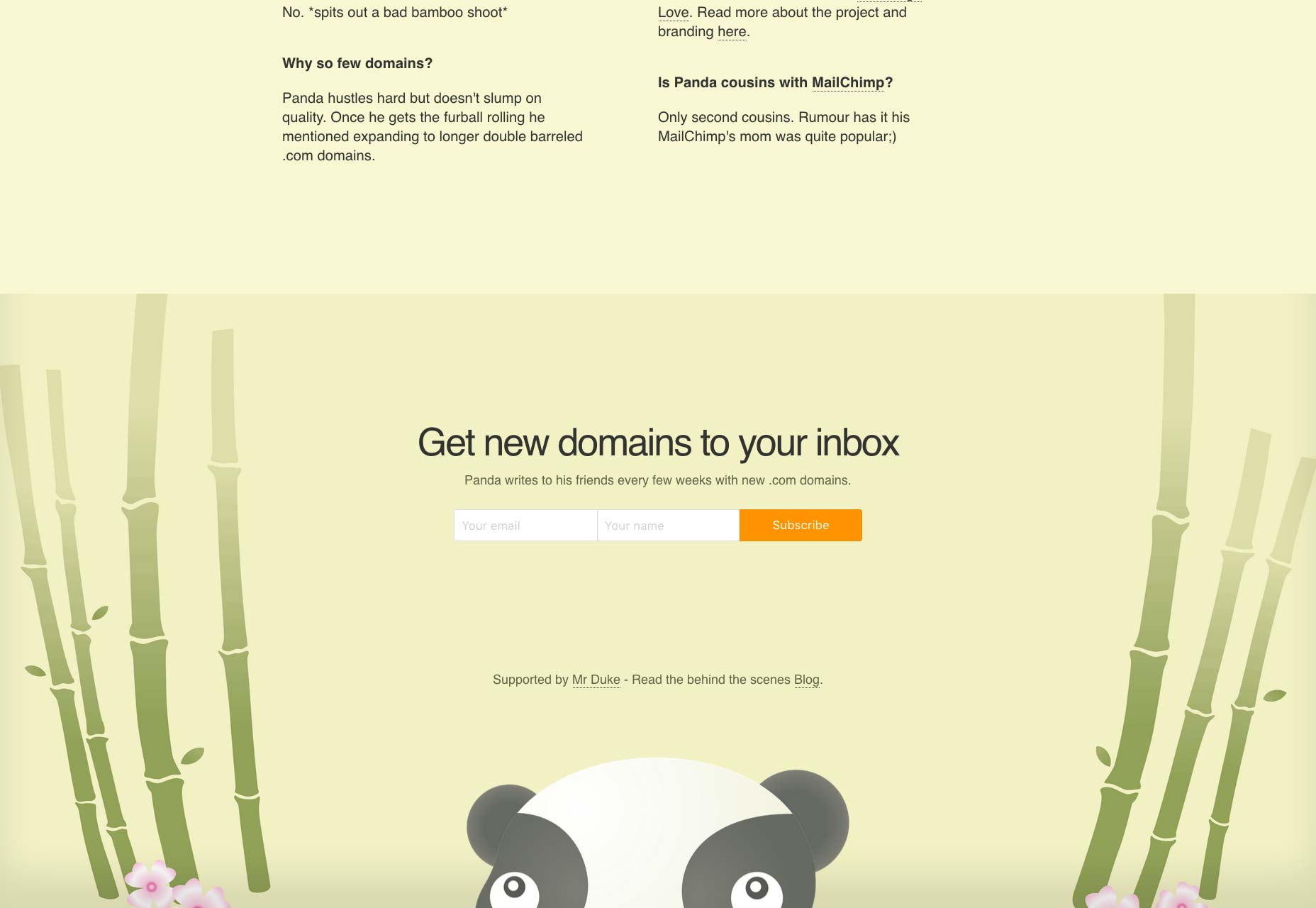
Your site’s footer is often an overlooked opportunity to reinforce your brand image in the visitor’s mind. You can use this space to communicate brand value. Using images, graphics, icons, or logos in your footer is a great way to remind visitors what website they’re on and give them something to remember it by. Alternatively, you can use colors, patterns, or icons that you have already used in your website’s design to achieve the same result. Miki Mottes’ mega-footer is a work of art. It uses graphics and animation incorporating a lot of visual elements. You will notice that it also uses a different version of its site’s logo in the footer to reinforce their brand. It’s a not-so-subtle reminder for visitors that Miki Mottes is an illustrator, animator, and designer.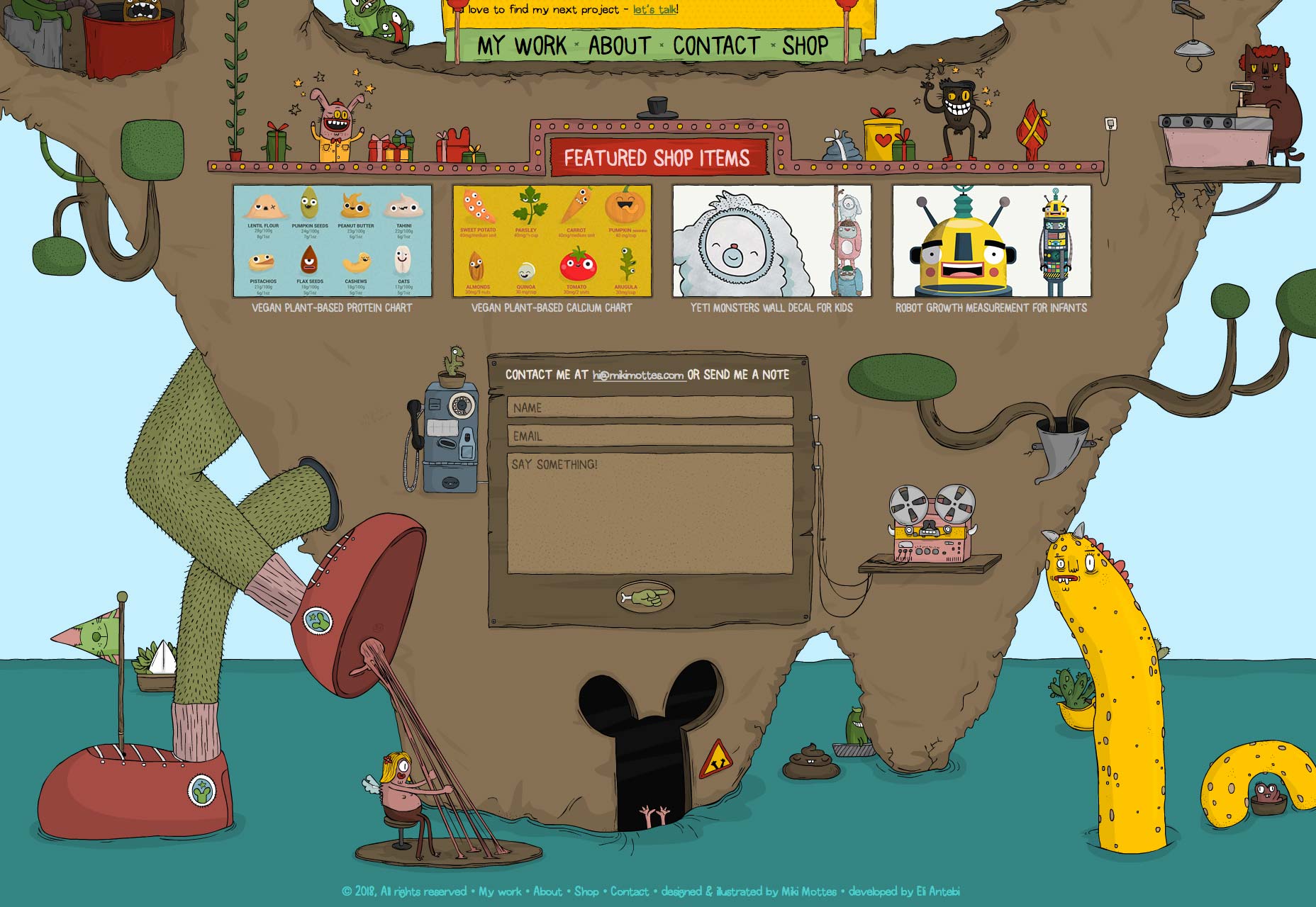 Hustle Panda is the perfect example of how you can keep things simple by using the same color palette and playing around with different logo sizes. The repeated use of their panda mascot reminds visitors about their brand message.
2. Gather Leads
Building an email list can be pretty difficult especially when you’re just starting out. From a design perspective, a lot of it has to do with how well your signup form fits in with the rest of the website’s design. Your website’s mega-footer is the perfect place to gather leads for your business. It gives you one last chance of getting your call to action across and then serving up a signup form. Zoyo Yogurt displays a large signup form that blends in with the rest of the footer’s design. It gives visitors an opportunity to take in everything they have to offer and then signup to receive emails about events and special offers.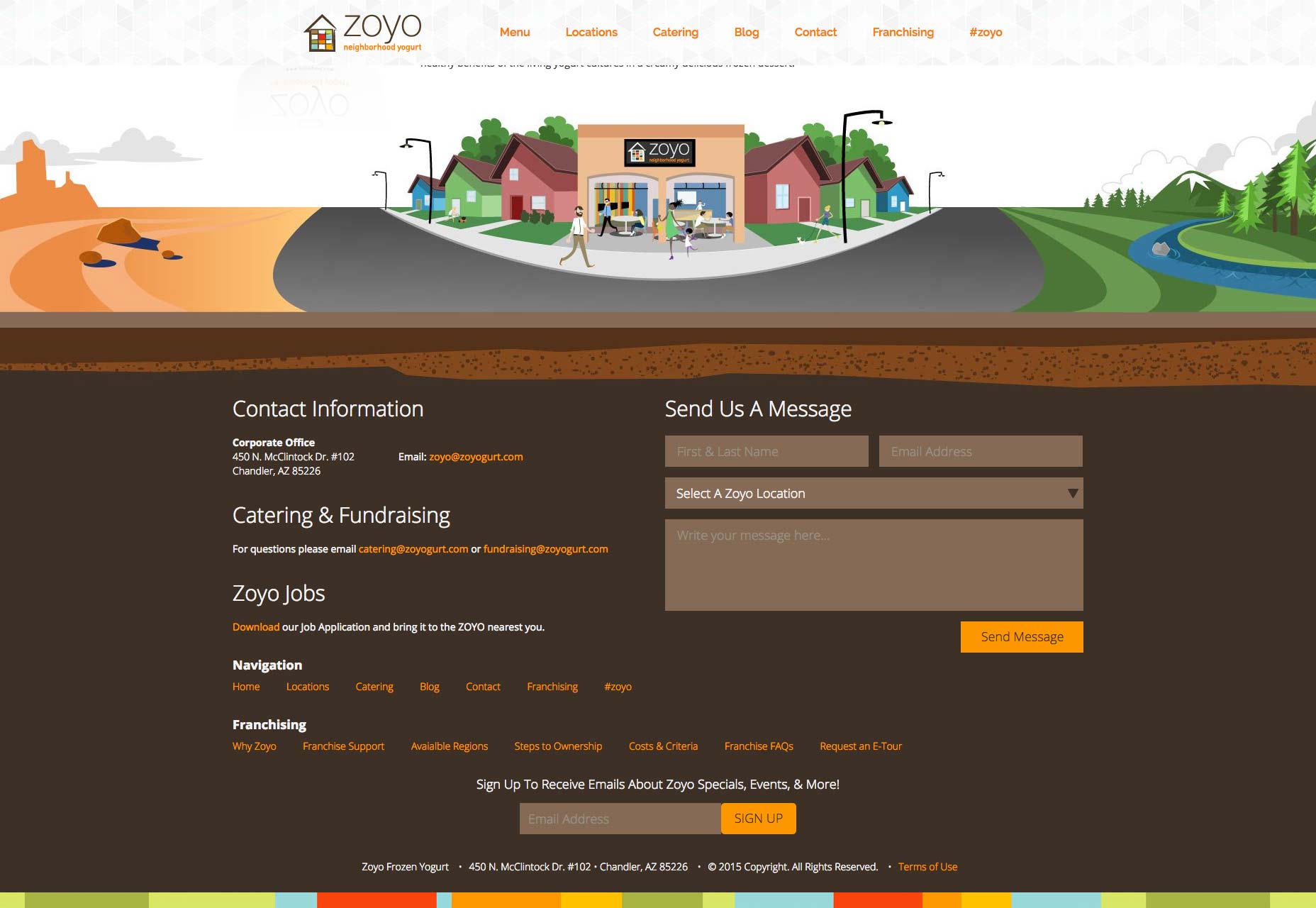
3. Add Social Media Buttons
Studies indicate that nearly 75% of marketing websites include social media icons in their site’s footer instead of the header. Why? As website owners, our goal is to keep visitors on our website instead of heading over to a social media page. Because once they land on a social media platform, it’s pretty difficult to get them to come back. For this reason, it’s better to place your social media buttons in your site’s footer instead of its header. This way, you can rest assured that your site’s visitors will have (at least) reached the bottom of your homepage before heading over to Facebook or Twitter. Capsicum Mediaworks neatly embeds its social media buttons into its site’s design. They blend in with the color palette and immediately captivate your attention. It’s an excellent example of mega-footers getting branding and social media icons right.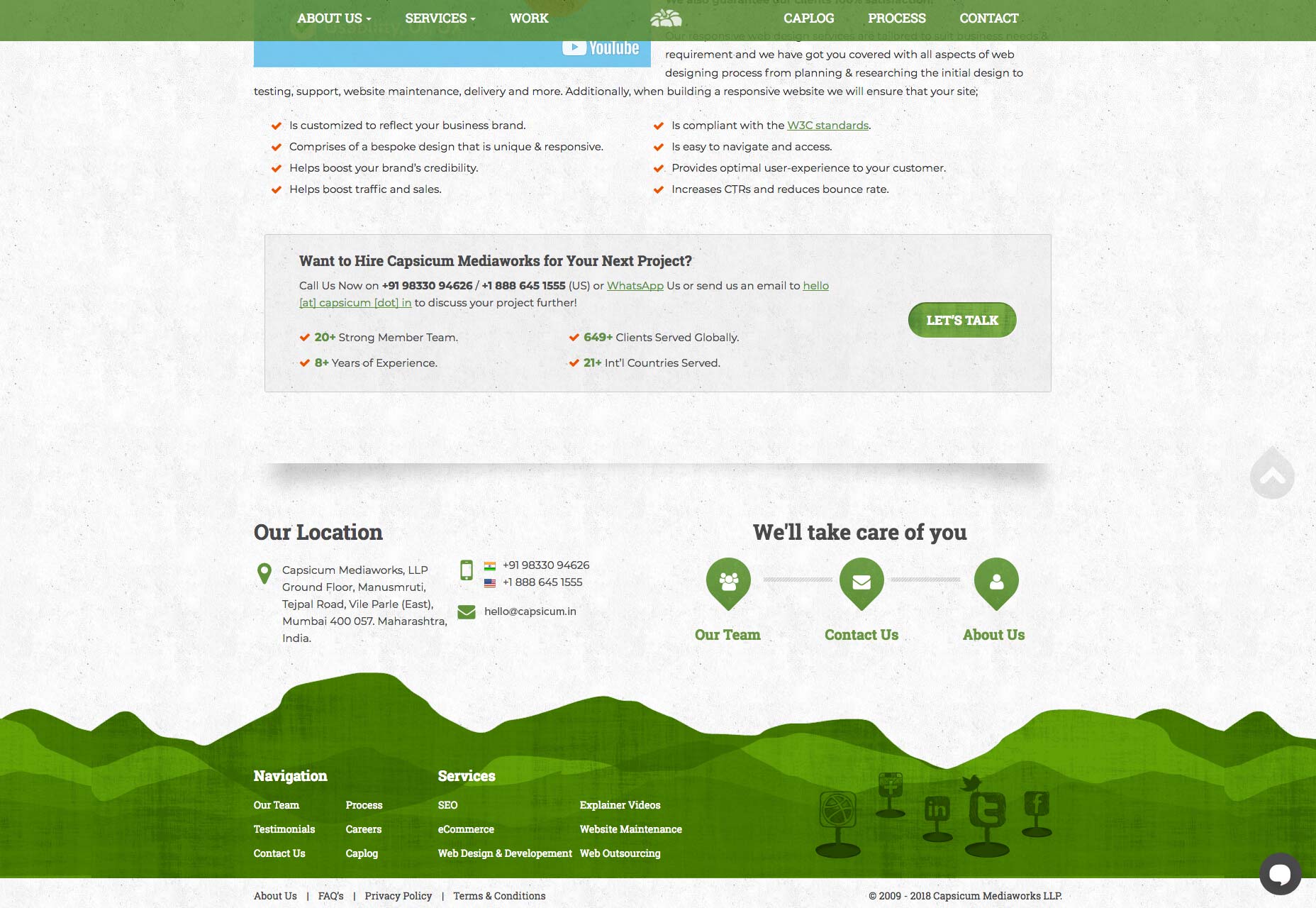 Holiday Harold takes a minimal approach in its footer with simple links to its social media pages placed directly above the graphics.
4. Create Navigation Hierarchies
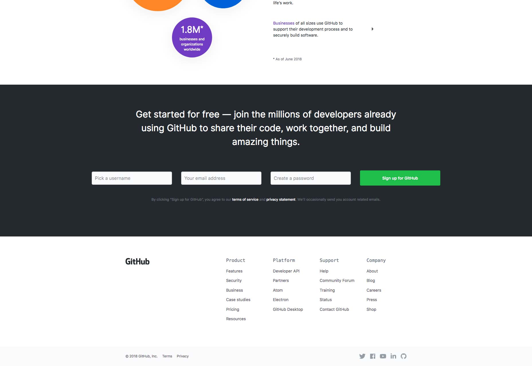
One of the best things you can do with mega-footers is including links to your site’s most popular content. For starters, you can organize links to your site’s most popular pages or categories into columns. Bonus points for categorizing them under appropriate headings and titles. Keep in mind that sometimes your visitors find themselves at the bottom of your page because they weren’t able to find what they were looking for up until that point. So, before they bounce off, you have one last chance to give them a few more options. And your footer makes this possible. TrueCar’s footer is organized into four columns – each column with a category title. This makes it easy to quickly scan for what you’re looking for. You will also notice that the headings of each column are more prominent which makes them easily noticeable.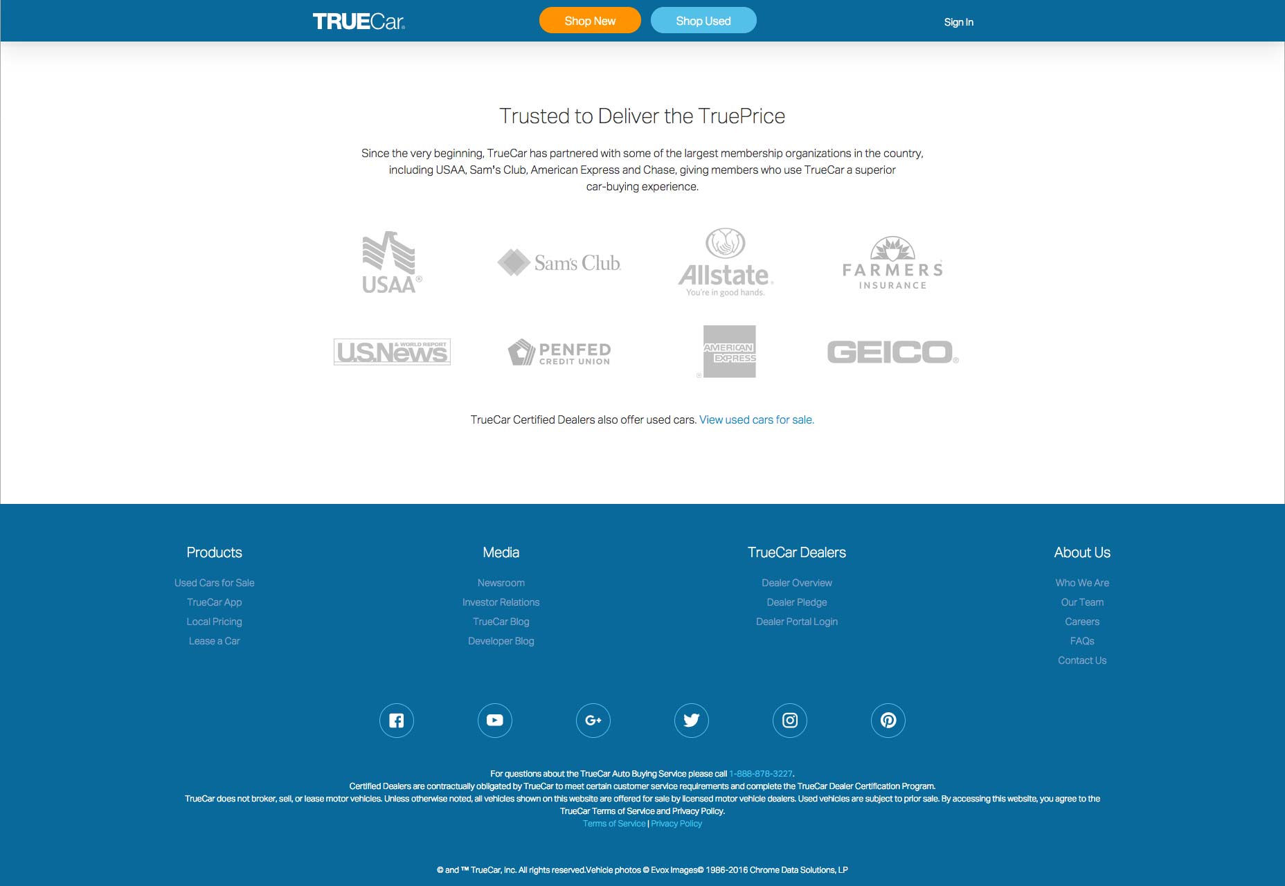 GitHub does the same thing by organizing their most important pages into columns. And by giving each column an appropriate title, they make it easy for visitors to find the page they were looking for.
Conclusion
Even though the footer is located at the very bottom of the page, it’s one of the most visible elements of your website. We listed out some of the different elements you can include in your site’s footer and shared some best practices to give you a good starting point. It’s a good idea to identify your goals and objectives and then add the right elements to your big website footer that help you achieve those goals.Rafay Ansari
A professional writer, digital, and brand designer, Rafay's work is published across a number of high-authority sites and magazines. He has provided services to numerous brands across the globe and is the go-to solution provider to many reputable private and government organizations. He is also the co-founder of BloggInc. When he isn't overloaded with work, you can find him tending the farm with his wife, furniture hunting, and being awesome at in-door badminton.


Read Next

3 Essential Design Trends, May 2024
Integrated navigation elements, interactive typography, and digital overprints are three website design trends making…

How to Write World-Beating Web Content
Writing for the web is different from all other formats. We typically do not read to any real depth on the web; we…
By Louise North

20 Best New Websites, April 2024
Welcome to our sites of the month for April. With some websites, the details make all the difference, while in others,…

Exciting New Tools for Designers, April 2024
Welcome to our April tools collection. There are no practical jokes here, just practical gadgets, services, and apps to…

How Web Designers Can Stay Relevant in the Age of AI
The digital landscape is evolving rapidly. With the advent of AI, every sector is witnessing a revolution, including…
By Louise North

14 Top UX Tools for Designers in 2024
User Experience (UX) is one of the most important fields of design, so it should come as no surprise that there are a…
By Simon Sterne

What Negative Effects Does a Bad Website Design Have On My Business?
Consumer expectations for a responsive, immersive, and visually appealing website experience have never been higher. In…

10+ Best Resources & Tools for Web Designers (2024 update)
Is searching for the best web design tools to suit your needs akin to having a recurring bad dream? Does each…
By WDD Staff

3 Essential Design Trends, April 2024
Ready to jump into some amazing new design ideas for Spring? Our roundup has everything from UX to color trends…

How to Plan Your First Successful Website
Planning a new website can be exciting and — if you’re anything like me — a little daunting. Whether you’re an…
By Simon Sterne

15 Best New Fonts, March 2024
Welcome to March’s edition of our roundup of the best new fonts for designers. This month’s compilation includes…
By Ben Moss

LimeWire Developer APIs Herald a New Era of AI Integration
Generative AI is a fascinating technology. Far from the design killer some people feared, it is an empowering and…
By WDD Staff