4 Web Design Principles Hollywood Reboots Can Teach Us

1. You Need to Know if Anyone Wants This
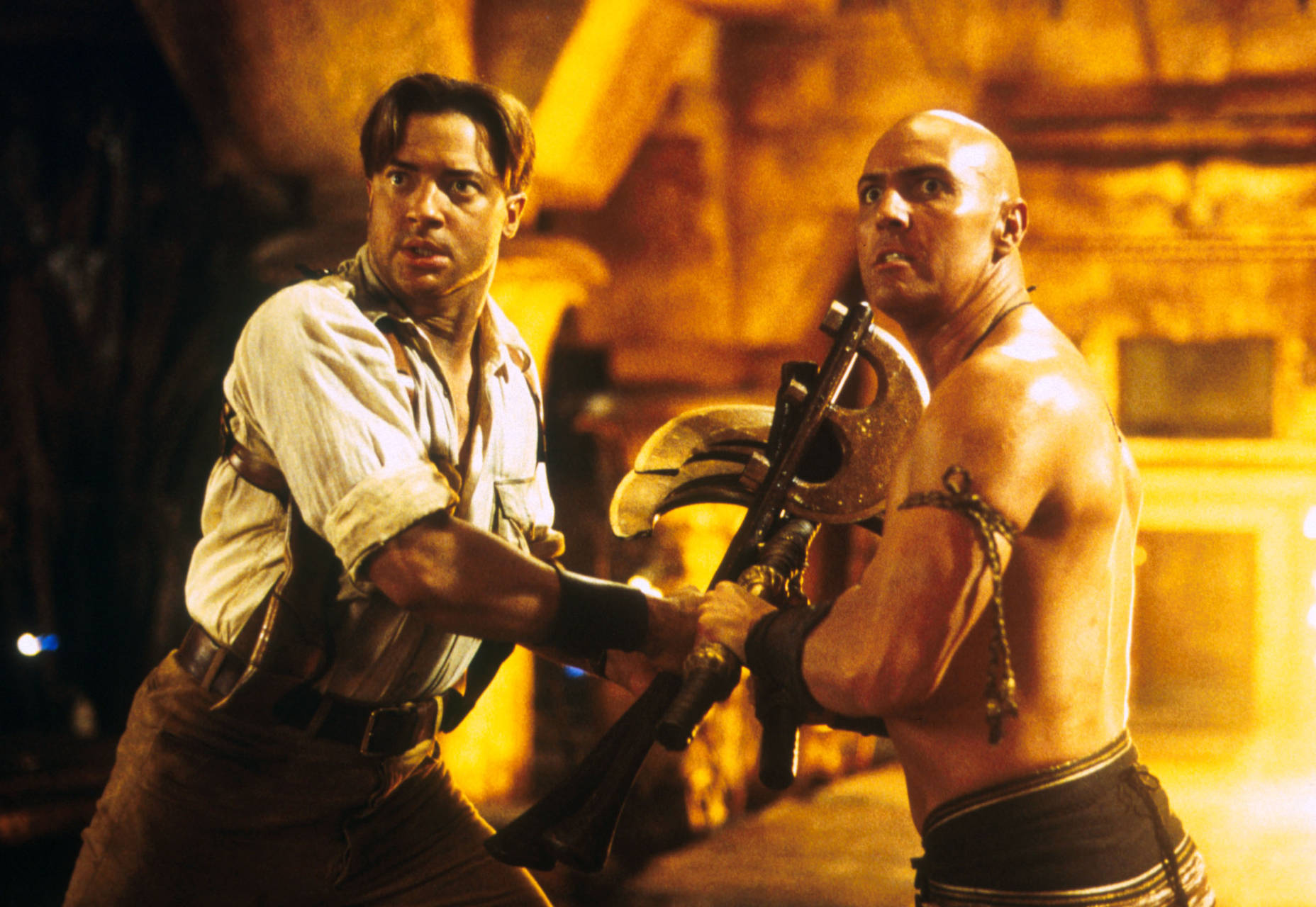
Some people might not know that the original version of The Mummy was actually made in 1932, and starred the legendary Boris Karloff. Brendan Fraser brought his signature charm to the story again in 1999, over sixty years later. A lot can happen in sixty years, including a World War, a couple more wars, the invention of the computer as we know it, and the invention of redesigning websites as a concept. So when the 1999 movie showed up, it premiered in what was practically a new world. The stars were likable, the Indiana Jones influence set it apart from its predecessor, but it kept the same sense of adventure, with a few actually kind-of-scary moments. The world was ready for it. And then in 2017, someone decided to reboot The Mummy again with an eye toward creating a whole new franchise of monster movies. But it was a lackluster movie at best, despite the talent that went into it, and people could remember the heart that went into the Brendan Frasier version all too easily, and the comparison hurt the new movie. The world was not ready for it. Going too fast hurt The Mummy Franchise, and don’t even get me started on all of the Spiderman reboots. That was ridiculous.
If you’re going to redesign your site, don’t do it too soon. And when you do get around to it, make sure it’s actually bringing something people want to the table. Speaking of which…
2. You Need to Know What Made the Original Special
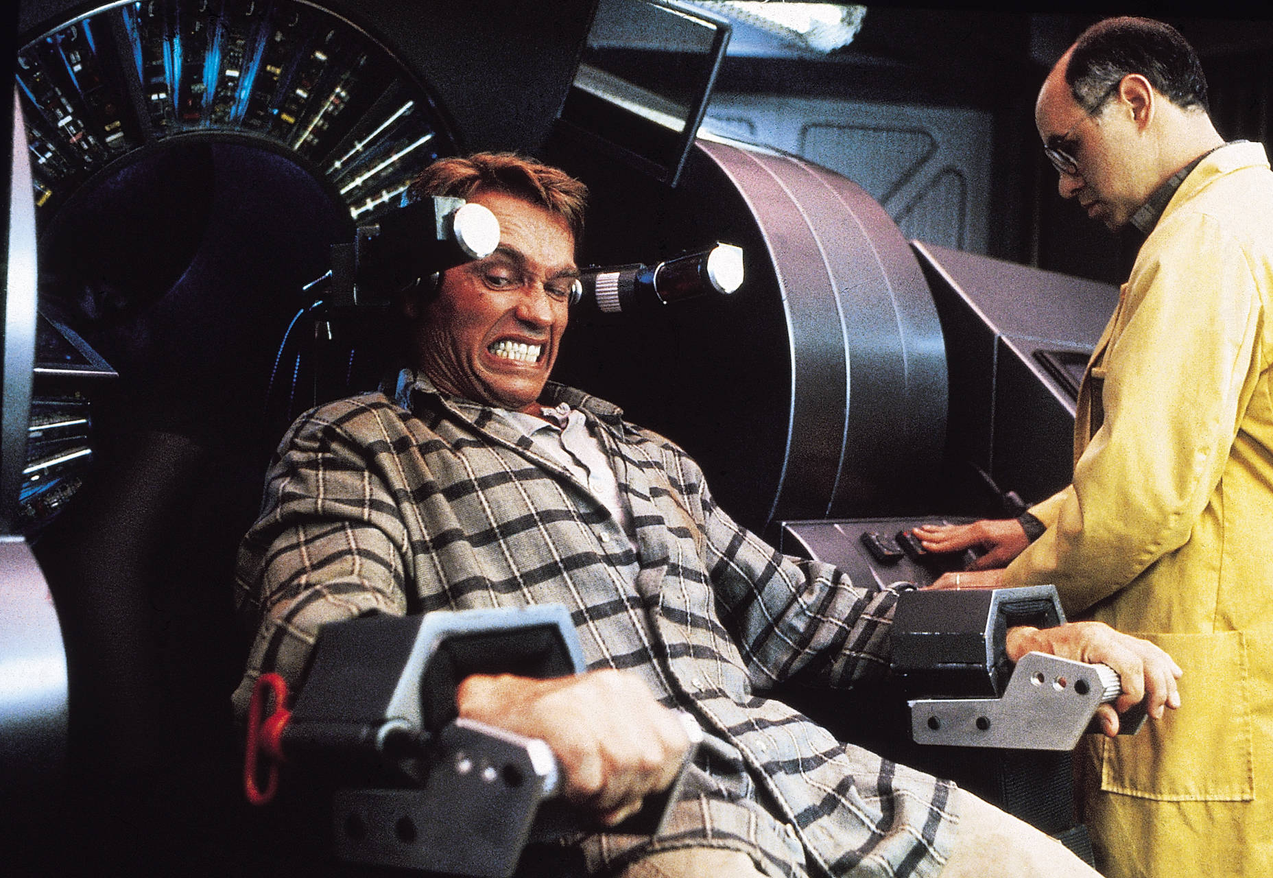
Let’s take a look at Total Recall, for example. The original was a fun sci-fi romp that combined light social commentary, silliness, and Arnold being Arnold. Replace Arnold with a star of lesser charisma, and the silly movie falls apart. Take away the silliness, and it’s a generic sci-fi action film. It still would have been good for its time, probably, but probably not as beloved as it is now. The 2012 remake couldn’t get Arnold back, and as good as Colin Farrell and the rest of the cast were, they couldn’t carry the movie alone. That delightful silliness was also gone, replaced by light touches of sarcasm. The mild social commentary was still there, but it was so shallow as to be easily dismissed.
They took a formula that worked, and removed at least two-thirds of it. Before you ever touch a website with the intent of redesigning it, you want to know why people like it at all. This means user research, and actually talking to users. God knows that if they’d polled the fans of the original movie, they might have kept some of its charm intact.
3. Your Audience May Change
People don’t usually want the same things for their entire lives. Times, people, and sensibilities change. Take the new Lost in Space series on Netflix. The original started in 1965, only one year before the original Star Trek launched. It featured TV tropes and family dynamics that were considered acceptable in its day; and so it unsurprisingly lasted longer than the forward-looking Star Trek. The new series can’t rely on those older family dynamics. Audiences expect a bit more drama in their sci-fi, a more realistic and nuanced approach to characters, and boy oh boy did Robot ever get a makeover. Dr. Smith, too. Audiences (particularly Netflix customers) have also come to expect a more diverse cast of characters, and so that’s what they’re getting. All in all, it’s a fairly successful reboot that combines the core concept of the show with the changed expectations of its audience. Do I have to make an analogy to website redesign, here? Well I will: how has your userbase changed since your site was launched? Do you know? If you don’t, you should find out right now.
4. The Medium May Change Too
With a solid-enough concept and an enduring audience, you could more or less keep telling the same story; but even then, the medium will change. Here we come to the many iterations of James Bond. They don’t technically count as “reboots”, but hey… they illustrate my point. Who doesn’t want to be smooth, sophisticated, and dangerous when they need to be? Bond’s time may come one day, but for now, the saga continues. Even so, the way James Bond films get made, from a technical standpoint, has changed often. It had to. With advancements in technology, refinements in cinematic storytelling, and cultural shifts, the Bond movies of today look very different from the first bond films, while being much the same in terms of substance.
A redesign of your site doesn’t have to mean changing its core philosophy, but it might be worth it to refine your design by rebuilding it with newer design and coding principles in mind. If you have a solid core design to work from, then iteration—rather than a full redesign—might be the better option.
Ezequiel Bruni
Ezequiel Bruni is a web/UX designer, blogger, and aspiring photographer living in Mexico. When he’s not up to his finely-chiselled ears in wire-frames and front-end code, or ranting about the same, he indulges in beer, pizza, fantasy novels, and stand-up comedy.
Read Next
15 Best New Fonts, July 2024
Welcome to our monthly roundup of the best fonts we’ve found online in the last four weeks. This month, there are fewer…
By Ben Moss
20 Best New Websites, July 2024
Welcome to July’s round up of websites to inspire you. This month’s collection ranges from the most stripped-back…
Top 7 WordPress Plugins for 2024: Enhance Your Site's Performance
WordPress is a hands-down favorite of website designers and developers. Renowned for its flexibility and ease of use,…
By WDD Staff
Exciting New Tools for Designers, July 2024
Welcome to this July’s collection of tools, gathered from around the web over the past month. We hope you’ll find…
3 Essential Design Trends, July 2024
Add some summer sizzle to your design projects with trendy website elements. Learn what's trending and how to use these…
15 Best New Fonts, June 2024
Welcome to our roundup of the best new fonts we’ve found online in the last month. This month, there are notably fewer…
By Ben Moss
20 Best New Websites, June 2024
Arranging content in an easily accessible way is the backbone of any user-friendly website. A good website will present…
Exciting New Tools for Designers, June 2024
In this month’s roundup of the best tools for web designers and developers, we’ll explore a range of new and noteworthy…
3 Essential Design Trends, June 2024
Summer is off to a fun start with some highly dramatic website design trends showing up in projects. Let's dive in!
15 Best New Fonts, May 2024
In this month’s edition, there are lots of historically-inspired typefaces, more of the growing trend for French…
By Ben Moss
How to Reduce The Carbon Footprint of Your Website
On average, a web page produces 4.61 grams of CO2 for every page view; for whole sites, that amounts to hundreds of KG…
By Simon Sterne
20 Best New Websites, May 2024
Welcome to May’s compilation of the best sites on the web. This month we’re focused on color for younger humans,…


