

I love the hamburger menu. I hate the hamburger menu.
I am constantly contradicting myself about this tiny website element; whether I think it works beautifully…or just makes a mess.
And I’m not alone. While this icon has exploded in popularity, there’s still significant debate as to whether it is the right choice for tucking navigation menus into websites. It’s a debate I have with myself (and team) every time we approach a new project as well.
Because while I love the simplicity of the hamburger menu and the clean canvas it provides, there are some lurking usability issues that just keep nagging me. That’s why I have a distinct love-hate relationship with the hamburger menu.
Love: Clean Design Canvas
The extra space provided by using a hamburger menu icon can create a cleaner, sleeker, more modern feel to the design. I love the look of a minimal design without clutter and layers of elements piled on top of each other.
This design element can encourage your team to actually think about and make certain content and usability decisions as well. Because the hamburger icon doesn’t contain the space to expand to those all-encompassing mega menus that were popular for a while, you have to determine what’s important enough to be a part of the main navigation. And this is an important discussion to have.
Having a limited amount of space for navigation can help the team focus on website goals and what users are doing and what you want them to do. (Gotta love that!)

Hate: Challenging for Some Users
That tiny little icon with three stacked lines still isn’t wholly familiar to some users. If you manage or are building a website with a distinctly older audience or one that’s not so mobile savvy, a hamburger icon can be confusing.
This segment might not ever click or tap the icon, leading to abandonment of the website.
While this tool tends to work well with more “techie” audiences, it’s not for every user group. If the primary users of your website are on desktop devices, it’s worth reconsidering.
Love: Acceptance as a Mobile User Pattern
It’s fun to watch something happen before your eyes. When the first few websites started using hamburger icons, many of us thought it would never catch on.
The opposite has been true.
On mobile devices, use of the hamburger icon to signal hidden navigation is generally accepted. Most mobile users understand what it is and how it works.
This user pattern also solved a problem with mobile navigation – those tiny little words were difficult to tap. With pop- or slide-out navigation from the hamburger icon, designers are leaving more space around each element and even designing individual navigation links to have the look of buttons, making the style highly usable.
Hate: There’s a Tendency to “Overstuff” Them
Because navigation from a hamburger icon looks and feels like its own page, there’s this tendency to overstuff it with information.
This drives me crazy! I don’t want to scroll in your navigation page. Pick a few important navigation elements, show them to users and move on. Don’t overstuff the navigation because you don’t want to make content and goal decisions.
Every website should have a few pages that are a priority for users to find and visit. Those should be in navigation that opens from the hamburger menu.
Love: Easy and Direct Access to Key Links
Elements in hamburger navigation provide direct access to content.
According to the Nielsen Norman Group, direct access allows users to click or tap right to a “preferred item, instead of forcing users to go through your content in serial order.” The alternative is sequential access, where users have to see multiple elements before getting to the one they want (think carousels for navigation or multi-level mega menus).
Direct access is important because it makes it quick and easy for users to get where they want in the website architecture. Fewer clicks to access information is a good thing.
I know what you are thinking: I already recommended that menus be streamlined to the most important information, so how is this quicker and easier for all users?
Simple: Include search in your navigation if you can’t highlight everything you need to. If users don’t see exactly what they are looking for, there’s a way to find it.
Hate: Lack of Immediate Information
One of the things I hate about hamburger menus is that they can hide some of the context of a website. A good navigation menu provides cues about the content of a website right away with keywords and information at the top of the screen.
It’s not always the case – especially if the design is well planned – but often these cues are missing when navigation is tucked inside a hamburger.
It’s important that the design doesn’t lose this context with that information written into the visible copy on pages.
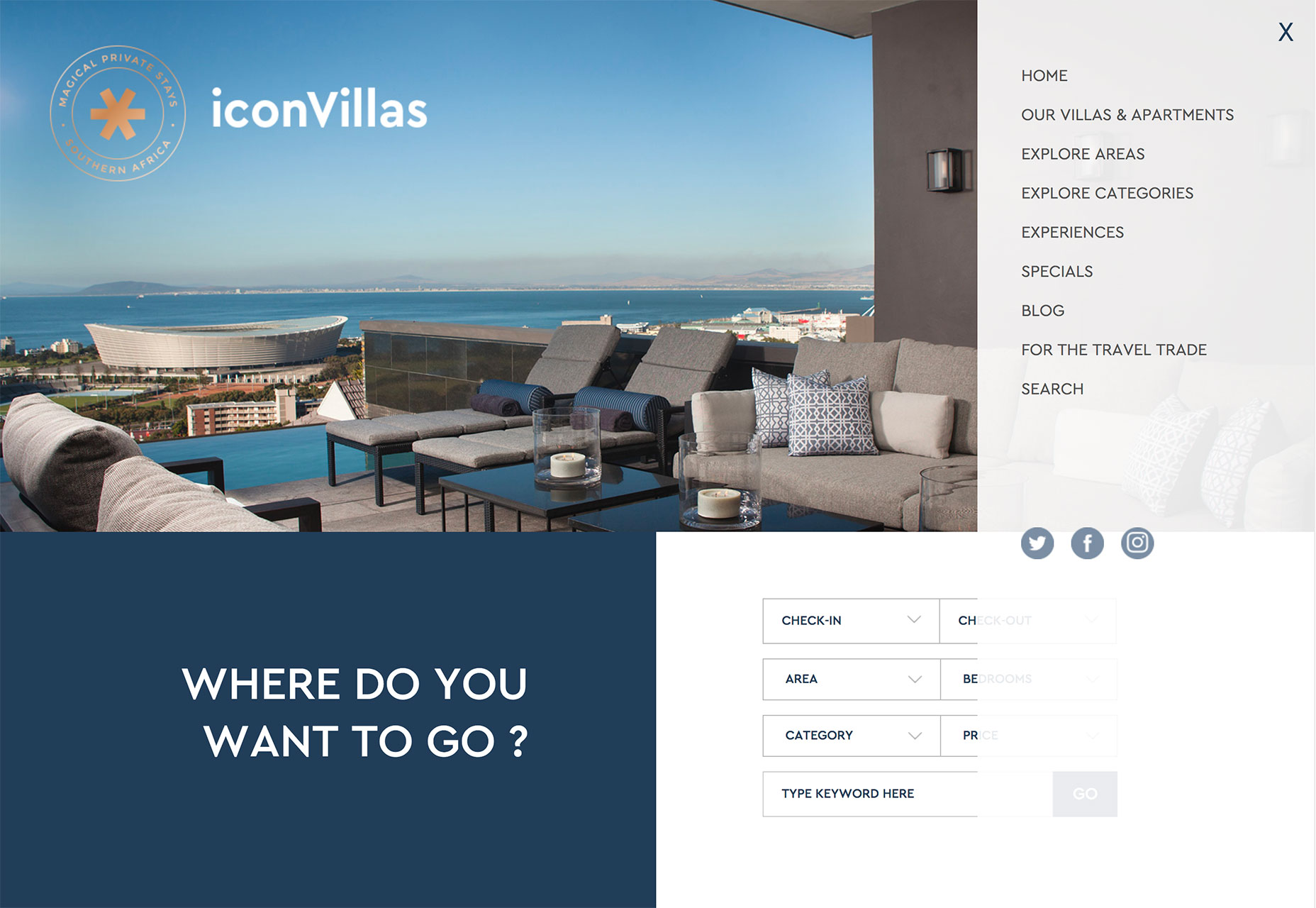
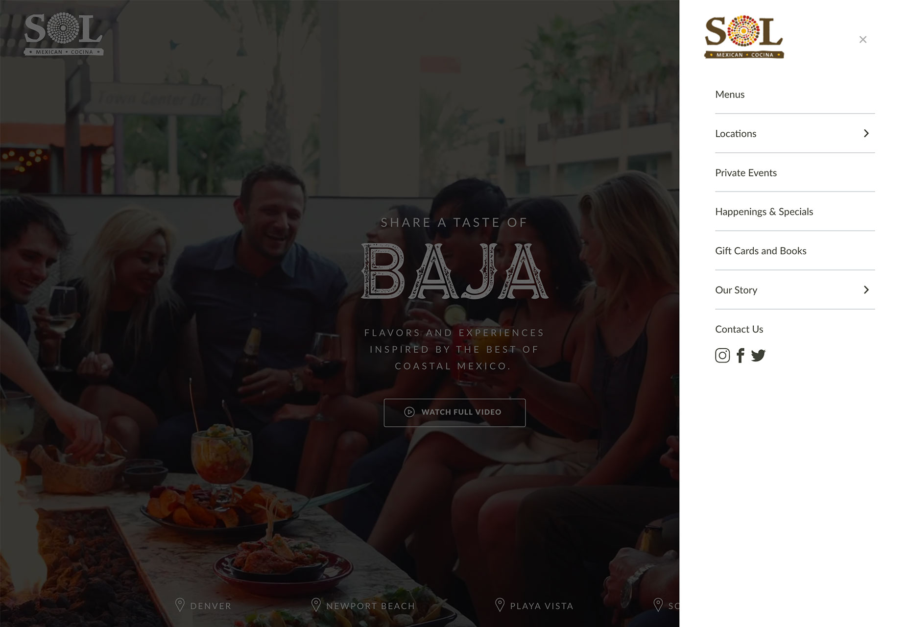
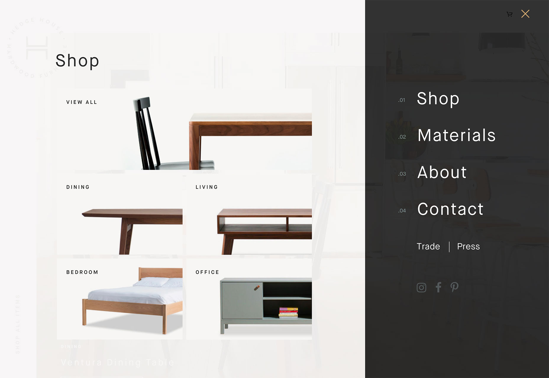
Love: Extra Real Estate on the Hamburger Screen
The pop- or slide-out nature of the hamburger icon navigation screen gives designers an extra space and bit of real estate to be creative.
Take advantage of that space to do something that will delight users. I absolutely love clicking that icon and getting something special that contributes to my overall user experience.
Use that space to provide extra information, re-emphasize an important fact or create a delightful interaction.
Hate: It Takes Multiple Clicks to Discover New Things
Is your attention span as short as mine? If I have to click all over the place to find things on a website, I tend to just check out.
Sometimes a hamburger icon can lead to “multiple click/tap fatigue.” Navigation elements are hidden. You have to click to find them. What you are looking for isn’t there. You have to click somewhere else to search. You have to click into and out of the navigation.
All of this clicking can get tedious – even if it does happen in a matter of seconds. (And the average attention span isn’t getting any longer.)
Wrapping Up
So what’s the verdict? Do I love or hate the hamburger menu icon?
It’s both. I’ll continue to love and hate it until a better solution comes along. How do you feel about it?
Carrie Cousins


Read Next

15 Best New Fonts, July 2024

20 Best New Websites, July 2024

Top 7 WordPress Plugins for 2024: Enhance Your Site's Performance

Exciting New Tools for Designers, July 2024

3 Essential Design Trends, July 2024

15 Best New Fonts, June 2024

20 Best New Websites, June 2024

Exciting New Tools for Designers, June 2024

3 Essential Design Trends, June 2024

15 Best New Fonts, May 2024

How to Reduce The Carbon Footprint of Your Website
