Mailchimp Unveils Quirky Rebrand

If any single tech company embodies the spirit of web-savvy, then it is Mailchimp. Since its beginnings as a side-project in the early-2000s the marketing service has walked the line between creative experiences, and simple usability. Mailchimp is one of those companies that saunters onto the court, lobs a shot over its shoulder, and gets nothing but net.

Now, with their latest rebrand courtesy of brand agency Collins (as ever, alongside an in-house team) Mailchimp has got almost everything right. Almost.
Chimp lovers will be relieved to discover that Freddie has survived the rebrand, and remains as the logomark, albeit redrawn in a simpler form. He’s lost his “M”, a bit of fur’s gone, the ear’s simpler. Essentially Freddie is more usable, more translatable, more international.
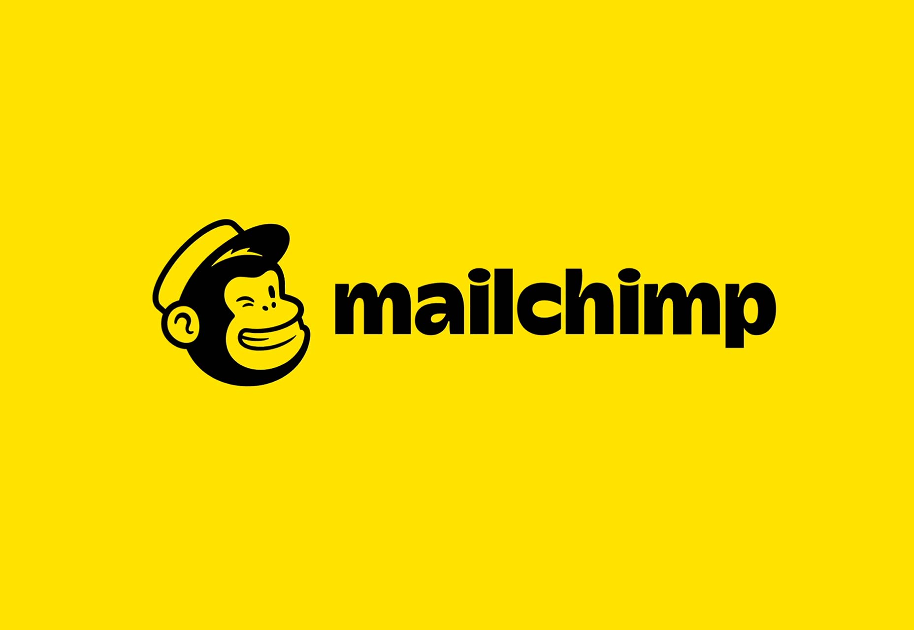
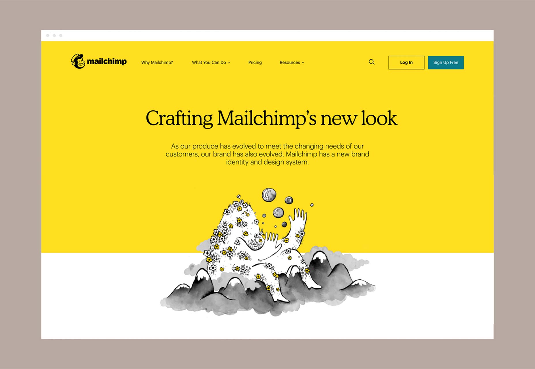
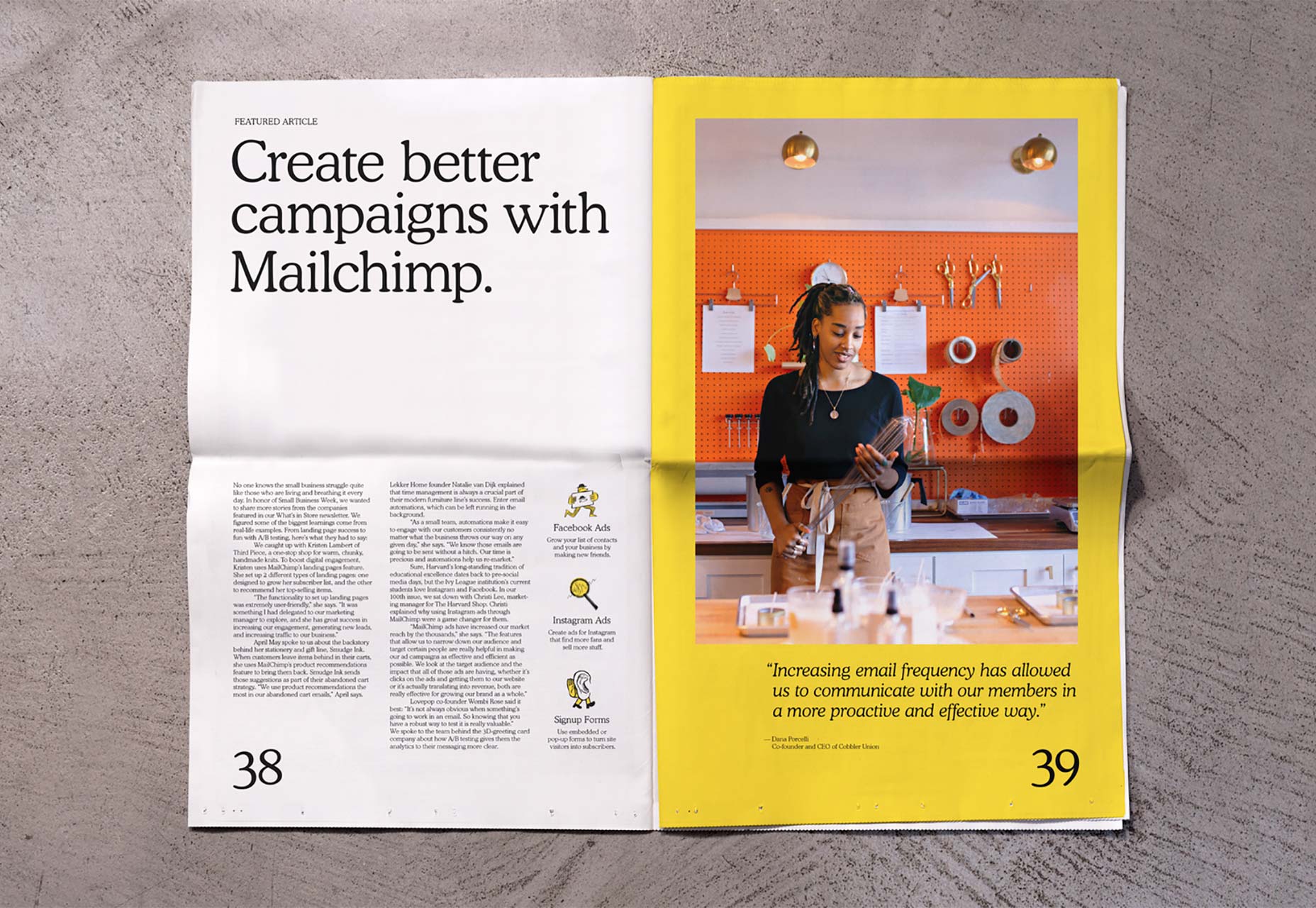
The most visually arresting element of the rebrand is the new brand color. Yellow is tough to design with, but it’s by far the most satisfying color when it’s got right, which in this case it is. It is used to tie the whole identity together in a way that wouldn’t work with anything less bold.
The most interesting—not necessarily in a good way—decision has been to abandon Jessica Hische’s much-loved redrawing of the original Mailchimp script. It’s been replaced with an oddly proportioned, retro-feel sans that lacks rhythm, and the syllables of which are crowbarred apart by an obnoxious “c”; strange given that the brand is keen to deemphasise that letter—it’s “Mailchimp” now, not “MailChimp”. There’s a half-baked explanation offered about the script’s incompatibility with the Freddie logomark. Initially I hated the new logotype; a hour later, I loved it; now I’m back to hating it again. The logotype seems destined to divide opinion, but at least it isn’t a geometric sans-serif.
Coupled with this logotype Mailchimp has adopted Cooper Light as its corporate typeface, giving everything a distinctly 1970s feel.
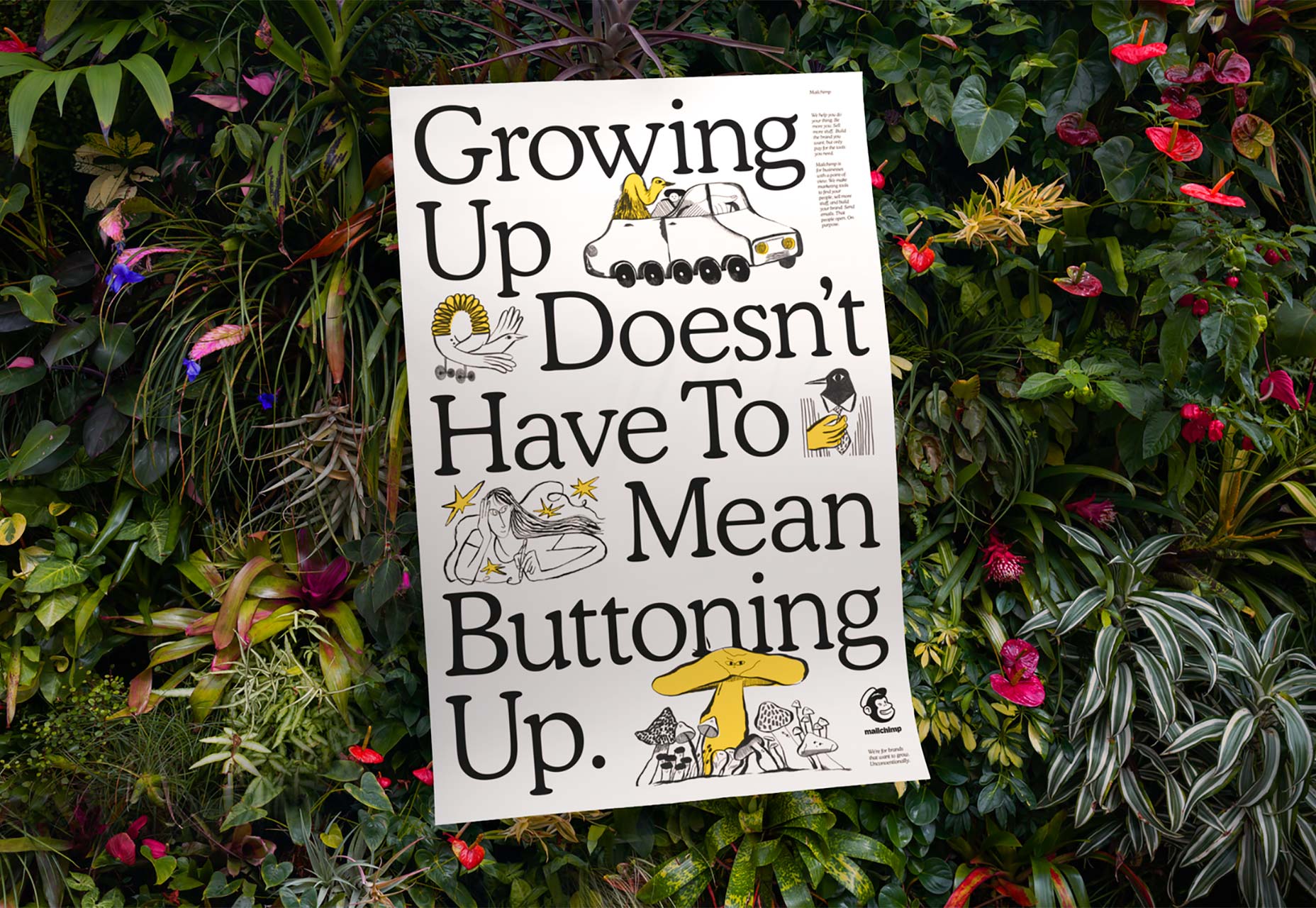
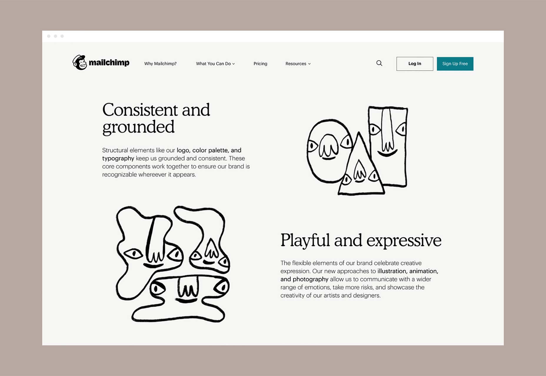
It’s not really any surprise that Mailchimp have labored to retain their quirky edge, it is after all what made them stand out (they have “chimp” in their name!) but what might come as a surprise is just how quirky Mailchimp have gone, particularly with their illustrations, which lie somewhere between Dr Seuss, and Quentin Blake, by way of Tove Jansson. The black and white illustrations with a strategic touch of brand yellow are sourced from illustrators around the world. (Although individual illustrations haven’t been attributed, several appear to be in the distinctive hand of Amber Vittoria.)
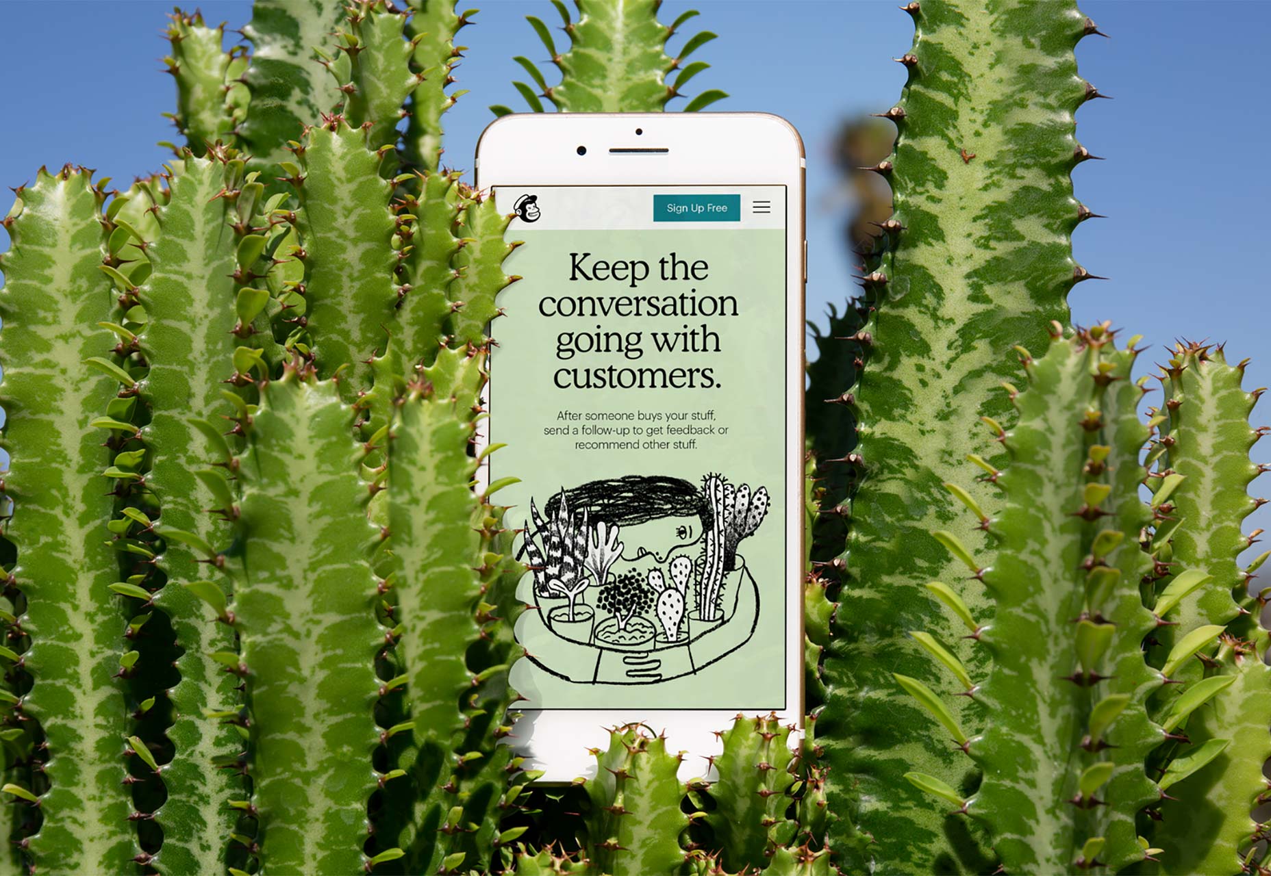
Mailchimp have also introduced a brand photography style that is easy to overlook amidst the joyful illustration. The photo examples themselves are well-taken, but their inclusion feels superfluous.
The rebrand is mostly excellent. The quirkiness is courageous and fitting. The color choice is striking. The type is debatable. The photography is questionable. But the whole is nothing if not fun. The biggest success is that despite growth—over 1 billion emails per day, 14,000 new users daily, $525m annual revenue—Mailchimp hasn’t lost sight of what made it a tool we wanted to use in the first place.
Ben Moss
Ben Moss has designed and coded work for award-winning startups, and global names including IBM, UBS, and the FBI. When he’s not in front of a screen he’s probably out trail-running.


Read Next

15 Best New Fonts, July 2024

20 Best New Websites, July 2024

Top 7 WordPress Plugins for 2024: Enhance Your Site's Performance

Exciting New Tools for Designers, July 2024

3 Essential Design Trends, July 2024

15 Best New Fonts, June 2024

20 Best New Websites, June 2024

Exciting New Tools for Designers, June 2024

3 Essential Design Trends, June 2024

15 Best New Fonts, May 2024

How to Reduce The Carbon Footprint of Your Website
