

1. Dark Backgrounds
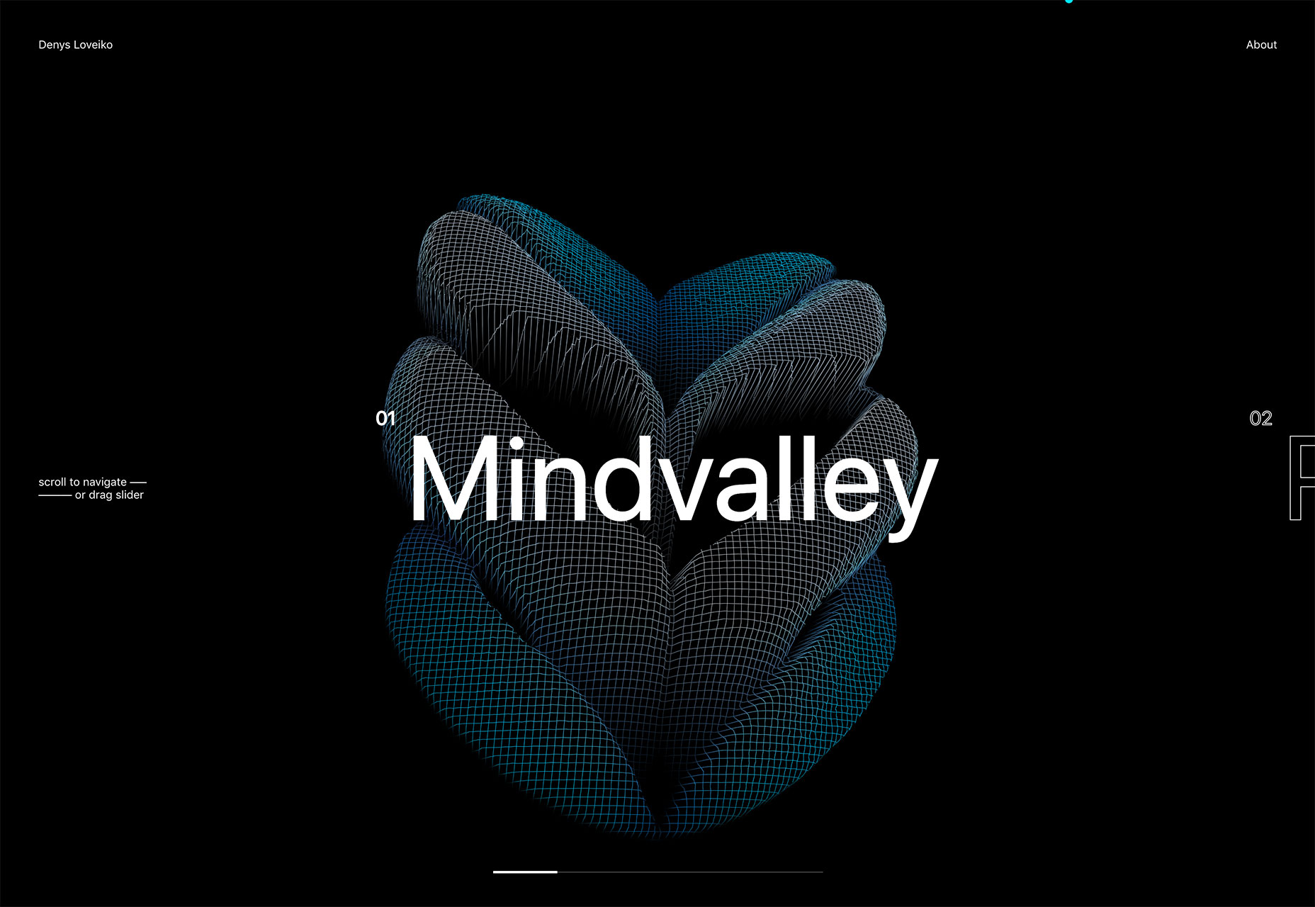
It seems like designers were focusing on light, white minimal styles for a long time, but that era is starting to end. Dark backgrounds are making a comeback in a big way. [pullquote]Dark backgrounds provide a design opportunity quite different from white[/pullquote] Maybe it’s the idea that cooler weather is coming. (Many of these dark backgrounds do have a cool feel.) Or maybe it’s just a shift in order to try something different. (Dark backgrounds provide a design opportunity quite different from white.) Either way, it’s a trend that needs to stick around for a while. Dark backgrounds can be used in so many different ways – and each presents an opportunity to create something in an entirely different way.- Black, flat background: A simple black background creates a wide open canvas. Denys Loveiko uses a black background to set the tone for animated elements and clean white typography. It’s sharp and easy to engage with.
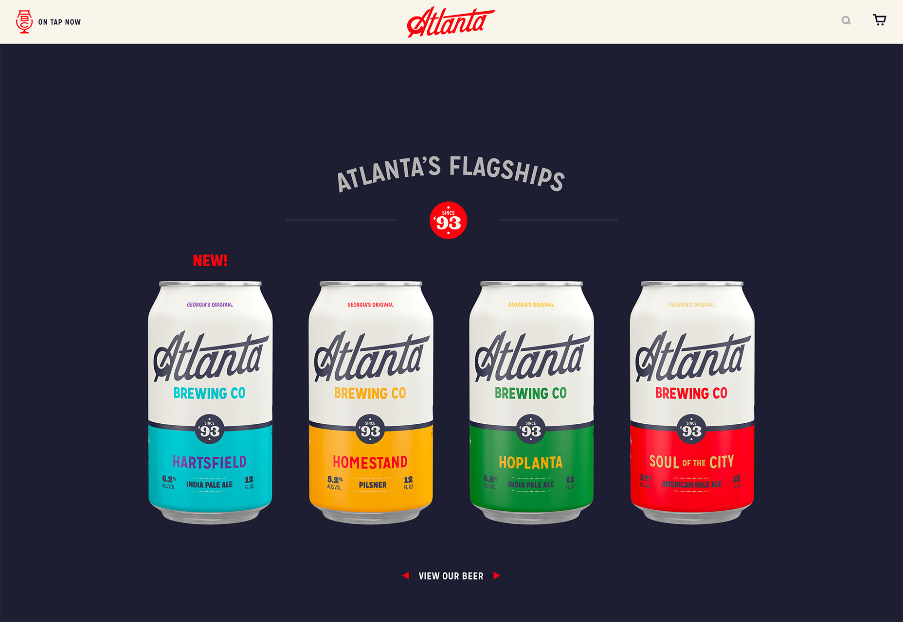
- Dark color background: Atlanta Brewing Co. uses a dark background with blue tones to emphasize its brand color and highlight the bright product designs. What’s nice about a dark color is that it is a little softer than a flat black background.
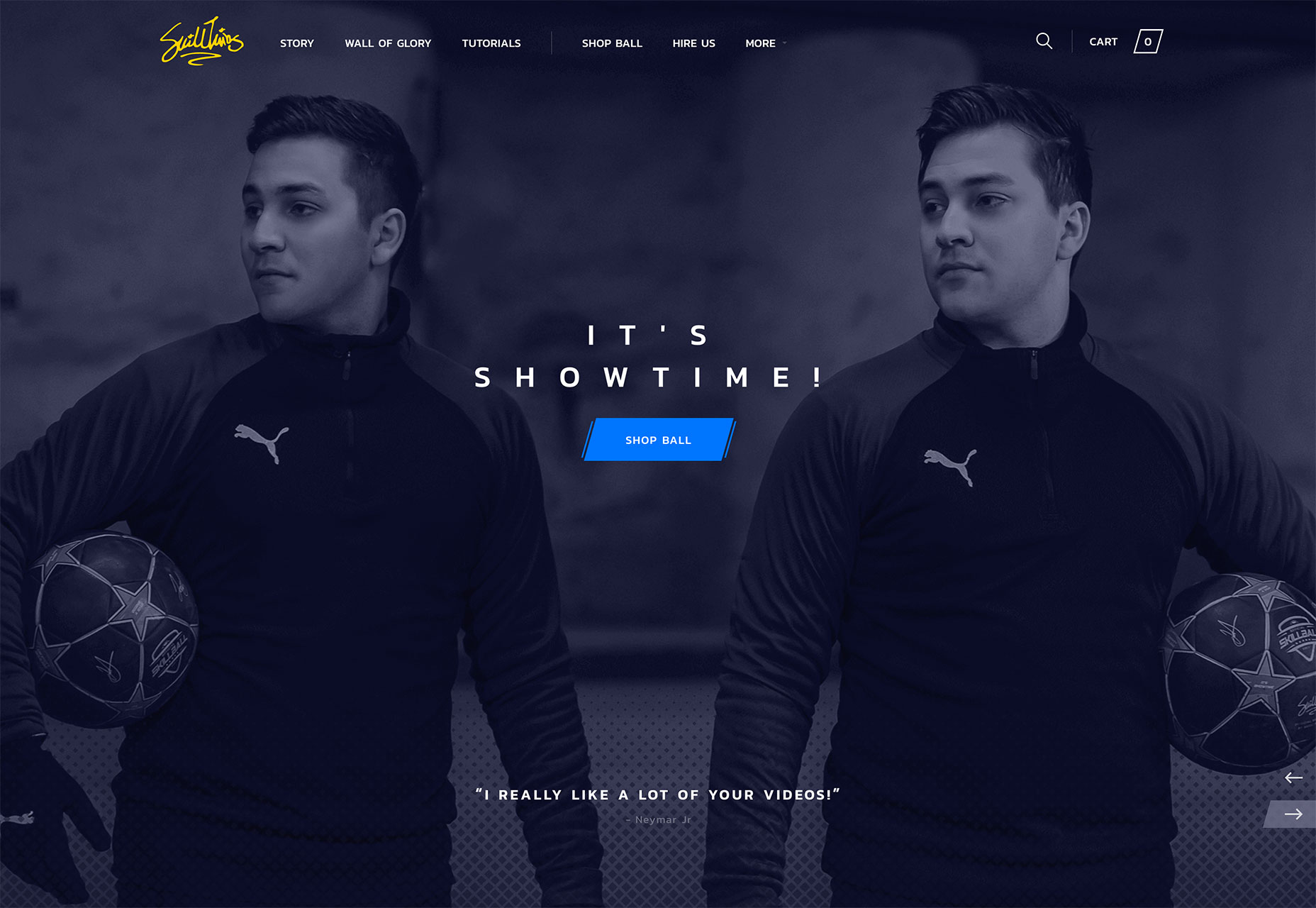
- Dark color overlay background: While much of this trend does focus on single color backgrounds, an image overlay is just as effective. Here the dark background provides an opportunity to meet the men who are the subjects of the website but with room to feature elements such as text, a logo and call to action.
2. Heavy White Headers
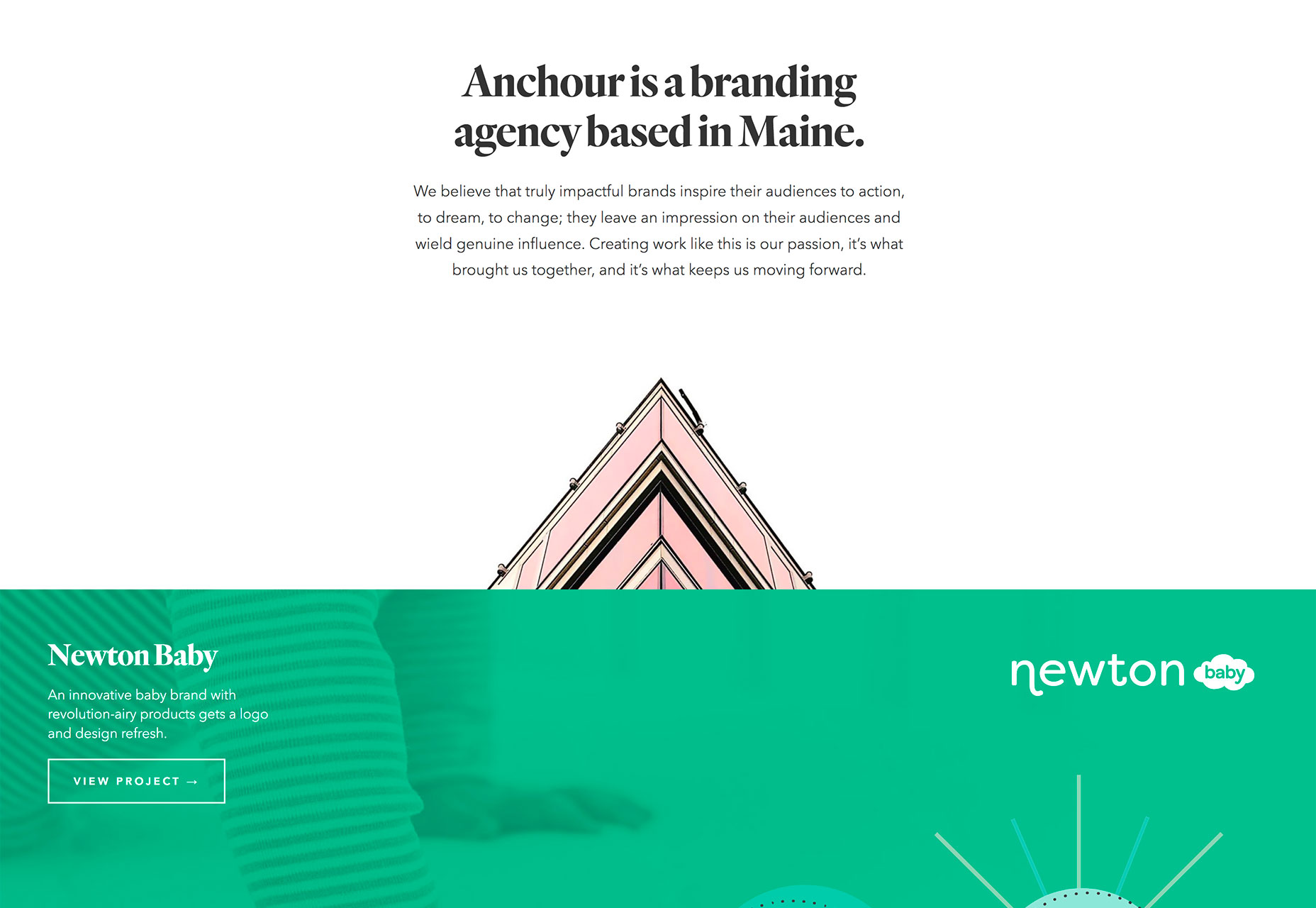
While some designers are going all in with dark backgrounds, there’s still a lot of white space trending. Heavy white headers are replacing all white designs though. This trend is exemplified by almost oversized headers that take up nearly half of the first screen, followed by other elements with more color, images or video. [pullquote]a great way to create a minimal style and use high-value imagery at the same time[/pullquote] It’s a great way to create a minimal style and use high-value imagery at the same time. The white space does a great job of creating an easy first impression that gives room to branding and key messaging, while there’s something a little more engaging to look at beyond the initial glimpse. This design style encourages scrolling. Most of these designs split the screen in such a way that the users sees the heavy white header and a portion of the next level of content at the same time. Each of the examples below uses this technique in a slightly different way:- Anchour uses a heavy white header that encompasses about two-thirds of the screen with a significant text block. What’s important to note is the use of the graphic to point users up to the information above. This key directional helps ensure that website visitors look at the headline and text first, then scroll.
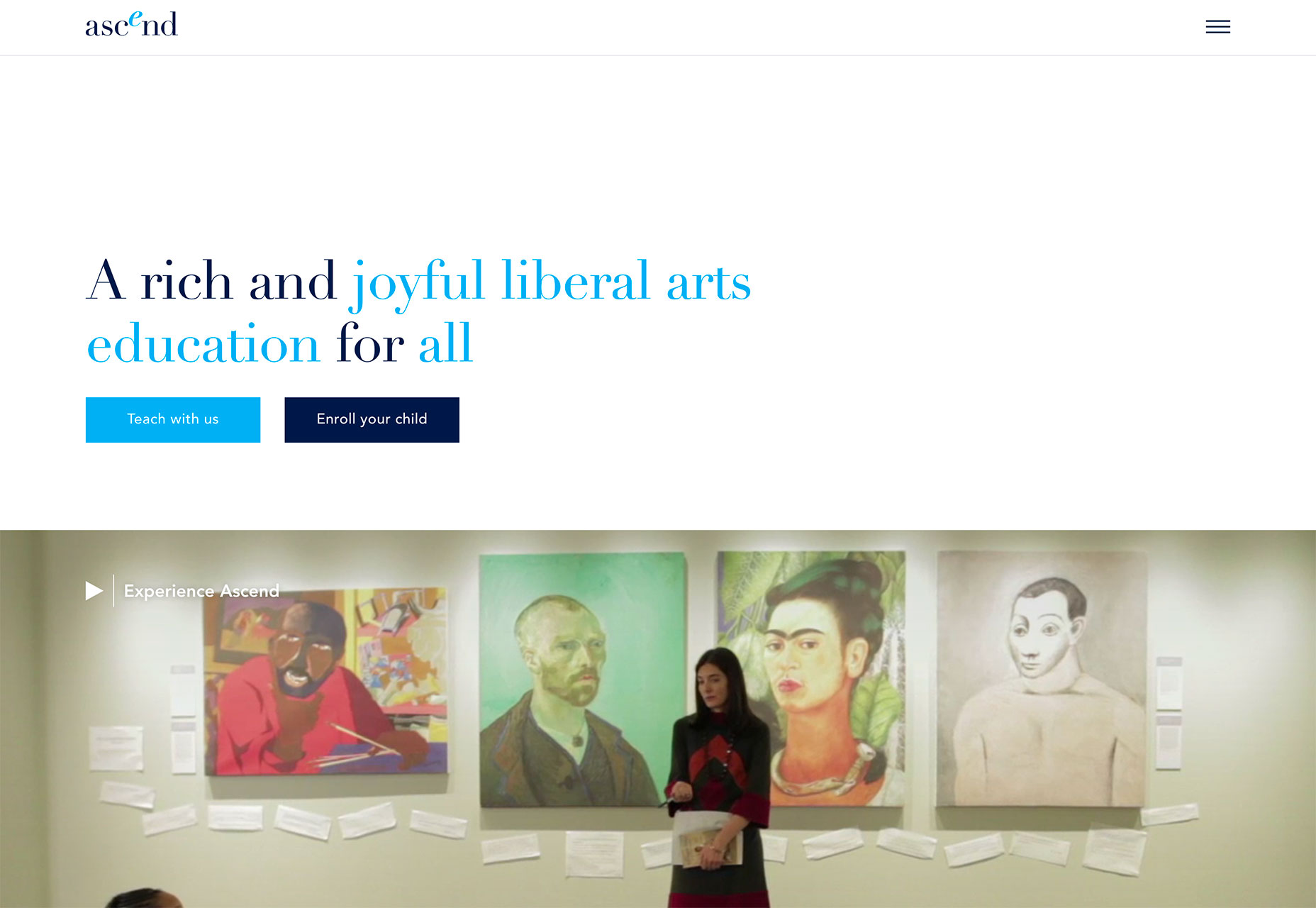
- Ascend uses a half screen of white space to tell you what they do with two calls to action (based on which part of the audience you are from). Below is a full-screen video that shows the school in action. It’s a fun way to tell the story without overwhelming users with too much information at once.
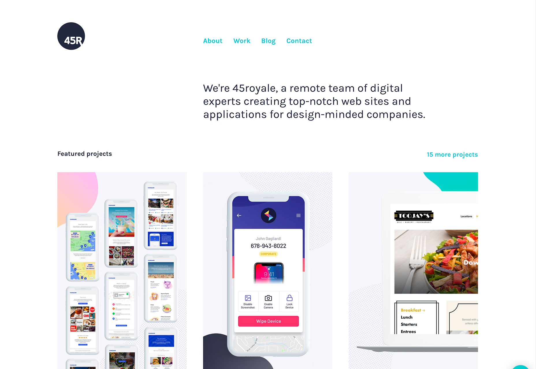
- 45royale takes another approach with a heavy white header followed by image tiles on a white background. The header still contains a logo, navigation and text block that highlights why users have come to the website. The text block at the top is oversized and has plenty of room around it, so that it’s easy to focus on.
3. New Application for Cards
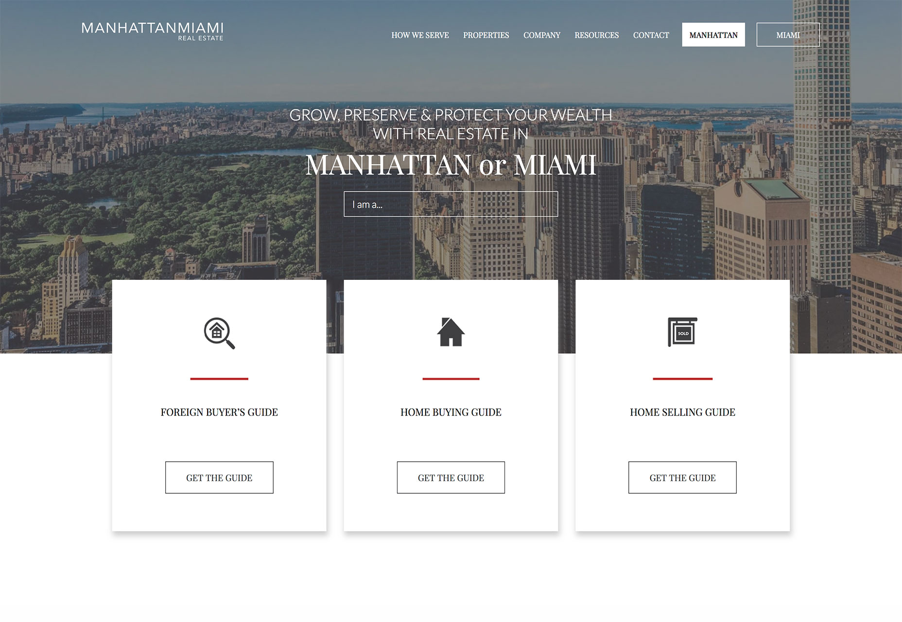
Card-style interfaces got a lot of attention as Material Design was beginning to take off but kind of fell of the radar for a while. Cards are returning to projects again, but not in the use-them-for-the-whole-design kind of way. These cards are somewhat smaller and designed for specific interactions. What’s nice about cards is that they do a good job of directing users to do something. When designed well, a card almost demands that the user click or tap it, making them a great tool to convert CTAs or aid navigation.- Manhattan Miami uses cards as calls to action for different types of users. The homepage features three cards, each with an action for a different segment of the audience. They are simple but attention grabbing because of the layered effect from the background.
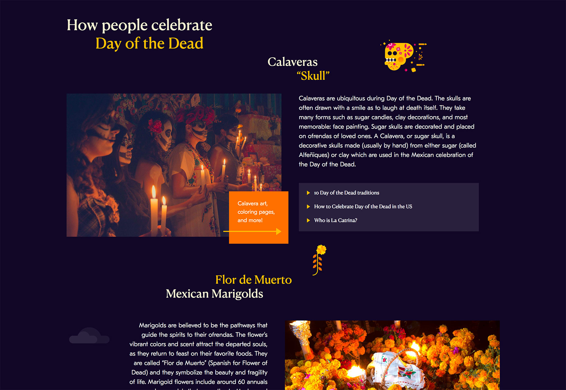
- Day of the Dead uses mini cards throughout the design to direct attention (note the arrow on the orange card to the links to the right of it) and provide additional information. Each tiny card includes a hover animation that further encourages clicks.
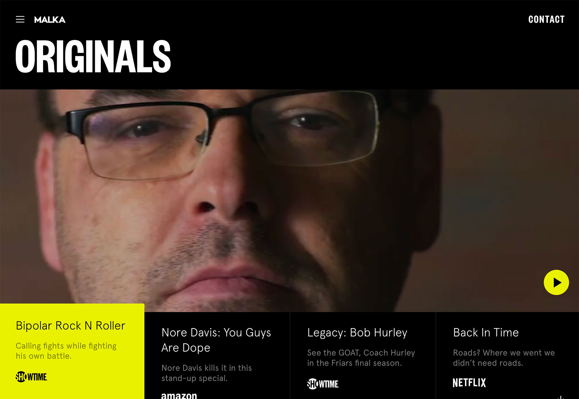
- Malka uses cards in a different way altogether. The four cards at the bottom of the screen are actually navigation elements. The card that relates to the video reel that’s actually playing pops up a little higher and turns yellow. Users can also change cards (and video on the screen) by moving to the appropriate card.
Conclusion
I love new takes on classic design elements. That’s what this month’s design trends captures. And any of these techniques is pretty easy to incorporate into projects (always a bonus).Carrie Cousins
Carrie Cousins is a freelance writer with more than 10 years of experience in the communications industry, including writing for print and online publications, and design and editing. You can connect with Carrie on Twitter @carriecousins.


Read Next

15 Best New Fonts, July 2024
Welcome to our monthly roundup of the best fonts we’ve found online in the last four weeks. This month, there are fewer…
By Ben Moss

20 Best New Websites, July 2024
Welcome to July’s round up of websites to inspire you. This month’s collection ranges from the most stripped-back…

Top 7 WordPress Plugins for 2024: Enhance Your Site's Performance
WordPress is a hands-down favorite of website designers and developers. Renowned for its flexibility and ease of use,…
By WDD Staff

Exciting New Tools for Designers, July 2024
Welcome to this July’s collection of tools, gathered from around the web over the past month. We hope you’ll find…

3 Essential Design Trends, July 2024
Add some summer sizzle to your design projects with trendy website elements. Learn what's trending and how to use these…

15 Best New Fonts, June 2024
Welcome to our roundup of the best new fonts we’ve found online in the last month. This month, there are notably fewer…
By Ben Moss

20 Best New Websites, June 2024
Arranging content in an easily accessible way is the backbone of any user-friendly website. A good website will present…

Exciting New Tools for Designers, June 2024
In this month’s roundup of the best tools for web designers and developers, we’ll explore a range of new and noteworthy…

3 Essential Design Trends, June 2024
Summer is off to a fun start with some highly dramatic website design trends showing up in projects. Let's dive in!

15 Best New Fonts, May 2024
In this month’s edition, there are lots of historically-inspired typefaces, more of the growing trend for French…
By Ben Moss

How to Reduce The Carbon Footprint of Your Website
On average, a web page produces 4.61 grams of CO2 for every page view; for whole sites, that amounts to hundreds of KG…
By Simon Sterne

20 Best New Websites, May 2024
Welcome to May’s compilation of the best sites on the web. This month we’re focused on color for younger humans,…