

A visual language is just like any other form of communication.
Where “language” refers to spoken or written communication, visual language goes a step further to connect with a certain community. Elements from color to style to type of photos or illustrations establish what a brand or company is. These visual elements tie together a group in a structured and conventional way that people understand.
A visual language includes both the written and spoken elements of a website or brand, as well as every design technique, photo, icon, logo and item, users can see on the screen. Often users won’t know a visual language is there; they just know that when they see your website or brand they recognize it.
Here’s how you create a visual language that users can understand.
1. Build a Color Palette
A strong color palette is an identification tool for users. When consistent colors, which as well-known and connected with the brand or website, are used; users know where they are. They aren’t lost in the massive universe of the web, because you have told them visually what website or brand they are interacting with.
This color palette shouldn’t be unique to your website. It needs to be universally applied and connected with everything a brand does—online, social media, swag items or packaging, business cards.
Further, the color palette should reinforce brand values.
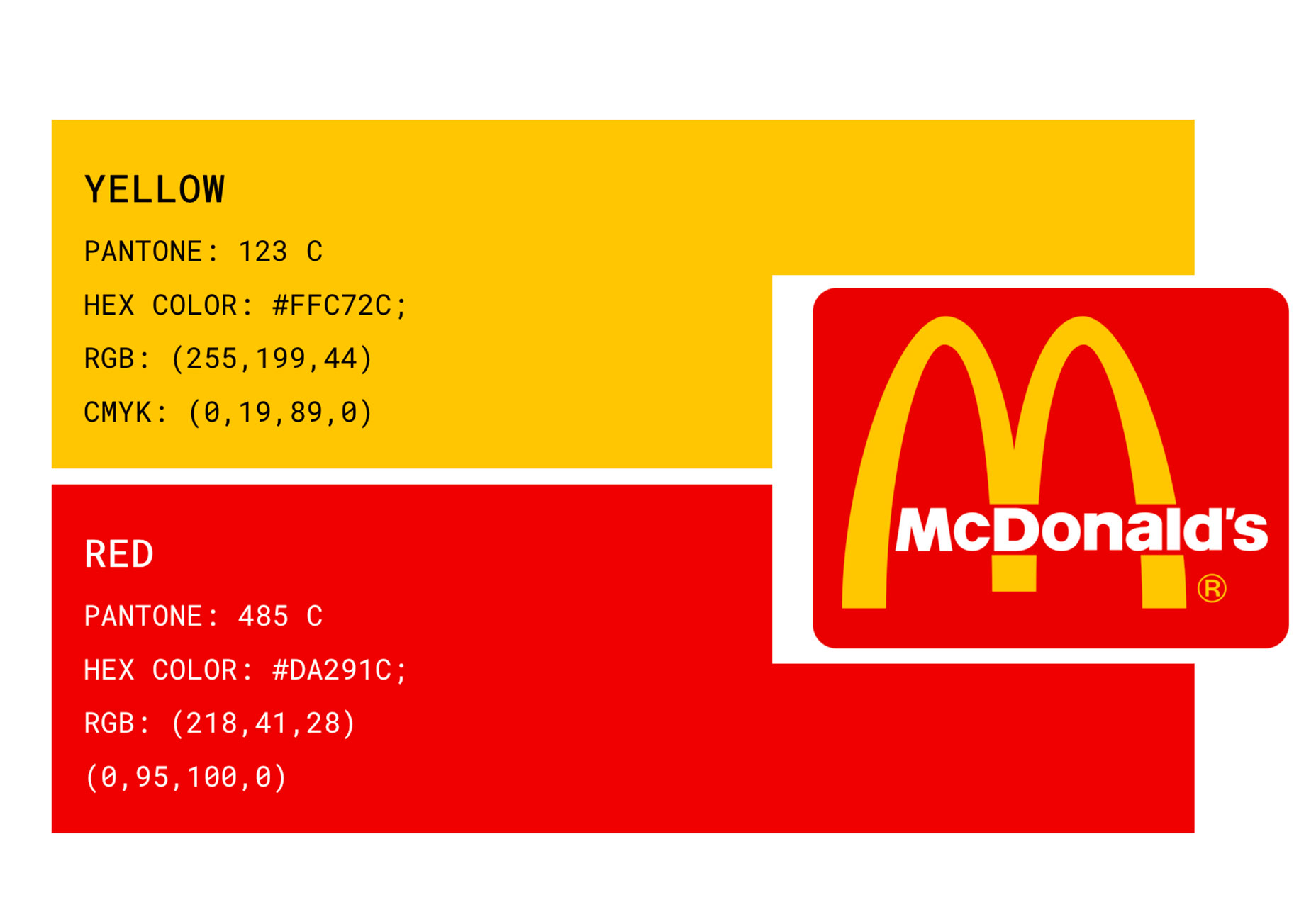
Think about the colors for fast-food restaurant McDonald’s: Yellow and red. The colors represent happiness (yellow) and hunger (red). How often have you ever seen this brand without the “Golden Arches” or something with red on the packaging?
2. Create a Typographic Hierarchy
Just as important as selecting fonts for your brand is determining how they will be used.
A typographic hierarchy sets the tone for whether you talk to users, whisper (small light typography) or yell at them (large all caps lettering). There’s no right or wrong way to communicate; it’s knowing what works with your tribe.
The trick to building a typographic scale is that each level should be different enough from the one preceding and following it so it is easy to see changes in text.
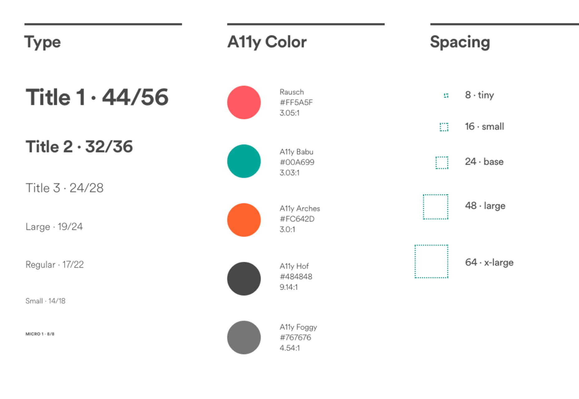
Airbnb has a distinct typographic scale with sizes and weights for typography that’s standardized. This standardization also extends to the color palette and spacing to contribute to a solid visual language.
3. Establish a Grid
Spacing and placement of elements can be just as important as the elements themselves. Is your visual identity clean and organized or a little more chaotic?
Your grid answers this question.
FreeCodeCamp explains this structure well:
A modular structure offers the possibility to work with entire engineering teams. Thus it could quickly produce products suitable for all platforms. If you are creating conceptual designs from a message sense, the integration method will be more useful.
In a nutshell, what does the complexity or simplicity of the grid communicate about you?
4. Create a Library of Components
From buttons to icons to cards or popups, create a library of components so all uses of elements within the design are consistent.
A button shouldn’t be a blue circle on one page and a red square on another. An icon shouldn’t be line style on one page and full color on another. This inconsistency can make users question if they have left your site by mistake.
A good library of components includes all the elements needed to build pages within the design and rule for usage—size and scale for each device size and adjustments for iOS versus Android devices.
While building common components can seem like a big chore on the front end, it can make creating new pages a breeze later down the line.
5. Emphasize an Image Style
Whether you are using photos, video or illustration, creating and maintaining an image style is important. This is one of the strongest visual assets that users will remember and associate with your website or brand.
This style relates to anything from photo crops—tight versus wide, use of filters, speed of videos and style of composition.
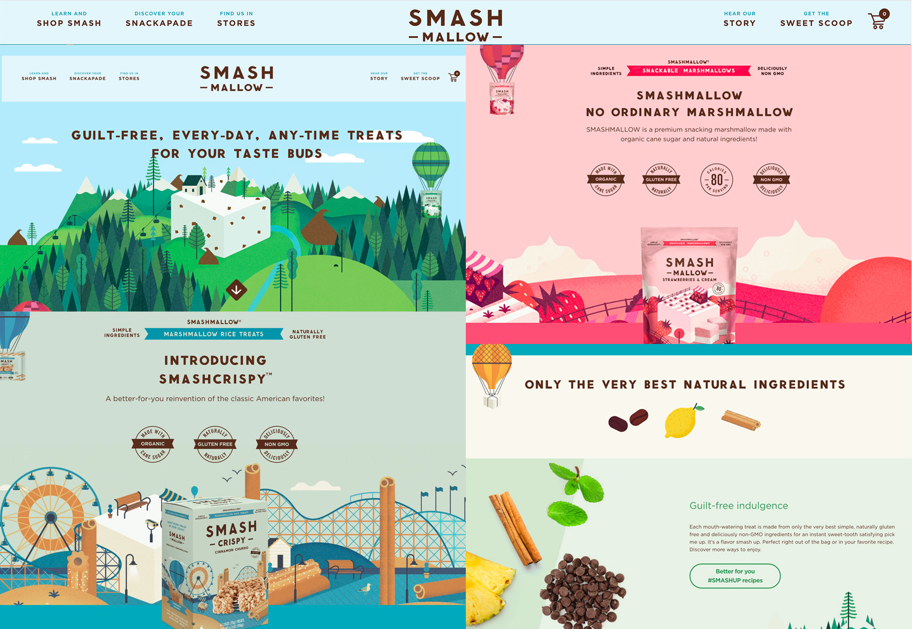
Look at the multiple elements from Smashmallow below. Even if they weren’t grouped, they contain common elements that connect the images to the brand. (Not the hot air balloon on every image.) This image style set the tone for who this company is and how they connect with users.
6. Build Rules for Animation
Animated elements should also follow a basic set of rules. Do they move fast or slow? Do they move on their own or only as a hover state?
These interactions help establish visual identity as well. Animations can set a tone for a project. Using, or not using, them can say a lot about who you are and what you want to be.
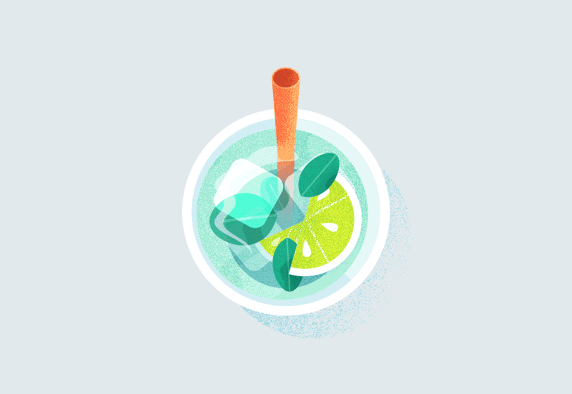
This mojito shot from Dribbble, below, has circular motion. Think about how other animations in the same visual language would look. They might also move in the same circular manner and at a similar speed.
7. Match Words and Visuals
For a visual language to be effective, it has to match the actual language used in the design. If the words and visual elements are a mismatch, users could be confused by the experience.
Elements should work together to create an overall package of communication that all emphasizes the same thing.
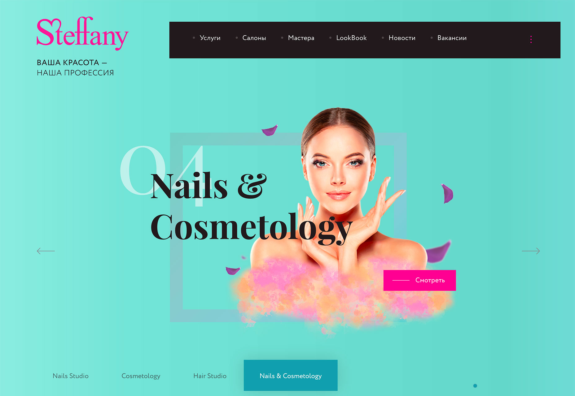
Steffany, below, uses color, a feminine logo and words to show what her website is all about. The pieces work together to create an overall picture and don’t compete with different text and visual messages.
8. Be True to Yourself
A visual language will only work if it is believable. It must represent who and what you are.
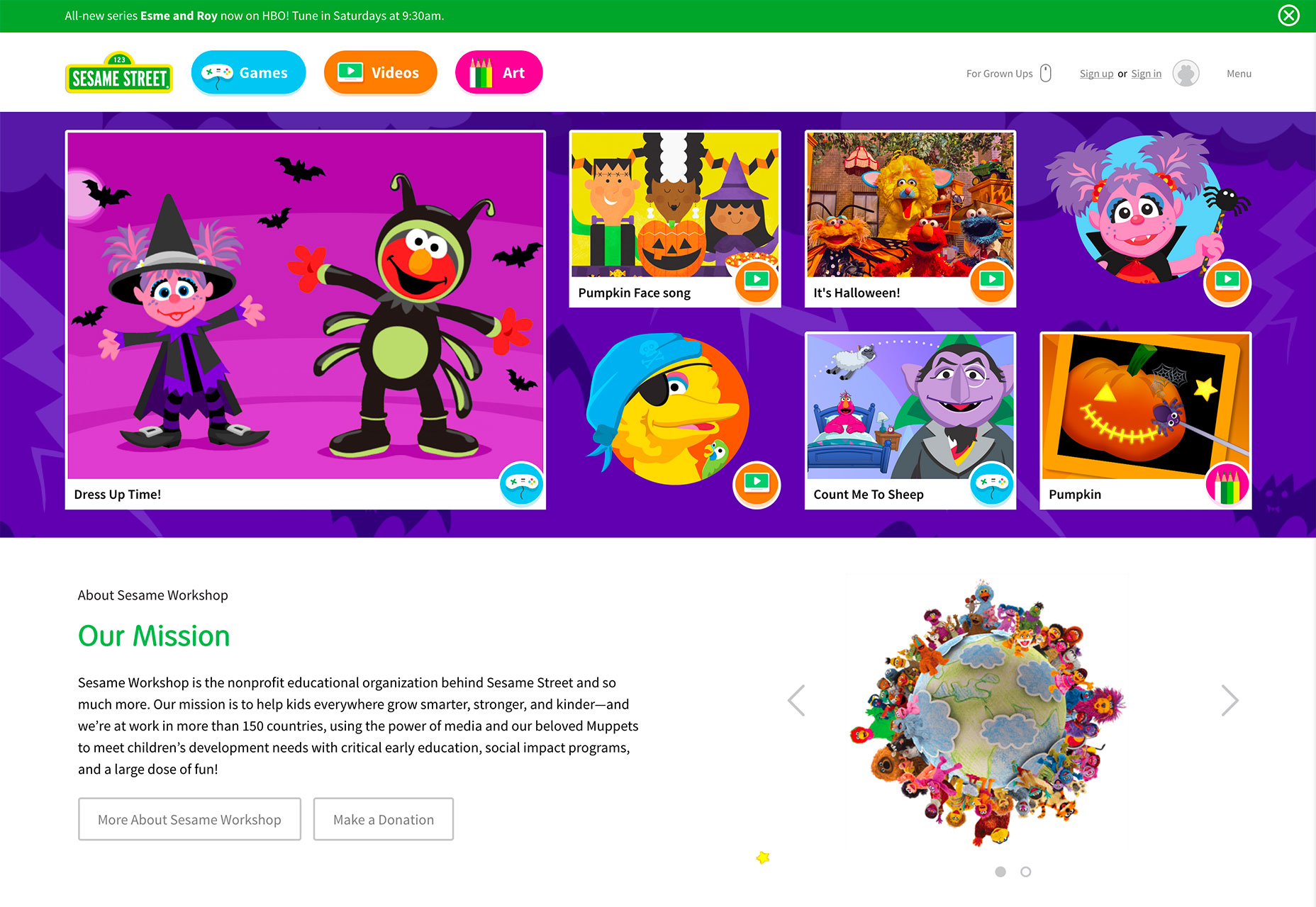
Could you imagine Sesame Street without the characters? It would be quite difficult.
The entire visual identity of the brand is built around Big Bird and Elmo and others. Every bit of the design reflects this. To further connect the visual identity of the television show and cartoon characters, note how both are used in the website design. This helps pull fantasy and reality together visually to help maintain the brand’s identity.
9. Be Consistent
Once you’ve developed a set of guidelines for a visual language, stick to them. The biggest misstep when working to build a visual language is inconsistency.
FreeCodeCamp notes that a design language should answer the following questions. They are also the benchmarks of whether you are honoring consistency with your visuals.
- What color are we using?
- Where is the logo placed?
- Was this pattern used somewhere else?
- What’s the latest documentation?
- How do we build this animation?
- Is this from the component library?
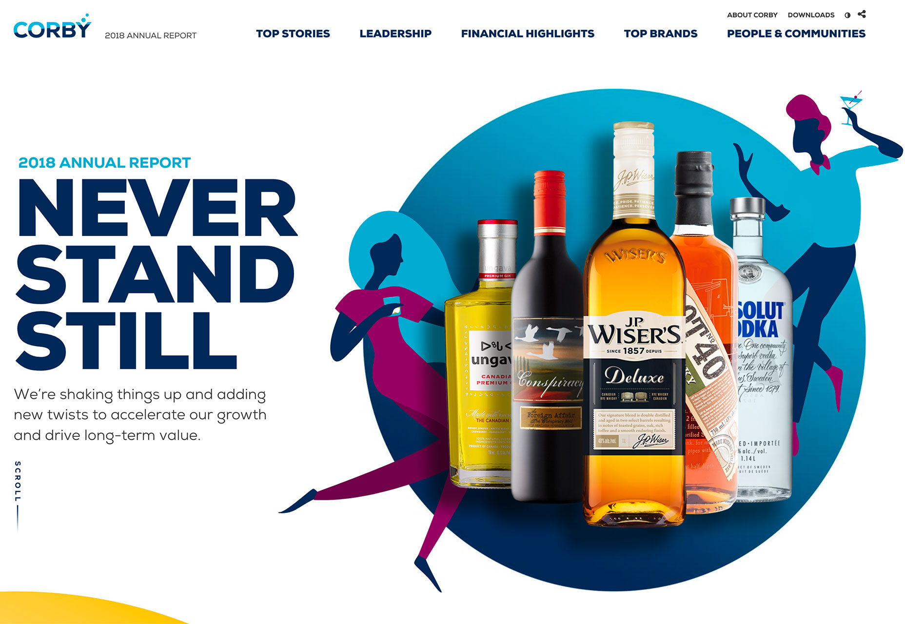
Note that Corby can affirm the answers to these questions. The logo is in a common placement, consistent colors are used throughout and the patterns/animations are used in the same way.
10. Develop a Style Guide…And Enforce it
Establish a visual language and codify it.
Then put someone in charge of enforcing it. Your identity is too important to leave to chance. Humans are innately visual; visual language can be one of the strongest elements that connects users to your website or brand.
Carrie Cousins


Read Next

15 Best New Fonts, July 2024

20 Best New Websites, July 2024

Top 7 WordPress Plugins for 2024: Enhance Your Site's Performance

Exciting New Tools for Designers, July 2024

3 Essential Design Trends, July 2024

15 Best New Fonts, June 2024

20 Best New Websites, June 2024

Exciting New Tools for Designers, June 2024

3 Essential Design Trends, June 2024

15 Best New Fonts, May 2024

How to Reduce The Carbon Footprint of Your Website
