

Justin Jackson
Justin Jackson’s portfolio does that rare and beautiful thing of making use of monospace fonts in a way that doesn’t look too brutalist. Okay, so maybe it looks a bit “grunge”, but it’s grunge and it’s usable. What’s not to love? Platform: Statamic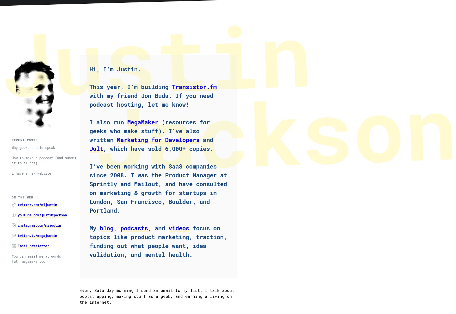
Paul Macgregor
Paul Macgregor’s portfolio brings us to our first (but probably not last!) uber-minimal design of the month. And it’s a fantastic example of the principle, too, with all the important information right up front, and quite literally center. Other than my usual issues with JS-dependent navigation, I can find no fault. Platform: Static Site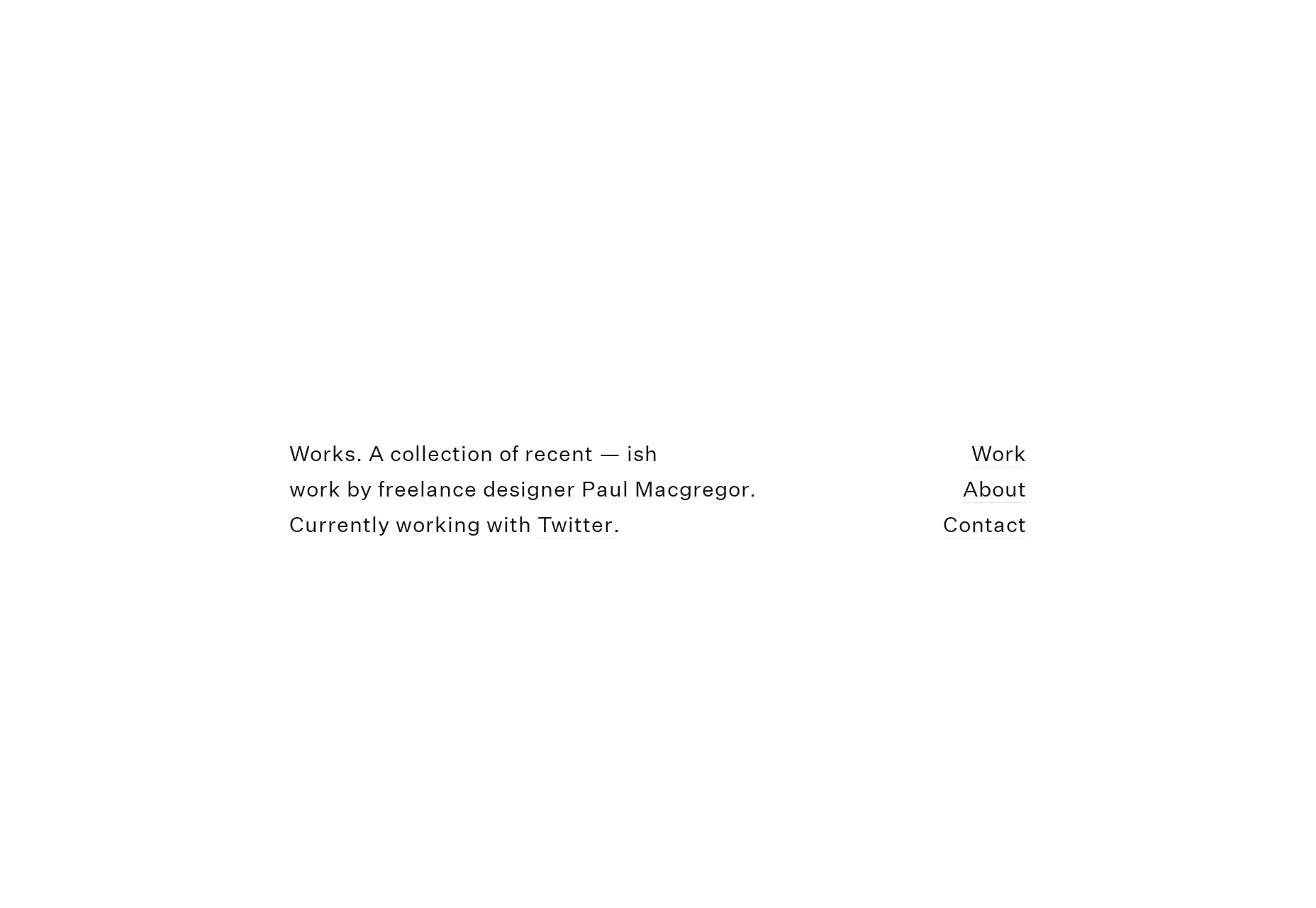
Mawla
Mawla is an app development studio, and I’m slightly in love with their site design. All the colorful blobs remind me of fliers from my childhood, but better. Yeah, they actually made blobs work. Look, I’m not saying everyone should adopt colorful blobs as a strategy. That way lies madness and/or blindness. But running across these sites that let their designers go a little wild without sacrificing general usability is always nice. Platform: WordPress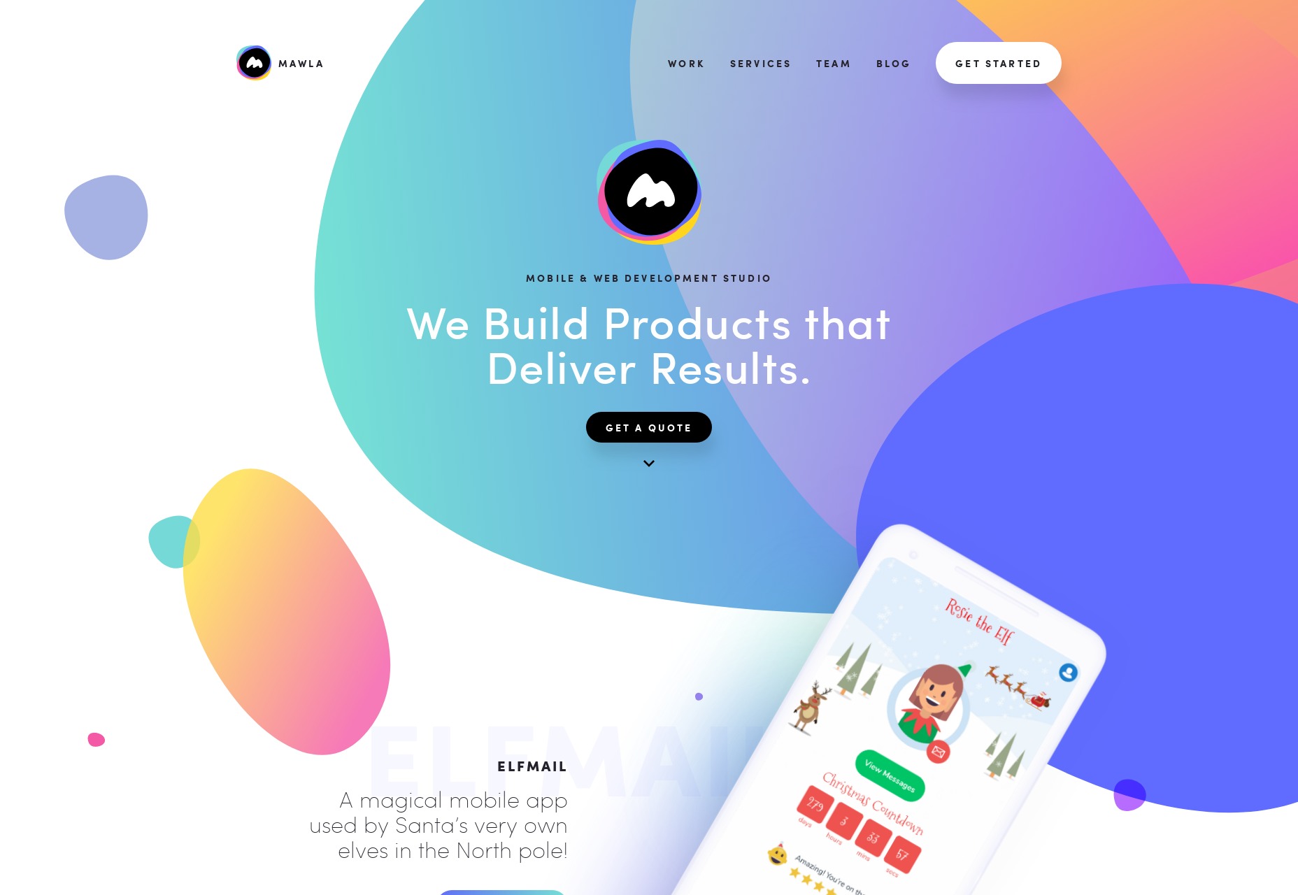
Ethan Tennier-Stuart
Ethan Tennier-Stuart brings us back down to earth with a very type-and-whitespace-focused design that keeps things simple. This one is an absolute master class in spacing out elements. Platform: Static Site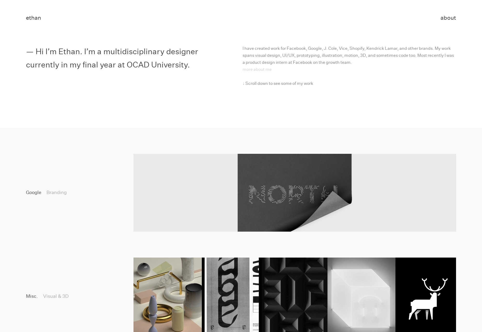
Owl
Owl is a Russian design agency, but maybe don’t quote me on that. You know typography is good when you can’t read a word of it, but you don’t mind just staring at it for a bit. Their graphic design skills are impeccable, too. It reminds me of that brief moment in time when photomontages were everywhere. Platform: WordPress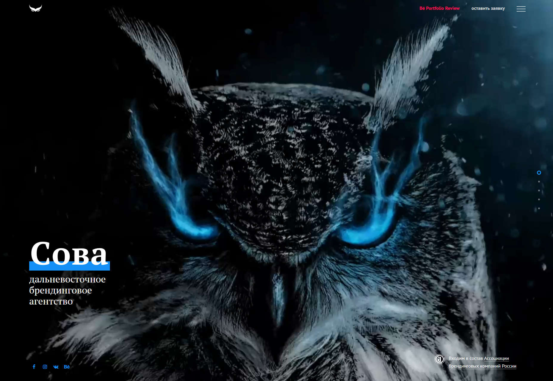
Jack McDade
Jack McDade bills himself as the “Ultimate Web Master”, a title as full of nostalgia as his site’s aesthetic. It’s simple, but colorful. I have to say that Jack is pretty confident in his work’s ability to speak for itself. He lists some of his former and current projects in paragraph form, and leaves you to decide whether or not to click. Considering that he built the CMS known as Statamic, I’d say he can afford to be confident. Platform: Statamic (Probably)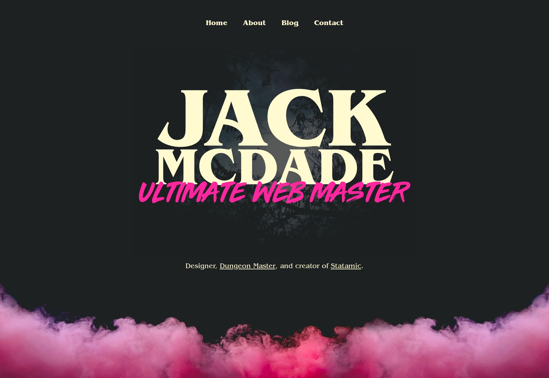
Future Comes
Future Comes is an interesting case. It’s a one-page website, but the studio seems to do a lot of different things. They don’t really bother to explain what they do in simple terms. They assume that if you need what they have, you understand what they’re telling you. Since it all seems to be fairly technical, and geared toward corporate customers, the site is highly corporate in its aesthetic. There is sans-serif type, subdued reds and blues, fun with gradients, and a little tasteful animation. Platform: Static Site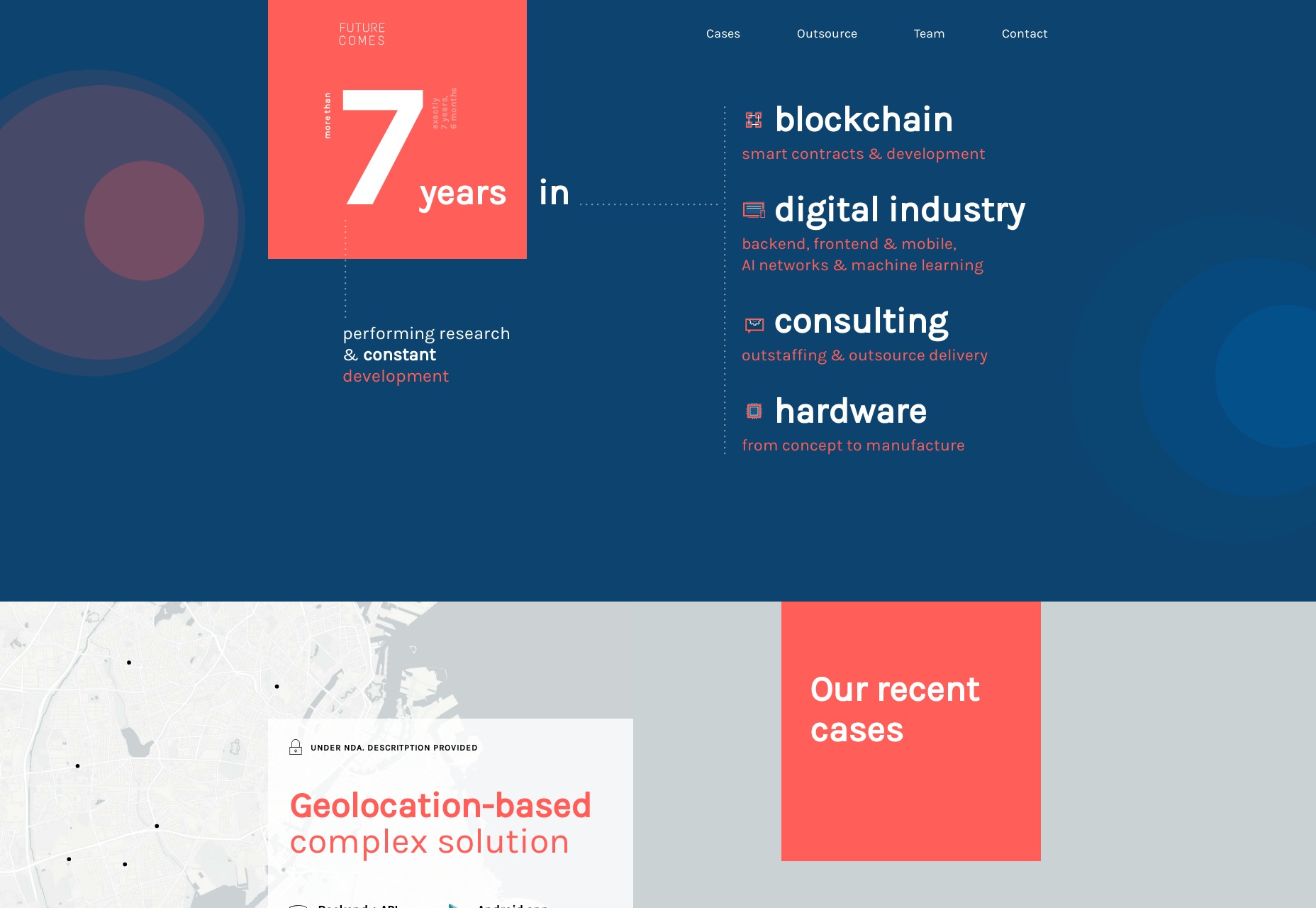
Cyber-Duck
If the last site whet your appetite for some clean corporate goodness, look no further than Cyber-Duck. It’s simple, it’s solid, it has a ton of blue. It’s strangely comforting. It also has a page that details their accessibility principles, which includes such delights as big text, their commitment to making the site accessible without JavaScript, and many other things that made me happy. This is how you do it, front-end devs! Platform: Undetermined CMS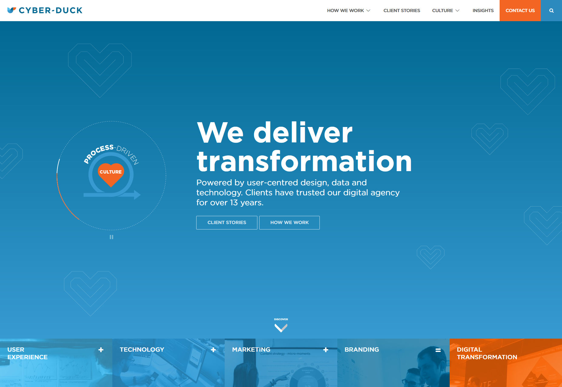
double take
double take goes for the good-old black, white, and yellow approach that just stand out so nicely. There’s a bit of asymmetry thrown in for good measure. Still not a fan of cursor replacement, but otherwise, this one’s worth a look. Platform: Static Site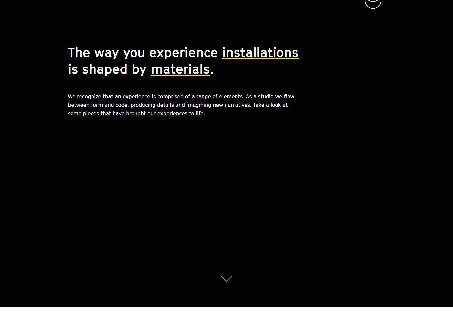
Paul O’Rely
Paul O’Rely caught my eye with those thin diagonal lines, and the highly expressive type in his one-page site. Overall, it creative and stylish. My only complaint is that the contact form really doesn’t look like one. To balance that out, I’ll say that I love the auto-generated ice-breaker feature. And the fact that you can send him drawings made right on the page. That’s pretty cool. Platform: Static Site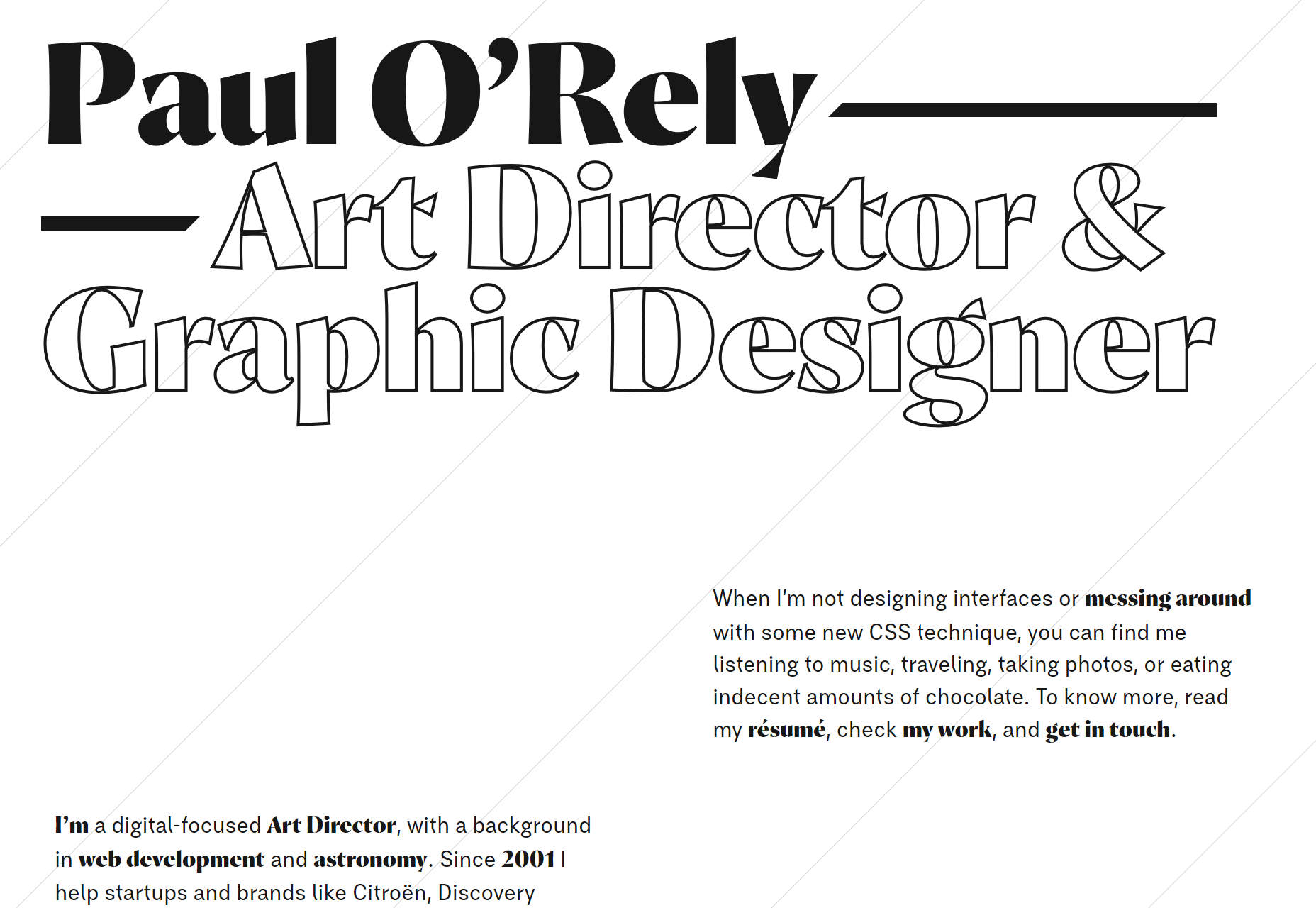
Jack Watkins
Jack Watkins’ portfolio features some lovely typography, and a generally solid aesthetic. The part I really like, though, is the layout. In a world of mobile-first layout—which is important—it seems like big screen often get underutilized. This site bucks that trend. Platform: Static Site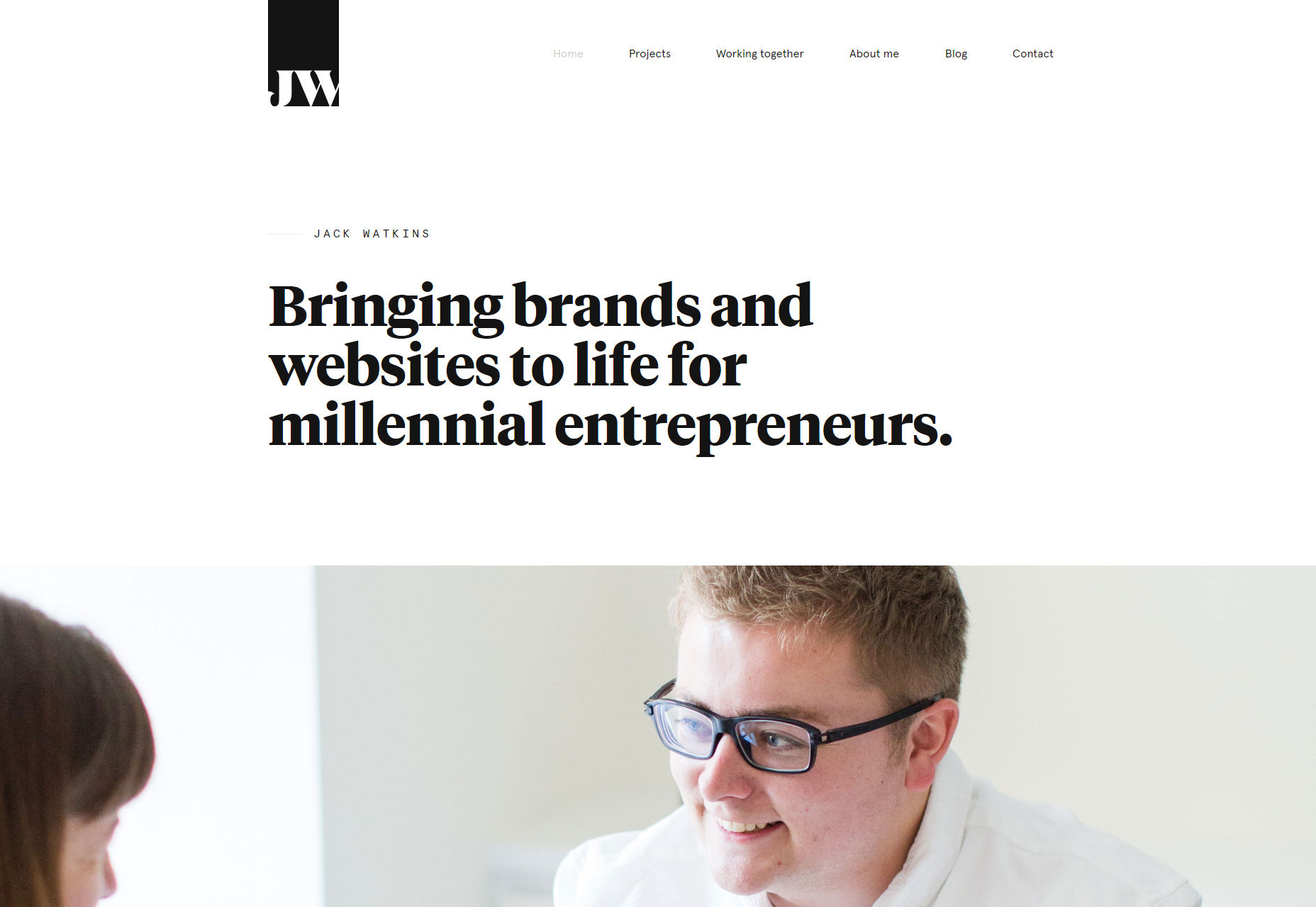
K2
K2 brings us a design that feels rather “Medium-ish”. For all that, it’s pretty, stylish, and a pleasure to browse. What can I say? Medium has good taste. Platform: Drupal
Rubxkub
Rubxkub brings us back a few months to an age when everything was artistic and collage-ridden. Good times. Don’t take my joking the wrong way, it looks beautiful. It’s some good old artsy minimalism. Platform: Static Site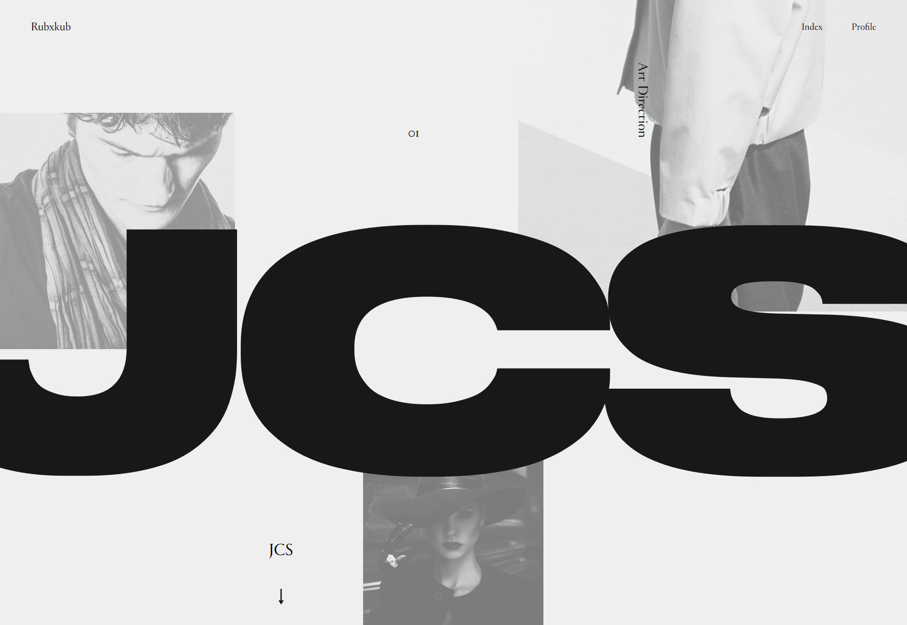
New Need
New Need is a furniture design studio with an emphasis on the modern aesthetic. Their website matches their work with a very PowerPoint style design. Platform: JS App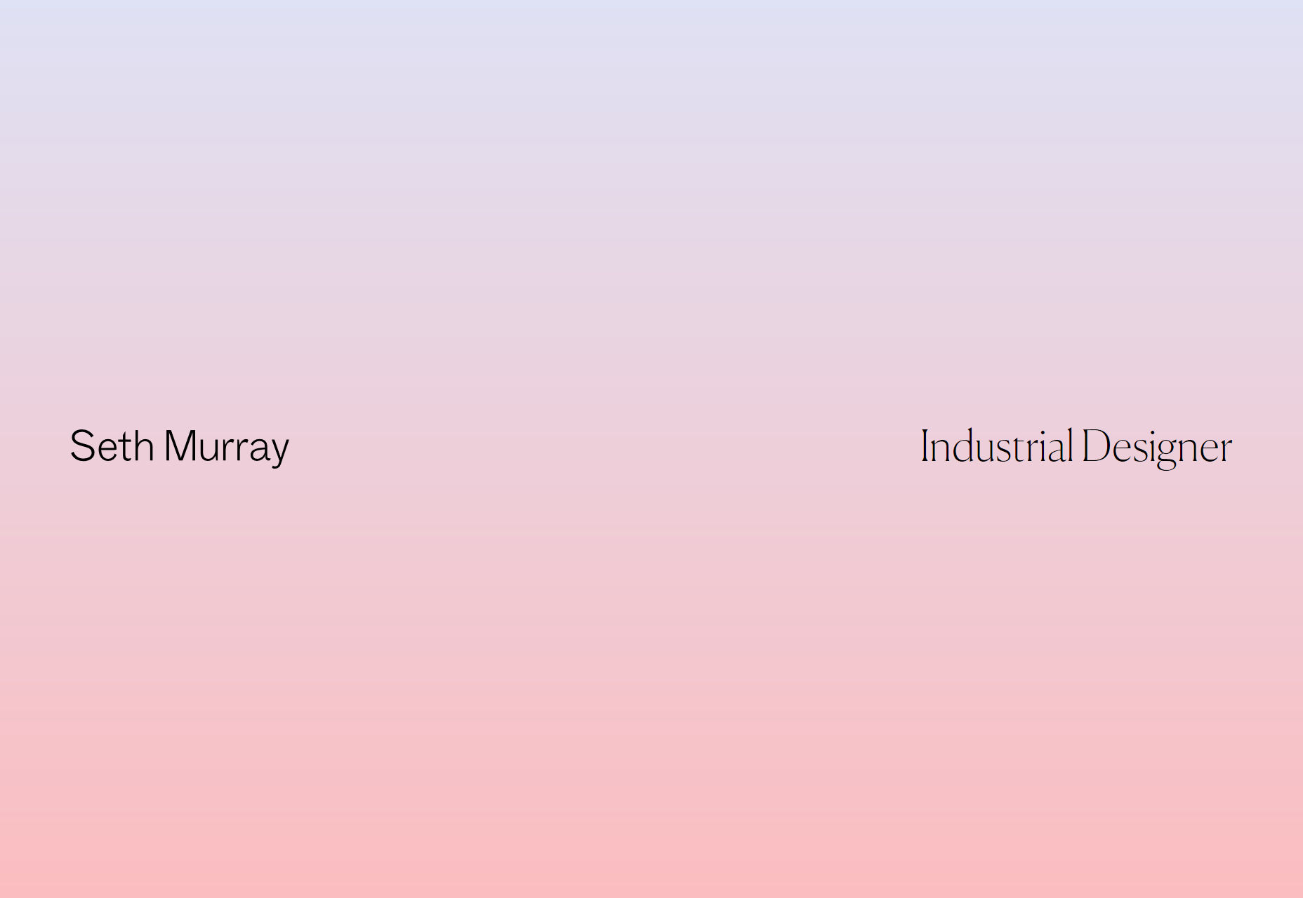
Great Design
Great Design is a boldly named studio with bold black lines everywhere. It’s just how they roll, apparently. I also like how they used independently scrolling columns in their portfolio. I’m not saying we need to be using iframes for everything again, but I will say that I rather like the look of the thing. Platform: Static Site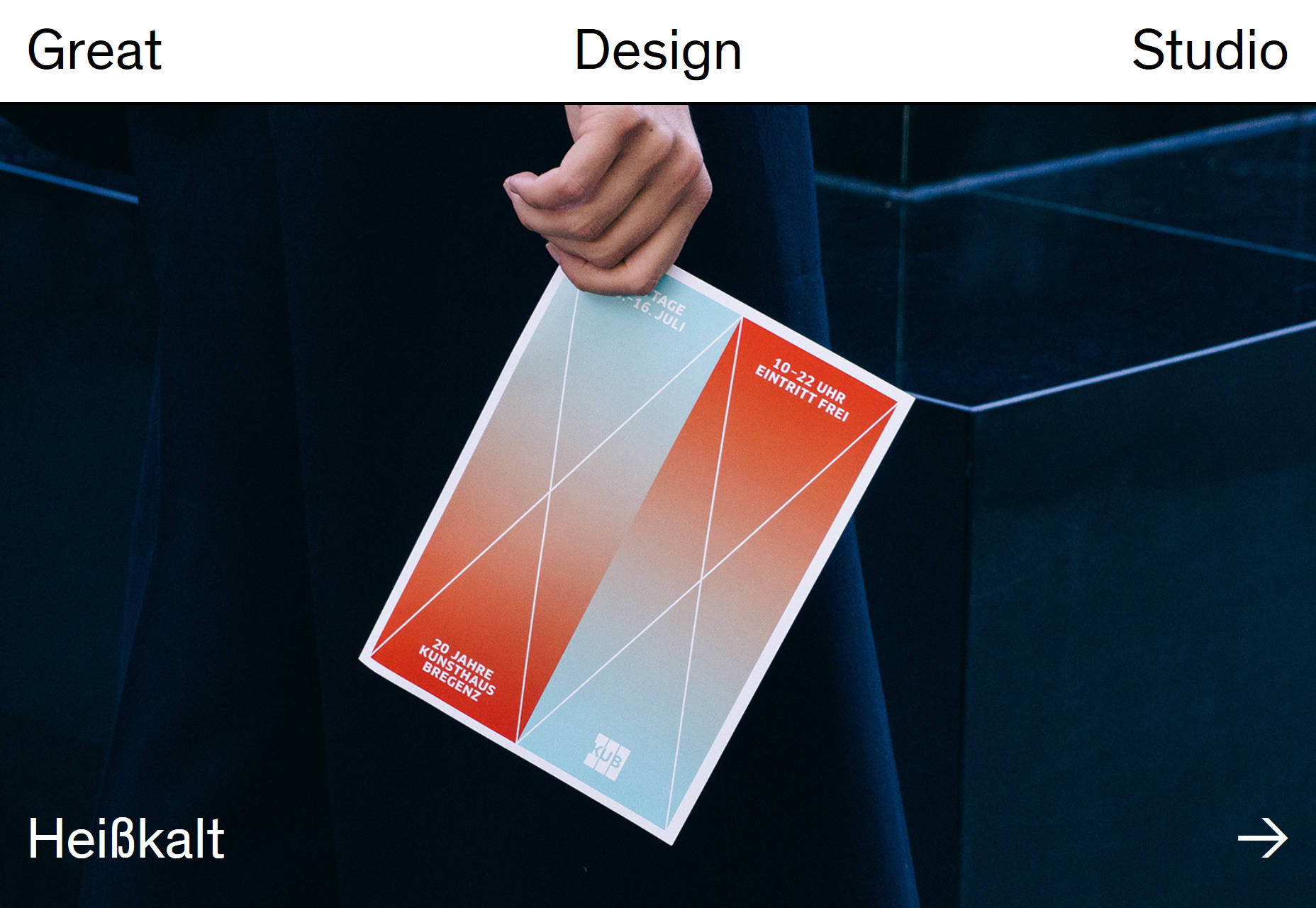
Thomas Williams
For something easier on the eyeballs, look no further than Thomas Williams who comes at us rather gently with a dark design. It’s still trends toward the modernist, but it’s more “solid” than “artsy”. Platform: WordPress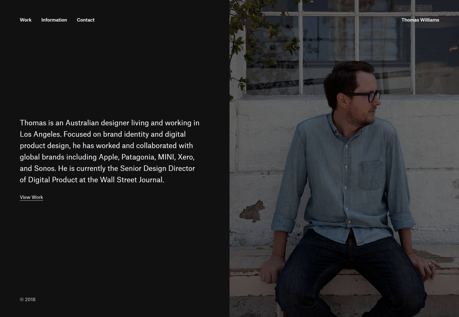
Netrix
Netrix uses a lot of building-block-style imagery, and the masonry layout of the portfolio will cement that concept in your mind in a slightly more subtle way. It does all of this while looking quite classy. Platform: Static Site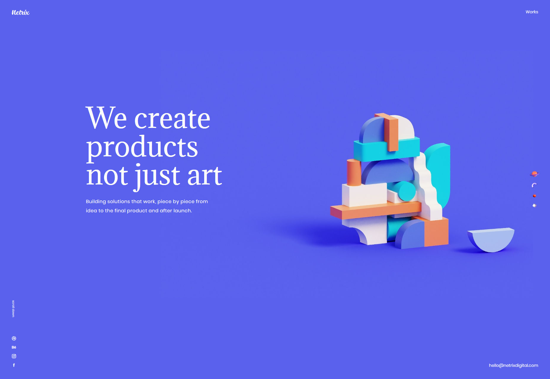
Wonderland
Wonderland is one of those sites that transitions from PowerPoint style to fairly standard minimalism, with a healthy dose of animation all throughout. It also makes nice use of the Lydian typeface, which makes a refreshing change from a lot of the usual typefaces. Platform: VueJS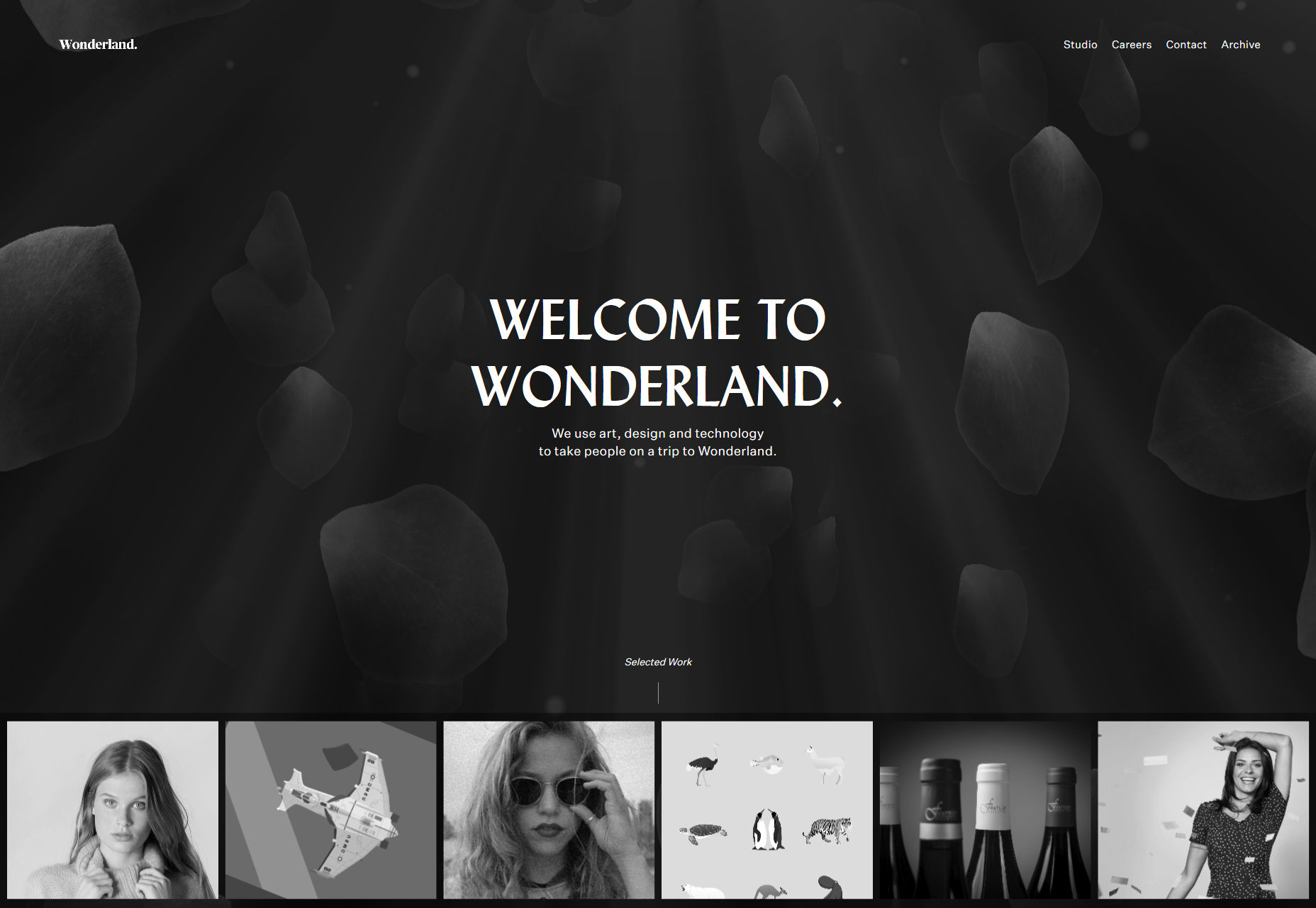
Koysor Abdul
Koysor Abdul’s photography portfolio keeps things simple with earthy tones and a lot of off-white space. Browsing this one is an almost peaceful experience. Platform: Webflow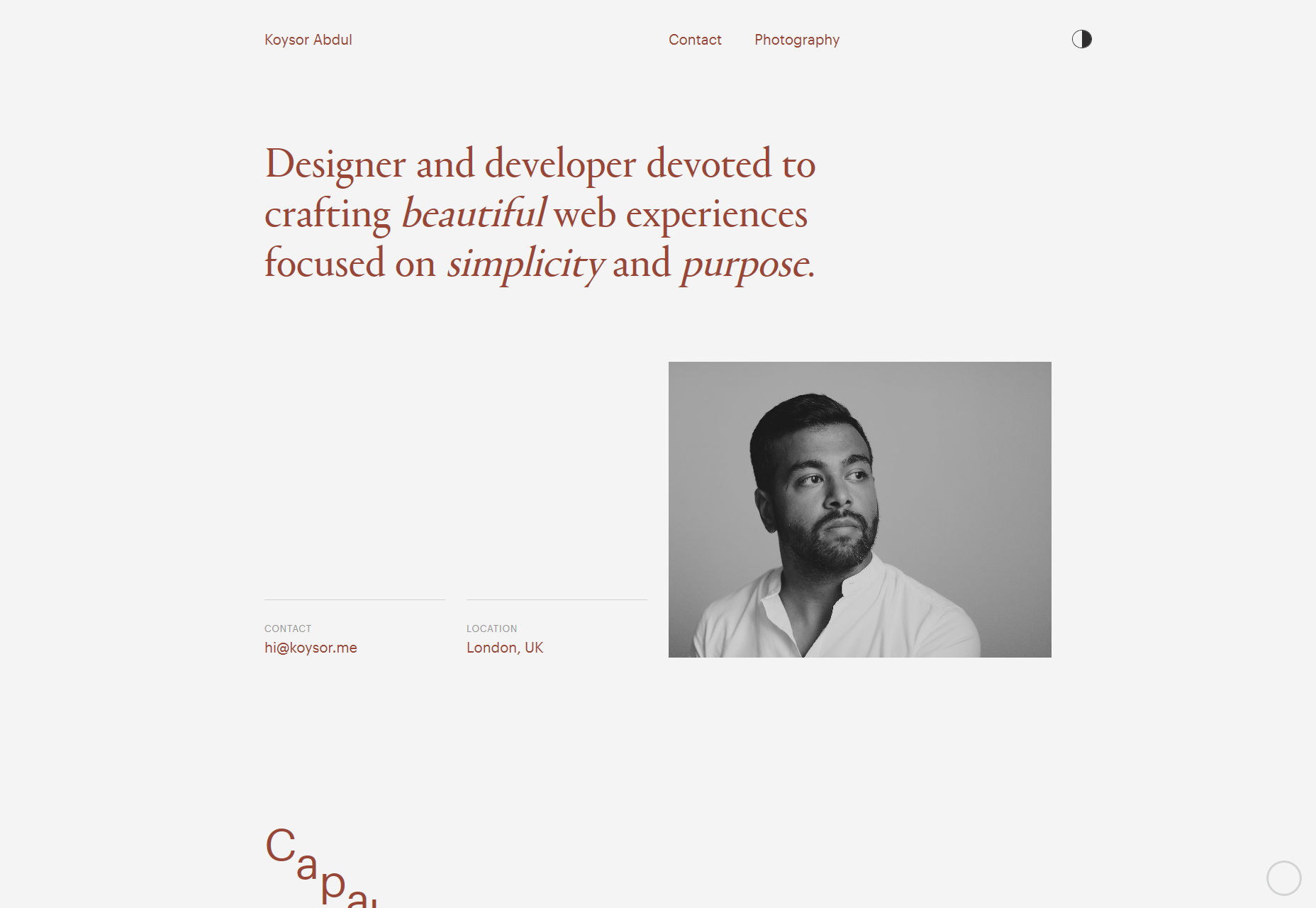
Aristide Benoist
I love to see the trends I’ve known and named evolve over time, and Aristide Benoist’s portfolio is a prime example of that evolution. It has a touch of both the modern and the post-modern, each helping to smooth out the edges of the other. There’s a little asymmetry, but everything still feels intentionally placed. It just feels good. Platform: Static Site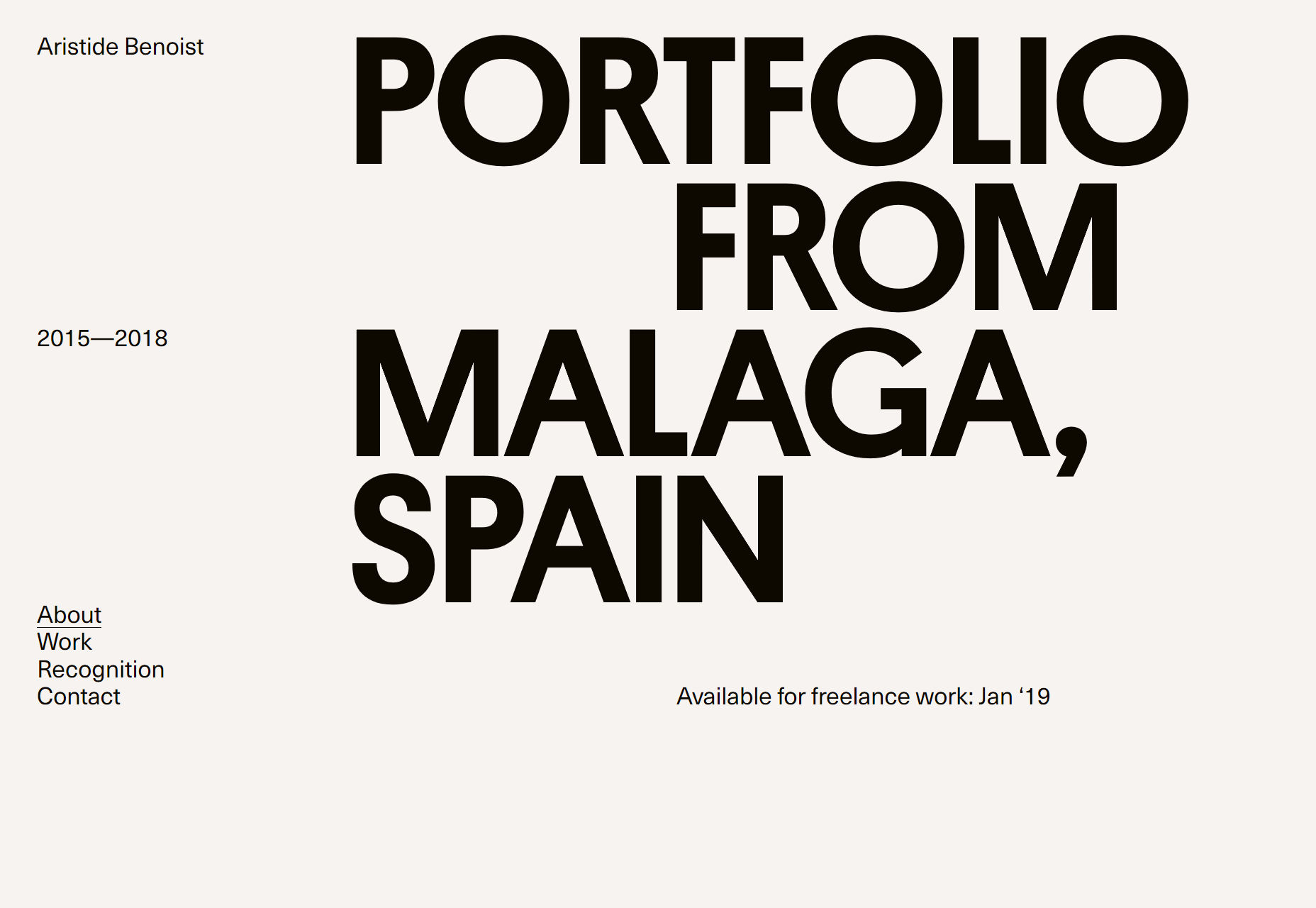
Ezequiel Bruni
Ezequiel Bruni is a web/UX designer, blogger, and aspiring photographer living in Mexico. When he’s not up to his finely-chiselled ears in wire-frames and front-end code, or ranting about the same, he indulges in beer, pizza, fantasy novels, and stand-up comedy.


Read Next

15 Best New Fonts, July 2024
Welcome to our monthly roundup of the best fonts we’ve found online in the last four weeks. This month, there are fewer…
By Ben Moss

20 Best New Websites, July 2024
Welcome to July’s round up of websites to inspire you. This month’s collection ranges from the most stripped-back…

Top 7 WordPress Plugins for 2024: Enhance Your Site's Performance
WordPress is a hands-down favorite of website designers and developers. Renowned for its flexibility and ease of use,…
By WDD Staff

Exciting New Tools for Designers, July 2024
Welcome to this July’s collection of tools, gathered from around the web over the past month. We hope you’ll find…

3 Essential Design Trends, July 2024
Add some summer sizzle to your design projects with trendy website elements. Learn what's trending and how to use these…

15 Best New Fonts, June 2024
Welcome to our roundup of the best new fonts we’ve found online in the last month. This month, there are notably fewer…
By Ben Moss

20 Best New Websites, June 2024
Arranging content in an easily accessible way is the backbone of any user-friendly website. A good website will present…

Exciting New Tools for Designers, June 2024
In this month’s roundup of the best tools for web designers and developers, we’ll explore a range of new and noteworthy…

3 Essential Design Trends, June 2024
Summer is off to a fun start with some highly dramatic website design trends showing up in projects. Let's dive in!

15 Best New Fonts, May 2024
In this month’s edition, there are lots of historically-inspired typefaces, more of the growing trend for French…
By Ben Moss

How to Reduce The Carbon Footprint of Your Website
On average, a web page produces 4.61 grams of CO2 for every page view; for whole sites, that amounts to hundreds of KG…
By Simon Sterne

20 Best New Websites, May 2024
Welcome to May’s compilation of the best sites on the web. This month we’re focused on color for younger humans,…