

 Oh dear God…why?
Thankfully, the representation of web design hasn’t been nearly as ham-fisted as that of information security. Sure, there are plenty of badly designed websites in movies and TV, but it’s getting better. Some may hate to hear this, but we probably have pre-made templates and frameworks to thank for that, because it now requires less effort to create a passable-looking prop site.
For the heck of it, I went down memory lane (and did some Googling, if you must know) to list some of the best and worst web design that our fictional universes have to offer. Some of them exist only in fleeting screenshots of shows, while others have real, live builds up right now. Some exist in both worlds.
Here they are, for your enjoyment. (Note: Some of these are old, and not all have working HTTPS. Just sayin’.)
Oh dear God…why?
Thankfully, the representation of web design hasn’t been nearly as ham-fisted as that of information security. Sure, there are plenty of badly designed websites in movies and TV, but it’s getting better. Some may hate to hear this, but we probably have pre-made templates and frameworks to thank for that, because it now requires less effort to create a passable-looking prop site.
For the heck of it, I went down memory lane (and did some Googling, if you must know) to list some of the best and worst web design that our fictional universes have to offer. Some of them exist only in fleeting screenshots of shows, while others have real, live builds up right now. Some exist in both worlds.
Here they are, for your enjoyment. (Note: Some of these are old, and not all have working HTTPS. Just sayin’.)
1. Chumhum
Ah, The Good Wife. Was it a bit soap-ish? Yes. Was it also littered with stunning performances by amazing actors? Was the sometimes-over-the-top drama balanced by interesting characters, and genuinely hilarious moments? Yes to all of that. Protagonist Alicia Florrick represents a tech company or two in the show, and many plot points revolve around web technology and the information age. One of the most notorious examples is that of Chumhum, a Google stand-in that copies the dead-simple aesthetic, but adds a cuddly mascot. The screenshot featured here is of a live mockup that is integrated with DuckDuckGo, a search engine with a mascot of its own. My ranking: I can’t fault the UX or aesthetics for much beyond maybe the small height of the text box. I mean, how complicated do you want your search?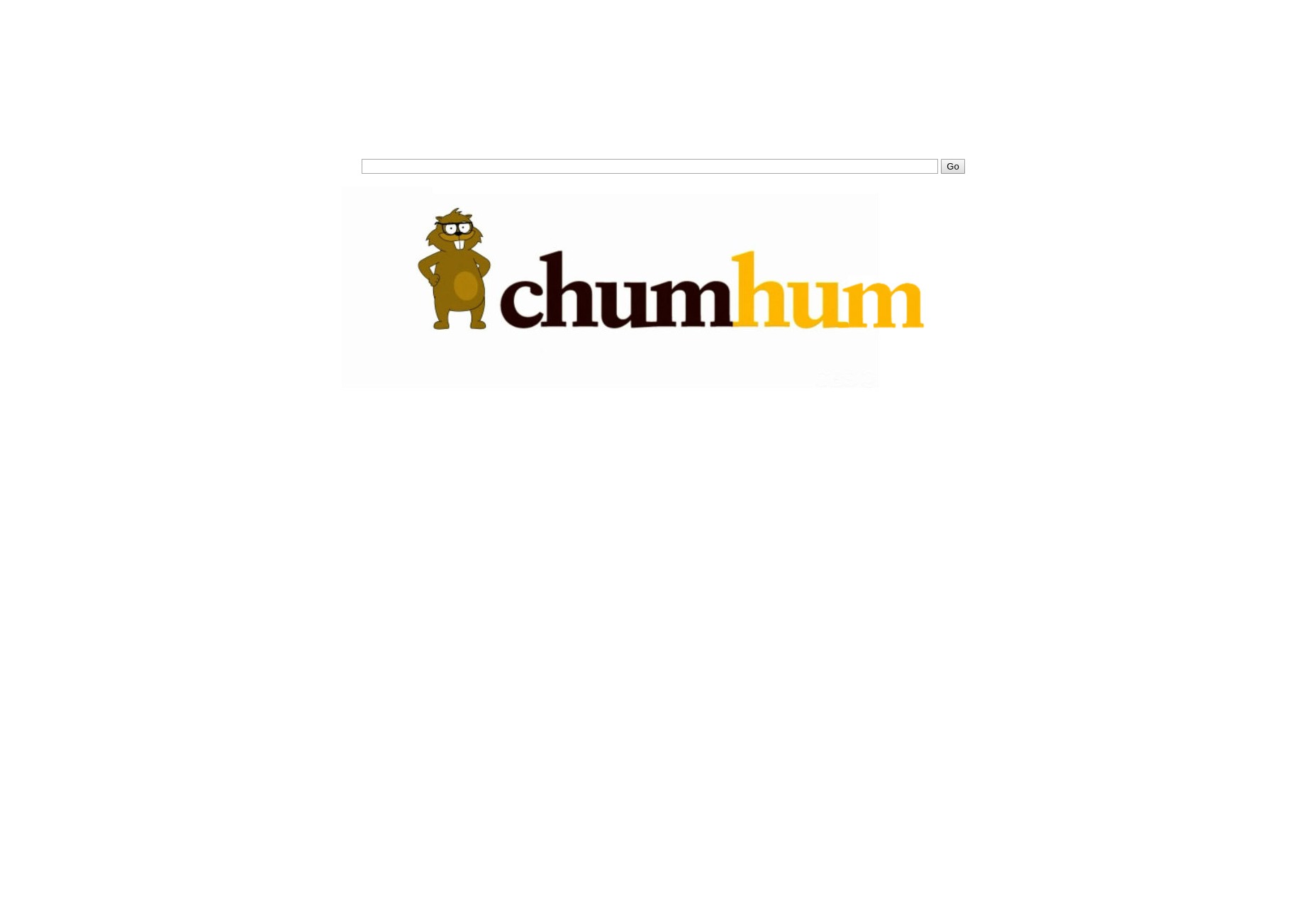
2. Trask Industries
In X-Men: Days of Future Past, Trask Industries is a corporation dedicated to dealing with “the mutant menace”. For all that, their website looks like a fairly standard corporate presentation-style site with a heavy emphasis on background video and simple animation. My ranking: It’s a bit JavaScript-heavy for my personal taste, but the aesthetic itself feels understated in a calm and professional way. I am gonna give it extra points just for the photos/video of Peter Dinklage, and say this is one of the better ones.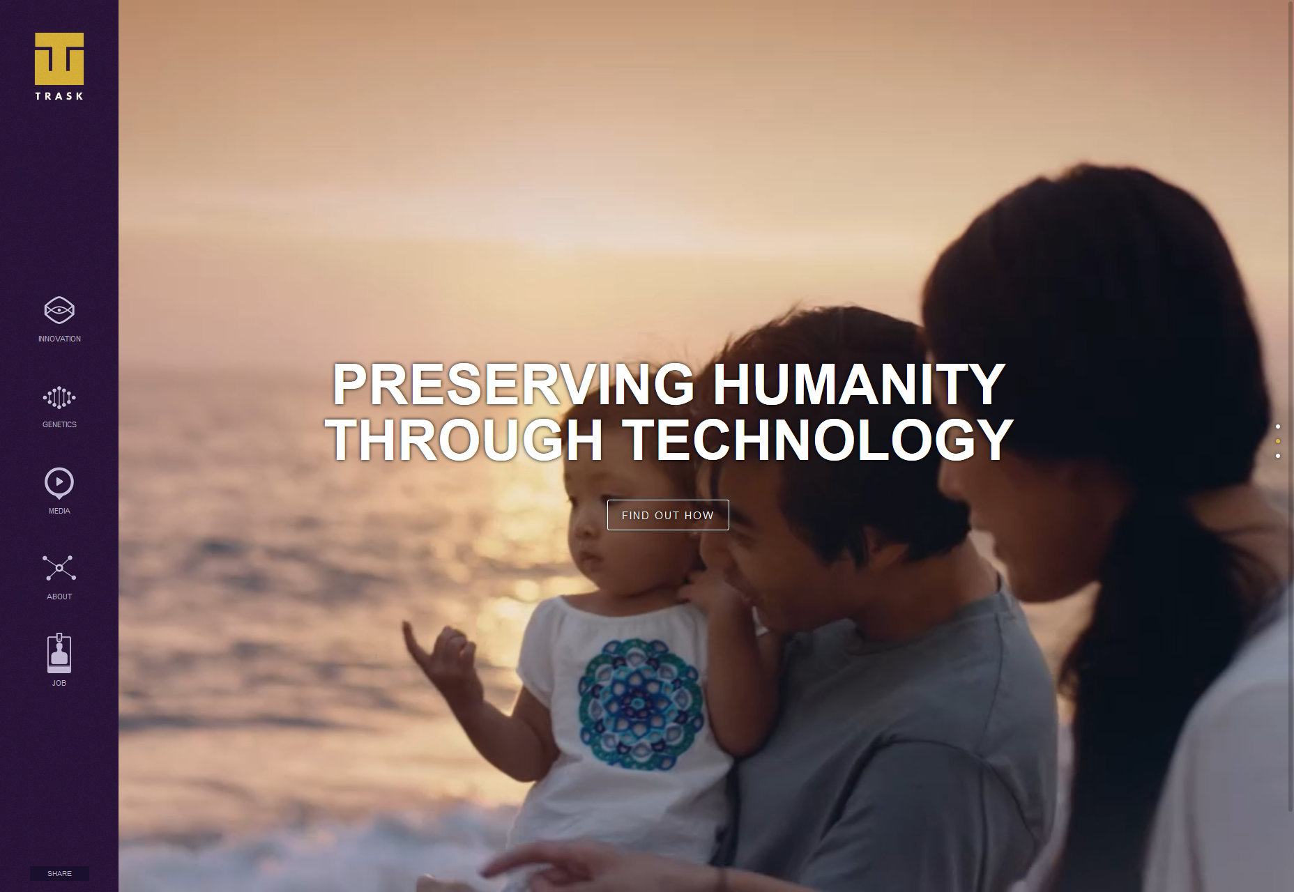
3. Masrani Global Corporation
The Masrani Global Corporation site (from Jurassic World) has a sort of low-key corporate feel like Trask Industries, and much less in the way of fancy flourishes. It feels a lot like a premade template. My ranking: It’s rather middle-of-the-road. While perfectly serviceable, it feels like they spent about as much money refining the details of their site as they did on not letting dinosaurs eat people. It loses a couple more points for having a splash video. Seriously, who does that? People who are bad with dinosaur security, that’s who.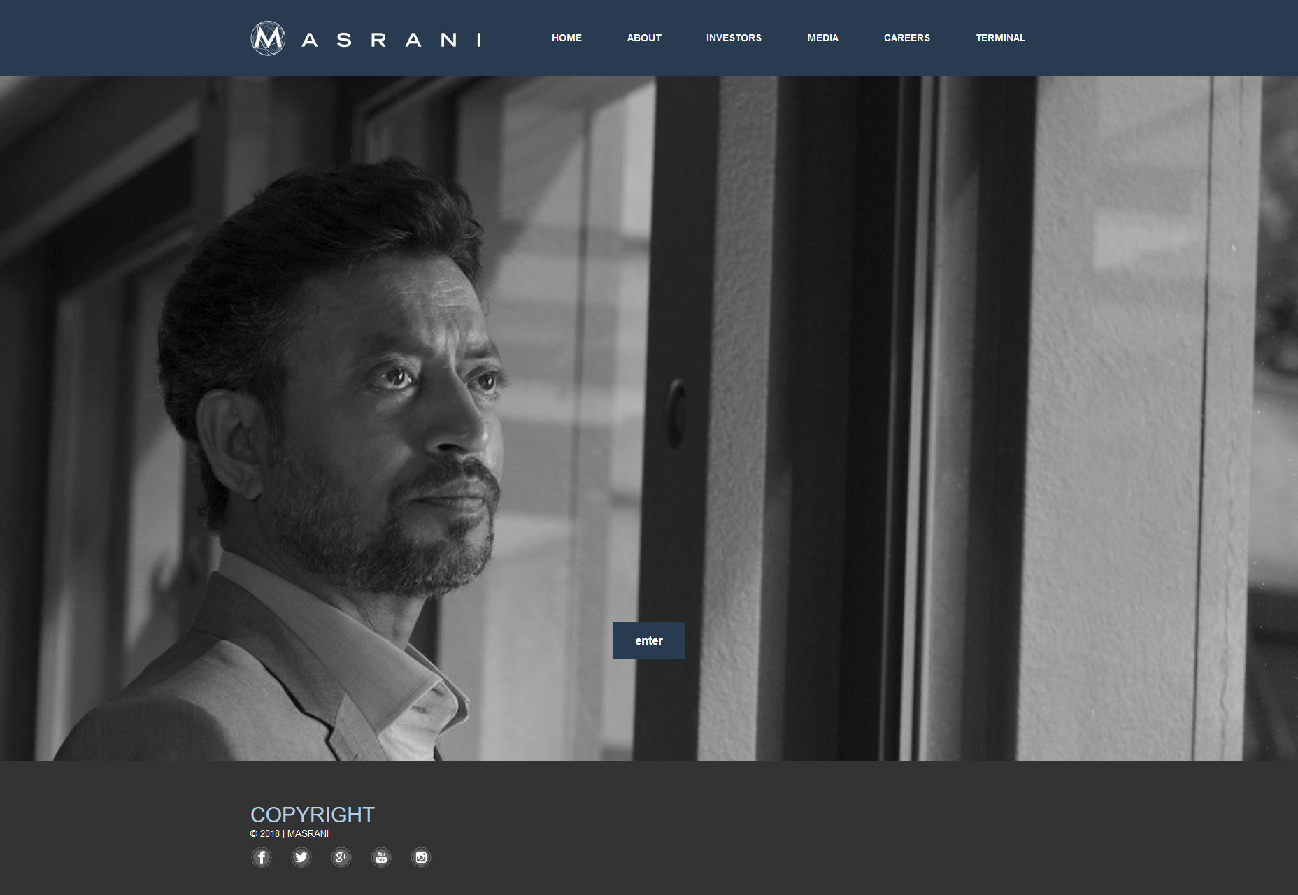
4. Pawnee
The City of Pawnee’s website (Parks and Recreation) is what you get when you use a government budget on the cheapest, oldest HTML 4 template you can find. It’s got illustrations, very small photos, very little in the way of typography, and even less in the way of layout. My ranking: As a website, it’s terrible. And because it’s terrible, it’s the perfect prop. It’s exactly what you’d expect a small-town website originally built in the ‘90s (probably) to look like.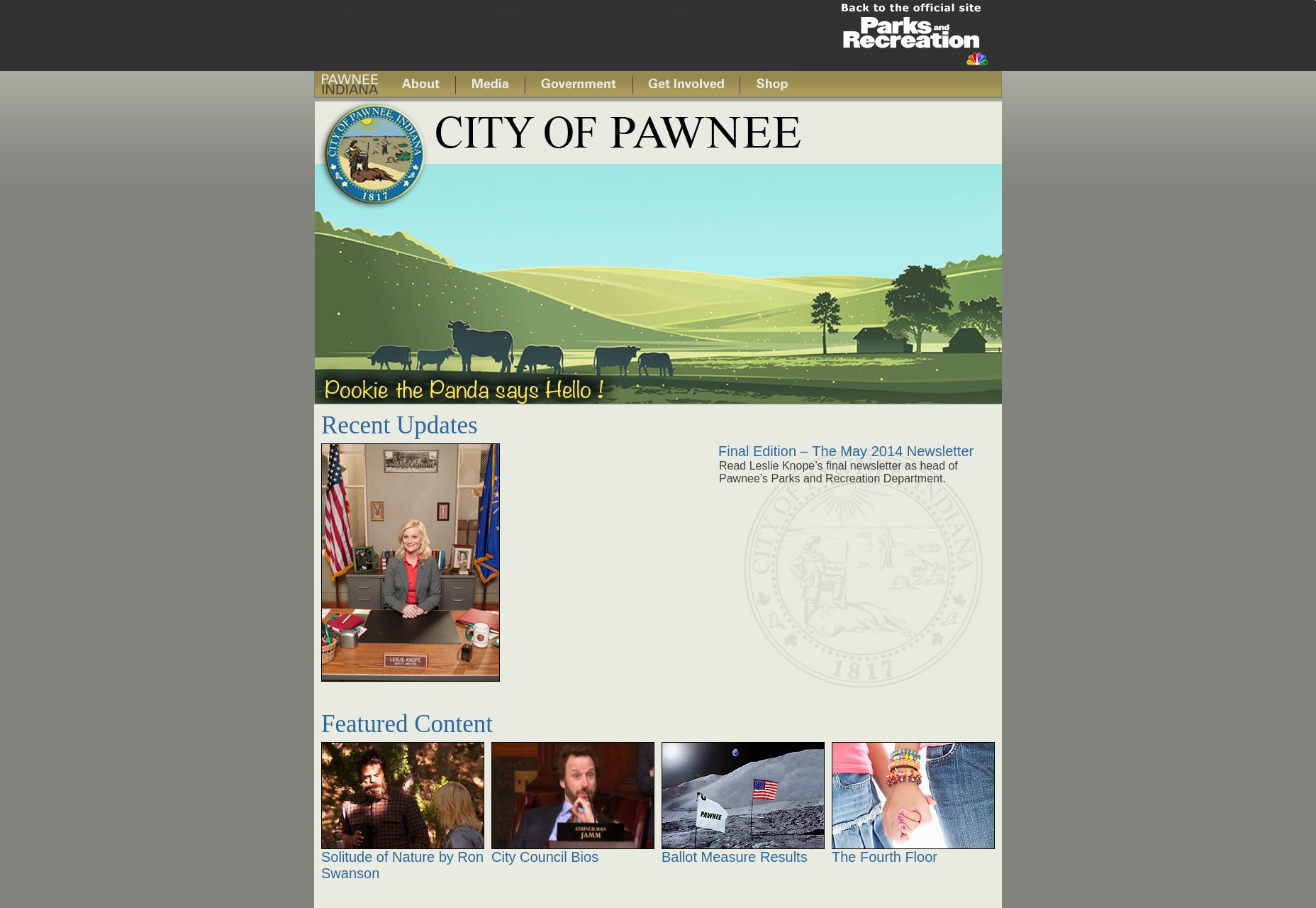
5. Pied Piper
Let’s bring it to the tech sector with Silicon Valley. This is Pied Piper’s website. It’s simple, it’s corporate, and it all looks exactly like it was designed by a developer who has a general idea of how modern websites look, but hasn’t practiced a lot. My ranking: As a website, it gets the job done. What really sells that “designed by a developer” feel for me is the typography. It has all the basic elements of a good website without the polish you get with experience.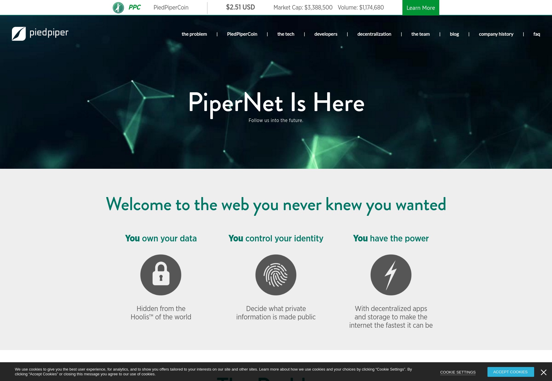
6. War of 1996
Ah Independence Day 2. It’s a perfectly mediocre movie with a website to match. The design is presentational and modern, but kind of stuck in the ‘90s. I feel like that’s appropriate, though, since web design and many other aesthetic disciplines might stagnate with interstellar war on the horizon. My ranking: It loses points for auto-playing audio, even if it’s epic music and that fantastic Independence Day speech from the first movie. It’s alright, otherwise.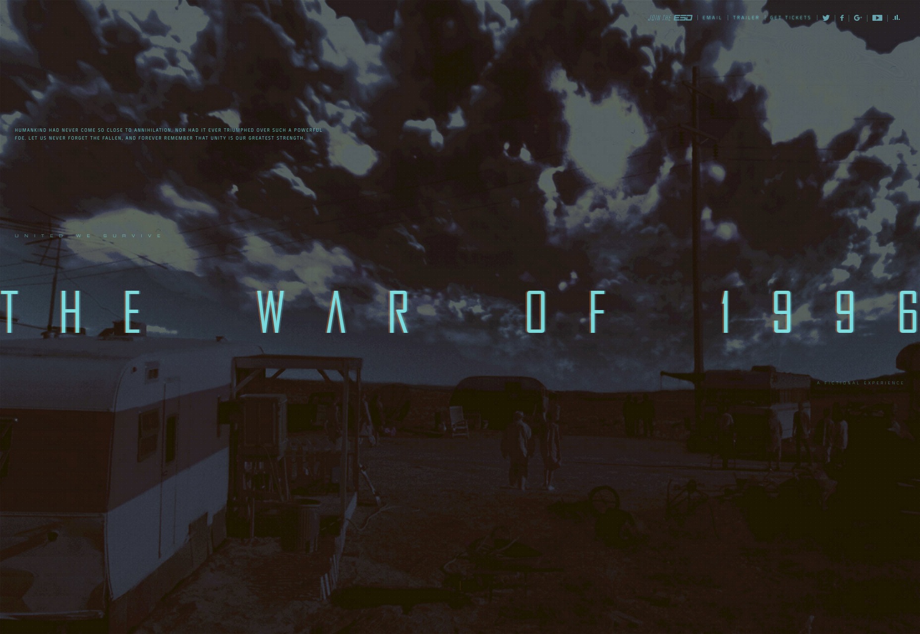
7. Save Walter White
The Save Walter White website (Breaking Bad) looks like it was built with GeoCities in mind. Since it’s supposed to have been built by Walter’s son, who is most decidedly not a professional. He just wants to save his dad. I think we can let this one slide. My ranking: It’s awful. It’s ugly. That’s appropriate.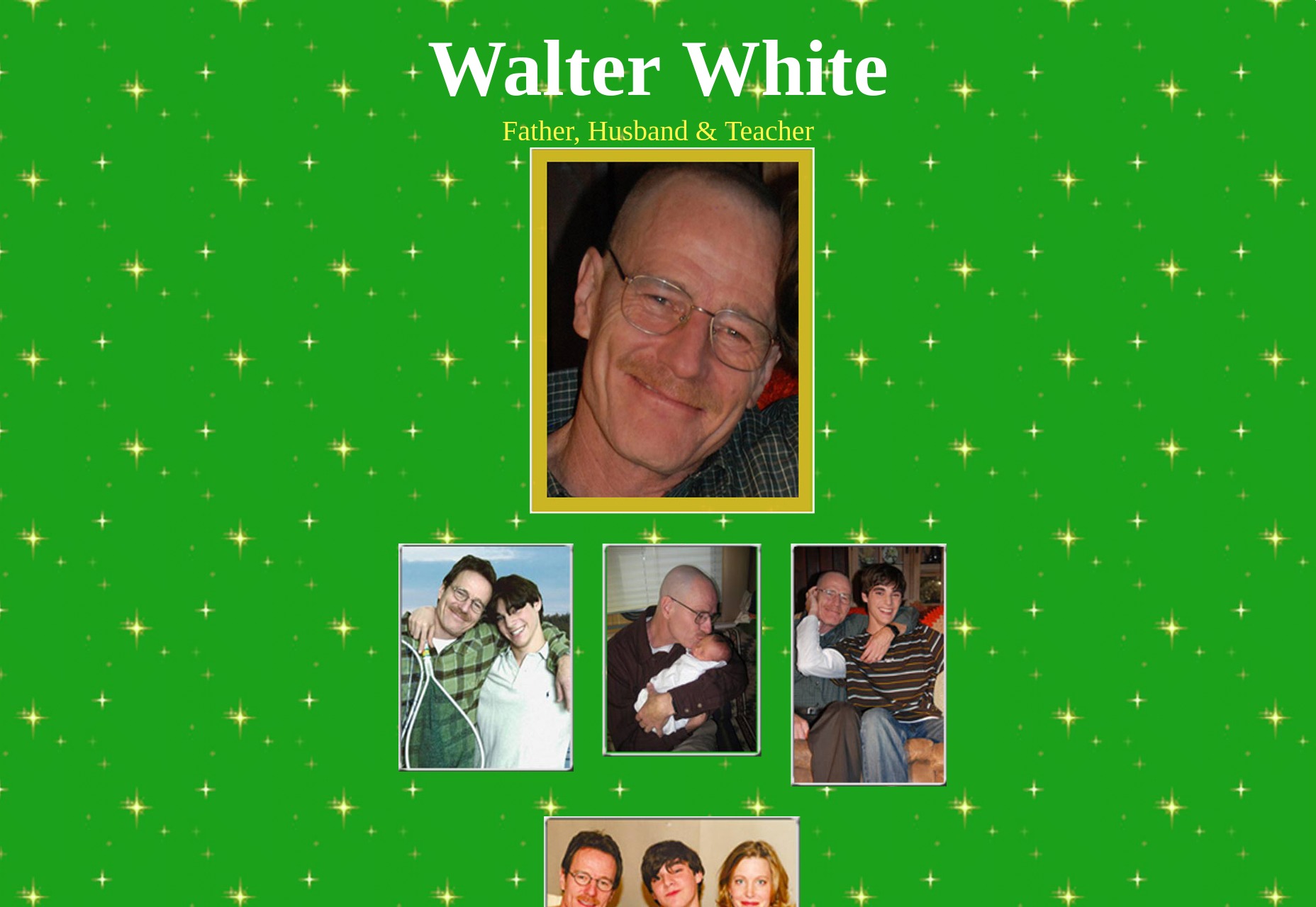
8. John Watson’s Blog
John Watson’s Blog was created to market the BBC’s Sherlock. While it certainly wasn’t a perfect show, they did pay great attention to detail in crafting the world. This would include what appears to be a standard blog theme that could run on any platform. My ranking: It’s one more of those sites that I couldn’t call “pretty”, but it doesn’t need to be. It needs to hold words and make them readable.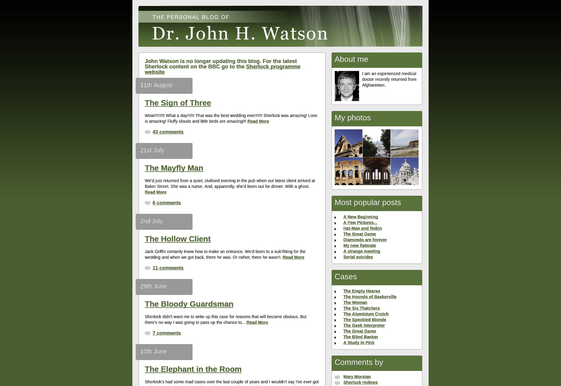
9. Grade my Teacher
Last, and definitely least, we come to Grade my Teacher from How I Met Your Mother. This one doesn’t even warrant a ranking. It’s abominable. It’s an image mockup on a repeating background. Approximately half an hour of Photoshop work went into this, and then they called it a day. Look, if it was just going to be a static prop (nothing wrong with that), why would they bother making it live? This low-effort “website” should have stayed purely fictional.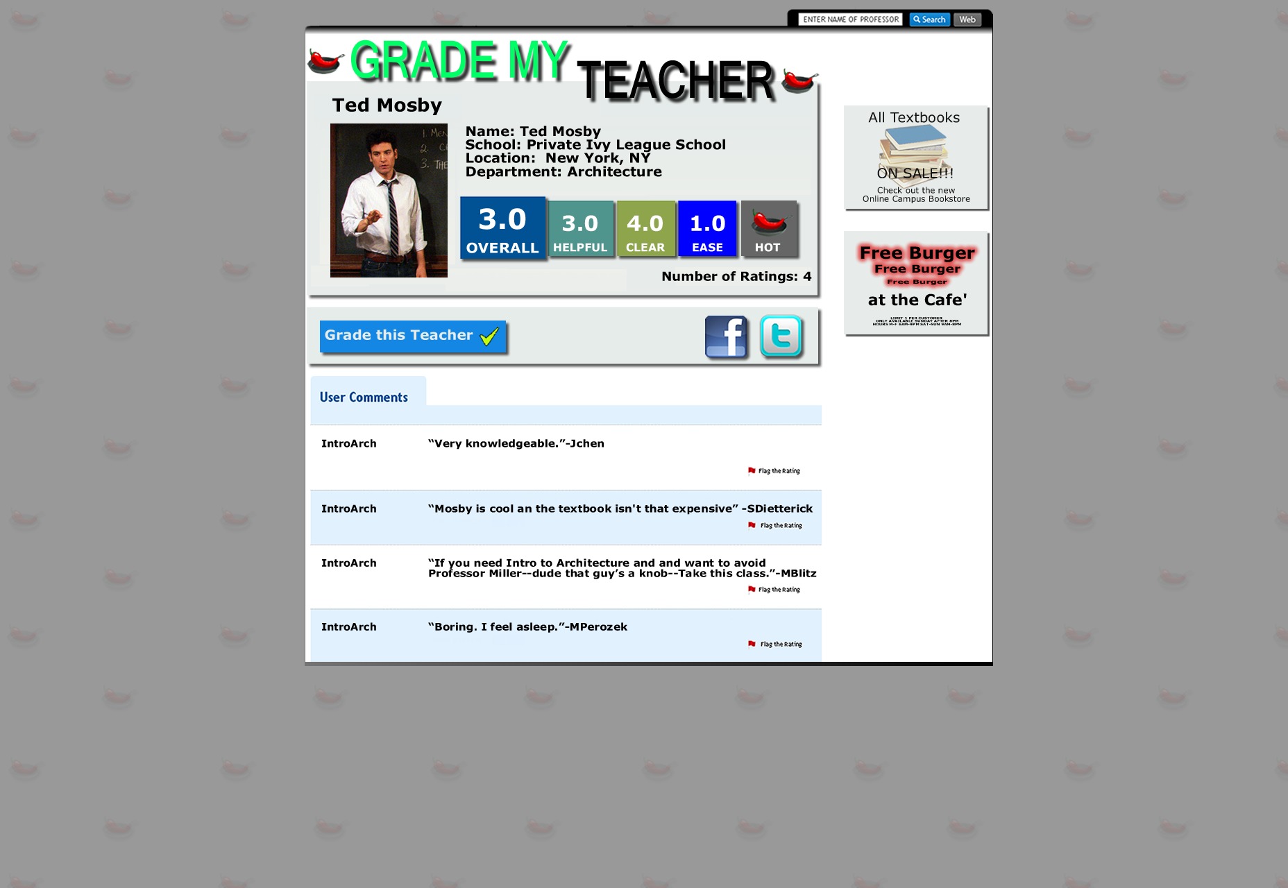
Ezequiel Bruni
Ezequiel Bruni is a web/UX designer, blogger, and aspiring photographer living in Mexico. When he’s not up to his finely-chiselled ears in wire-frames and front-end code, or ranting about the same, he indulges in beer, pizza, fantasy novels, and stand-up comedy.


Read Next

3 Essential Design Trends, May 2024
Integrated navigation elements, interactive typography, and digital overprints are three website design trends making…

How to Write World-Beating Web Content
Writing for the web is different from all other formats. We typically do not read to any real depth on the web; we…
By Louise North

20 Best New Websites, April 2024
Welcome to our sites of the month for April. With some websites, the details make all the difference, while in others,…

Exciting New Tools for Designers, April 2024
Welcome to our April tools collection. There are no practical jokes here, just practical gadgets, services, and apps to…

How Web Designers Can Stay Relevant in the Age of AI
The digital landscape is evolving rapidly. With the advent of AI, every sector is witnessing a revolution, including…
By Louise North

14 Top UX Tools for Designers in 2024
User Experience (UX) is one of the most important fields of design, so it should come as no surprise that there are a…
By Simon Sterne

What Negative Effects Does a Bad Website Design Have On My Business?
Consumer expectations for a responsive, immersive, and visually appealing website experience have never been higher. In…

10+ Best Resources & Tools for Web Designers (2024 update)
Is searching for the best web design tools to suit your needs akin to having a recurring bad dream? Does each…
By WDD Staff

3 Essential Design Trends, April 2024
Ready to jump into some amazing new design ideas for Spring? Our roundup has everything from UX to color trends…

How to Plan Your First Successful Website
Planning a new website can be exciting and — if you’re anything like me — a little daunting. Whether you’re an…
By Simon Sterne

15 Best New Fonts, March 2024
Welcome to March’s edition of our roundup of the best new fonts for designers. This month’s compilation includes…
By Ben Moss

LimeWire Developer APIs Herald a New Era of AI Integration
Generative AI is a fascinating technology. Far from the design killer some people feared, it is an empowering and…
By WDD Staff