

How to Create a Visually Appealing Instagram
Before starting to post content on Instagram, you want to decide on an overall theme. Think of your theme as the way you want to be perceived and what feelings you want to create. By creating a theme, you’ll be able to make your Instagram posts and profile more consistent—as opposed to just sharing random posts without any thought behind them. Creating an overall theme is also great since it makes your profile more instantly recognizable and makes it stand out from your competitors. There are several elements to creating a theme with your Instagram posts, and these elements make up an overall theme, but these are the most important aspects you want to pay attention to:1. Pick a Color Scheme
Having a consistent color scheme on Instagram is probably the easiest way you can make your Instagram profile more visually appealing fast. Creating a color scheme is simple, too! Simply decide on which colors/side of colors that you want your account to lean towards and then go with that. It’s not necessarily that your posts need to be all about a single color every time, but it’s more common to focus on warm/cold schemes, as well as choosing a color and then incorporating various colors that are variants of the chosen color. You can choose 1-3 colors that you want to focus on, and which you will always incorporate in your posts. Just take a look at Coca-Cola. No matter where you come across them, it’s obvious which colors they want you to associate their brand with.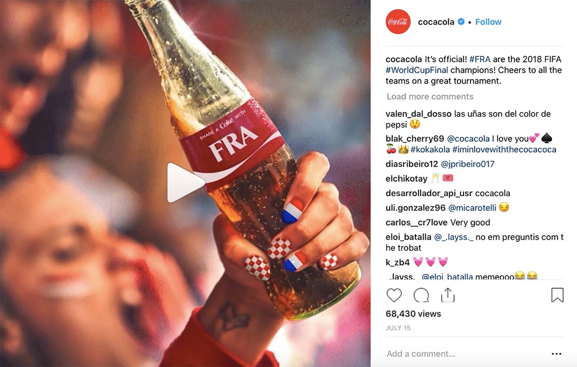 A consistent color scheme is key to a consistent theme, and this allows your posts and profile to look more coherent, but most importantly, it helps make your posts Instantly recognisable. Once you’ve chosen your colors, there are several ways to make your posts aligned with your color scheme.
One of the most common is to edit them in the same way and then increase the saturation of the objects in the image that are your color scheme color.
Another common and effective method is to strategically include elements in your images which have the color of your color scheme.
A consistent color scheme is key to a consistent theme, and this allows your posts and profile to look more coherent, but most importantly, it helps make your posts Instantly recognisable. Once you’ve chosen your colors, there are several ways to make your posts aligned with your color scheme.
One of the most common is to edit them in the same way and then increase the saturation of the objects in the image that are your color scheme color.
Another common and effective method is to strategically include elements in your images which have the color of your color scheme.
2. Choose One Filter and Stick With It
This is similar to having a color scheme, but there is nothing that say you can’t work with filters AND use a filter as well. Choosing a filter and then using it consistently is the ultimate way to make your posts more coherent. The filter adds a similar look and style to your posts, and this allows you to create an obvious connection between all of your posts. Using a consistent filter to make your posts more connected is super simple. Simply go through Instagram’s filters (or filters in any editing app) and then choose one that you like. Now, just use it consistently across all your posts. A great example is @Aleksandrazee. With her consistent filters, she has been able to create a very coherent feed that looks extremely inviting.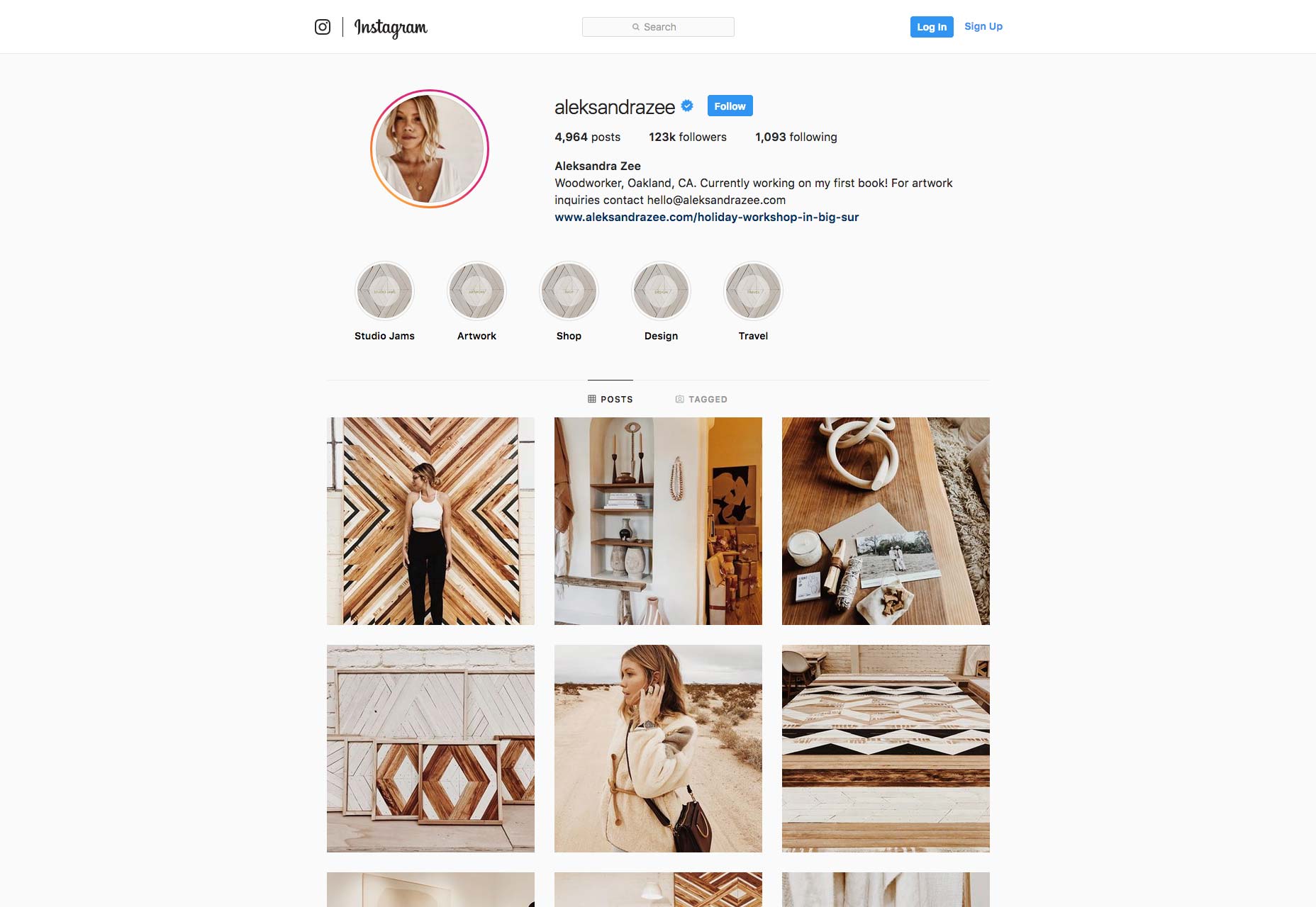
3. Don’t Forget to Take Great Photos
First things first. Before you do anything else, it’s crucial that you focus on this above all. The reason is that it’s very hard to save a low-quality image with the help of a filter. Instagram is a visually-driven social platform, and this demands you to pay great attention to the images you take. Not just the way you edit them. You don’t need a super expensive camera to take great photos anymore. The phone in your pocket is more than enough. Just make sure that you avoid any rookie mistakes when photographing, such as having a dirty lens, shaking, taking blurry pictures, and so on. Also, when taking photos, you also want to think of what you’re going to post about, and this brings me to my next point…4. Choose a Subject
This one is super important. While how your images look is also very important, if your posts are just beautiful but don’t really bring any real value, they won’t see a lot of traction anyway. This is why you need to not only focus on creating appealing images, but also focus on what you’re going to take images of. Ask yourself: ”What are my followers and fans interested in?” and then build upon that. After all, this may be the most important step to creating a visual appealing feed, so pay some extra attention to it.5. Audit Your Images
Before posting on Instagram, you need to make sure that they are up to standards. Both in terms of quality, but also in a visual theme and style sense. Does your post align with your visual theme? Does your post align with your style, color scheme, and overall theme? If so, great! Go ahead and post it. If not, you may want to rethink posting it.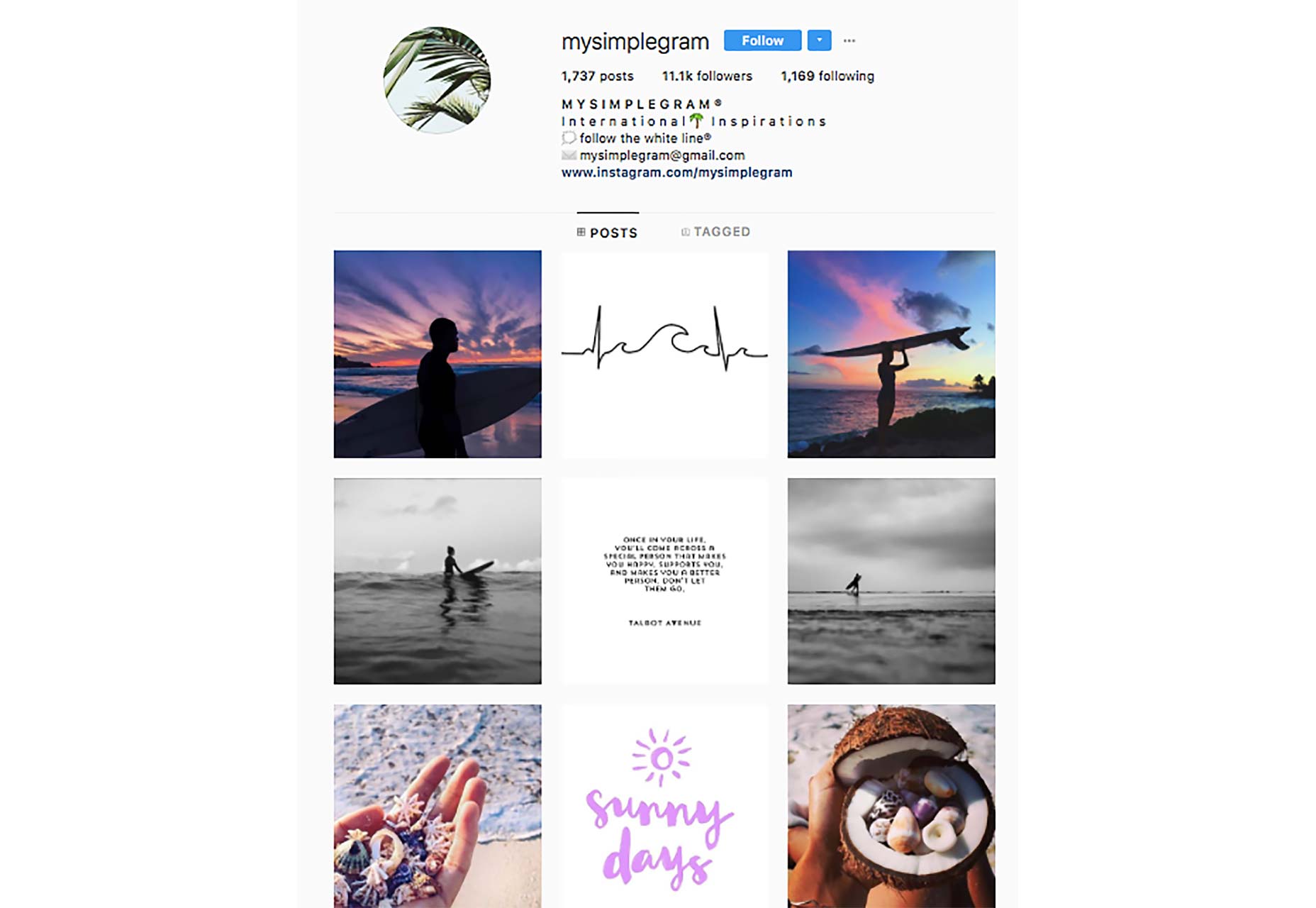
6. Use Natural Light
Bad lightning is often the reason for low-quality images on Instagram, and I cannot emphasise just how important good lightning is for your Instagram posts’ quality. If you have bad lightning for your images, it won’t matter that much if you use consistent colors or a consistent filter, because good lightning really lays the foundation for a great photo on Instagram. And make sure you don’t use poor lightning, for example from a lamp. Natural light is always best. With natural light, you’ll be able to take higher quality photos with a greater sharpness and quality.7. Plan Your Feed Layout
Most people on Instagram just choose pictures to upload randomly, but think about the fact that your Instagram posts are after posting, showcased in your profile like a collage, and paying attention to how your posts look in unity is part of making your Instagram profile visually appealing. Sharing visually appealing images is the first step, but if you truly want to go above and beyond, planning your feed layout is the answer. Don’t just pay attention to how the image looks in people’s feed, but consider how you can make your profile feed visually appealing and coherent. Before sharing any new posts, ask yourself, “How will my feel look with this image in it?” This allows for greater planning with your feed.8. Set up Your Profile Properly
When it comes to designing your Instagram profile properly, it’s not only about creating visually appealing content for your page. Even though the visual content you post plays an important role in your success on Instagram—no matter what you wish to achieve—If you haven’t designed and set up your profile properly, it will cripple your success on the platform. As such, you need to begin by completing all of the information boxes in your Instagram profile. Start by adding a profile picture to your account. Make sure that it is high-quality and attention grabbing. Ideally, it should be in a strong color, alternatively the color of your visual theme. If you have your own personal brand where you yourself are your brand, a faceshot is great. On Instagram, your profile picture will display as 110 x 110 pixels in the mobile app. But if you look at your profile from the web, it will be displayed in a larger size, so Instagram recommends that you use an image that is 180 x 180 pixels for optimal quality. Second, you have your bio, also known as profile description. This is probably the most important part of your Instagram profile. You only have 150 characters for your Instagram bio, so it’s important that you are clear, concise, and to the point. Your Instagram needs to quickly tell people who you are, what you do, and why they should follow you. Lastly, you have the contact information. If you have an Instagram business profile, you have the option to add contact buttons to your Instagram profile, which includes call, email, and location. If you don’t, you still have the option to add your website to your profile. This helps add more context to your audience, and allows you to tell them what you do.Jens Wirdenius
Jens Wirdenius is the editor-in-chief and co-founder of Veloce International online marketing blog and the influencer directory Veloce Network. He is a social media and marketing nut, sharing his passion for online marketing and business in his articles.


Read Next

15 Best New Fonts, July 2024
Welcome to our monthly roundup of the best fonts we’ve found online in the last four weeks. This month, there are fewer…
By Ben Moss

20 Best New Websites, July 2024
Welcome to July’s round up of websites to inspire you. This month’s collection ranges from the most stripped-back…

Top 7 WordPress Plugins for 2024: Enhance Your Site's Performance
WordPress is a hands-down favorite of website designers and developers. Renowned for its flexibility and ease of use,…
By WDD Staff

Exciting New Tools for Designers, July 2024
Welcome to this July’s collection of tools, gathered from around the web over the past month. We hope you’ll find…

3 Essential Design Trends, July 2024
Add some summer sizzle to your design projects with trendy website elements. Learn what's trending and how to use these…

15 Best New Fonts, June 2024
Welcome to our roundup of the best new fonts we’ve found online in the last month. This month, there are notably fewer…
By Ben Moss

20 Best New Websites, June 2024
Arranging content in an easily accessible way is the backbone of any user-friendly website. A good website will present…

Exciting New Tools for Designers, June 2024
In this month’s roundup of the best tools for web designers and developers, we’ll explore a range of new and noteworthy…

3 Essential Design Trends, June 2024
Summer is off to a fun start with some highly dramatic website design trends showing up in projects. Let's dive in!

15 Best New Fonts, May 2024
In this month’s edition, there are lots of historically-inspired typefaces, more of the growing trend for French…
By Ben Moss

How to Reduce The Carbon Footprint of Your Website
On average, a web page produces 4.61 grams of CO2 for every page view; for whole sites, that amounts to hundreds of KG…
By Simon Sterne

20 Best New Websites, May 2024
Welcome to May’s compilation of the best sites on the web. This month we’re focused on color for younger humans,…