

Robbygraphics
Robbygraphics starts us off with some modernist minimalism and a touch of illustration. It’s a part of that business-friendly wave of design that I mentioned recently, and it’s a fine example of the trend. My only critique is that the hero image on the home page could really be SVG. PNG is great and all, but large vector illustrations are better served in a vector format, these days. Platform: WordPress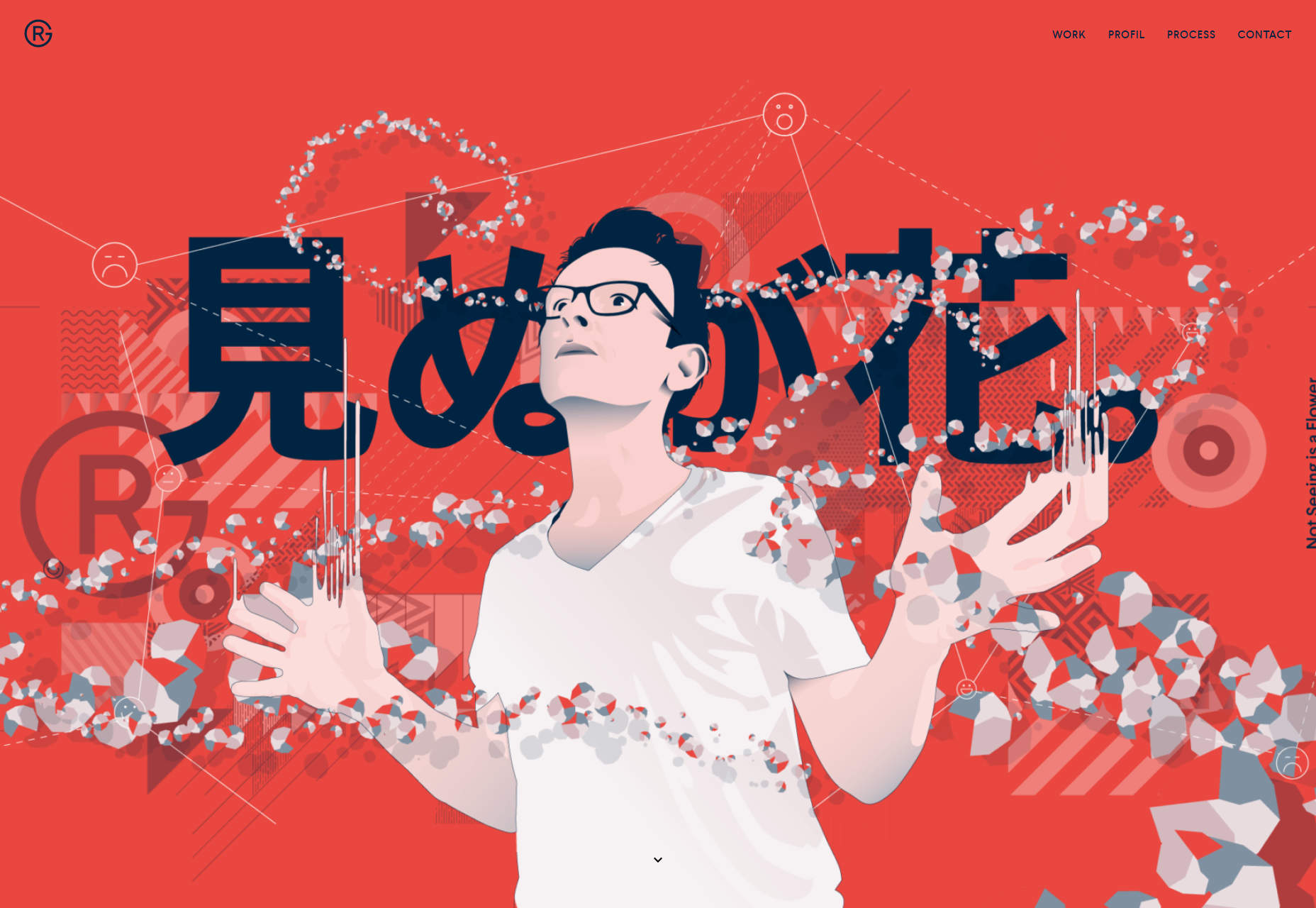
O
Yup, this designer is named “O”. The one-page portfolio is a bare-bones as the name, with simple typography, screenshots, and red blobs that change shape as you scroll. I’m not a huge fan of animations that absolutely depend on having smooth scrolling turned on (I keep it turned off), but overall, it’s a good-looking site. Platform: Custom CMS built on Ruby (I think)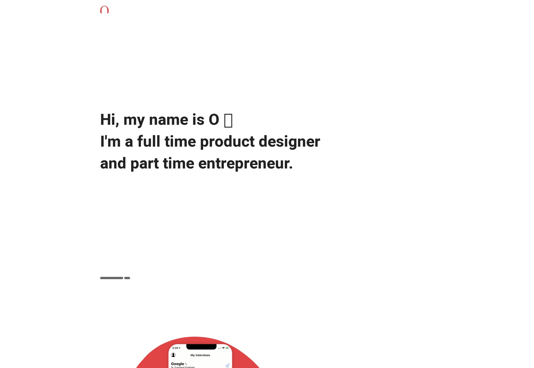
Florent Biffi
Florent Biffi stands out in the crowd with bold text on a sort of… wrinkled cloth texture? Look, the effect, while simple, is fairly striking. I haven’t seen it a lot. The rest of the site is fairly standard sans-serif fare with thick headings and occasionally-overlapping elements. That first striking visual is enough to keep a user scrolling all on its own, and that’s the point, isn’t it? Platform: Static Site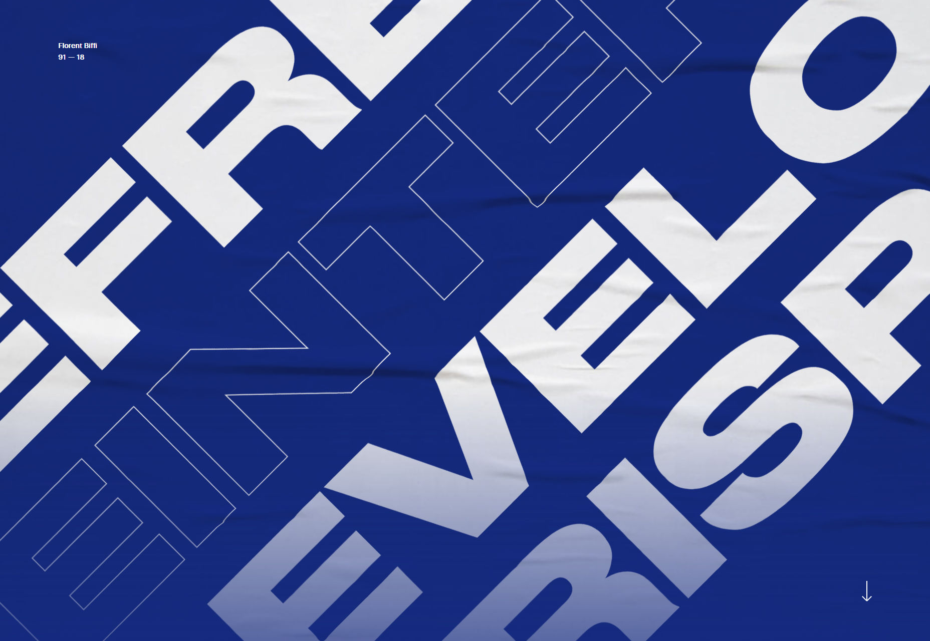
Timo Kuilder
Timo Kuilder makes new-age-ish cip-art-ish illustrations that look… way better than that sounds. So of course the whole site leans into the aesthetic, using a light masonry collage of the work to sell their services. Platform: Cargo Combined with Backdrop, apparently.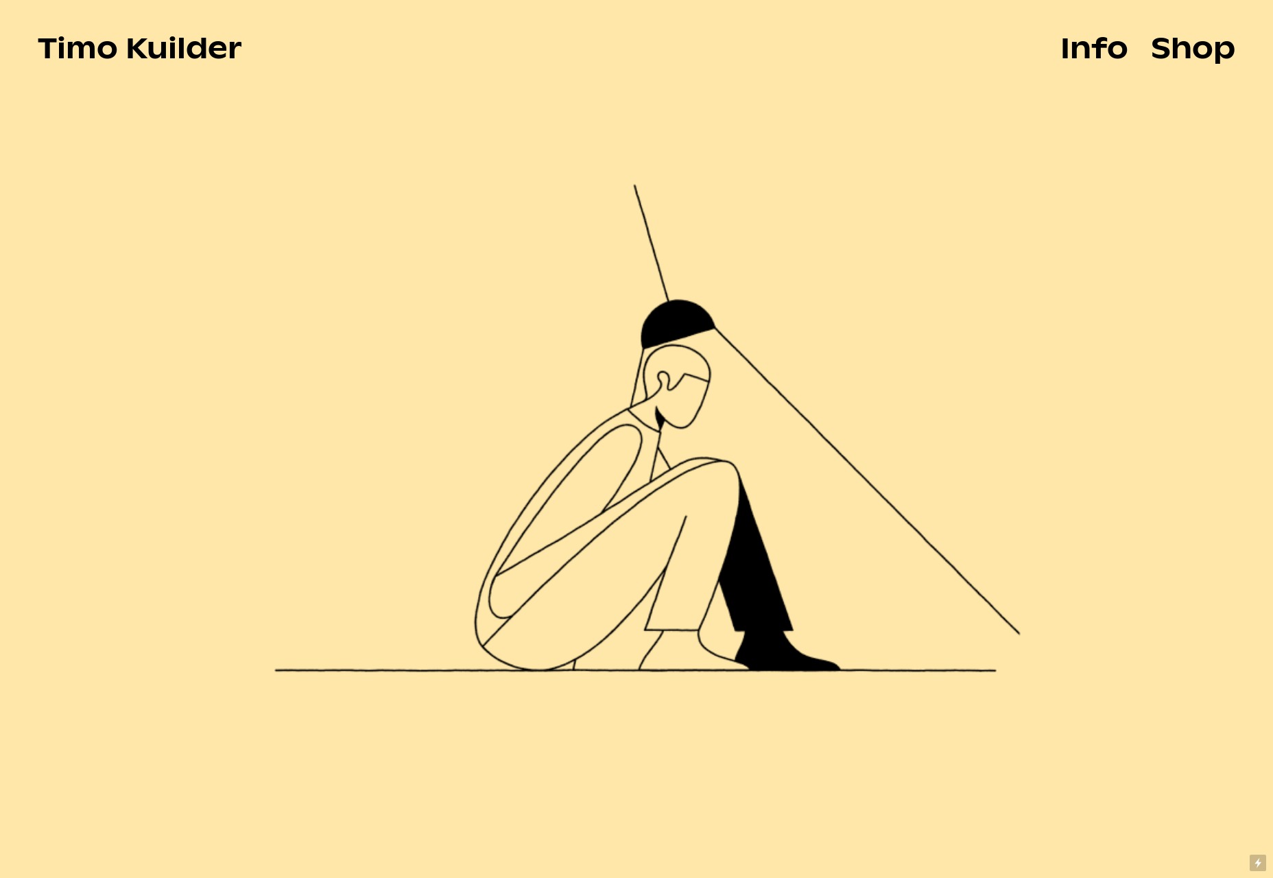
D7 Creative
D7 Creative takes an interesting and highly interactive approach by making every section of their one-pager look almost completely different. I mean, that’s one way to showcase your range, right? Plus, they have a fully functioning game of Snake that you can play. It’s not the most visually consistent approach, but rules are made to be broken eventually. Platform: WordPress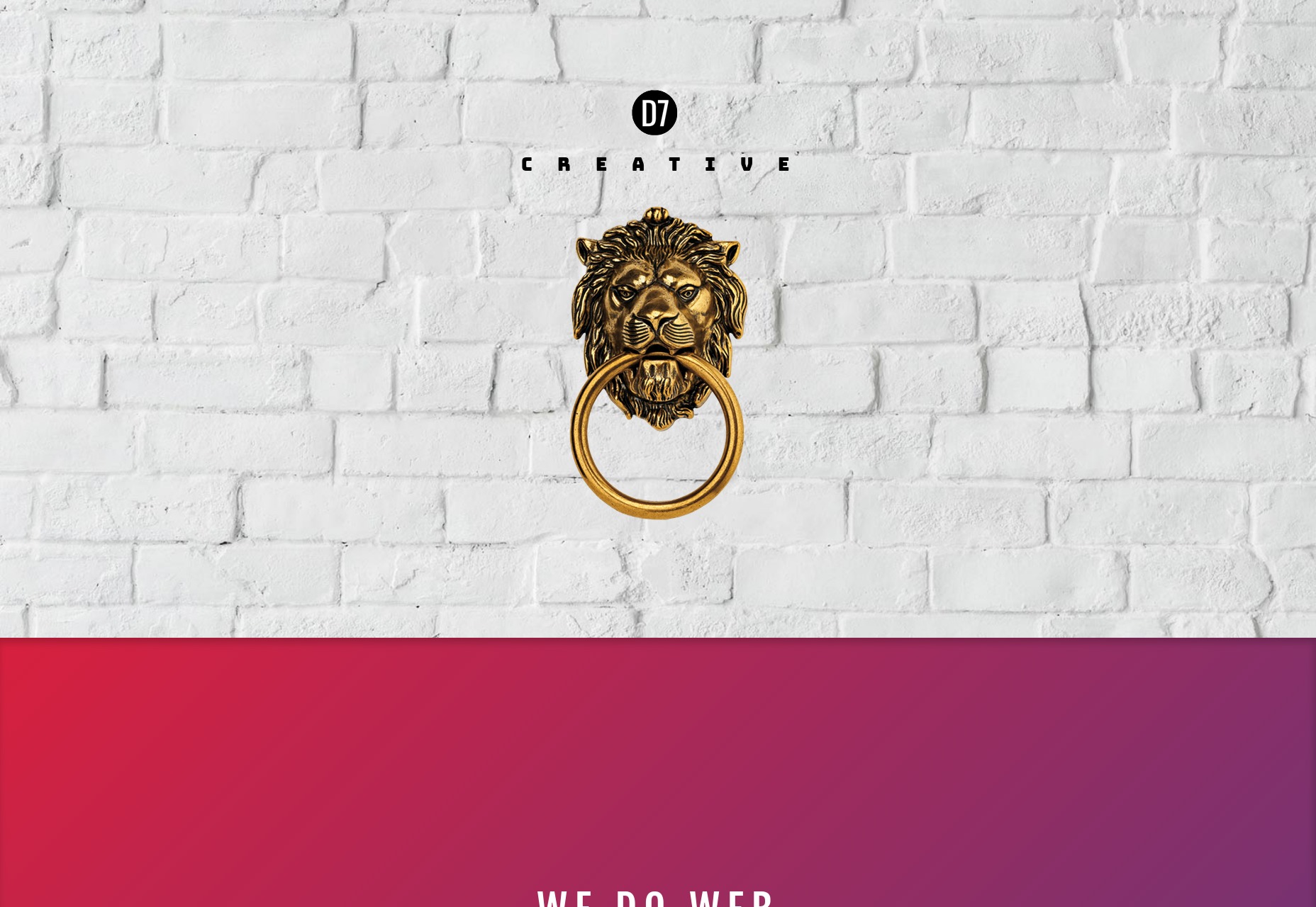
Playground
Playground is a fusion of the corporate-friendly aesthetic (including lots of solid blue and red) with the constantly-overlapping elements of more post-modernist web design. There’s also plenty of animation, but it’s understated enough that it’s not too distracting. I like this style a lot, but don’t make me come up with a name for it, please. Platform: Static Site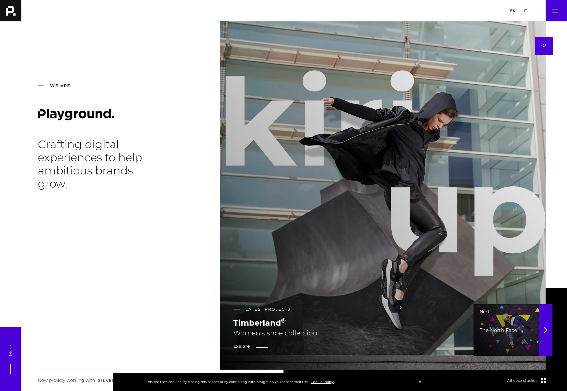
Camilo Alvarez
Camilo Alvarez hit me right in the nostalgia. I had a phase where I used a sort of “film grain” effect for almost everything. Well the film grain is back with an animated vengeance, overlaid on a sort of post-minimalist design. As with most of these sites, it’s a bit JS-heavy for me, but it’s pretty and it’s making me feel young again, so it’s here on the list. Platform: WordPress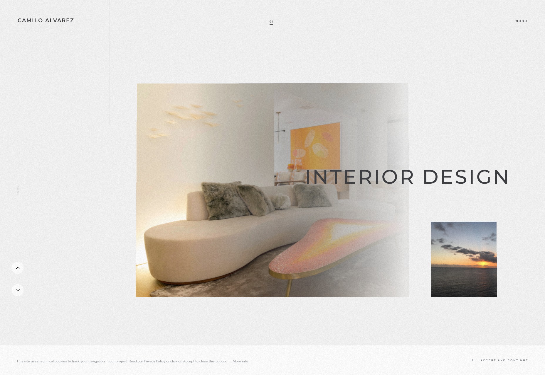
Fly Digital
Fly Digital is going very minimalist, and reminds me of the ’90s in a good way. I normally wouldn’t recommend a handwriting typeface for body text, but when there’s this little text, you can get away with it. Though the text could be bigger. And I wouldn’t blur out those client logos on the home page, even if you are going to unblur them on hover. Otherwise, the site feels handmade and old-fashioned without feeling amateurish. It’s a fine line to walk, but they’re doing it. Platform: WordPress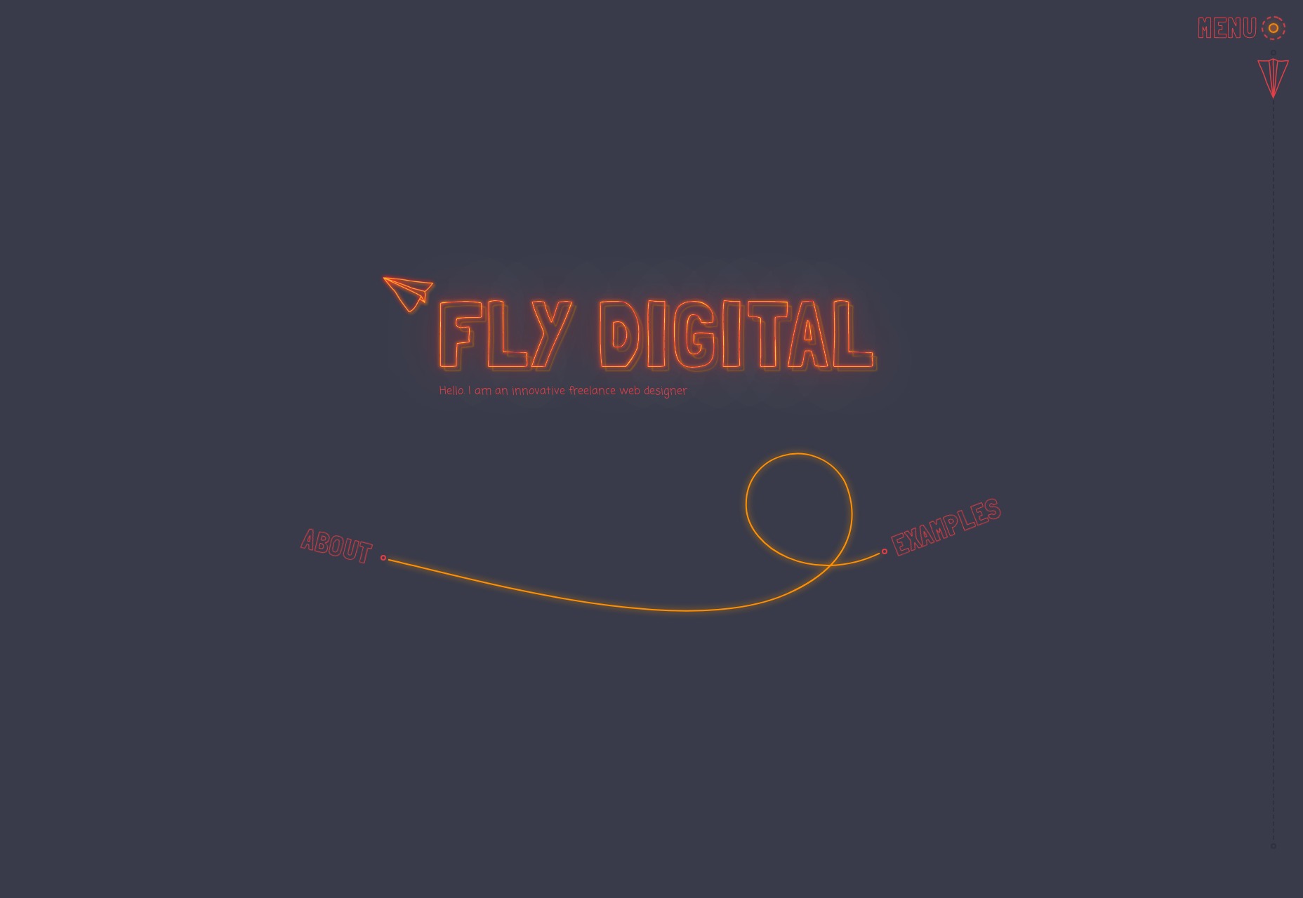
epo
Where other sites merely feel modern, epo feels super modern. It’s like flat design had a baby with a corporate color palette. It’s like easy listening music in web design form. None of that is criticism, mind you. If it gets them the clients they want, then it’s doing the job right. Platform: WordPress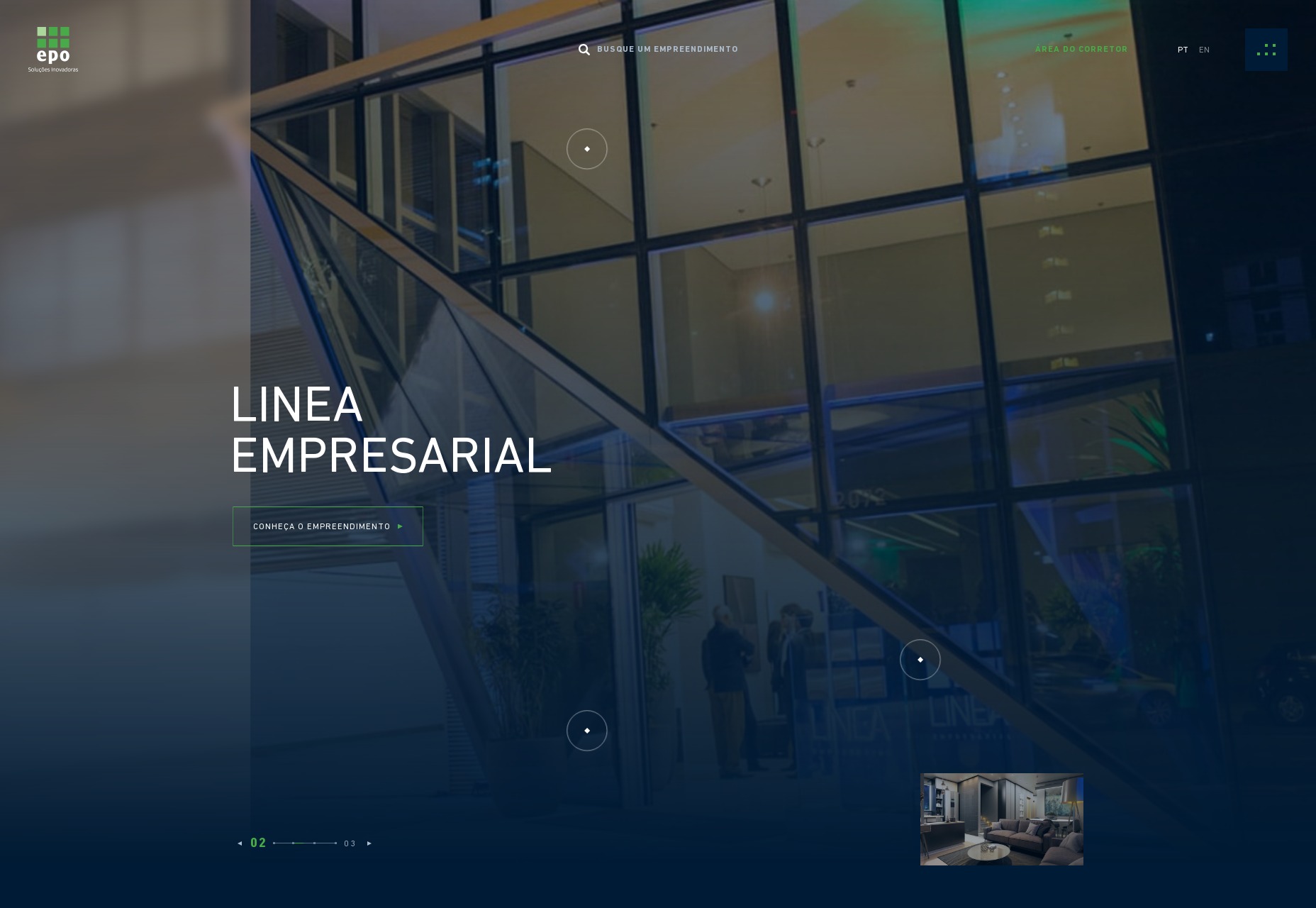
Breadhead
Breadhead brings us some of that classic elegant dark-layout minimalism that we don’t see nearly often enough these days. Thin type, illustrations, and an all around classy feel are what will make this design stick in your brain for a while. Platform: Static Site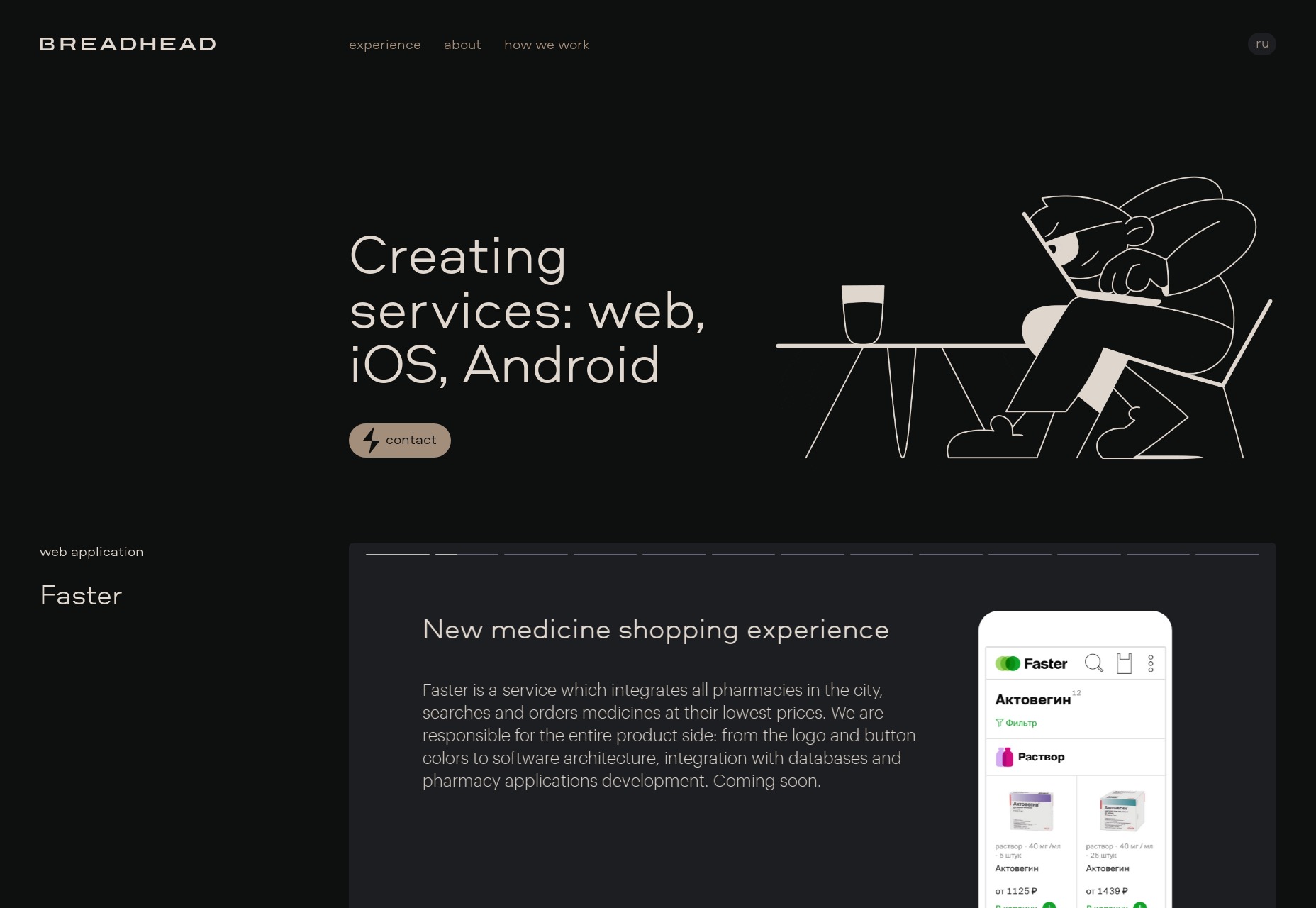
Marijn Bankers
Marijn Bankers’ portfolio reminds me, at first, of an animated spa brochure. You know, the whites and pastels, then thin type, the thinly-lined UI elements, everything. As you dive into the site, it feels more like an architecture firm. And then it all makes sense when you look through the portfolio. His clients are exactly those who would appreciate the aesthetic. I keep highlighting websites with this approach for the simple reason that it works. Portfolios tailored to the clients just work. Platform: Static Site
Anvar Shoe
Anvar Shoe’s portfolio eschews the aesthetic fusion we’ve been seeing lately for a site that looks positively post-minimalist. It’s artsy all the way with a mostly-one-column layout and effects that, once again, kind of depend on smooth scrolling to look good. Platform: Static Site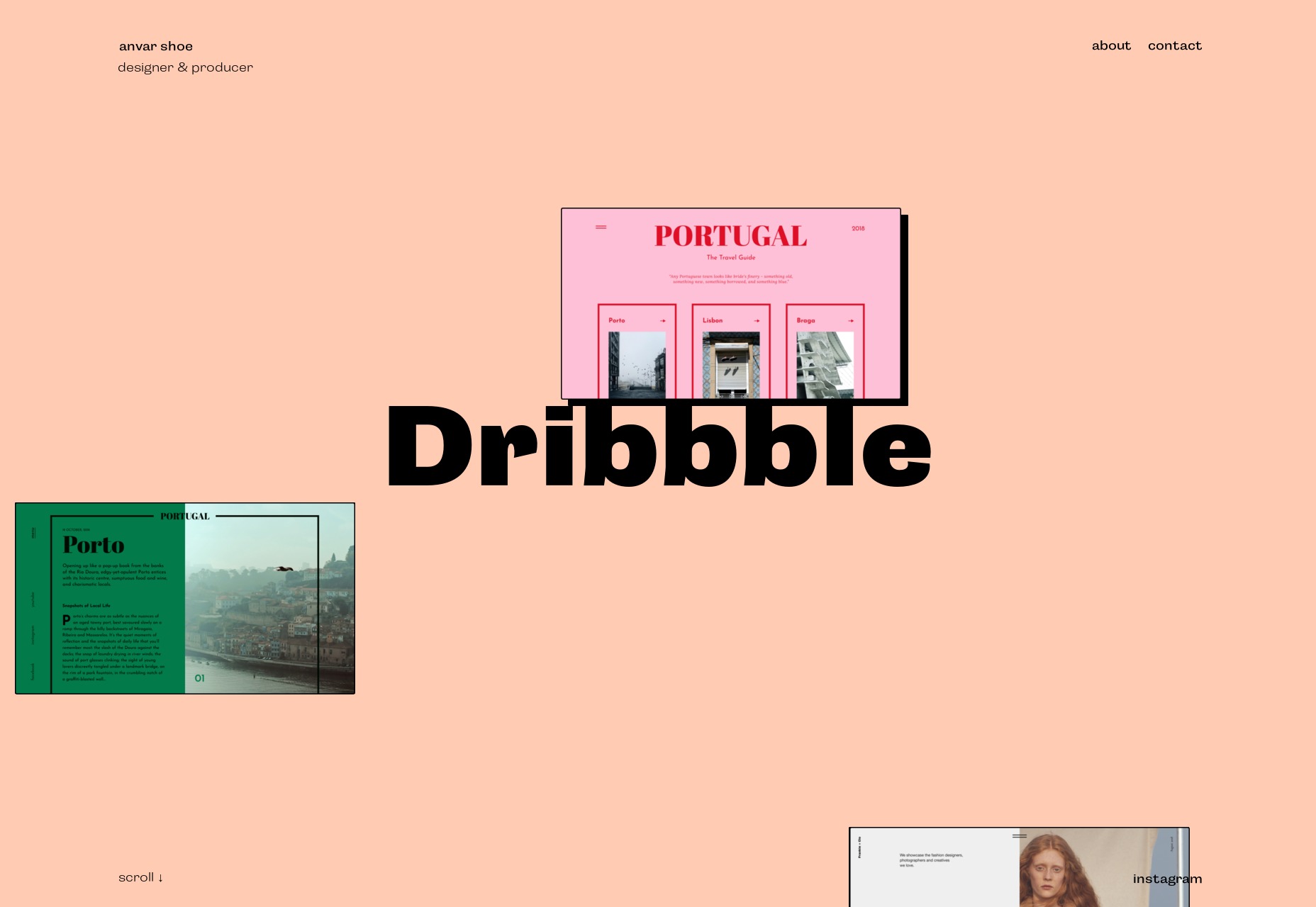
YRS Truly
YRS Truly is an interesting case. I’ve previously featured portfolio sites that mimic an operating system, but this one fuses the “windows” gimmick with the general structure and layout of a normal two-column website. It’s odd, but it works, and it uses UI conventions that most of us are used to. Platform: WordPress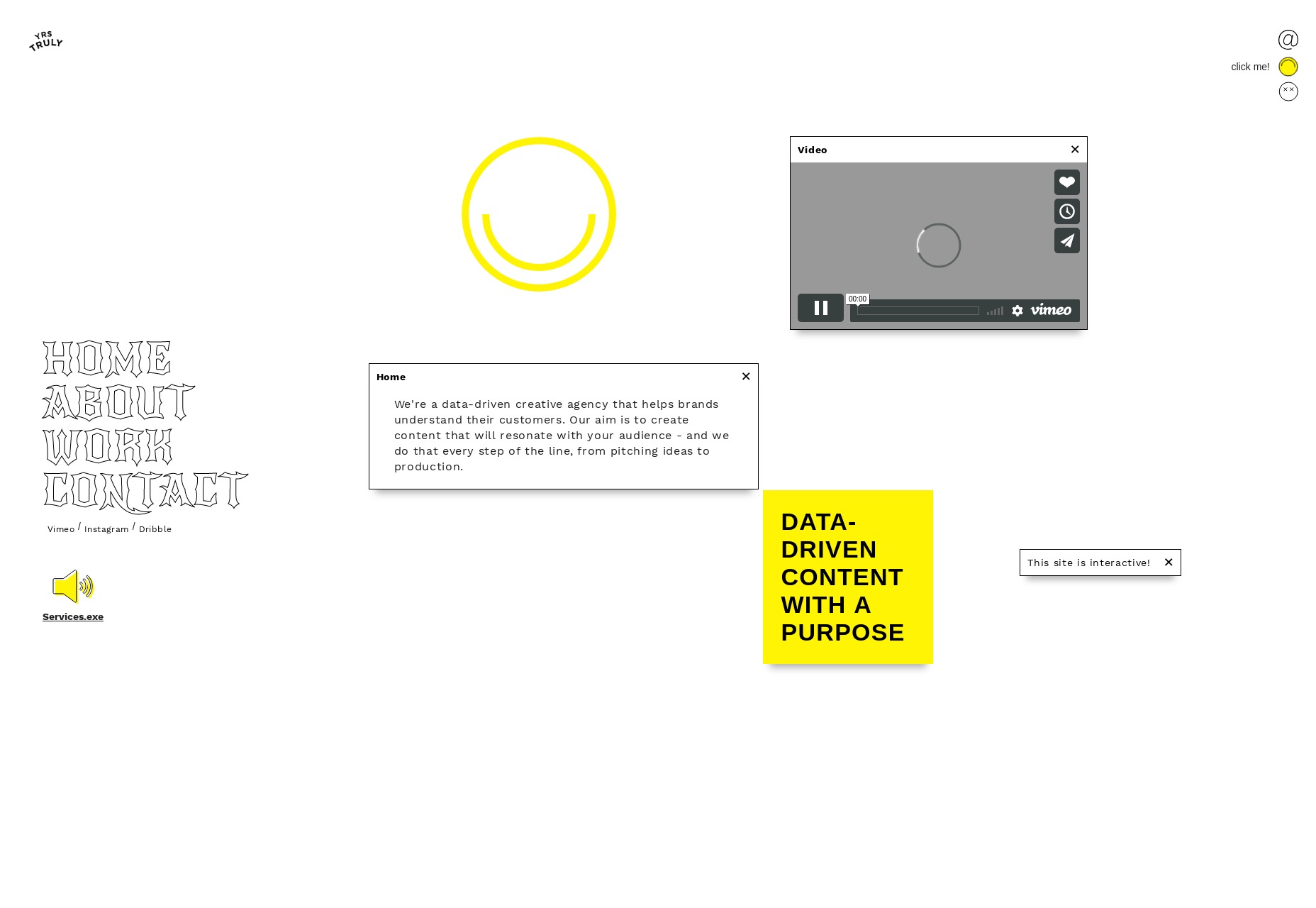
Cleverbirds
Cleverbirds’ art portfolio is highly presentational and animated. No points for accessibility here, but if you want some creative and pretty ideas for monochromatic web graphics, look no further. It’s on the list because it’s pretty, and that’s that. Platform: Static Site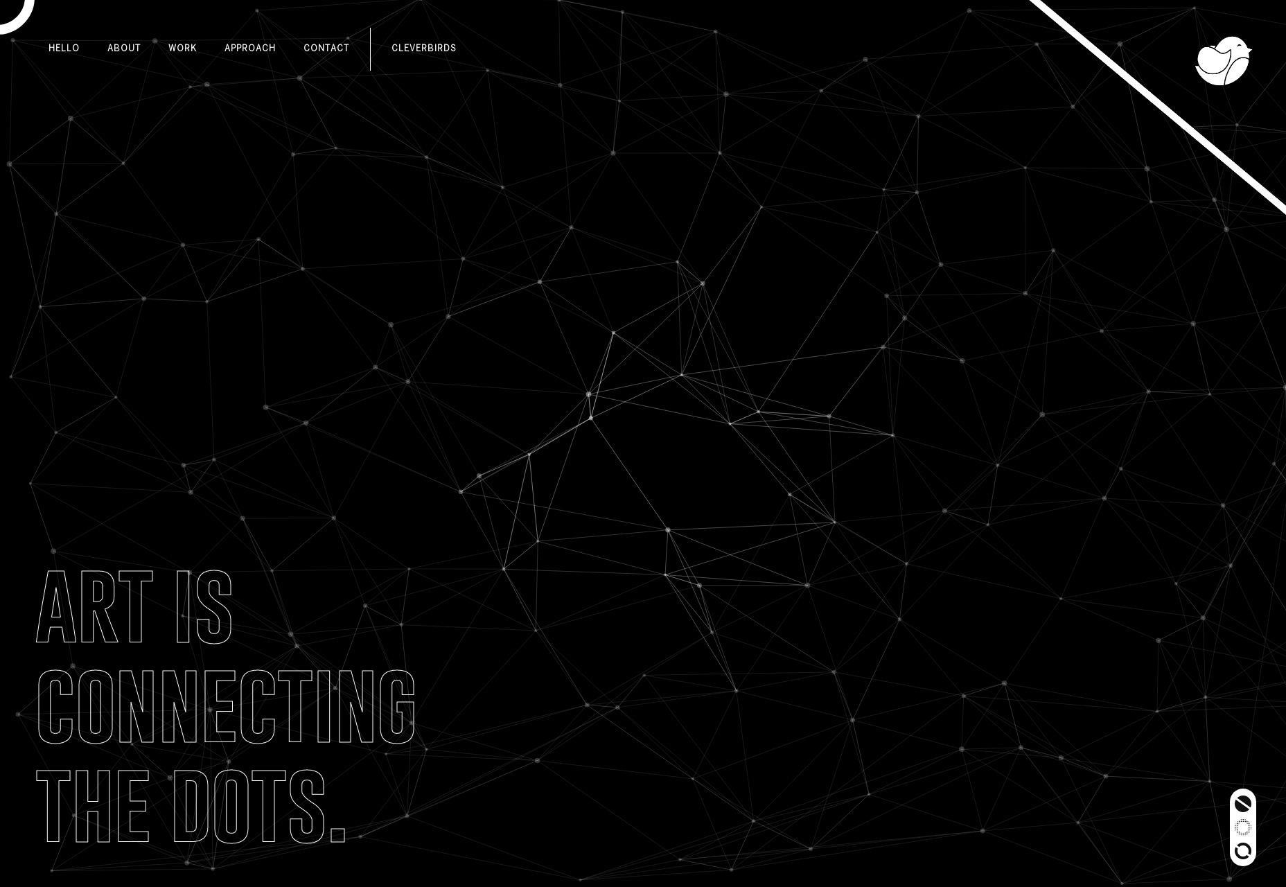
João Pereira
João Pereira’s portfolio is just plain pretty; I love the use of color. While the text could use a little more contrast in places, it’s just generally gorgeous. Plus you can click the triangles in the background to see a list of his skills. Sure, that’s not intuitive, but it’s better than any “skill progress bars” I’ve ever seen. Platform: Static Site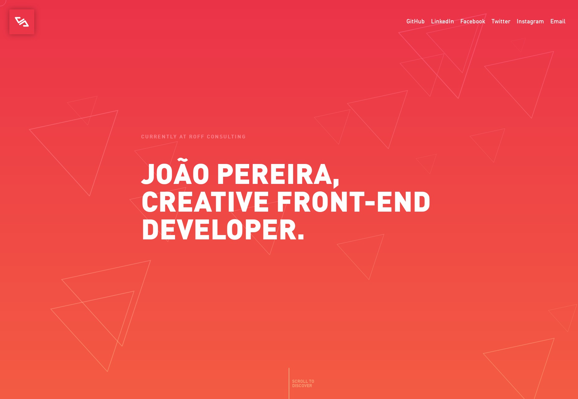
Kristopher Bolleter
Kristopher Bolleter’s portfolio leads with text that says, “No cliché slogans, just work that speaks for itself.” Well, he might not know how often I use the phrase “speaks for itself”, right? All kidding aside, he lives by that motto, presenting all his featured work on one page in old-fashioned iMac illustrations. Man it’s been a while since I’ve seen that instead of the mockup mobile devices. The whole thing isn’t very flashy, but it’s effective and serviceable. Platform: Hugo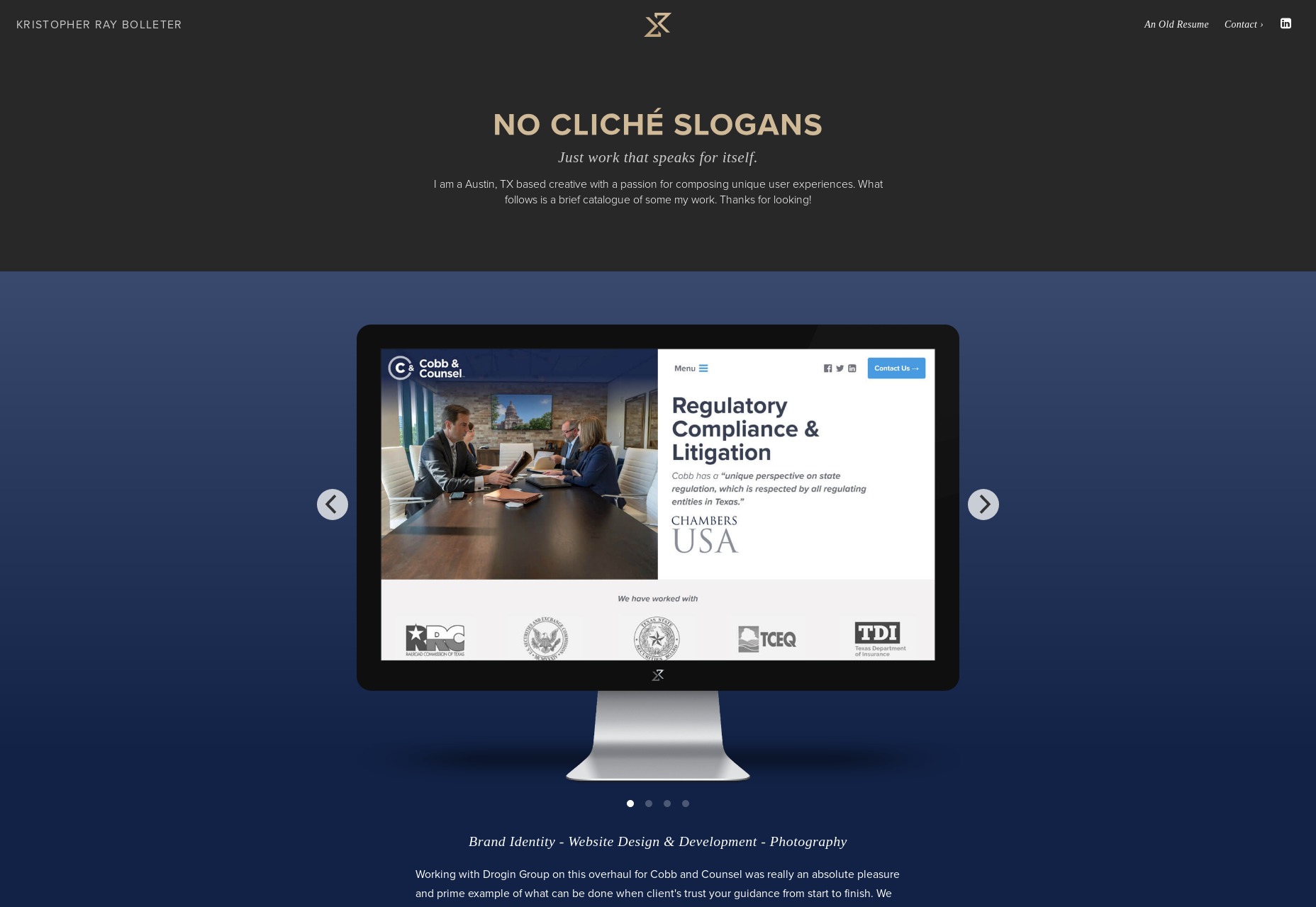
Adrien Laurent
Adrien Laurent brings us back to the flashy stuff with their portfolio. It’s post-modernist, presentational, pastel, and loaded with animation (I couldn’t think of an animation-related word that started with “p”). Platform: Static Site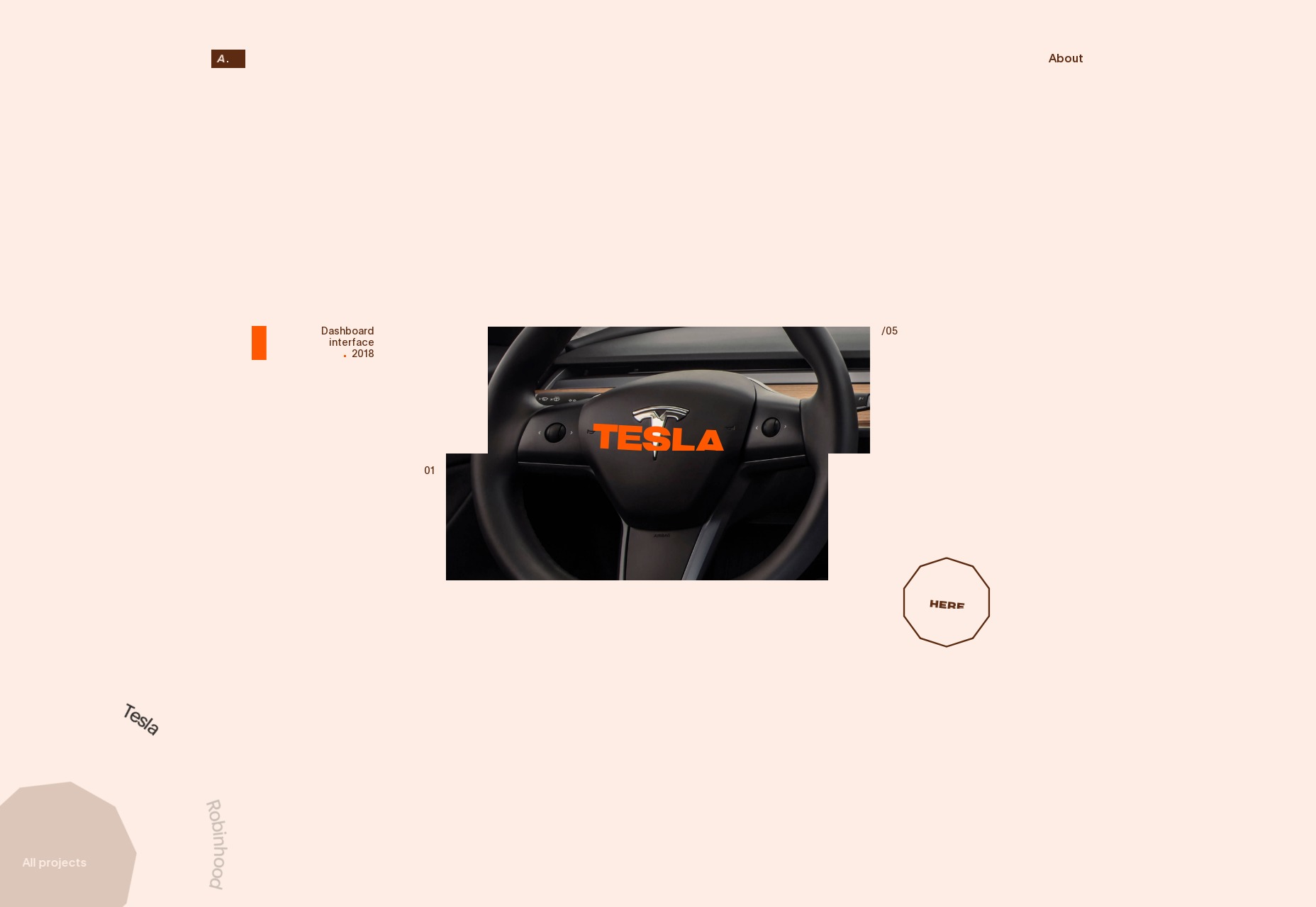
Translation
Translation takes a generally bold approach, starting with their overall aesthetic, and on to their assertion that “The world doesn’t need another ad agency.” With a monochromatic palette and really big headings, the whole idea seems to be to blast your brain and hope it sticks. Well it’s working for me. Platform: Static Site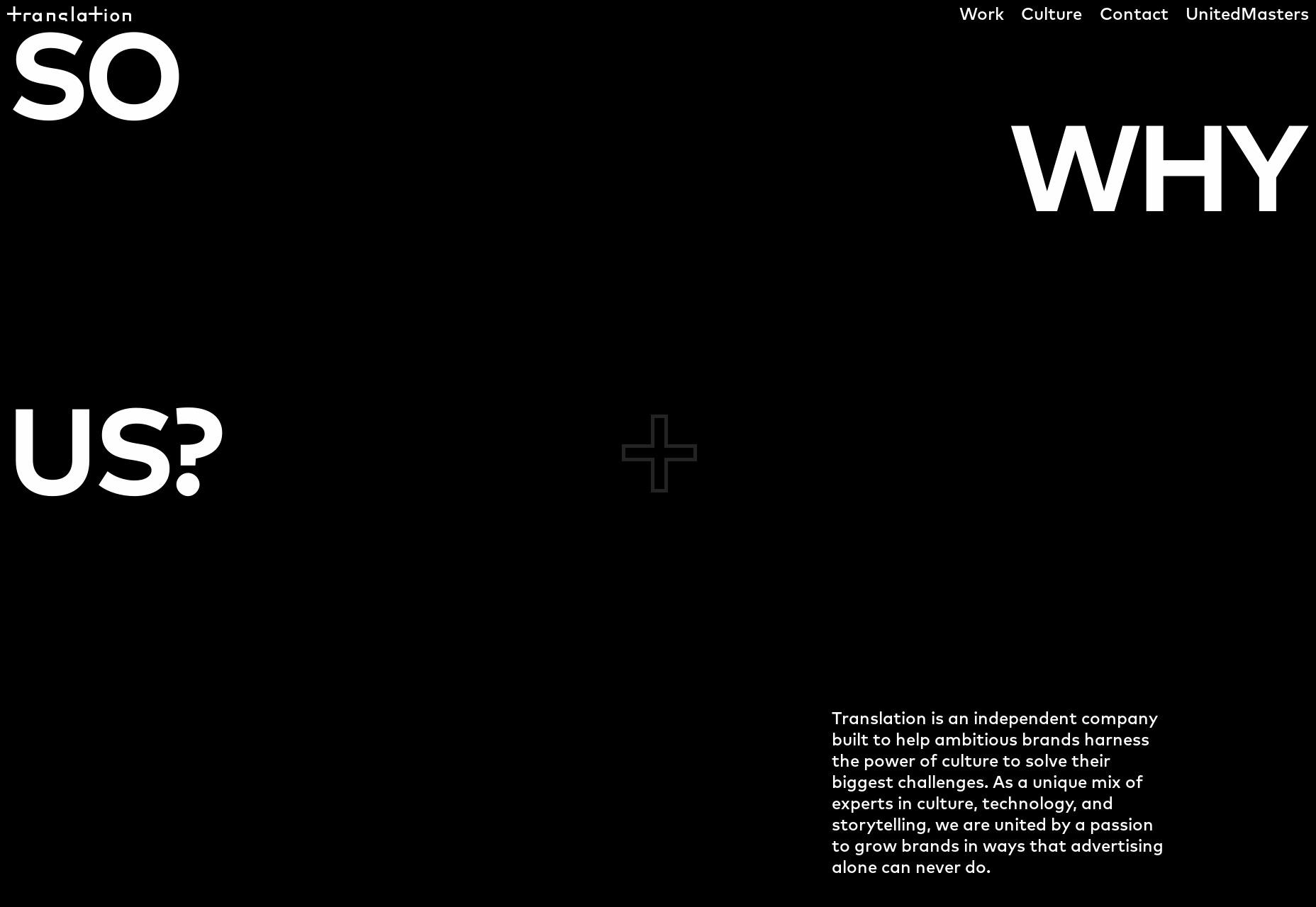
Anthony Florio
Anthony Florio’s portfolio is fairly standard modernist, with light artsy touches in the form of randomly placed illustration. And it wouldn’t be a photographer’s portfolio without some sort of collage. Do you ever miss the classic grid full of thumbnails? Nah. Me neither. Platform: Static Site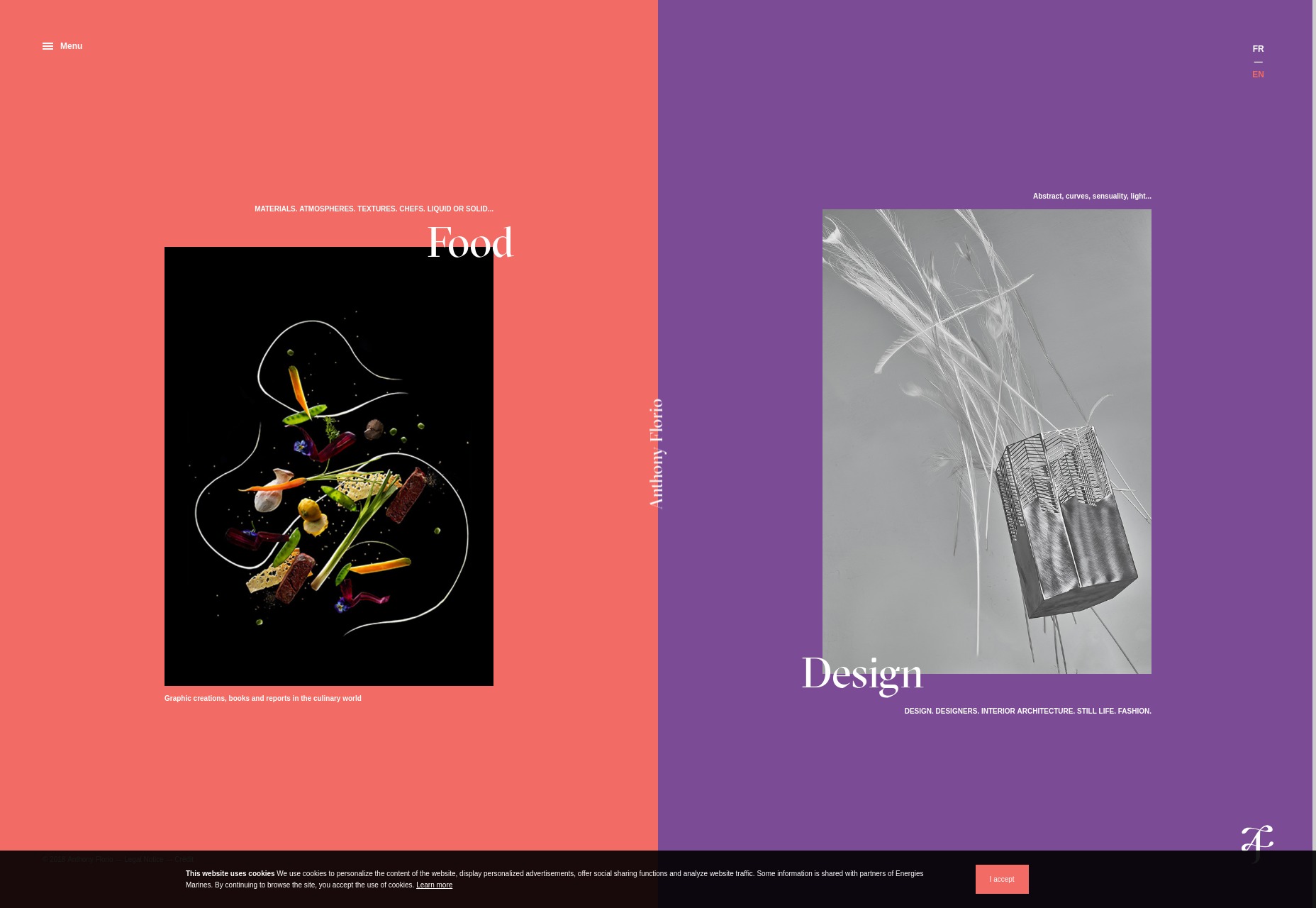
Corn Studio
No portfolio list of mine is truly complete without someone using yellow right. In this case, it’s the ever-so-appropriately named Corn Studio gracing us with the classic yellow and black, combined with some highly animated minimalism. It’s flat, it’s pretty, and it’s pretty good. Platform: WordPress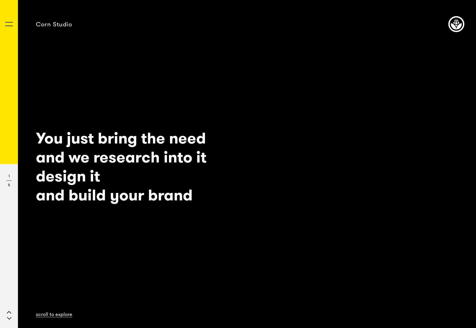
Ezequiel Bruni
Ezequiel Bruni is a web/UX designer, blogger, and aspiring photographer living in Mexico. When he’s not up to his finely-chiselled ears in wire-frames and front-end code, or ranting about the same, he indulges in beer, pizza, fantasy novels, and stand-up comedy.


Read Next

15 Best New Fonts, July 2024
Welcome to our monthly roundup of the best fonts we’ve found online in the last four weeks. This month, there are fewer…
By Ben Moss

20 Best New Websites, July 2024
Welcome to July’s round up of websites to inspire you. This month’s collection ranges from the most stripped-back…

Top 7 WordPress Plugins for 2024: Enhance Your Site's Performance
WordPress is a hands-down favorite of website designers and developers. Renowned for its flexibility and ease of use,…
By WDD Staff

Exciting New Tools for Designers, July 2024
Welcome to this July’s collection of tools, gathered from around the web over the past month. We hope you’ll find…

3 Essential Design Trends, July 2024
Add some summer sizzle to your design projects with trendy website elements. Learn what's trending and how to use these…

15 Best New Fonts, June 2024
Welcome to our roundup of the best new fonts we’ve found online in the last month. This month, there are notably fewer…
By Ben Moss

20 Best New Websites, June 2024
Arranging content in an easily accessible way is the backbone of any user-friendly website. A good website will present…

Exciting New Tools for Designers, June 2024
In this month’s roundup of the best tools for web designers and developers, we’ll explore a range of new and noteworthy…

3 Essential Design Trends, June 2024
Summer is off to a fun start with some highly dramatic website design trends showing up in projects. Let's dive in!

15 Best New Fonts, May 2024
In this month’s edition, there are lots of historically-inspired typefaces, more of the growing trend for French…
By Ben Moss

How to Reduce The Carbon Footprint of Your Website
On average, a web page produces 4.61 grams of CO2 for every page view; for whole sites, that amounts to hundreds of KG…
By Simon Sterne

20 Best New Websites, May 2024
Welcome to May’s compilation of the best sites on the web. This month we’re focused on color for younger humans,…