Nicole Fenton
Nicole Fenton seems to believe as much as I do that, ideally, words should sell themselves. Typography is the clear focus of the layout, with only a couple of light stylistic flourishes by way of distraction. The sales strategy follows the design: less is more. There are perhaps four whole paragraphs on the entire site that you could classify as “sales copy”, and the rest just shows off her work.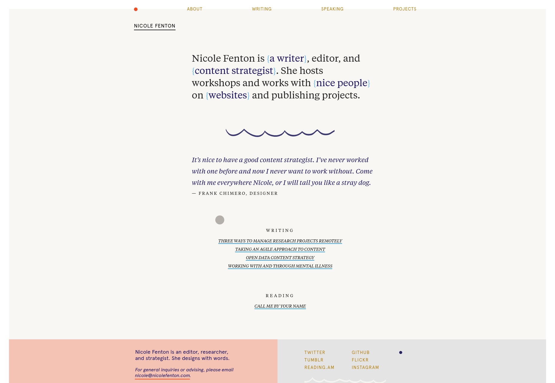
Shawn Graham
Shawn Graham’s site, on the other hand, will remind you of every marketer who ever annoyed you, and it probably works for him. The design looks like a WordPress theme, with a logo ripped straight from Web 2.0 (the design style, not the social networking). The strategy is a classic: the blog. It’s filled with helpful advice about a variety of marketing-related topics, and strives to educate its users while showing off Shawn’s expertise.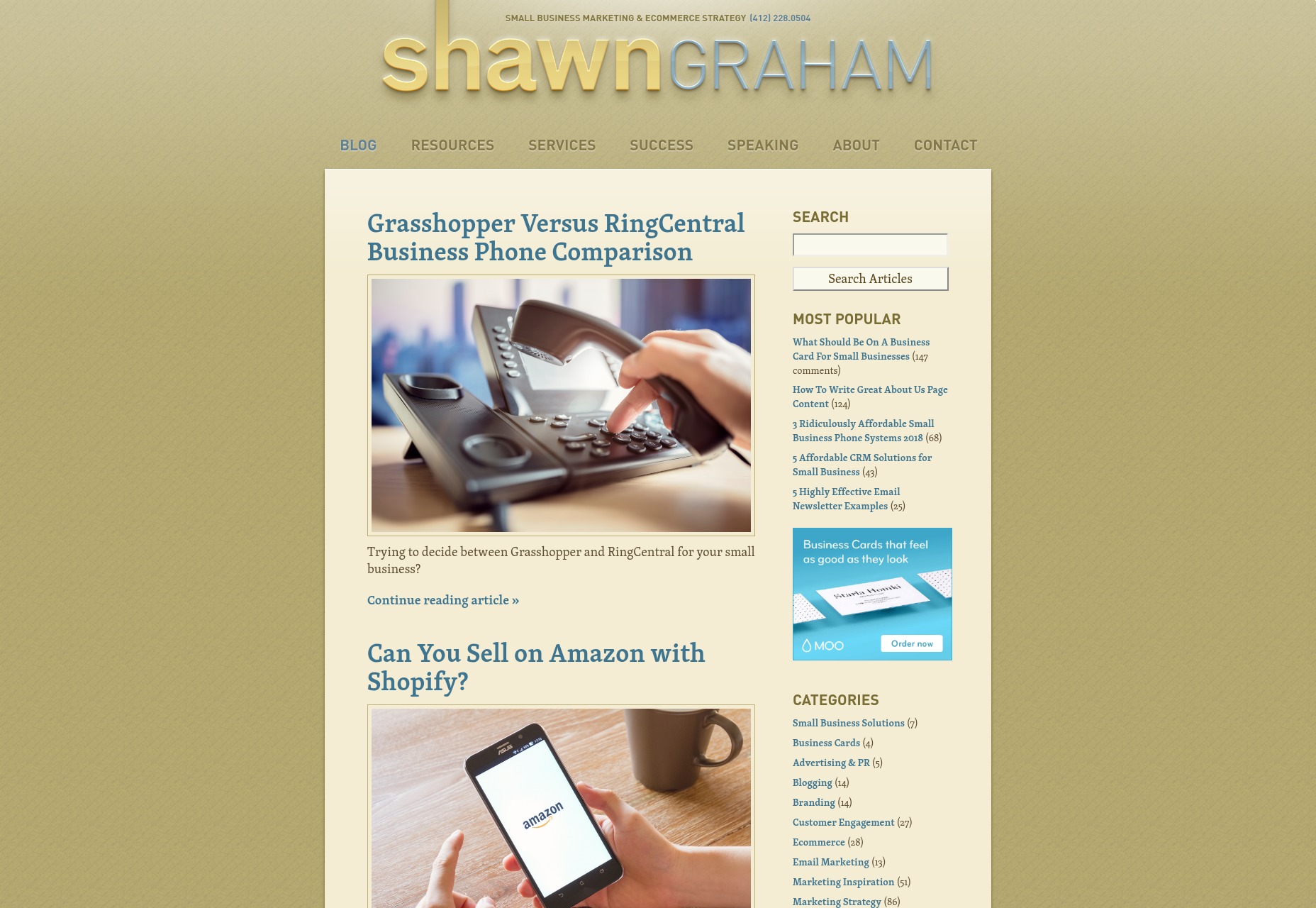
Sally Bacchetta
Sally Bacchetta’s site looks as corporate as they come, right down to the cut-out picture of her with the faint white glow around the edges. It could not possibly look any more plain and businesslike. This actually is the idea, here. She writes and designs instructional and training materials for corporate clients, and so both the site’s design and her copy reflect this unerringly. It might look dull to some, but it will look comfortable and familiar to her ideal clients.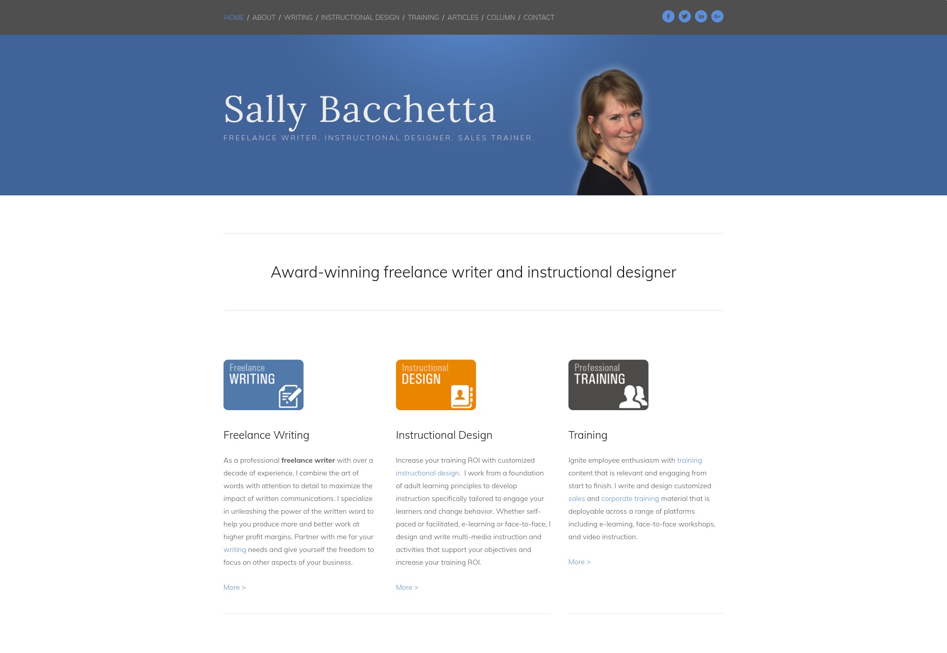
Michael Petrov
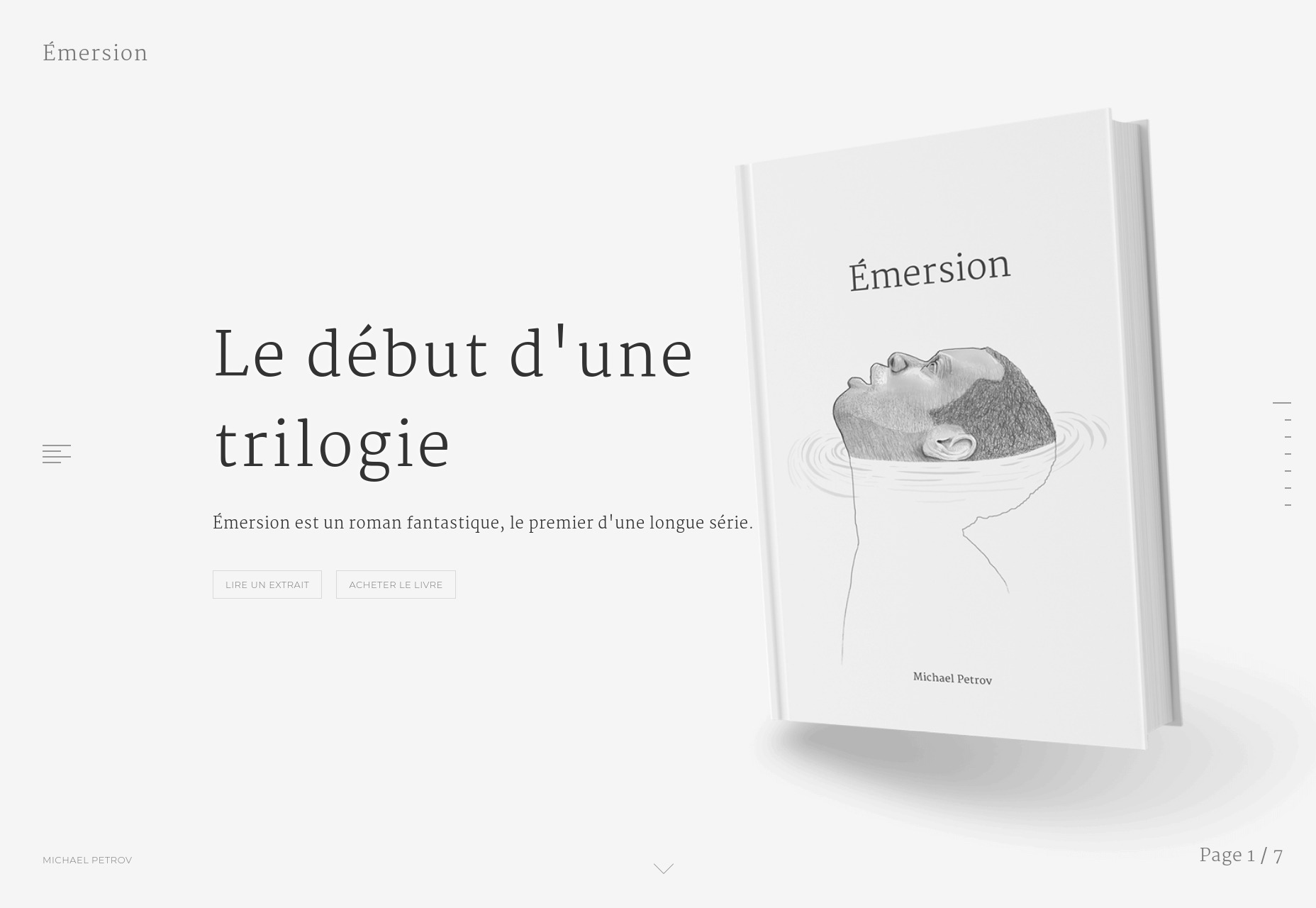
Michael Petrov’s site is quite minimalist, but makes use of heavy, and almost heavy-handed animation. At this point, though, that’s par for the course with portfolio-style sites, and we’ll see that style leak from the web design industry to every other industry where making an online portfolio might be appropriate. Now I can’t read French, but imagery is clearly a part of the sales process, here. It’s all custom illustration with light animation, so it’s designed to fit the theme of the author’s work, and many of the illustrations seem to be paired with a quote. It seems the book being promoted is itself a fusion of both literary and visual art, so the site follows its lead.Clare Barry
Clare Barry’s site is built with Squarespace, so it looks predictably modern, clean, and generally pleasing to the eye. There’s decent typography, a solid grid-based layout, everything you’d expect. Clare Barry, it seems, has opted for a fairly classic approach: sell via personality. Where many sites on this list have a picture of the author somewhere, this one puts her front and center, smiling for the world to see. Much of her work seems to stem from her own experience, and deals with personal issues like work/life balance, burnout, and wellbeing. Personal subject matter means you have to put some effort into selling the person, so it makes sense, and she hired a good photographer.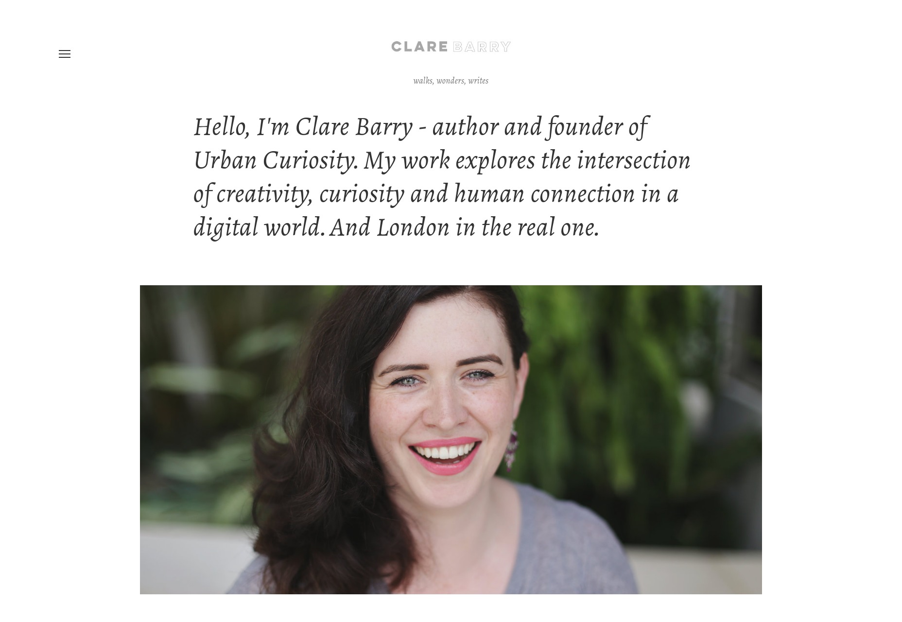
Cyrus Vanover
Cyrus Vanover’s site is built with Divi, and is very clearly targeted at fairly traditional clients. The design itself isn’t going to blow any minds, but it’s clearly designed to make you start reading, already. You see, the idea here is to show you how persuasive the author’s writing is by exposing you to that persuasiveness first hand. I wouldn’t call it a hard sell so much as simply putting the proof out where you can see it. The writing samples are almost incidental: the portfolio site is the portfolio piece.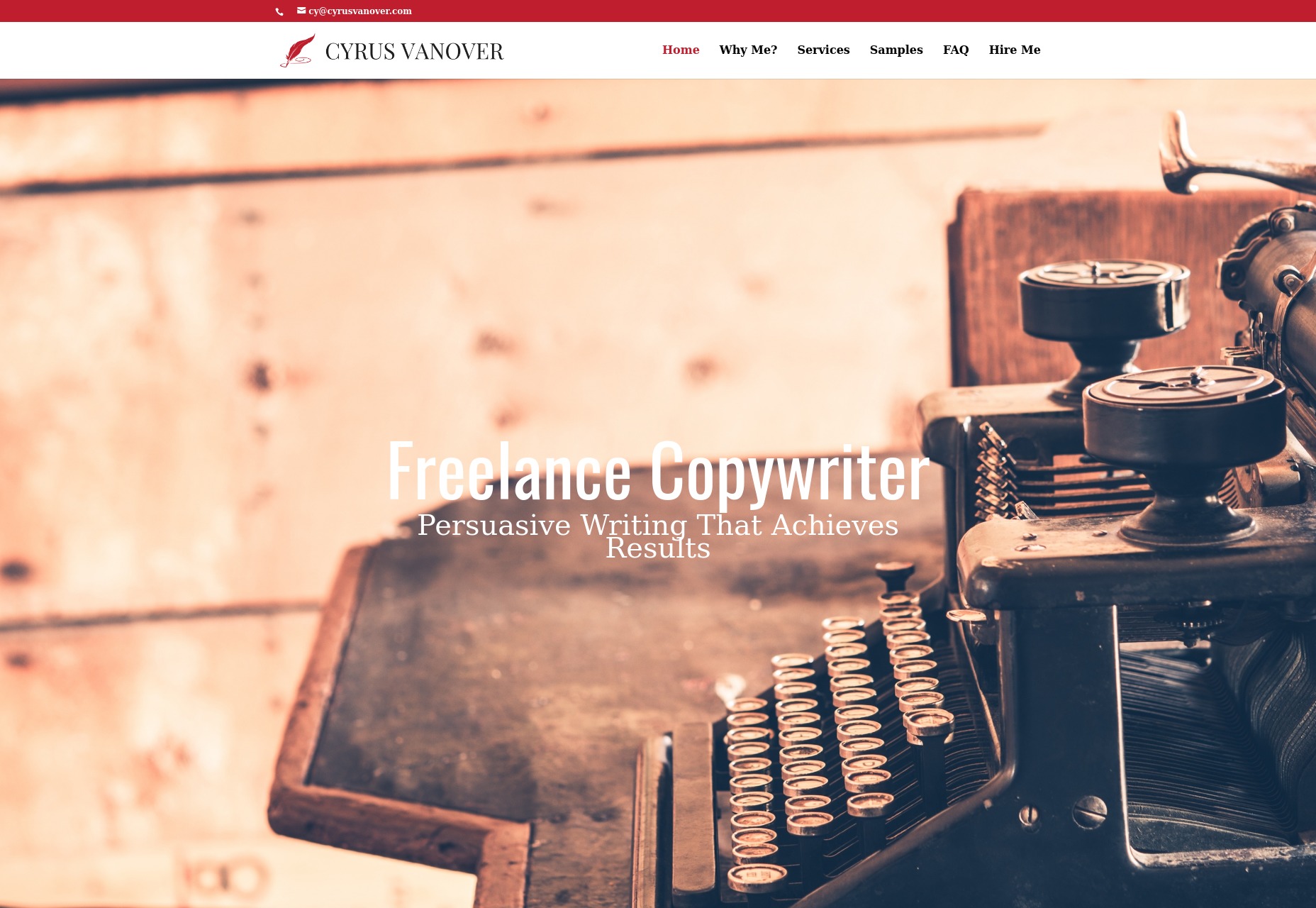
Kristi Hines
Kristi Hines’ writing portfolio uses a pre-made WordPress theme that has a flair for the dramatic. There’s the color palette that makes full use of almost-harsh contrast, combined with a clean and modern style. Even so, it’s nice and readable. The sales tactics used are actually a bit of a hybrid system. There’s the blog, the "what-I-do" copy, and so on. But the home page really doubles down on the social proof. There are prominently featured testimonials, a huge collection of famous brands she’s worked for, the works. She’s not just a writer, she’s a social marketer, and she can prove it. She’s also a photographer, and she includes her photos on her site, though I don’t think that’s a part of the service. Just an interesting tidbit.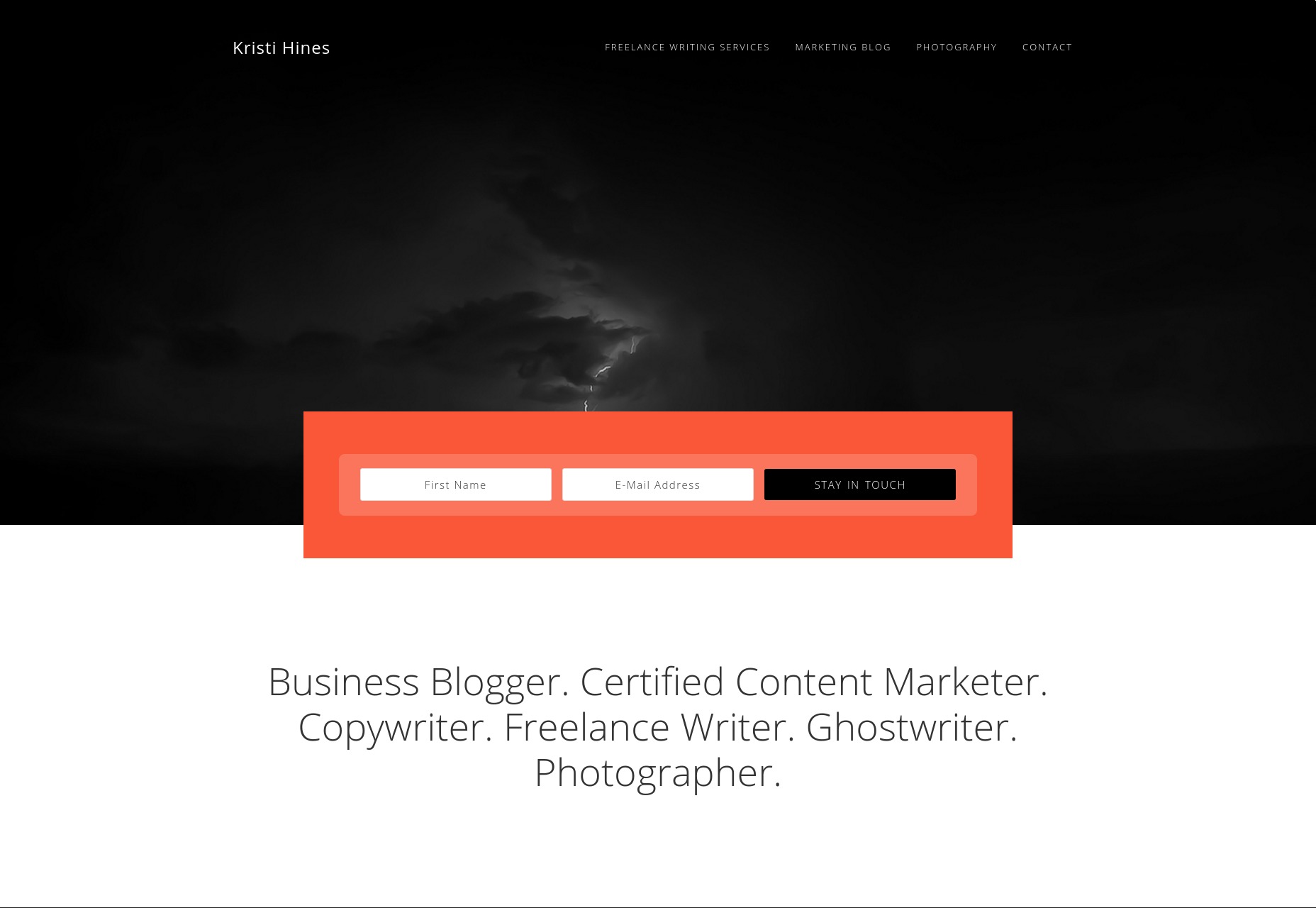
Ezequiel Bruni
Ezequiel Bruni is a web/UX designer, blogger, and aspiring photographer living in Mexico. When he’s not up to his finely-chiselled ears in wire-frames and front-end code, or ranting about the same, he indulges in beer, pizza, fantasy novels, and stand-up comedy.
Read Next
15 Best New Fonts, July 2024
Welcome to our monthly roundup of the best fonts we’ve found online in the last four weeks. This month, there are fewer…
By Ben Moss
20 Best New Websites, July 2024
Welcome to July’s round up of websites to inspire you. This month’s collection ranges from the most stripped-back…
Top 7 WordPress Plugins for 2024: Enhance Your Site's Performance
WordPress is a hands-down favorite of website designers and developers. Renowned for its flexibility and ease of use,…
By WDD Staff
Exciting New Tools for Designers, July 2024
Welcome to this July’s collection of tools, gathered from around the web over the past month. We hope you’ll find…
3 Essential Design Trends, July 2024
Add some summer sizzle to your design projects with trendy website elements. Learn what's trending and how to use these…
15 Best New Fonts, June 2024
Welcome to our roundup of the best new fonts we’ve found online in the last month. This month, there are notably fewer…
By Ben Moss
20 Best New Websites, June 2024
Arranging content in an easily accessible way is the backbone of any user-friendly website. A good website will present…
Exciting New Tools for Designers, June 2024
In this month’s roundup of the best tools for web designers and developers, we’ll explore a range of new and noteworthy…
3 Essential Design Trends, June 2024
Summer is off to a fun start with some highly dramatic website design trends showing up in projects. Let's dive in!
15 Best New Fonts, May 2024
In this month’s edition, there are lots of historically-inspired typefaces, more of the growing trend for French…
By Ben Moss
How to Reduce The Carbon Footprint of Your Website
On average, a web page produces 4.61 grams of CO2 for every page view; for whole sites, that amounts to hundreds of KG…
By Simon Sterne
20 Best New Websites, May 2024
Welcome to May’s compilation of the best sites on the web. This month we’re focused on color for younger humans,…

