Slack Adopts Generic New Identity

There were few logos more recognizable than Slack’s. In the five years since the messaging service gained traction it has become a staple on desktops—as much a part of many professionals’ daily routine as email once was—and has grown to an $8bn valuation.

So it’s entirely understandable that when Slack revealed its new logo this week, there was a knee-jerk reaction from the design community. No matter how much they might protest, most people don’t like adapting to change.
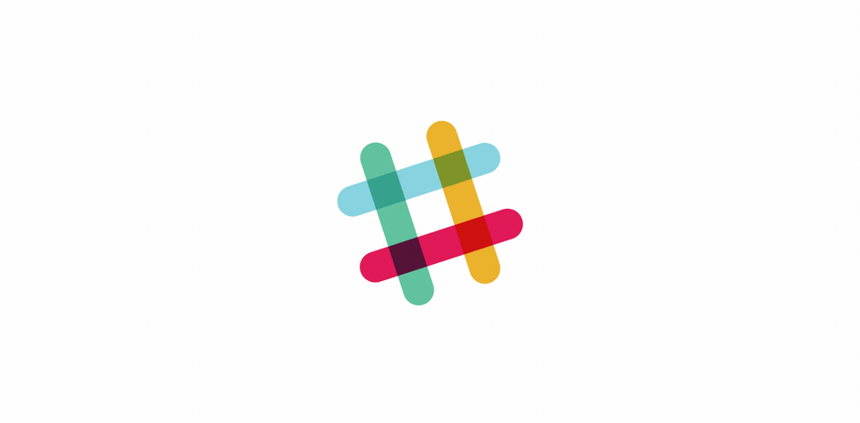
Slack’s old logomark was a much-loved plaid hashtag. No, it was not perfect; the colors were a little dirty, especially where the bars overlapped, and it really wasn’t that flexible (as Slack themselves point out in their defensive blog post announcing the change).
Yes, the old logomark had problems, but they were problems that could have been fixed; if all you want to do is tackle legibility and color flexibility, why not just type ‘Slack’ in bright blue Gotham and have done with it.
The new logo was designed by the in-house team, together with Michael Beirut of Pentagram (yes, him again) together with assorted designers whose contributions didn’t warrant a namecheck in the press release.
The new logomark is crisp, clean, very well executed, and entirely lacking in soul. It follows a very sound, scientific logic, and yet lacks the personality that truly great identities have.
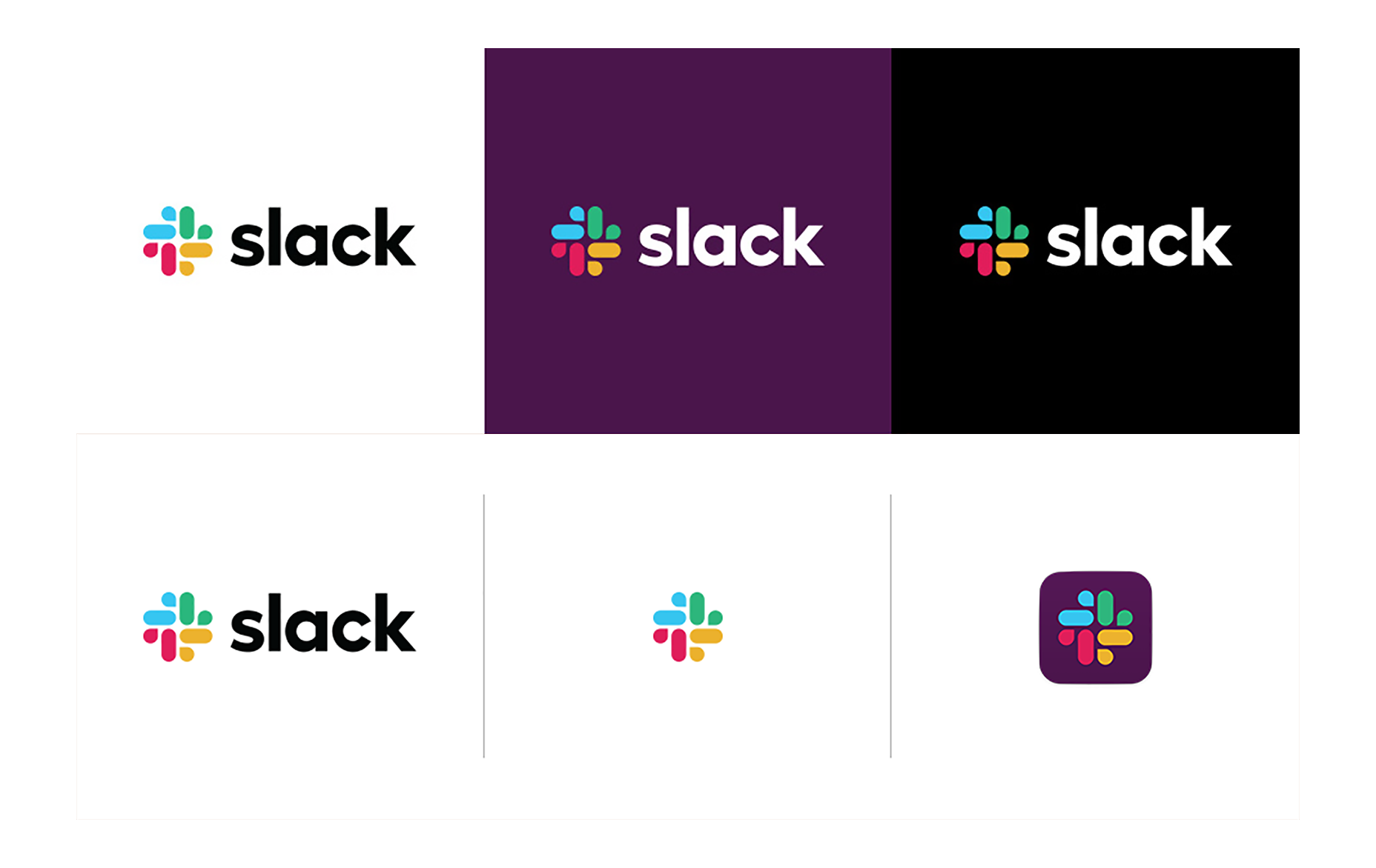
Whereas the original Slack logomark was both a hashtag, and a huddle with four different elements supporting each other; the new logomark feels more like four people with their backs to each other. No matter how insistent the press release, the new logomark does not evoke a spirit of teamwork—at least not as well has the hashtag did.
We don’t know what the brief was, and as such, we can only objectively talk about our own reactions to the change. But if this was a successful response to the brief, then the brief needed rewriting. The main problem being, that the bland non-committal look of the logomark makes it look like one of those free “logos for startups” that you can download as freebies in packs of a hundred.
As well as the logomark change, the type has been changed. Slack is currently looking at going public, and I can only conclude that there is some obscure fiscal law that requires all corporations listed on the stock market to abandon their humanist sans-serifs in favor of a geometric sans, because every single company with more than 10 employees is doing it.
The new logo has already been compared to rubber ducks, a web 2.0 logo, Joomla’s identity, and even a swastika. In fairness, bland as it is, the negative reaction to the new Slack logo is born out of a love for the old identity. Give it a few days for our eyes to adjust, and we’ll probably tune-out the change.
Ben Moss
Ben Moss has designed and coded work for award-winning startups, and global names including IBM, UBS, and the FBI. When he’s not in front of a screen he’s probably out trail-running.


Read Next

15 Best New Fonts, July 2024

20 Best New Websites, July 2024

Top 7 WordPress Plugins for 2024: Enhance Your Site's Performance

Exciting New Tools for Designers, July 2024

3 Essential Design Trends, July 2024

15 Best New Fonts, June 2024

20 Best New Websites, June 2024

Exciting New Tools for Designers, June 2024

3 Essential Design Trends, June 2024

15 Best New Fonts, May 2024

How to Reduce The Carbon Footprint of Your Website
