

<blink>
Shhh… shhhh… it’s okay. It’s okay. It’s dead, and it can’t hurt you anymore. For everyone who didn’t have a visceral reaction just now, the <blink> tag made things do just that: blink. Off and on, there and not there. It’s almost like it was designed to hurt your eyes. Invented during the height of the early Browser Wars, the tag was an early example of browser-specific tags, and was meant to give Netscape Navigator an edge over the then-nascent Internet Explorer. I’m not saying that this decision killed Netscape Navigator, or that NN deserved to die because of it, but that’s exactly what I’m saying. (Screenshot not provided for obvious reasons.)Flash Menus
I was guilty as hell of this one. That’s right, in the beginning, I couldn’t get the hand of animated navigation menus (read: menus having a hover state) built with JavaScript. Or DHTML, as it was called in Dreamweaver. So I used Macromedia Flash to create super fancy menus with animated buttons, and embedded them into every website header I made. I was hardly the only one. For a while, Flash-based menu templates were a cottage industry on their own. Hot tip: Never, EVER make a website menu that you can’t change by just editing a text file. The maintenance cost alone was a massive headache, and search engines never did get the hang of crawling through Flash files. Thank God for :hover.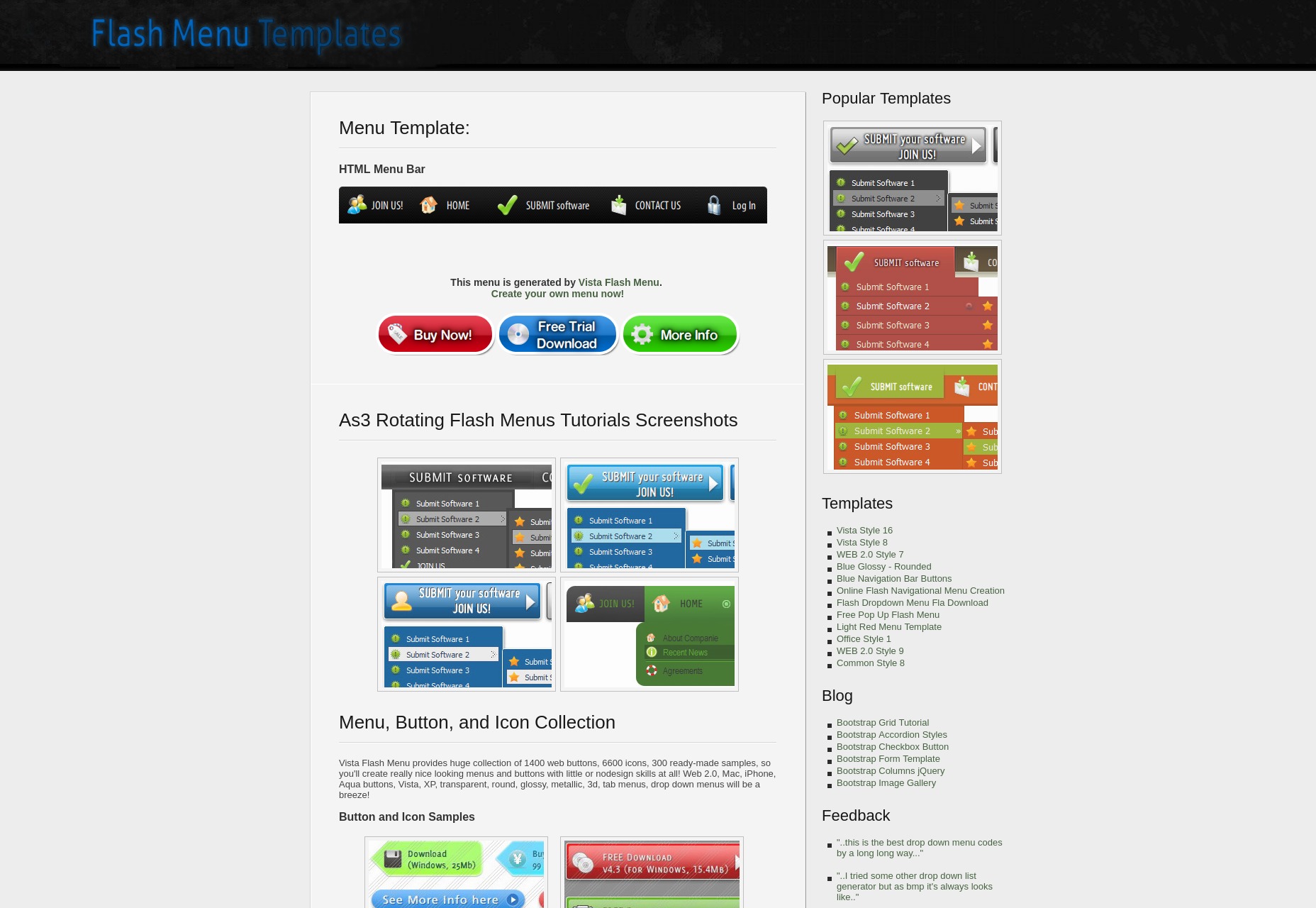
Frames, the Original AJAX
That’s right, kids. Before we used JavaScript to load all of our data in progressive web apps, the browser did all the work, and presumably still can. You know iframes? They used to have a big brother that was just called “Frames”, and that’s what we used for basic layouts before Tables came along. The problem was that even as they allowed the browser to update just part of a page instead of loading a whole new one (sort of), they also broke several fundamental browser features, including:- The Back and Forward buttons;
- Browser history in general;
- It was harder to copy-paste links to specific pages in a site;
- Reloading a website certainly got a bit random, and would usually just take you back to the “home page”, as it were.
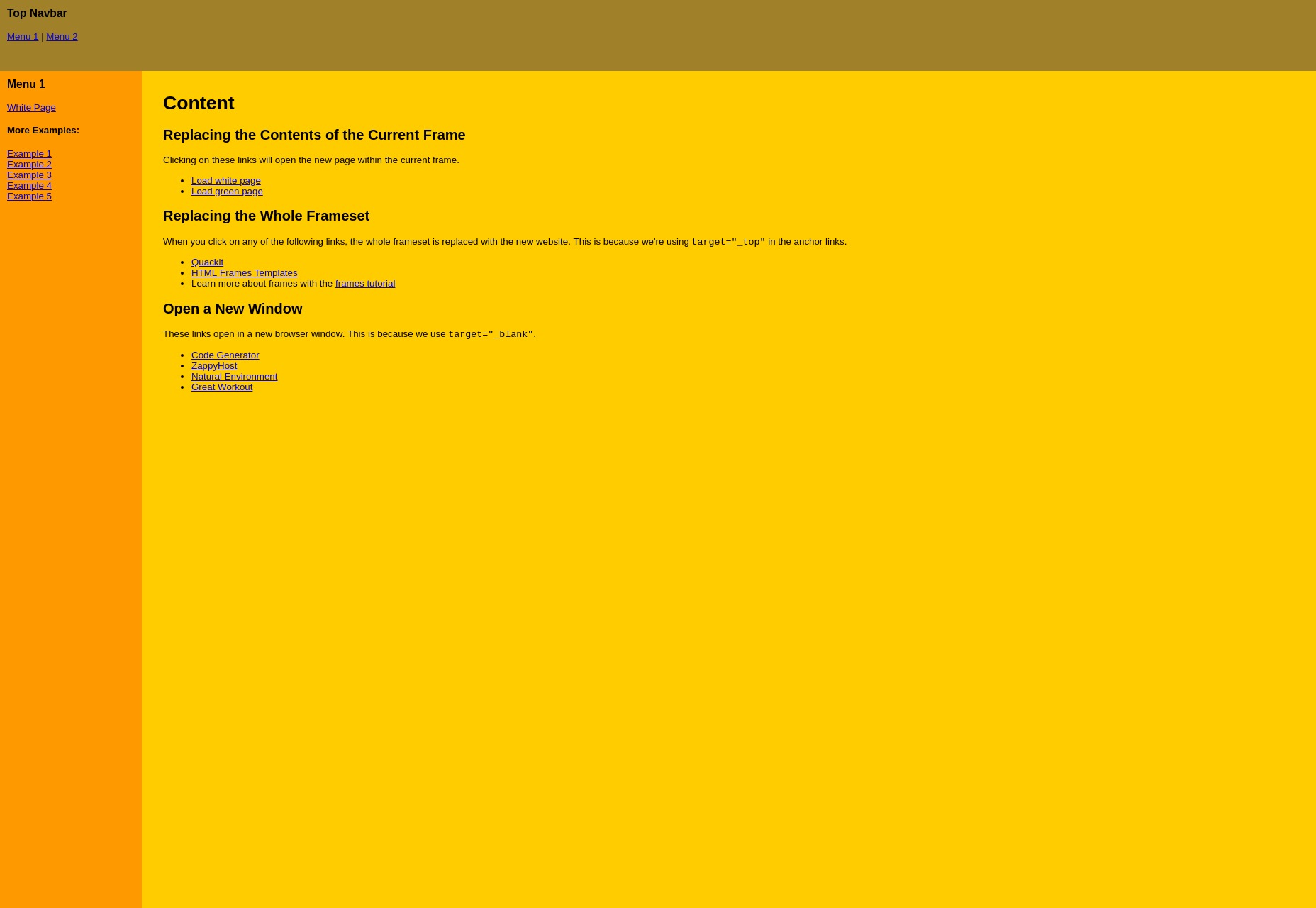
Image Buttons
Not long ago, flat design took the world by storm, prompting people to say things like, “Wait… is that a button? Can I click it? WHY would you even use a custom cursor, there?” Before that, everyone was all about those 3D-looking buttons. Because they were fancy. Look, it started in the early ‘90s, and we just don’t question anything that happened between 1980 and 2005. They were just different times. Of course, CSS3 has all but killed the image-based button. When the text was baked into the image, the buttons were impossible to manage, and when it wasn’t, we had to use a thousand tricks to make them even semi-responsive. Anyone remember making a button that was one-part loooooong PNG, and one part the corners on the right? Or having a separate PNG for each corner of a button? God, we have it good, nowadays.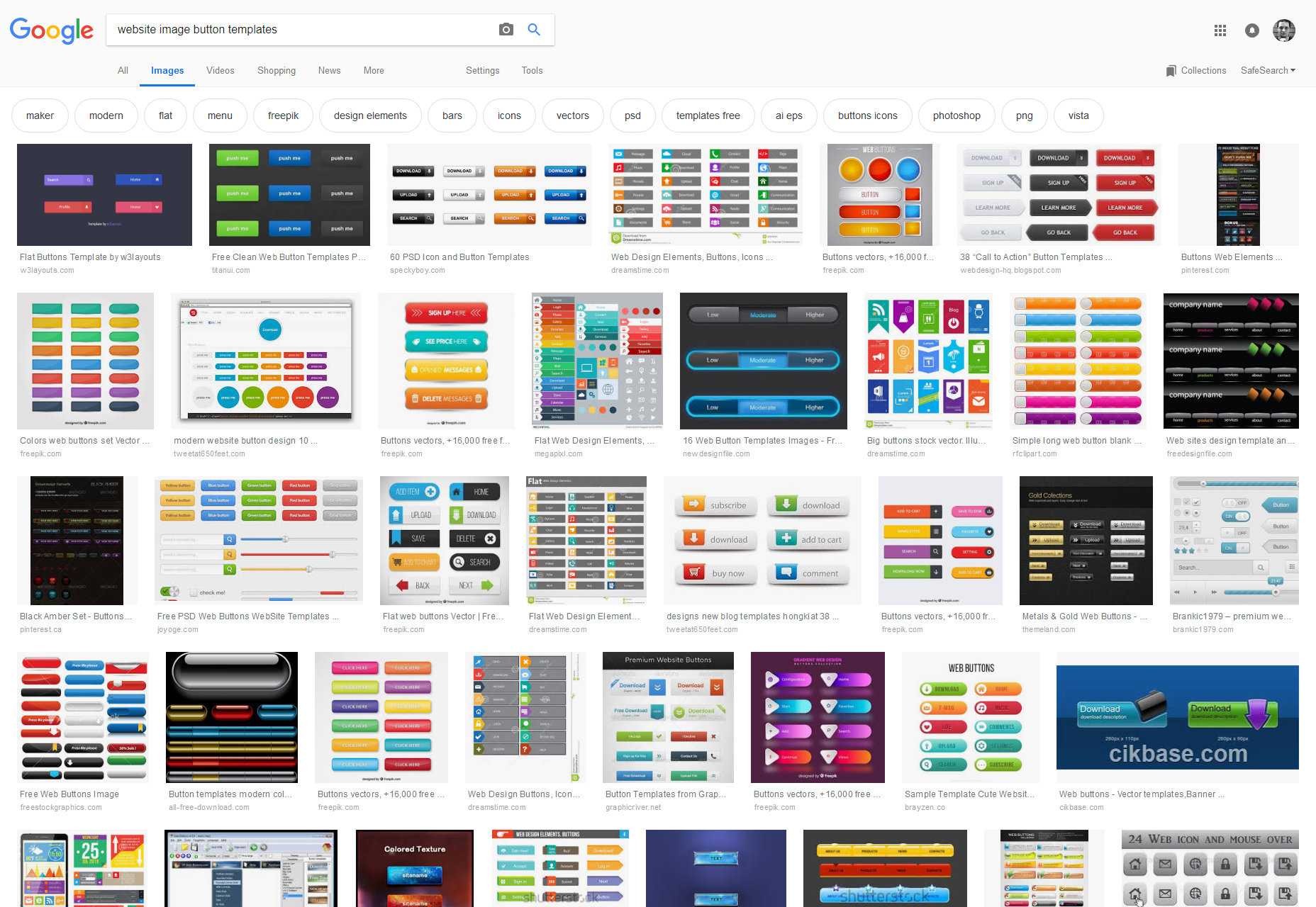
Marquee
Once upon a time, before everyone started saying that image sliders were bad, HTML actually had a built-in element for making things slide around the page. It was called the Marquee tag, and people hated it long before it actually died. It was implemented in Internet Explorer in response to the <blink> tag, and was only marginally less bad for your eyes. It was abandoned and deprecated for being too distracting to users. Demos available here: https://www.quackit.com/html/codes/html_marquee_code.cfmFancy Separators/Page Dividers
Back before we ever started doing proper layout, people needed a way to break up long pages of text to make them less awkward to read. The <hr> element felt a little too plain to some, and so the designers of the day resorted—as they so often did—to .GIFs. They were just horizontal bars at heart, but as long as they were images, the could be as fancy as you liked. This was another trend that fell to CSS/CSS3. Besides, when the divider is so much more visually exciting than the text, that can prove to be a bit of a conflict for the user.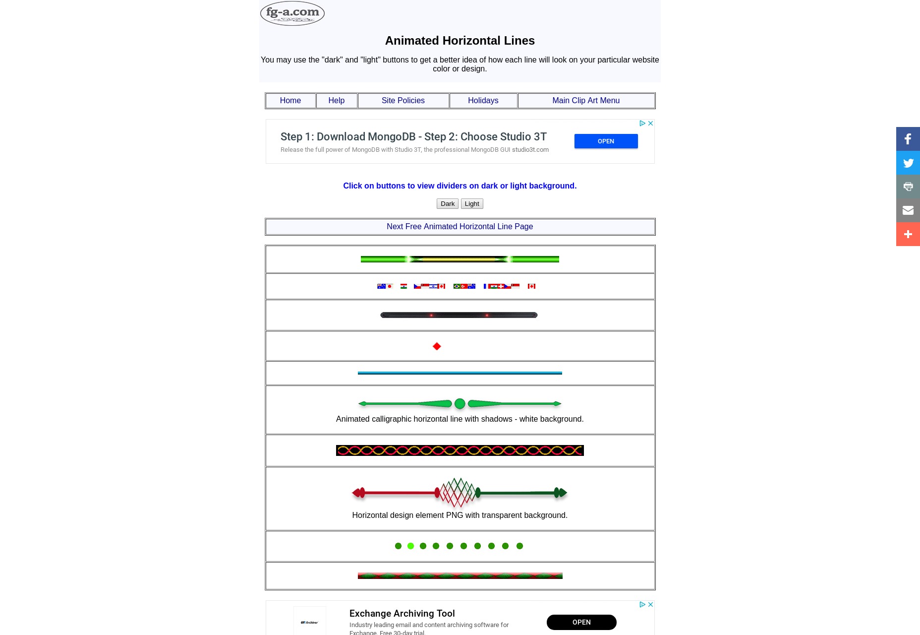
The Site Map
The Site Map used to be the be-all and end-all of navigation. Before websites had their own search functions, you used the site map to find what you needed on any given site. It was simple: all of the content was right there, and you just needed to scroll. Nowadays, a lot of sites are just too big, or too small, to ever need a site map as a UI element. They are typically still auto-generated by many CMS, but they’re used to help search engines crawl the site faster. For medium-sized websites, I think this is a feature that could come back, and it wouldn’t hurt anybody.
Table Layout
Ah, table layout. It’s mocked in jokes by some, referenced only in hushed whispers by others. It was the trend that pushed web design forward, and the one that couldn’t die fast enough. It combined inline styles, a fair amount of confusion, and 1-pixel .GIF files that somehow held the layouts together. I never really got that part. It died because CSS had floats. And though that was a dirty hack and a half, it was actually better. We only used tables for so long because browsers (cough IE cough) were slow to catch up with CSS support, but they got there eventually. The weird thing is that CSS Grid is like having tables back again, but so much better. Yeah, I had to use the Wayback Machine. Googling for table layouts gets you a whole bunch of articles about why you shouldn’t use them.
Ezequiel Bruni
Ezequiel Bruni is a web/UX designer, blogger, and aspiring photographer living in Mexico. When he’s not up to his finely-chiselled ears in wire-frames and front-end code, or ranting about the same, he indulges in beer, pizza, fantasy novels, and stand-up comedy.


Read Next

15 Best New Fonts, July 2024
Welcome to our monthly roundup of the best fonts we’ve found online in the last four weeks. This month, there are fewer…
By Ben Moss

20 Best New Websites, July 2024
Welcome to July’s round up of websites to inspire you. This month’s collection ranges from the most stripped-back…

Top 7 WordPress Plugins for 2024: Enhance Your Site's Performance
WordPress is a hands-down favorite of website designers and developers. Renowned for its flexibility and ease of use,…
By WDD Staff

Exciting New Tools for Designers, July 2024
Welcome to this July’s collection of tools, gathered from around the web over the past month. We hope you’ll find…

3 Essential Design Trends, July 2024
Add some summer sizzle to your design projects with trendy website elements. Learn what's trending and how to use these…

15 Best New Fonts, June 2024
Welcome to our roundup of the best new fonts we’ve found online in the last month. This month, there are notably fewer…
By Ben Moss

20 Best New Websites, June 2024
Arranging content in an easily accessible way is the backbone of any user-friendly website. A good website will present…

Exciting New Tools for Designers, June 2024
In this month’s roundup of the best tools for web designers and developers, we’ll explore a range of new and noteworthy…

3 Essential Design Trends, June 2024
Summer is off to a fun start with some highly dramatic website design trends showing up in projects. Let's dive in!

15 Best New Fonts, May 2024
In this month’s edition, there are lots of historically-inspired typefaces, more of the growing trend for French…
By Ben Moss

How to Reduce The Carbon Footprint of Your Website
On average, a web page produces 4.61 grams of CO2 for every page view; for whole sites, that amounts to hundreds of KG…
By Simon Sterne

20 Best New Websites, May 2024
Welcome to May’s compilation of the best sites on the web. This month we’re focused on color for younger humans,…