The Hidden Costs of Minimalism in Design

Minimalism is a trend that has largely defined the best part of the last decade. Its rise to prominence came as a reaction to the abundance of heavy styling which preceded it.

It offered a simpler and cleaner design direction for websites and interfaces. Web and app designs became less complex in terms of styling, speeding up development time and resulting in digital products that loaded quicker.
As a design direction, minimalism has been around for a long time. Whether you look back at product design and companies like Braun, or to modernist architects like Mies van der Rohe, designers have always looked to simple forms for inspiration.
designers have always looked to simple forms for inspiration
In more recent times, it was the introduction of iOS 7 which really pushed designers away from the rich styles and effects we had become so accustomed to. Apple looked to create an interface that reflected the design of the Apple product hardware itself. The result included buttons replaced with thin ambiguous icons, little differentiation between elements, and a general lack of any sort of feeling: it was stark and severe. Since then, iOS has made some improvements while still opting for a direction that strips back as much detailing as possible.

Apple is always an intriguing example when it comes to minimalism in general. It brings up important questions surrounding aesthetics and user experience. As a company, their sales rely heavily on a reductionist technique. They sell products through apparent simplicity; creating something that anyone can look at and understand how it works and how to use it. Decisions like the removal of the headphone jack, I/O ports, and home button are all long-term decisions to work further toward this goal. This is what Apple was founded upon and why it created beautiful user-friendly products like the iMac G3.
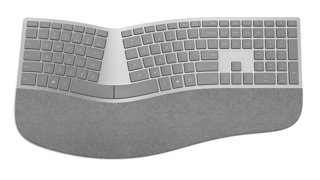
Apple’s mice and keyboards are beautiful, but offer some of the very worst ergonomics to have ever been designed
But as you begin to look deeper into Apple’s minimalist design direction, it becomes clear that the aesthetics are by far the most important consideration to drive sales, and something of an obsession. Apple’s minimalist approach to product and software design is very much ‘one size fits all’. At a product and software level, this comes at a cost to user experience. For example, Apple’s mice and keyboards are beautiful, but offer some of the very worst ergonomics to have ever been designed. The sleek, low-profile designs cause wrists and hands to lie in unnatural positions and can put them under considerable strain over time. Contrast this with Microsoft’s offering which looks to a more balanced design which is simple but ergonomic.
You can also look to products like the iPod Shuffle 3rd Gen which removed the pause/prev/next track buttons for the sake of minimalism. It entirely took away its ease-of-use, replacing it with something that was aesthetically attractive, but lacking in any sort of consideration for the end user. It’s not just Apple who can be known to apply minimalism in such an extreme way. From magazine publishers to car companies, it’s present across almost all industries in some form. It’s a coveted style for consumers, thus providing an incentive for companies to produce products which fill this criteria.

The tradeoffs of minimalism in product design are much the same as in digital product and web design. It’s become the norm to push minimalism to extremes, rather than present a more balanced design. This often results in ineffective color schemes, a lack of element differentiation, poor accessibility, and frustrating navigation practices.
Primary actions are frequently hard to spot, using blacks/greys and ambiguous icons with no accompanying text label. Content typography is often too small, presenting accessibility issues for a great number of users and visitors.
It’s these design decisions which become destructive and can have a profoundly negative effect on users, particularly those most in need of adequate accessibility considerations.
Minimalism will always primarily be about aesthetics. It’s about taking away from a design, rather than adding to it, and making informed design decisions. Renowned architect, Frank Gehry, once summed minimalism up as a ‘dead end’. In this short interview, he highlights how minimalism strips a design of all emotion and feeling, and is always headed toward an extreme.
As a designer, it’s a difficult task to manage. On one hand, it’s a coveted trend with beautiful visual direction which can be impressive when implemented with care. On the other hand, the question is whether aesthetic considerations should even play such a large part in digital product design. The optimal design for accessibility and ease-of-use will rarely fall within the bounds of minimalism.
This suggests it should be confined primarily to visual areas of design; not areas that have usability at their core. That includes user interfaces, websites, and physical products too. More than anything, it’s about finding balance in design as opposed to taking it to either extreme, be it minimalism, or maximalism.


Read Next

15 Best New Fonts, July 2024

20 Best New Websites, July 2024

Top 7 WordPress Plugins for 2024: Enhance Your Site's Performance

Exciting New Tools for Designers, July 2024

3 Essential Design Trends, July 2024

15 Best New Fonts, June 2024

20 Best New Websites, June 2024

Exciting New Tools for Designers, June 2024

3 Essential Design Trends, June 2024

15 Best New Fonts, May 2024

How to Reduce The Carbon Footprint of Your Website
