

Chaos by Design
Have you ever looked at a design and wondered “what were they thinking?” But then … “that is actually pretty nice.” It seems like there are plenty of designs out there right now that feature a structure of chaos. These projects are identifiable by an aesthetic that seems to be all over the place, but the more you dig into it, the more it seems to come together. Common themes include:- Lack of an obvious grid
- Lots of motion or animation across multiple elements
- Website elements with the same visual weight
- “Too many” fonts or colors
- Oversized elements that make you think about content
- “Trendy” word breaks without hyphenation
- Peeking elements from the edges of the canvas
Oversized Lettering
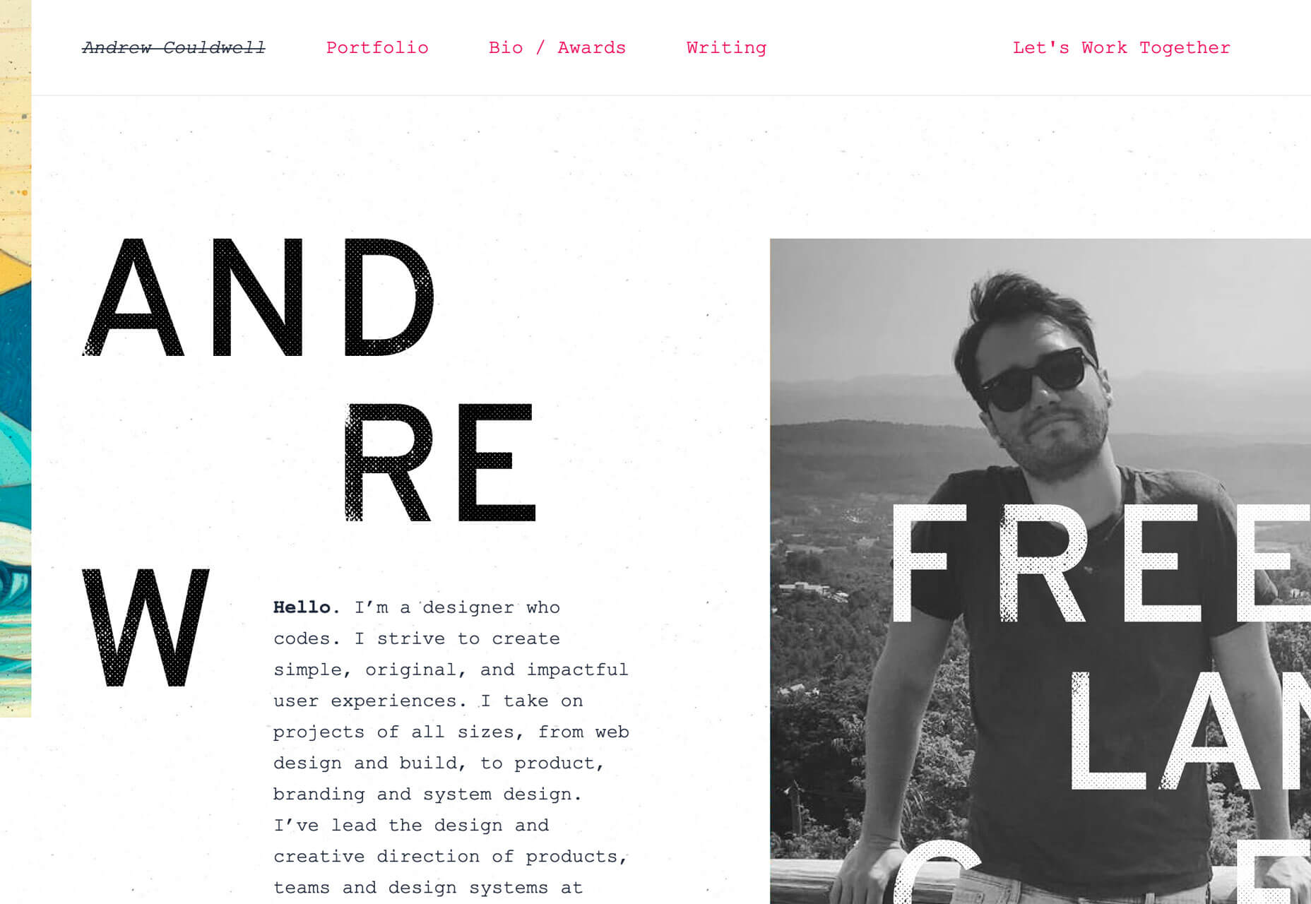
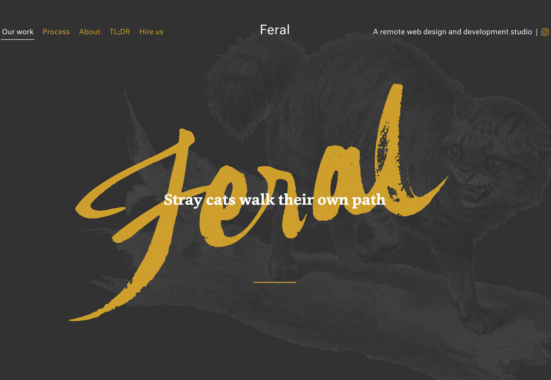
Big, bold typography has been a trend in website design for some time (we’ve explored that here on multiple occasions.) But there’s been a common theme until now: Most oversized type has been of the sans serif variety. Now the trend is shifting to an even bolder display above the scroll: Oversized lettering and script fonts. Each of the examples below uses this trend in a different way: Kota uses a subtle gradient-color animation in a minimal style design. The letters KOTA are the brand of the website and have a memorable design. While the main logo of the site uses a simple square mark with a sans serif, the funky lettering style is carried through the design in the form of call to action links/buttons.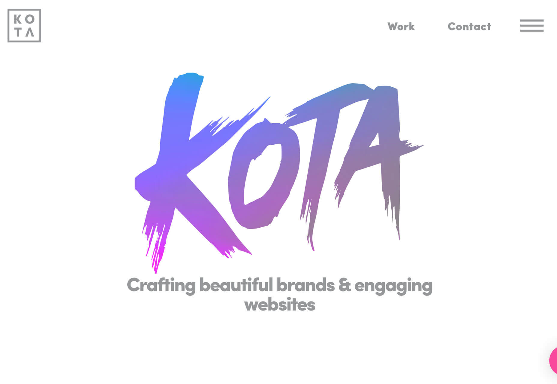 Feral also features its name in the center of the screen with a handwriting style font, but the bright yellow letters are on top of a dark image and behind a simple tagline for the company. The rest of the design is brighter and more minimal, but hints of the funky font carry through in surprising details.
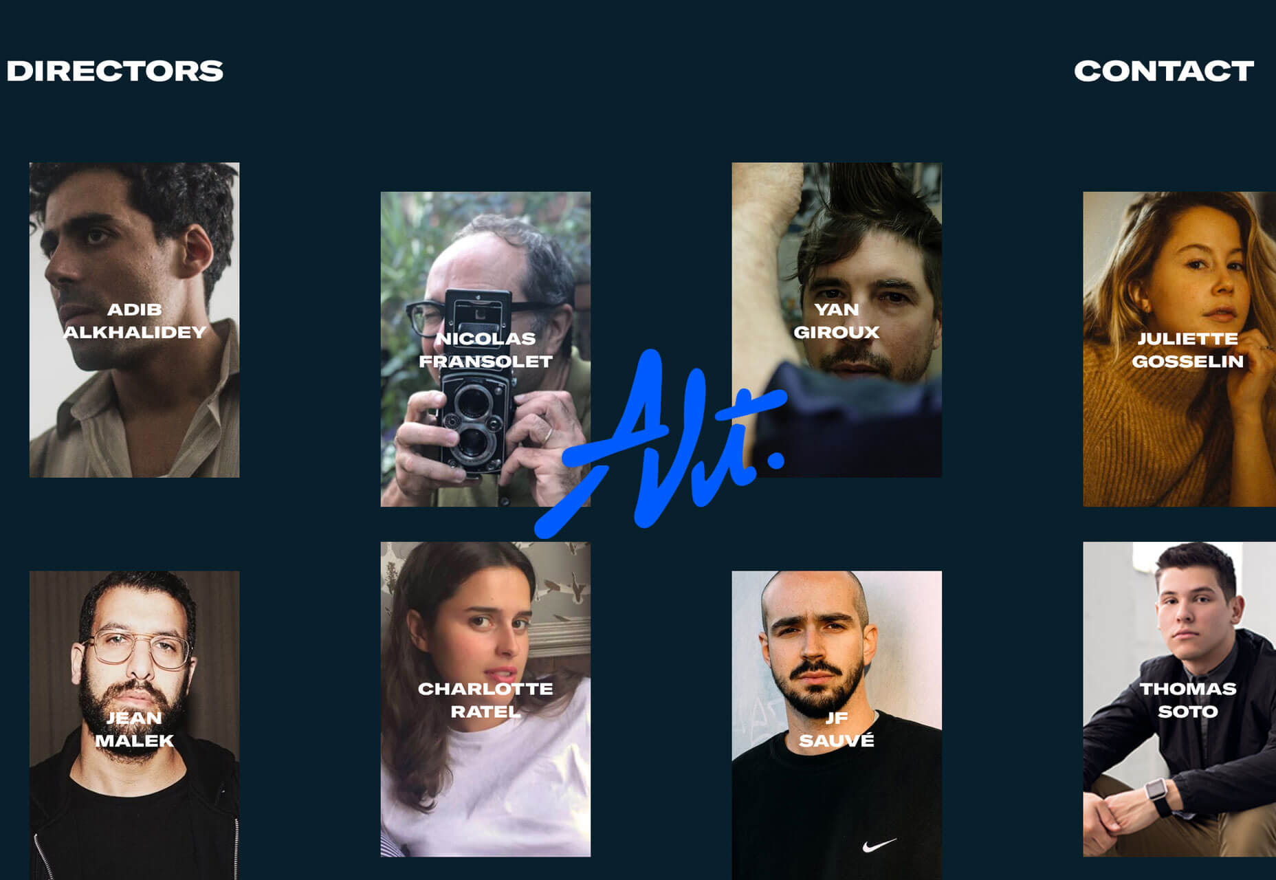
 Alt is a little less big than the other featured trending designs, but it is just as bold. What’s nice about the handwriting-style font here is that it is sleek and has a retro feel. As a center-screen element, it draws the eye in among multiple smaller photos and helps create a sense of cohesion among elements. The font and bright blue color combination do a great job of setting the mood for this website design. (Pay attention to the animation as well. The words don’t move while the image pop around it, some behind and some in front.)
 The common theme among all three projects is that this style of typography works best with a single word or short phrase. This style of type can be a challenge in terms of readability, so sticking to a simple use is the best option.
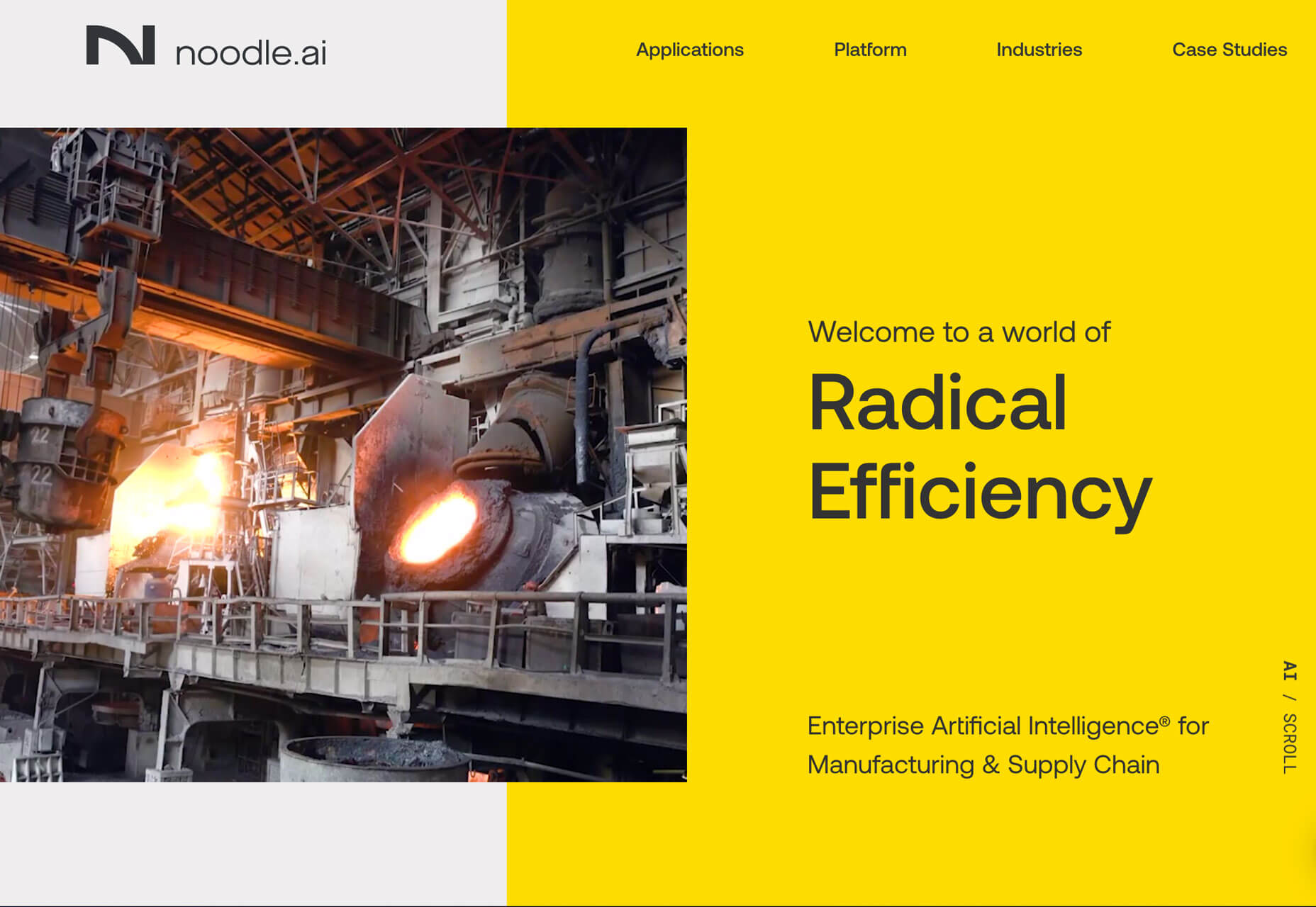
Poster-Style Hero Images
Creating a poster-style hero image or homepage screen might be the least controversial trend in the roundup this month, but it can be equally challenging when it comes to design. With multiple layered elements and bold elements, getting the visuals to collapse (or expand) to different responsive viewports can take some work. There are so many different ways to create a design that follows this trend. The commonality is that the first screen is an immersive visual experience. It’s not a about how much to read or three places to click; it’s about setting the scene for interactions to come. What often makes this design style work is a combination of amazing imagery – each of the examples below start with stunning images – impactful text and enough of a curiosity tease to get users to explore the design more. (It’s also interesting that all three examples are from design studios; that’s where many envelope-pushing trends show up first.) Deep Blue does this with an amazing visual. You might not know exactly what the website is about at first glance, but it’s so pretty that you’ll probably scroll to learn more. If you do, the design has done its job.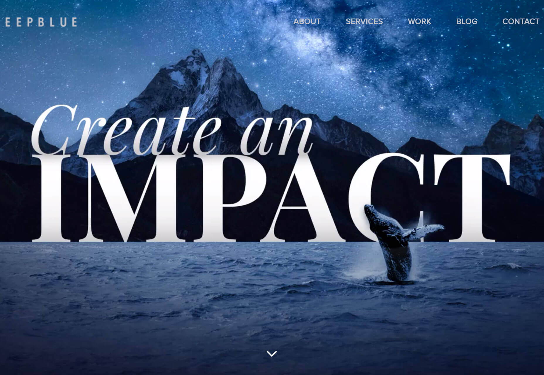 Chaptr Studio uses a striking image in a different way. It grabs your attention with a tiny, animated cursor that expands on clickable elements. Users hardly have to try to understand that there’s much more to this design.
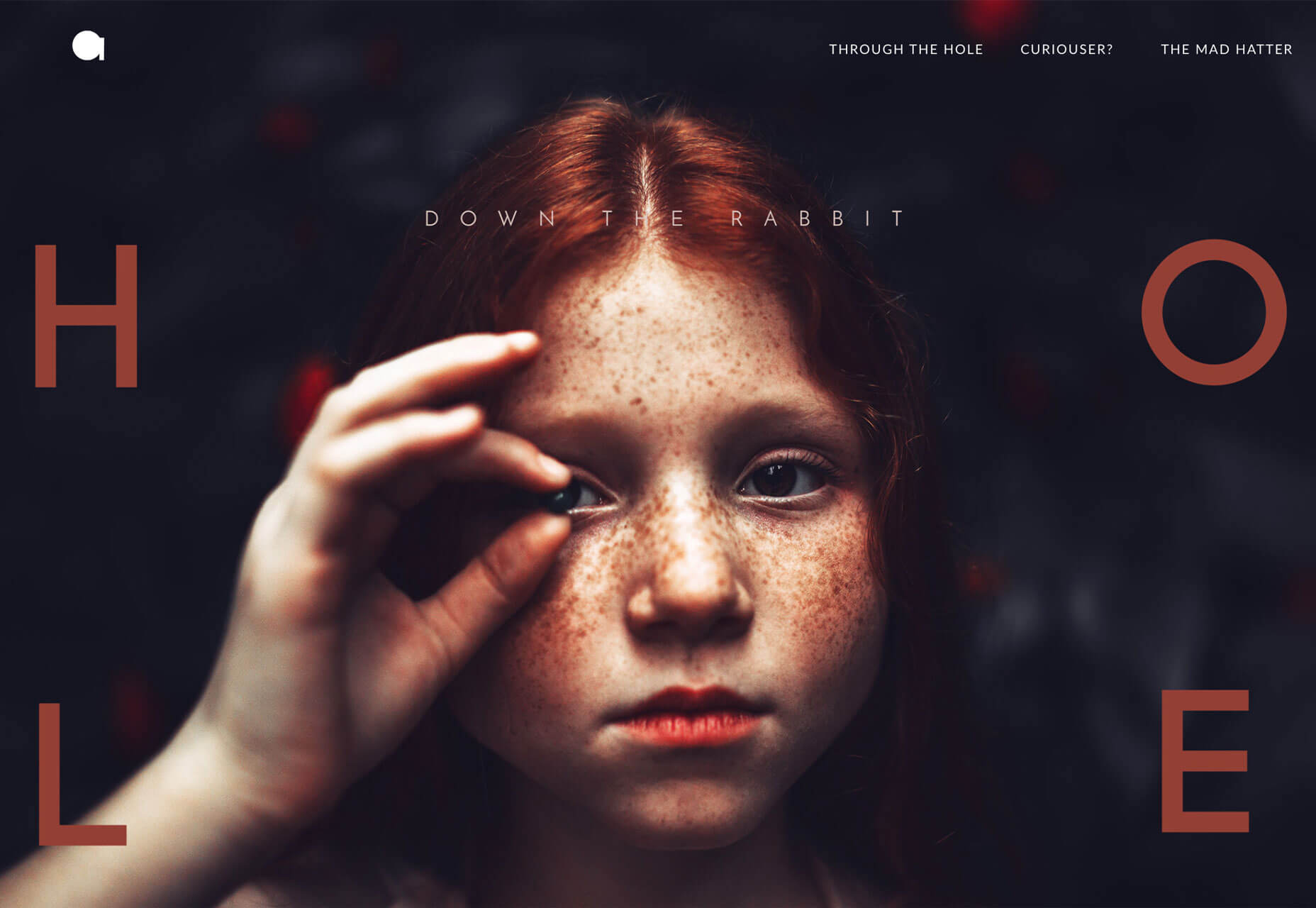
 Alber Graphics tugs at your curiosity with a stunning image and visual theme that is reminiscent of “Through the Looking Glass.” The visual presentation is so strong that users want to know what’s next; can you feel yourself wanting to engage with the CTA just to see how they respond?
Conclusion
How many of this month’s trends could you see as part of future design projects? Working with super trendy elements, especially ones that break common design rules or contrast with principles of design theory, can be a challenge. But if you get it right, there’s a huge upside. That’s what you get with each of the projects above; these risky design concepts are well worth the time and are a lot of fun to explore.Carrie Cousins
Carrie Cousins is a freelance writer with more than 10 years of experience in the communications industry, including writing for print and online publications, and design and editing. You can connect with Carrie on Twitter @carriecousins.


Read Next

15 Best New Fonts, July 2024
Welcome to our monthly roundup of the best fonts we’ve found online in the last four weeks. This month, there are fewer…
By Ben Moss

20 Best New Websites, July 2024
Welcome to July’s round up of websites to inspire you. This month’s collection ranges from the most stripped-back…

Top 7 WordPress Plugins for 2024: Enhance Your Site's Performance
WordPress is a hands-down favorite of website designers and developers. Renowned for its flexibility and ease of use,…
By WDD Staff

Exciting New Tools for Designers, July 2024
Welcome to this July’s collection of tools, gathered from around the web over the past month. We hope you’ll find…

3 Essential Design Trends, July 2024
Add some summer sizzle to your design projects with trendy website elements. Learn what's trending and how to use these…

15 Best New Fonts, June 2024
Welcome to our roundup of the best new fonts we’ve found online in the last month. This month, there are notably fewer…
By Ben Moss

20 Best New Websites, June 2024
Arranging content in an easily accessible way is the backbone of any user-friendly website. A good website will present…

Exciting New Tools for Designers, June 2024
In this month’s roundup of the best tools for web designers and developers, we’ll explore a range of new and noteworthy…

3 Essential Design Trends, June 2024
Summer is off to a fun start with some highly dramatic website design trends showing up in projects. Let's dive in!

15 Best New Fonts, May 2024
In this month’s edition, there are lots of historically-inspired typefaces, more of the growing trend for French…
By Ben Moss

How to Reduce The Carbon Footprint of Your Website
On average, a web page produces 4.61 grams of CO2 for every page view; for whole sites, that amounts to hundreds of KG…
By Simon Sterne

20 Best New Websites, May 2024
Welcome to May’s compilation of the best sites on the web. This month we’re focused on color for younger humans,…