

Back when the web was controlled by a trackpad, or a mouse, there was no use case for a left-handed web, but with the exponential growth of touchscreens across mobile, and desktop devices, we’re finding that it’s increasingly essential for many of our customers.~Jason Sommer, Senior Usability Designer, Mozilla
What is the Left-Handed Web?
When users browse the web on a touchscreen phone, especially on a larger device, certain areas are easier to tap than others, due to the reach of the user’s thumb. When held in the other hand, the available hit area is mirrored. Globally, around one in ten people are left-handed, which means that for around 10% of any site’s users, the navigation and CTAs (Calls to Action) are inaccessible. The LHW (Left-Handed Web) protocol is an option in the browser preferences that enables users to set their browser to invert the horizontal rendering of the page so that elements that appear on the right move to the left, and vice versa. (Elements such as text remain left aligned, and images aren’t flipped.) By repositioning elements based on this preference, hit areas become more accessible.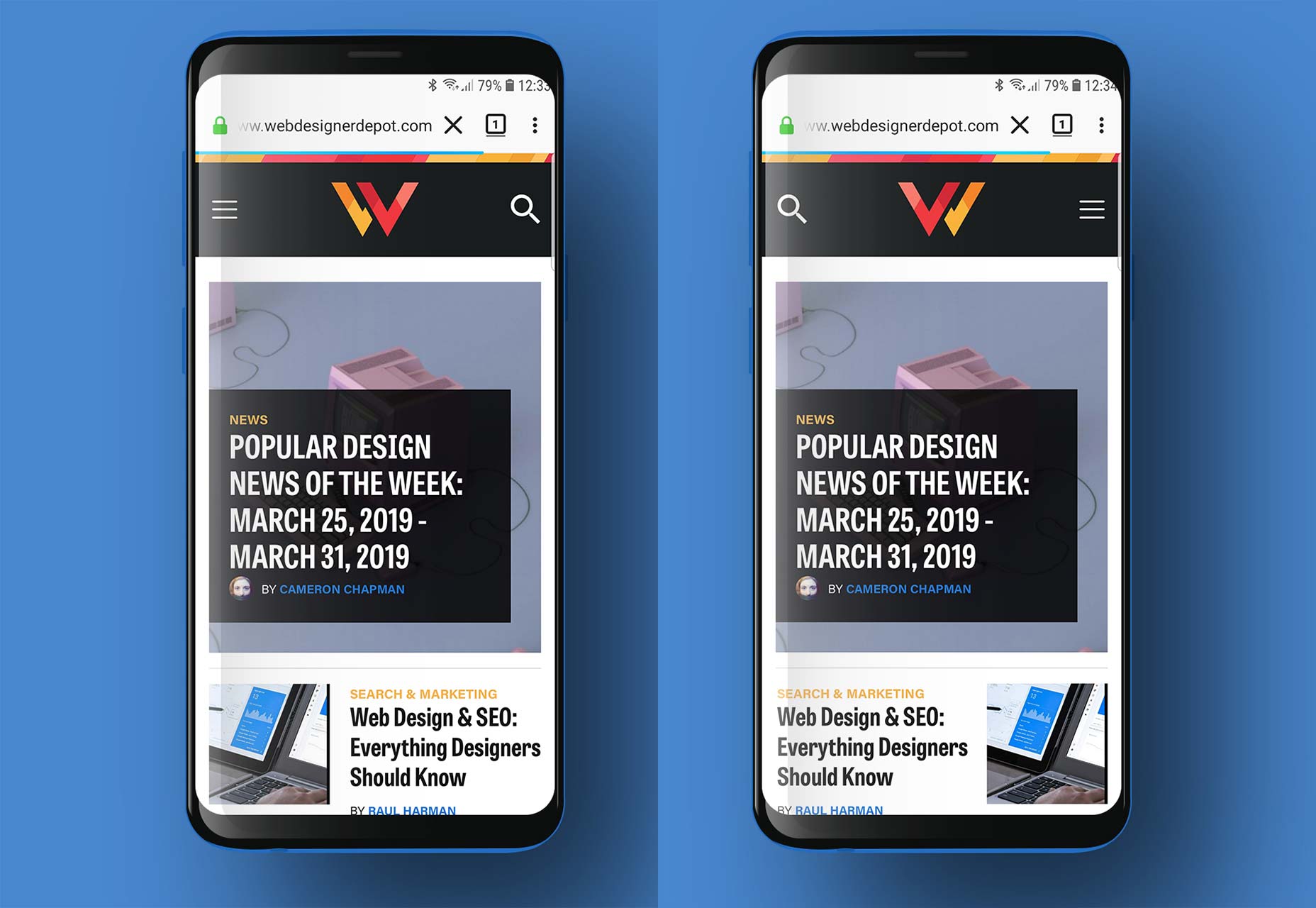 Webdesignerdepot.com rendered normally in Firefox mobile (left) and with the Left-Handed option enabled (right).
In simple terms, the LHW option—it’s important to note that the LHW is an opt-in preference; only those users that want to enable it will do so—simply flips the layout order of a site; if your logo is in the top left and your hamburger menu the top right, then with the LHW option enabled, your logo will move to the top right, and your hamburger menu to the top left.
Firefox’s implementation has come to market so quickly because it is piggy-backing on the CSS Flexbox’s ability to reverse the horizontal order of items laid out on screen.
Webdesignerdepot.com rendered normally in Firefox mobile (left) and with the Left-Handed option enabled (right).
In simple terms, the LHW option—it’s important to note that the LHW is an opt-in preference; only those users that want to enable it will do so—simply flips the layout order of a site; if your logo is in the top left and your hamburger menu the top right, then with the LHW option enabled, your logo will move to the top right, and your hamburger menu to the top left.
Firefox’s implementation has come to market so quickly because it is piggy-backing on the CSS Flexbox’s ability to reverse the horizontal order of items laid out on screen.
What Does the LHW Mean for UX?
One of the biggest issues with the LHW is how different browser manufacturers choose to interpret the recommendations; as no formal recommendation has yet been made, those interpretations are likely to be wildly different. When CSS Flexbox was introduced, there were radically different interpretations made by browser manufacturers, resulting in the need for numerous browser prefixes. Microsoft in particular implemented a very different set of rules to anyone else. Implementations of the LHW are likely to be even worse. The most contentious issue is whether navigation should be reversed. Firefox’s implementation does not reverse navigation, so if your site’s header is structured as ‘logo > home > services > about > contact’ then it will be rendered as ‘home > services > about > contact > logo’ (assuming that the logo is a separate element, and the navigation is correctly marked up with a <nav> element). However, Opera has hinted that its future implementation will reverse navigation, so that a site with a header that reads ‘logo > home > services > about > contact’ will be rendered as ‘contact > about > services > home > logo’. The argument put forward for this approach is that changing the order of elements should not change their context. At present, we don’t know which way the big browsers—Chrome, Edge, and Safari—will go (or even if they will implement the LHW at all). We know from numerous user tests that the most effective position for a logo is the top left of the screen. Moving that logo to the top right of the screen for the LHW is likely to impact readability. Advocates of the LHW believe that users will adapt, not least because the only users who will see the web in this way are left-handed users who opt-in, and will see the whole web this way.What Should Designers Do?
Ultimately, designing for left-handed users is about accessibility, it’s about inclusive design, and it’s just one more way in which we need to design responsively. At last year’s X Conf in Budapest, Matt Ritchie presented a proposal for a new media query to handle LHW browsing. The idea was to permit fine-tuning of LHW presentation, allowing designers to override critical placement issues, like logo position. However the idea has been widely dismissed as being too easy to override user preferences:Ultimately, this is about empowering users to interact in a way that is natural to them…providing front-end developers with a tool to overrule those stated preferences borders on the unethical.~ Caitlin Fring, human-centered designer In time, workarounds will inevitably be found. Logos for example could be coded into a <nav> element to prevent their reversal, although that would only work with Firefox’s implementation, and not Opera’s version. One important thing to note is that LHW only impacts rendering in the browser, it does not affect source code. So there will be little to no impact on search engine ranking, and links will continue to be crawled by bots in the same order. However, it may affect a user’s route through a site, and that in turn may impact rankings. Designers and developers need to work together to ensure they are fully prepped for this change as it begins to be adopted. Consider centralizing logos on mobile devices, so that the logo’s position isn’t changed. Consider switching from horizontal menus to vertical menus so that the order of items isn’t reversed. Finally, ensure that any navigation is correctly marked up in a <nav> element. The LHW is likely to affect a small percentage of site visits: only 10% of users will benefit from it; it is currently only available in the Firefox mobile nightly; it is an opt-in preference. Good design is about creating sites that adapt to user needs, not imposing a designer’s preferences on users. It cannot be long until designing for the left-handed is not only a best practice, but is written into inclusivity laws. We seem to have fooled most of you this year, this was our April Fools post as spotted by one or two readers.
Ben Moss
Ben Moss has designed and coded work for award-winning startups, and global names including IBM, UBS, and the FBI. When he’s not in front of a screen he’s probably out trail-running.


Read Next

15 Best New Fonts, July 2024
Welcome to our monthly roundup of the best fonts we’ve found online in the last four weeks. This month, there are fewer…
By Ben Moss

20 Best New Websites, July 2024
Welcome to July’s round up of websites to inspire you. This month’s collection ranges from the most stripped-back…

Top 7 WordPress Plugins for 2024: Enhance Your Site's Performance
WordPress is a hands-down favorite of website designers and developers. Renowned for its flexibility and ease of use,…
By WDD Staff

Exciting New Tools for Designers, July 2024
Welcome to this July’s collection of tools, gathered from around the web over the past month. We hope you’ll find…

3 Essential Design Trends, July 2024
Add some summer sizzle to your design projects with trendy website elements. Learn what's trending and how to use these…

15 Best New Fonts, June 2024
Welcome to our roundup of the best new fonts we’ve found online in the last month. This month, there are notably fewer…
By Ben Moss

20 Best New Websites, June 2024
Arranging content in an easily accessible way is the backbone of any user-friendly website. A good website will present…

Exciting New Tools for Designers, June 2024
In this month’s roundup of the best tools for web designers and developers, we’ll explore a range of new and noteworthy…

3 Essential Design Trends, June 2024
Summer is off to a fun start with some highly dramatic website design trends showing up in projects. Let's dive in!

15 Best New Fonts, May 2024
In this month’s edition, there are lots of historically-inspired typefaces, more of the growing trend for French…
By Ben Moss

How to Reduce The Carbon Footprint of Your Website
On average, a web page produces 4.61 grams of CO2 for every page view; for whole sites, that amounts to hundreds of KG…
By Simon Sterne

20 Best New Websites, May 2024
Welcome to May’s compilation of the best sites on the web. This month we’re focused on color for younger humans,…