

Up Late
Up Late is the one of the best neon-soaked portfolios I’ve come across, because it combines those bright and occasionally-flashing colors with considerable restraint in the rest of the design. The one-page portfolio is going to stick in your head for a while. The only thing I might change would be to put a maximum width on the little bit of body text there is. At wider resolutions, it can get a bit harder to read. Platform: WordPress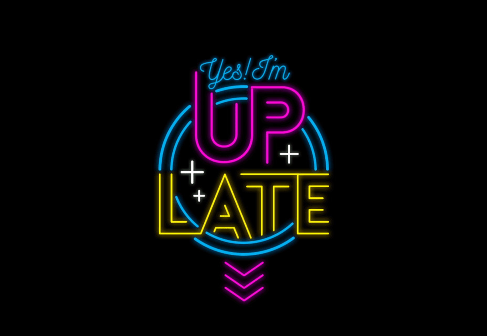
Raphael Aleixo
Raphael Aleixo’s one-pager is dark, clean, modern, and short, but still manages to make room for a full case study with each project. This is, in my personal opinion, one of the only acceptable ways to use modal screens. The use of animation is sparing by today’s standards, but that just means the site loads and runs fast while still looking pretty. Extra bonus points all around! Platform: Static Site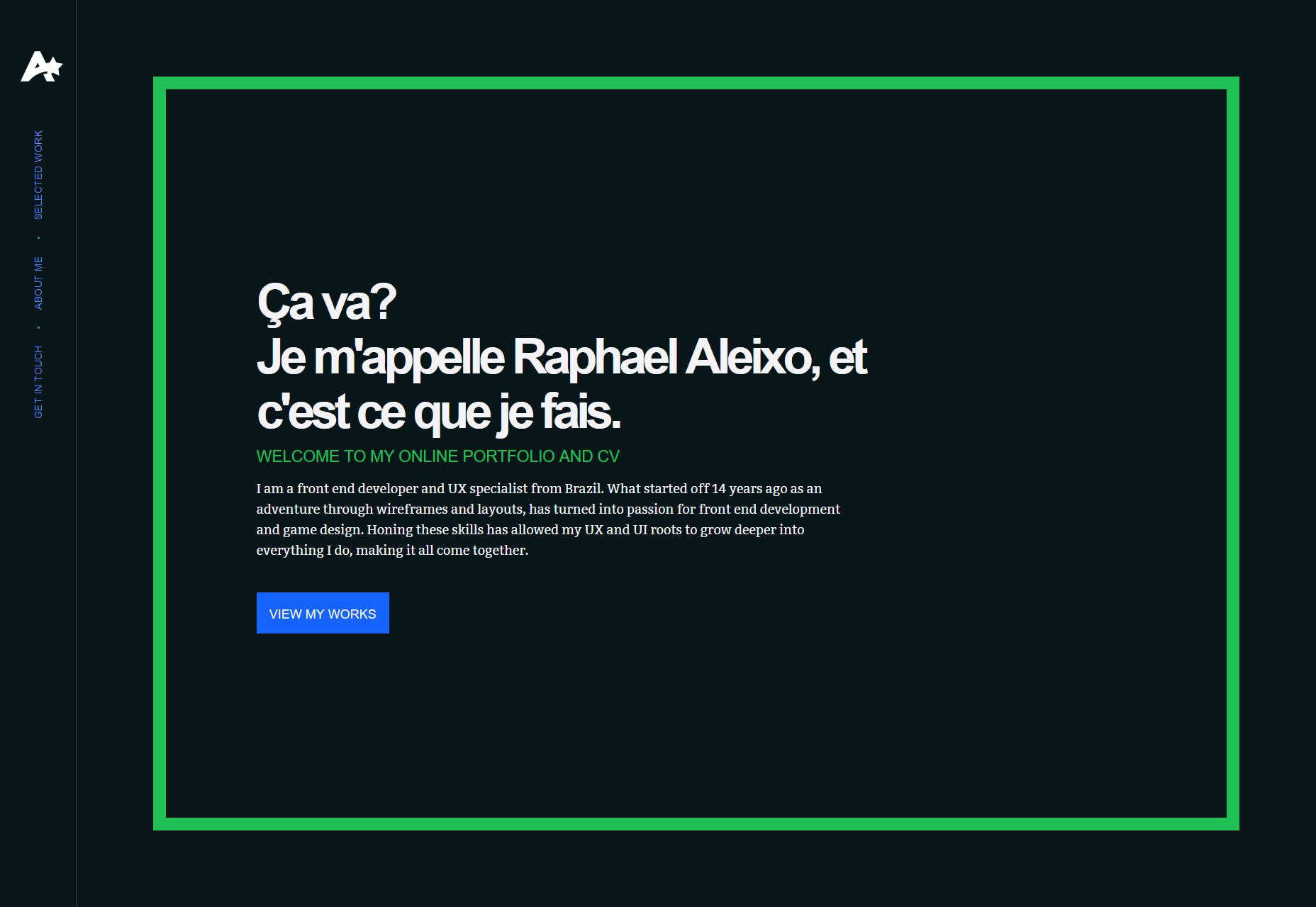
Artëm Tarasov
Artëm Tarasov’s portfolio is modernist and goes hard on the masonry layout. Beyond the home page, it’s all about those classic grid-style lines, and splashes of orange for emphasis. This sort of modernism may not be the most visually exciting of aesthetics, but it’s reliable. Platform: Custom CMS (I think)
Rifat Najmi
Rifat Najmi has embraced a more classic form of minimalism, and plays into a sort of “design blog aesthetic” that’s all about the typography. Portfolio pieces are displayed like blog posts, which blends them in with the actual blog posts. That might sound a bit confusing, but it actually works rather well. Just… what in the heck is a “certified design thinking practitioner”? Platform: WordPress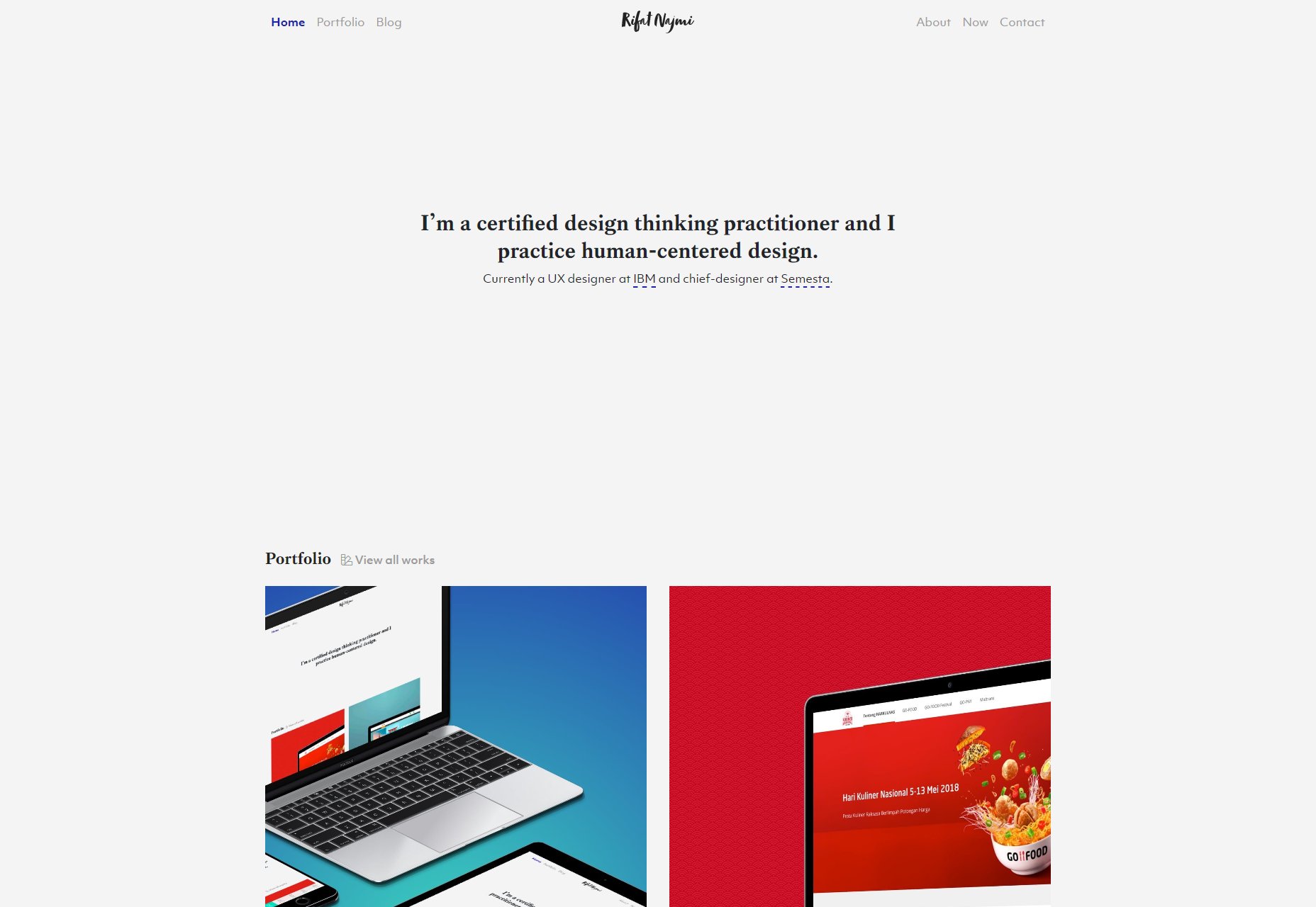
Graphikconcept
Graphikconcept is a highly PowerPoint-style site, but it’s just that good-looking. The imagery, the geometric lines, the use of color to divide the website into visually distinct sections, I just like it. It’s the kind of graphic-design-heavy website that fourteen-year-old-me always wanted to make. They made me wait behind a preloader, but it actually loaded pretty quickly. I’m going to give these guys a pass. Platform: Static Site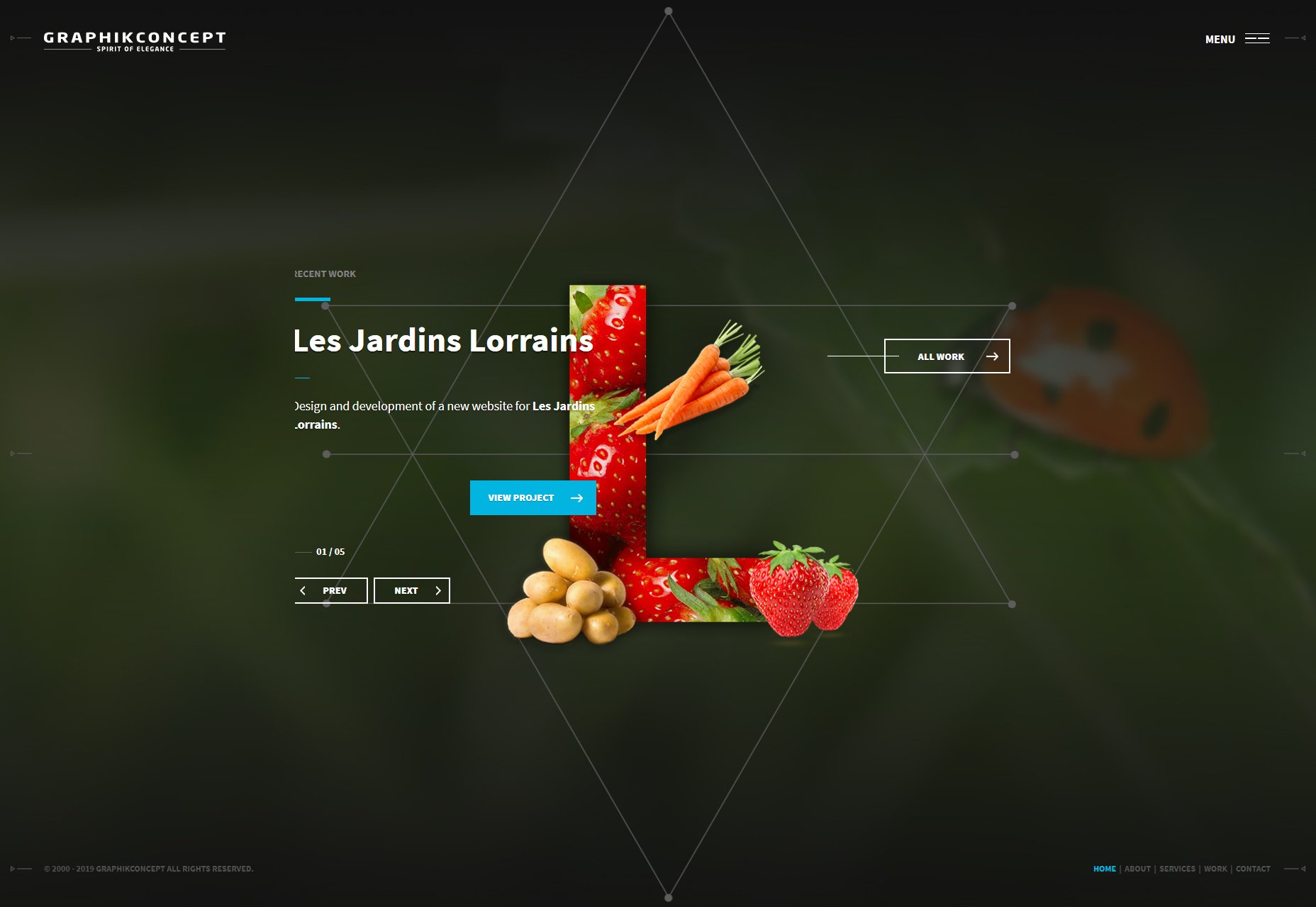
Angle2
Angle2 is another presentation-style site, and it plays with angles a lot. You know, like in the name. It leans hard into the geometry, especially with the type, and it manages to look a little bit chaotic while remaining fairly usable. It’s smooth, it’s pretty, and every page is different. No, let me rephrase that… I’m convinced that this is what happens when you give an art director coffee mixed with Red Bull to chase down their Adderall. They presumably designed this, then spent the rest of the week deep-cleaning their house. And I like it. Platform: Static Site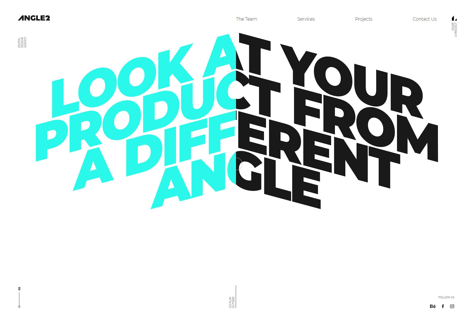
Psychx86
Speaking of things fourteen-year-old-me would have loved, Psychx86 is totally what I would have named my studio, and possibly my character in any number of MMOs. In this case, it happens to be a snazzy portfolio that is clearly targeted at businesses who like a light touch of space imagery and lovely type. Platform: Static Site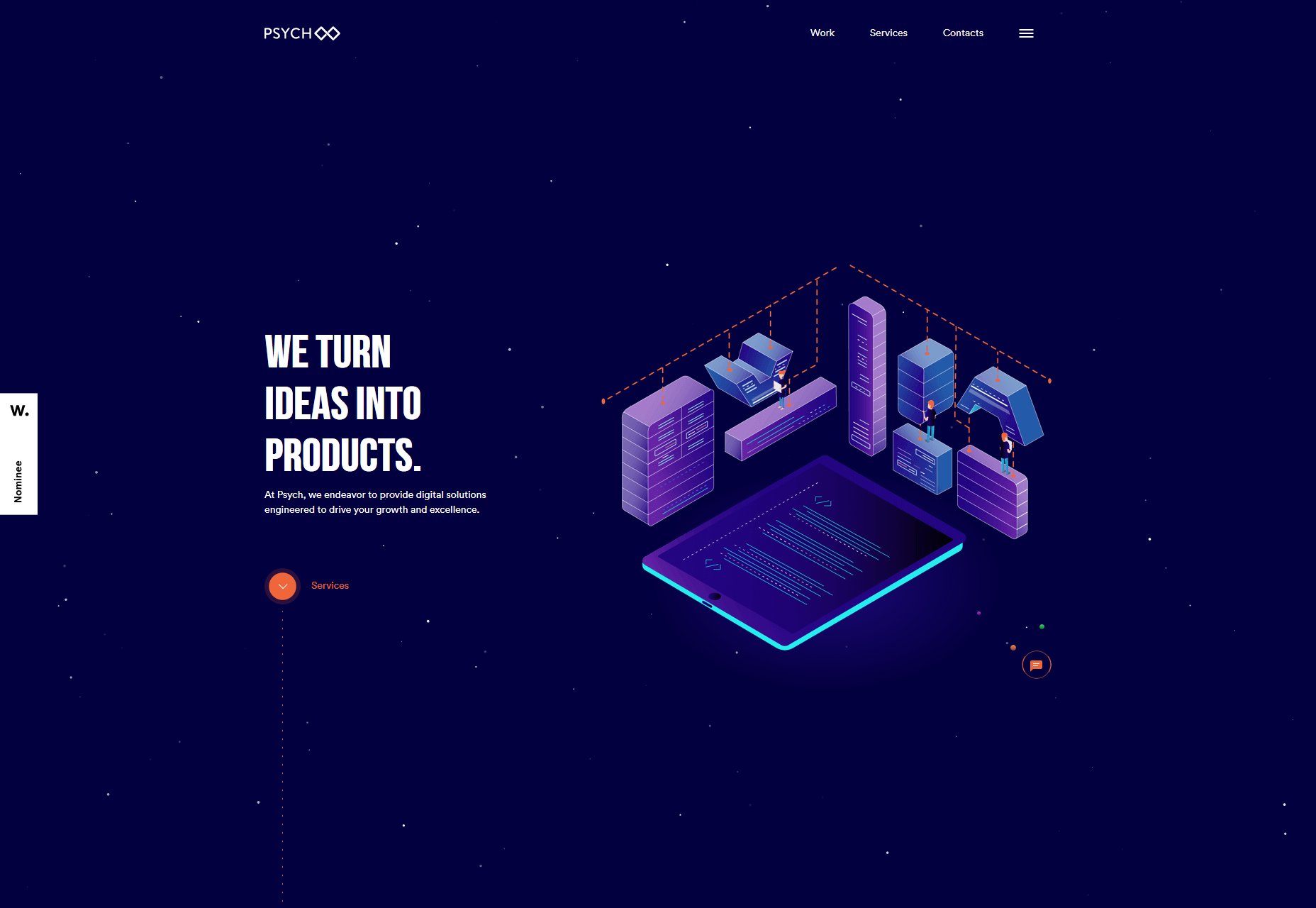
Contrast Visuals
Contrast Visuals is another portfolio site that leans hard into its name. It’s got black, white, and some video in an asymmetrical layout. It also has, in my opinion, the world’s best one-word navigation bar. It really is a case of less-is-more. Is it weird that I actually kind of like the little clipart logo that you can chase around the page? I don’t think it’s weird. Platform: WordPress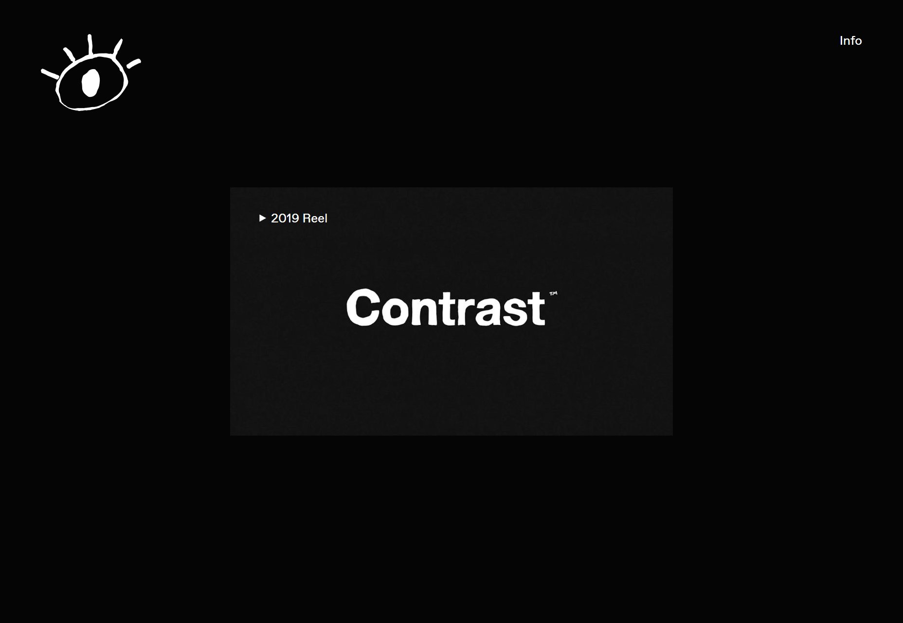
Branex
Branex stands out amongst other portfolio sites in its category by embracing color in a big way. And they’ve managed to use a bunch of gradients without overdoing it. And they do darn good-looking case studies. Look, they’re doing a lot right. It’s like they hit that point in the design process where you think, “It’s good, but it just needs something more.”, and by God I think they found that something. Platform: Static Site (I think)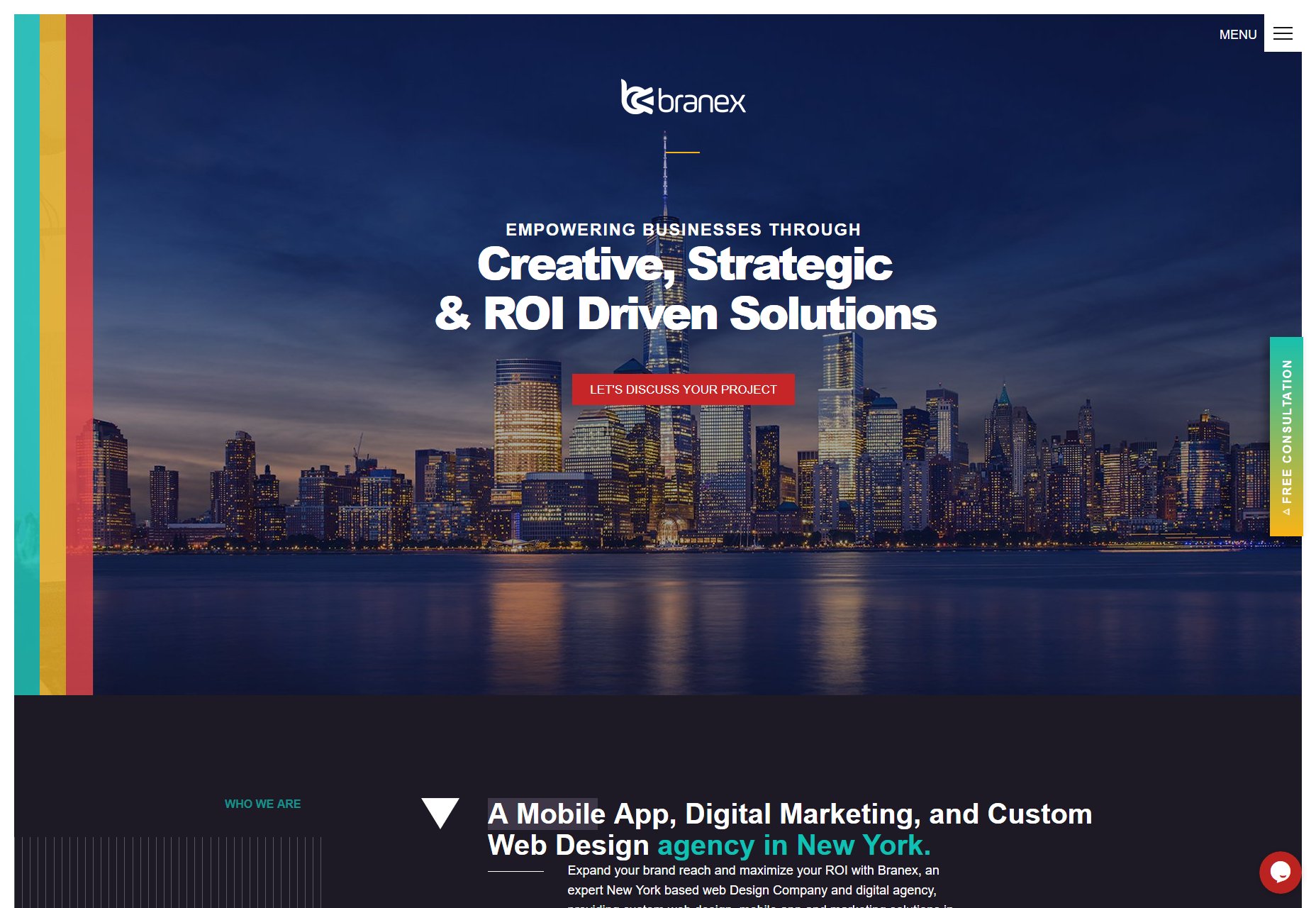
Nicholas Jackson
Nicholas Jackson’s portfolio combines a sort of gritty artsy design with elegant minimalism, strong typography, and a great use of yellow. And we all know I’m a sucker for yellow in my web design. The whole feel is almost like if National Geographic got a bit of a makeover. This especially holds true in the case studies. They’re laid out a bit like magazine articles. Platform: Static Site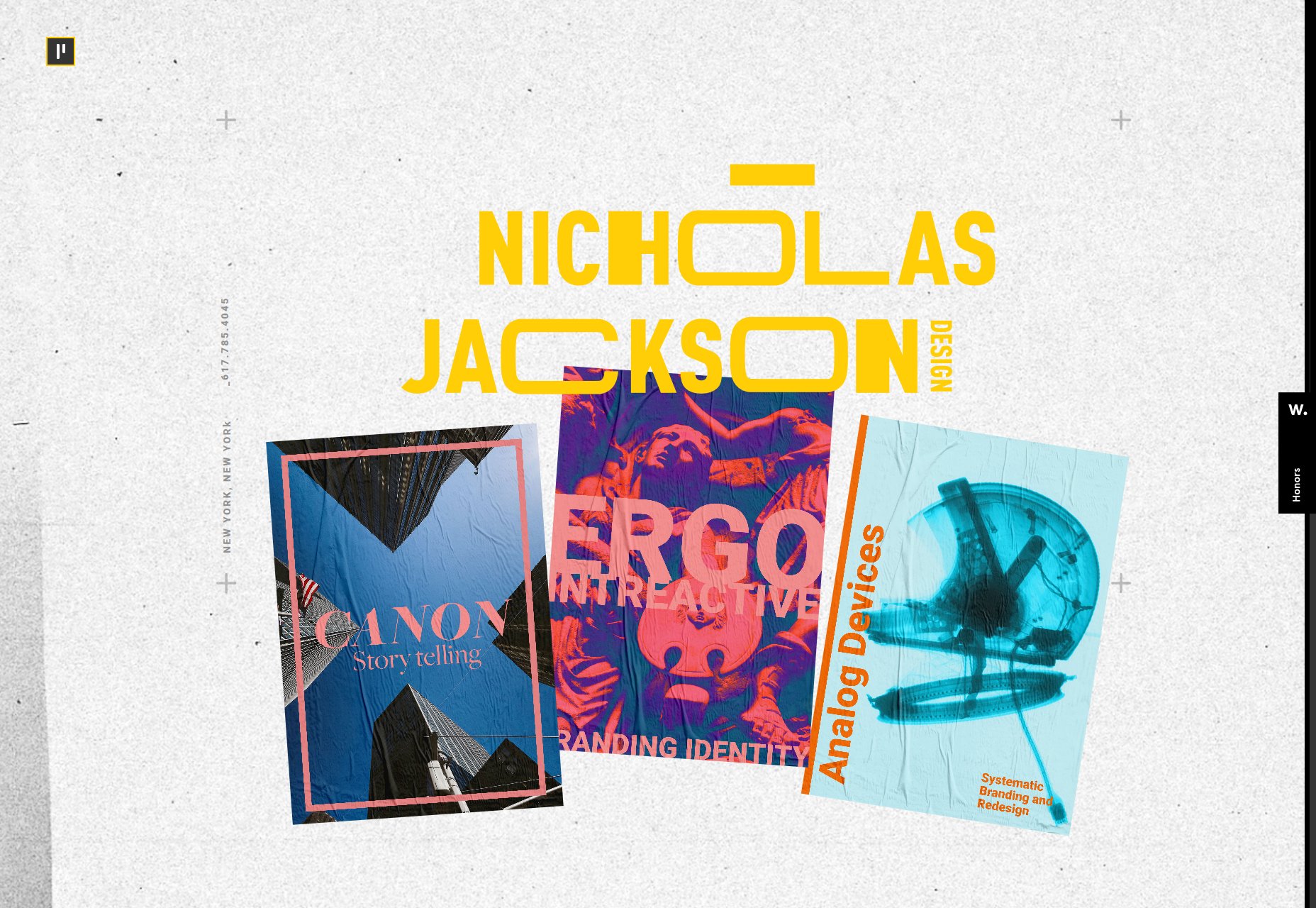
Alt Productions
Alt Productions’ site is interesting mostly for its navigation. Don’t get me wrong, I like the solid type and solid blues, but I really like the way what happens when you want to view a director’s work. Well, you get to see their work, which is obvious, but when you’re done, you just scroll down and it takes you right back to the menu of directors. It’s simple, intuitive, and it saves clicks and mouse movement. The only potential downside is that users might get lost a couple of times before they get used to it. Platform: Static Site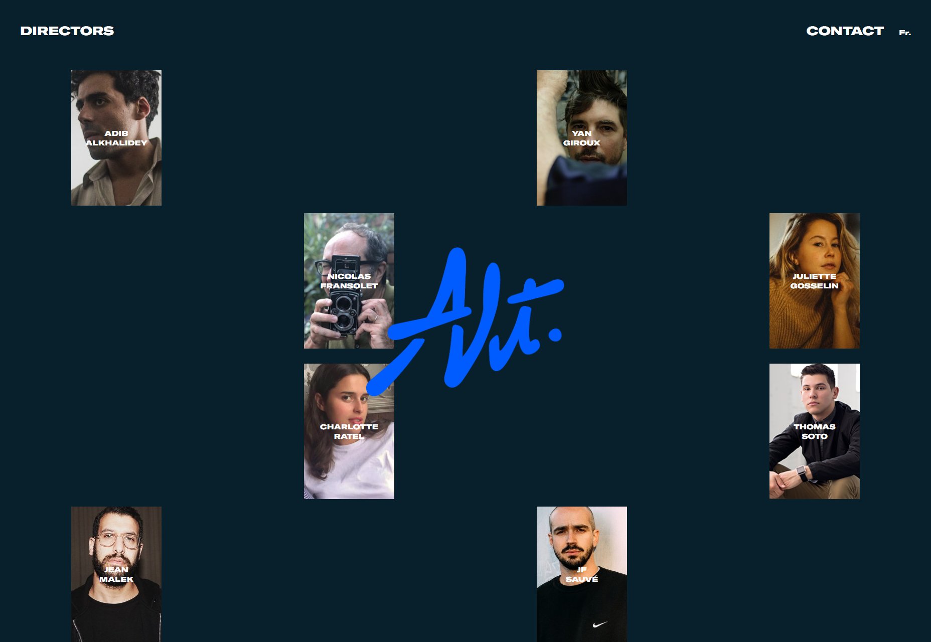
Aleksandr Yaremenko
Aleksandr Yaremenko’s portfolio brings us a touch of classic monochromatic elegance mixed with… emoji? I wouldn’t have thought of that, but the effect brings a touch of playfulness to an otherwise dead-simple experience. Platform: Static Site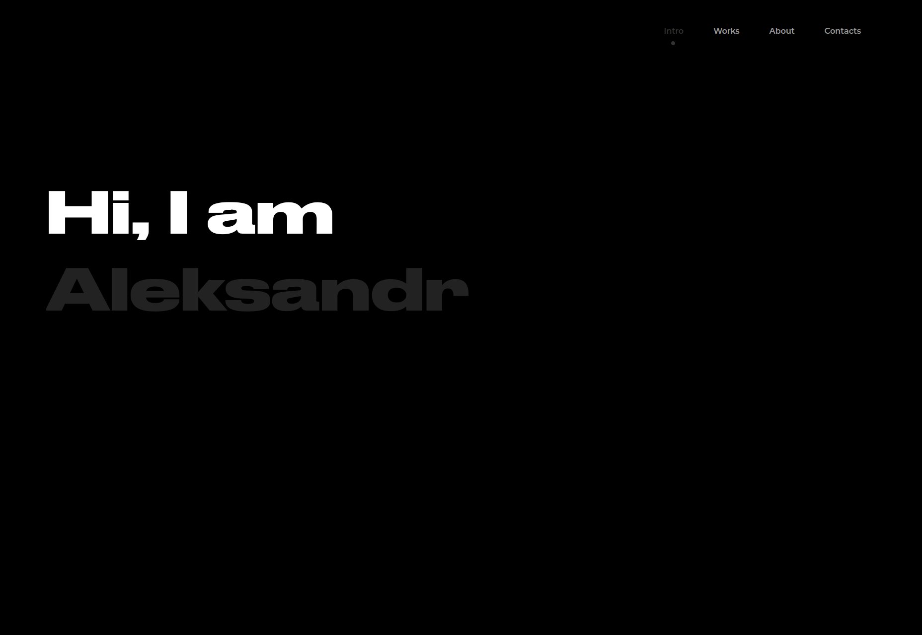
Kutia
Kutia is another one of those sites I wish I’d built when I was younger. Smooth gradients, super “techy” type, green Matrix filters on the imagery. Very junior designer me is in love! Another thing I like is the call to action on the homer page. They encourage interaction by asking, “What can we help you with?”, and providing a number of potential responses. Sure, all roads lead to the contact page, but it helps customers get an idea of what this agency can do for them. Platform: WordPress
Vincent Saïsset
Vincent Saïsset’s portfolio brings us some more lovely monochrome goodness, with thick type, and smooth animation that just feels right. It’s creative, it’s pretty, it’s good. Platform: Custom CMS (Maybe)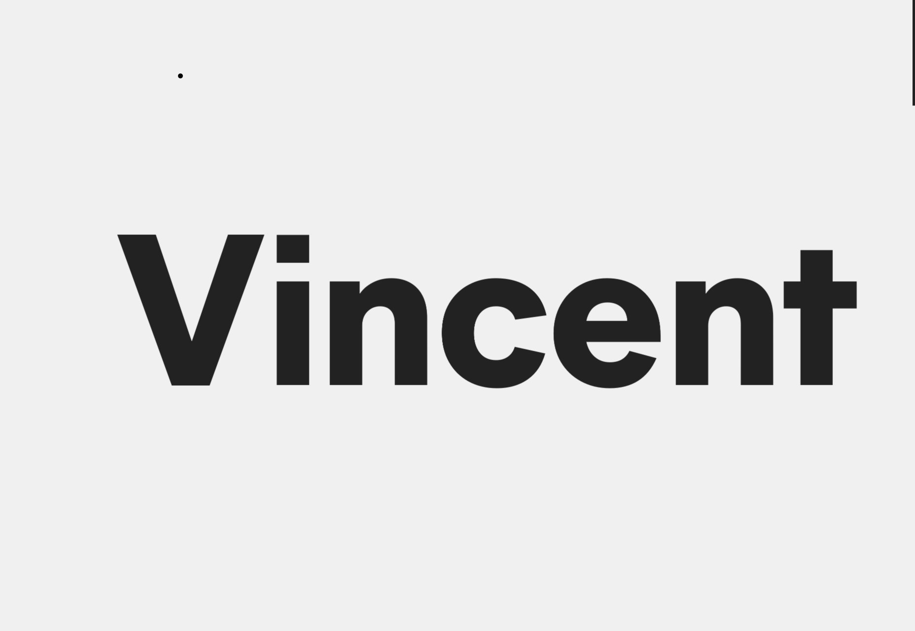
Steven Hanley
Steven Hanley’s portfolio is made up of two things, pretty much: typography, and animation. Oh there’s imagery, but it takes a back seat to big words, and shifting color palettes until you actually click on a portfolio piece. All in all, it’s pleasant to look at and browse through. Can you ask for more? Platform: Static Site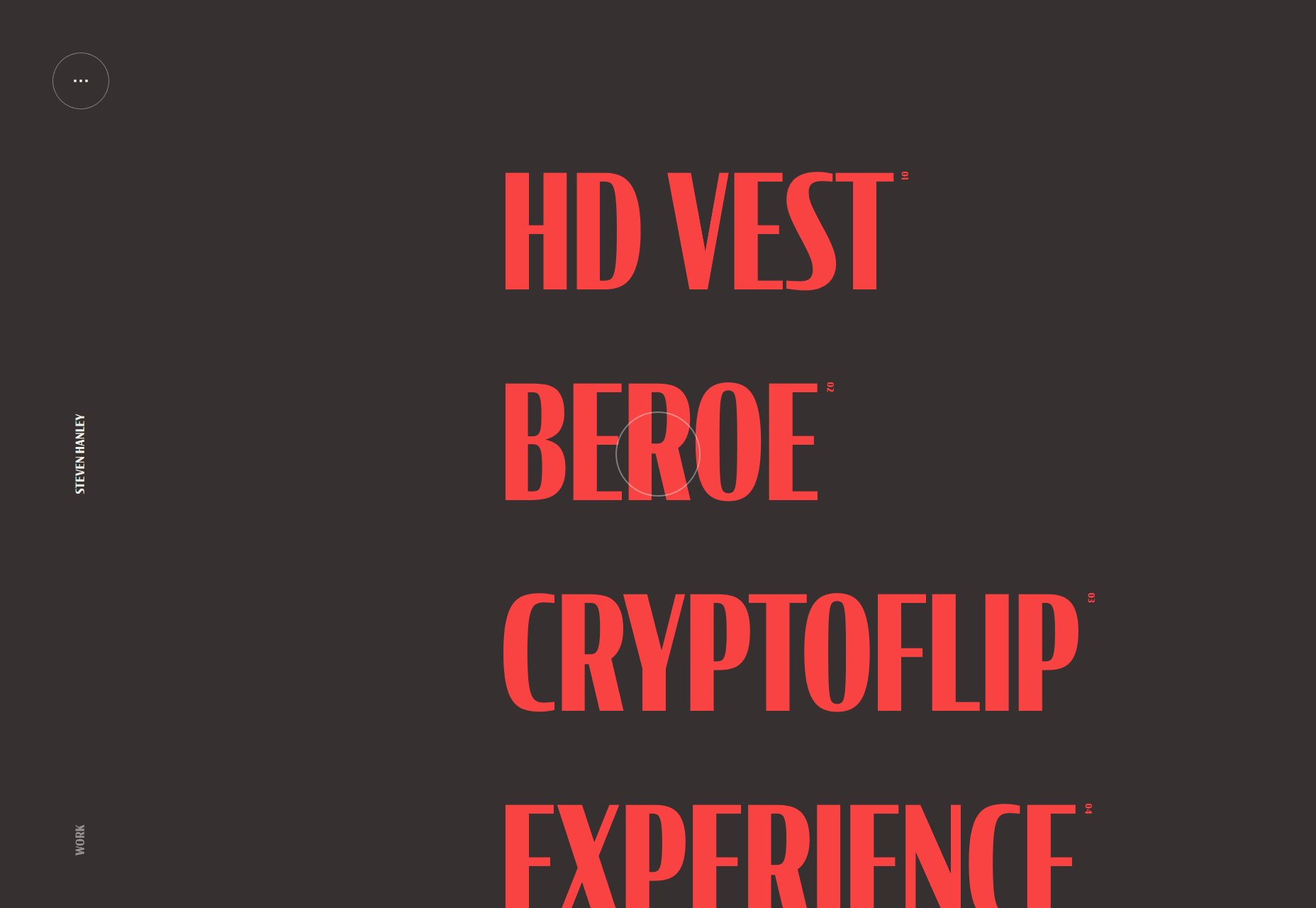
EVOXLAB
Now I know I talk about PowerPoint-style sites a bit, but EVOXLAB takes this concept to the next level. They went out of their way to make every section of their one-page portfolio look like an actual presentation slide. Thing is, for the way their content is set up… it really works. Some of the text is a bit small in the “About Us” section, but otherwise, this design is kind of like a fun trip down memory lane, without all the Flashbacks. (Sorry.) Platform: Static Site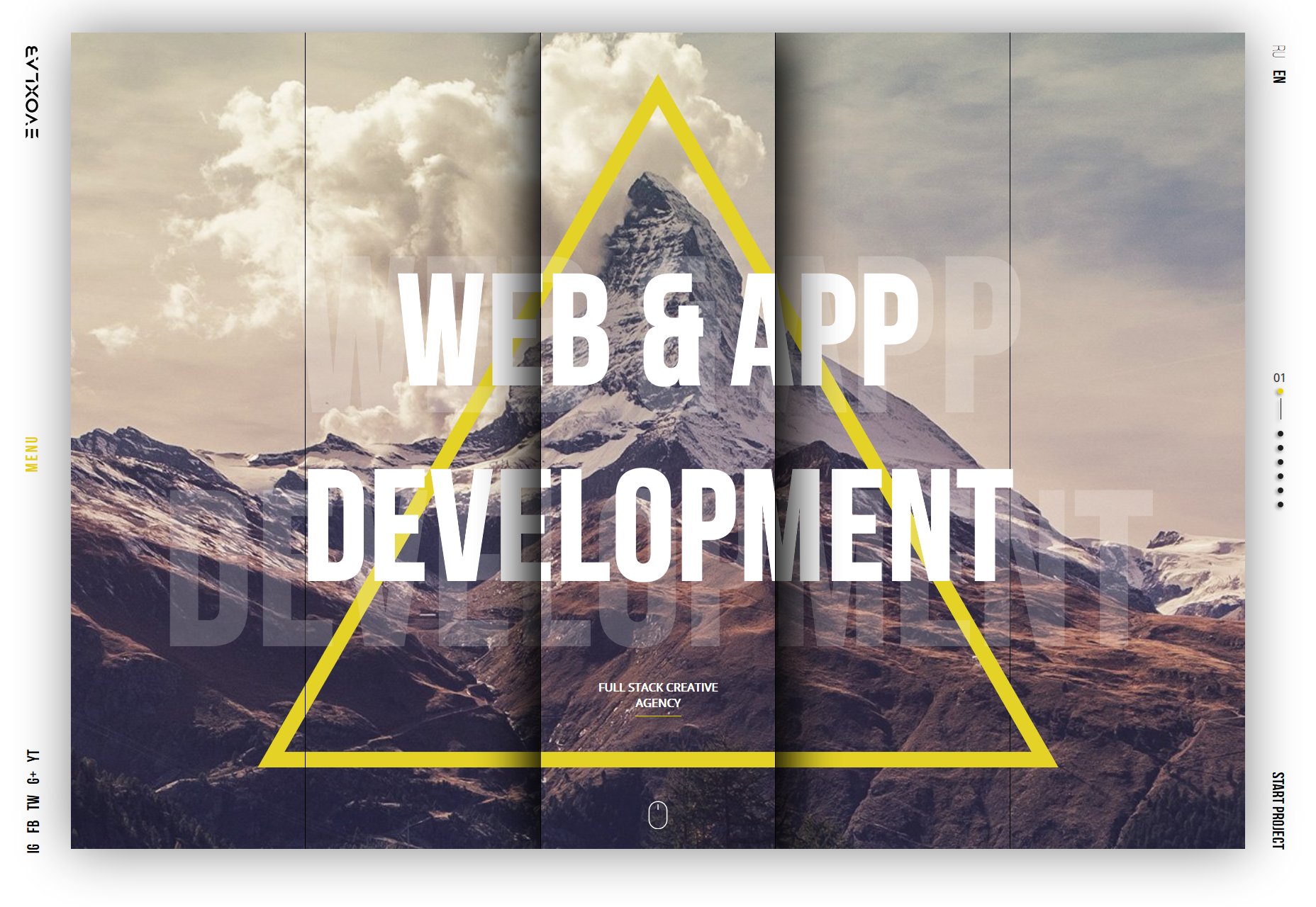
Rumsey Taylor
Rumsey Taylor’s portfolio is interesting in that Rumsey’s featured work is linked to throughout paragraphs of regular copy text. It’s not the only portfolio to do this, but it does have its own twist on the formula. Go take a look. Platform: Static Site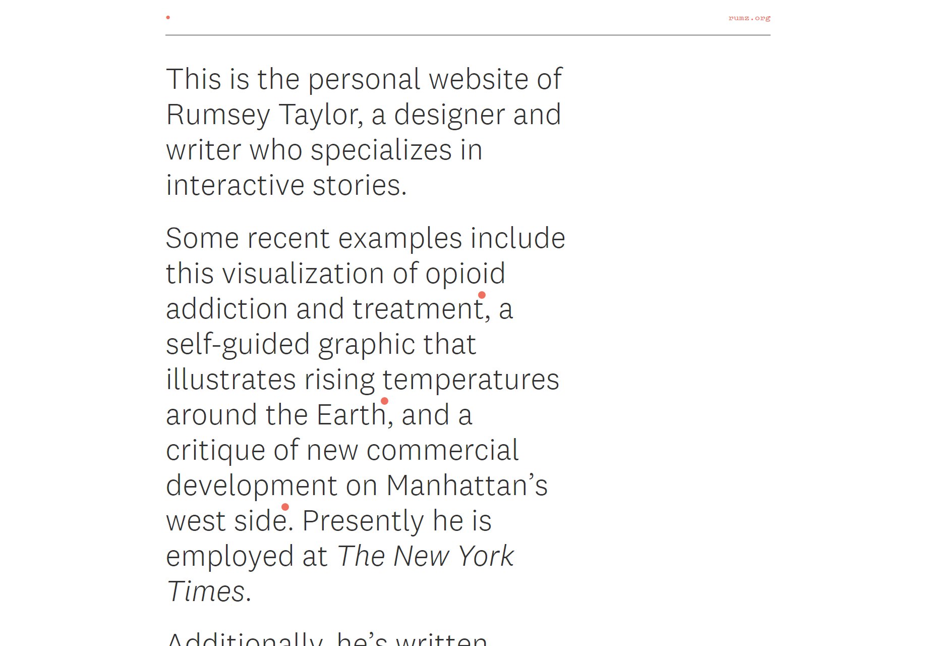
Grégoire Mielle
Grégoire Mielle’s portfolio is a semi-presentational site with some 3D graphics thrown into the mix. The fancy schmancy animation leads into a fairly standard but beautifully rendered minimalist layout. The only thing I’d change would be to give the 3D graphics a little more contrast for those whose screens aren’t calibrated right. Platform: Static Site
Chaptr
Chaptr is one of those portfolios that goes hard with the “default link blue”, or at least a very similar blue. While I’ve seen and featured a number of sites like that over the years, they still stand out because it seems like a lot of other designers are trying so hard to get away from that particular color. In addition to loving the blue, I like how on various pages, scrolling will bring different elements into and out of focus, giving you one small chunk of content to digest at a time. It’s a simple effect, but it’s powerful. Platform: WordPress
Iteo
Iteo presents us with a very business-friendly, yet still lovely aesthetic, with a focus on sans-serif type, and a lot of blue and orange thrown in to spice up the white backgrounds. The whole thing just screams “modern”, but it’s still tasteful. In particular, I like the animated illustrations that are slightly reminiscent of blueprints. I also like that they add their own elements to the stock photos they use on their blog. It shows they put time and effort into everything they do. Platform: Hugo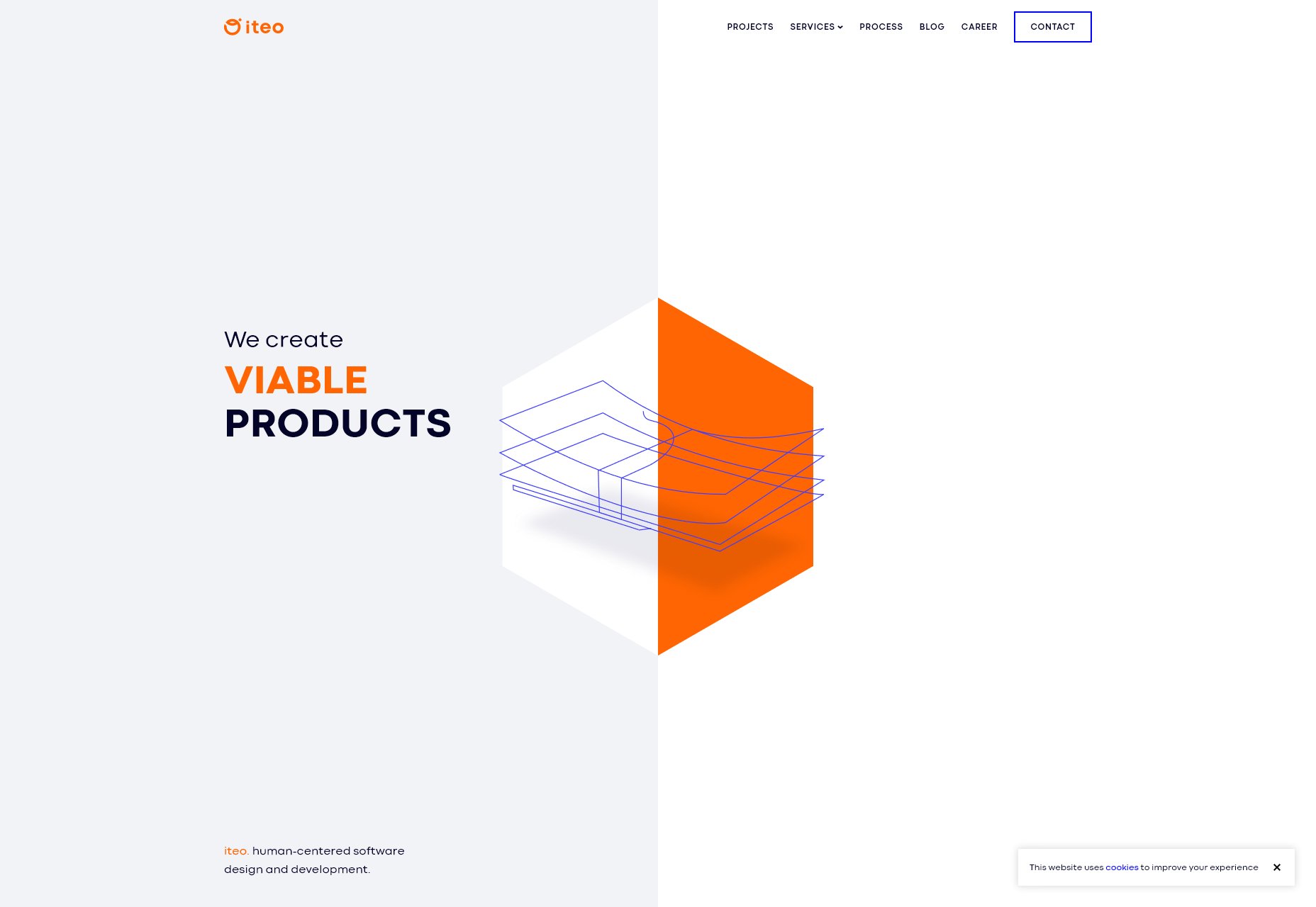
Ezequiel Bruni
Ezequiel Bruni is a web/UX designer, blogger, and aspiring photographer living in Mexico. When he’s not up to his finely-chiselled ears in wire-frames and front-end code, or ranting about the same, he indulges in beer, pizza, fantasy novels, and stand-up comedy.


Read Next

15 Best New Fonts, July 2024
Welcome to our monthly roundup of the best fonts we’ve found online in the last four weeks. This month, there are fewer…
By Ben Moss

20 Best New Websites, July 2024
Welcome to July’s round up of websites to inspire you. This month’s collection ranges from the most stripped-back…

Top 7 WordPress Plugins for 2024: Enhance Your Site's Performance
WordPress is a hands-down favorite of website designers and developers. Renowned for its flexibility and ease of use,…
By WDD Staff

Exciting New Tools for Designers, July 2024
Welcome to this July’s collection of tools, gathered from around the web over the past month. We hope you’ll find…

3 Essential Design Trends, July 2024
Add some summer sizzle to your design projects with trendy website elements. Learn what's trending and how to use these…

15 Best New Fonts, June 2024
Welcome to our roundup of the best new fonts we’ve found online in the last month. This month, there are notably fewer…
By Ben Moss

20 Best New Websites, June 2024
Arranging content in an easily accessible way is the backbone of any user-friendly website. A good website will present…

Exciting New Tools for Designers, June 2024
In this month’s roundup of the best tools for web designers and developers, we’ll explore a range of new and noteworthy…

3 Essential Design Trends, June 2024
Summer is off to a fun start with some highly dramatic website design trends showing up in projects. Let's dive in!

15 Best New Fonts, May 2024
In this month’s edition, there are lots of historically-inspired typefaces, more of the growing trend for French…
By Ben Moss

How to Reduce The Carbon Footprint of Your Website
On average, a web page produces 4.61 grams of CO2 for every page view; for whole sites, that amounts to hundreds of KG…
By Simon Sterne

20 Best New Websites, May 2024
Welcome to May’s compilation of the best sites on the web. This month we’re focused on color for younger humans,…