20 Best New Portfolios, July 2019

Every month we roundup the best portfolios launched by agencies, freelance designers, and other creative professionals, into one easy-to-digest collection.

White Elephant
White Elephant combines pastels, some asymmetrical design, some very grid-focused design, and a whole lot of absolutely gorgeous type to create a pleasant, pretty browsing experience. Also, there’s the occasional witty GIF used during page transitions, a sort of blink-and-you’ll miss it detail that amused me. Platform: WordPress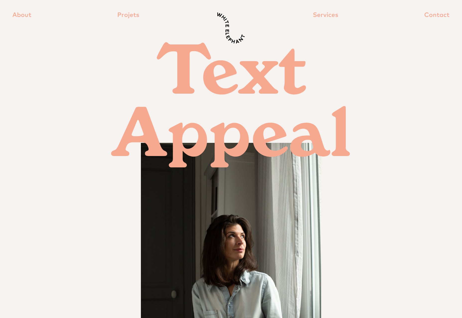
Adam Brandon
Adam Brandon’s portfolio keeps things very minimalist. But then, when you have Netflix, Apple, Nike, and Ford in your portfolio, do you really want that much getting in the way of all those logos? No, in these situations, minimalism is definitely the way to go, and the sort of grid-based collage doesn’t hurt. Platform: Squarespace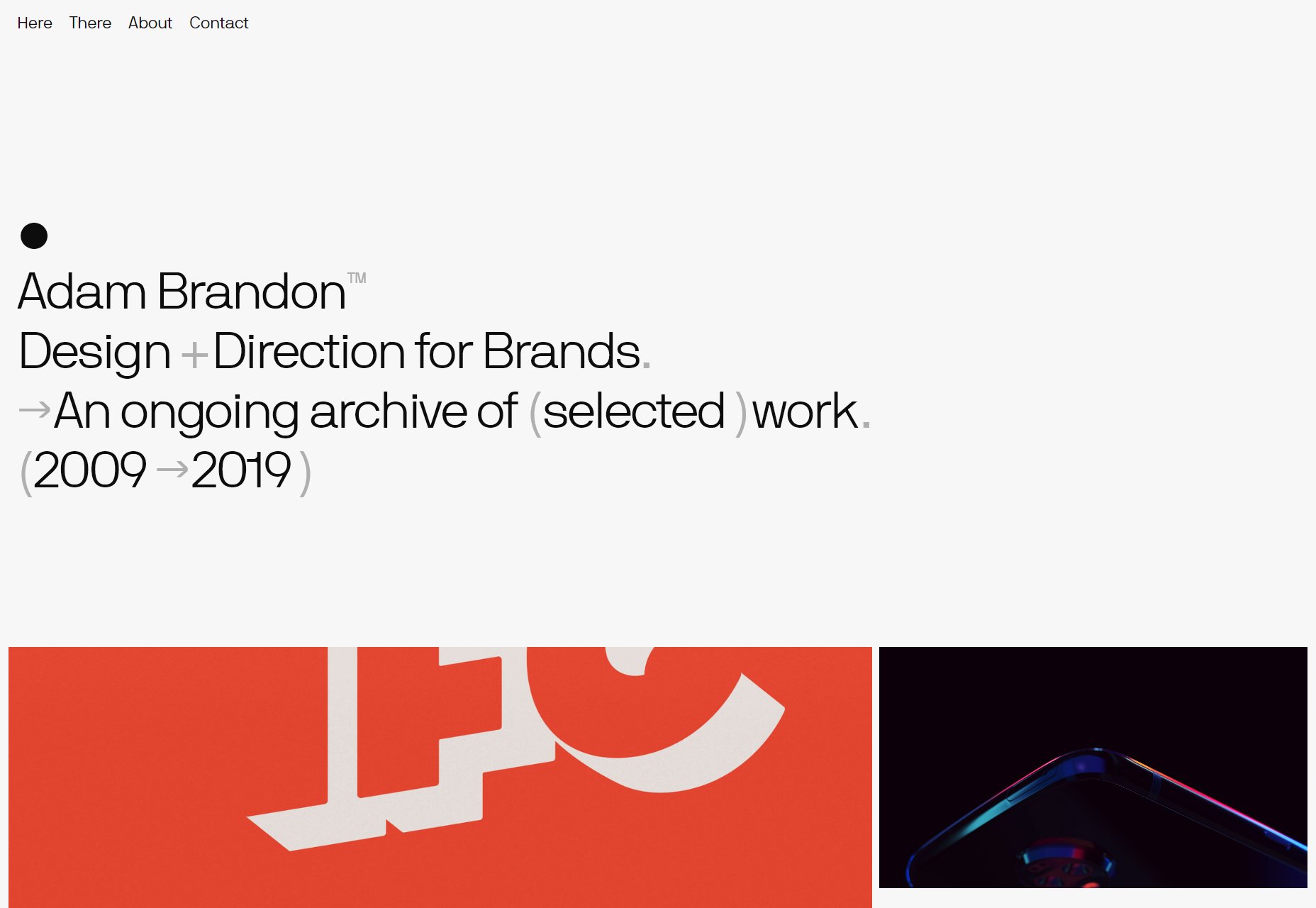
Planetary
Planetary’s agency site is pretty, modern, and I have to say that the designers sure know how to effectively use just the tiniest splashes of extra color for emphasis. It’s just that nice to look at. Plus, this site just introduced me to the typeface known as Neutrif pro, and I think I’m in love. Platform: Gatsby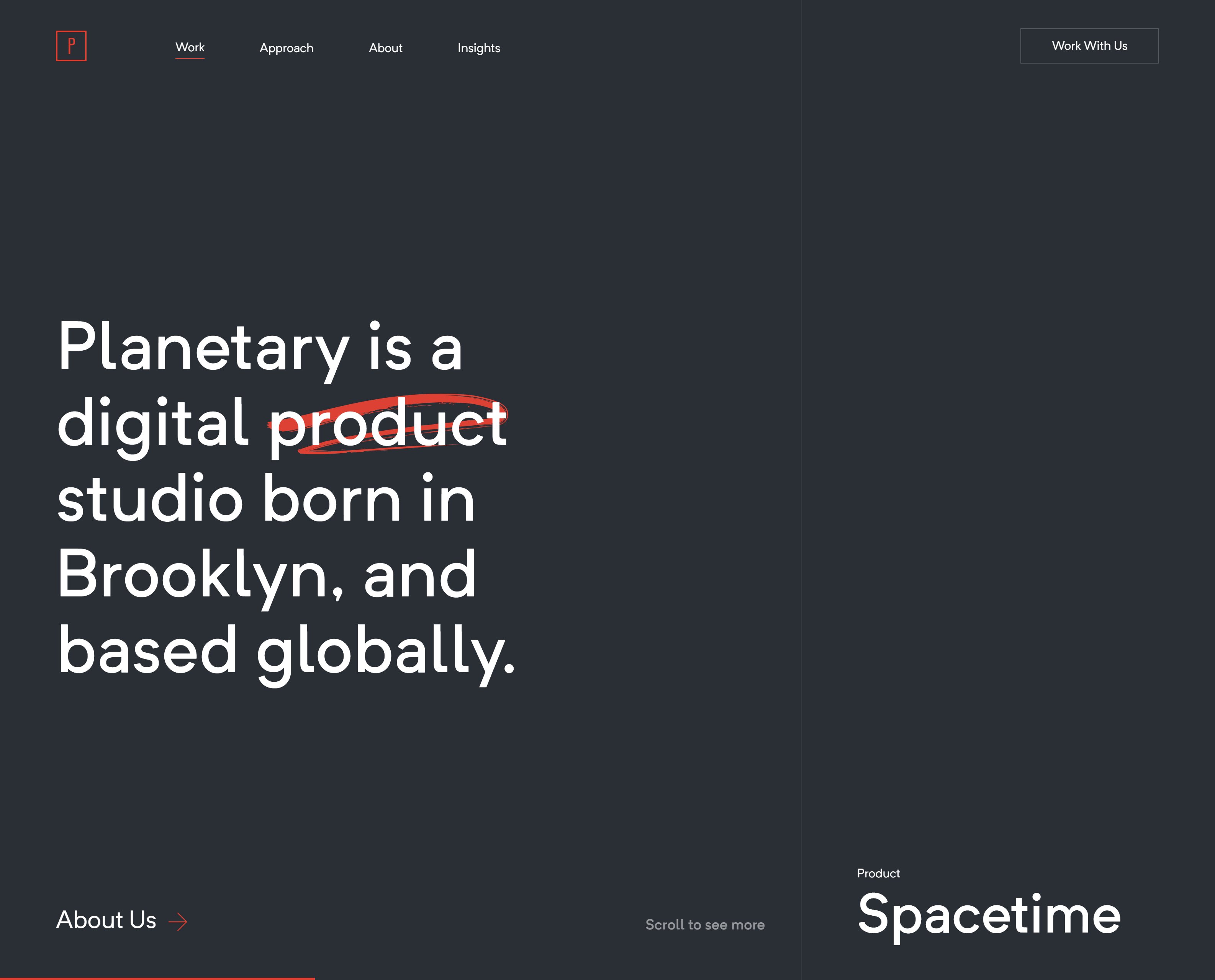
Werlen Meyer
Werlen Meyer keeps things fairly simple with a dark layout, simple sans-serif type, and quite a bit of background video. I have to hand it to whomever is optimizing this site. All of the video/animation loaded fast and smooth on my 5Mbs connection. Platform: Custom CMS (I think. I never know for sure when Lua is listed as the programming language.)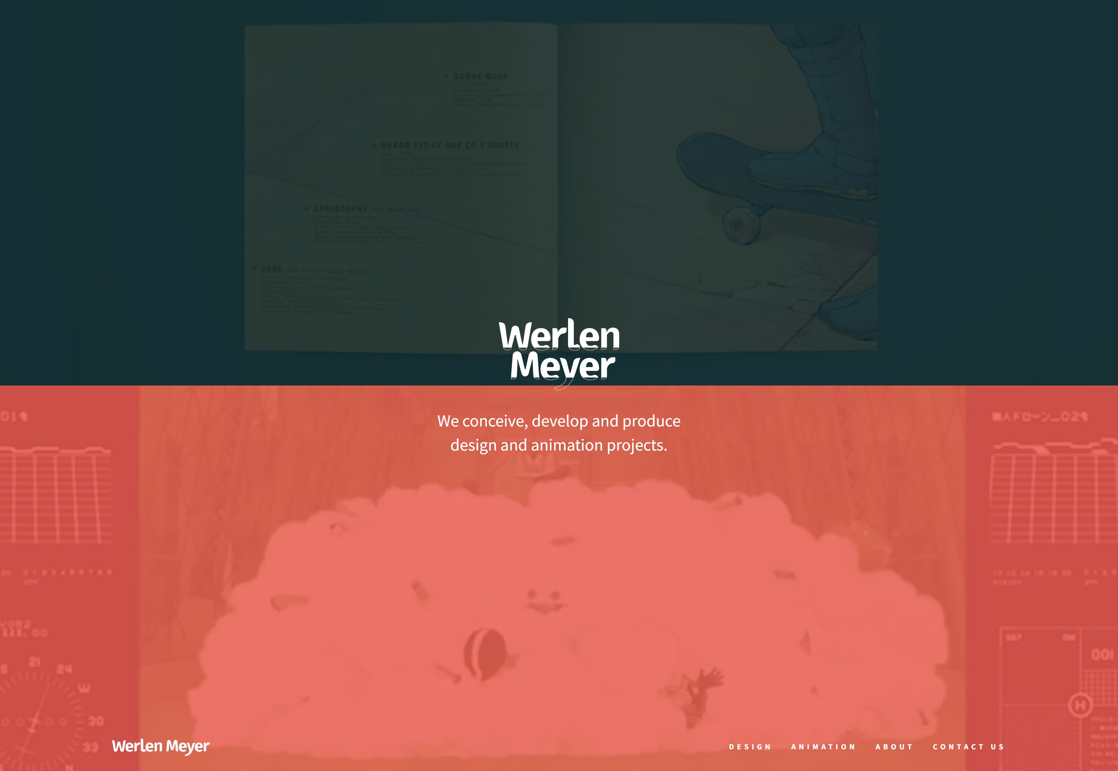
Renaud Rohlinger
Renaud Rohlinger is a “French Creative Developer living in Japan (soon)”, and this is presumably why his site is a mix of Japanese and English. Not content with that, however, he threw in a whole lot of gorgeous WebGL animation that runs pretty smooth and fast, even on my old laptop with integrated graphics. While there could be some improvements made layout-wise, and the body text could be a little bigger, the whole thing is a technical marvel. Platform: Static Site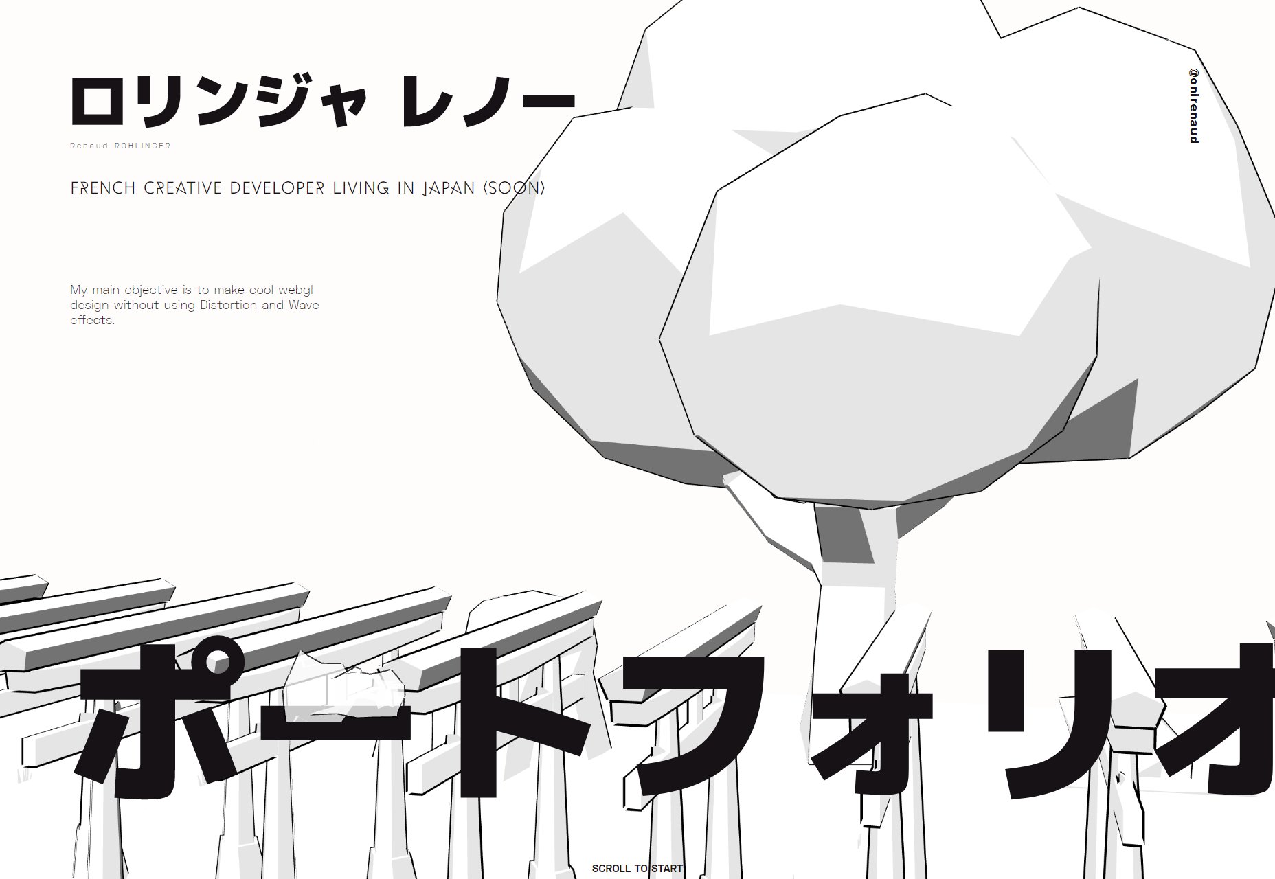
Tiago Majuelos
Tiago Majuelos’ one-page portfolio is colorful, wild, and full of… hieroglyphic-clipart graphics? I’m not sure how the heck else to describe his art style. You can browse the work by dragging/swiping horizontally, or you can scroll down to see the most organized collage I’ve ever seen. I’ve never seen anything quite like this, so it’s on the list. Platform: WordPress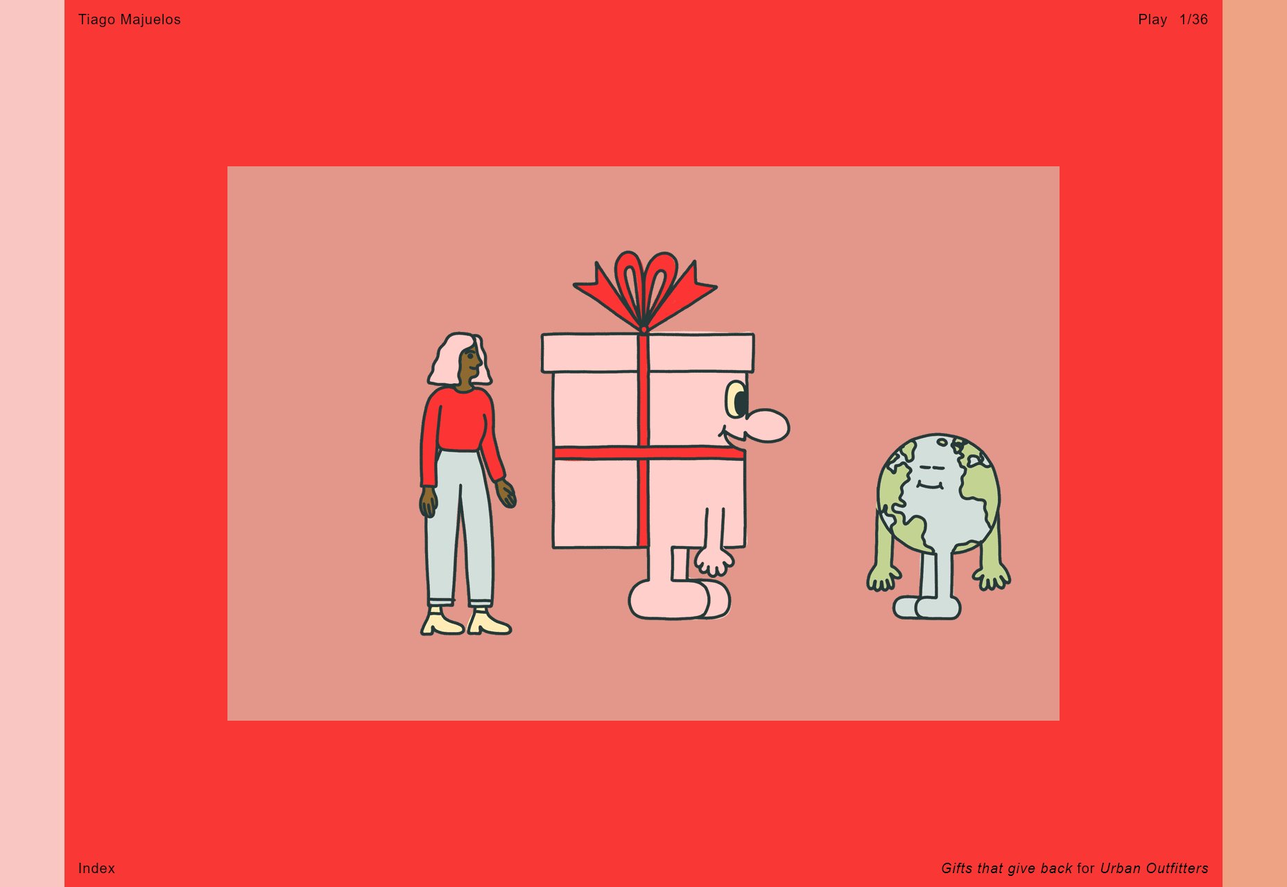
Josh Newton
Josh Newton’s portfolio has a beautifully simple dark layout, great condensed type, and body text that’s sadly way too small. That usability issue aside, it’s rather nice to look at. Another great grid-based layout. Platform: Custom CMS (Probably)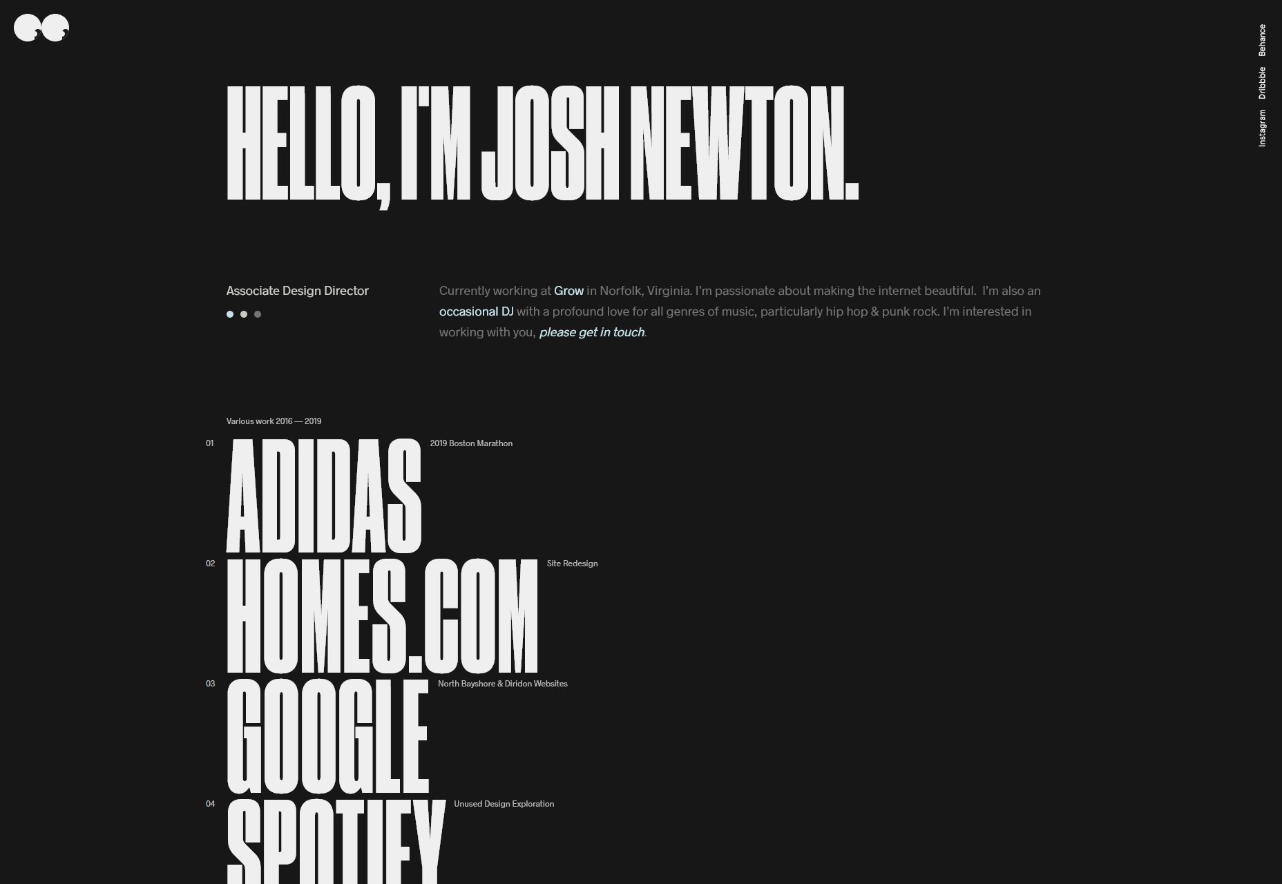
Diogo Akio
Diogo Akio’s portfolio is more grid-based goodness, mixed with more horizontal scrolling goodness, and a heavy dose of modern minimalism. And for variety, it’s not a dark layout. Platform: Static Site
Rise
When Rise was being designed someone clearly looked at a bunch of sites with asymmetry and overlapping elements, and said, “That. I want loads of that.” Then threw in some pretty decent typography, and they’ve managed to pull off using the color yellow, so they’ve earned their spot on this list. Platform: ExpressionEngine (Haven’t seen that for a while.)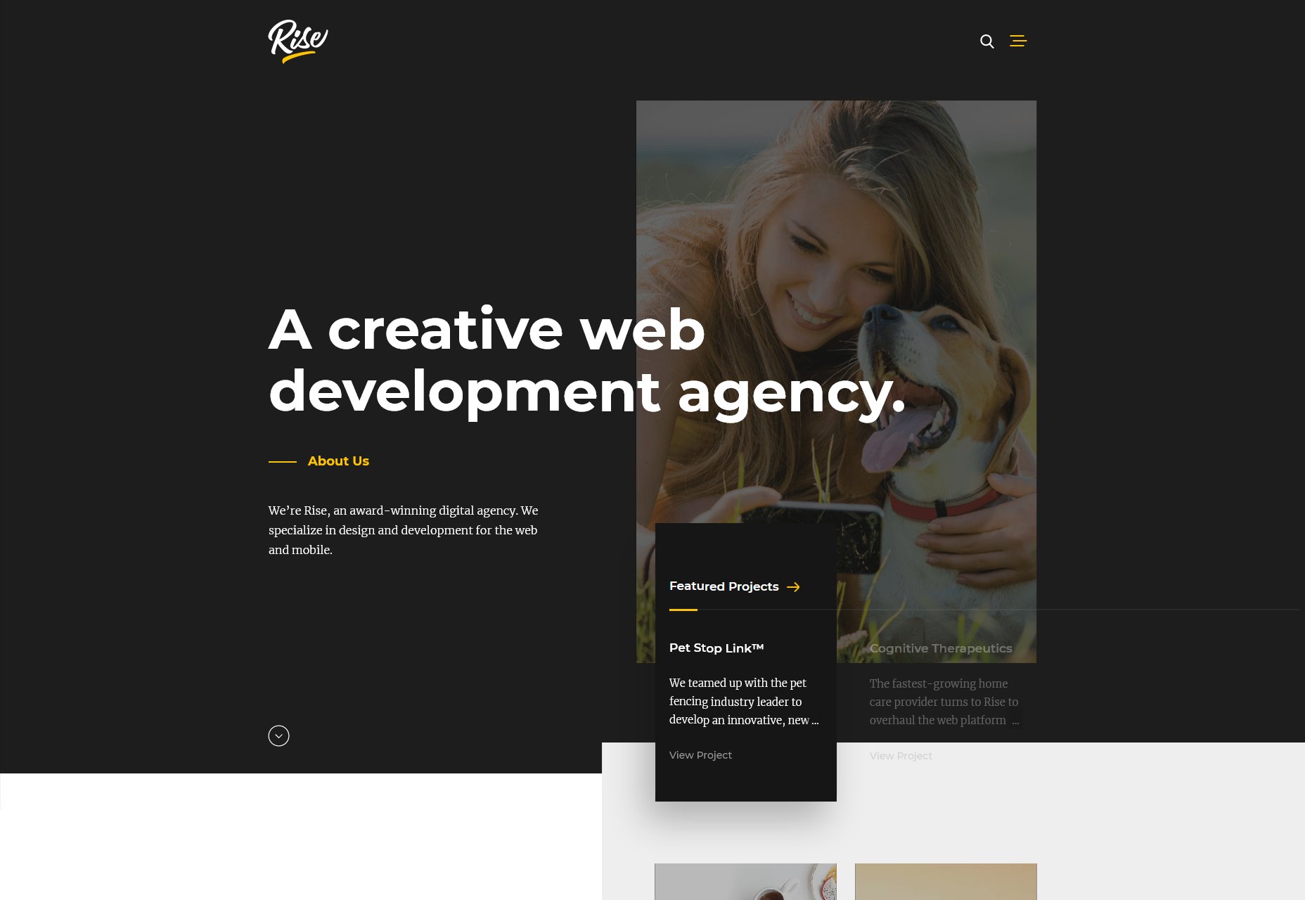
makespace.
Makespace. More dark layout. More collages. More grid stuff. Lots of periods going around. No but really, it’s a fantastic looking site, and you don’t see too many collages that are animated like a slideshow. Unfortunately, this site falls into the same small-text trap that many dark sites fall into in their quest to look elegant. Elegant text is text I can read. Just saying. Platform: Static Site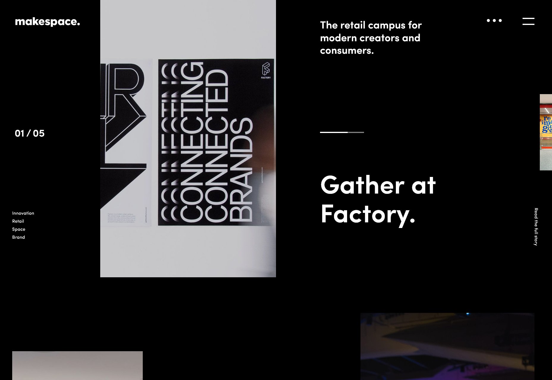
Diana Costa
At first glance, Diana Costa’s portfolio seems downright brutalist. Dig in a little, though, and you’ll see the monochromatic tones and monospaced text tempered with plenty of white space, and simple, smooth animation. It’s amazing how much white space can transform the feel of a website, almost on its own. Though I don’t like sites that depend on JS to run at all, especially sites this simple, I have to respect the developers for putting in a warning message when you turn JS off. Platform: Static Site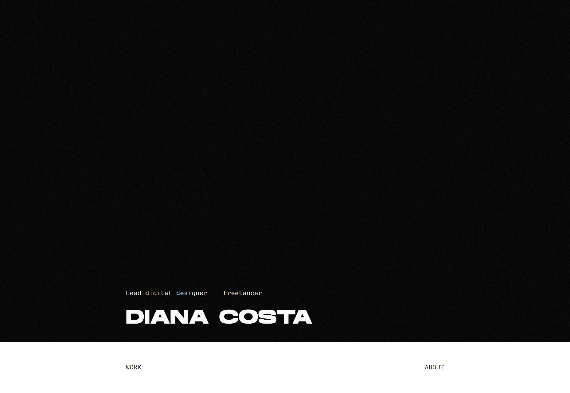
Firstborn
Like many minimalist sites, Firstborn uses animation to spice things up, decent type, and multicolumn body text. Well okay, multicolumn isn’t that common. No, they’re not relying on CSS to do that just yet, it’s being done with JS. Even so, I’m glad to see it out in the wild. Platform: Contentful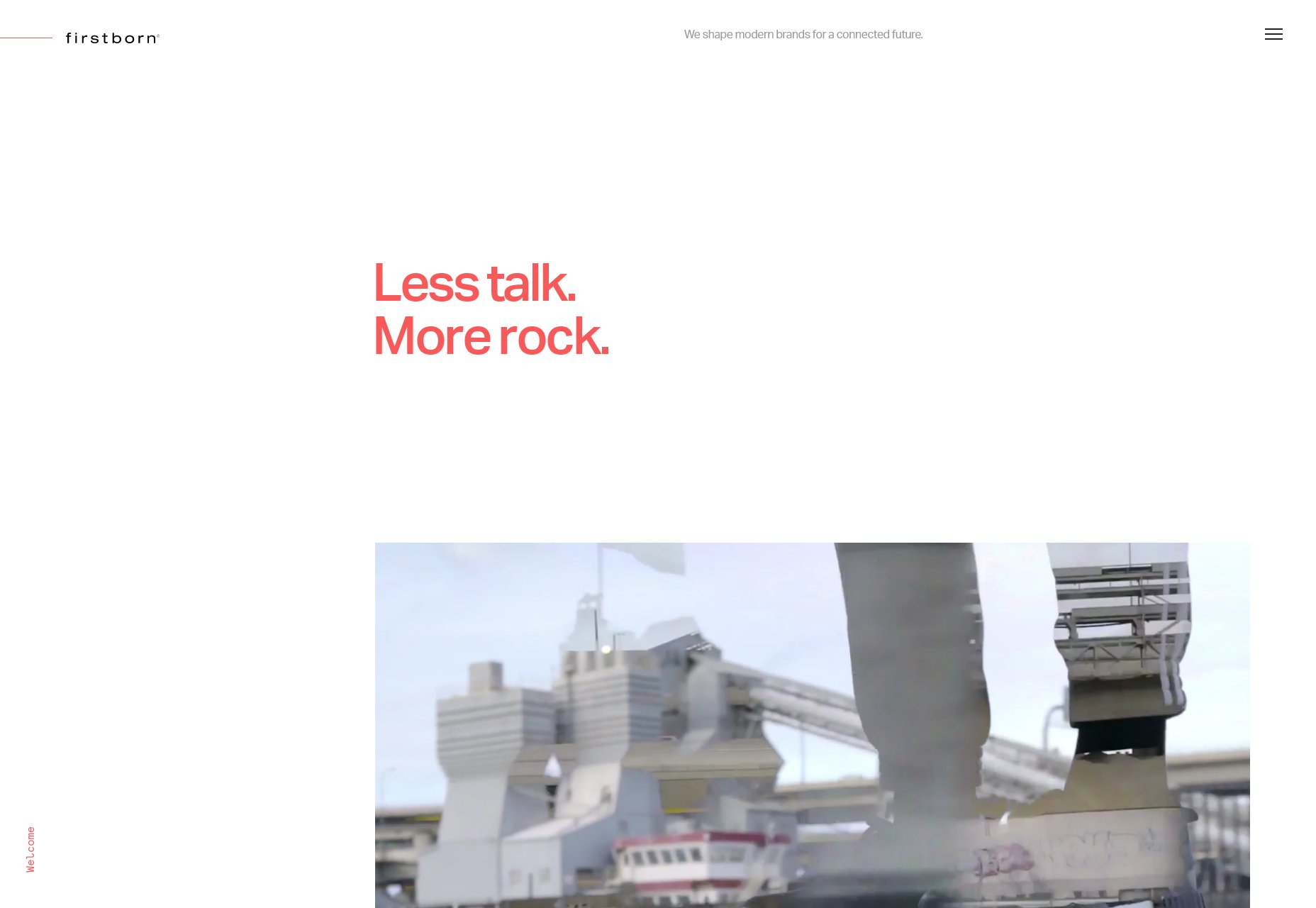
Yuen Ye
Okay, you know that see-the-preview-on-project-title-hover thing? Well Yuen Ye’s portfolio has officially done it better than everything else. There are elements that are rather convincingly animated to look like cloth on the home page, and hovering over a project title changes the “pieces of cloth” into the preview for… go just got look at it. Rarely am I actually impressed by these sorts of bells and whistles, but it’s beautifully executed here. The rest of the site is pretty solid, too. Platform: WordPress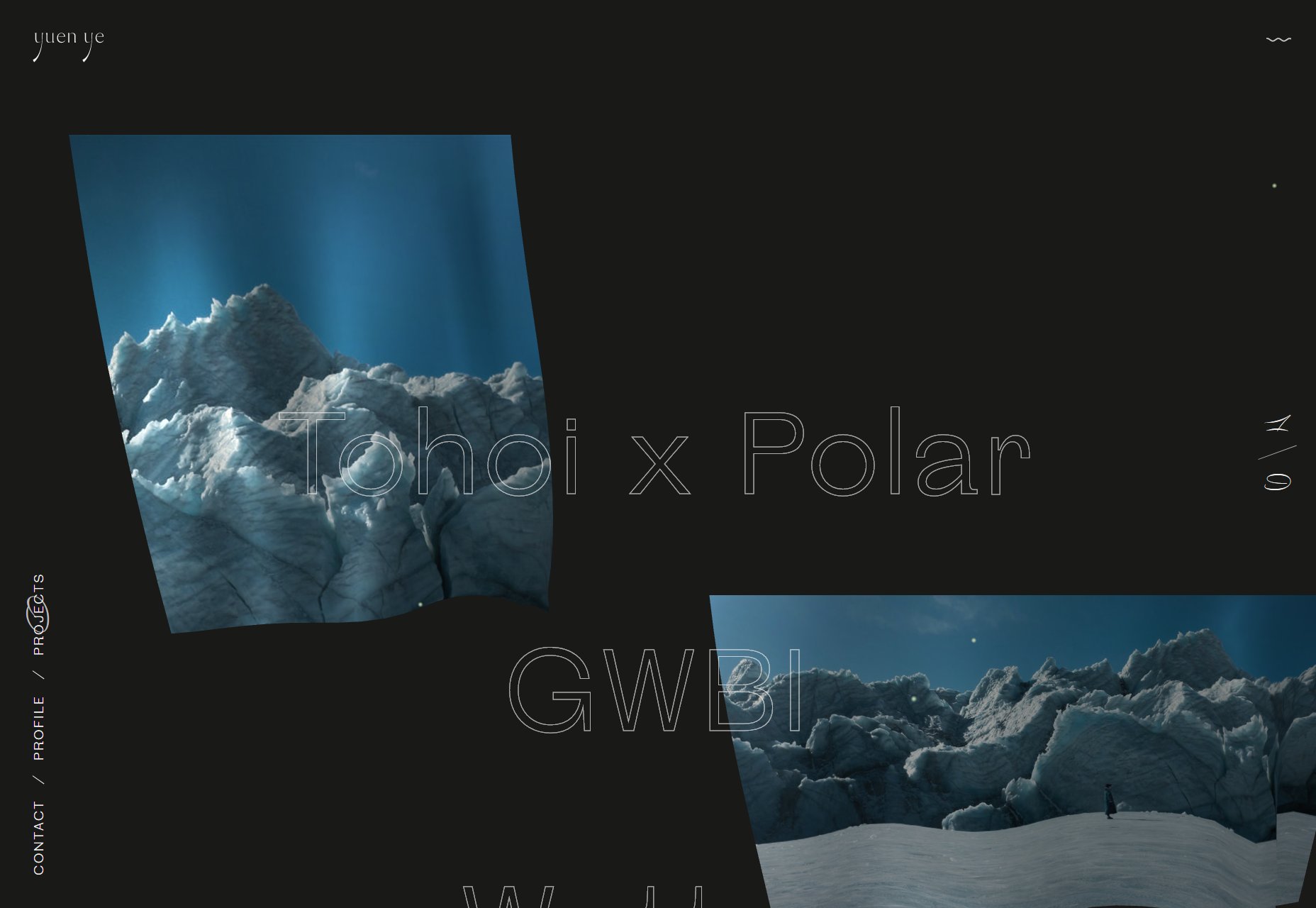
Onix Design
Onix Design improves on the ever-familiar modern/dark aesthetic by adding a fair amount of illustration, including some sort of semi-3D illustrations of faces that I found strangely compelling. The color scheme is a bit of a blast to the eyeballs, even with the mostly-dark layout, but it’s certainly a striking, and uncommon look. Platform: Custom CMS? (It’s programmed in Go.)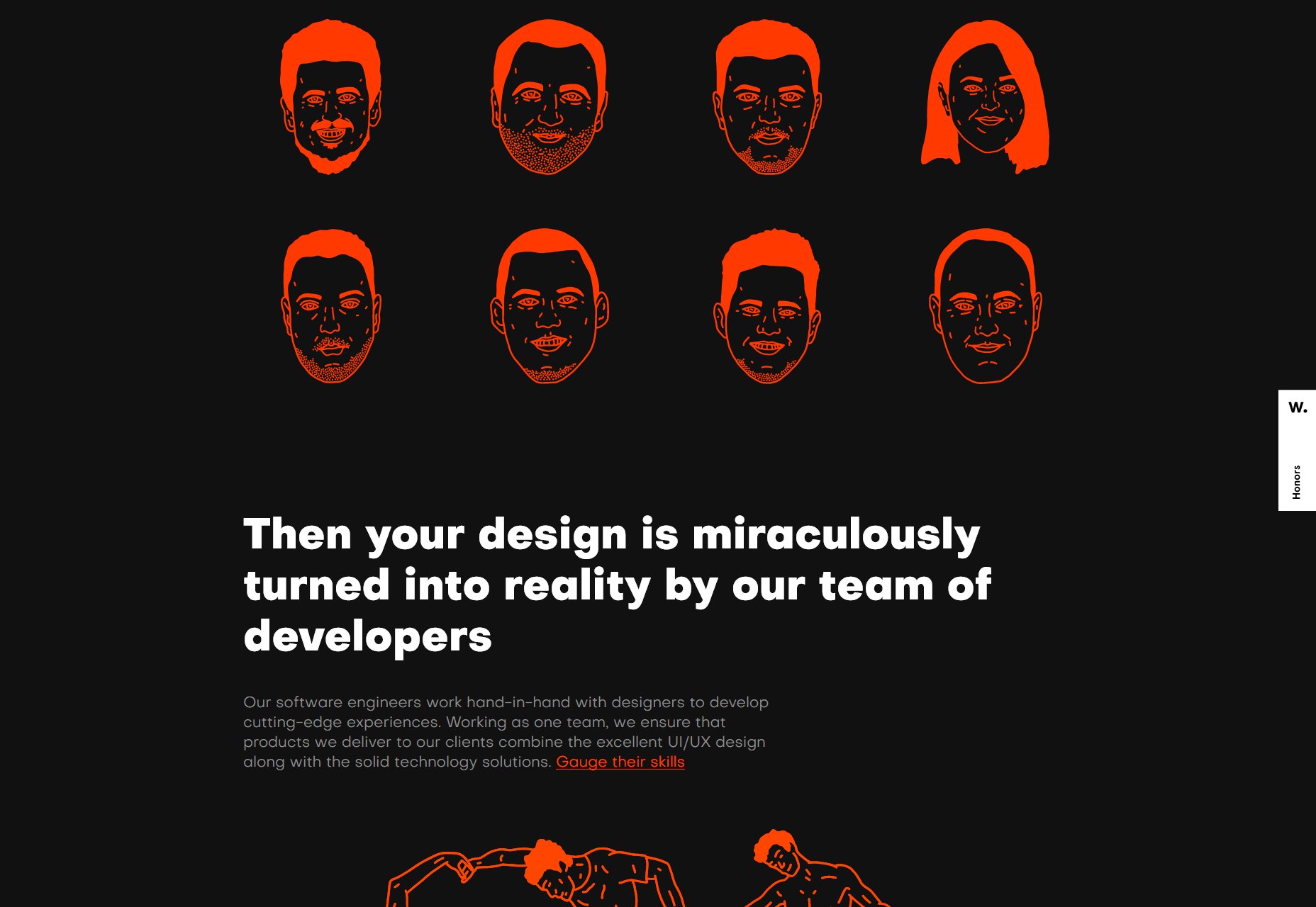
Zef
Zef’s Website is decidedly new-looking, even as certain aspects of it (including the name) evoke a sort of Geocities-era nostalgia. I love everything: the curving text on the home page, the clashing colors, the careless-seeming typography that is actually quite effective. It’s amazing. Platform: Static Site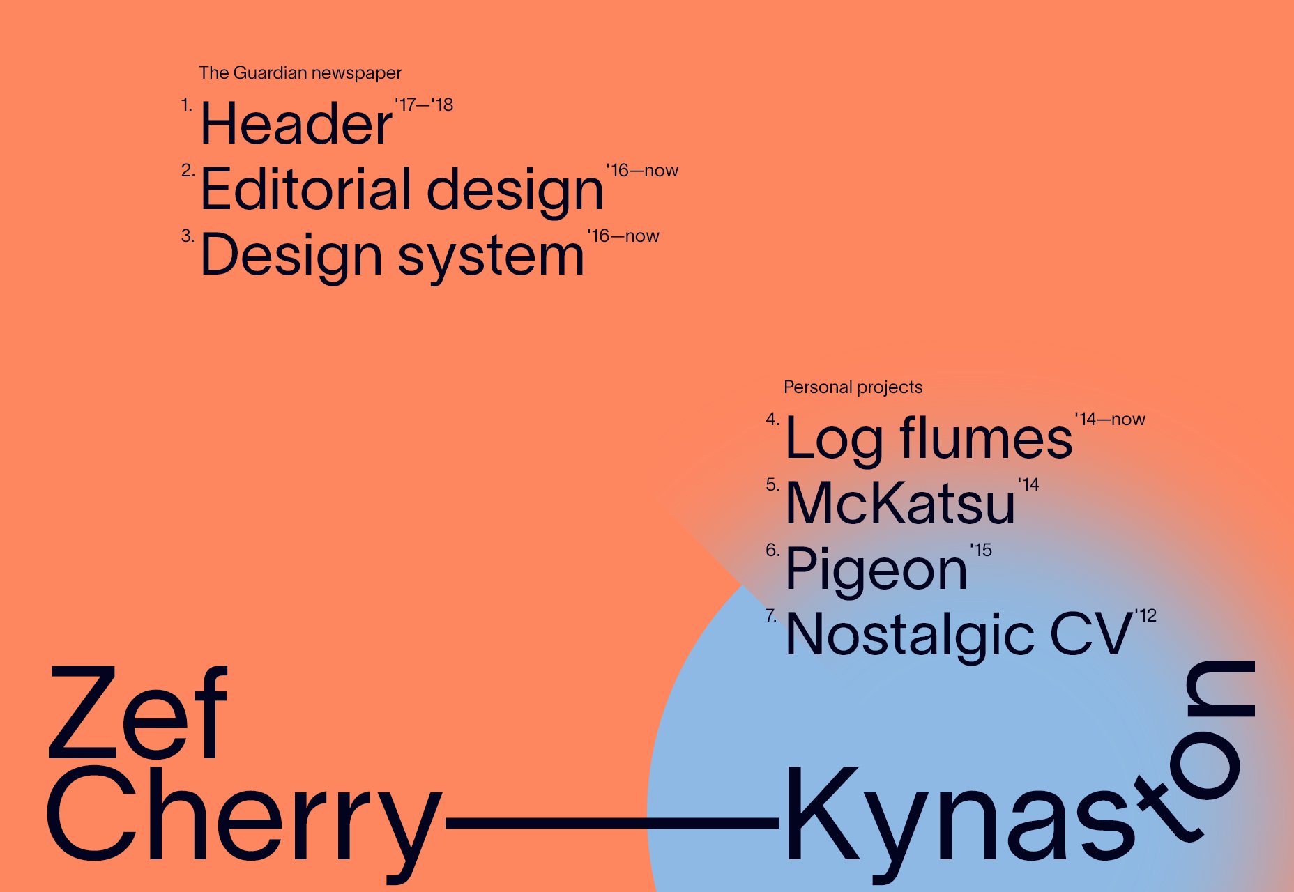
thePXA Creative
thePXA Creative’s agency site is darned good-looking. Far more good-looking, perhaps, than usable. Even so, I found myself liking this highly PowerPoint-ish site for it’s sheer style, and commitment to a theme. Platform: Static Site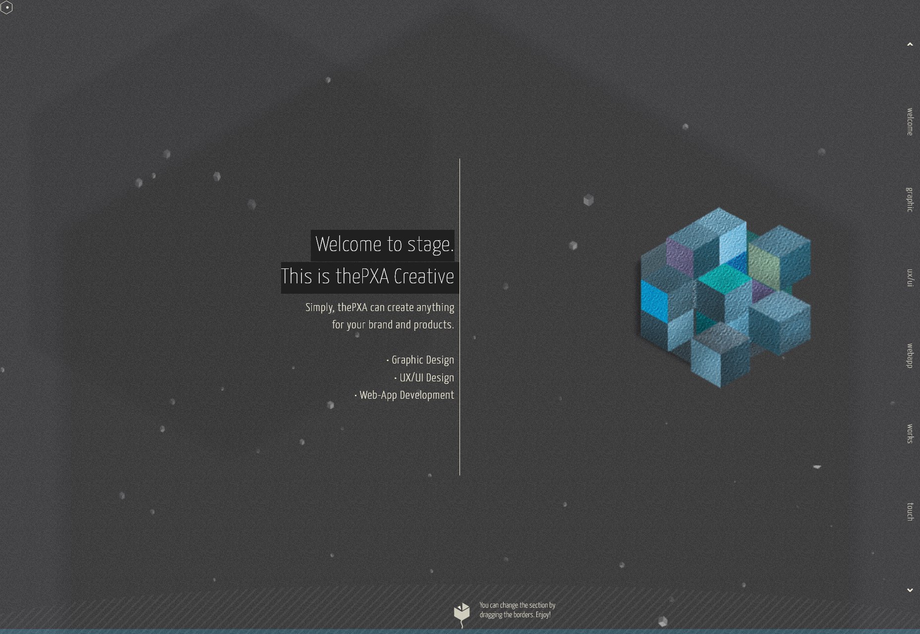
Muax
Muax is another dark, grid-loving layout, sure. It’s also a showcase of just how absolutely gorgeous Russian typography can be. I have no idea what any of it says, but I could stare at it for a good ten minutes. If this is what Dostoevsky’s work looked like in Russian, no wonder people read it to the end. Platform: Custom CMS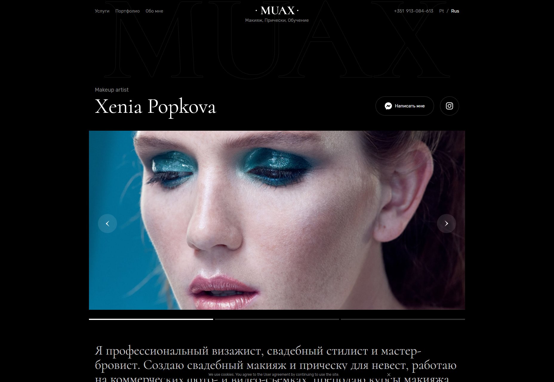
Casper Fitzhue
Casper Fitzhue’s portfolio is one of those very white designs that could get boring if you don’t love that sort of simplicity as much as I do. But to keep things interesting, the background will change color depending on what you’re looking at/hovering over. Plus, I like how things like essays and other text-based works are included in the portfolio. Platform: Static Site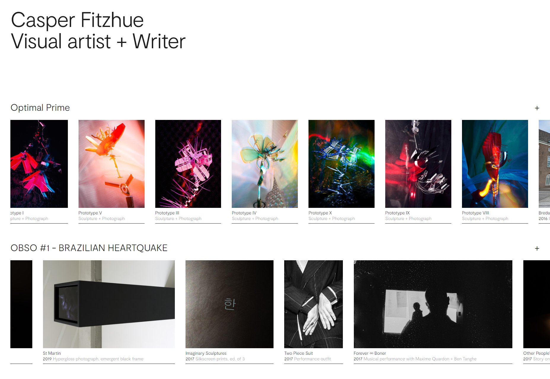
Chris Cyran
Chris Cyran’s portfolio is maybe the only one I’ve seen that’s bold enough to just sort of… put a business card design right in the middle of the page, and leave it there no matter what else happens to be scrolling by. Platform: WordPress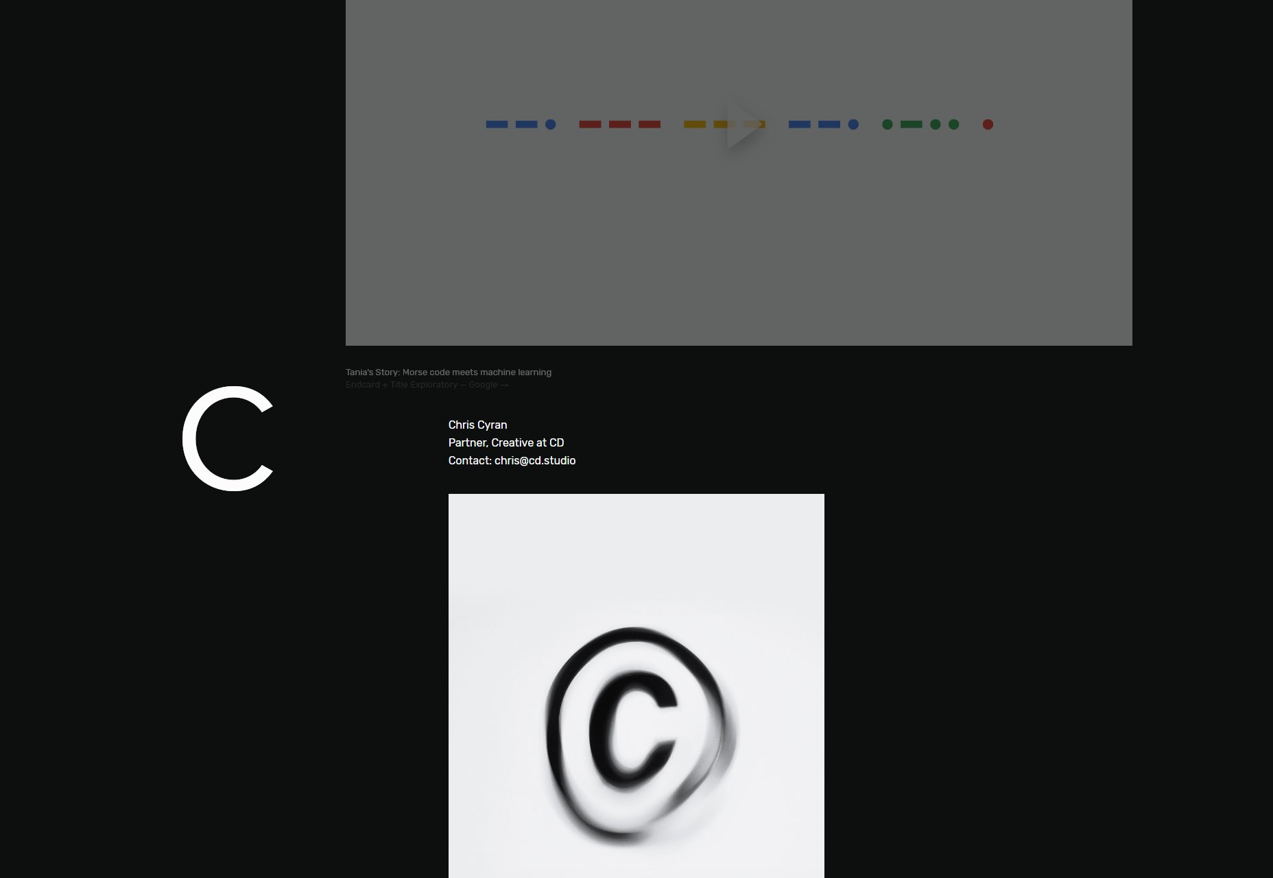
Locomotive
Locomotive looks like a site that should be minimalist, but they occasionally just sort of… don’t do minimalist things. It also leans hard into the animation, creating an experience that is at once familiar and outstanding. Platform: Static Site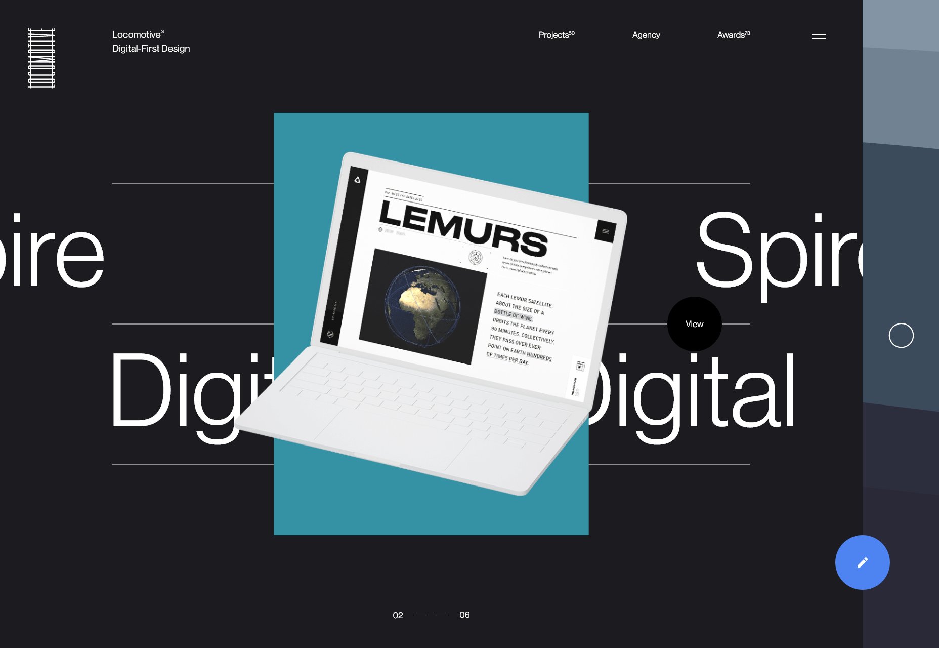
Ezequiel Bruni
Ezequiel Bruni is a web/UX designer, blogger, and aspiring photographer living in Mexico. When he’s not up to his finely-chiselled ears in wire-frames and front-end code, or ranting about the same, he indulges in beer, pizza, fantasy novels, and stand-up comedy.


Read Next

3 Essential Design Trends, May 2024
Integrated navigation elements, interactive typography, and digital overprints are three website design trends making…

How to Write World-Beating Web Content
Writing for the web is different from all other formats. We typically do not read to any real depth on the web; we…
By Louise North

20 Best New Websites, April 2024
Welcome to our sites of the month for April. With some websites, the details make all the difference, while in others,…

Exciting New Tools for Designers, April 2024
Welcome to our April tools collection. There are no practical jokes here, just practical gadgets, services, and apps to…

How Web Designers Can Stay Relevant in the Age of AI
The digital landscape is evolving rapidly. With the advent of AI, every sector is witnessing a revolution, including…
By Louise North

14 Top UX Tools for Designers in 2024
User Experience (UX) is one of the most important fields of design, so it should come as no surprise that there are a…
By Simon Sterne

What Negative Effects Does a Bad Website Design Have On My Business?
Consumer expectations for a responsive, immersive, and visually appealing website experience have never been higher. In…

10+ Best Resources & Tools for Web Designers (2024 update)
Is searching for the best web design tools to suit your needs akin to having a recurring bad dream? Does each…
By WDD Staff

3 Essential Design Trends, April 2024
Ready to jump into some amazing new design ideas for Spring? Our roundup has everything from UX to color trends…

How to Plan Your First Successful Website
Planning a new website can be exciting and — if you’re anything like me — a little daunting. Whether you’re an…
By Simon Sterne

15 Best New Fonts, March 2024
Welcome to March’s edition of our roundup of the best new fonts for designers. This month’s compilation includes…
By Ben Moss

LimeWire Developer APIs Herald a New Era of AI Integration
Generative AI is a fascinating technology. Far from the design killer some people feared, it is an empowering and…
By WDD Staff