How Color Impacts UX


Let’s start with a common example: You’ve just finished a website design for someone. It looks and functions exactly like the wireframe. Everyone on the design team has praised the project. The client hates it, but they can’t explain why.
The culprit might be color. Different colors can evoke such strong emotions that people have sharp reactions to them. It’s part personal preference, part psychological, and even part social norms. Understanding these tendencies and user preferences can greatly impact user experience.
Here’s what you need to know.
User Expectations and Preferences
User experience starts with the type of user your website or app is designed for. Basic demographics such as gender or region where a user lives can impact their perception of your design based on color. (You can read more about color and cultural considerations here.)
One of the most interesting impacts from color on UX is linked to gender. Studies have shown that men and women tend to like and dislike certain types of color.

Men tend to interact more with websites that have darker design schemes and more saturated colors, such as the design for VLNC Studio, above.
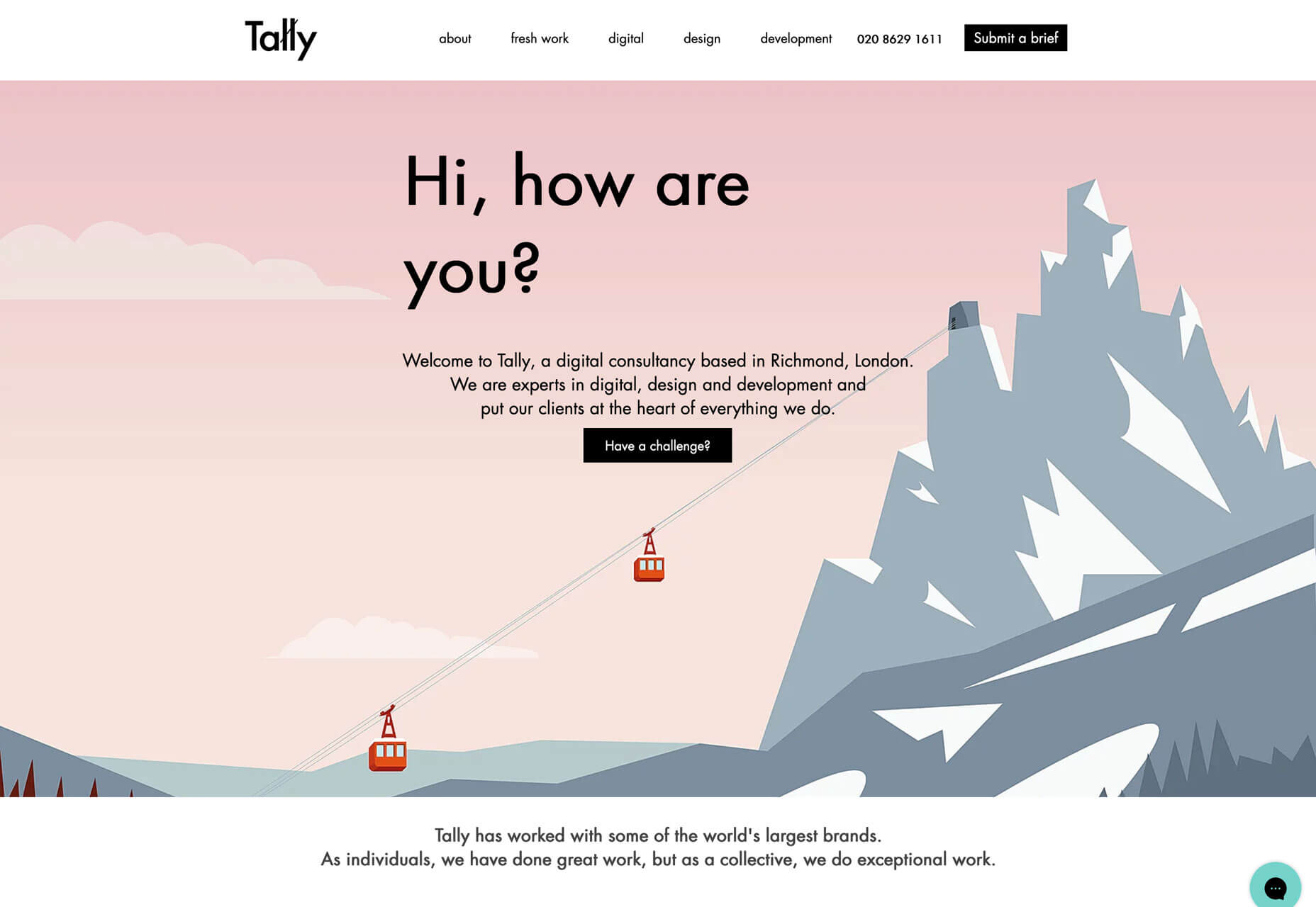
Women tend to prefer to interact with websites that have lighter design schemes and more muted color palettes, such as Tally, below.
Some men have a sharp reaction to websites using distinctly feminine colors such as pastel pinks, purples, and yellows.
More women tend to be put off by websites with harsh color schemes such as dark background with fully saturated red accents.
Mid-tone palettes are the most generally appealing to everyone.
Color Associations and Meanings
While it’s not an exact science, colors have fairly distinct emotional associations. Note that some colors can fall into categories of extremes. These associations tend to work with other design elements to create an overall vibe.
When a user sees a certain color or combination of colors, it creates an immediate response in the brain.
- Red: Power, danger, love/passion, hunger
- Yellow: Energy, happiness, light, warmth
- Orange: Creativity, determination, stimulation, encouragement
- Green: Nature, growth, harmony, freshness
- Blue: Confidence, trust, serenity, calmness
- Purple: Magic, royalty, ambition, independence
Establishing Brand Recognition
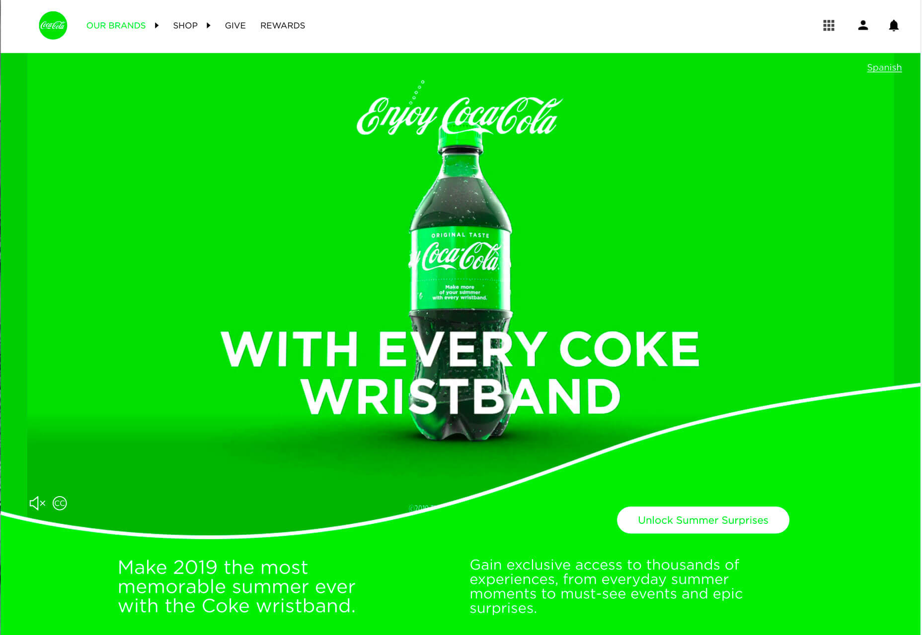
You expect design elements for Coca-Cola to be red. The color is so synonymous with the brand that it’s referred to as “Coke red.” Change the color and the brand is confusing. You don’t recognize it right away. The user is jarred and doesn’t quite react in the expected fashion. The drink might even seem to taste different.
All of those feelings come from changing the color. You might have felt yourself say “what?” when you saw the first image with green Coca-Cola branding.
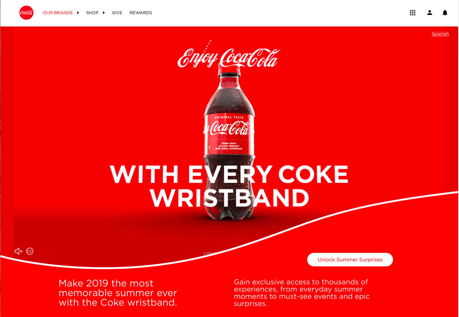
It impacted the user experience you would have with the brand moving forward.
Color is an important element in branding because it creates that distinct connected between a user and a design. Color tells users what the brand is about. It tells users about the thing they are about to engage with.
Change that color, or use something off brand, and the user experience suffers because website visitors are suddenly confused or uncertain about the brand they thought they knew.
User Patterns Connect to Color
Have you noticed how many websites use red or orange buttons?
There’s a reason for that.
Bright colored buttons that contrast with the background of a website – red and orange often stand out from either light or dark backgrounds. Can help users find, understand, and want to engage with click- or tappable elements because they visually, and immediately, know what their expectation of that element is.
A key part of user experience is providing easy opportunities for users to interact that they enjoy and understand.
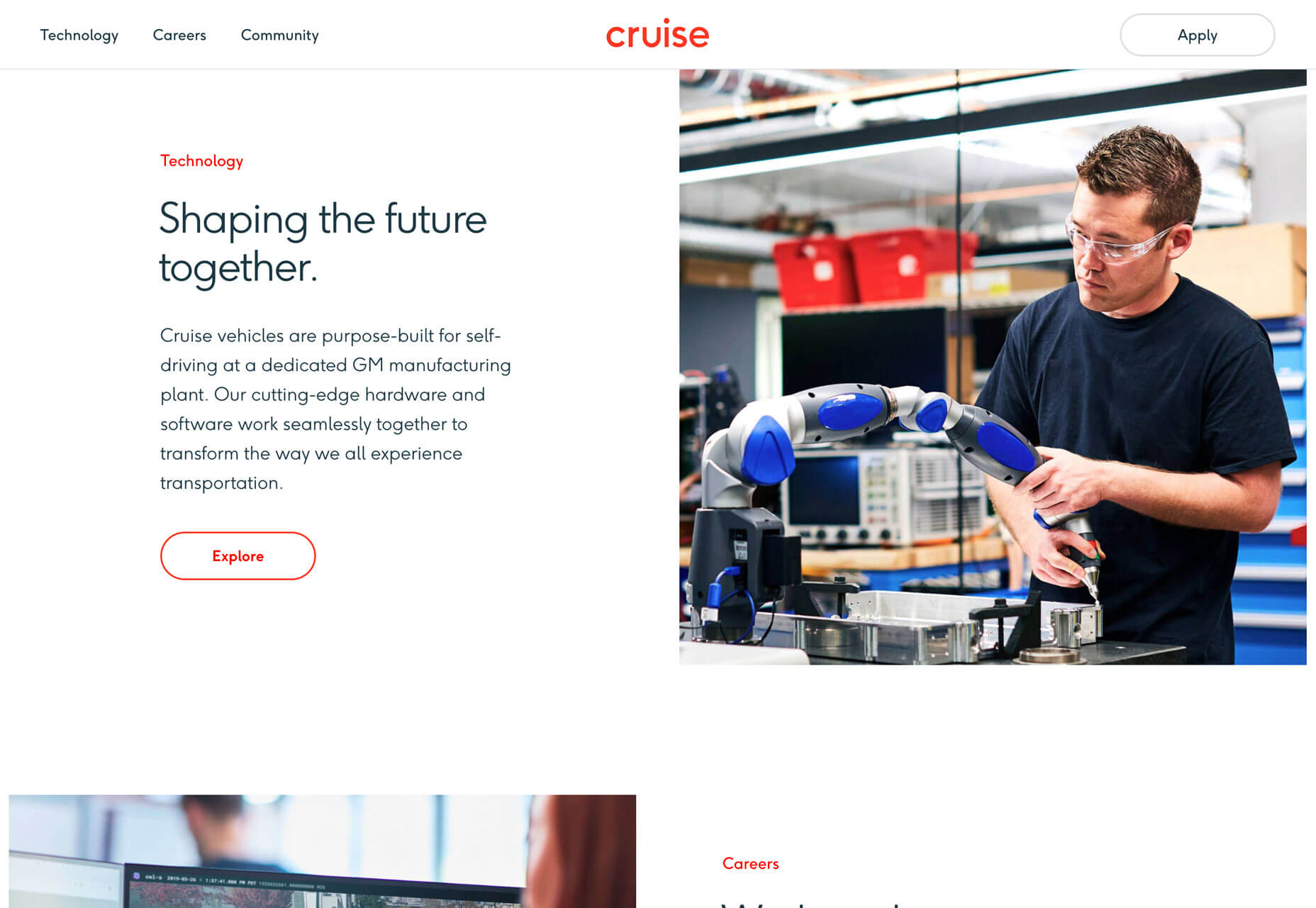
Cruise uses a ghost-style button with red text and a red hover state. It’s a different spin on traditional solid-color buttons, but there’s little question as to how to interact with it. Color draws users to the button.
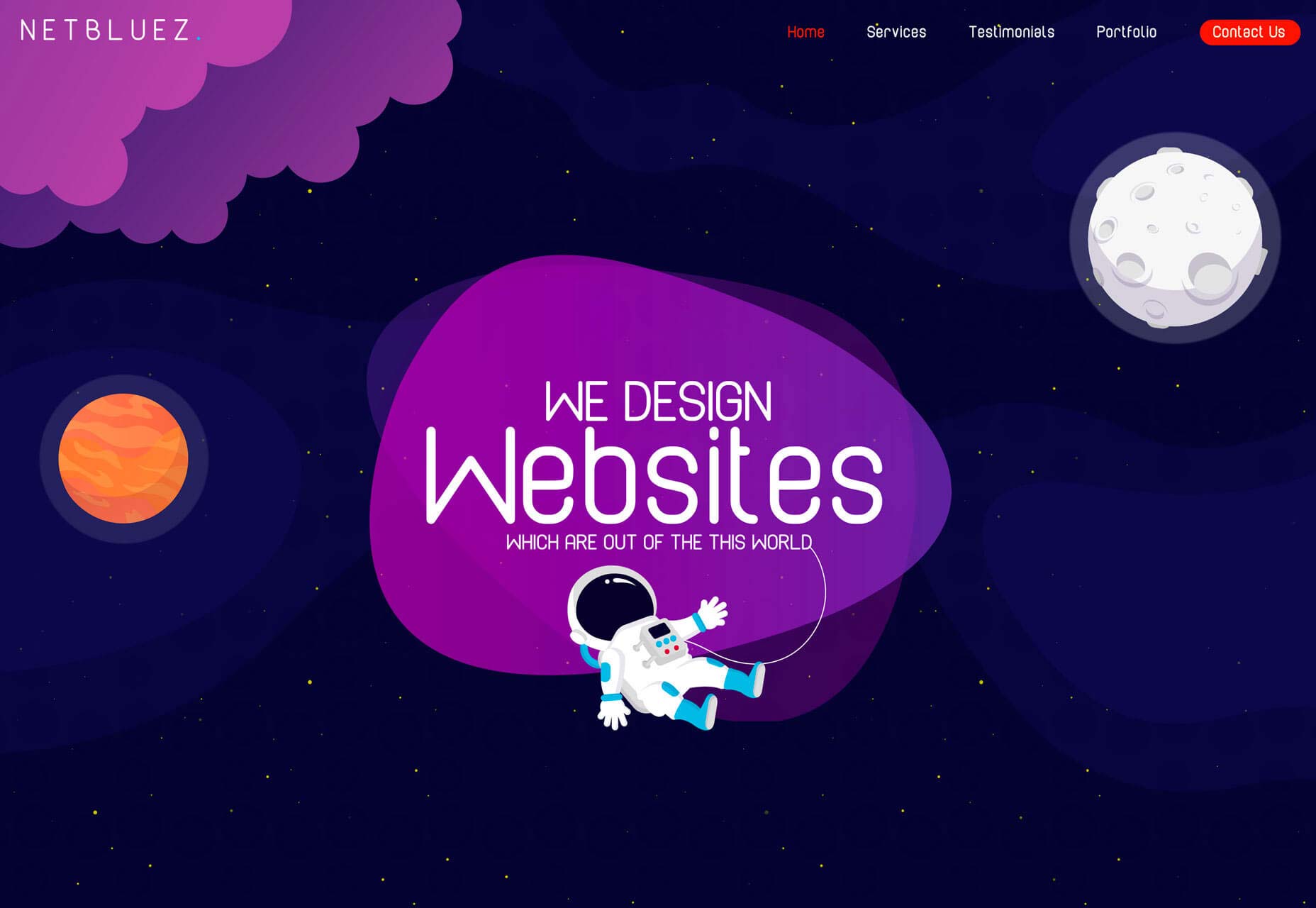
Net Bluez uses a bright orange button for the most important element in the navigation menu. Notice how that element tends to jump off the screen begging to be clicked.
Increasing Conversion Rates
Challenge yourself in the design process to A/B Test button color. You’ll likely find that one color has a distinctly higher conversion rate than the other. (And it might not be the color you expect.)
Conversion rates tend to increase when the color of buttons or links is in stark contrast to the rest of the design. So, while you want to use a brand palette, picking a contrast color is key to generating conversions that contribute to overall user experience.
Look at the website below for a minute. Which color button is most likely to make you click? (The original color is blue.)
Providing Accessibility to All Users
Finally, color impacts UX in a way that’s not emotional or rooted in psychology. It’s much more practical than that.
Color impacts user experience because it can make a design accessible or not.
In order for everyone to understand a design fully, and engage with content, they must be able to see and read it with ease. Using color palettes and contrast ratios that fall in line with Web Content Accessibility Guidelines (WCAG 2.1) can ensure that every user can understand your color choices.
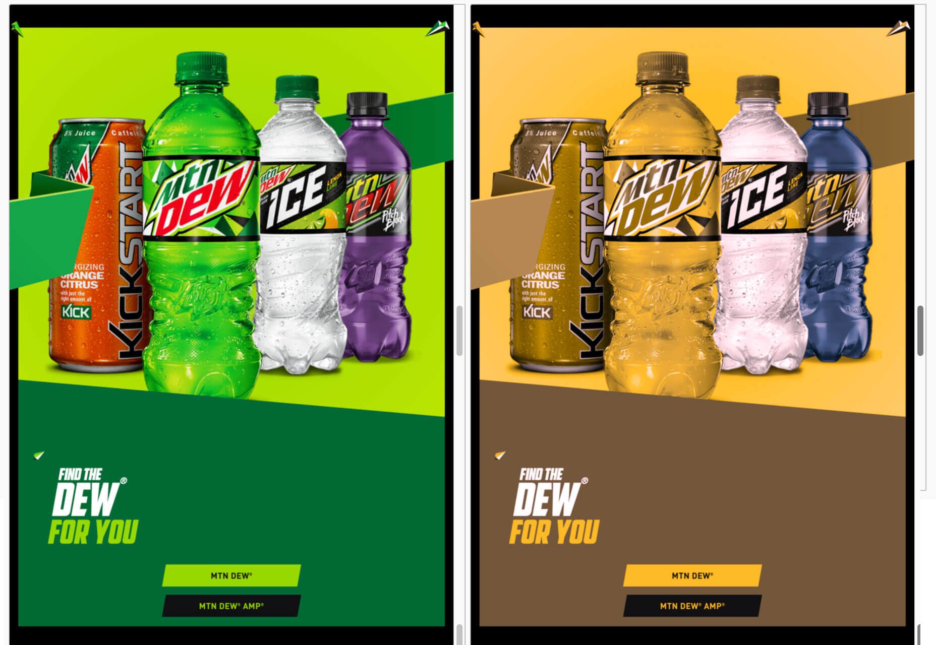
Use a color-blind filter, such as those in the comparisons below, to help simulate what other users might see when they look at your website. How could that impact usability?
Conclusion
Think of color as a tool to help users better interact and experience the content on your website. It impacts user experience on an emotional and usability level.
The key to figuring out if color is impacting UX in the right way is through user testing. A/B color tests can be a valuable tool.
Carrie Cousins


Read Next

15 Best New Fonts, July 2024

20 Best New Websites, July 2024

Top 7 WordPress Plugins for 2024: Enhance Your Site's Performance

Exciting New Tools for Designers, July 2024

3 Essential Design Trends, July 2024

15 Best New Fonts, June 2024

20 Best New Websites, June 2024

Exciting New Tools for Designers, June 2024

3 Essential Design Trends, June 2024

15 Best New Fonts, May 2024

How to Reduce The Carbon Footprint of Your Website
