How Prevalent is Dark UX?

UX professionals often seek to influence user behavior. How often does that influence cross the line into dark patterns? How prevalent is dark UX on the web?

Opt-Out Newletters (or Even Purchases!)
Sign-up forms often come with the option to get their newsletter pre-selected. I’ve also run into airlines that have some of their add-on services pre-selected during the ticket purchase process. Forgetting to unselect those is an expensive mistake to make. But then there’s this process for unsubscribing from an email newsletter, which is pretty flagrant: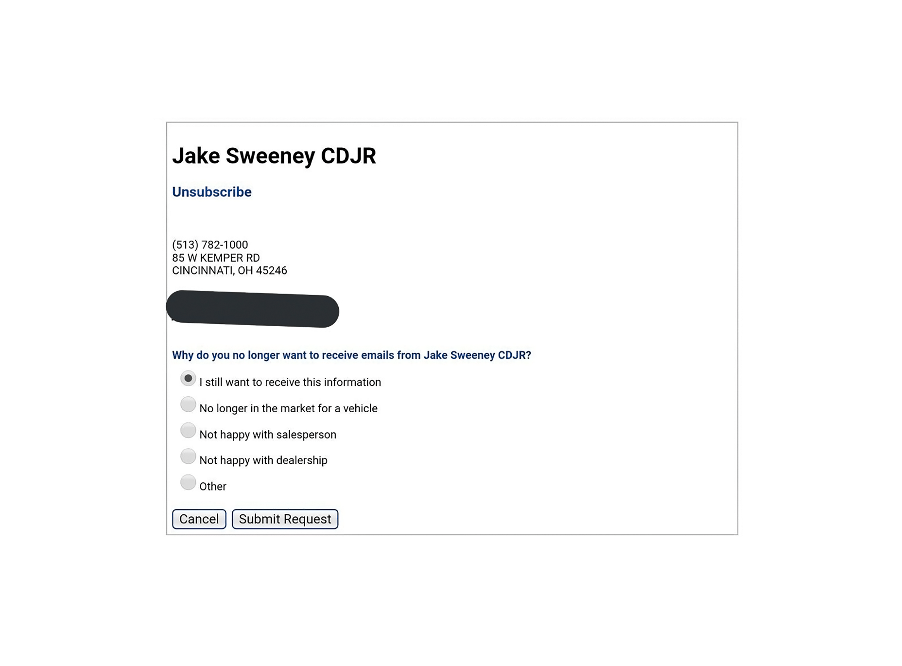
Scummy “No” Buttons
You know, the ones that say things like: “No, I don’t want to better my life immeasurably by receiving these product offers. By clicking this button, I acknowledge that my life is worthless, my children will be left homeless, and I am a terrible person.” Even Amazon is doing it: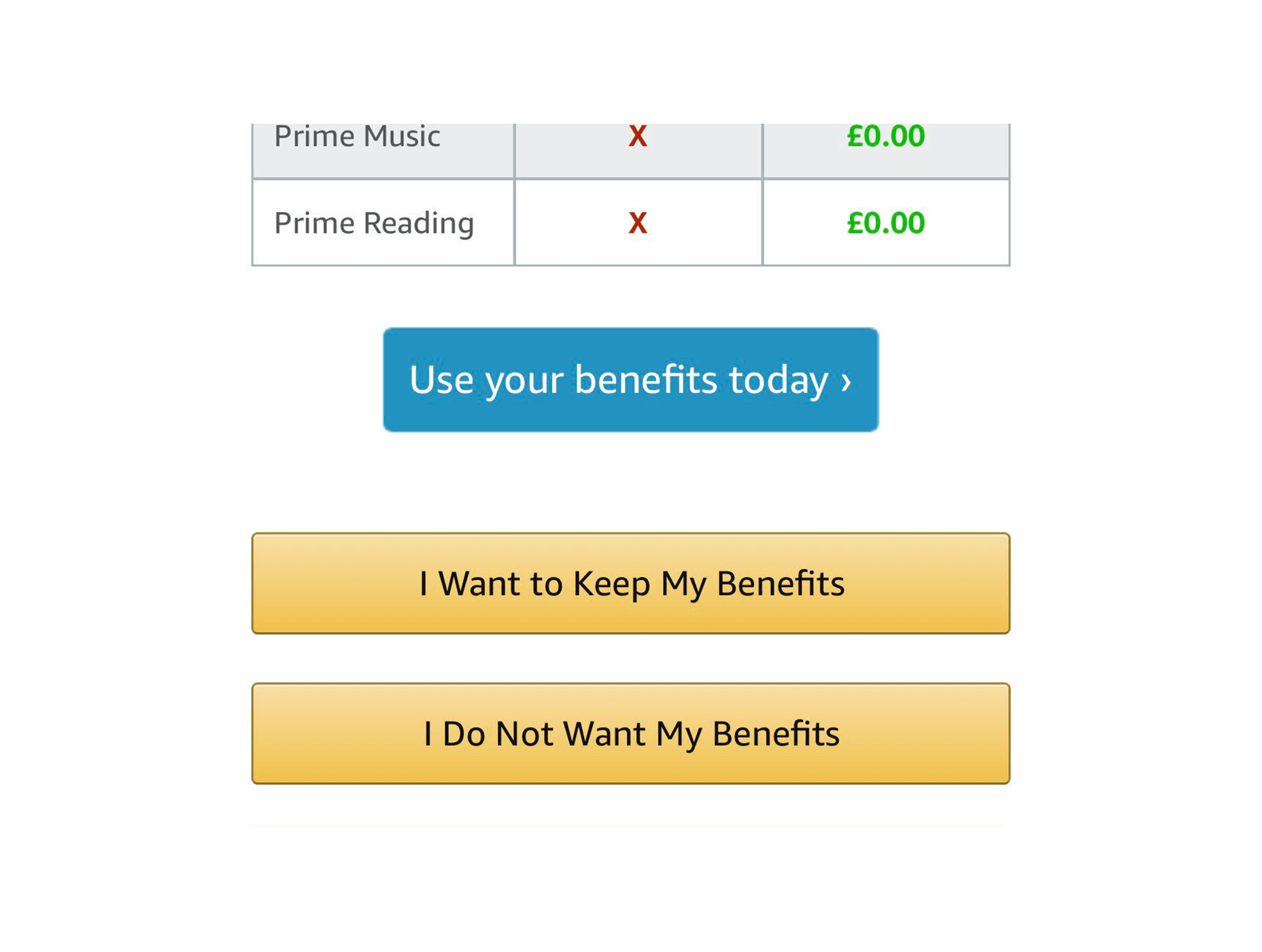
The Complete Lack of “No” Buttons
Then there are the people that don’t even include a “no” button, or an “exit” button. I’ve had it happen with Google Play Music sometimes giving me no way to listen to my music unless I either sign up for their family plan, or refresh the page. I couldn’t get a screenshot of that, so here’s one of CrazyEgg doing something similar: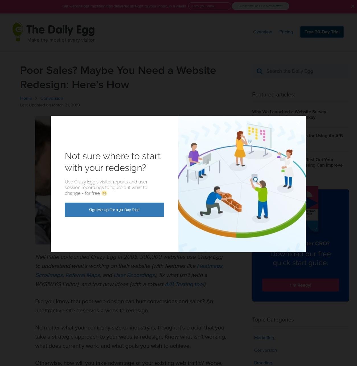 Also, Twitter won’t even let you turn off their more annoying features. There’s only a button to “see less” of them, and no one’s sure if it actually works.
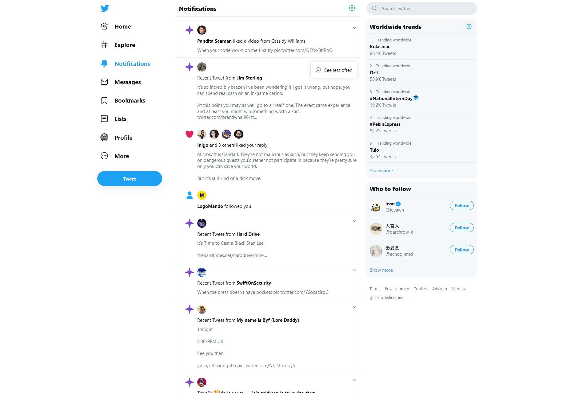
Intentionally Frustrating Products
Recently, I reviewed a service named Smashinglogo (no relation) for another website. See how I’m not linking it? That’s for a reason. It’s supposed to be an AI-based logo generator and… well it does that. But you have to depend almost entirely on the AI to randomly give you the logo you want. The customization features are minimal, and partially random too. But the site makes very sure to tell you that you can hire one of their professional designers to finish up your logo at any time. It just costs a bit more. This sort of design is actually a notorious problem in the world of video games, and not just the mobile titles. Middle Earth: Shadow of War launched as a very grindy sort of game that took a long time to complete, but you could make it easier on yourself by purchasing “just a few, simple time savers” on top of buying the full-priced game. Assassin’s Creed: Odyssey took flak for pretty much the same reason. It wasn’t too bad if you like playing all the side quests in a game, but it was still a problem.Predatory Features/Mechanics
We can look to video games for even more examples. Mobile games introduced the idea of the “loot box”, a purchase which will always grant you some sort of digital reward within the game. But what you get is randomized, so you can never be sure of getting what you want. [pullquote]It used to be just an industry controversy, but now governments the world over are looking into this situation[/pullquote] They’ve made their way into 60 USD desktop titles as well, and they’re specifically designed to tap into the gambler’s instinct. It used to be just an industry controversy, but now governments the world over are looking into this situation, with UK Mainstream outlets like the BBC documenting what happens when someone who has compulsive gambling tendencies gets suckered in by video games, which are supposed to be comparatively “safe”.Dark UX is Everywhere…Oops
I wish I had better news. Look, it’s not that the majority of websites are necessarily using dark UX patterns. I frankly couldn’t find any hard data on that, but I doubt it. Is all their marketing honest? I don’t know about that, but I don’t think that most websites are trying to trick users into clicking stuff. But not every website is Amazon, Twitter, or Google. While most sites may not have dark UX, a lot of the biggest sites and products do, affecting a number of people that is potentially in the billions. I’d like to think designers are mostly good people, but the ones employed by bad companies have done a lot of damage. What can we do to correct this? Either we can burn it all down and try to develop a post-money society, or we can try to convince our corporate overlords that treating people right will net them more money in the long run. I’ve always believed that true (brand) love is better than Stockholm Syndrome. Now we just need to convince everyone else. Featured image via DepositPhotos.Ezequiel Bruni
Ezequiel Bruni is a web/UX designer, blogger, and aspiring photographer living in Mexico. When he’s not up to his finely-chiselled ears in wire-frames and front-end code, or ranting about the same, he indulges in beer, pizza, fantasy novels, and stand-up comedy.


Read Next

15 Best New Fonts, July 2024
Welcome to our monthly roundup of the best fonts we’ve found online in the last four weeks. This month, there are fewer…
By Ben Moss

20 Best New Websites, July 2024
Welcome to July’s round up of websites to inspire you. This month’s collection ranges from the most stripped-back…

Top 7 WordPress Plugins for 2024: Enhance Your Site's Performance
WordPress is a hands-down favorite of website designers and developers. Renowned for its flexibility and ease of use,…
By WDD Staff

Exciting New Tools for Designers, July 2024
Welcome to this July’s collection of tools, gathered from around the web over the past month. We hope you’ll find…

3 Essential Design Trends, July 2024
Add some summer sizzle to your design projects with trendy website elements. Learn what's trending and how to use these…

15 Best New Fonts, June 2024
Welcome to our roundup of the best new fonts we’ve found online in the last month. This month, there are notably fewer…
By Ben Moss

20 Best New Websites, June 2024
Arranging content in an easily accessible way is the backbone of any user-friendly website. A good website will present…

Exciting New Tools for Designers, June 2024
In this month’s roundup of the best tools for web designers and developers, we’ll explore a range of new and noteworthy…

3 Essential Design Trends, June 2024
Summer is off to a fun start with some highly dramatic website design trends showing up in projects. Let's dive in!

15 Best New Fonts, May 2024
In this month’s edition, there are lots of historically-inspired typefaces, more of the growing trend for French…
By Ben Moss

How to Reduce The Carbon Footprint of Your Website
On average, a web page produces 4.61 grams of CO2 for every page view; for whole sites, that amounts to hundreds of KG…
By Simon Sterne

20 Best New Websites, May 2024
Welcome to May’s compilation of the best sites on the web. This month we’re focused on color for younger humans,…