20 Freshest Web Designs, September 2019
Welcome to September’s edition of our monthly roundup of the best sites to be launched (or relaunched with significant updates) in the previous four weeks.

Bon Iver Visualizer
This impressive site, built with Spotify data, visualizes all of the people currently streaming Bon Iver music, including key details of their location like elevation, and weather conditions. It’s a fascinating attempt to make streamed music a collective experience.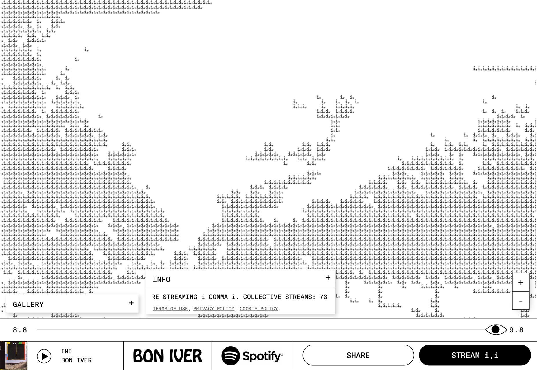
Jia Szeto
Paris-based stylist Jia Szeto’s portfolio site is a joy to browse through, with colorful frames that bring out the best in the photography, and stylish transitions that move you from one project to the next. It’s deceptively simple, and very high-class.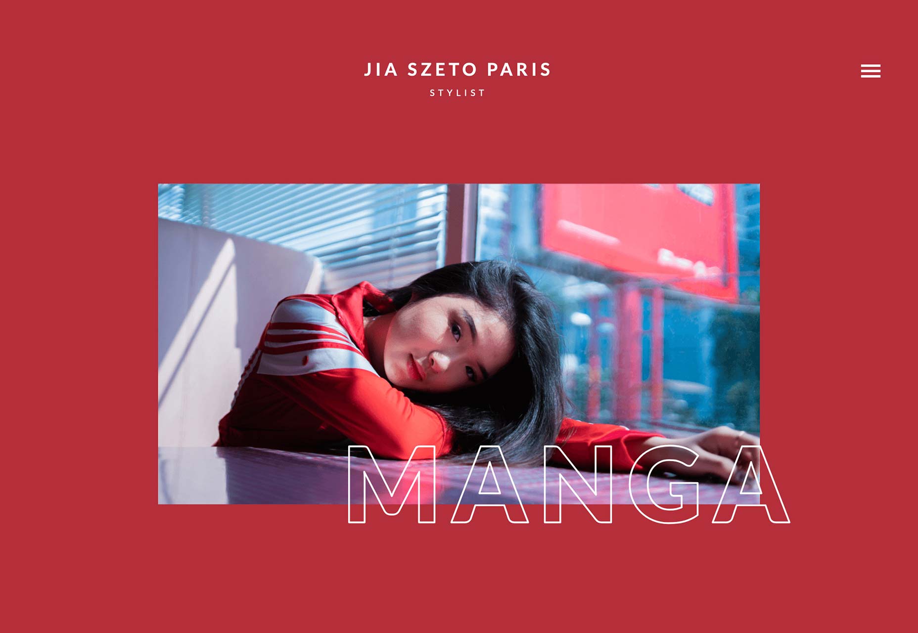
Headless Horse
Headless Horse presents a new way to browse through a studio’s portfolio. In this case, move your cursor around the wall of seemingly random thumbnails. It works, because Headless Horse have worked with some huge clients, so recognizable brands leap out at you.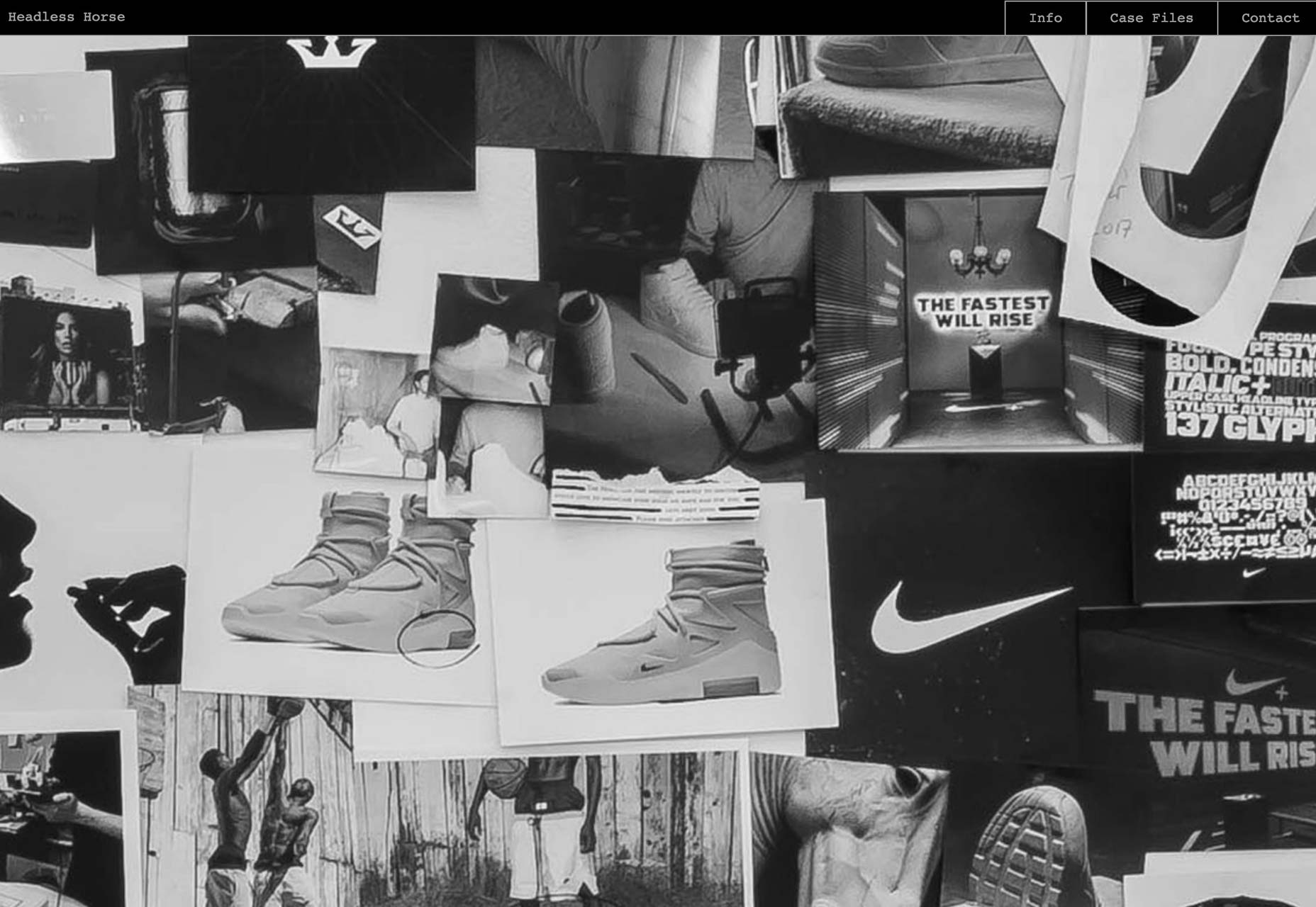
Monastery
This site is a joy to browse around. The exquisite product photography and the luxurious feel of the transitions — note the subtle blur added to the fade — make Monastery’s skincare range highly-desirable before you’ve even tried it.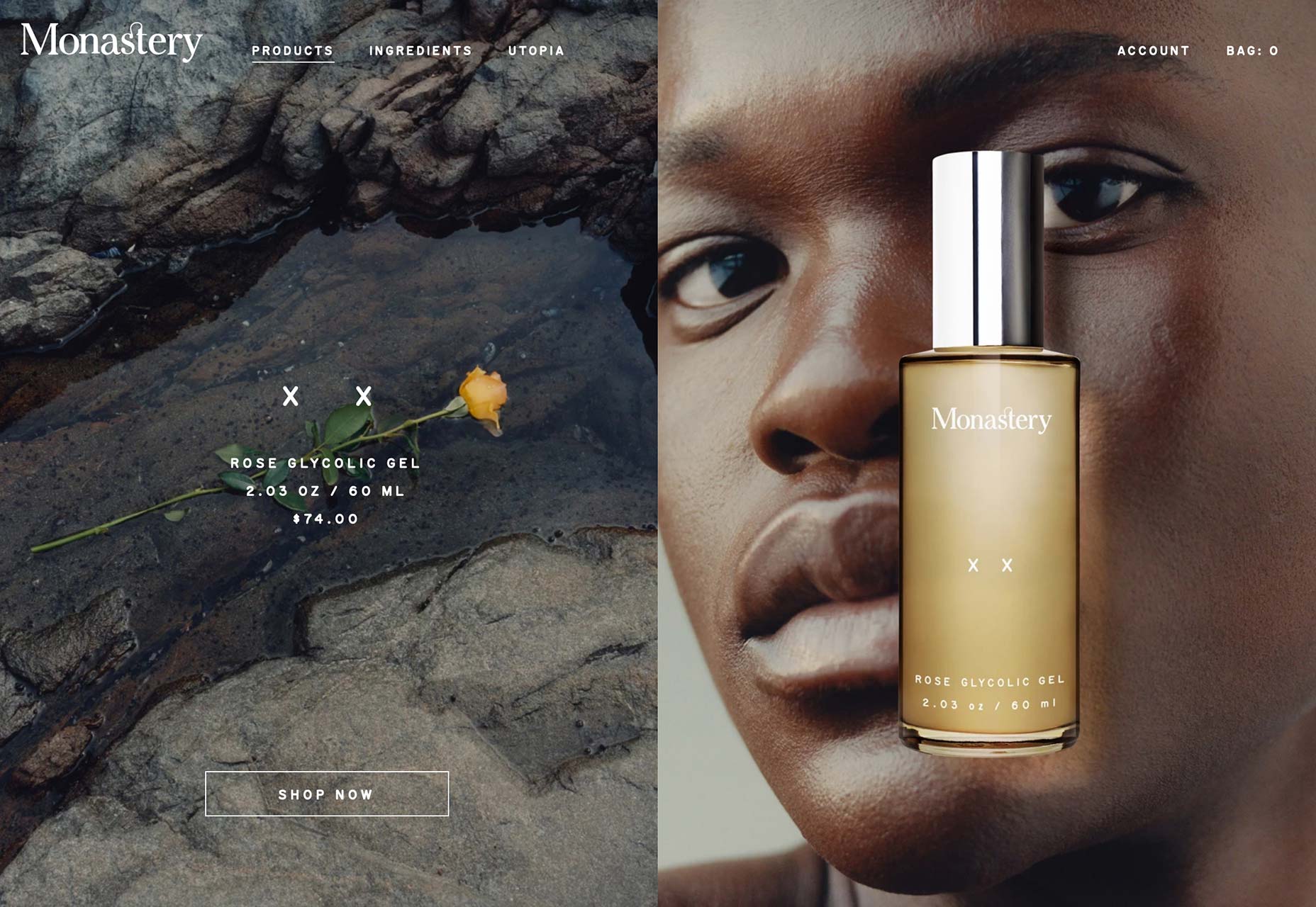
Hazelbrook Legal
Hazelbrook Legal is a corporate law firm, its site is innovative in its field, using a large video, showing a ball rolling around an Escher-style maze. The ball is solid, and its path is calm and certain. Exactly what you want from this type of company.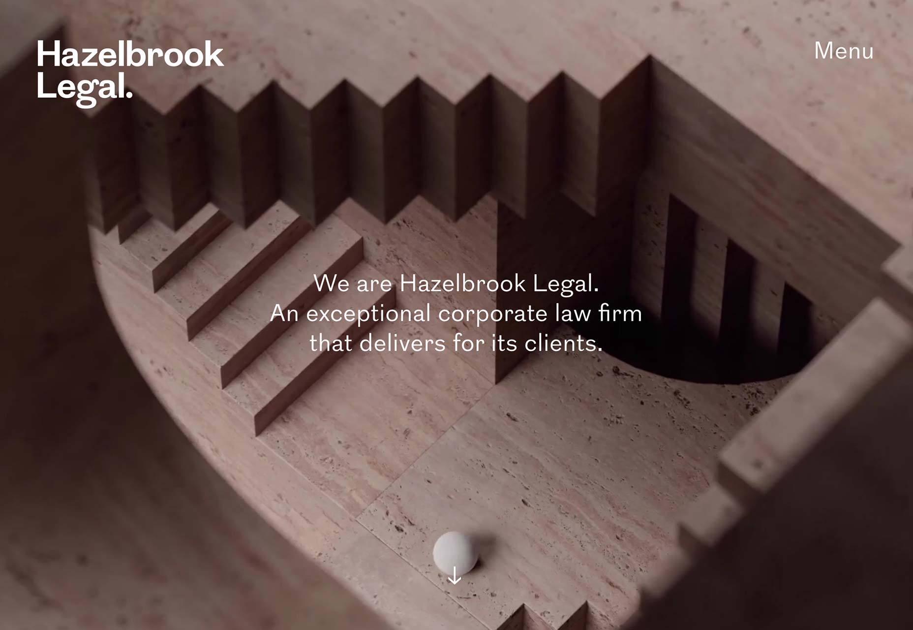
Ramus
Ramus is a design collective drawing talent from across the creative industries to produce works of art with light. The scale of its portfolio is truly impressive, and a different showcase video loads each time you visit the site.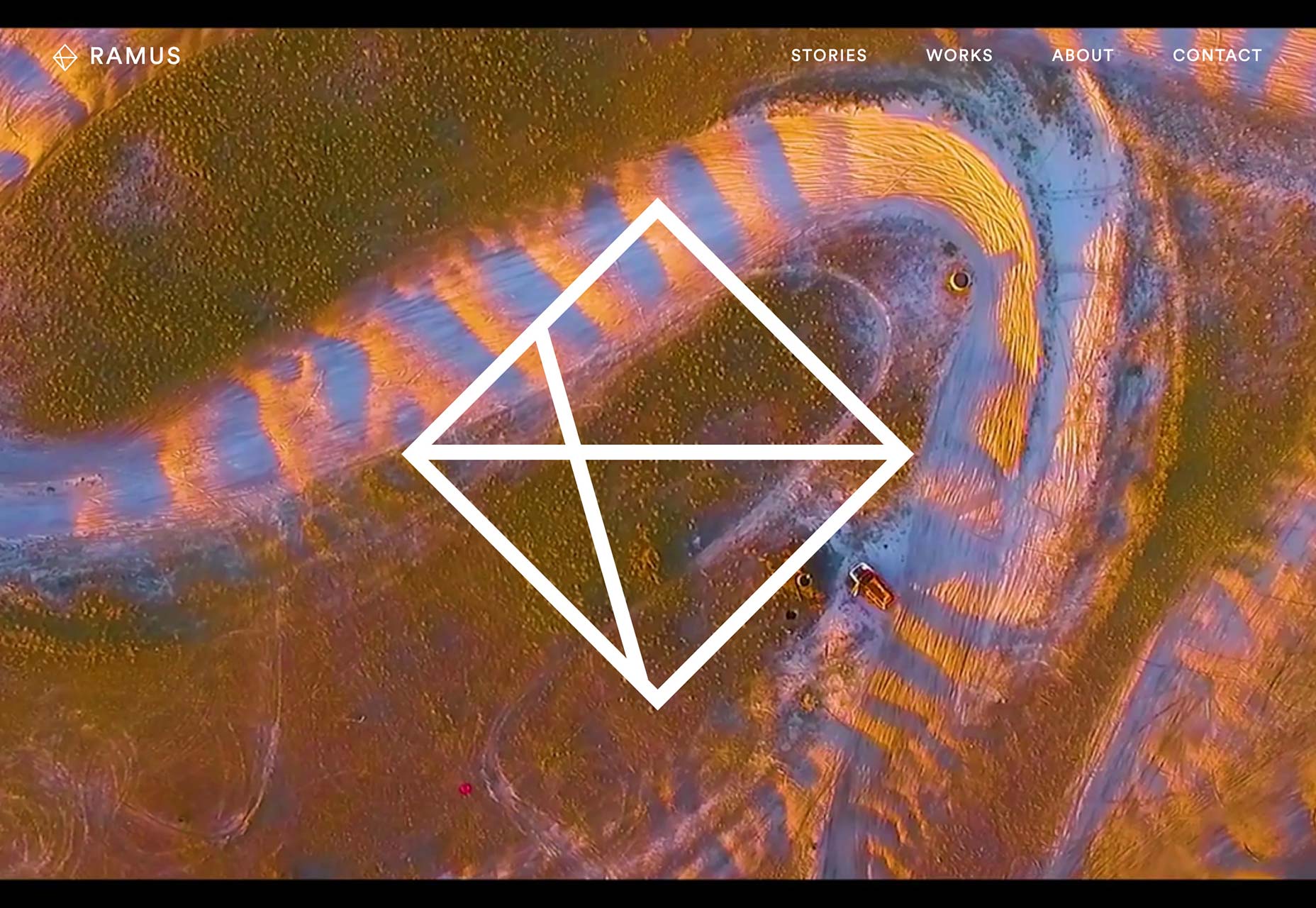
Thirst
If you want to be successful in design you need to carve out a niche. Thirst has certainly done that by only designing packaging for drinks. The animated gradients on its homepage calls to mind exotic flavours perfectly.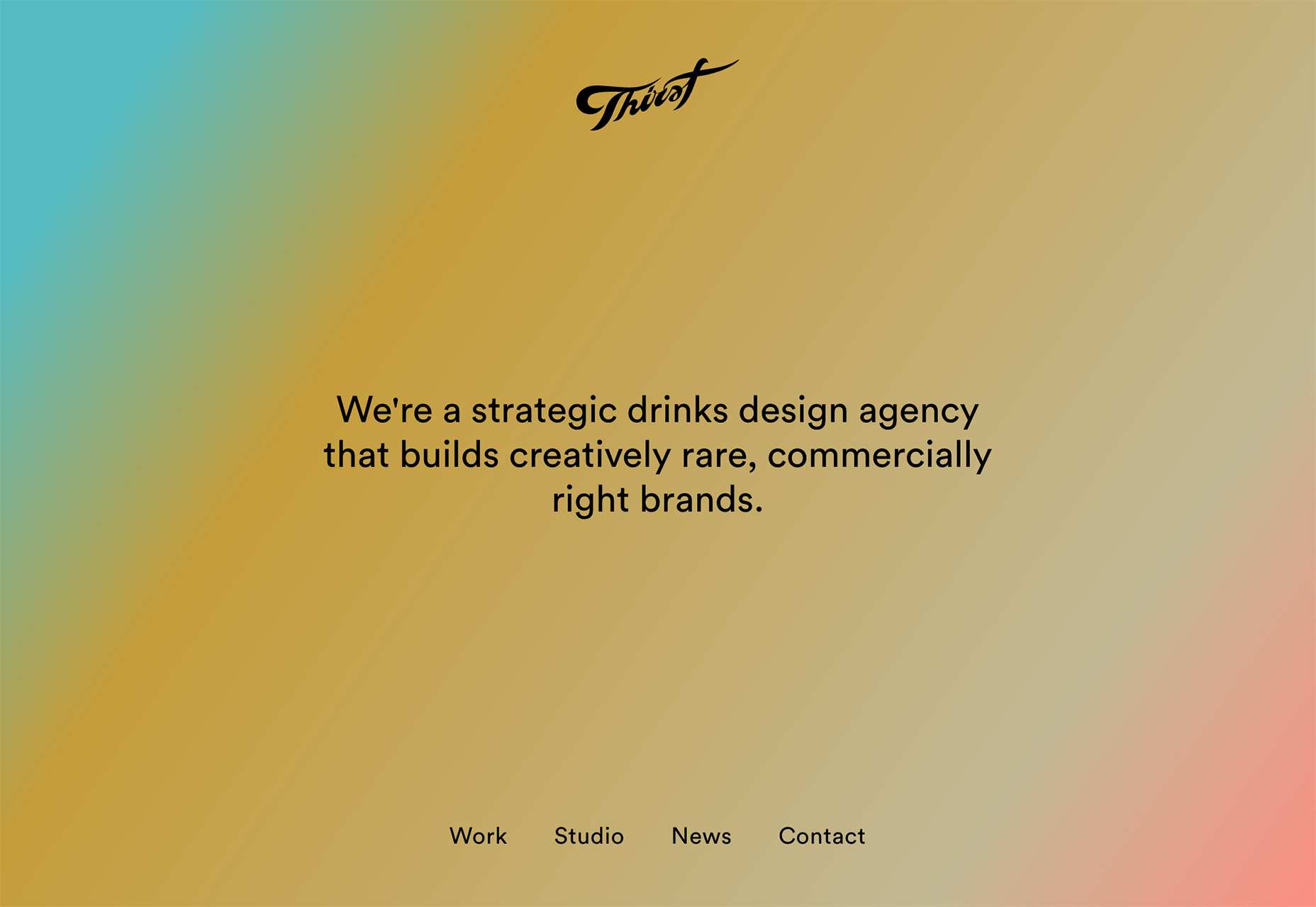
Near Miss Memorials
Near Miss Memorials is a public safety campaign from New Zealand that’s educating the public about crossing train tracks safely. Scroll along the tracks, and watch videos of people risking their lives for a few extra seconds off their journey. It’s an impactful, and potentially life-saving site.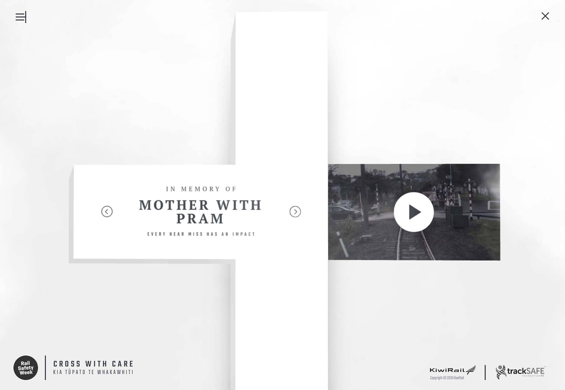
Seafood From Norway
If like me, you’re hooked on Nordic Noir TV dramas, then the opening video on Seafood From Norway’s site will get your pulse racing. The site is actually a very beautiful advert for the Norwegian fishing industry, showcasing its high standards. The recipes are great too.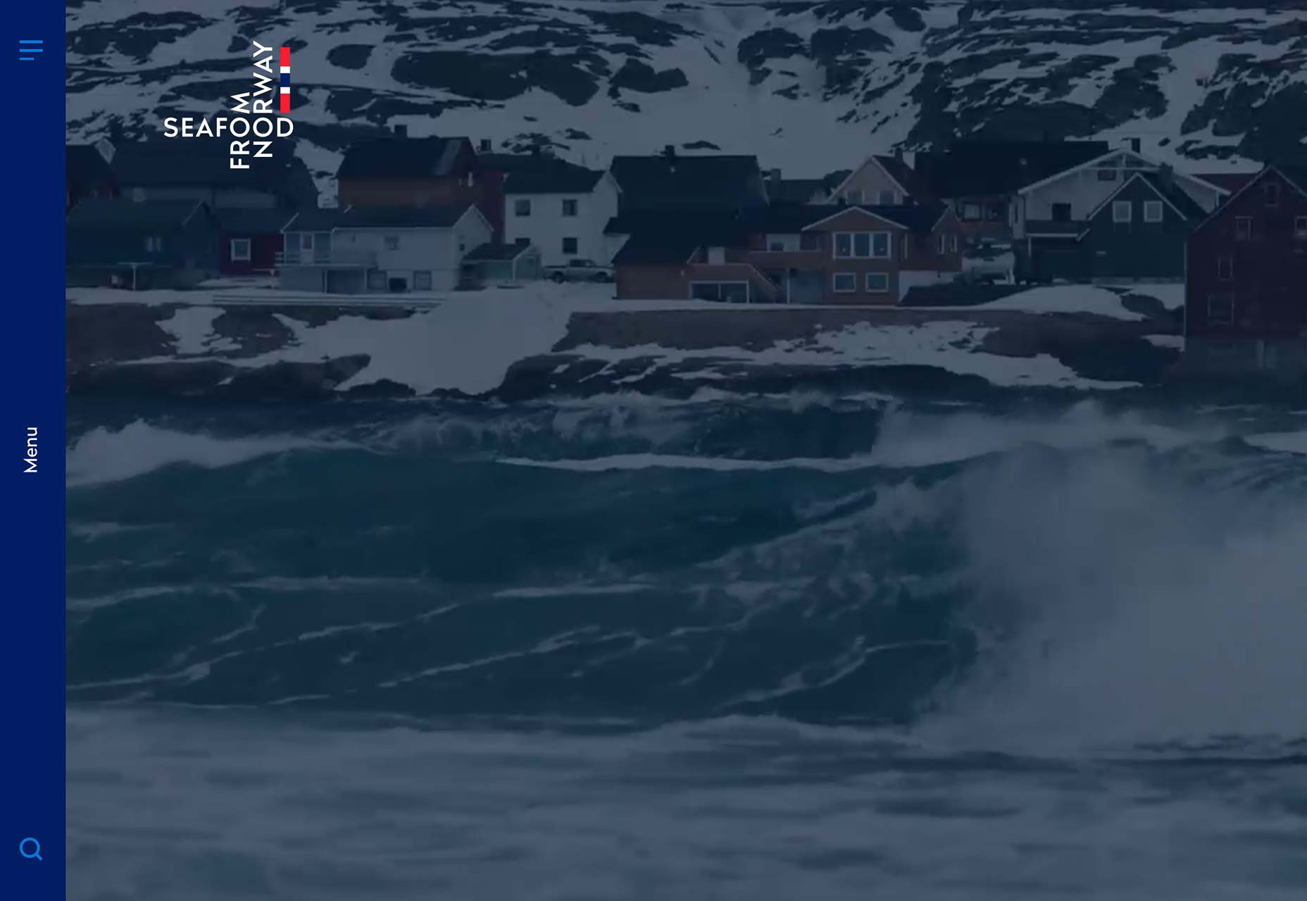
Cognito
This awesome illustrated site uses animation and simple illustration to simplify technologically complex solutions. Best of all, the flow of the illustrations lead you through the sections of the site, drawing you into the content brilliantly.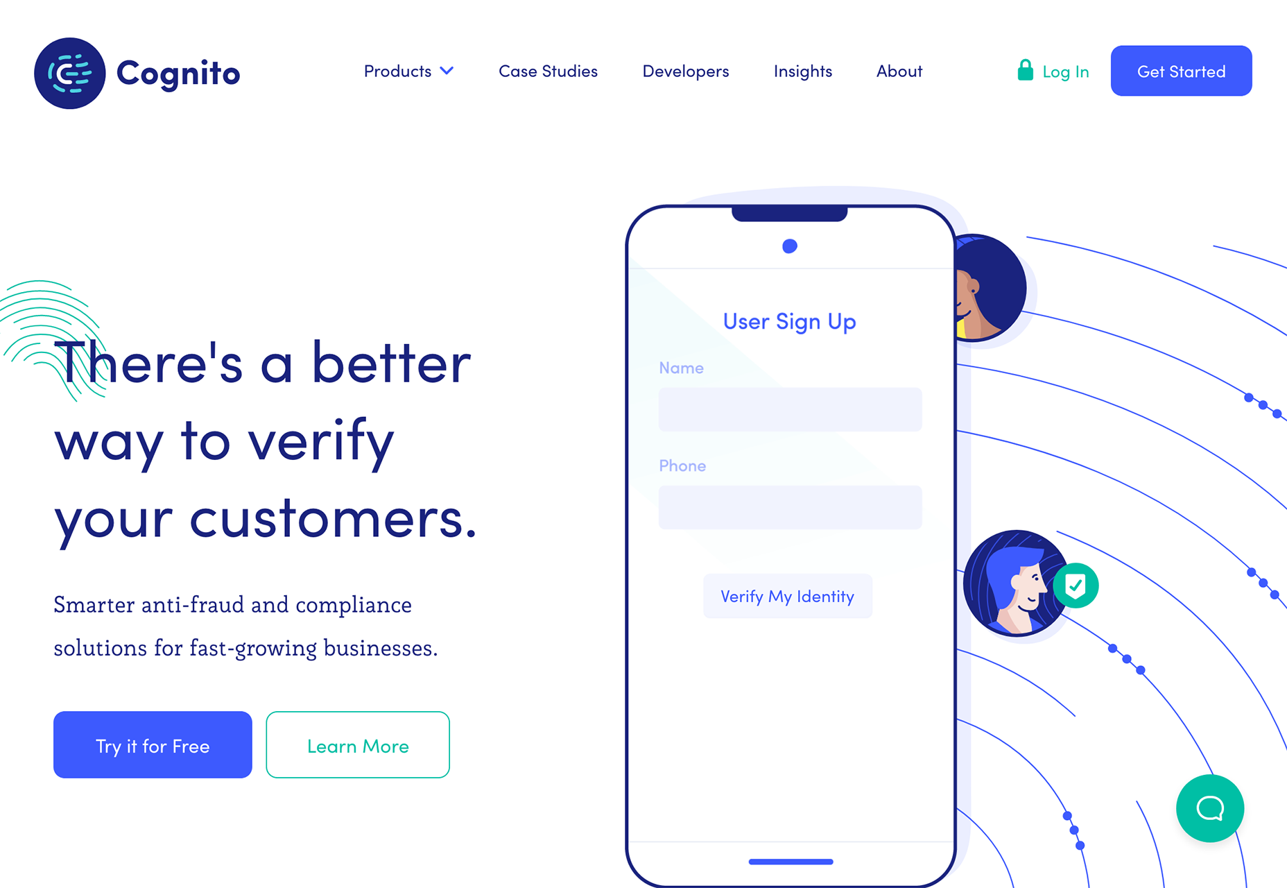
VLNC
French design studio VLNC has a unique approach to the thorny problem of how to layout thumbnails, they turned them into a mouse trail. It’s a surprisingly effective way to make use of one of the web’s oldest clichés.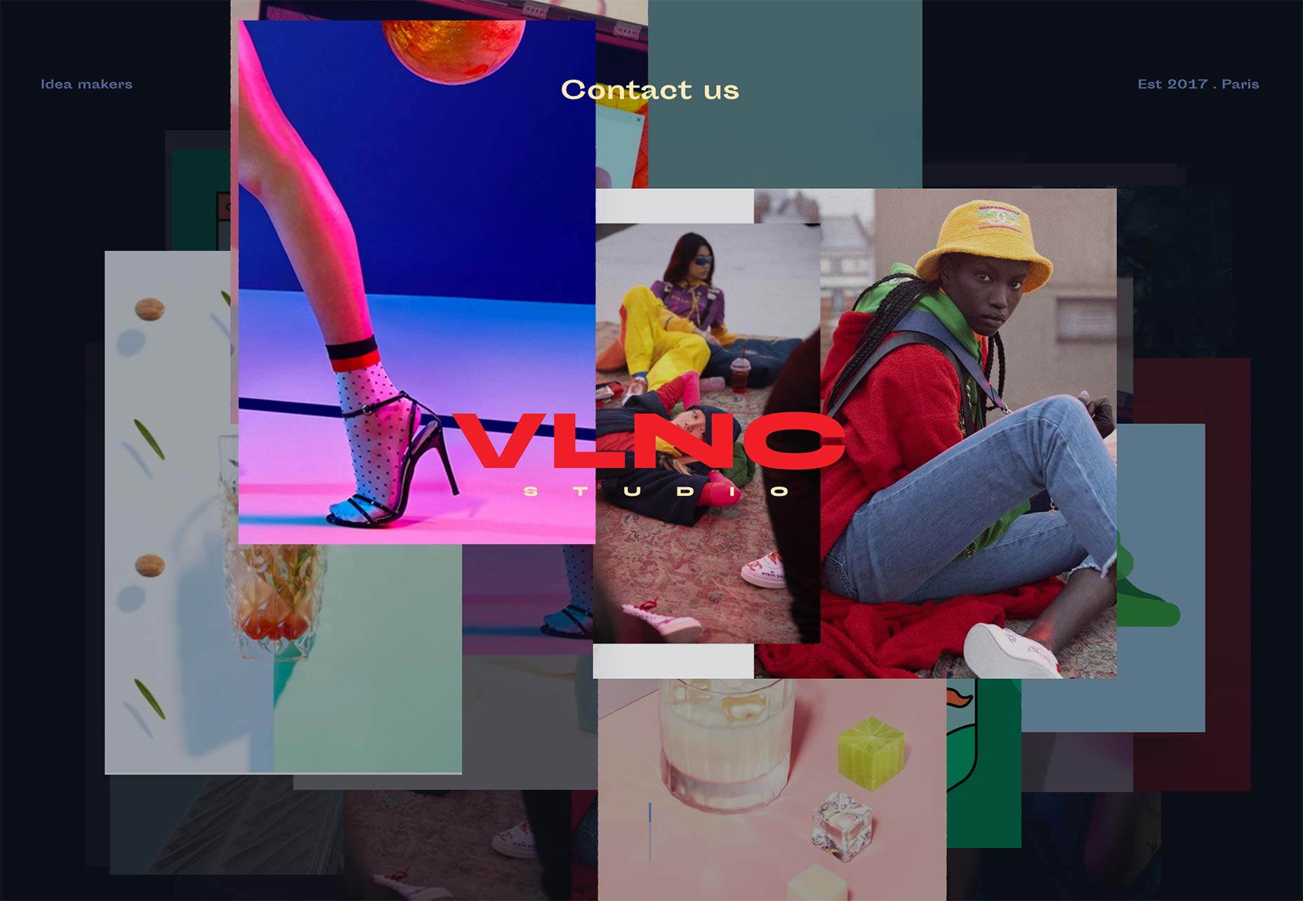
Fetching Fields
The ingredients on Fetching Fields’ site look good enough to eat, and with its luxury-feel brand you’d expect this to be a fancy new foodie option. But Fetching Fields are selling treats for our dogs. Because our furry friends deserve the best.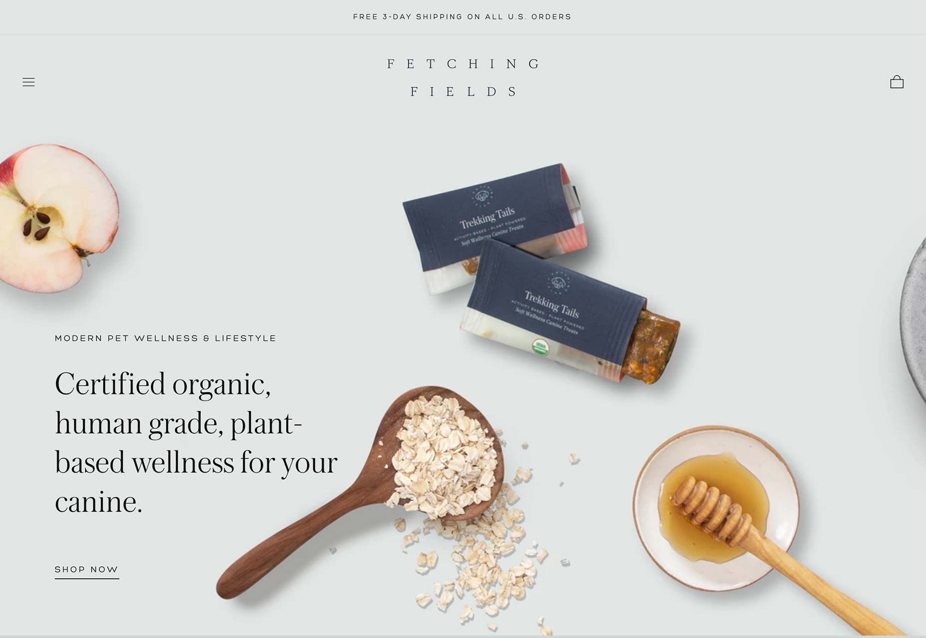
Tusk
One of the most difficult aspects of a site to get right is the tone. It’s when user experience, art direction, content, animation, and typography all come together to just feel right. Tusk gets it perfectly.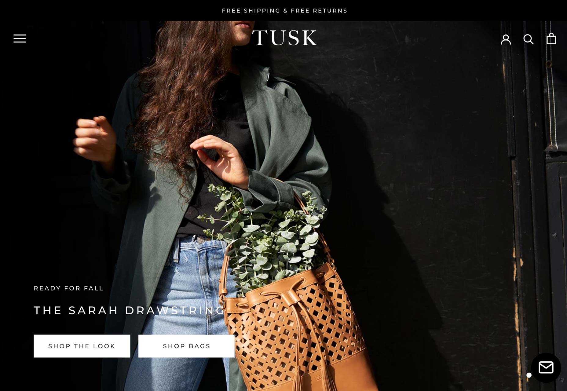
We Compost
Normally, any delay in getting to a site’s content is a bad thing, but Auckland’s We Compost opens with a delightful animation of earthworms, which ties the concept together instantly. It’s lovely.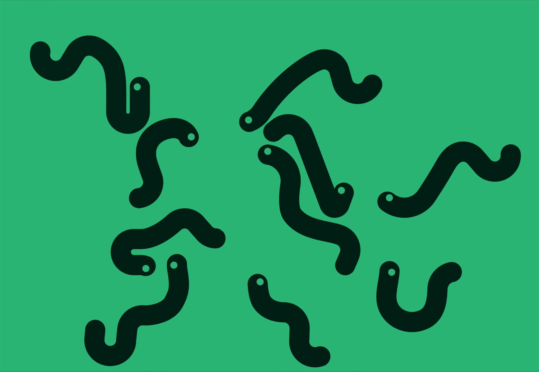
Bimble
Who says parallax is dead? This simple site for CBD-based drink is calm, brand appropriate, and makes excellent use of the tried and tested effect that we all love to hate to love.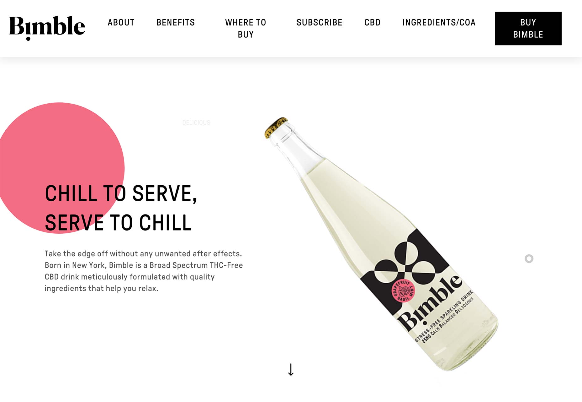
The Jacky Winter Group
The Jacky Winter Group represents illustrators, artists, animators, lettering designers, and all manner of visually creative professional. The site is almost an assault on your eyes. It’s modern, exciting, and packed with energy.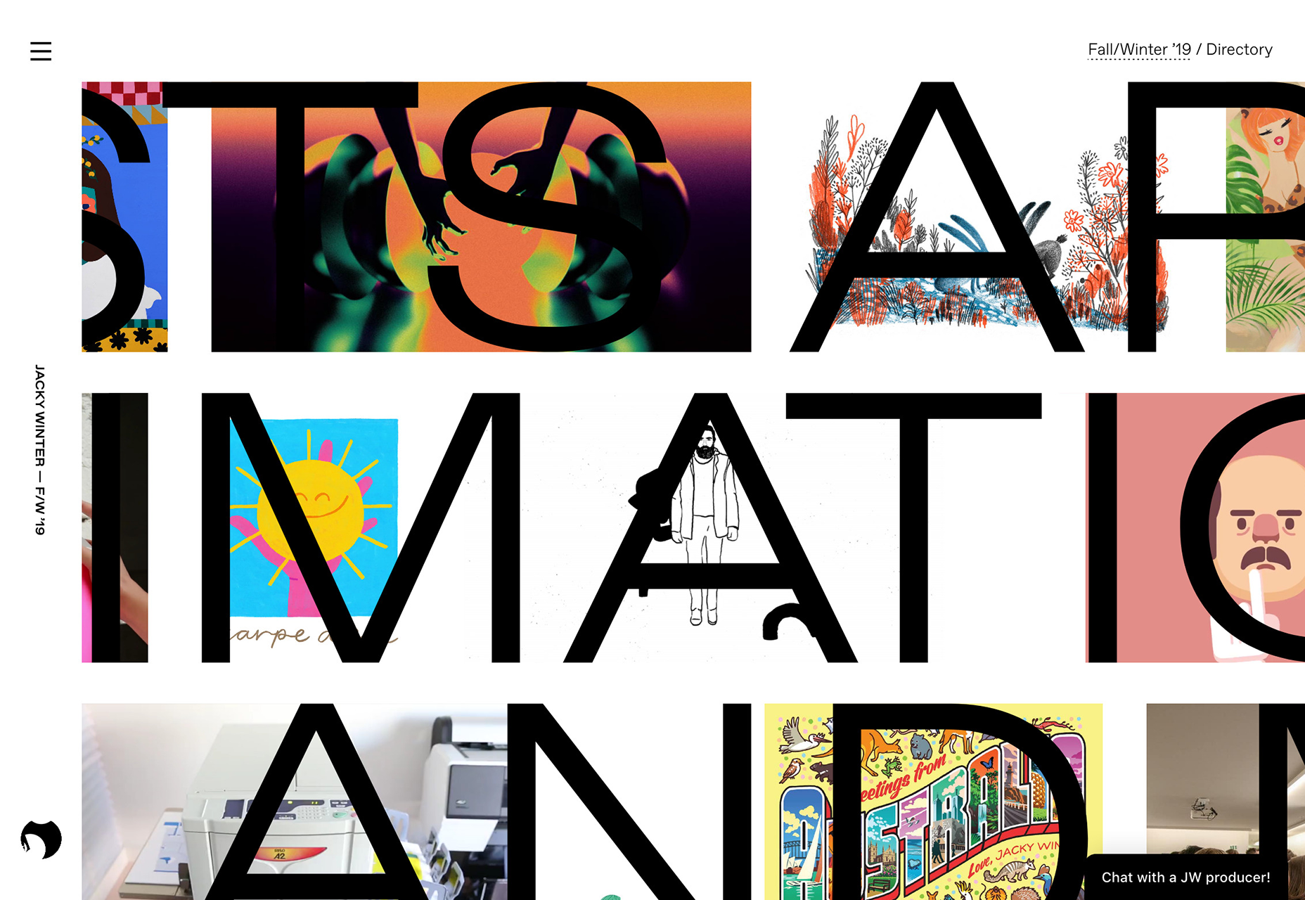
NYT Food Festival
This great little site for the New York Times’ Food Festival captures our attention with fun, animated typography. There are excellent splashes of color blocking throughout the site, even if the vital information is a little hidden away.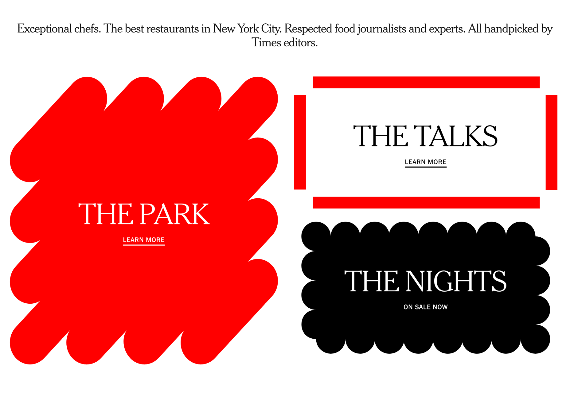
Almond Surfboards
With an innovative range of surfboards, the site for Almond Surfboards captures a retro, West-coast vibe perfectly. The warm off-white colors and all-American typography feel precisely on point. Check out the accessories section for some awesome flag-based lettering work.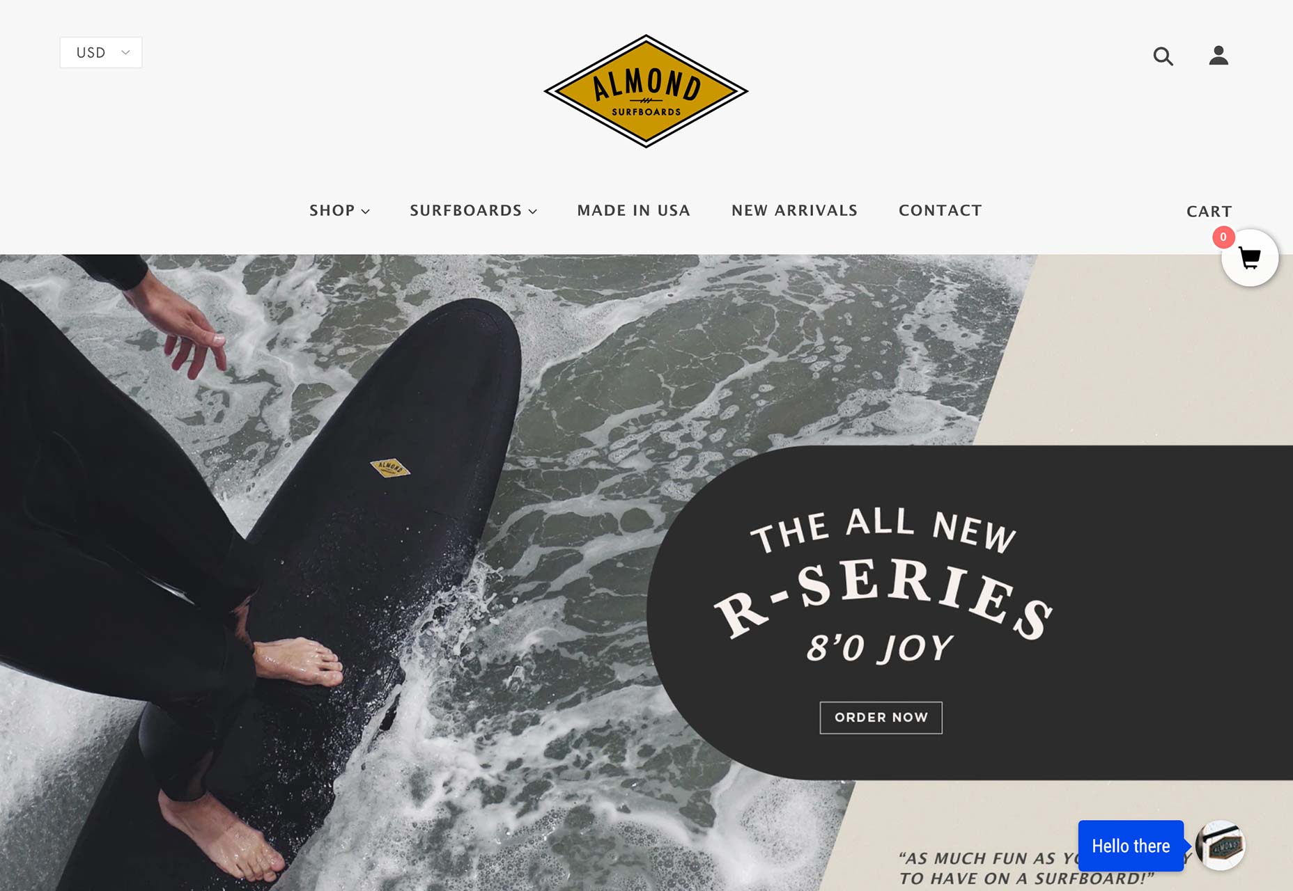
Hudson Hemp
Hudson Hemp uses an opening looping video to set the tone of its content. It’s respectable, science-orientated, it could be a feature for National Geographic. All essential characteristics when you’re selling a product about which there is so much misinformation.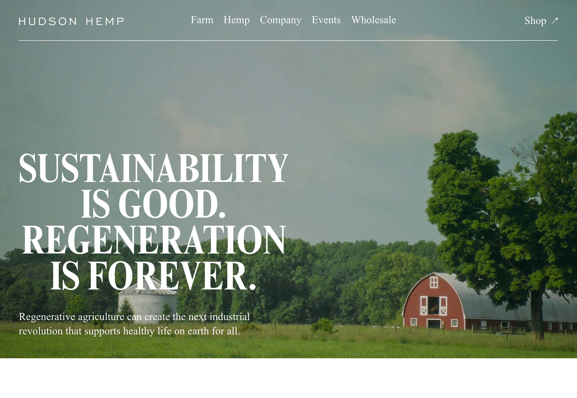
Adventure of the Detective’s
I don’t pretend to fully understand Andrew Maruska’s quest-generator for D&D. But what I do understand is the excellent choice of typeface, that levels-up this one-pager. It feels entirely appropriate, and I wish more sites were brave with their font choices.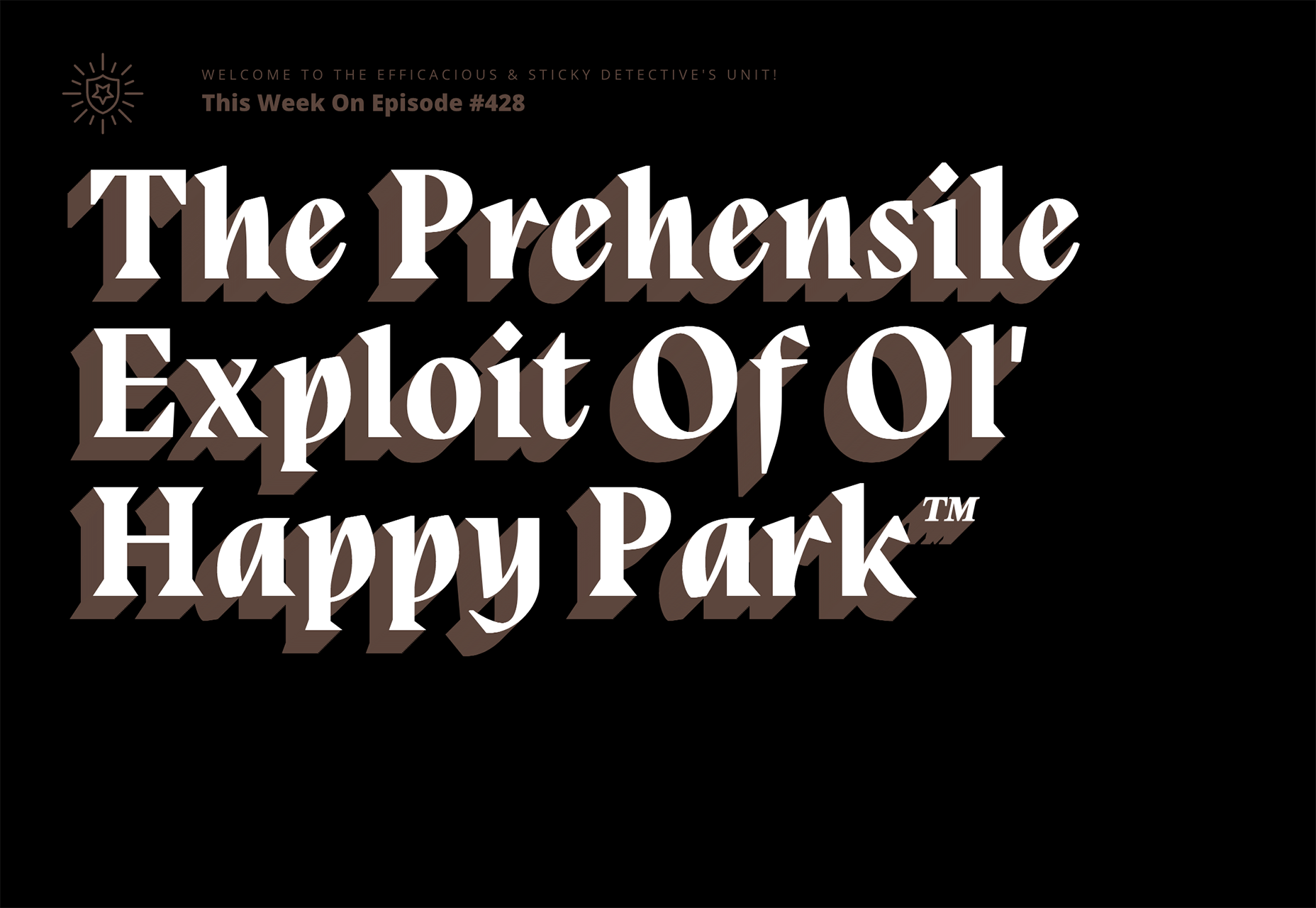
WDD Staff
WDD staff are proud to be able to bring you this daily blog about web design and development. If there's something you think we should be talking about let us know @DesignerDepot.


Read Next

15 Best New Fonts, July 2024
Welcome to our monthly roundup of the best fonts we’ve found online in the last four weeks. This month, there are fewer…
By Ben Moss

20 Best New Websites, July 2024
Welcome to July’s round up of websites to inspire you. This month’s collection ranges from the most stripped-back…

Top 7 WordPress Plugins for 2024: Enhance Your Site's Performance
WordPress is a hands-down favorite of website designers and developers. Renowned for its flexibility and ease of use,…
By WDD Staff

Exciting New Tools for Designers, July 2024
Welcome to this July’s collection of tools, gathered from around the web over the past month. We hope you’ll find…

3 Essential Design Trends, July 2024
Add some summer sizzle to your design projects with trendy website elements. Learn what's trending and how to use these…

15 Best New Fonts, June 2024
Welcome to our roundup of the best new fonts we’ve found online in the last month. This month, there are notably fewer…
By Ben Moss

20 Best New Websites, June 2024
Arranging content in an easily accessible way is the backbone of any user-friendly website. A good website will present…

Exciting New Tools for Designers, June 2024
In this month’s roundup of the best tools for web designers and developers, we’ll explore a range of new and noteworthy…

3 Essential Design Trends, June 2024
Summer is off to a fun start with some highly dramatic website design trends showing up in projects. Let's dive in!

15 Best New Fonts, May 2024
In this month’s edition, there are lots of historically-inspired typefaces, more of the growing trend for French…
By Ben Moss

How to Reduce The Carbon Footprint of Your Website
On average, a web page produces 4.61 grams of CO2 for every page view; for whole sites, that amounts to hundreds of KG…
By Simon Sterne

20 Best New Websites, May 2024
Welcome to May’s compilation of the best sites on the web. This month we’re focused on color for younger humans,…