3 Essential Design Trends, October 2019

Welcome to our monthly roundup of the latest and greatest trends in the world of web design.

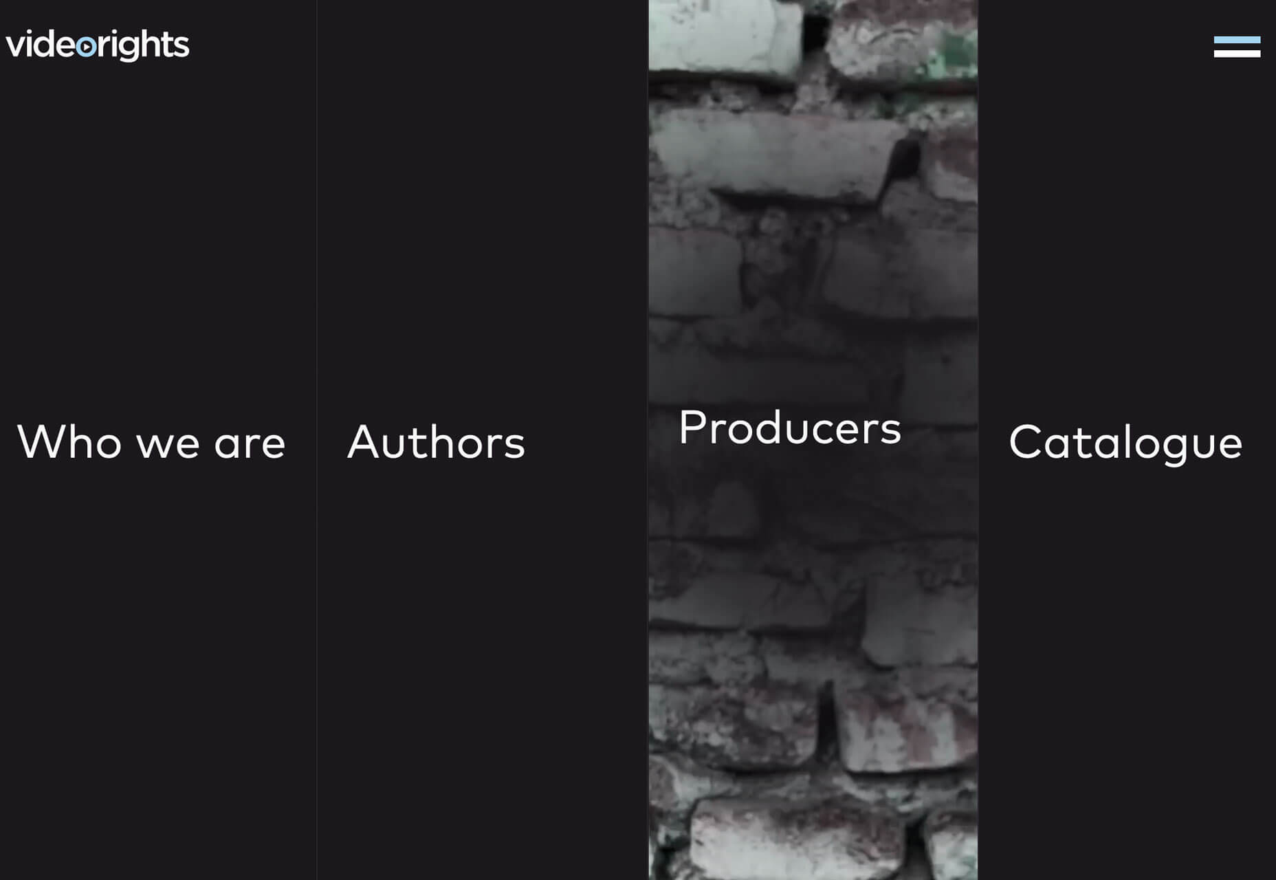
Skinny Vertical Elements
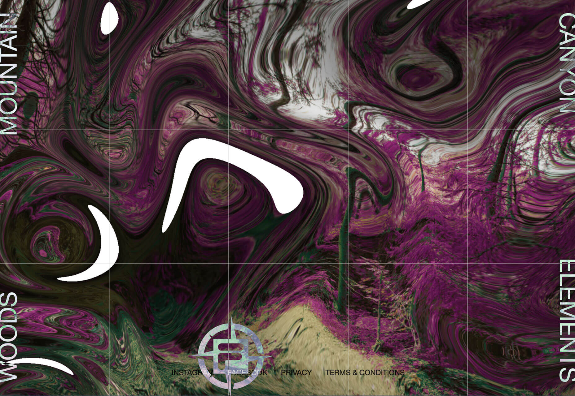
This might be the coolest looking trend in the roundup: Skinny vertical elements that add a fresh visual aspect to website projects. The space they occupy and the fact that they look different are engaging. The only trouble can be with the conversion away from desktop sizes to smaller screen resolutions, but all of the examples below seem to handle that well. It’s also a technique that can be used for different purposes. Front Pourch Brewing uses a skinny vertical bar with icons on the left side of the screen to highlight navigation elements. On mobile, the yellow bar collapses into a bottom of the screen nav with a hamburger menu. (Bottom of the screen menus are great for ease of navigating and tapping elements.)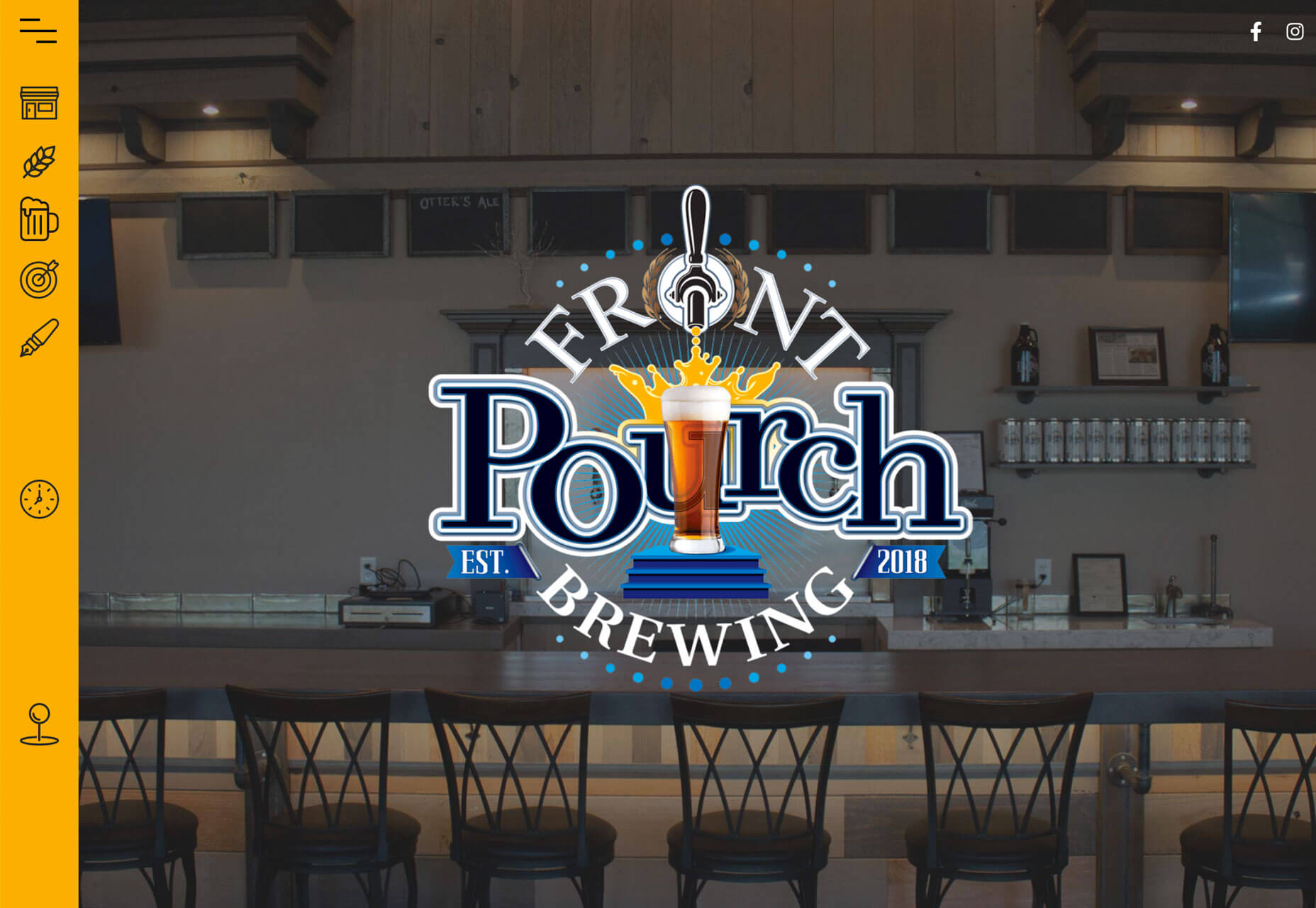 Fila Explore uses skinny vertical navigation elements on both sides of the screen that change the hero image when you hover over them. Each word is also clickable to go to another page. The UX is the same on mobile, albeit with a different aspect ratio.
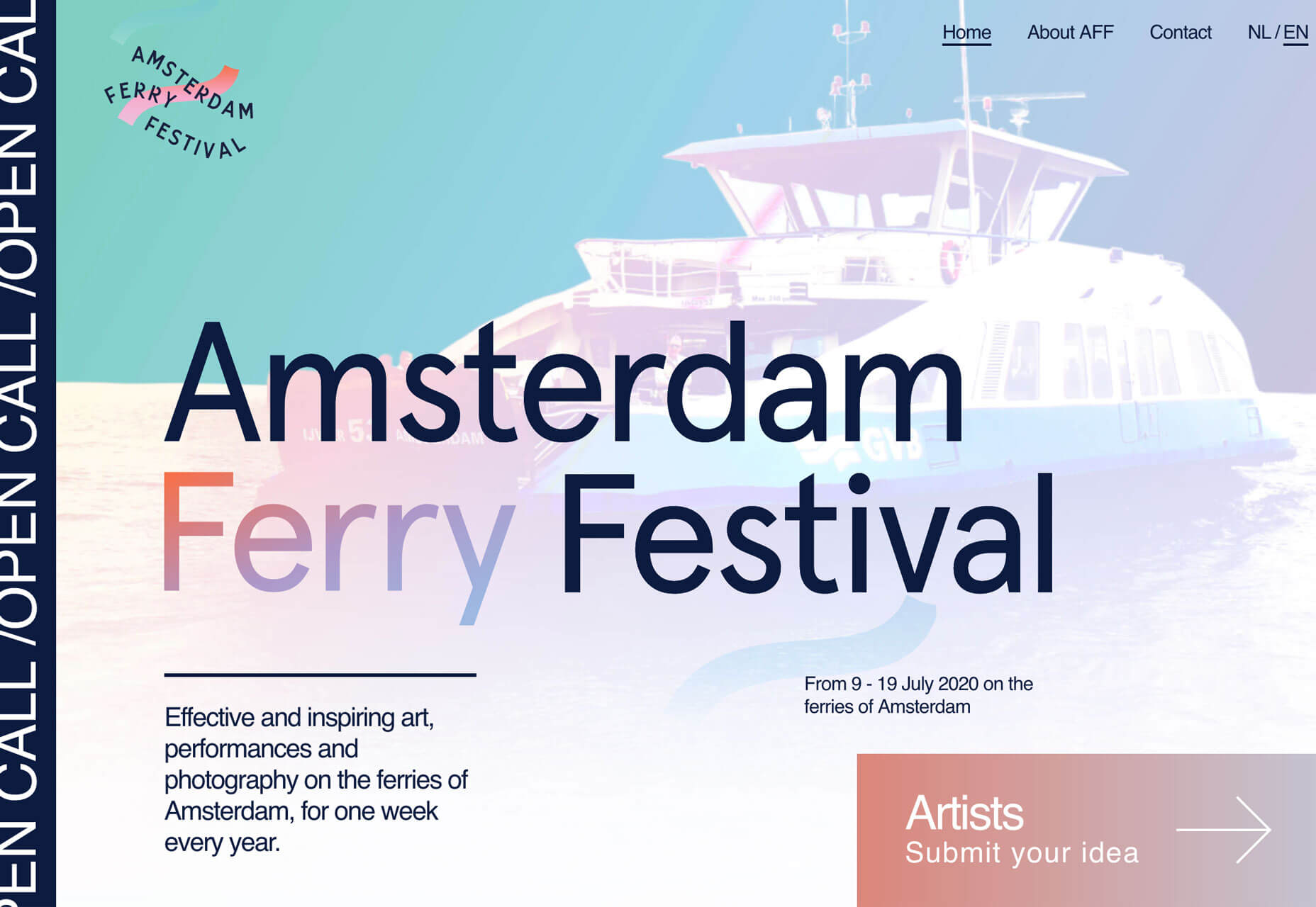
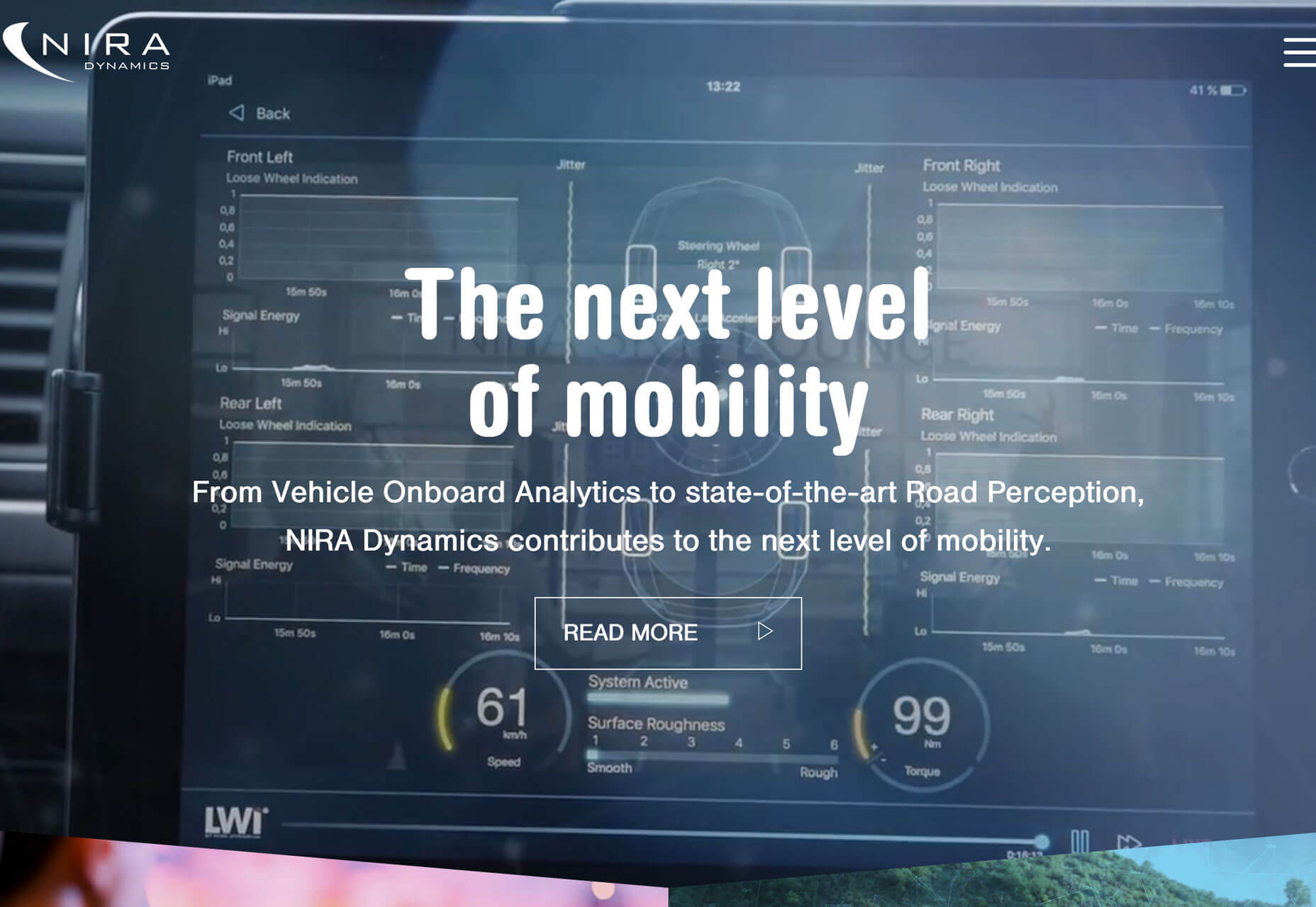
 Amsterdam Ferry Festival uses a skinny vertical element on the left side of the screen with scrolling text to highlight an important event message. The area is also clickable and takes you to the call for entries listing in the scrolling text. It’s a different way to provide a scroller that isn’t at the top of the homepage. The placement is nice because it doesn’t detract from the rest of the design and the visuals could work equally well if it were removed. The placement and UX is the same on mobile, although it is a little harder to actually click/tap.
Tiny Logos and Branding
It’s best practice to place your logo, brand, or website name in the top left corner of the design. It’s not a new idea and one that users understand. (Just don’t forget to make that logo your home button.) But there is a shift that these logos and brand marks are getting smaller and smaller. Part of it might be due to responsive design and how many website we are looking at on phones or small devices. A big honkin’ logo will surely get in the way. [pullquote]create good content first and worry about creating brand loyalty after[/pullquote] But more, it’s a practice of subtlety. If your content is good and what users expect when they come to your website, a large logo or brand name isn’t always contributing to the design or content. Think about it for a minute. None of the examples below are household names, but they are all well-designed websites that serve a purpose for a specific user group. Aside from major companies such as Coca-Cola, Google, or Amazon that everyone is familiar with, the brand is often secondary to what’s on display. This applies to websites that deal in ecommerce or provide goods or services and sites that are purely informational or for entertainment. A big homepage logo never got anyone excited; create good content first and worry about creating brand loyalty after users have already connected with what you have to offer.
Dark and Moody
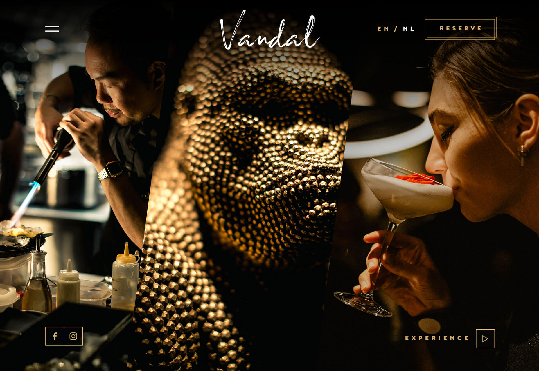
Dark and moody website themes have a sleek look and aura of mystery that seems to instantly jump out. This trend really pops right now because light and white minimalism or bright, bold color palettes have been so dominant. It makes dark themes stand out even more. Each of these examples does it in a similar, but different way. Warped Cigars uses a black and white theme with bold, beautiful typography. Images lack color and also have a bit of a black overlay to give more room to text elements and contribute to readability.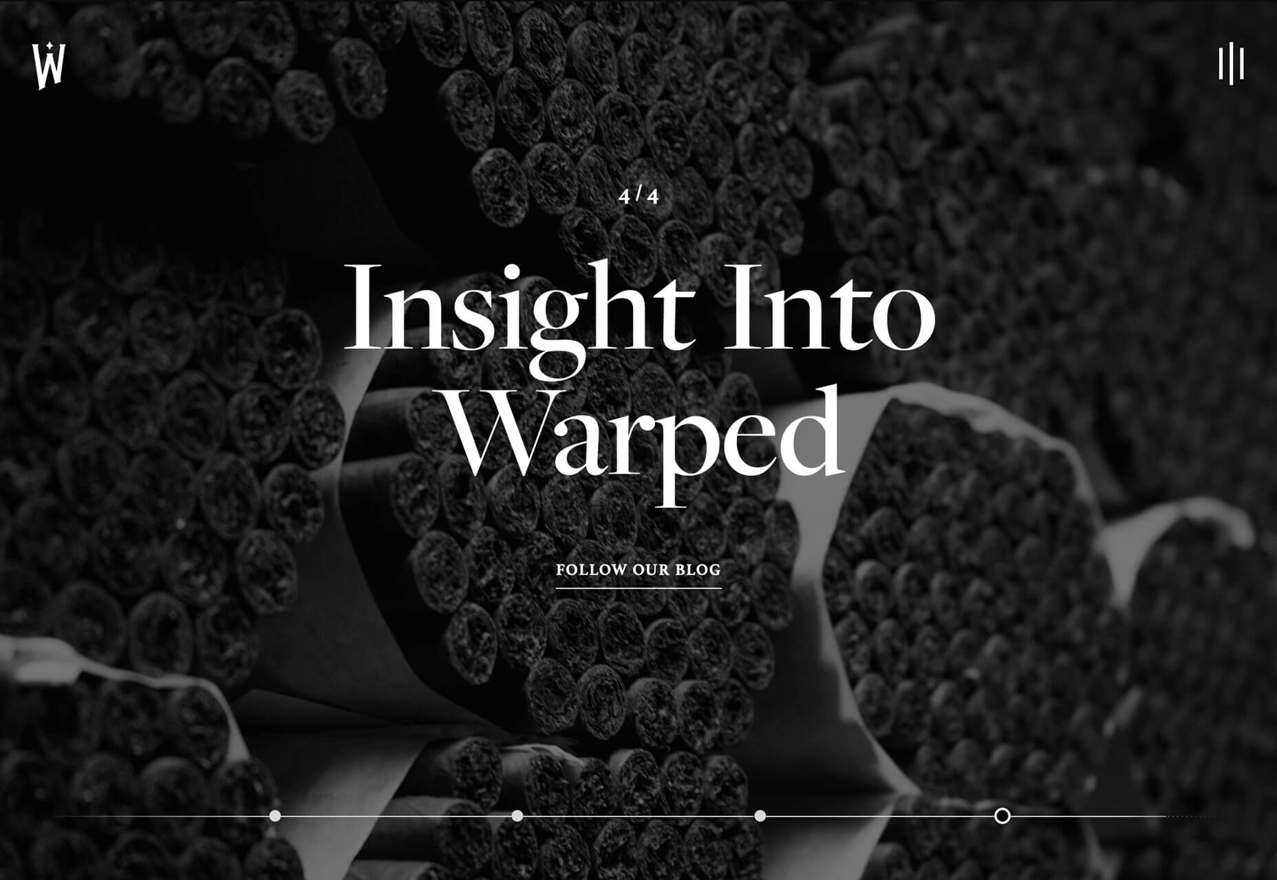 Vandal uses a combination of intriguing images in dark lighting. Each looks like it was taken in a dark room. Images and a dark scheme are magnified with gold accents, lettering, and lines that create a regal feel of elegance and mystery.
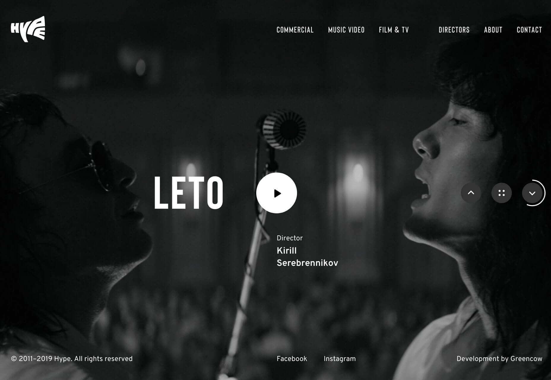
 Hype uses a fairly traditional dark scheme with a slider of images with a dark overlay for highlight text elements. Images are both color and black and white as the slider almost allows the dark, moody scheme to flip for a moment (depending on the image) and draw you back in for another glance. The image selections here also contribute to the moody feel of the website project.
Conclusion
If you clicked through the examples above you might have uncovered another trend. There’s a growing number of websites using oversized cursor circles that help user discover interactive elements. Several of these examples use them and it’s starting to show up on all kinds of websites. What you see is often a large circle that moves with the mouse on the screen. It might activate hover states of other elements or help you find fun divots to explore. And now that you are aware of this little goodie, take note of how often you are finding it when you browse the web.Carrie Cousins
Carrie Cousins is a freelance writer with more than 10 years of experience in the communications industry, including writing for print and online publications, and design and editing. You can connect with Carrie on Twitter @carriecousins.


Read Next

15 Best New Fonts, July 2024
Welcome to our monthly roundup of the best fonts we’ve found online in the last four weeks. This month, there are fewer…
By Ben Moss

20 Best New Websites, July 2024
Welcome to July’s round up of websites to inspire you. This month’s collection ranges from the most stripped-back…

Top 7 WordPress Plugins for 2024: Enhance Your Site's Performance
WordPress is a hands-down favorite of website designers and developers. Renowned for its flexibility and ease of use,…
By WDD Staff

Exciting New Tools for Designers, July 2024
Welcome to this July’s collection of tools, gathered from around the web over the past month. We hope you’ll find…

3 Essential Design Trends, July 2024
Add some summer sizzle to your design projects with trendy website elements. Learn what's trending and how to use these…

15 Best New Fonts, June 2024
Welcome to our roundup of the best new fonts we’ve found online in the last month. This month, there are notably fewer…
By Ben Moss

20 Best New Websites, June 2024
Arranging content in an easily accessible way is the backbone of any user-friendly website. A good website will present…

Exciting New Tools for Designers, June 2024
In this month’s roundup of the best tools for web designers and developers, we’ll explore a range of new and noteworthy…

3 Essential Design Trends, June 2024
Summer is off to a fun start with some highly dramatic website design trends showing up in projects. Let's dive in!

15 Best New Fonts, May 2024
In this month’s edition, there are lots of historically-inspired typefaces, more of the growing trend for French…
By Ben Moss

How to Reduce The Carbon Footprint of Your Website
On average, a web page produces 4.61 grams of CO2 for every page view; for whole sites, that amounts to hundreds of KG…
By Simon Sterne

20 Best New Websites, May 2024
Welcome to May’s compilation of the best sites on the web. This month we’re focused on color for younger humans,…