How to Decrease Decision Fatigue and Increase Conversions

With so much of our lives spent trying to choose from oversized lists of options, why not make your website simpler? Here’s what you can do to reduce decision fatigue and make your website easier to say “yes” to.

What Web Designers Can Do to Reduce Design Fatigue
If you or your client want your website to convert, you really need to think about the ways you’re forcing them to stop and wonder: “Which one do I choose?” Whether your website sells content, services, or products, less is always going to be more in terms of decision-making. And this isn’t about how many products you sell on a website. This is about how you frame every individual decision leading up to conversion. Here are some examples of where decision fatigue may take place and how to reduce friction there:1. Clear Up the Navigation
With smaller websites and more narrowly-focused businesses, you won’t have to worry about this too much. With big stores, however, the navigation can get you into a lot of trouble if you don’t organize it well. Here’s what I mean: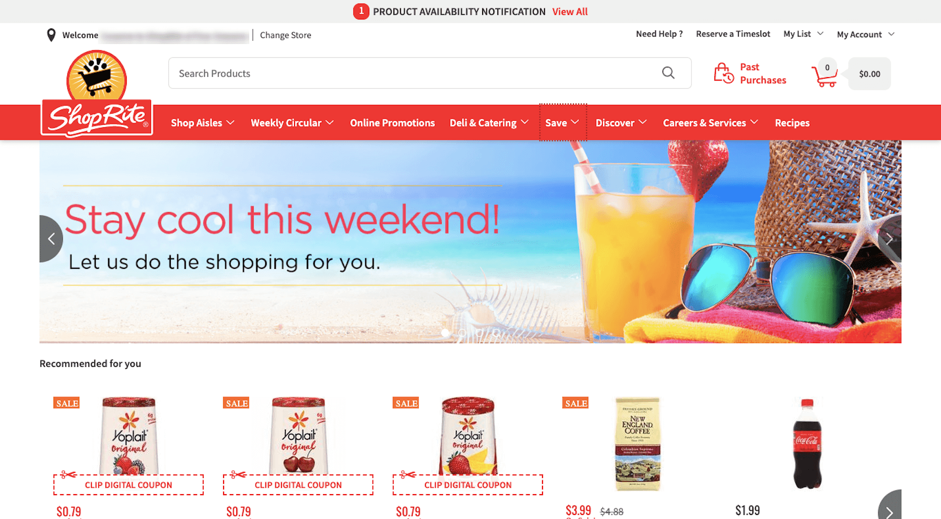 This is the website for ShopRite, a major grocery chain in the U.S.
While I understand that people may come to this website for a variety of purposes, it’s clearly set up as an online ordering system. If that’s your main priority, then the navigation should not be organized in this manner.
“Shop Aisles” certainly belongs there. But do they need three menus to promote specials and coupons: “Weekly Circular”, “Online Promotions”, and “Save”? What about “Discover”, “Careers”, and “Recipes”? There’s a lot of extra noise here.
If the data is telling you that the majority of customers come here to shop, give them what they want in a clear and simple fashion. Don’t make them read through other menu labels or click on them to figure out what something labeled “Discover” even means.
This is the website for ShopRite, a major grocery chain in the U.S.
While I understand that people may come to this website for a variety of purposes, it’s clearly set up as an online ordering system. If that’s your main priority, then the navigation should not be organized in this manner.
“Shop Aisles” certainly belongs there. But do they need three menus to promote specials and coupons: “Weekly Circular”, “Online Promotions”, and “Save”? What about “Discover”, “Careers”, and “Recipes”? There’s a lot of extra noise here.
If the data is telling you that the majority of customers come here to shop, give them what they want in a clear and simple fashion. Don’t make them read through other menu labels or click on them to figure out what something labeled “Discover” even means.
2. Choose One Promotion
Promotional offers and discounts are a great way to entice new visitors to take the plunge and for returning visitors to buy again. But just because they can be effective in increasing sales doesn’t mean you can go overboard with it. For instance: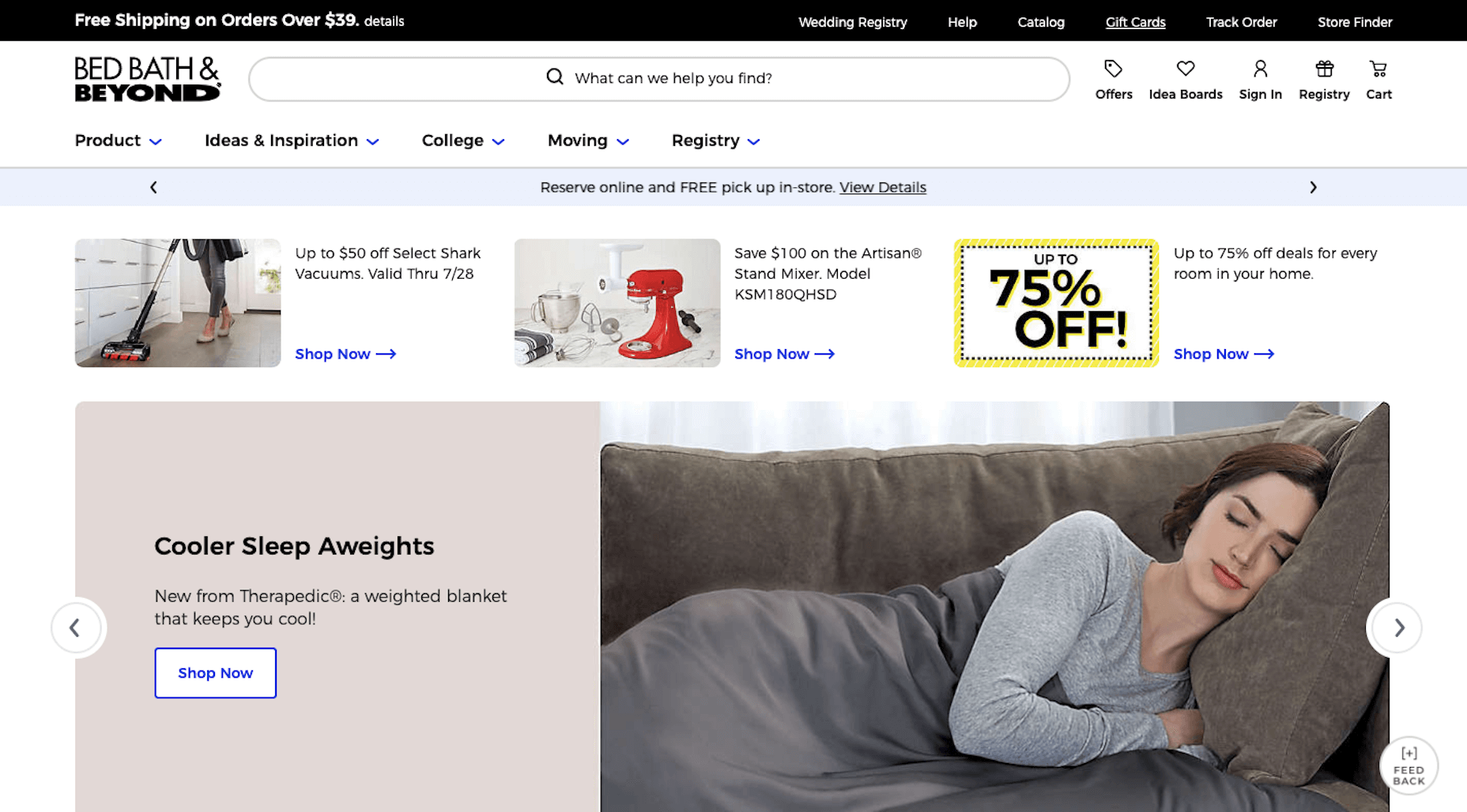 This is what the Bed, Bath & Beyond website looks like at the time of writing. Above the fold, there are promotions for:
- “Free shipping on orders over $39”
- “Reserve online and free pick-up in store”
- “Up to 50% off select Shark vacuums”
- “Save $100 on the Artisan Stand Mixer”
- “Up to 75% off deals for every home in your room”
- And, depending on where you catch the slider, there are rotating offers there as well.
3. Reduce the Number and Variety of CTAs
This typically isn’t a problem on internal pages of a website where the structure is simpler:- This is the topic;
- This is the call-to-action.
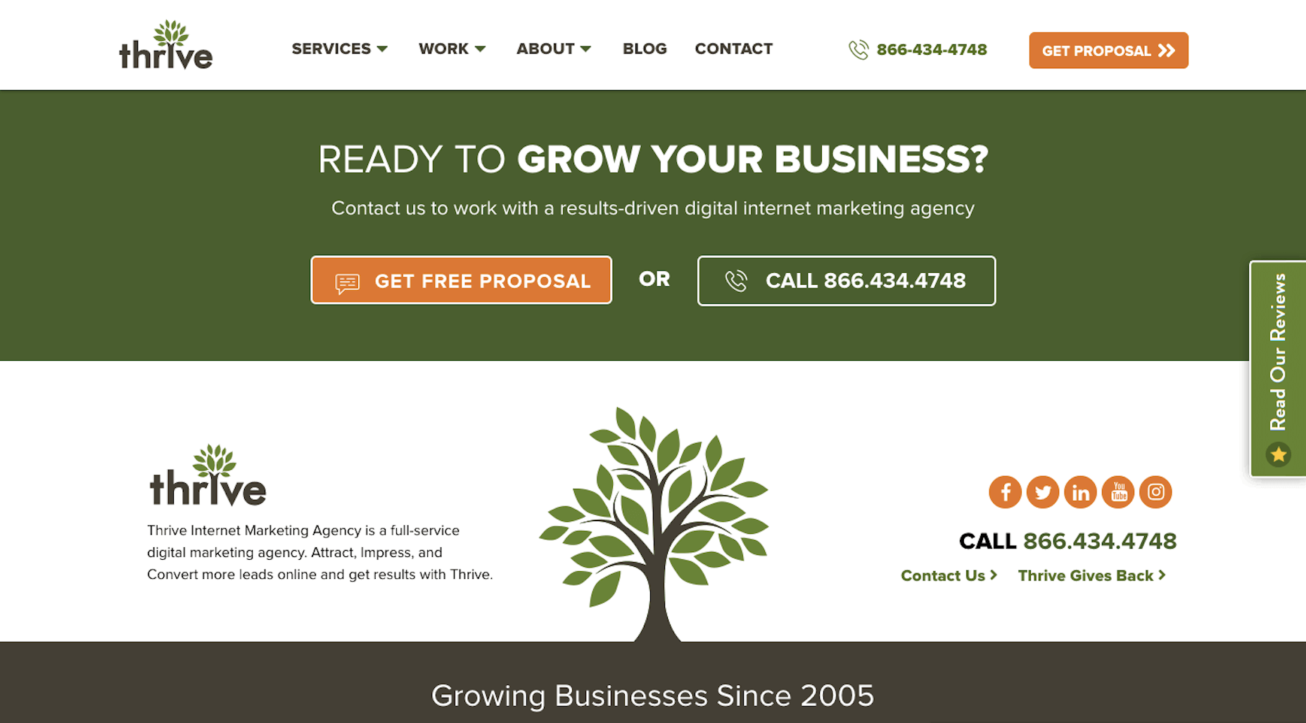 The home page, in general, is way too long. While it’s important to demonstrate authority and leverage customer testimonials when possible, this page is overkill. Then, when visitors get through the bravado, they stumble upon the call-to-action section above where they can:
- Get a free proposal;
- Call someone;
- Follow them on up to five social media platforms;
- Contact them through the website;
- Learn about how the agency gives back.
- Read more customer reviews.
4. Show Only the Most Recent Content
Content marketing is an essential part of most websites. And while it might seem like a good idea to show off how much high-quality content is available all at once, too many options can trigger decision fatigue. Just like what happens with this example from the Convince & Convert website: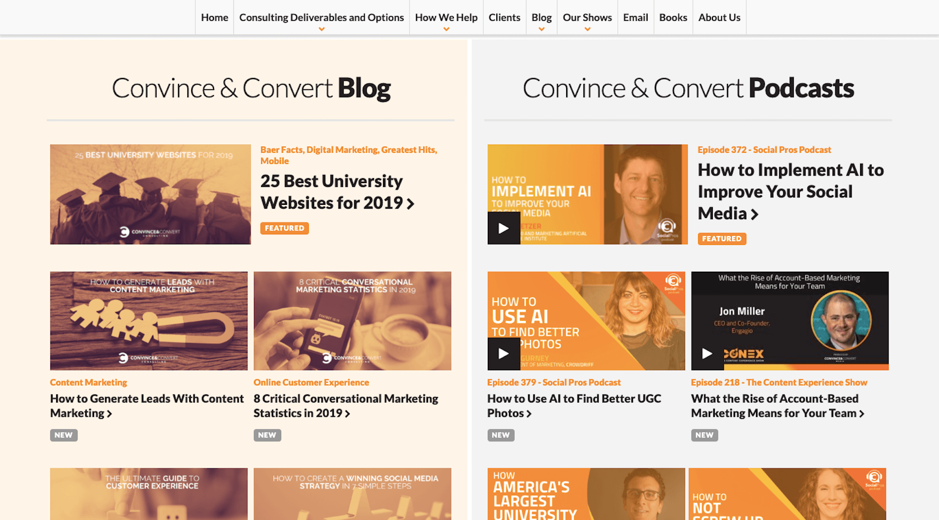 In just this screenshot, you can see six pieces of lookalike content, with four more poking up from the bottom. That’s ten headlines visitors have to read to determine which one or ones is worth clicking on.
You’d be better off using a recent posts slider where only one post shows at a time. Then, the “Blog” link in the navigation or the search bar at the top of the site can help them find more content if they’re interested in exploring.
In just this screenshot, you can see six pieces of lookalike content, with four more poking up from the bottom. That’s ten headlines visitors have to read to determine which one or ones is worth clicking on.
You’d be better off using a recent posts slider where only one post shows at a time. Then, the “Blog” link in the navigation or the search bar at the top of the site can help them find more content if they’re interested in exploring.
5. Include Filters and Sort Functionality for Search Results
When it comes to online search, you don’t want to take a page out of Google’s book where the responsibility is on the users to type exactly what they’re looking for and to decide how far they want to dig into the search results pages (which usually isn’t far). Give your visitors an easy way to filter and sort their search results so that the most relevant options present themselves and everything else is weeded out. For example, this is the Patina Restaurant Group’s chain of restaurants from around the US: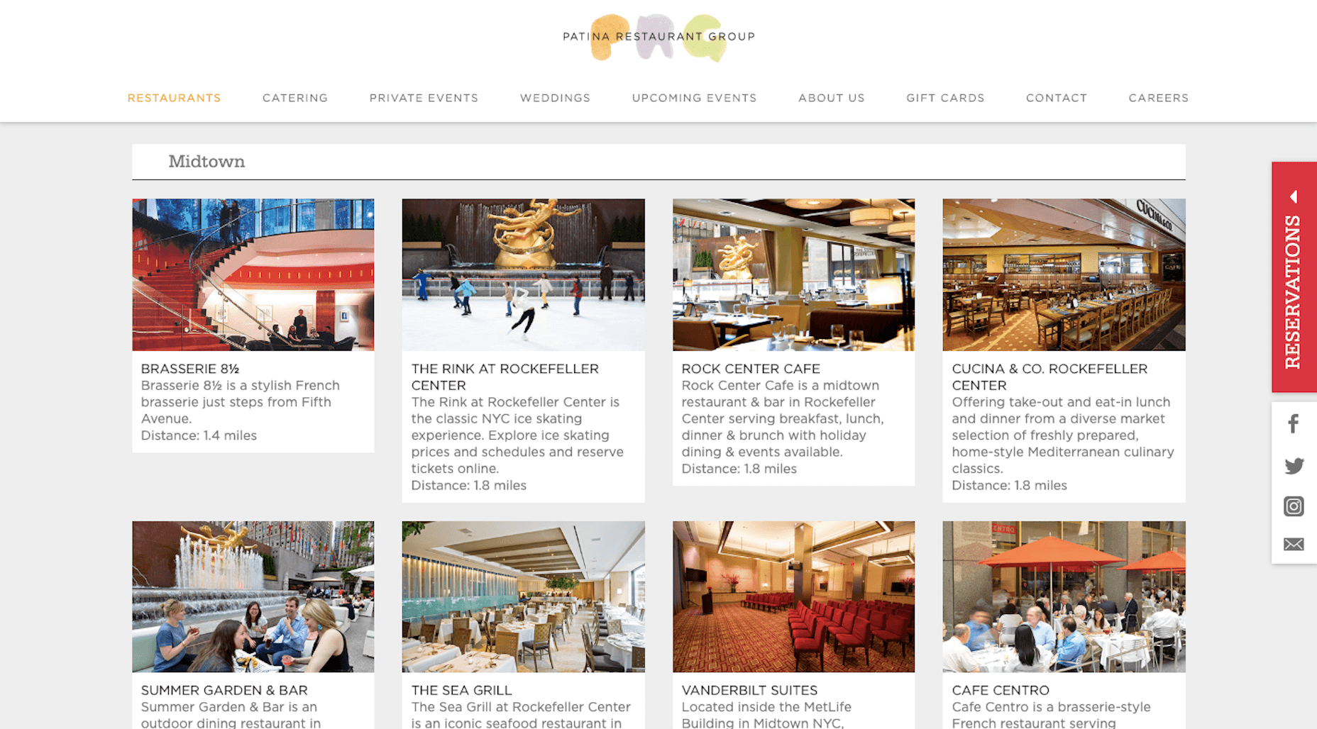 This page has dozens of dining options split up per location. It’s not a great approach to helping diners find the perfect place to eat with so much information being thrown at them.
That said, Patina Restaurant Group does have a solution for the problem. At the top of the page, there’s a custom search filter people can use to sort by location or by occasion:
This page has dozens of dining options split up per location. It’s not a great approach to helping diners find the perfect place to eat with so much information being thrown at them.
That said, Patina Restaurant Group does have a solution for the problem. At the top of the page, there’s a custom search filter people can use to sort by location or by occasion:
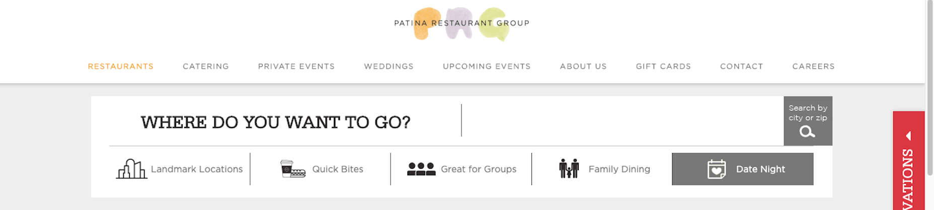 In this particular example, it takes the list of 13 Midtown restaurants I was looking at before, down to 2 options.
As you look for ways to narrow down search results for your own users, don’t be afraid to look outside the box and develop filters specific to the things they’re looking for.
In this particular example, it takes the list of 13 Midtown restaurants I was looking at before, down to 2 options.
As you look for ways to narrow down search results for your own users, don’t be afraid to look outside the box and develop filters specific to the things they’re looking for.
Wrap-Up
I know it might seem like a good idea to give your visitors as many options as they want. It almost seems luxurious, right? But when you ask visitors to make too many decisions, you run the risk of creating friction that doesn’t need to be there. To reduce decision fatigue, take a look at your website and identify those spots where users have to make a choice. Do I stop and watch this video… or do I request a free consultation? Do I look at the 24 phones available… or do I do a side-by-side comparison of the top 3 top-rated phones to see which ones have the features I need? Do I buy the mattress I came here for… or do I spend 20 minutes reviewing the specs of the one that’s 50% off this week? Your goal is to design a website that turns visitors into customers. But, more than that, your goal is to design a website that turns visitors into satisfied customers. Make the decision-making process simple and easy so that can happen. Featured image via DepositPhotos.Suzanne Scacca
Suzanne Scacca is a freelance writer by day, specializing in web design, marketing, and technology topics. By night, she writes about, well, pretty much the same thing, only those stories are set under strange and sometimes horrific circumstances.


Read Next

15 Best New Fonts, July 2024
Welcome to our monthly roundup of the best fonts we’ve found online in the last four weeks. This month, there are fewer…
By Ben Moss

20 Best New Websites, July 2024
Welcome to July’s round up of websites to inspire you. This month’s collection ranges from the most stripped-back…

Top 7 WordPress Plugins for 2024: Enhance Your Site's Performance
WordPress is a hands-down favorite of website designers and developers. Renowned for its flexibility and ease of use,…
By WDD Staff

Exciting New Tools for Designers, July 2024
Welcome to this July’s collection of tools, gathered from around the web over the past month. We hope you’ll find…

3 Essential Design Trends, July 2024
Add some summer sizzle to your design projects with trendy website elements. Learn what's trending and how to use these…

15 Best New Fonts, June 2024
Welcome to our roundup of the best new fonts we’ve found online in the last month. This month, there are notably fewer…
By Ben Moss

20 Best New Websites, June 2024
Arranging content in an easily accessible way is the backbone of any user-friendly website. A good website will present…

Exciting New Tools for Designers, June 2024
In this month’s roundup of the best tools for web designers and developers, we’ll explore a range of new and noteworthy…

3 Essential Design Trends, June 2024
Summer is off to a fun start with some highly dramatic website design trends showing up in projects. Let's dive in!

15 Best New Fonts, May 2024
In this month’s edition, there are lots of historically-inspired typefaces, more of the growing trend for French…
By Ben Moss

How to Reduce The Carbon Footprint of Your Website
On average, a web page produces 4.61 grams of CO2 for every page view; for whole sites, that amounts to hundreds of KG…
By Simon Sterne

20 Best New Websites, May 2024
Welcome to May’s compilation of the best sites on the web. This month we’re focused on color for younger humans,…