20 Freshest Web Designs, October 2019
If you’ve become accustomed to the slick, sophisticated look of minimalism, prepare your eyeballs for a shock. This month, we’ve reached tipping point on the maximalist design trend, with color, movement, and energy flooding the web.

Chevalvert
Chevalvert is a French design agency whose site visually bombards you from the moment it loads. The maximalist approach is visually overwhelming in places, and individual work can be hard to distinguish, but what the site conveys brilliantly is the creative passion and courage of the agency.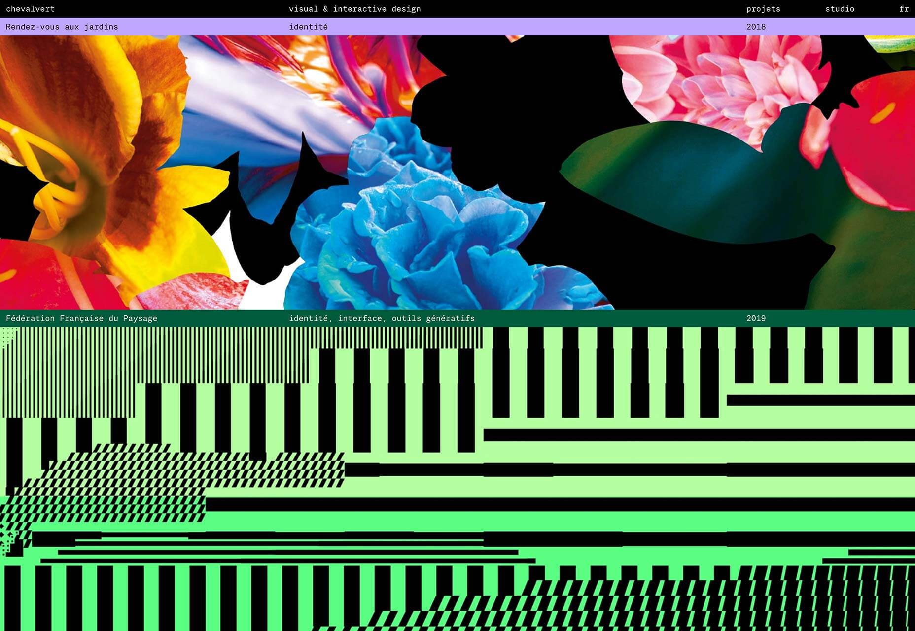
#24HourAce
We’ve been vibing on minimalism for a decade or more, but recently a more anarchic, more colorful, more visually aggressive style has taken hold. #24HourAce for Gucci is the embodiment of this maximalist trend with crazy animation, color, and glitch effects. More is more.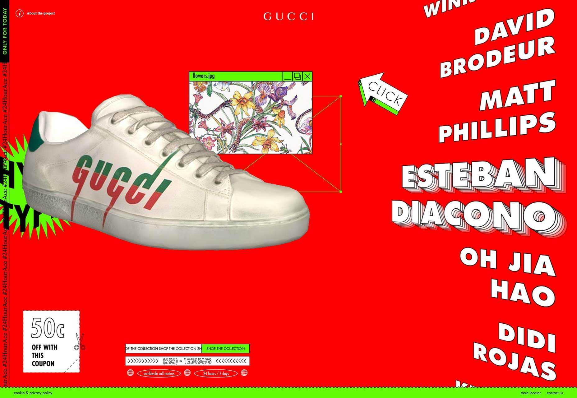
La Maison de Santé Pantinoise
The web’s not all clashing colors and glitch effects. The site for La Maison de Santé Pantinose, a medical practice in a Parisian suburb, calms potentially anxious patients with pastel tones and simple color block animation that sensitively illustrates the conditions treated at the practice.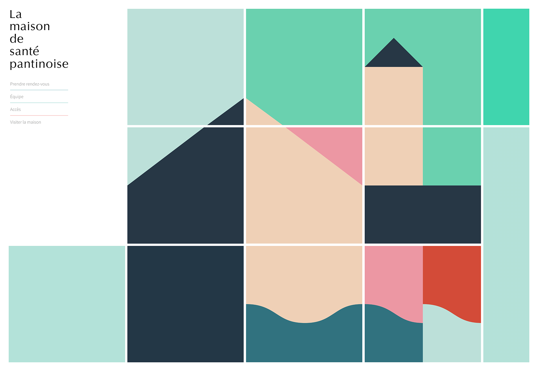
Ride & Crash
Back to anarchy, with Ride & Crash’s energy-packed site. From the variations on its deceptively simple, but carefully drawn logotype, to the text that transforms from gibberish as you scroll, everything about this site communicates creative confidence, admirable in a young project.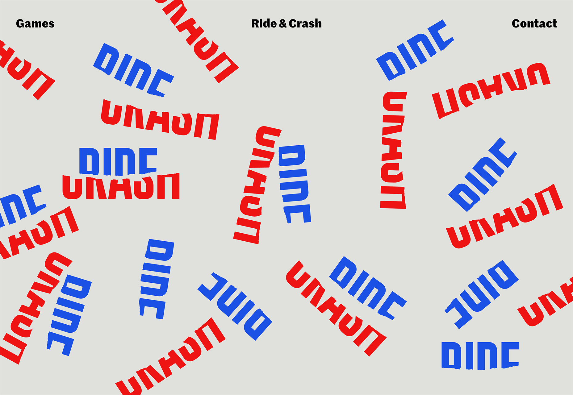
Collage Crafting
As if keen to demonstrate that modernist typography can also be expressive, Collage Crafting’s landing page text explodes deliciously as you scroll. But what I really love is the way the hover effects combine in the product page, making the box appear to slide from one item to the next.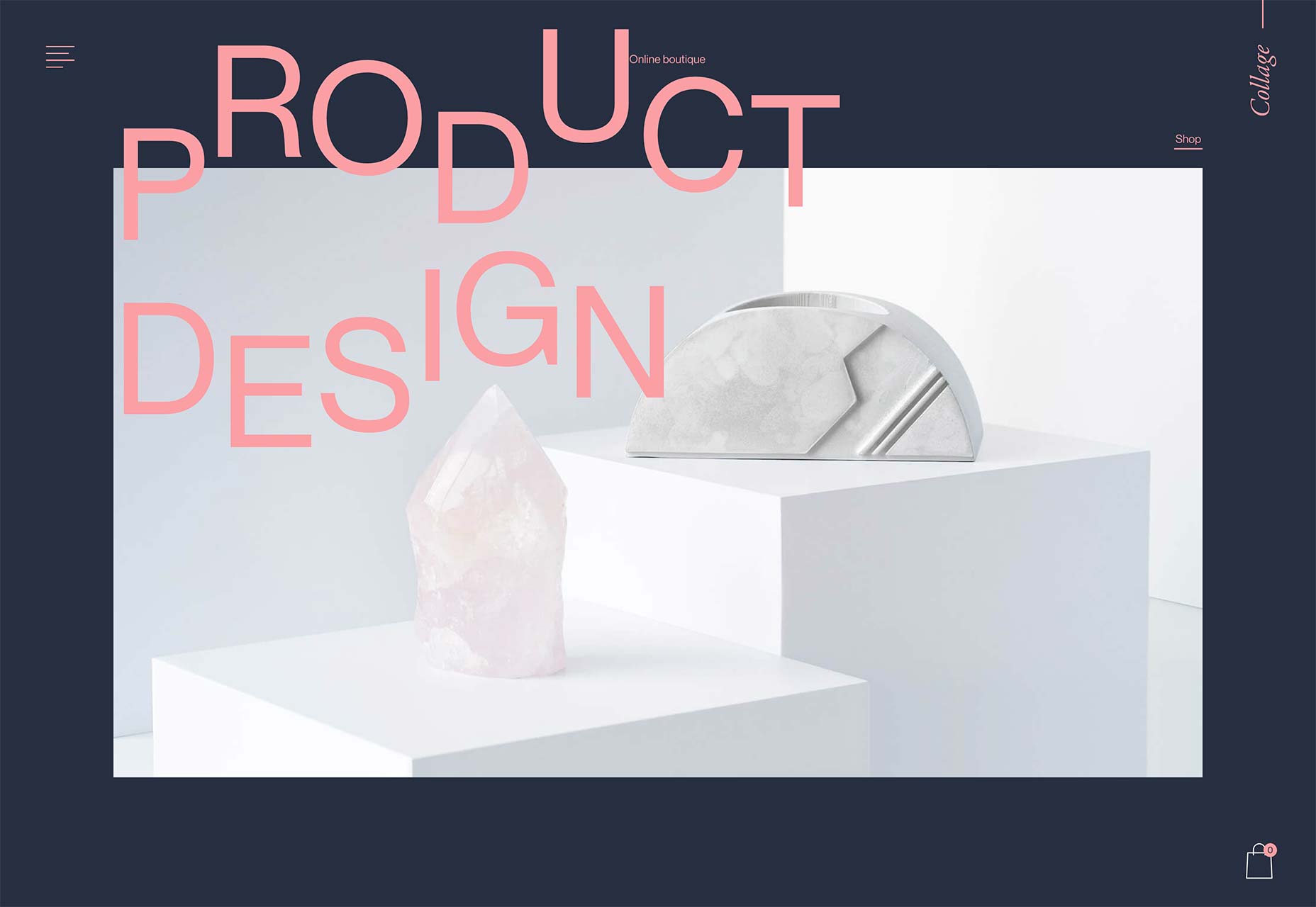
Genesis Block
Genesis Block is an impressive site for a fintech company. The line art illustrations reach another level by using gradients to promote the feeling of three dimensions, and the animation that’s tied to the window scroll — not least the animated Rubik’s Cube — is all presented expertly.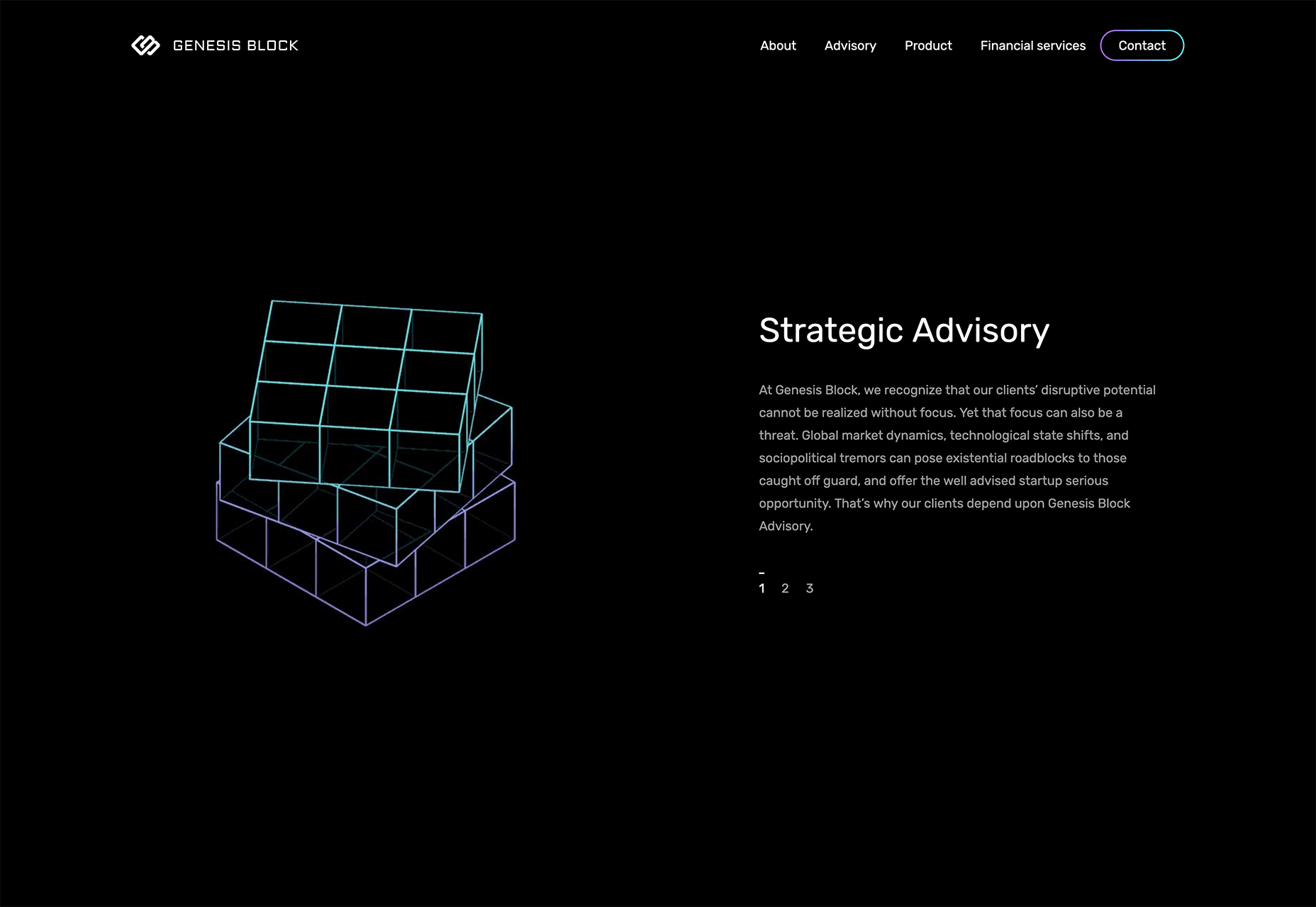
Dropmark
Until the growth of maximalism the biggest trend on the web, favoured by SaaS, was animated blocks of complementary color, looping to produce low file size, high interest motion on a site. Dropmark uses the trend to frame its landing page and divide up the generous whitespace.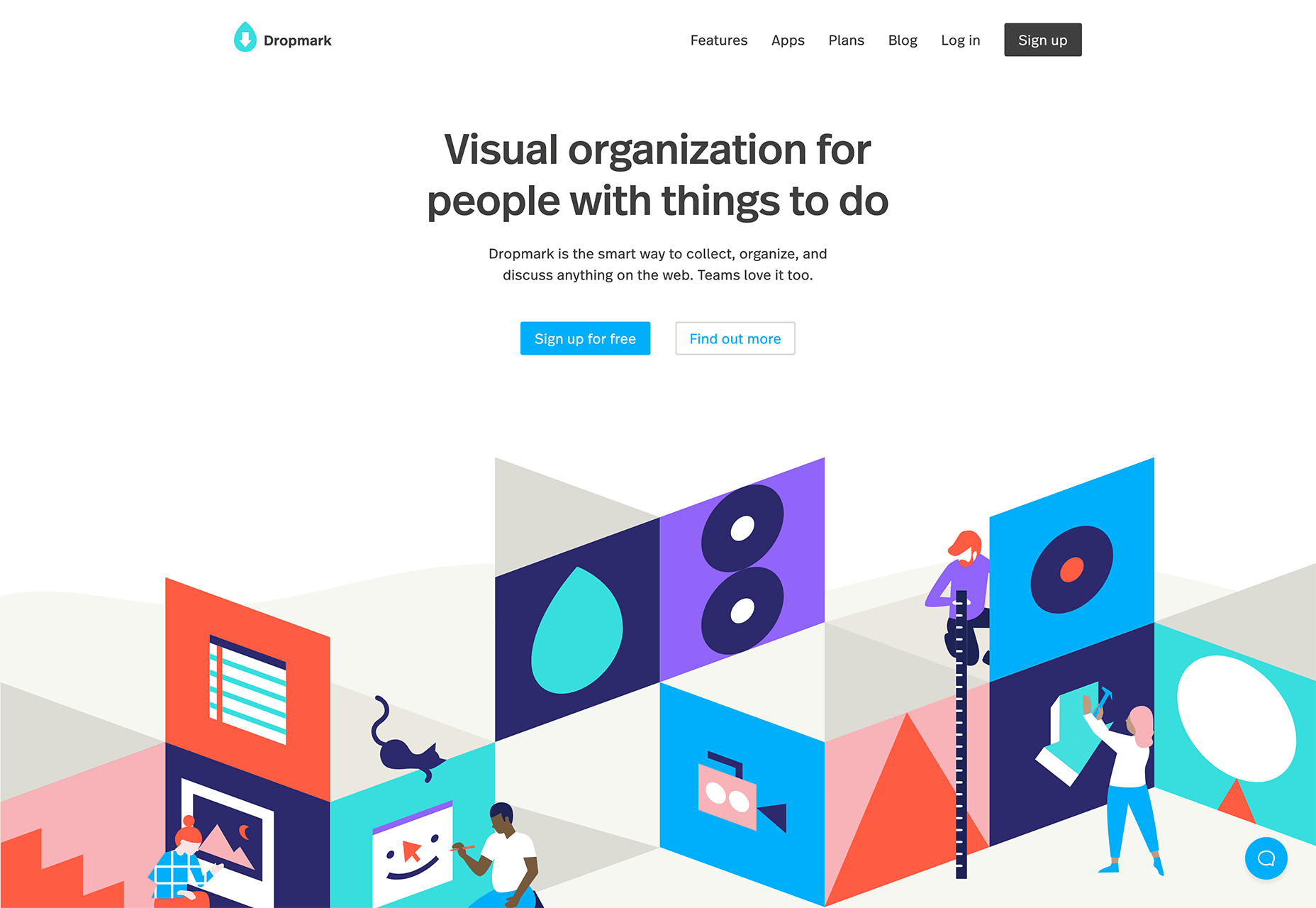
Olivia Palermo
As soon as CSS grid was announced we were promised it would herald new web design layouts that broke out of simple RWD grids, and we’re finally starting to see some. Olivia Palermo uses a complex grid to present a fashion magazine-style site that’s vibrant, dynamic, and engaging.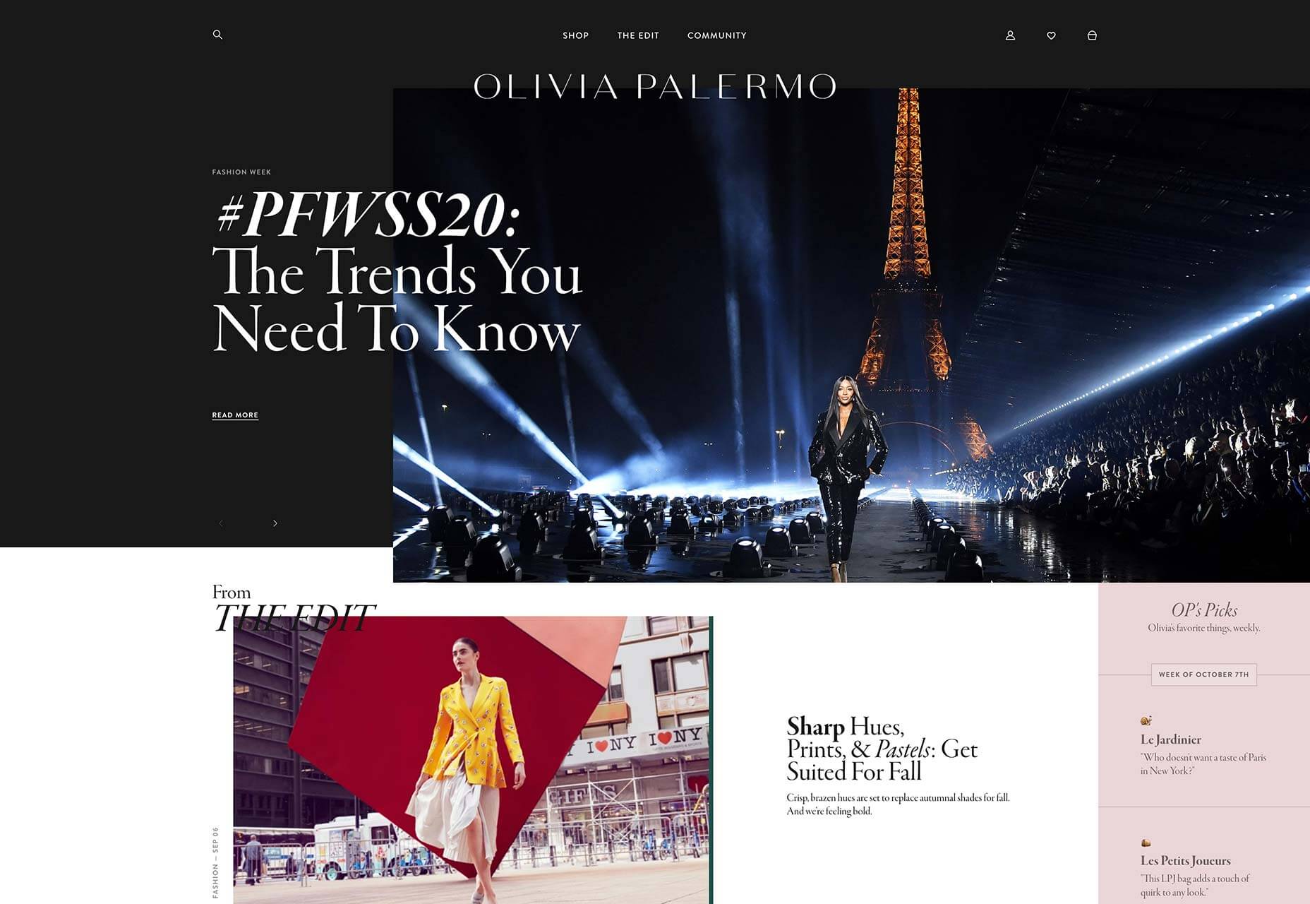
Hest
Hest is a Norwegian photography agency and presents its photographers’ work in a standard way. But in places, the designers have added a sharp drop shadow in pastel, breaking up the grid and creating a sense of depth. It’s such a simple trick, but amazingly effective.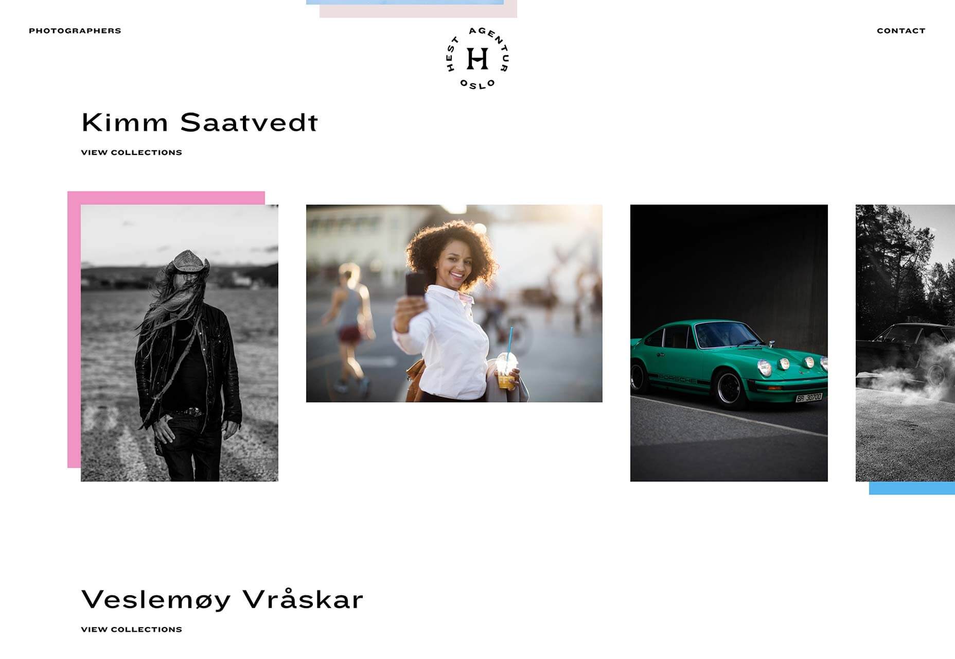
Kaohsiung Music Center
From the moment the brand mark animates as a loader, it’s clear that the Kaohsiung Music Center site is something special. The impressive three dimensional site for a Taiwanese music venue features a flyover of the site based on architects’ renderings. It feels game-like in its futurism.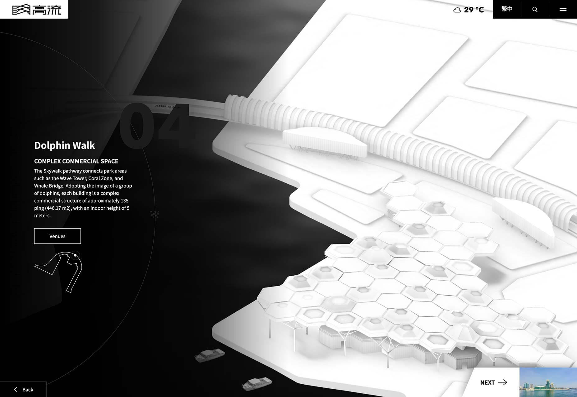
Ooma
Ooma makes cloud-based home communications services, from security cameras to entry systems. The clean landing page for its home security cameras uses an alternating alignment to create a predictable and reassuring rhythm, perfect for those looking for a safety solution.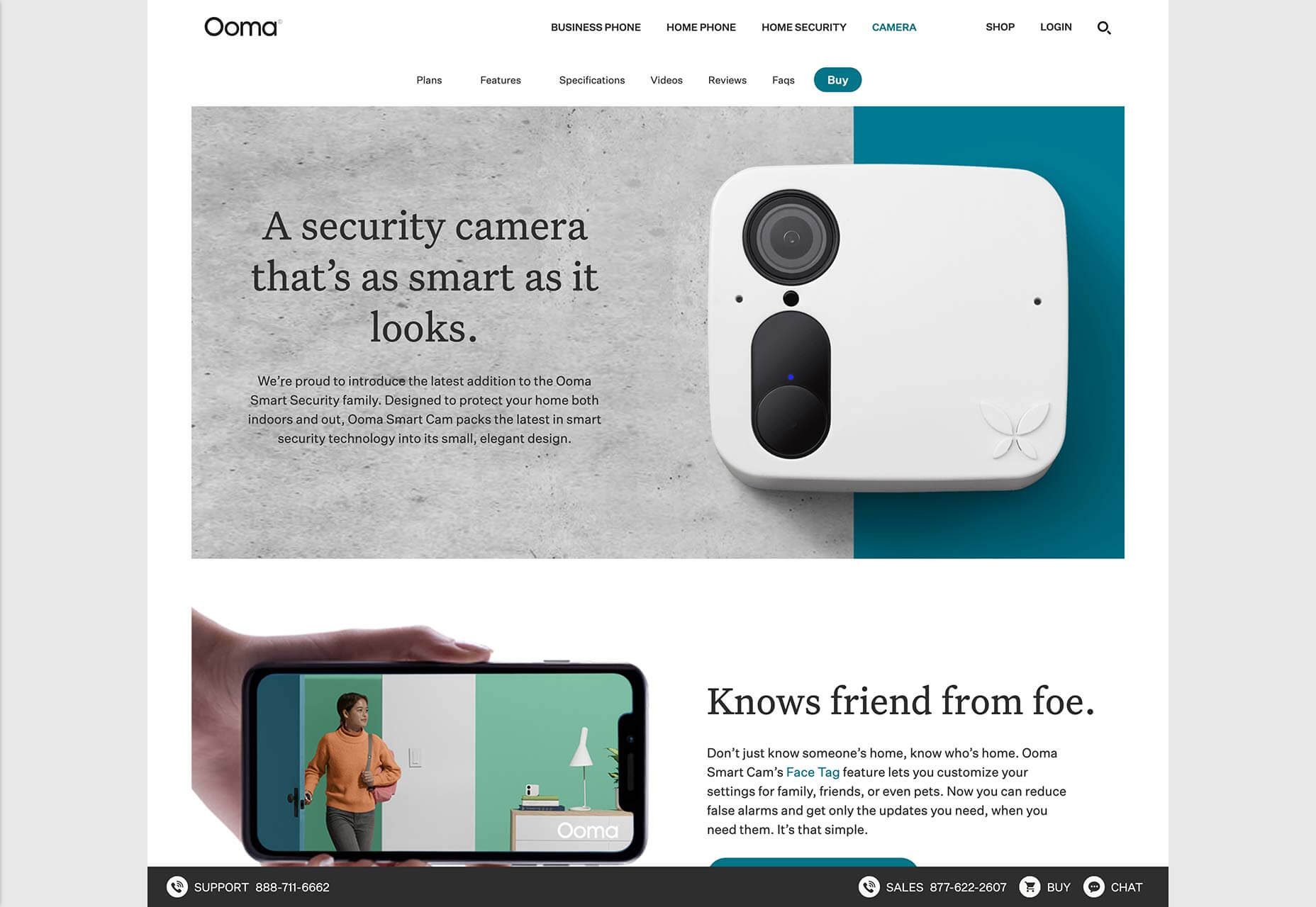
Déplacé Maison
Using heavy black outlines and halftone shading, Déplacé Maison’s art directions evokes the feel of graphic novels. An aesthetic reinforced by the lettering-style typography. It’s a look that makes you feel that you couldn’t fail to find adventure in these shoes, exactly what their customers want.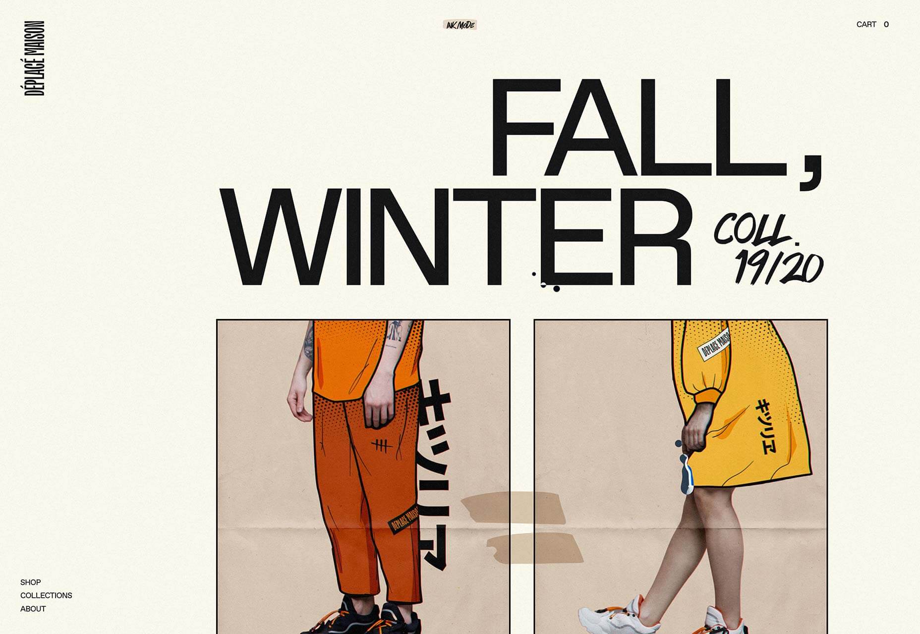
Guzema
Guzema Fine Jewelry mixes images, text, and video to create a design packed into little boxes, that feels part-browsing experience, part-gift receiving. It’s slow, which is usually a disaster online, but for luxury goods, the sense of anticipation actually adds a positive edge to the experience.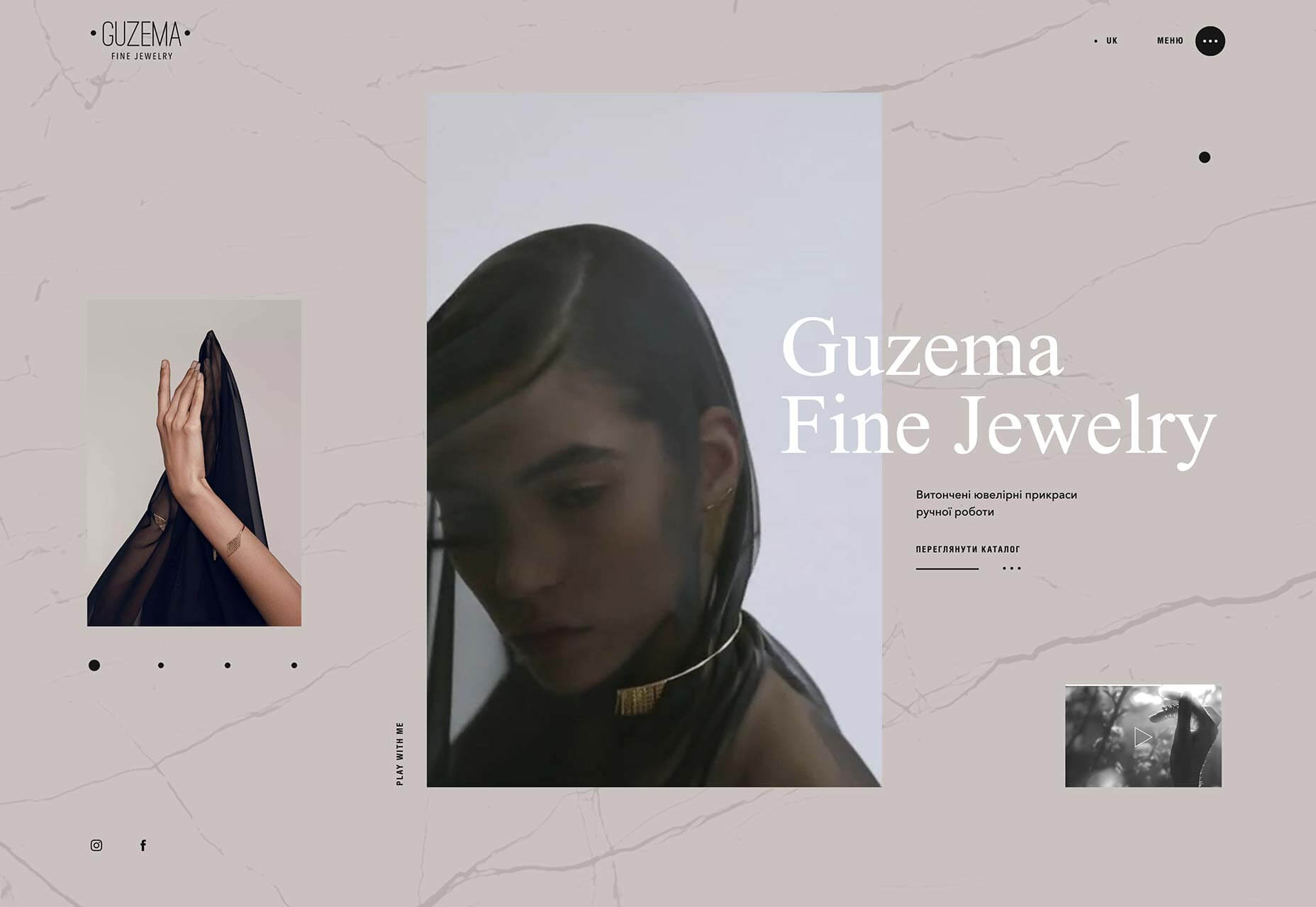
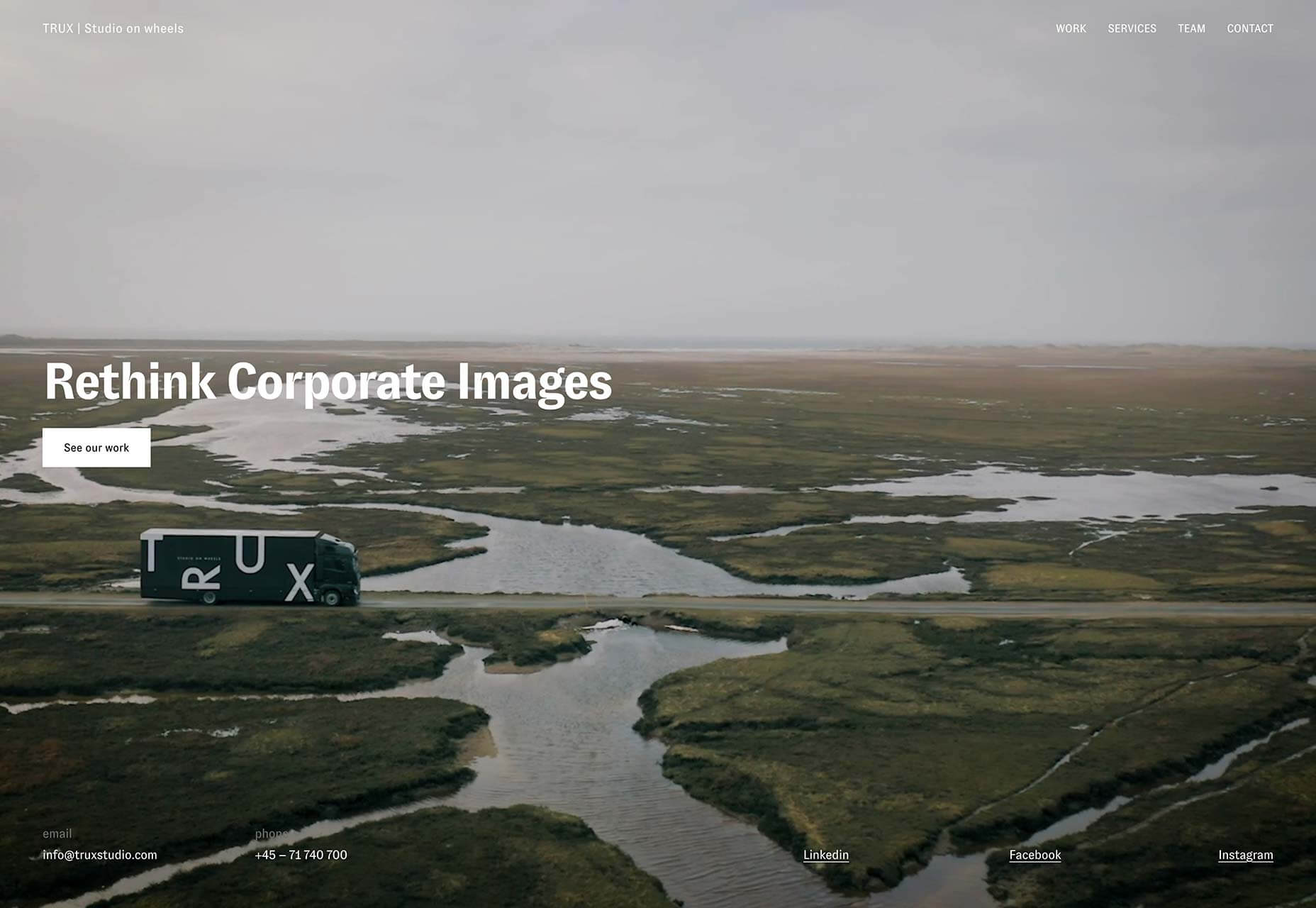
Trux Studio
Trux Studio’s site opens with a full screen video that clearly explains the Danish business’ unique offering. Packing a portrait studio into the back of a lorry, the team travels to your location to shoot corporate portraits. It’s a shame for us they couldn’t pack it all into a plane.
Black Futurism 2019
Black Futurism is a conference that took place at the start of October. Organized by the Harvard University Graduate School of Design’s African American Student Union, it’s about exploring liberation and equality through design, and this promotional site is a simple, powerful statement.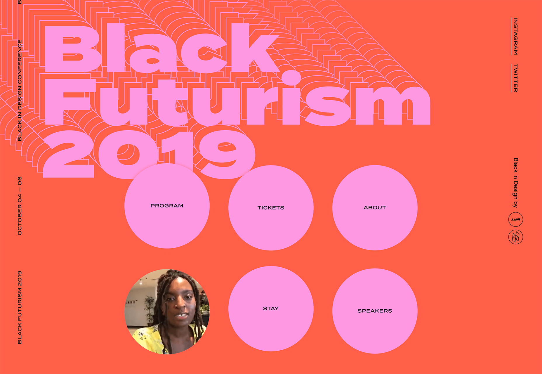
Starface
Spots, zits, pimples, and all manner of skin ‘imperfections’ can be crippling on your self-confidence, especially among younger people. Starface is an awesome company that is rebranding its spot treatment as something to be celebrated with its super-positive site.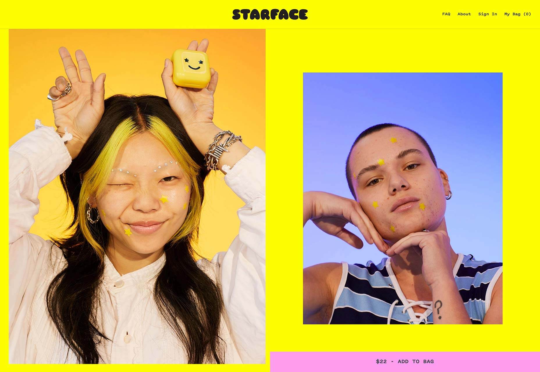
Old Spitalfields Market
Old Spitalfields Market is a fashionable covered market in East London. Its site uses a classic modernist grid to divide up the page. The grid transforms as you scroll, with different sections pausing, while others glide past. It’s a technique that’s repeated across the sumptuous site.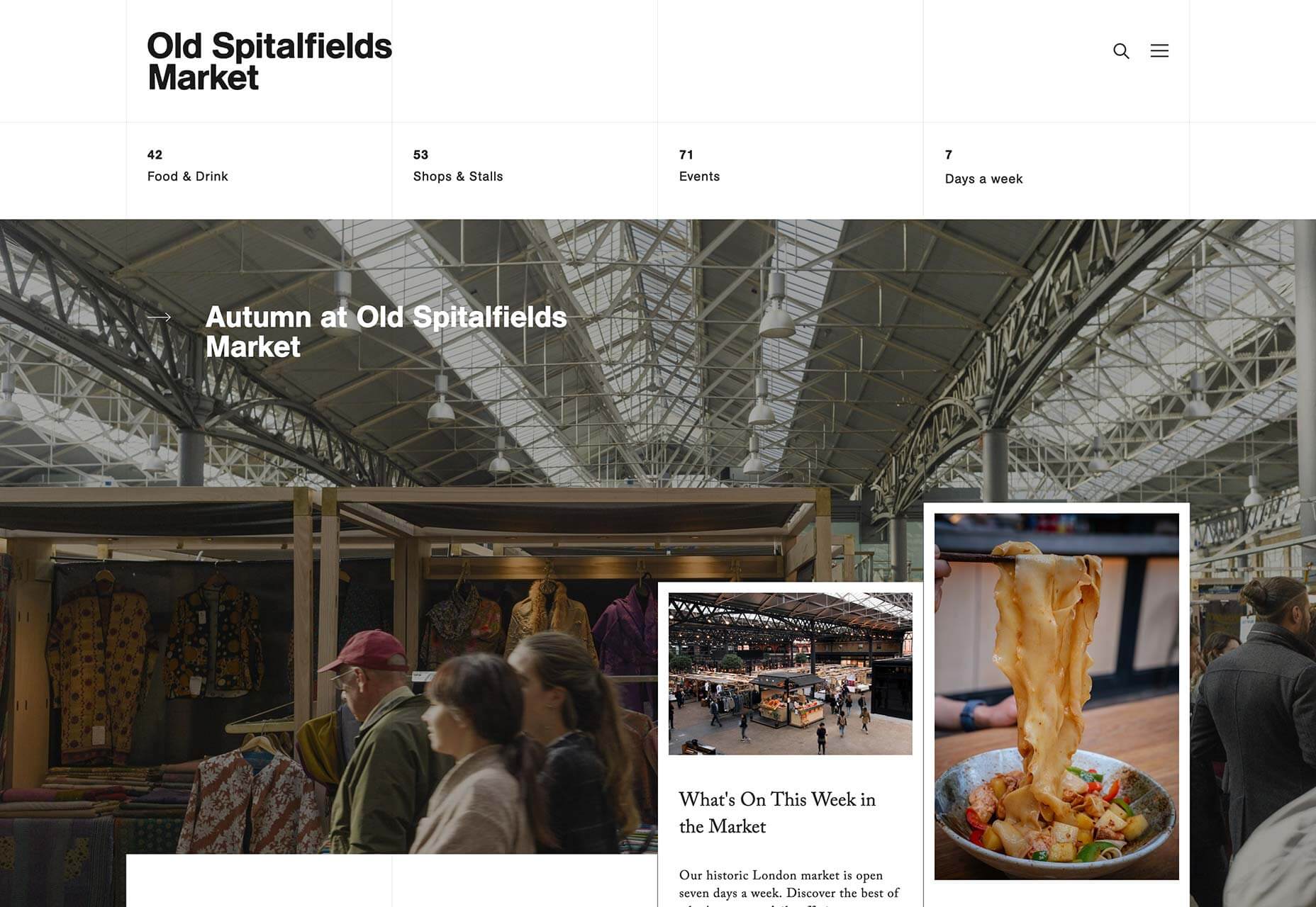
Graf Lantz
Graf Lantz is an LA-based company producing cute accessories that they market directly to customers in Japan with this dedicated site. It’s fascinating to compare the company’s approach to the Japanese market, with its .com. The Japanese, it seems, love liquid transition effects.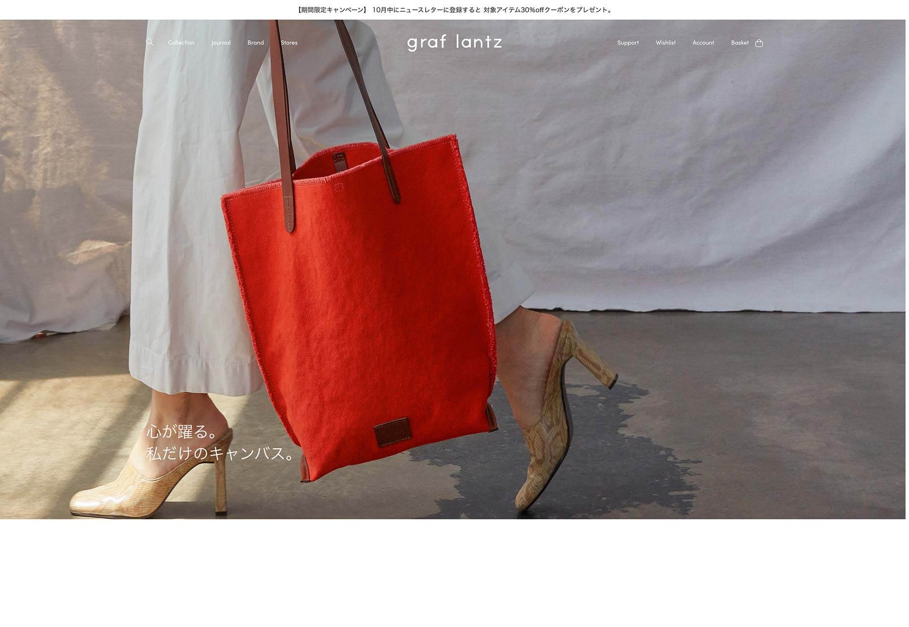
Two Robbers
Convinced the Brutalist trend was destined to be short-lived? Proving there’s life in the harsh style yet, Two Robbers is a site for hard seltzers brewed in Philadelphia. The stark site emphasizes the unique flavors of the drinks by contrasting the black and white with bursts of color.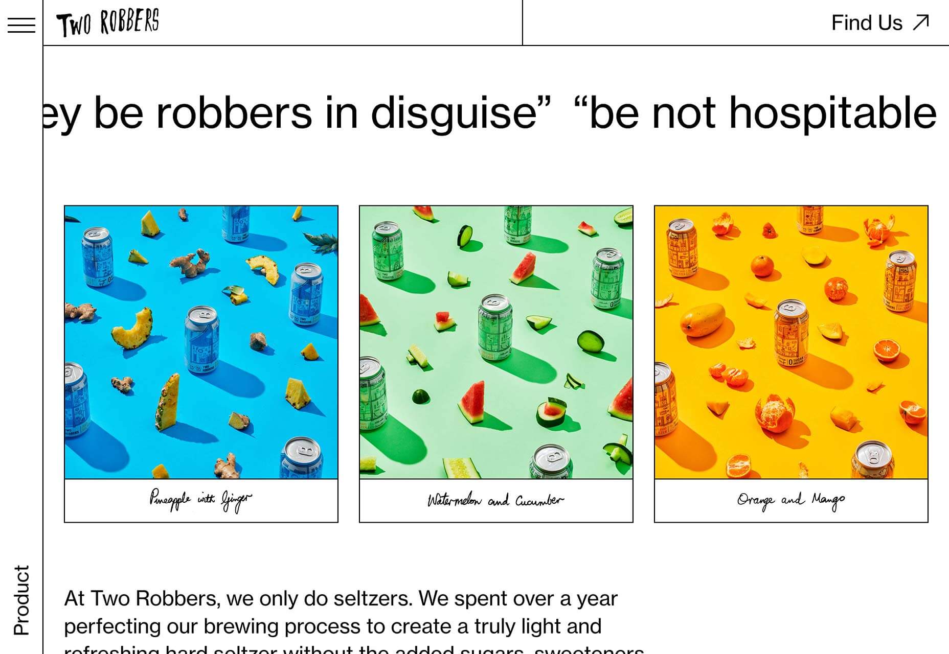
2nd Street Clothing
Finally, the maximalism trend returns in full effect for the 2nd Street Clothing site, but you’ll have to scroll to see it. With reversed text, colourful animation, spinning images and video, it’s a young, energetic style. This site won’t look the same in a year, which makes it perfect for right now.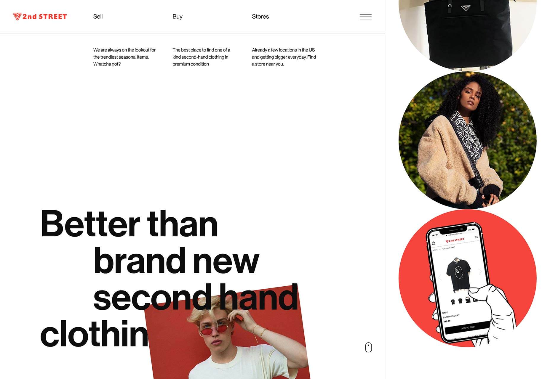
WDD Staff
WDD staff are proud to be able to bring you this daily blog about web design and development. If there's something you think we should be talking about let us know @DesignerDepot.


Read Next

15 Best New Fonts, July 2024
Welcome to our monthly roundup of the best fonts we’ve found online in the last four weeks. This month, there are fewer…
By Ben Moss

20 Best New Websites, July 2024
Welcome to July’s round up of websites to inspire you. This month’s collection ranges from the most stripped-back…

Top 7 WordPress Plugins for 2024: Enhance Your Site's Performance
WordPress is a hands-down favorite of website designers and developers. Renowned for its flexibility and ease of use,…
By WDD Staff

Exciting New Tools for Designers, July 2024
Welcome to this July’s collection of tools, gathered from around the web over the past month. We hope you’ll find…

3 Essential Design Trends, July 2024
Add some summer sizzle to your design projects with trendy website elements. Learn what's trending and how to use these…

15 Best New Fonts, June 2024
Welcome to our roundup of the best new fonts we’ve found online in the last month. This month, there are notably fewer…
By Ben Moss

20 Best New Websites, June 2024
Arranging content in an easily accessible way is the backbone of any user-friendly website. A good website will present…

Exciting New Tools for Designers, June 2024
In this month’s roundup of the best tools for web designers and developers, we’ll explore a range of new and noteworthy…

3 Essential Design Trends, June 2024
Summer is off to a fun start with some highly dramatic website design trends showing up in projects. Let's dive in!

15 Best New Fonts, May 2024
In this month’s edition, there are lots of historically-inspired typefaces, more of the growing trend for French…
By Ben Moss

How to Reduce The Carbon Footprint of Your Website
On average, a web page produces 4.61 grams of CO2 for every page view; for whole sites, that amounts to hundreds of KG…
By Simon Sterne

20 Best New Websites, May 2024
Welcome to May’s compilation of the best sites on the web. This month we’re focused on color for younger humans,…