

1. Obscured Text Elements
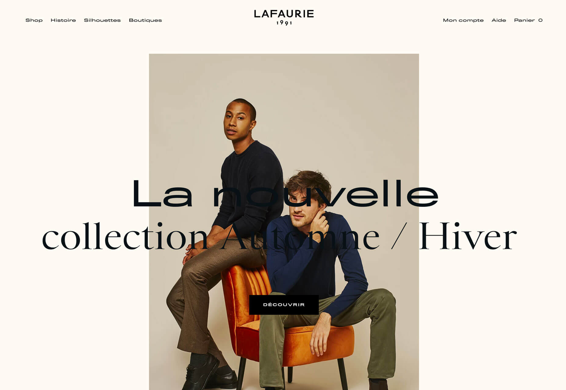
When it comes to text elements, the first thought is often readability. Not with this design trend. More design projects are showcasing text elements that are partially obscured or hidden within other elements. And while these designs look pretty cool and are visually stunning, whether it actually works might be more debatable. Each of the examples below uses this trend in a slightly different way. Granyon Party uses oversized text in a layered design – background, text, animated illustration – where the words are hyphenated and in a layer behind design elements. While the obscured text is fairly easy to read, the addition of hyphenation and a monotone color palette makes it a little trickier.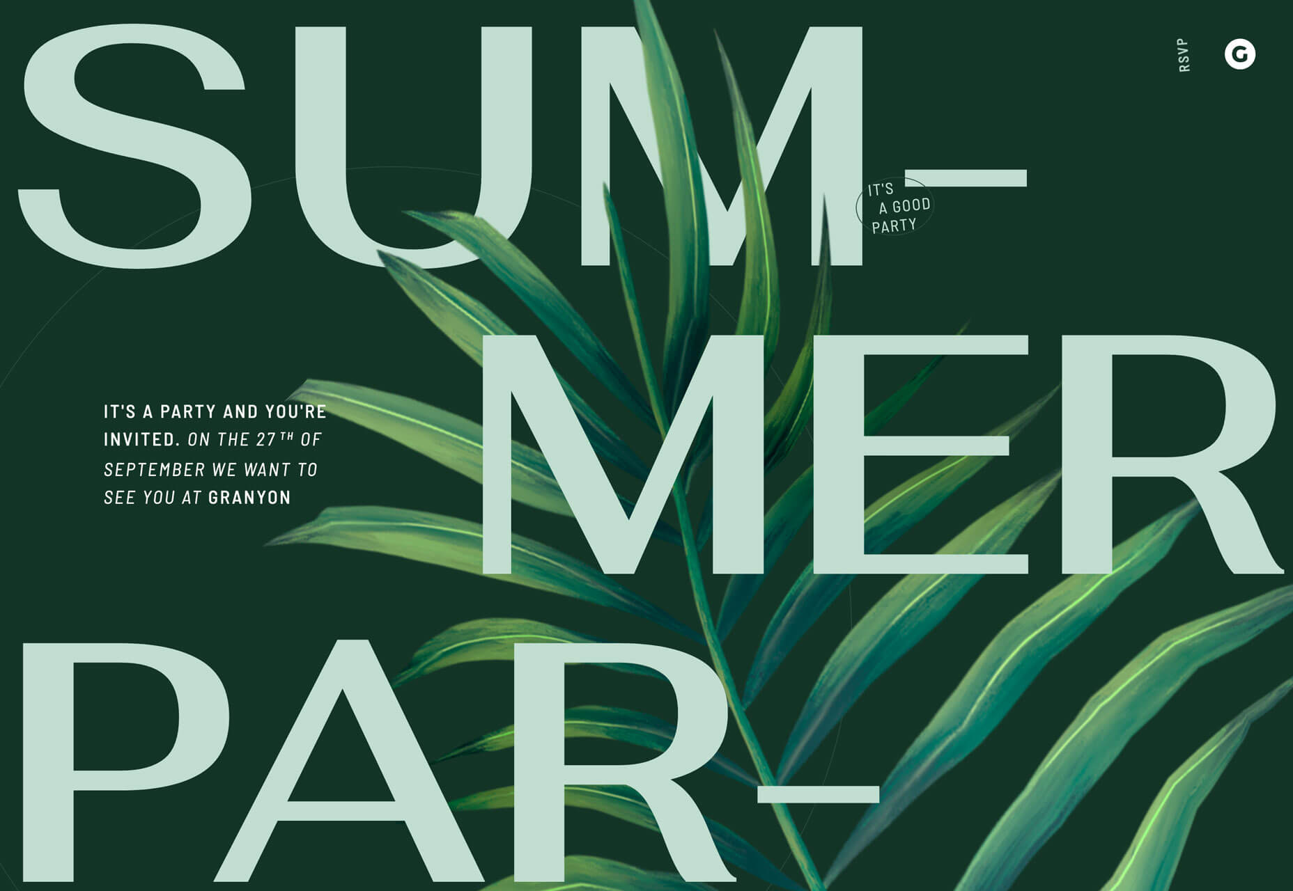 Lafaurie Paris uses black text over an image layer with dark coloring, leaving little contrast between the two. This makes the main text element a challenge in terms of readability on an otherwise visually stunning design.
 Ride & Crash’s Paco the Judo Popcorn has a text layer that’s behind a semitransparent animated illustration. It’s not too difficult to read, but does make you stop and really think about the words on the screen. Use of space helps draw focus and make it a little easier to digest.
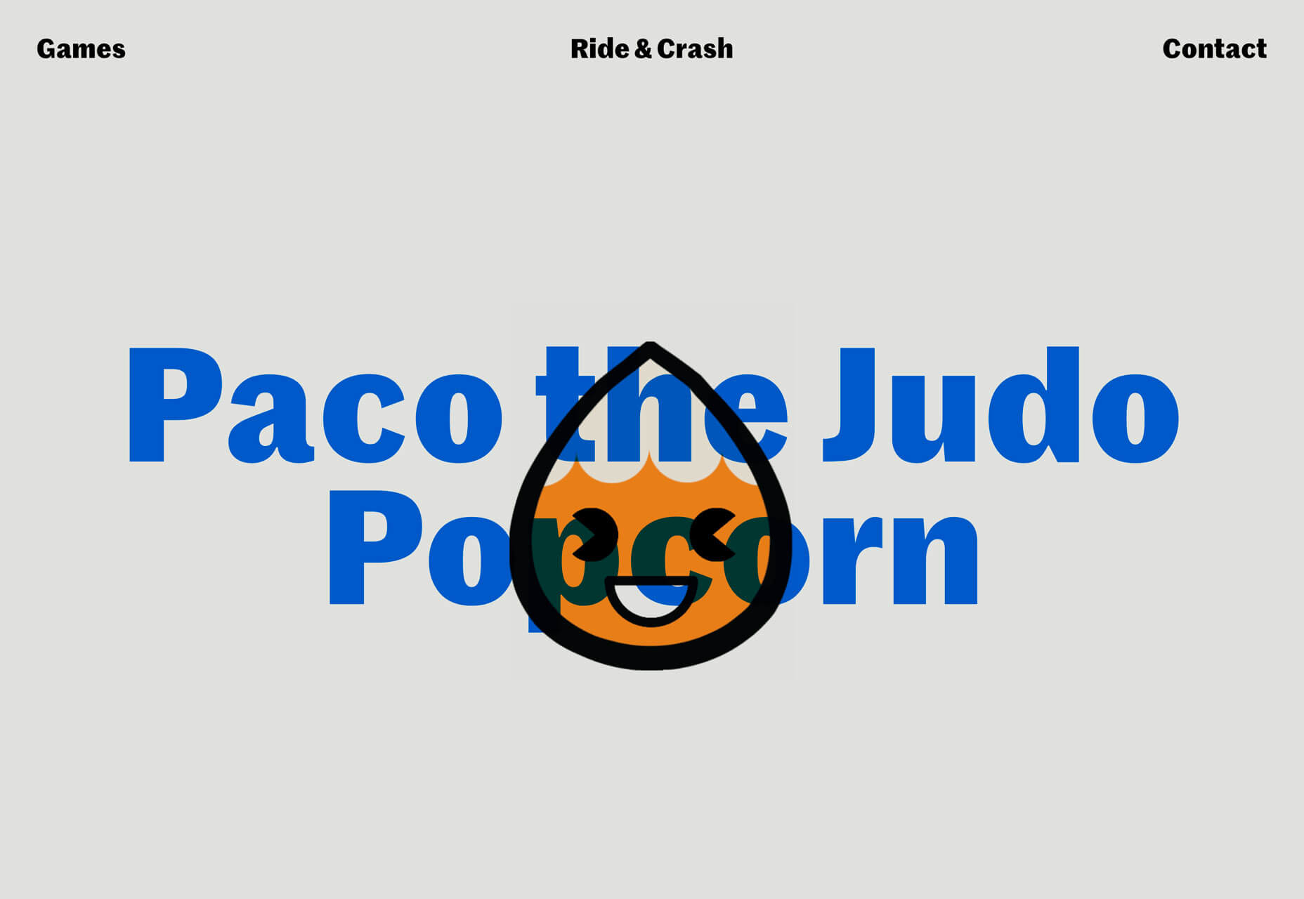 With all of these examples, the design has to weigh big questions: Is the visual display worth losing readability? Will visitors understand and interact with the design?
2. Animated Spheres
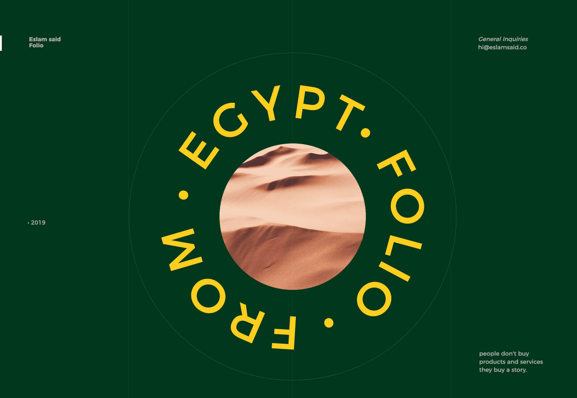
Circles have always been a popular design element. They carry plenty of symbolism and meaning and can set the right tone for projects. Circles are also a little less rigid than hard-edged elements, such as buttons or calls to action. Bigger spheres with animation are a solid way to draw users into design elements and focus the eye. This trending element might be pure decoration or serve a more functional role. 2nd Street uses large spheres down the right margin as a secondary level of navigation. The middle circles have a link and hover animation to help signal this action. The bottom circle is a decoration with movement that helps draw the eye and encourage users to move the mouse in that direction, activating the other circular buttons.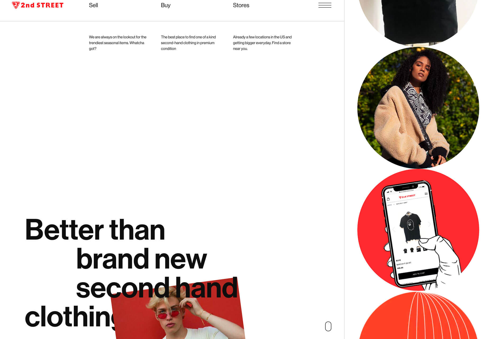 Eslam Said uses a large sphere in the center of the screen with simple movement to create visual interest in the portfolio website. The simple design and movement are hard to stop looking at with a soothing feel to them.
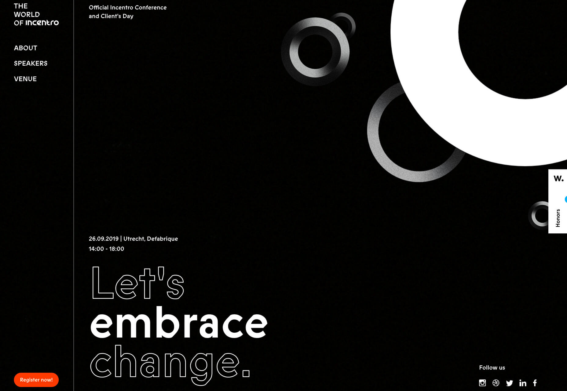
 World of Incentro uses multiple spheres with small movements and subtle animation as a decorative element. Further, the design uses a red, circular cursor to encourage engagement with the design. (If you click around this site a little, you’ll also find that it makes use of the first trend mentioned here, with different layers of obscured text.)
3. Large Left Margins
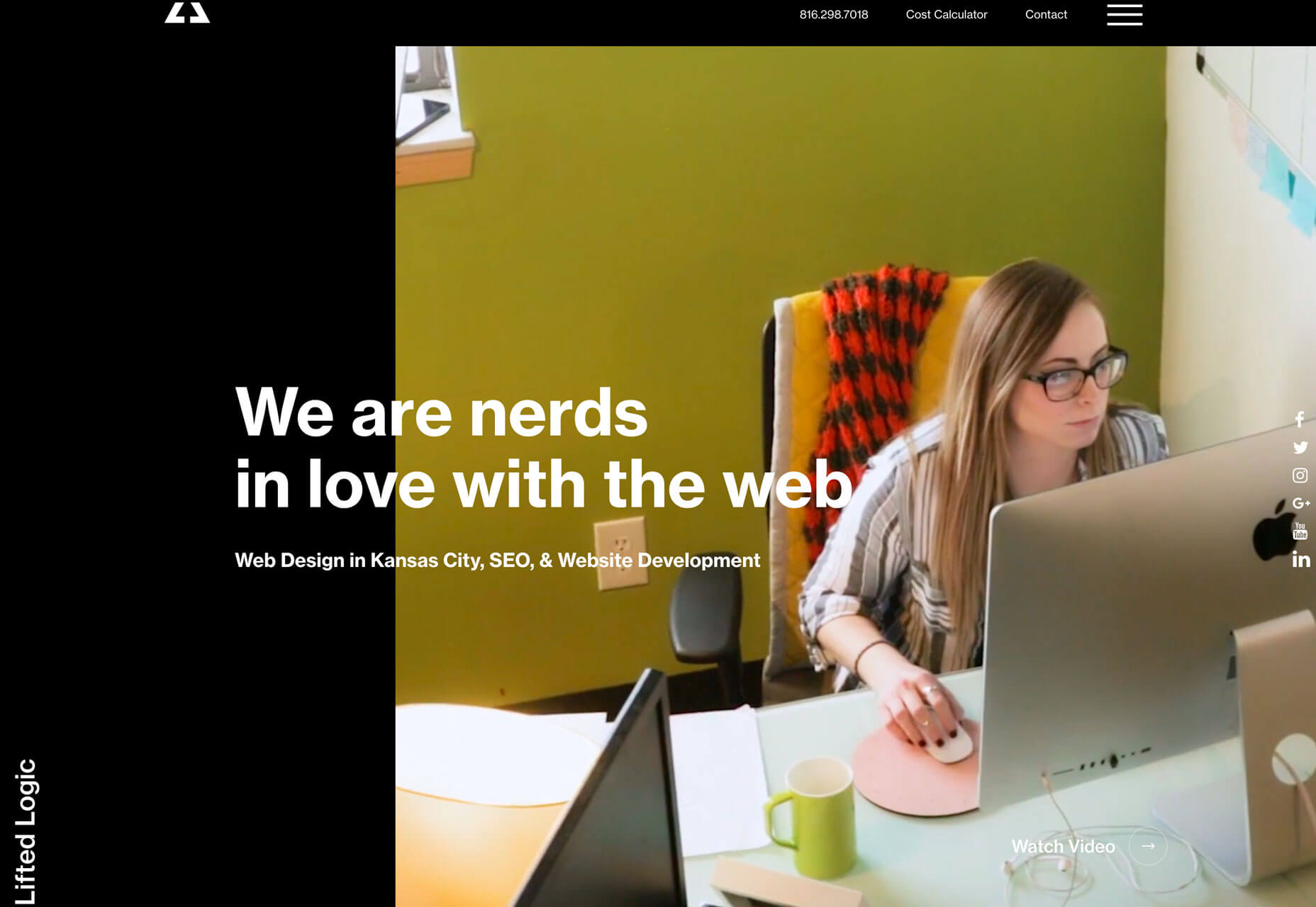
This might be my personal favorite trend, as a fan of asymmetrical balance. These designs use large left margins and areas of whitespace opposite a more visually full right side with an art element that fades off the screen. They create a beautifully imbalanced balance with visual weight that draws the eye across this screen. But this style isn’t for everyone, especially if you really like more symmetry. The challenge with this style is how elements stack on smaller mobile or vertical screens. The result isn’t often as stunning as the desktop counterpart. Ervaxx uses a simple animation paired with large bold text. The large font size offsets the weight of the animated blob on the right.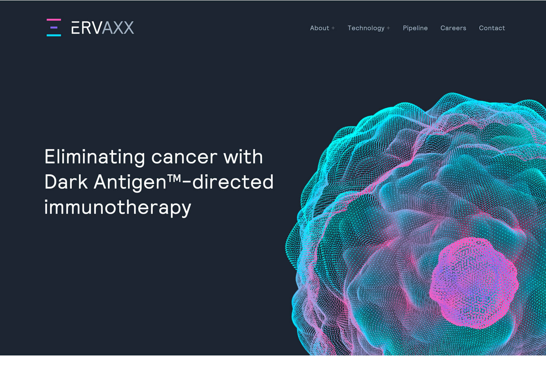 Lifted Logic carries a hero text element across white (ahem, black) space into a video. The use of space really pulls the eye across the text into the image and back.
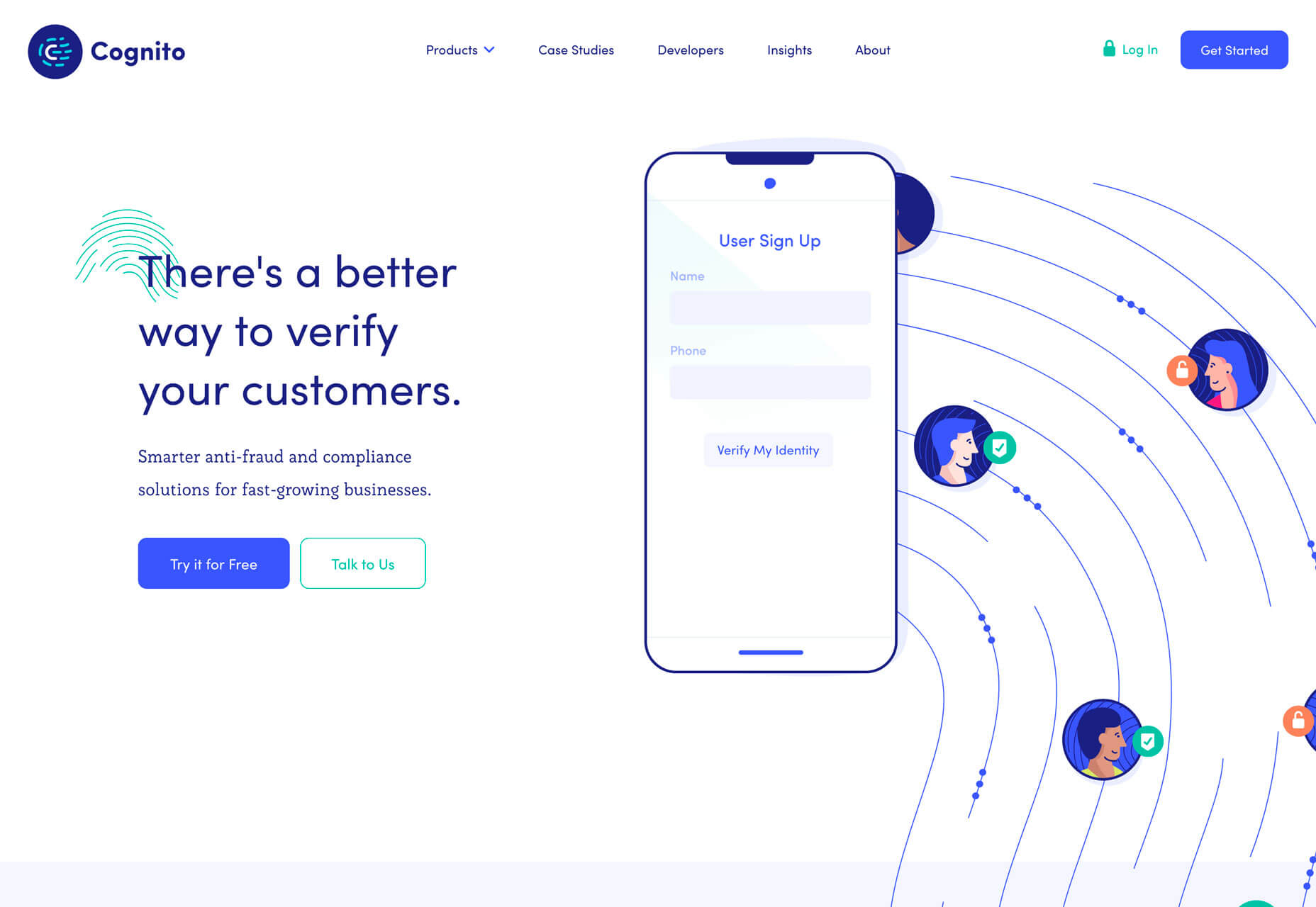
 Cognito uses balanced weights with text and line illustrations across the screen. Space, here, makes the design feel a little less busy with a lot of elements to take in at once – navigation menu, headline, secondary text, two buttons, animated illustration, and a chat box.
Conclusion
It’s possible to love the look of a trendy design, but never use the technique because you don’t find that it works with your content or in a way that focuses on usability. And that’s ok. That’s the beauty of trends; they spark conversation and push all designers to think bigger and better. Do you tend to be more of a visual or functional designer? Most of us have fairly distinct tendencies and it’s good food for thought.Carrie Cousins
Carrie Cousins is a freelance writer with more than 10 years of experience in the communications industry, including writing for print and online publications, and design and editing. You can connect with Carrie on Twitter @carriecousins.


Read Next

15 Best New Fonts, July 2024
Welcome to our monthly roundup of the best fonts we’ve found online in the last four weeks. This month, there are fewer…
By Ben Moss

20 Best New Websites, July 2024
Welcome to July’s round up of websites to inspire you. This month’s collection ranges from the most stripped-back…

Top 7 WordPress Plugins for 2024: Enhance Your Site's Performance
WordPress is a hands-down favorite of website designers and developers. Renowned for its flexibility and ease of use,…
By WDD Staff

Exciting New Tools for Designers, July 2024
Welcome to this July’s collection of tools, gathered from around the web over the past month. We hope you’ll find…

3 Essential Design Trends, July 2024
Add some summer sizzle to your design projects with trendy website elements. Learn what's trending and how to use these…

15 Best New Fonts, June 2024
Welcome to our roundup of the best new fonts we’ve found online in the last month. This month, there are notably fewer…
By Ben Moss

20 Best New Websites, June 2024
Arranging content in an easily accessible way is the backbone of any user-friendly website. A good website will present…

Exciting New Tools for Designers, June 2024
In this month’s roundup of the best tools for web designers and developers, we’ll explore a range of new and noteworthy…

3 Essential Design Trends, June 2024
Summer is off to a fun start with some highly dramatic website design trends showing up in projects. Let's dive in!

15 Best New Fonts, May 2024
In this month’s edition, there are lots of historically-inspired typefaces, more of the growing trend for French…
By Ben Moss

How to Reduce The Carbon Footprint of Your Website
On average, a web page produces 4.61 grams of CO2 for every page view; for whole sites, that amounts to hundreds of KG…
By Simon Sterne

20 Best New Websites, May 2024
Welcome to May’s compilation of the best sites on the web. This month we’re focused on color for younger humans,…