Introducing 15 Best New Portfolios, October 2019
Every month we publish this roundup of the best new portfolios launched by agencies, freelance designers, and other creative professionals.

Hello Monday
Hello Monday’s site is utterly charming, with a delightful animation that I could watch for hours. The work section of the site is a masonry-style vertical grid, which is less easy to browse than you would expect, thanks to the number of projects. The best parts of this site are the little details: I love that they tell you how many days it is until Monday, and the way that hamburger menu slips away as you scroll is super-slick.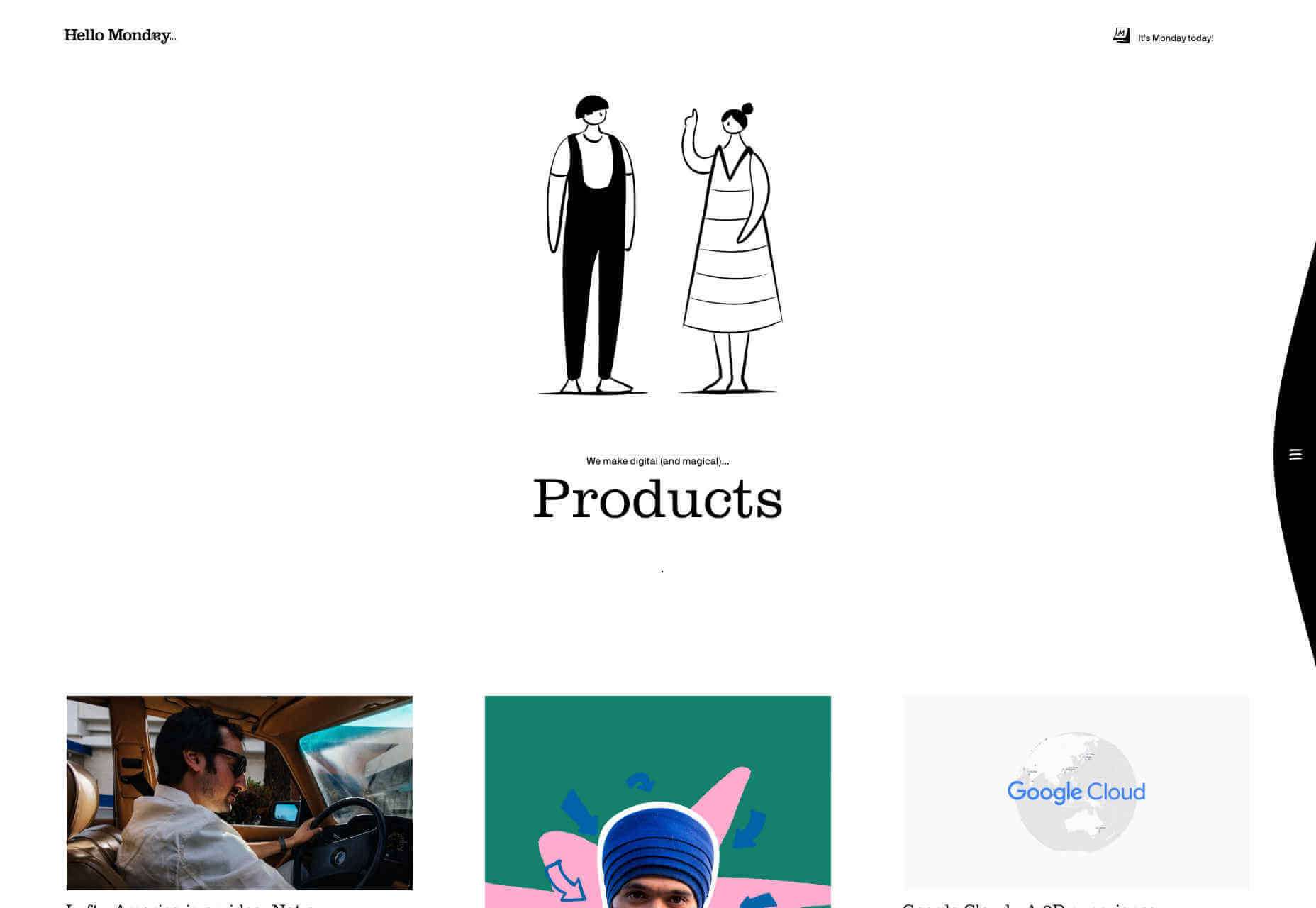
Bold
Bold’s portfolio is about sending a powerful message. It’s the website equivalent of huge shoulder pads, and an enormous, solid gold smartphone. The way the border expands from the featured images, giving you the sense of zooming into the project is inspired. It helps to have huge-name clients as social proof, but this site is excellent at inspiring confidence in the designers behind it.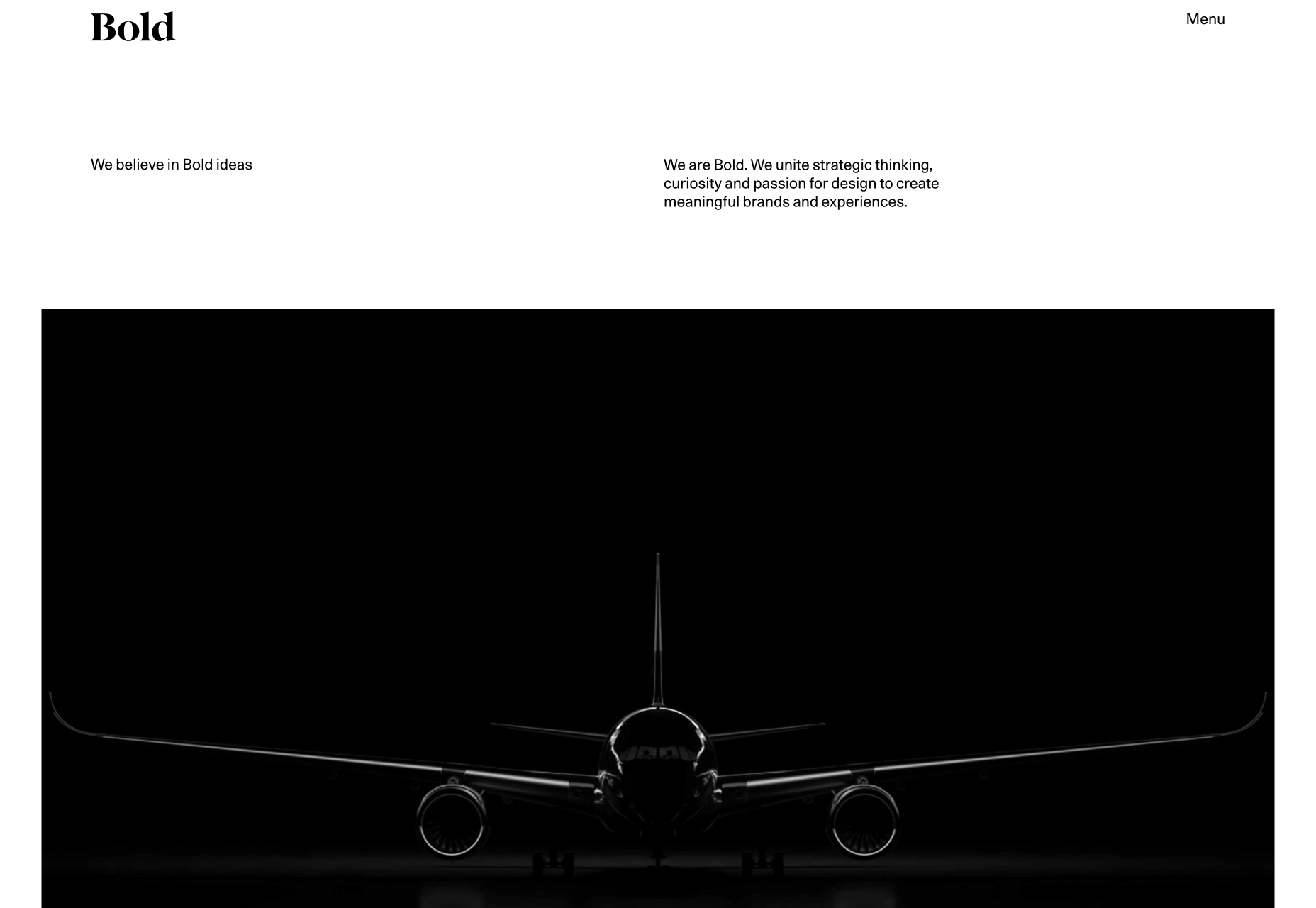
Analog is Heavy
Analog is Heavy is a creative photography practice that works with design studios to hone brand messages with high-quality product photography. Its approach to a portfolio is a vertically aligned grid of images, and that’s it. Targeting design agencies means that they’re speaking to an audience of visually educated professionals, giving Analog is Heavy the freedom to let its work sell itself.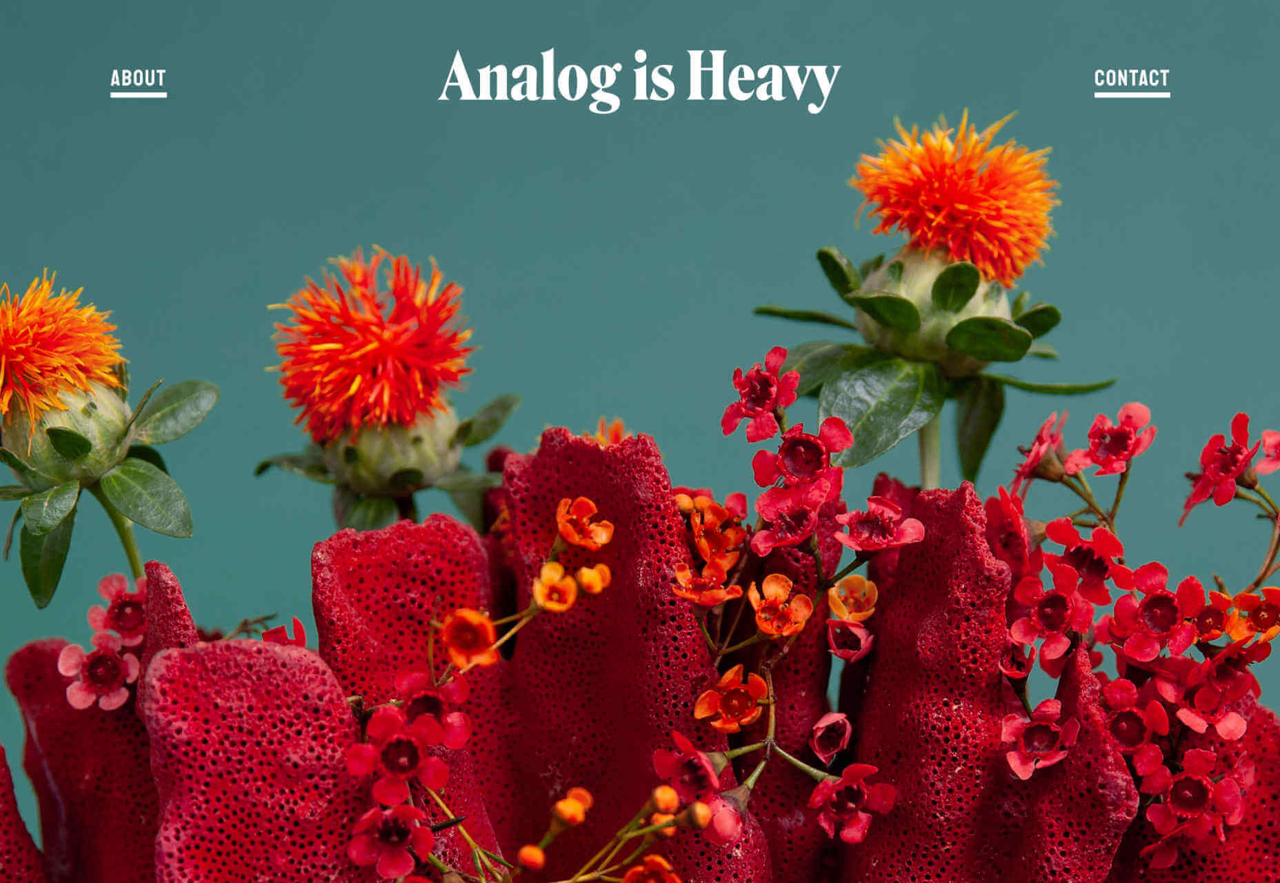
Athletics
Another big agency, with a client list to kill for, Athletics jumps right into fullscreen video case studies of its work for clients like IBM. One trend with many of these portfolios is that work is cherry-picked to be showcased and then less-exciting work is linked to below the initial presentation. In Athletics’ case this means an interesting grid of lower-profile, but equally exciting work.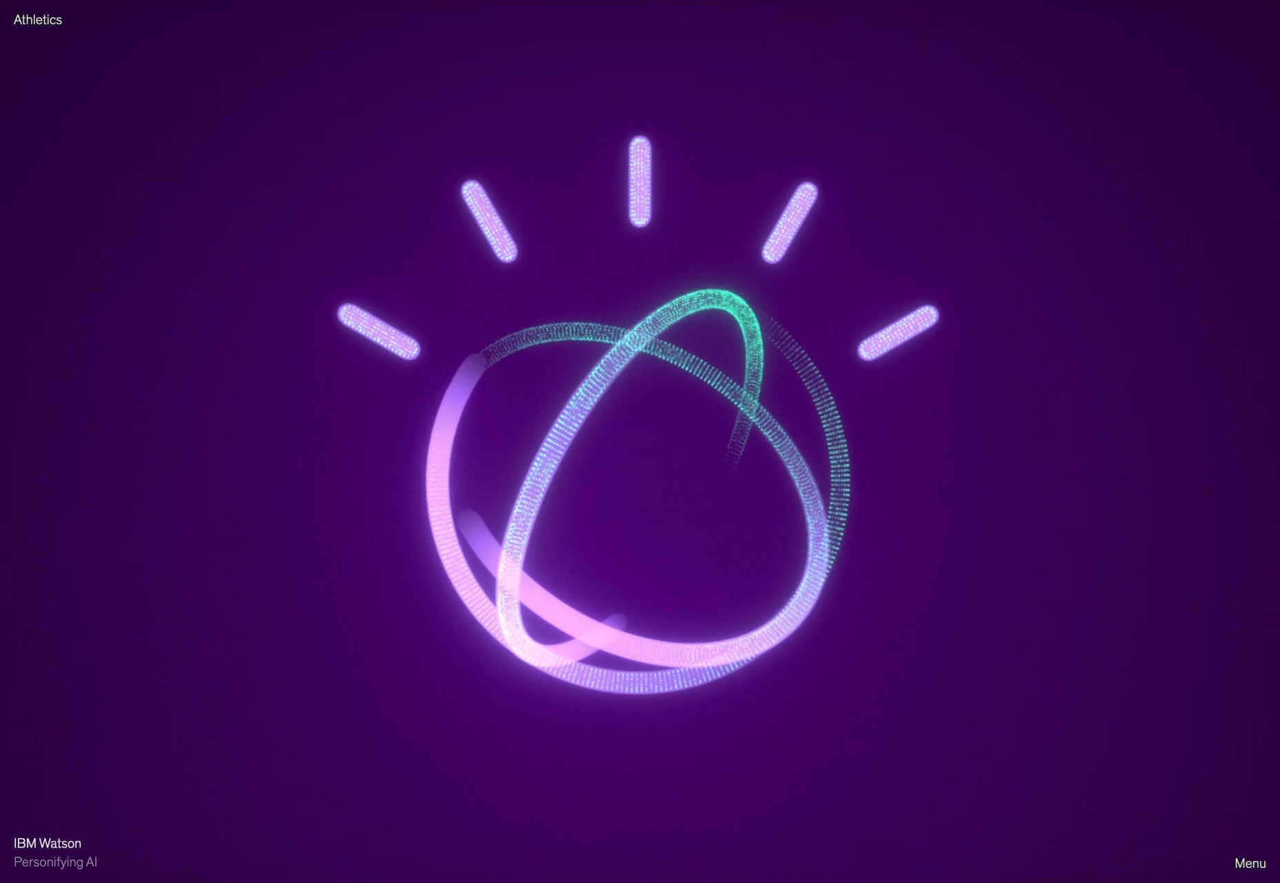
Brittany Chiang
Brittany Chiang builds things for the web. How’s that for a no-nonsense approach? This great little site feels very app-orientated thanks to the dark-mode color palette and the monospaced typeface. Its a single-pager, which are increasingly rare these days, and the simplicity of it works really well. Brittany has out UXed plenty of dedicated UX designers, by being true to herself.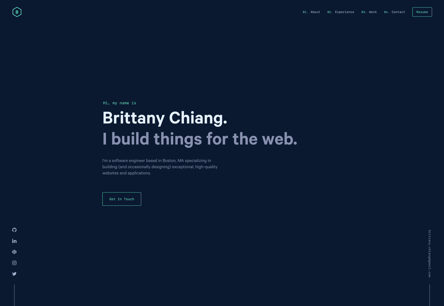
Shohei Takenaka
As the web drifts towards maximalism, it’s great that there are still calm, simple, minimalist masterpieces to admire. Shohei Takenaka’s site is beautiful, with restraint, attention to detail, and ample whitespace. The subtle underlines on the menu text, and the images protruding into the white space to encourage scrolling, as well as the way the color bands are grouped when you scroll, are all perfect examples of clever UI design.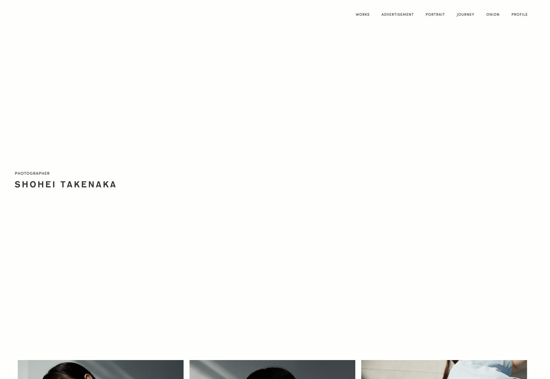
Aristide Benoist
Aristide Benoist’s portfolio features some beautiful typography. It’s great to see a developer take an interest in the finer points of design. The all-caps sans-serif text is a little too much to cope with in large amounts, but here it works just fine. My favourite part of the site is the transition from thumbnail to case study. Hover over the list of projects and a little flag-like ribbon will appear, click on it and it expands into a full project image, delightful!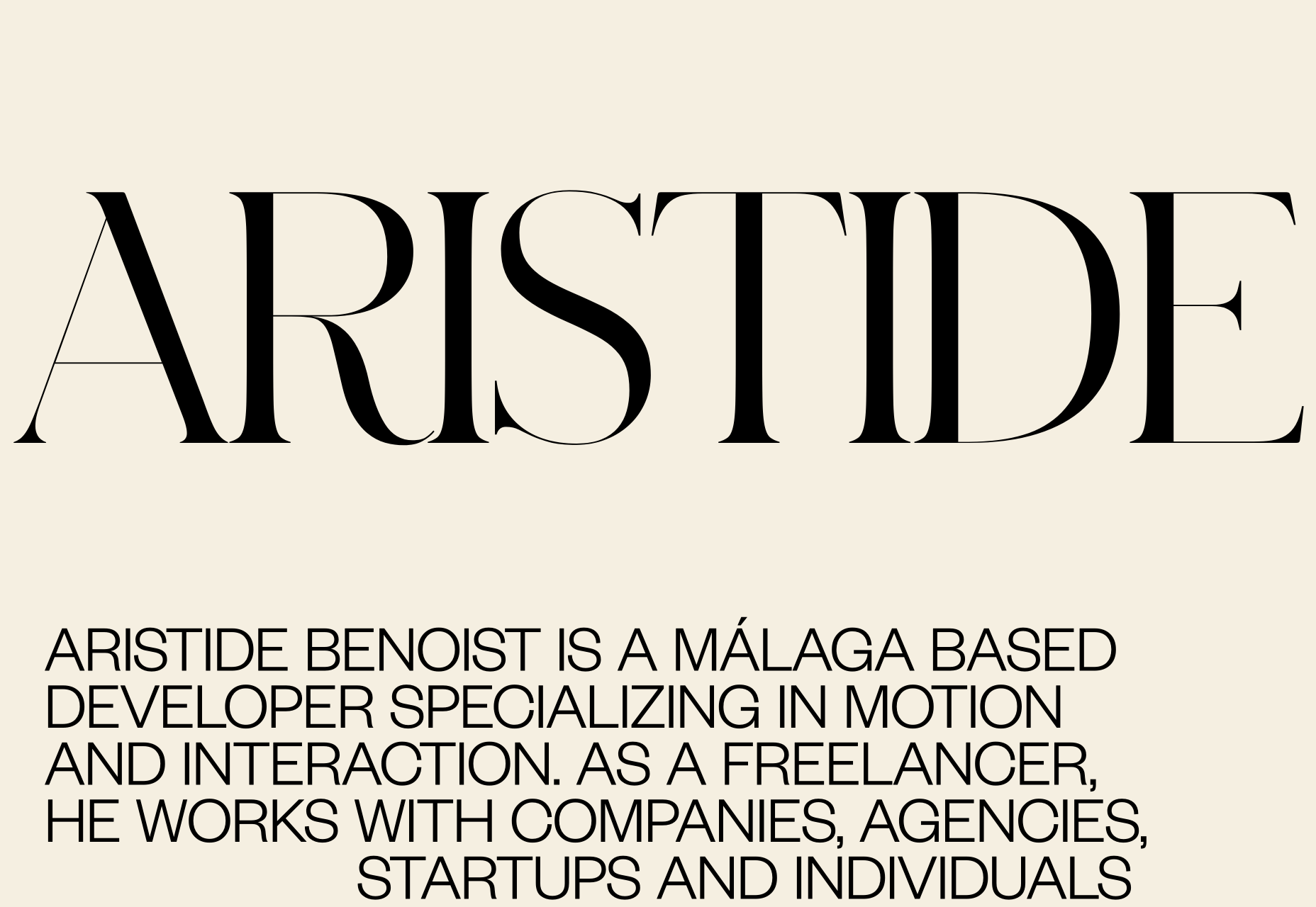
WTF Studio
WTF Studio’s portfolio is as in-yer-face as the name suggests. A front for NYC-based creative director Able Parris, the site slaps you in the eyes with color and animation the moment it loads. But scroll down past the anarchic introduction and you’ll find a series of projects for household names presented as individual case studies. It’s exactly what big brands like to see: creativity and safe hands.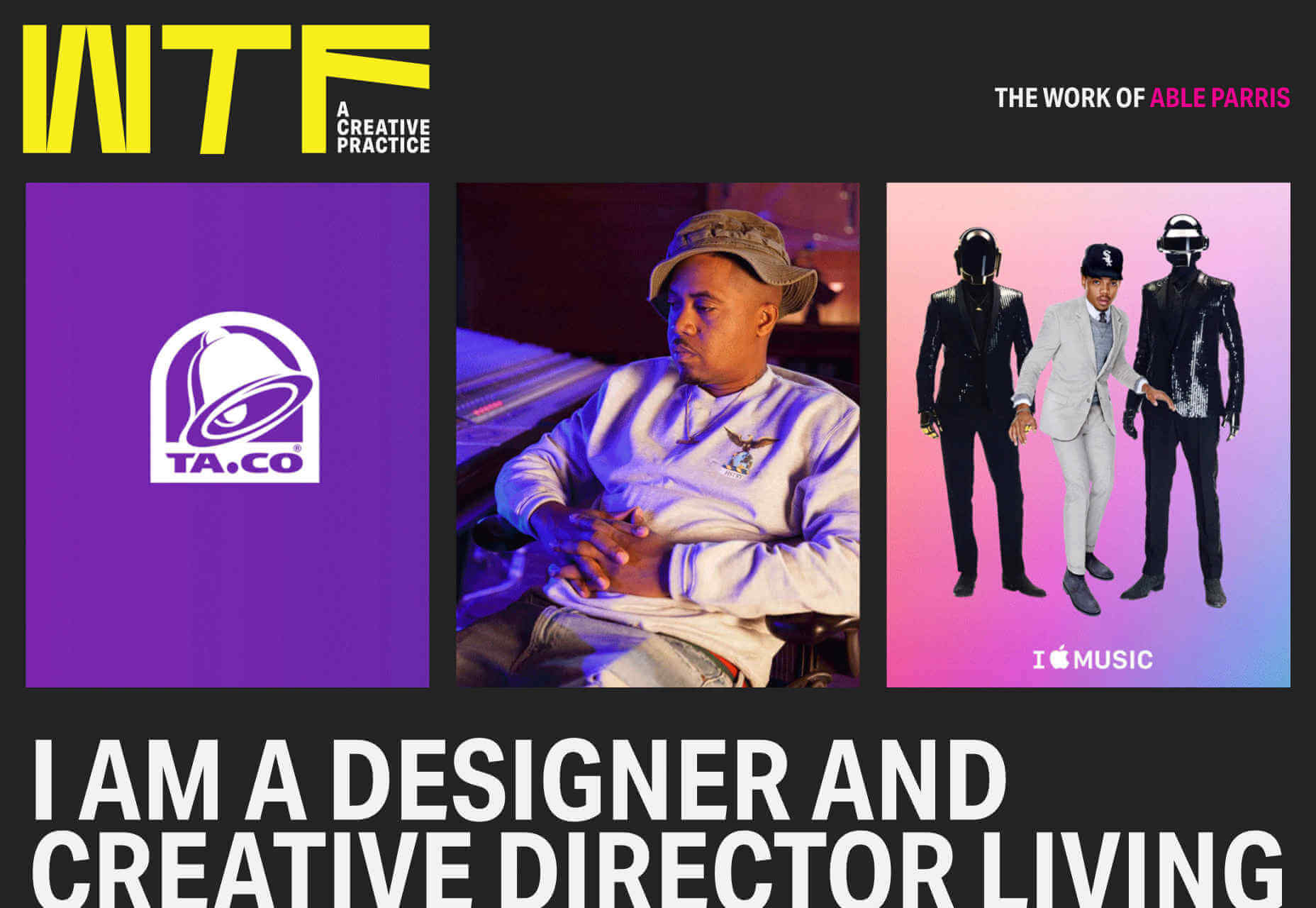
Jim Schachterle
Jim Schachterle’s site takes an approach that we don’t normally see: he’s opted for a dark green background. That simple choice, alongside the carefully paired project shots make for a sophisticated, and distinct style. Unfortunately the choice of typeface doesn’t work in places, at 12px the detail in the design is lost altogether, swapping it out for a simpler sans-serif whenever the font-size was under 18pt would have been a better choice.
Swwim
Perhaps it’s the chilly Northern climate at this time of year, but this Saint-Tropez looking site for Swwim warms my heart. The rounded sans-serif is an interesting choice — most designers would aim for sharp lines to emphasize precision. I adore the logotype, and its frivolity is echoed throughout the site in section titles. The less-subtle animation feels a little forced, but the wave motion is enticing, and brand-appropriate.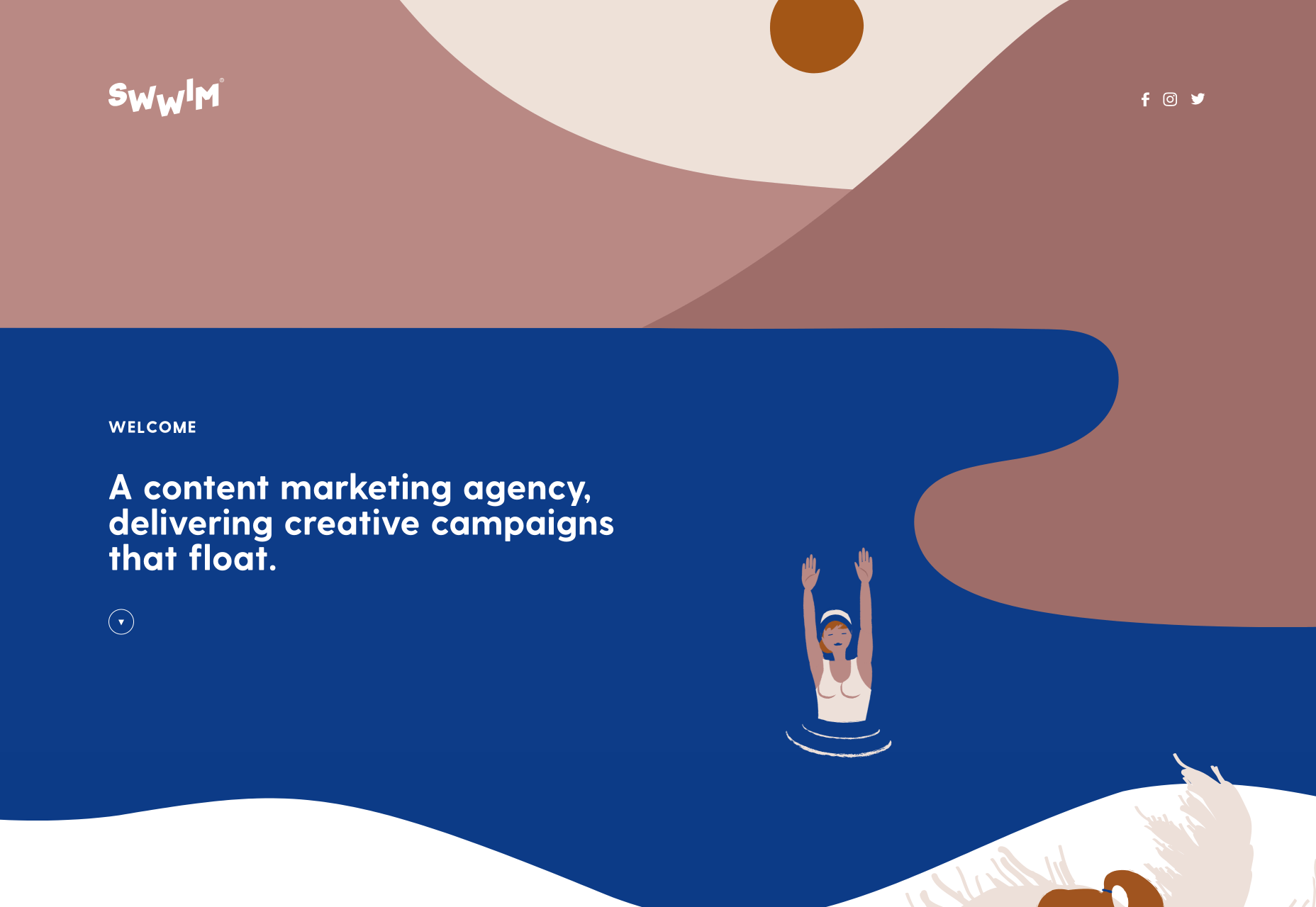
Hadrien Mongouachon
Hadrien Mongouachon is a freelance developer, so it makes perfect sense for him to demo his skills front and center on his site. He’s opted for a variation of the highly-trendy liquid effect, and it works really well. I’m not convinced by the sideways type — it only works in print because you can tilt the page — and the usability is a little compromised by the click-hold action. Once you’re accustomed to the site, it’s fun to traverse.
Butchershop
Butchershop is another design agency relying heavily on a video reel to sell its brand work. What’s really interesting about this site, is all the things it does “wrong”: the logo mark is positioned top right instead of top left, the title of its homepage is “Home”. It keeps breaking with received wisdom, so either they know something we don’t, or they didn’t get the memo about UX being a thing — you decide which.
Nikolas Type
It’s rare that we get to enjoy a purely type-based portfolio, because design work is visual, but this minimal showcase is Nikolas Wrobel’s Type Foundry, Nikolas Type. Click through to the product pages and you can edit the preview text. Thanks to the foundry being a small independent, it’s able to show some lovely samples that bring the type to life, something that larger foundries often fail to do.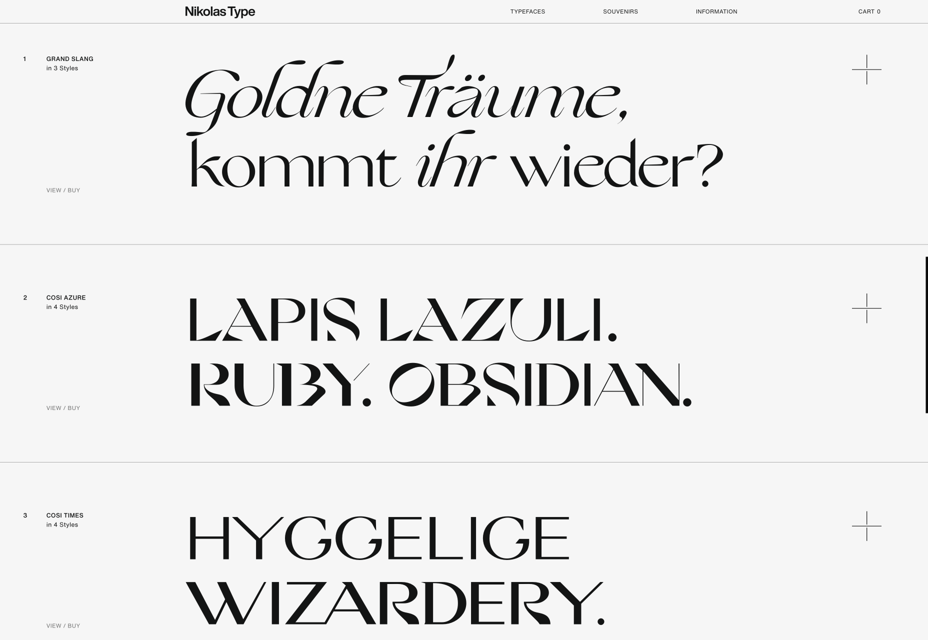
Jam3
It seems video (not static images) are now a must for any portfolio site. Agencies want companies to see real-world experiences, and understand what the working relationship is like. Jam3 is no exception, but scroll past the looping video and you’ll find a rigorously organized set of projects. The menu isn’t easy to locate, but I do like agencies opening up about their approach, and culture. Plus there’s a cool bubble effect hovering over the menu items.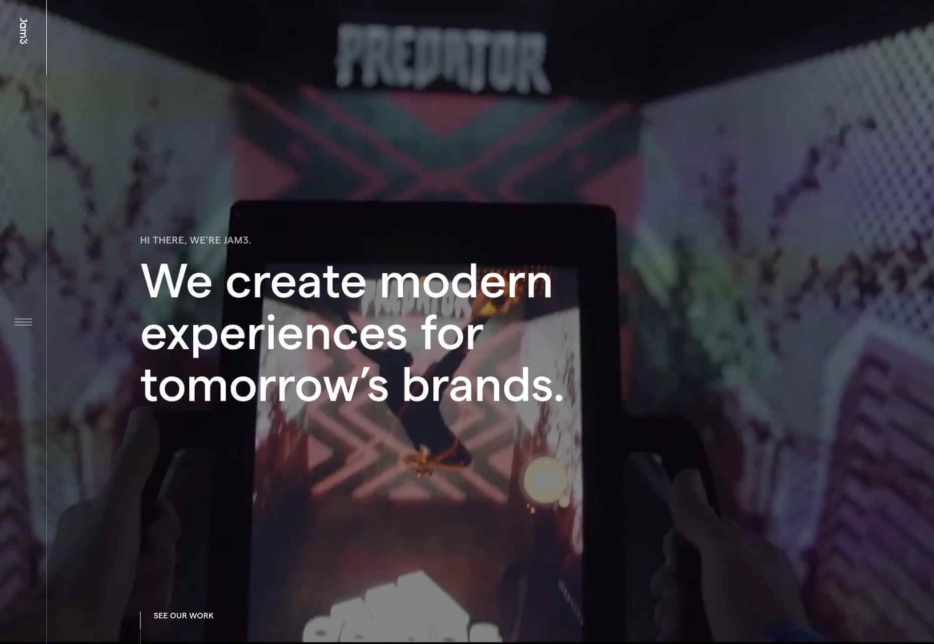
New Land
There’s a tendency among motion graphics and video firms to be slightly mysterious about who they are, and what they do — perhaps it comes from the high-concepts of advertising. New Land’s target audience probably do know who it is, because this is the kind of company that you don’t hire without some prior-knowledge. Interestingly the site is geared around tablet and mobile preferred interactions, as if intended to be passed around a meeting.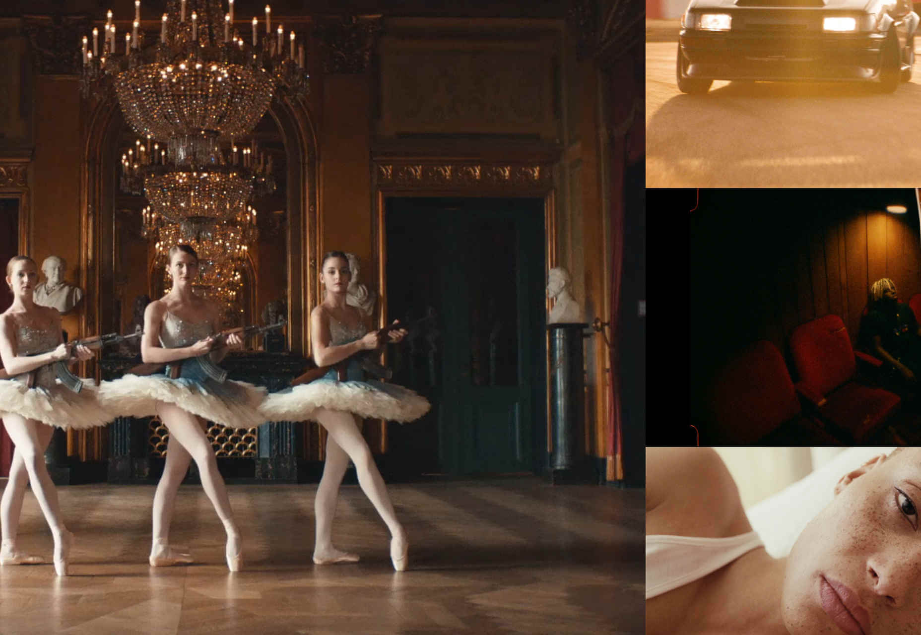
WDD Staff
WDD staff are proud to be able to bring you this daily blog about web design and development. If there's something you think we should be talking about let us know @DesignerDepot.


Read Next

15 Best New Fonts, July 2024
Welcome to our monthly roundup of the best fonts we’ve found online in the last four weeks. This month, there are fewer…
By Ben Moss

20 Best New Websites, July 2024
Welcome to July’s round up of websites to inspire you. This month’s collection ranges from the most stripped-back…

Top 7 WordPress Plugins for 2024: Enhance Your Site's Performance
WordPress is a hands-down favorite of website designers and developers. Renowned for its flexibility and ease of use,…
By WDD Staff

Exciting New Tools for Designers, July 2024
Welcome to this July’s collection of tools, gathered from around the web over the past month. We hope you’ll find…

3 Essential Design Trends, July 2024
Add some summer sizzle to your design projects with trendy website elements. Learn what's trending and how to use these…

15 Best New Fonts, June 2024
Welcome to our roundup of the best new fonts we’ve found online in the last month. This month, there are notably fewer…
By Ben Moss

20 Best New Websites, June 2024
Arranging content in an easily accessible way is the backbone of any user-friendly website. A good website will present…

Exciting New Tools for Designers, June 2024
In this month’s roundup of the best tools for web designers and developers, we’ll explore a range of new and noteworthy…

3 Essential Design Trends, June 2024
Summer is off to a fun start with some highly dramatic website design trends showing up in projects. Let's dive in!

15 Best New Fonts, May 2024
In this month’s edition, there are lots of historically-inspired typefaces, more of the growing trend for French…
By Ben Moss

How to Reduce The Carbon Footprint of Your Website
On average, a web page produces 4.61 grams of CO2 for every page view; for whole sites, that amounts to hundreds of KG…
By Simon Sterne

20 Best New Websites, May 2024
Welcome to May’s compilation of the best sites on the web. This month we’re focused on color for younger humans,…