Mobile App Website Inspiration: 20 Application Websites And Tips To Design One

5 Simple Steps to Creating the Best App Websites
Step 1: Choose a Mesmerizing Color Palette
Not everyone will necessarily agree with your idea of what a mesmerizing color palette would be. Maybe you’re not even sure what it should look like. Not a problem. Stick to these 3 simple rules and your selection should be spot on every time:- Your palette should feature colors that immediately attract visitors’ attention.
- Make sure it’s on brand so as not to detract from the message.
- It needs to be visually supportive of the message as well.
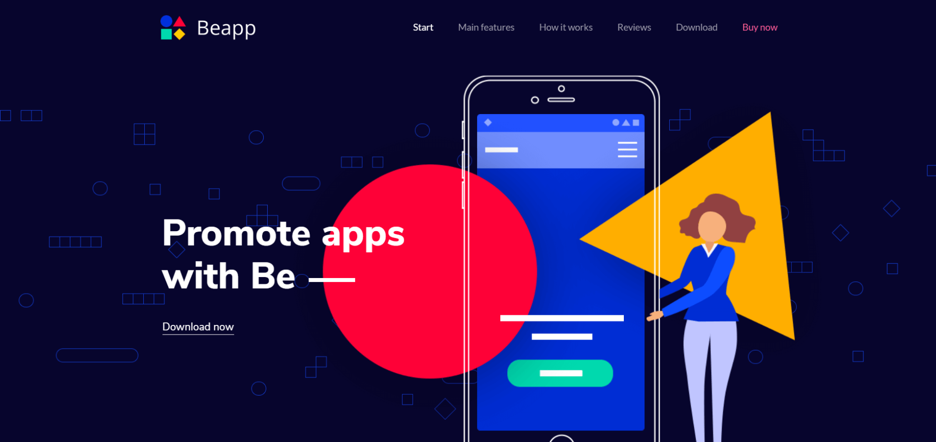
 You can create a similar colorful app website with this Be Theme pre-built website that puts an eye-catching palette of bold colors to good use.
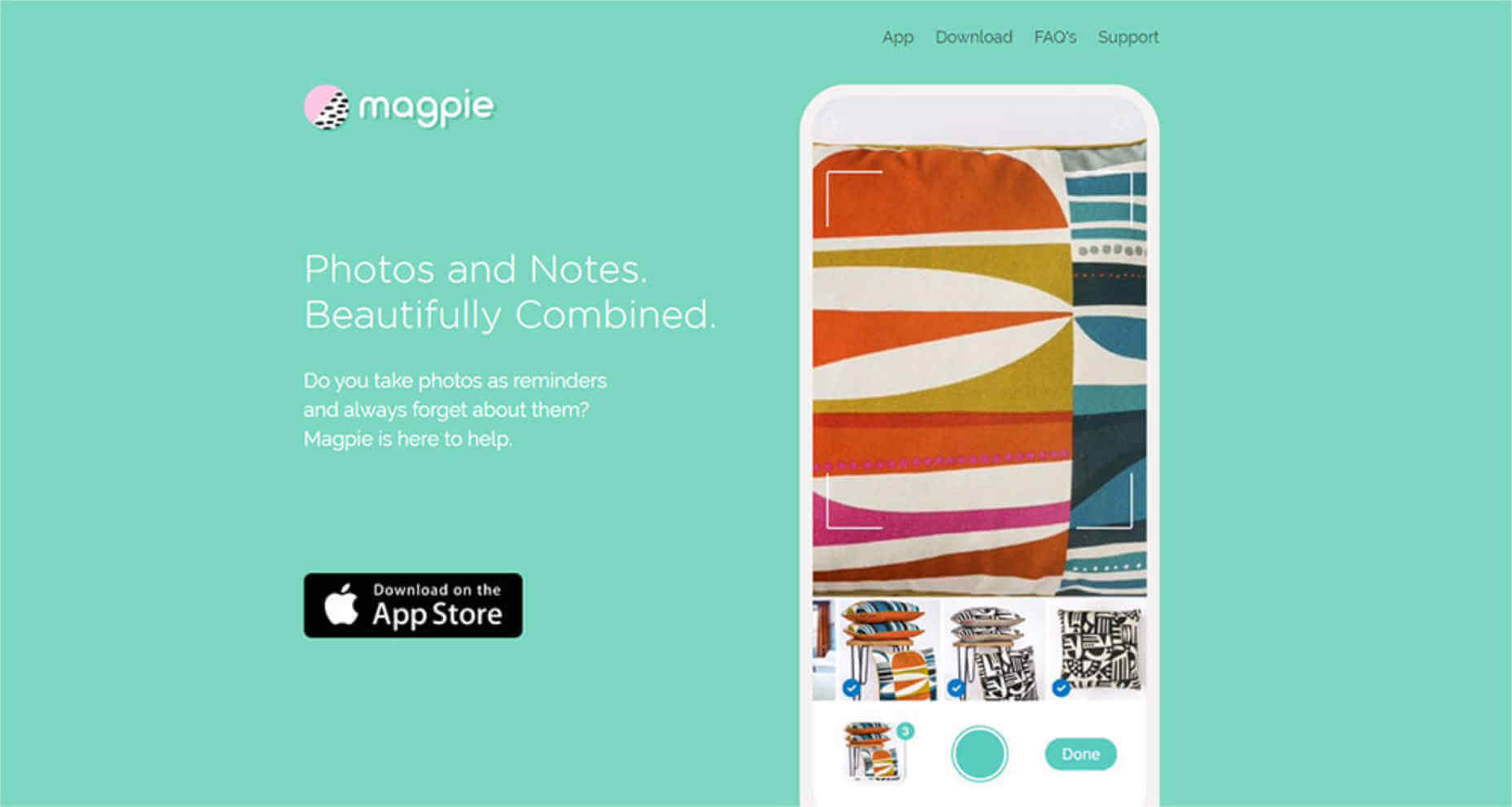
 Magpie illustrates the result of creating a color palette that aligns perfectly with its brand – in this case, visually memorable pastels.
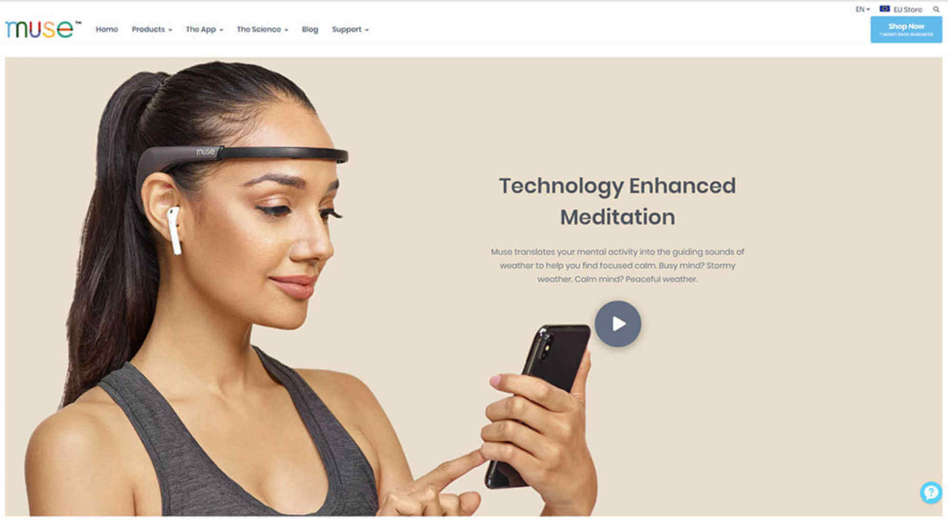
 Muse's subtle use of a natural, neutral color palette reinforces the message that their product line makes users more mindful and connected as they go about their daily lives.
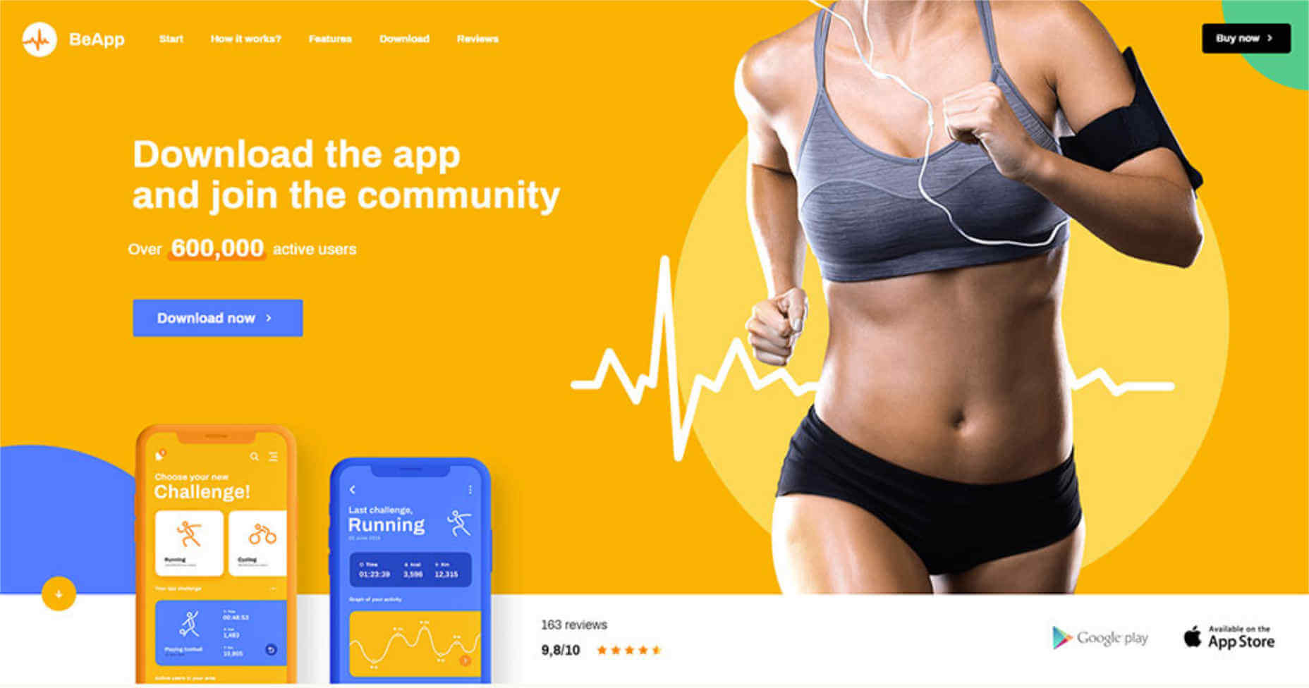
 On the other hand, the vibrancy of the BeApp2 color palette is designed to perfectly appeal to a large audience of physically active users.
Step 2: Feature Crystal-Clear Product Photos and Images
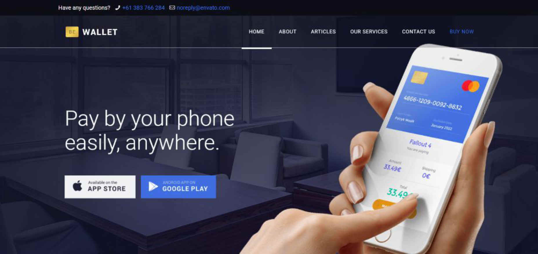
People don’t want clever hints as to what the app looks like. Anytime visitors have to try to figure things out you’ll likely loose them. They want to be able to clearly understand how easy or how difficult using the app will be; and above all how it differs from the other 400 similar ones on the market. Bite for example, clearly displays how the app appears on a smartphone while giving the user a sense of how easy it is to work with.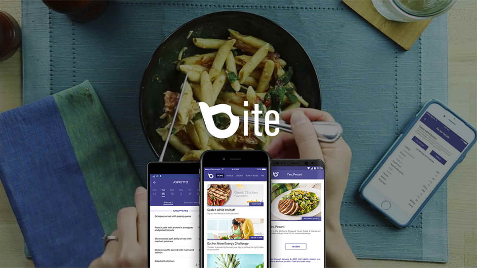 You can create a similar app website with BeWallet. This pre-built website provides an excellent starting point for building a website designed for financial apps. Financial apps are in great demand; especially those that are both helpful and straightforward to work with.
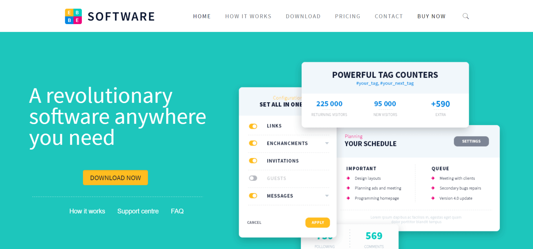
 BeSoftware provides an excellent foundation for creating a website that allows a visitor to navigate through the inner workings of the app.
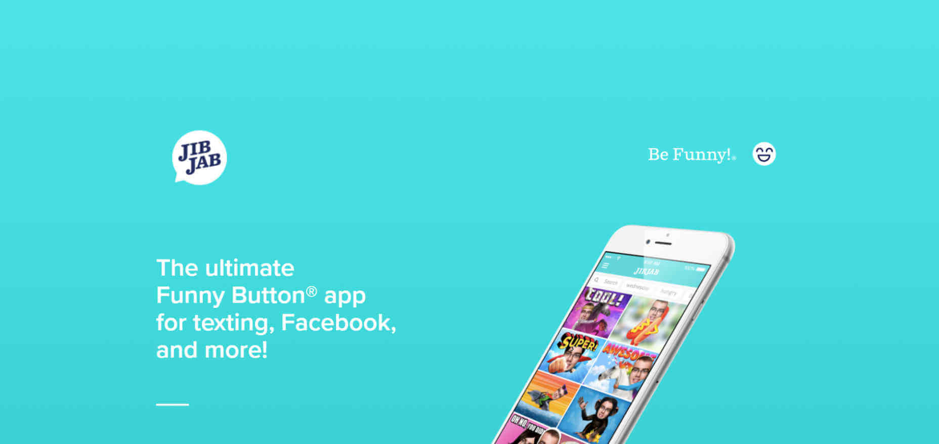
 The use of before and after examples is a simple yet highly credible way to demonstrate what an app is capable of. JibJab applies this tactic to near perfection.
Step 3: Give Visitors A Clear Picture Of How The App Works
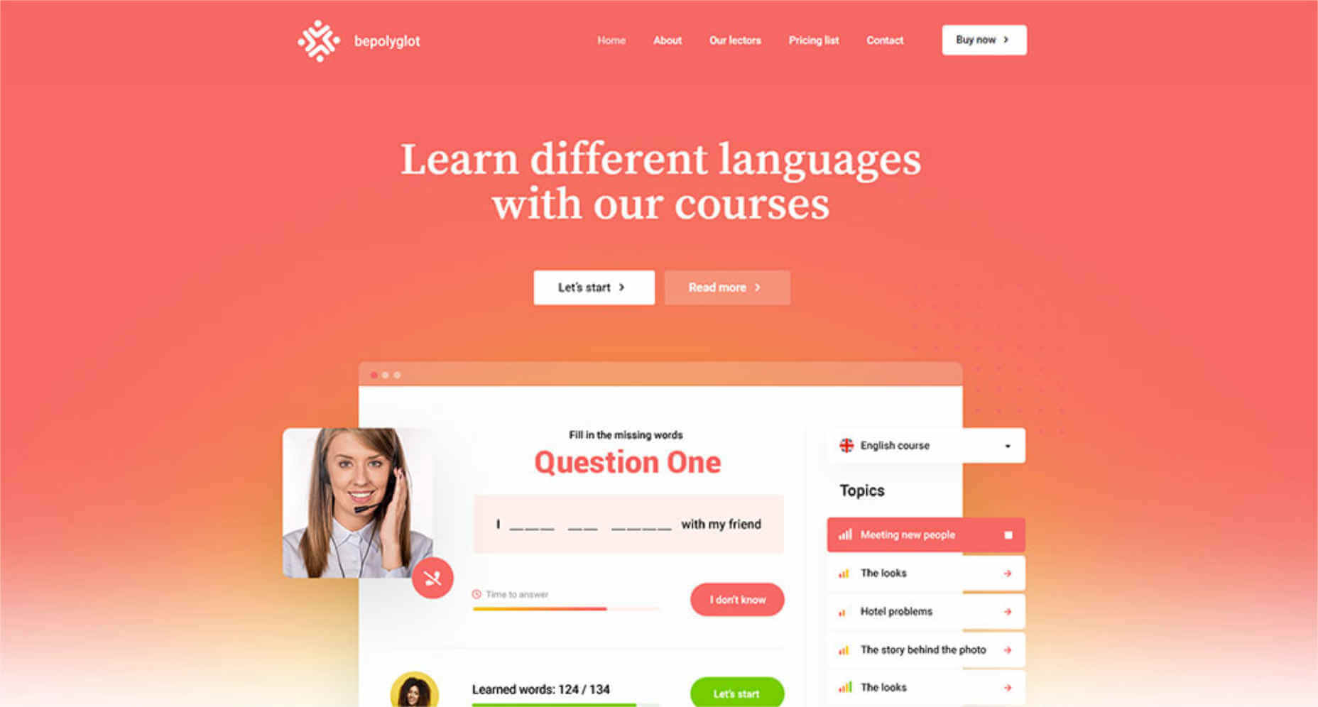
Showing visitors what an app does is a necessary step, but it’s not enough. You need to show how the app works as well. One of the most effective sales drivers lies in the ability of an app website to allow visitors to imagine themselves as actual users of the app. Video is one of the easiest ways to accomplish this. PeekCalendar’s hero section includes such a video.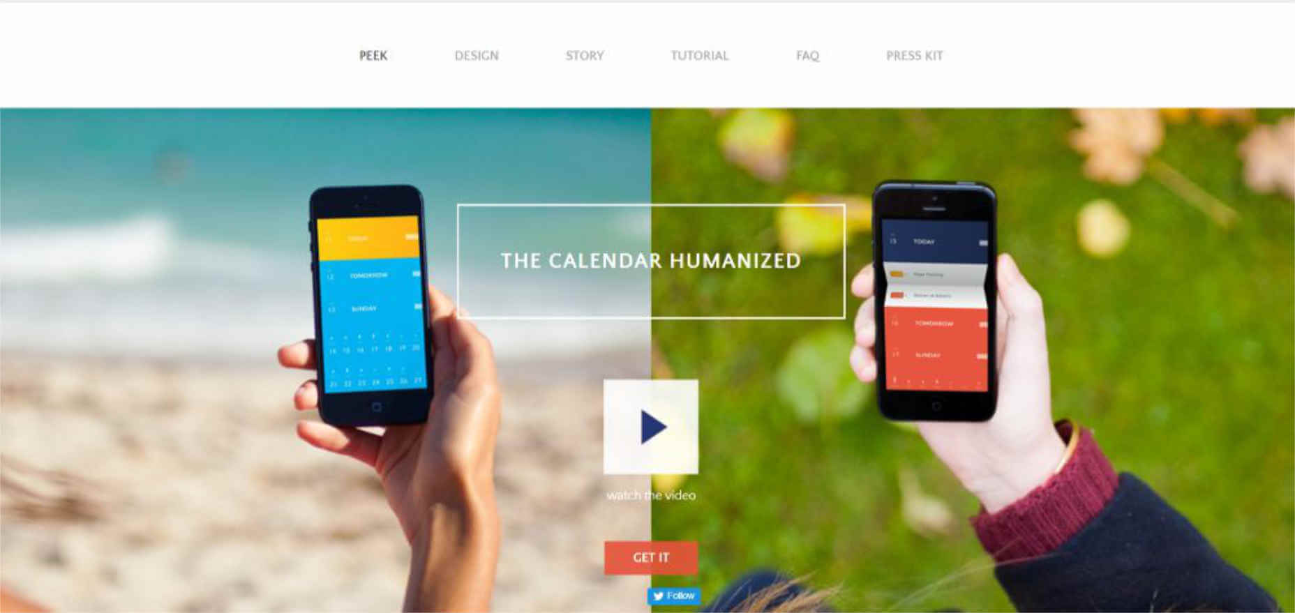 BePolyglot may not have been initially created only for presenting an app, but its product in use hero section is exactly what you need to offer the users a preview of your app.
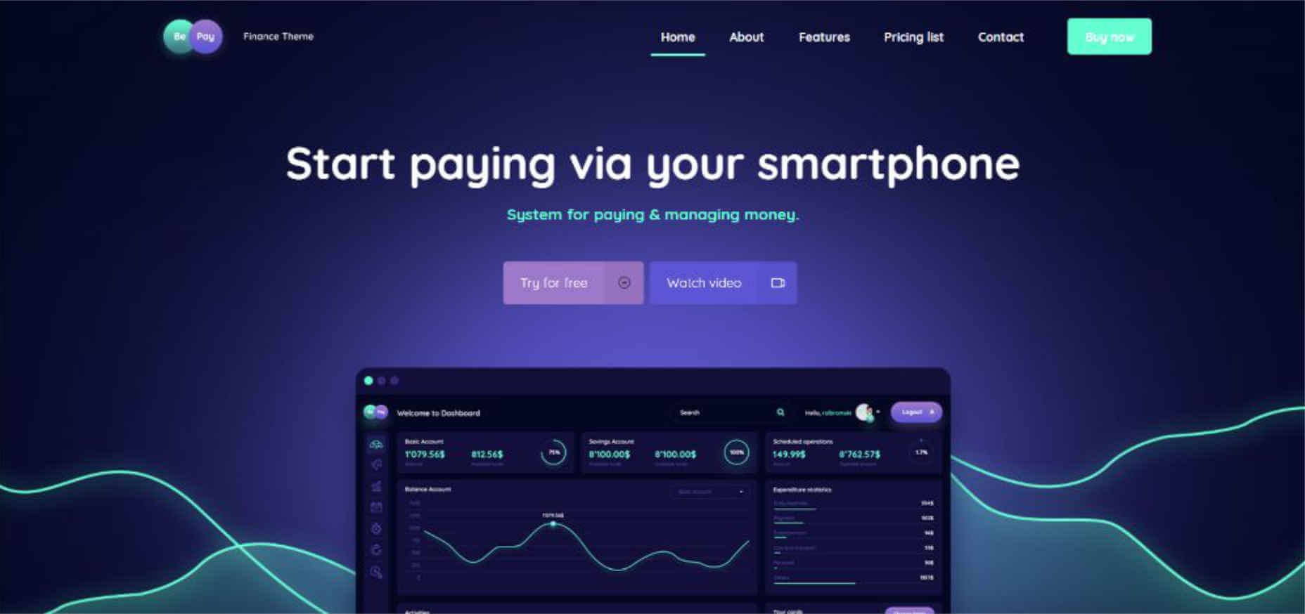
 The best way to present a video is to invite the visitor to watch it (not everyone enjoys watching a video that automatically runs). BePay’s video is opened with a CTA button above the fold.
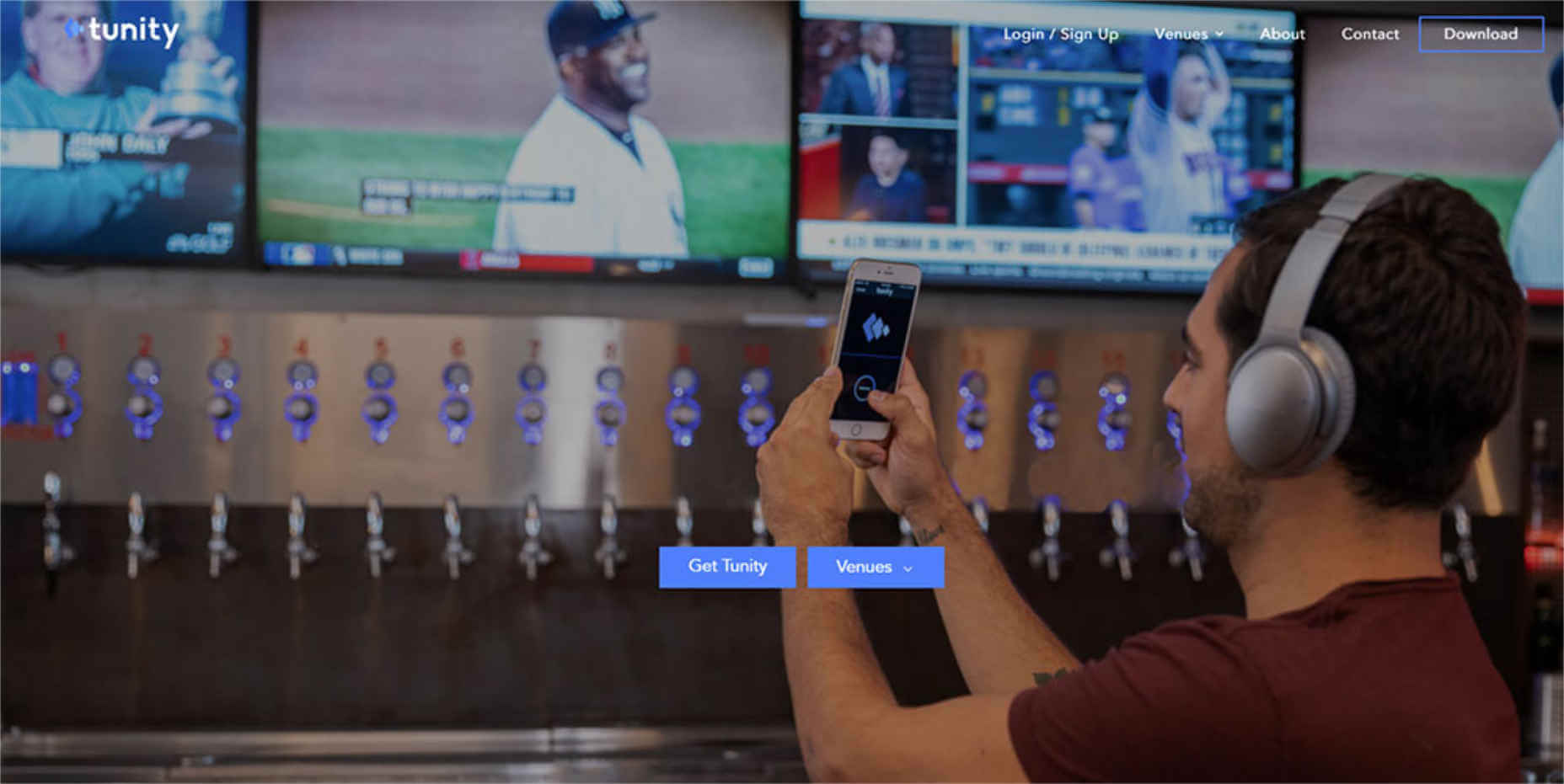
 Tunity’s website uses a slider in the hero section to show several examples of how the product works. In fact, the entire website brilliantly presents the various workings of the app in great detail.
Step 4: Don’t Be Afraid To (Over)Use “White” Space On App Websites
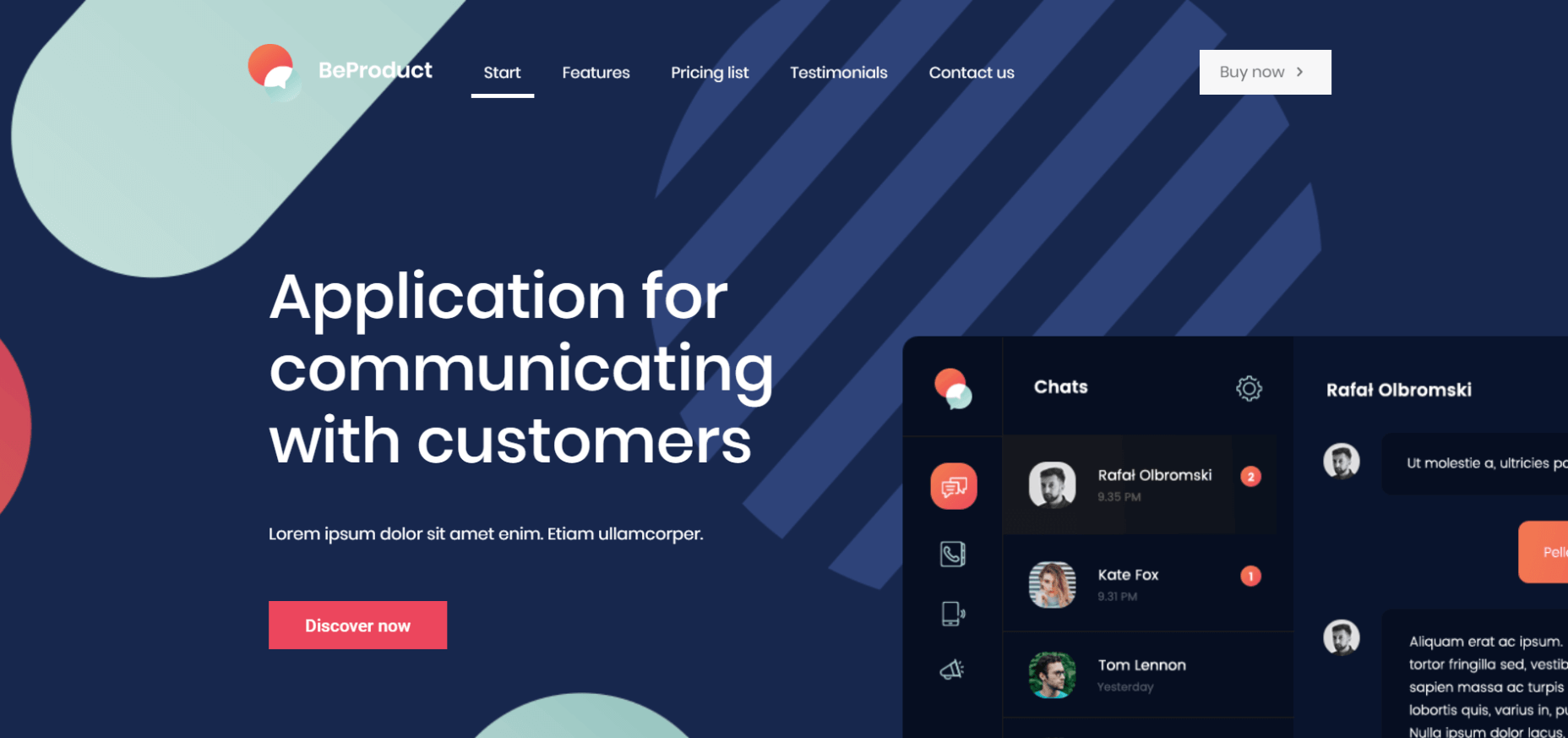
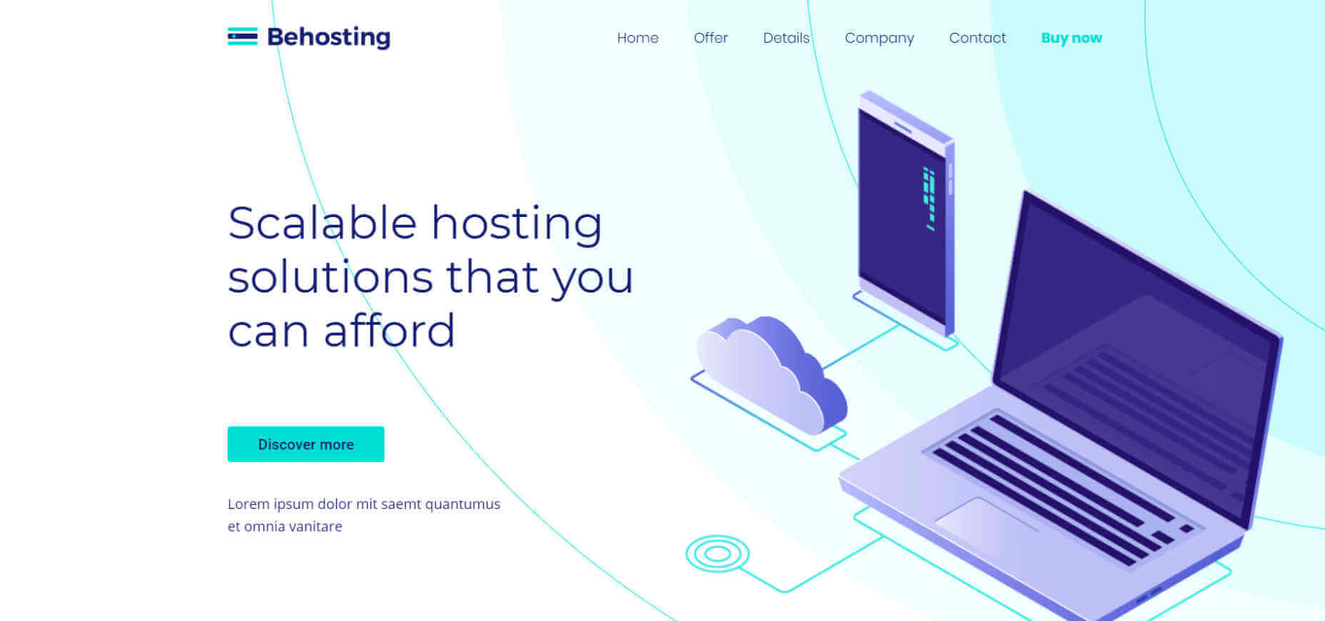
An overly generous use of white space often does more good than harm, while sparse usage can have the opposite effect. Use just enough white space to highlight the main message on the page. Add a little bit more, and you’ll be in great shape. White space makes it easier for visitors to focus on a single message or element, or on several. Curio utilizes a clean, fresh design that makes it ever-so-easy for the eye to focus on what’s most important.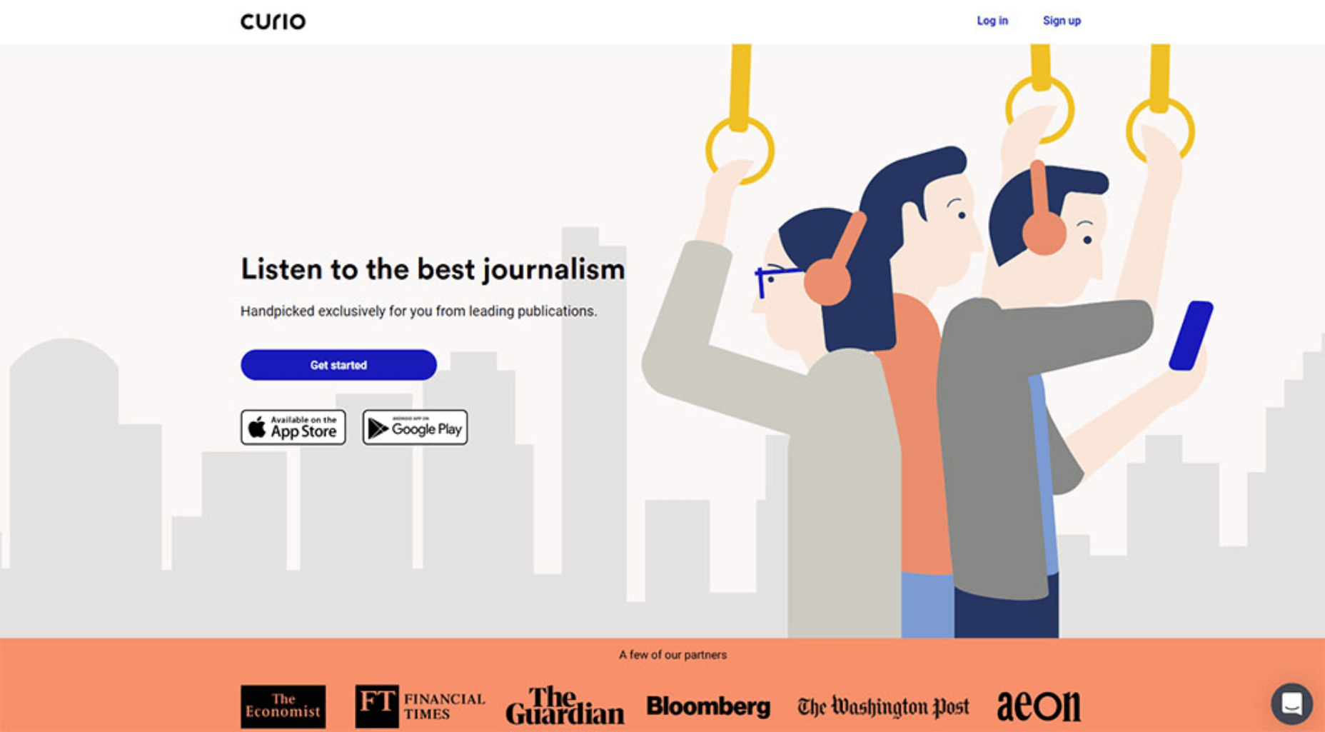 The BeProduct4 or BeHosting2 pre-built websites can be used to create an app website that has the same, clean and fresh effect. Dark “white space” is used effectively in one example; white and pale blue in the other. The message is clearly presented in both examples.
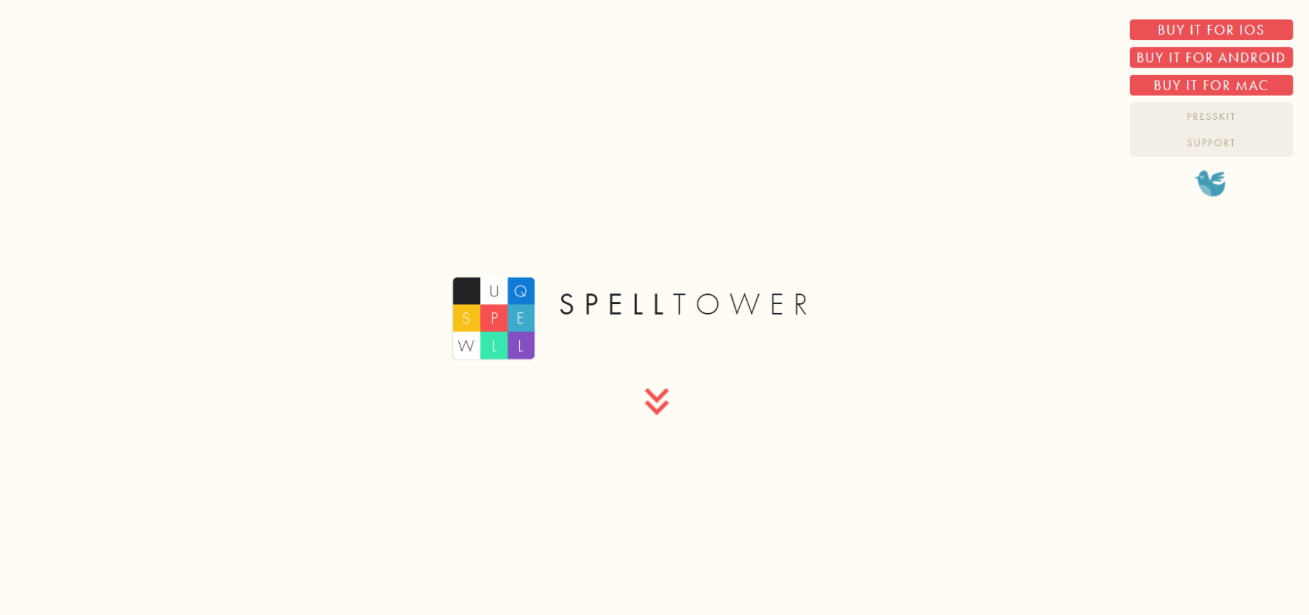
 SpellTower is an extreme example of white space usage. 90% or more of the page is white space, yet it is by no means excessive. The user clearly knows where to go or what to do next.
Step 5: Use CTA Designs That Will Grab Visitors By The Eyeballs
The very worst thing you can do with a CTA button (with the possible exception of causing it to send a visitor to the wrong place) is to make it hard to locate. The simple fact is, you want to make it virtually impossible to miss and make your visitor feel compelled to click on it. Bright and bold are the operative parameters. The Splitwise CTA button clearly stands out. A visitor will first be drawn to the headline, next to the sub-headline, and the flow naturally extends to the CTA button which is easy to see.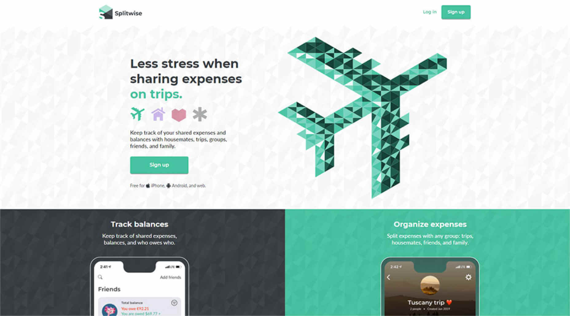 BeERP uses a bright green color to draw attention to the primary CTA button and a somewhat plainer color (black) to highlight the secondary button.
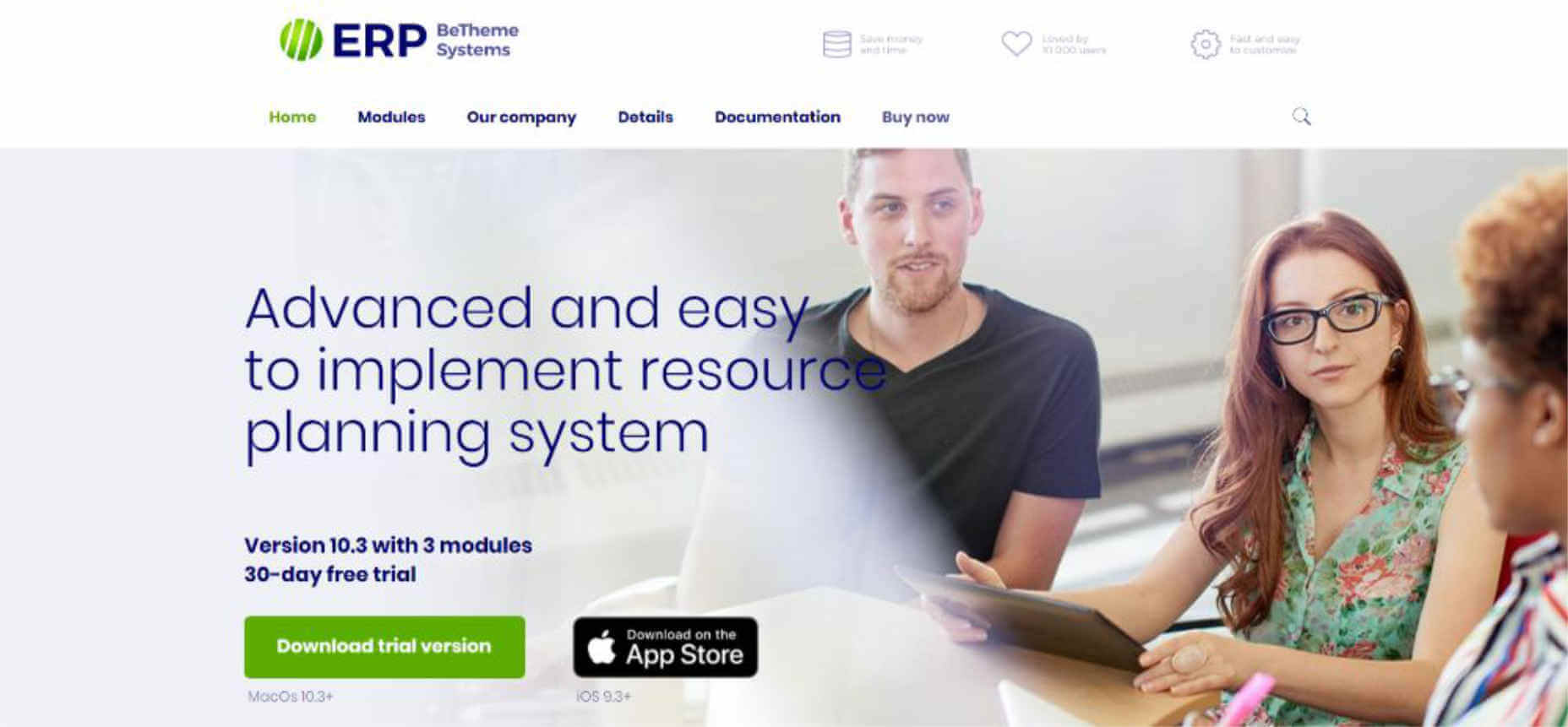
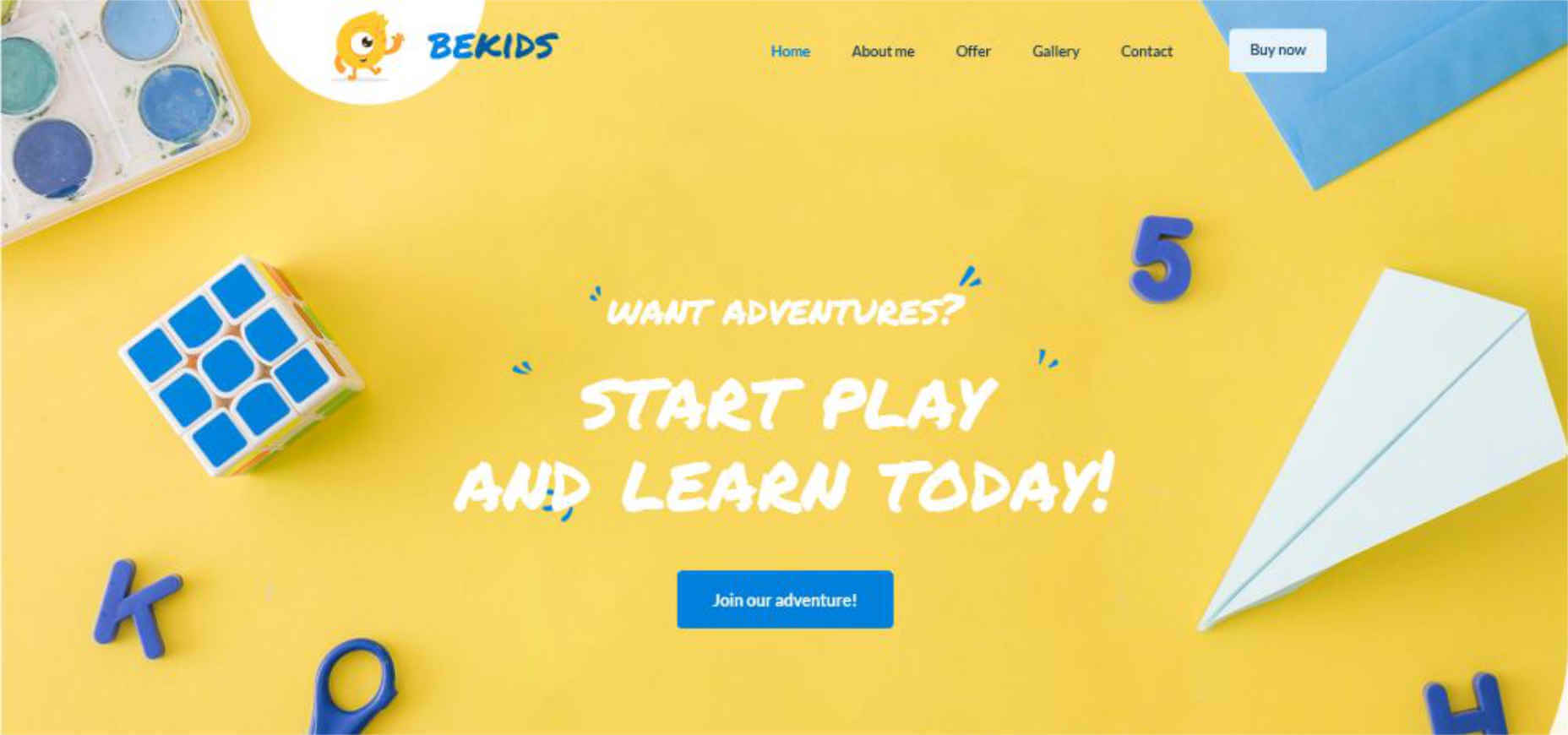
 As the BeKids example illustrates, it can be perfectly OK to use the same color for the CTA button as is used in other visual elements; in this case blue. Rather than being lost in the shuffle, the button stands out.
Conclusion
Follow these 5 surefire steps and you should have little problem creating an app website that’s designed to turn visitors into customers. Your mesmerizing color palette and clean imagery will attract attention. Clearly illustrating what the app does and enabling a potential user to visualize how to work with it keeps visitors engaged. White space helps to make the user experience a pleasant one, and bright bold CTA buttons lead to conversions. It’s important however to remember that the website presentation should be geared to making the intended audience want to use the app. If you really intend to create as many app websites as possible (while avoiding Christmas Every Day or Groundhog Day issues) you might want to check out Be Theme’s gallery of more than 450 customizable pre-built websites. They’re functional and visually impressive, and they have intuitive navigation and everything else you need to create one attention-getting app website after another. [-- This is a sponsored post on behalf of Be Theme --]WDD Staff
WDD staff are proud to be able to bring you this daily blog about web design and development. If there's something you think we should be talking about let us know @DesignerDepot.
Read Next

15 Best New Fonts, July 2024
Welcome to our monthly roundup of the best fonts we’ve found online in the last four weeks. This month, there are fewer…
By Ben Moss

20 Best New Websites, July 2024
Welcome to July’s round up of websites to inspire you. This month’s collection ranges from the most stripped-back…

Top 7 WordPress Plugins for 2024: Enhance Your Site's Performance
WordPress is a hands-down favorite of website designers and developers. Renowned for its flexibility and ease of use,…
By WDD Staff

Exciting New Tools for Designers, July 2024
Welcome to this July’s collection of tools, gathered from around the web over the past month. We hope you’ll find…

3 Essential Design Trends, July 2024
Add some summer sizzle to your design projects with trendy website elements. Learn what's trending and how to use these…

15 Best New Fonts, June 2024
Welcome to our roundup of the best new fonts we’ve found online in the last month. This month, there are notably fewer…
By Ben Moss

20 Best New Websites, June 2024
Arranging content in an easily accessible way is the backbone of any user-friendly website. A good website will present…

Exciting New Tools for Designers, June 2024
In this month’s roundup of the best tools for web designers and developers, we’ll explore a range of new and noteworthy…

3 Essential Design Trends, June 2024
Summer is off to a fun start with some highly dramatic website design trends showing up in projects. Let's dive in!

15 Best New Fonts, May 2024
In this month’s edition, there are lots of historically-inspired typefaces, more of the growing trend for French…
By Ben Moss

How to Reduce The Carbon Footprint of Your Website
On average, a web page produces 4.61 grams of CO2 for every page view; for whole sites, that amounts to hundreds of KG…
By Simon Sterne

20 Best New Websites, May 2024
Welcome to May’s compilation of the best sites on the web. This month we’re focused on color for younger humans,…