
WTF Studio
If you’re going to name your business WTF Studio, you need a suitably WTF site. Able Parris is a NY-based creative director who’s more than happy to slap you in the face with colour and motion. What we really loved about this site is that once you’ve scrolled past the anarchic introduction, it’s actually very safe, very clear. Attitude doesn’t have to mean sacrificing UX.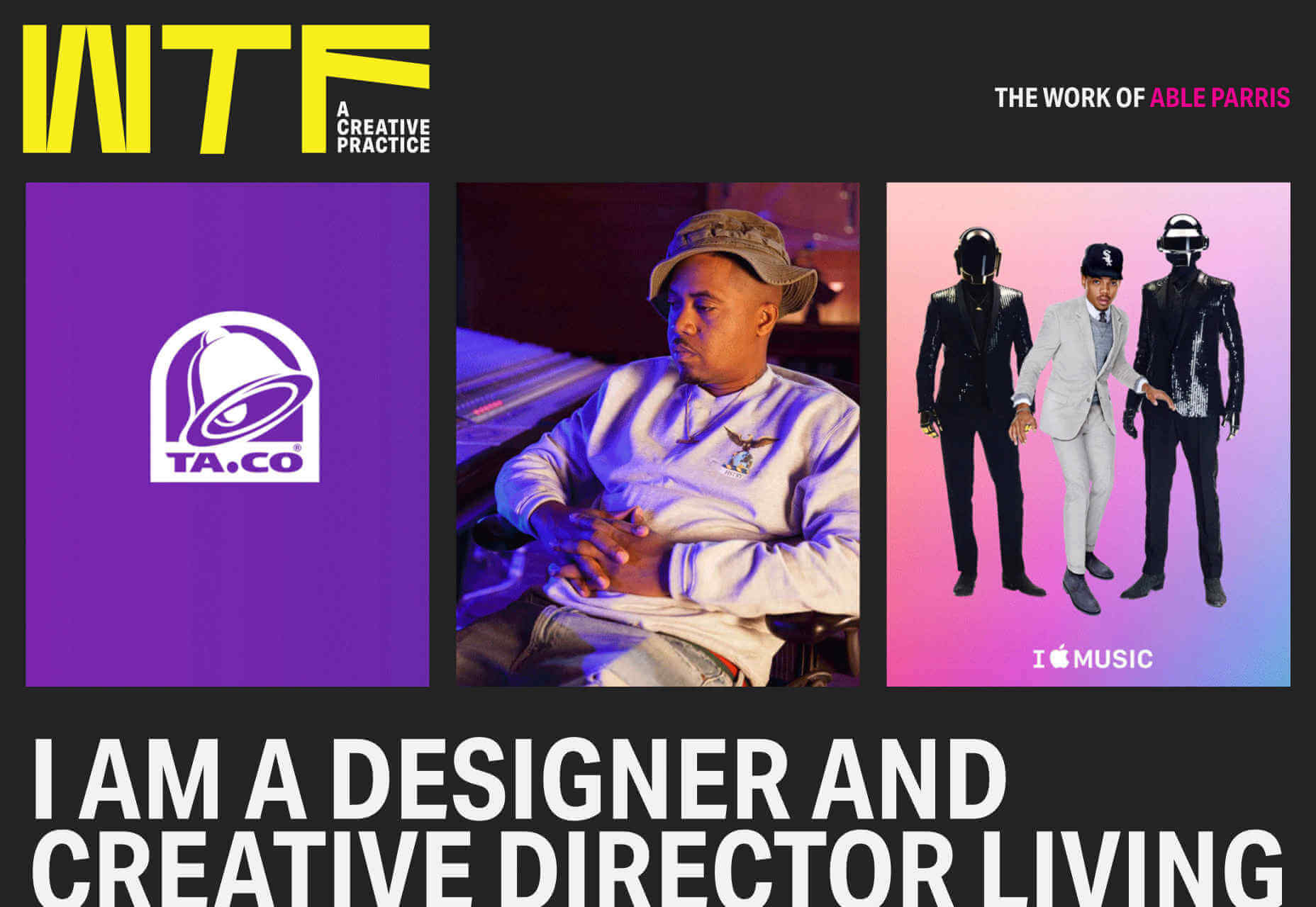
Stereo
Stereo features smooth animation, a beautiful palette, and some really gorgeous type. What makes it stand out is the unusual navigation menu — it scrolls across the center of the screen like an old-style marquee. We also loved its sweeping animation as it transitions from state to state.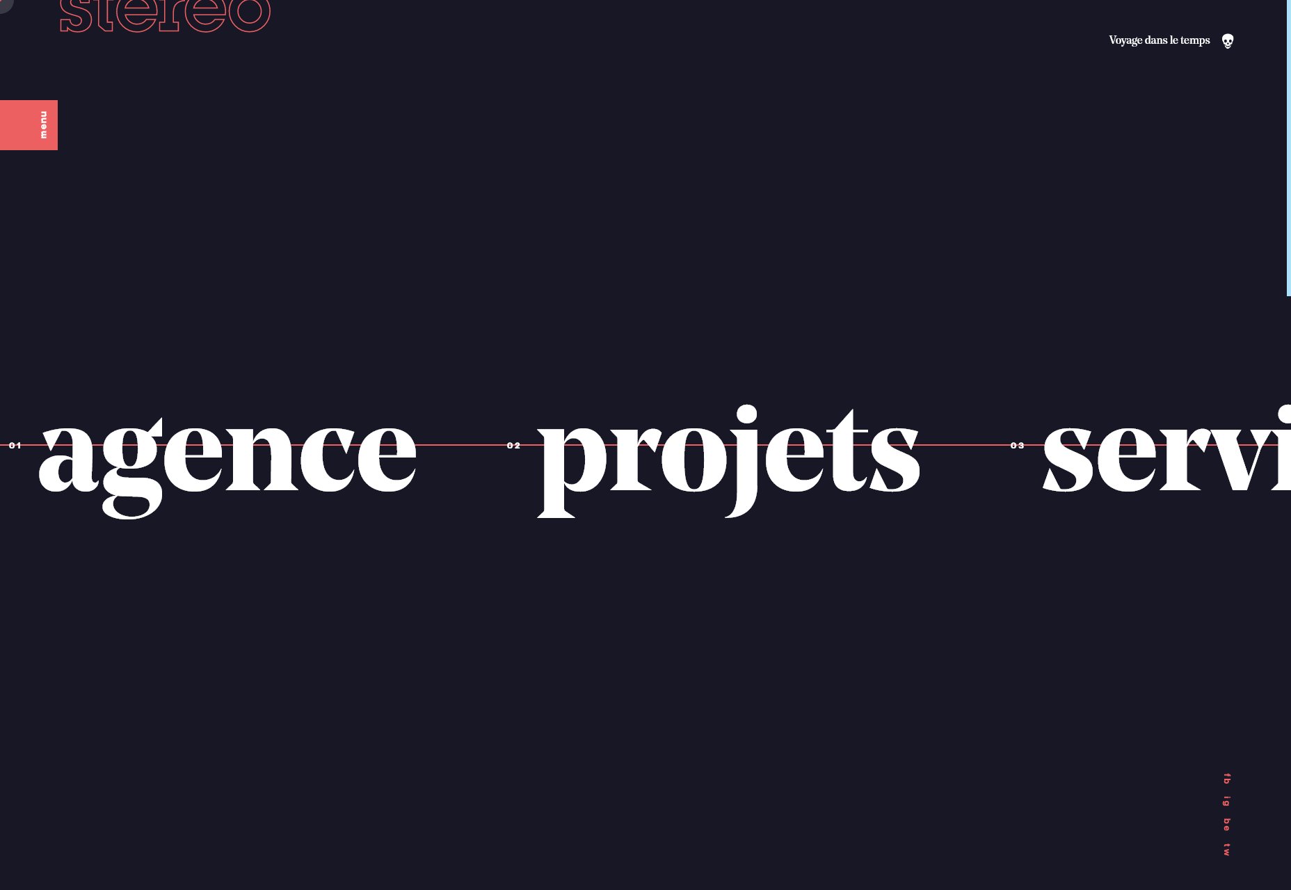
Eva Garcia
We weren’t just impressed with the portfolios of design agencies this year. Eva Garcia’s portfolio is a classic example of how to build a portfolio site. It’s brand-appropriate, intuitive to use, and lets the work come to the fore.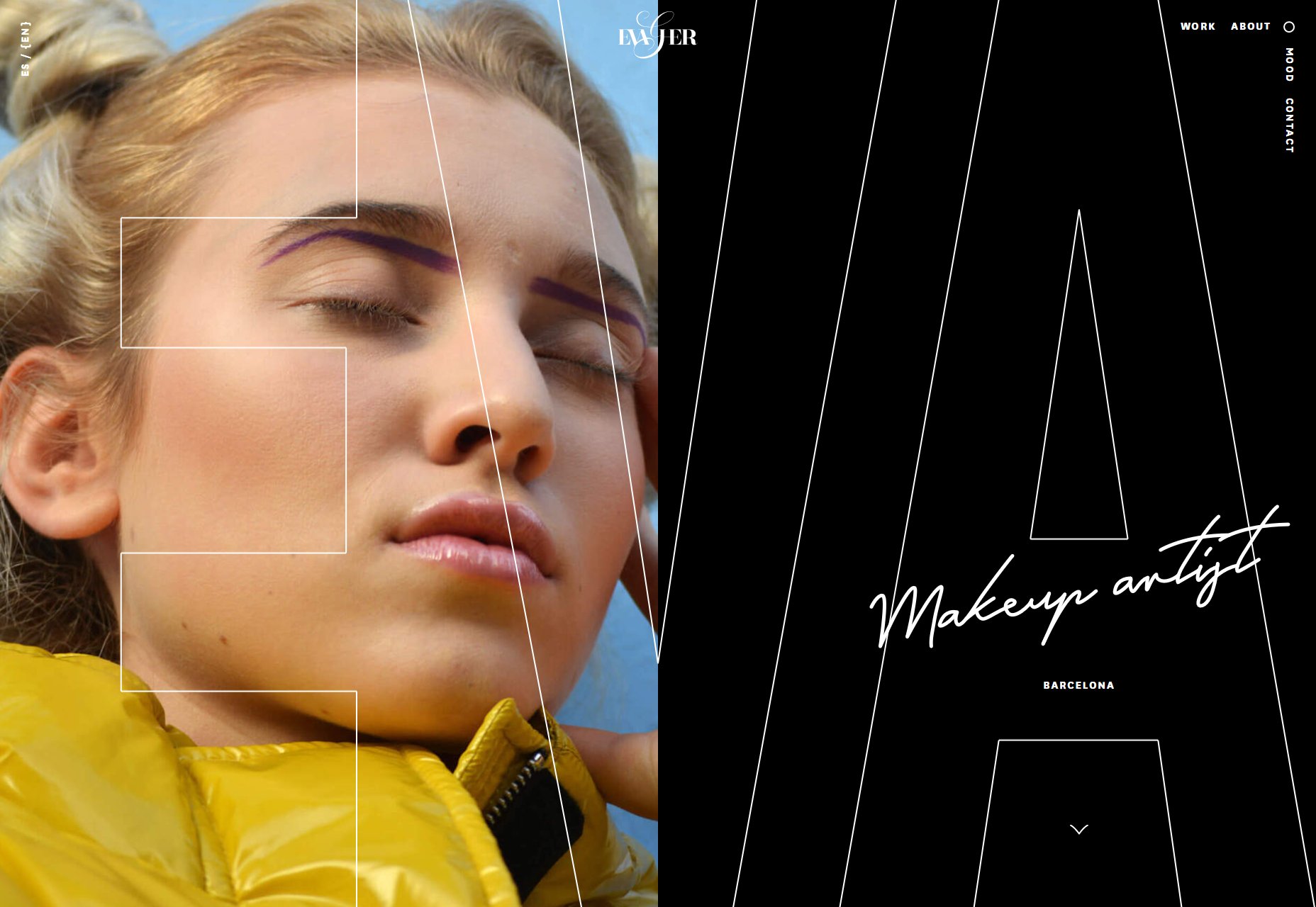
Kévin Chassagne
Kévin Chassagne’s site is a great example of a site that delivers excellent layout, and awesome animation, without relying on JavaScript. The JavaScript here is used for a few details, but you really lose nothing without it. Everything from the typography, to the colour scheme, to the simple UX are great for a portfolio when you’re potentially browsing hundreds of sites at once.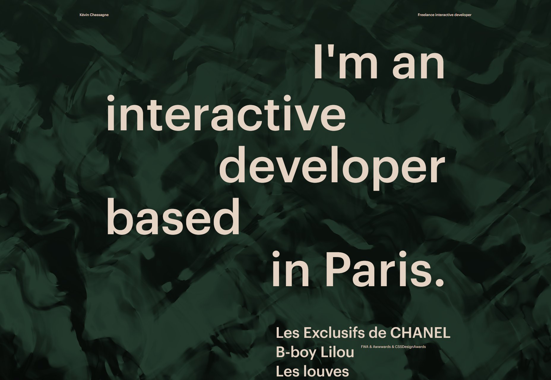
Nicky Tesla
Nicky Tesla’s portfolio is one of the most original of 2019. It’s a spreadsheet; it doesn’t just look like a spreadsheet, it actually is one; it’s a publicly available spreadsheet on Google, with a domain attached. It’s not the most beautiful portfolio you’ll ever see, but it is daringly committed to its core concept.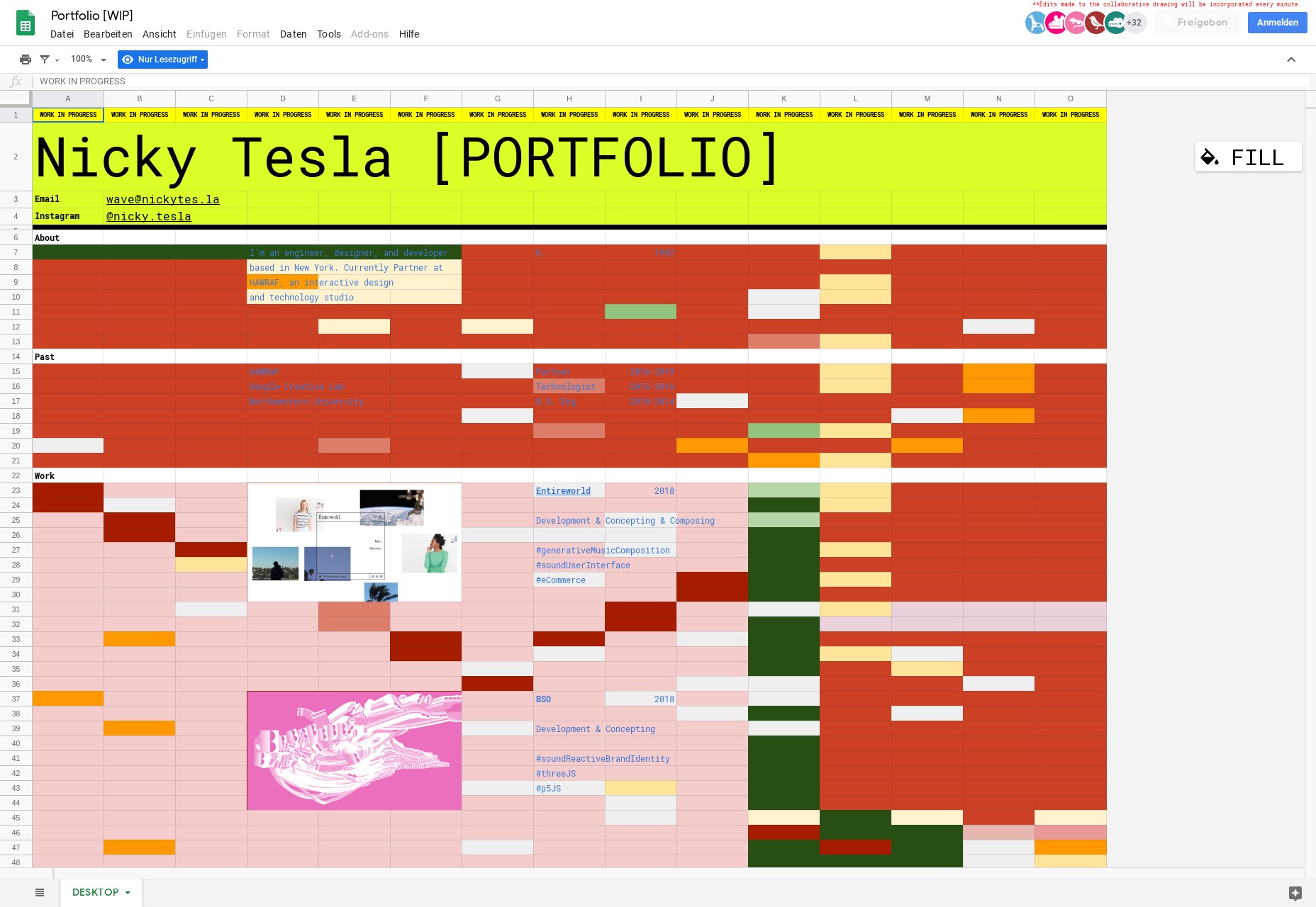
Florian Wacker
Florian Wacker’s portfolio features absolutely beautiful typography. This site wowed us back at the start of the year, when minimalism was still de rigueur. As a pitch to design agencies that value good typography, this is almost faultless.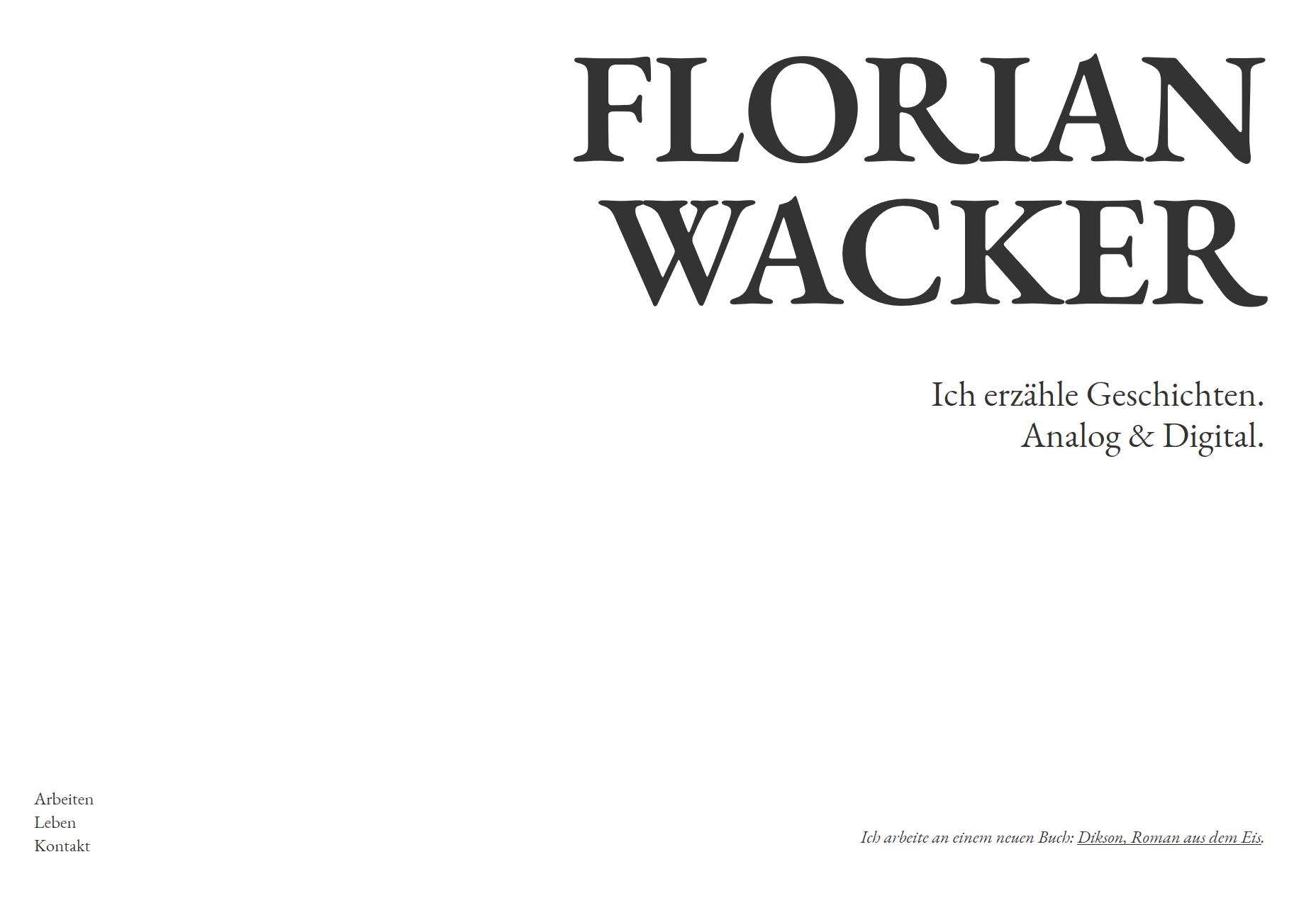
Adam Brandon
More minimalism from the start of 2019 in the form of Adam Brandon’s portfolio. His client list is fairly formidable, with Netflix, Apple, Nike, and Ford in there. The site sensibly takes a step back and lets the work promote itself.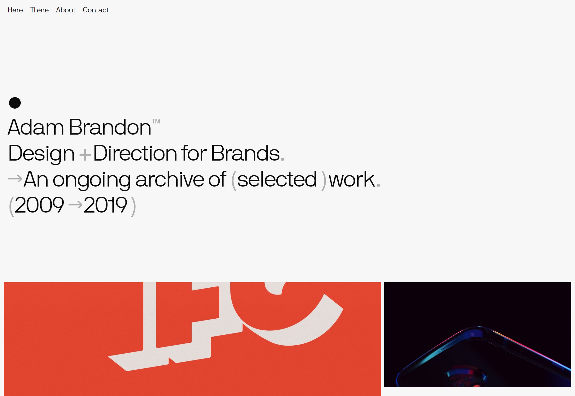
EVOXLAB
Evoxlab is an unusual site for us, in that it has gone out of its way to mimic powerpoint slides, which is bordering on skeuomorphism. Well, kinda. It certainly feels like a slideshow. We’ve included it because it’s really committed to the concept, and in this case it works.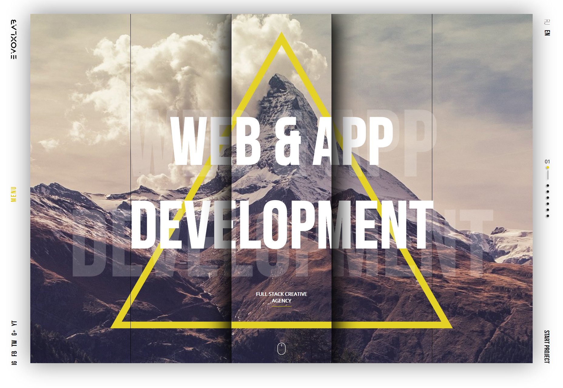
Plug & Play
The agency site for Plug & Play is one of the least challenging sites we've seen in 2019. In many ways it verges on cliché, but that’s all intentional, because this site is about a simplified user experience. What’s more we love the way it transitions from dark mode to light, as you scroll.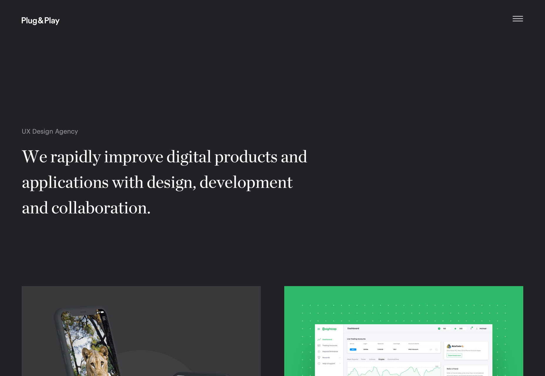
Athletics
Athletics jumps right into fullscreen video case studies of work for clients like IBM. At that point, if you have the budget, you’re probably sold, but Athletics follows up with a grid of lower-profile, but equally exciting design work.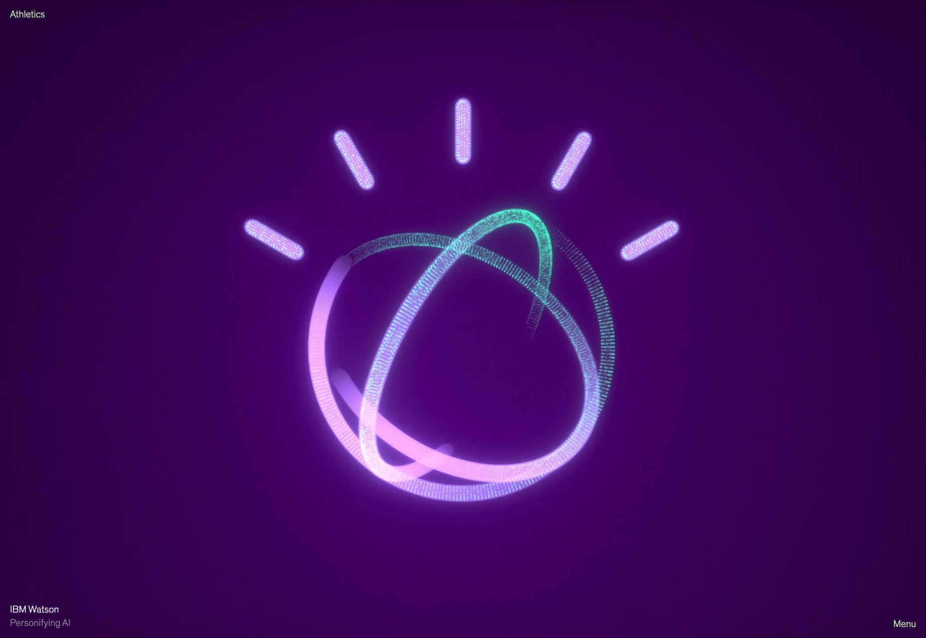
Revolve Studio
Revolve Studio’s site really stands out not because of the presentation-style user experience, but because it’s built in ASP.NET. It also stands out by not showing any work, which is an unusual approach that has been surprisingly popular over the last year.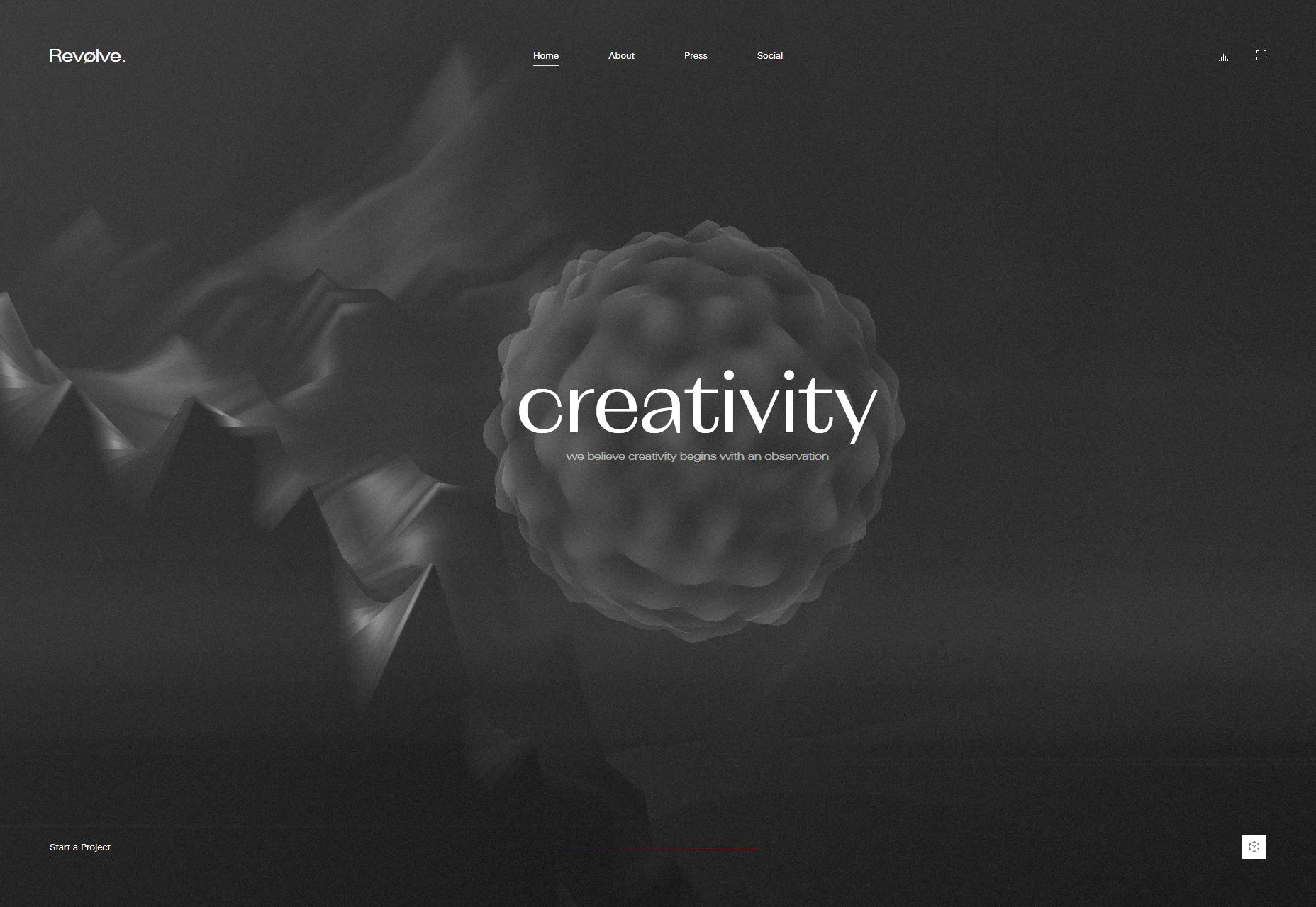
Florian Monfrini
Florian Monfrini’s portfolio is an expanded, full screen, collage approach. It fills the space well, and was one of the sites that adopted this approach long before it became fashionable.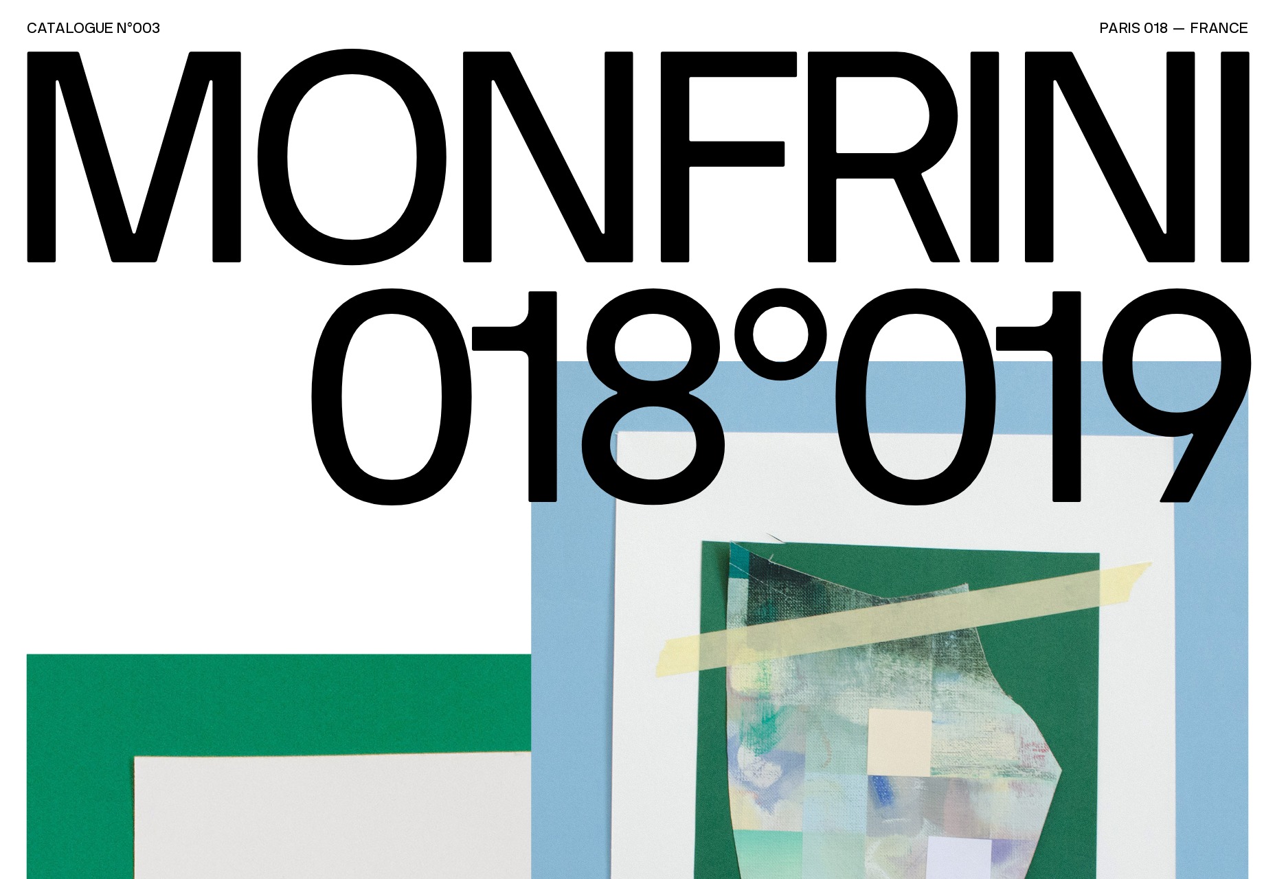
Angle2
We love the typography of Angle2. It’s another slideshow-style site, but it’s brought to life by the angles and skew of the typography. Despite the energetic feeling text, and the variety of designs — one per page — it always remains usable.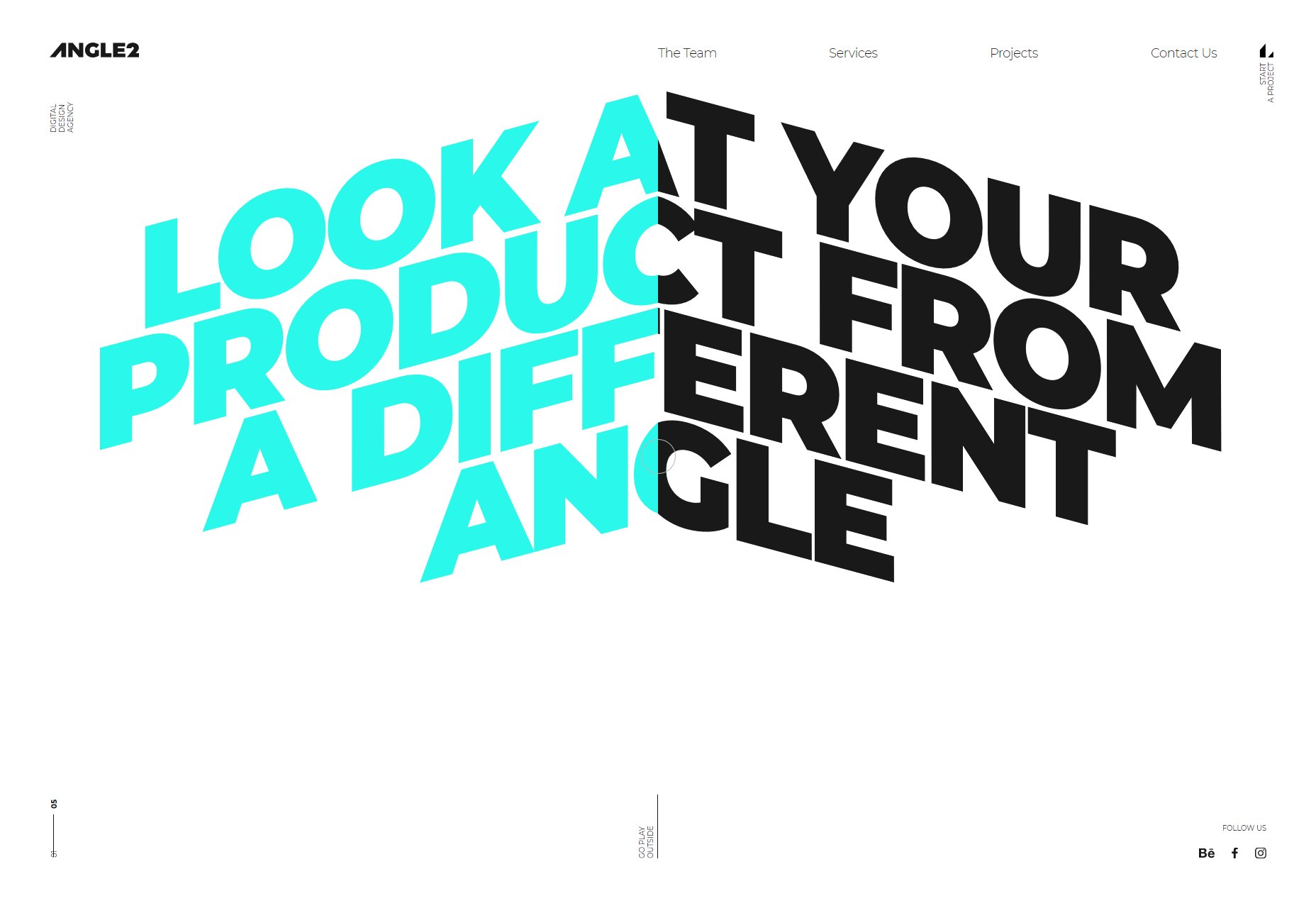
Florent Biffi
If 2019 was the year of a single effect, it was the year of rippling, liquid-style effects. One of the first we saw was Florent Biffi’s site, with huge, bold typography and a subtle rippling effect over the design.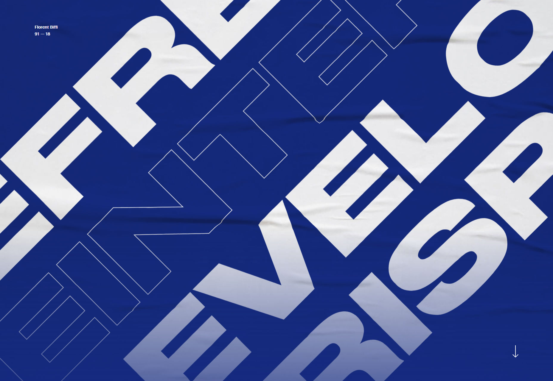
Bethany Heck
We really loved the semi-brutalist approach of Bethany Heck’s portfolio. It’s just a collection of project titles, and in places the accompanying logos, that lead either to the site being referenced, or to an internal link with delightful typography.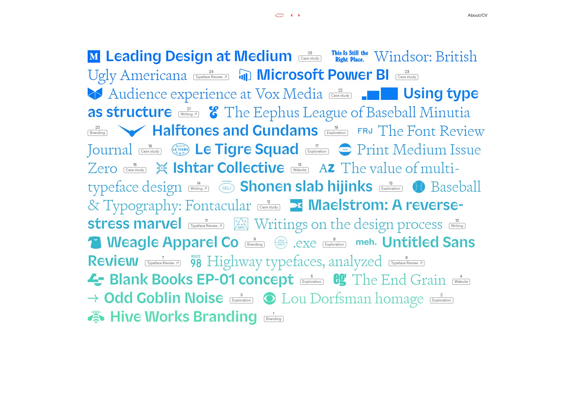
Bold
Bold’s portfolio is a simple presentation with some exceptionally sophisticated details. We loved the way the border expands from the images as you scroll, creating the sense of zooming into a project. It’s a confident and understated portfolio that sells to big names, with big budgets.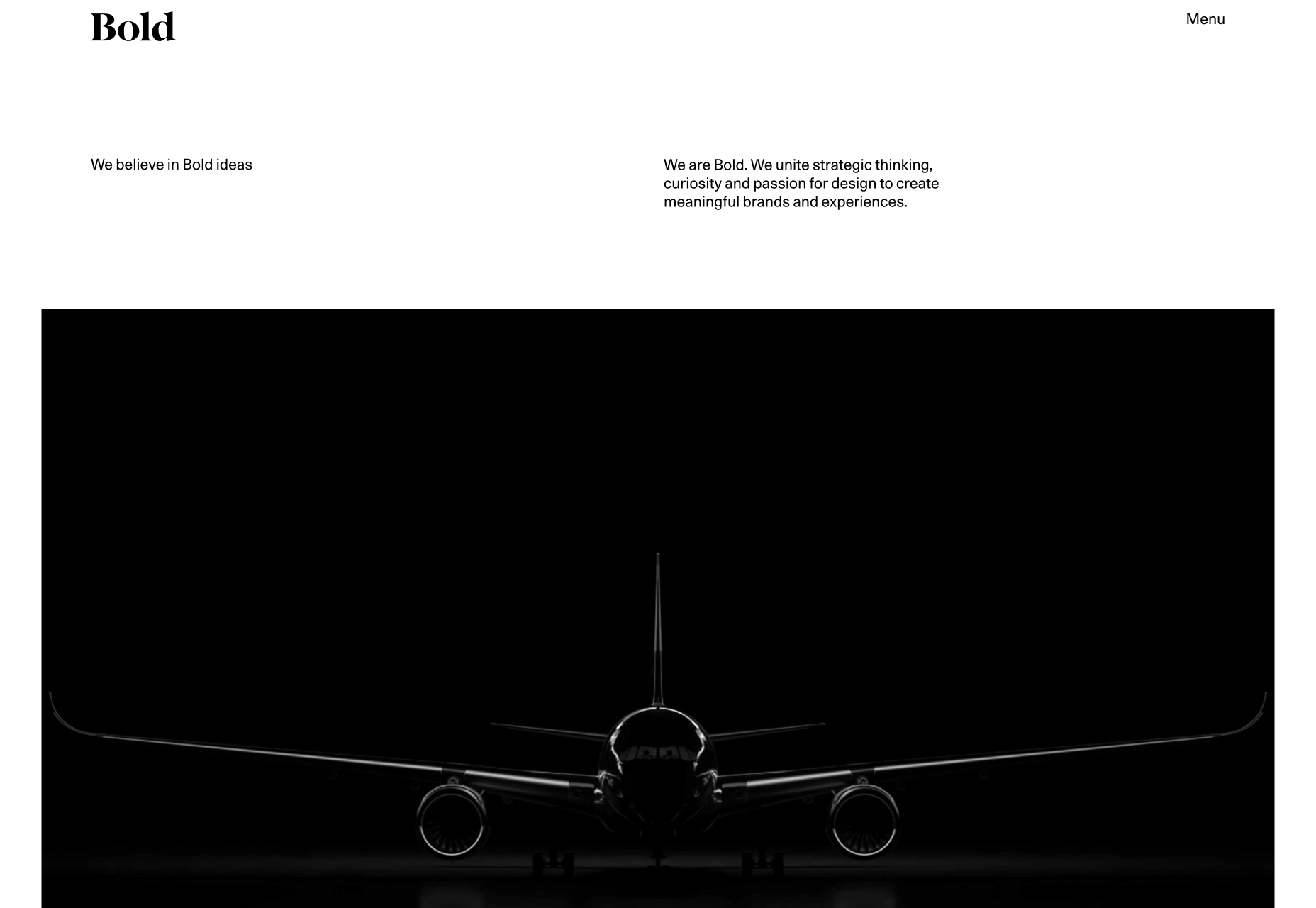
Transatlantic Film Orchestra
The Transatlantic Film Orchestra make music for video. Its website opens with calm, dark, monochromatic visuals, and absolutely no auto-play audio, which is exactly the right approach. When we actually chose to play the audio, we loved the UI.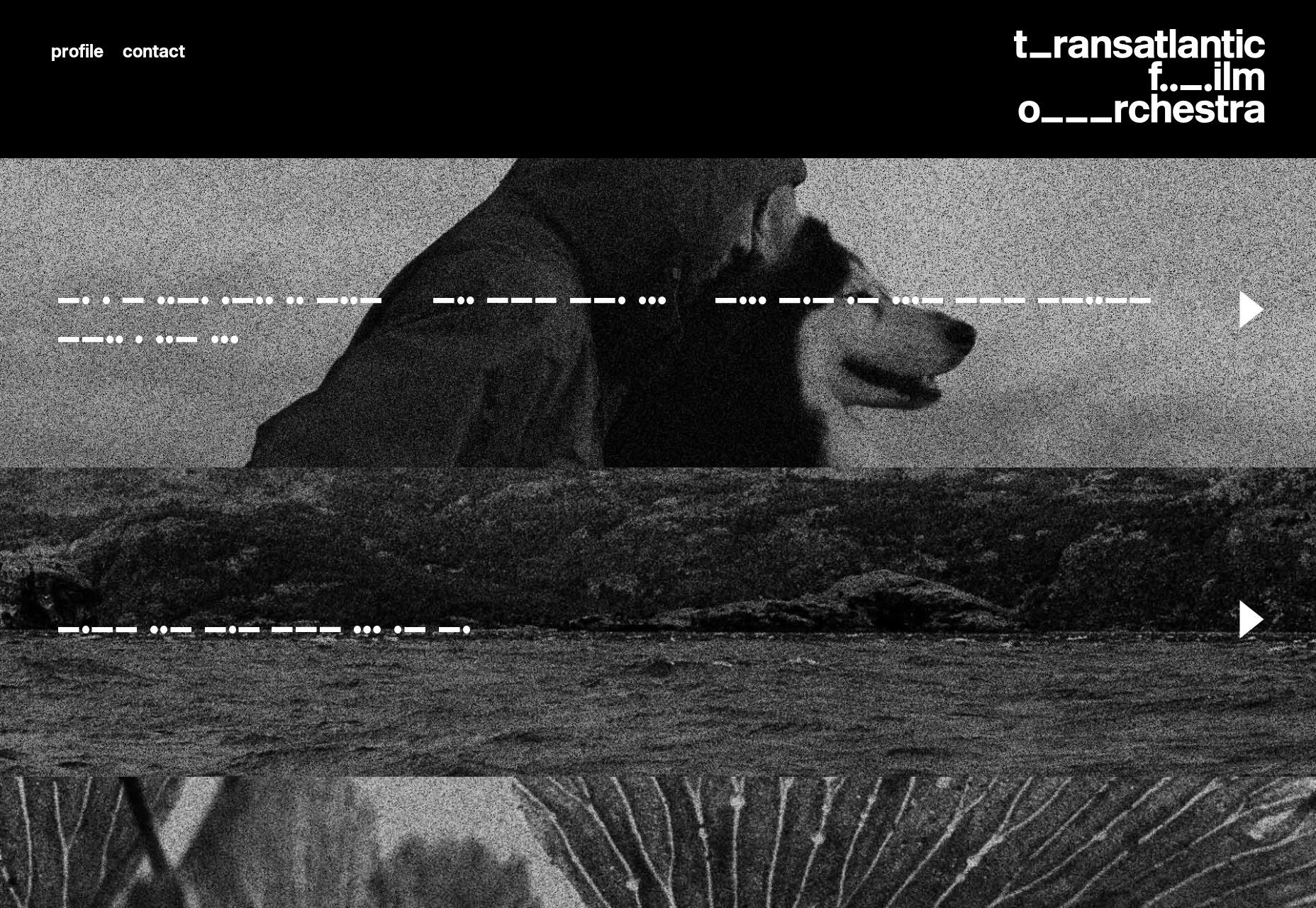
Nick Losacco
Nick Losacco’s site highlights a lot of different skills, not least his typeface design. The whole site relies heavily on bold typography and an acidic red background for its personality.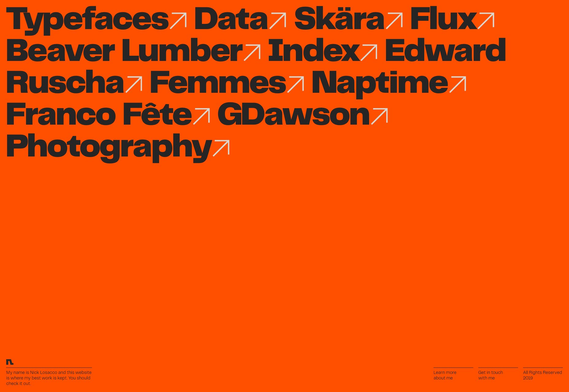
Versett
Versett’s portfolio is a clean, modern site, that leans towards a one-page approach without ever fully embracing it. It’s easy to scan if you’re a business comparing potential agencies, and we loved the “More+” menu option that herds you towards different options like product design, or launching a new company.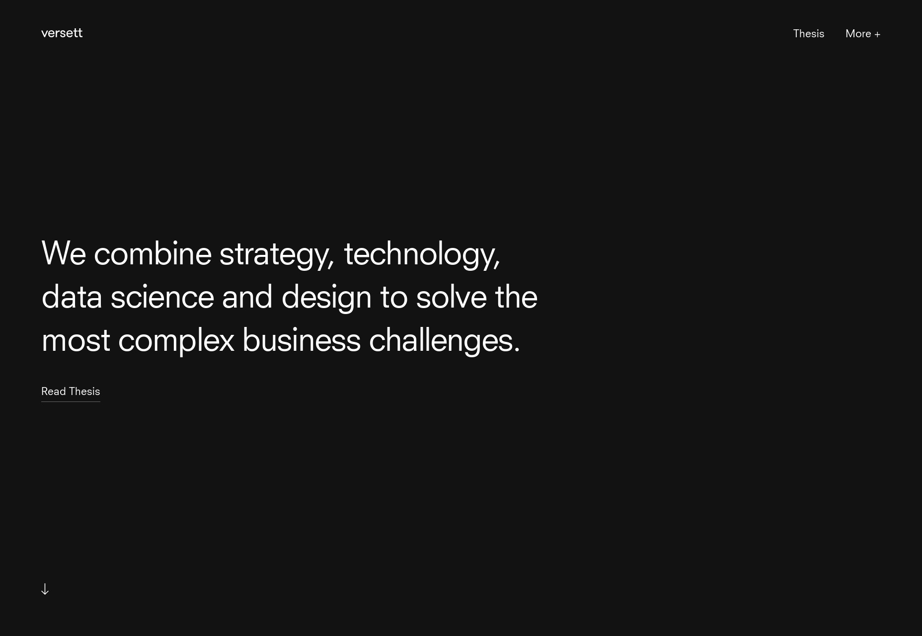
WDD Staff
WDD staff are proud to be able to bring you this daily blog about web design and development. If there's something you think we should be talking about let us know @DesignerDepot.
Read Next
15 Best New Fonts, July 2024
Welcome to our monthly roundup of the best fonts we’ve found online in the last four weeks. This month, there are fewer…
By Ben Moss
20 Best New Websites, July 2024
Welcome to July’s round up of websites to inspire you. This month’s collection ranges from the most stripped-back…
Top 7 WordPress Plugins for 2024: Enhance Your Site's Performance
WordPress is a hands-down favorite of website designers and developers. Renowned for its flexibility and ease of use,…
By WDD Staff
Exciting New Tools for Designers, July 2024
Welcome to this July’s collection of tools, gathered from around the web over the past month. We hope you’ll find…
3 Essential Design Trends, July 2024
Add some summer sizzle to your design projects with trendy website elements. Learn what's trending and how to use these…
15 Best New Fonts, June 2024
Welcome to our roundup of the best new fonts we’ve found online in the last month. This month, there are notably fewer…
By Ben Moss
20 Best New Websites, June 2024
Arranging content in an easily accessible way is the backbone of any user-friendly website. A good website will present…
Exciting New Tools for Designers, June 2024
In this month’s roundup of the best tools for web designers and developers, we’ll explore a range of new and noteworthy…
3 Essential Design Trends, June 2024
Summer is off to a fun start with some highly dramatic website design trends showing up in projects. Let's dive in!
15 Best New Fonts, May 2024
In this month’s edition, there are lots of historically-inspired typefaces, more of the growing trend for French…
By Ben Moss
How to Reduce The Carbon Footprint of Your Website
On average, a web page produces 4.61 grams of CO2 for every page view; for whole sites, that amounts to hundreds of KG…
By Simon Sterne
20 Best New Websites, May 2024
Welcome to May’s compilation of the best sites on the web. This month we’re focused on color for younger humans,…


