
Whimsical Illustrations
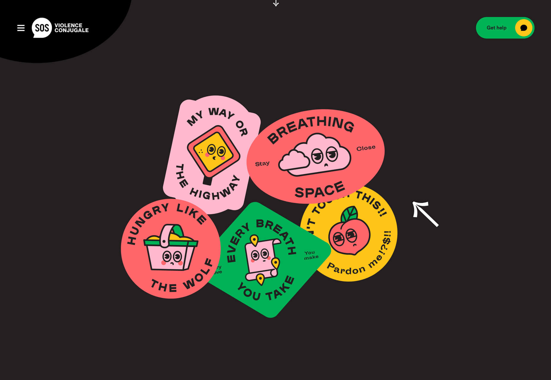
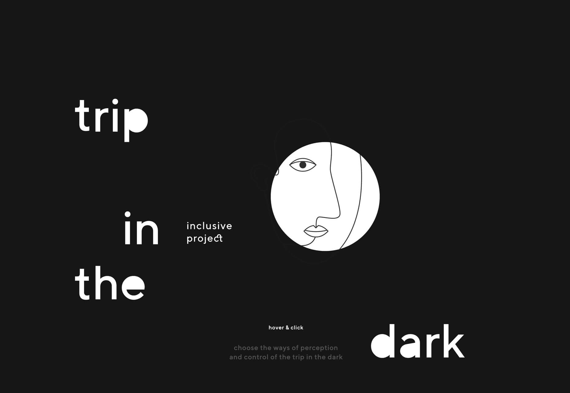
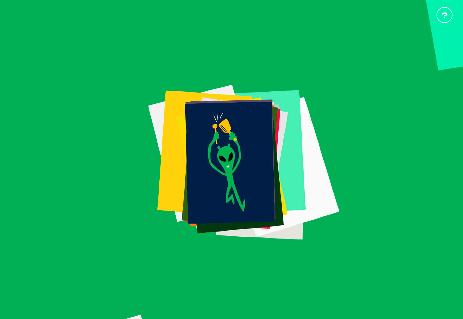
It seems like whimsical illustrations are practically everywhere. Fun drawings that can be anything from line-style illustrations to full-color pieces of art are popping up in all kinds of projects – even for brands, companies, of business types that you might not expect. Whimsical illustrations are trending for a number of reasons:- They create just the right feel for a project that doesn’t need to be heavy;
- You can design the main imagery to be whatever you want;
- They provide a source of delight for users;
- Every project using illustrations looks a little different, creating a custom design;
- The proliferation of illustration kits has made creating this style easier than ever.
Black and Blue
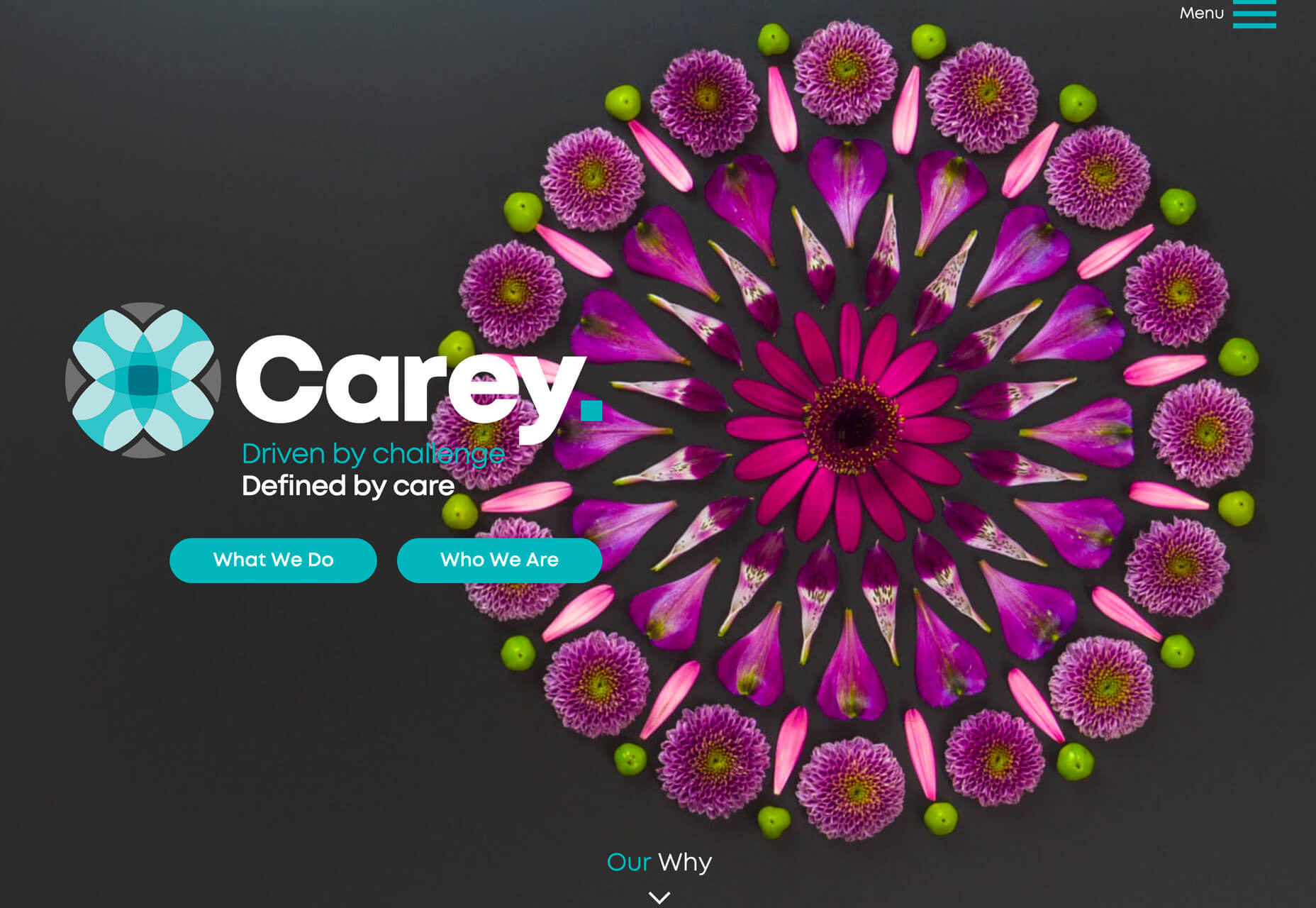
It’s a classic color combination that’s making a big return to projects – black and blue palettes. The contrast of a dark background and blue accents is eye-appealing and creates a harmonious and pleasing visual aesthetic. The projects below use this color trend in different ways, all with the same cool result. Arm Yourself uses a black background with a black and white illustration to make bright blue lettering and accents pop off the screen. Color draws users into the interactive part of the homepage design with a drag to the bullseye instruction.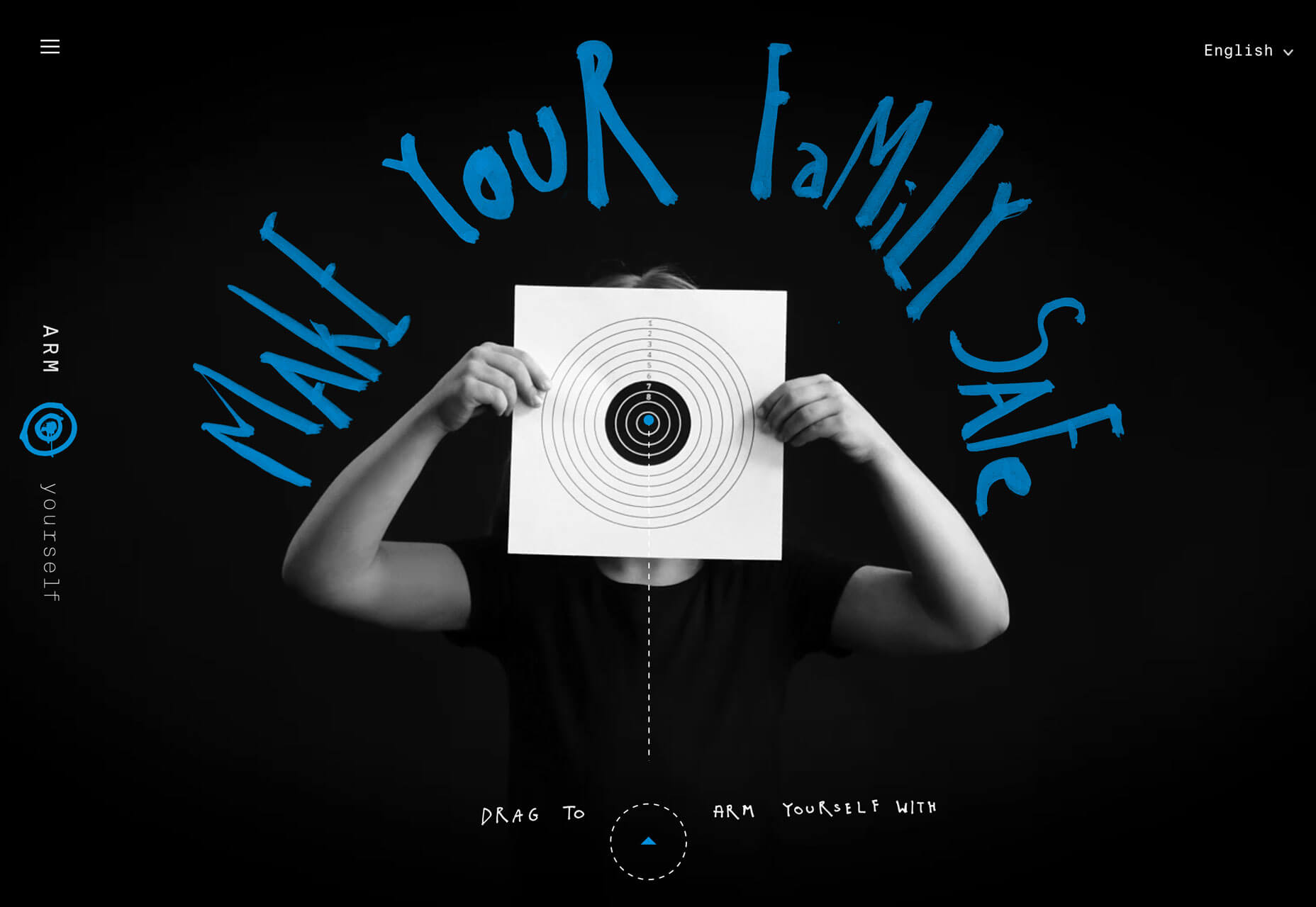 Carey uses a lighter, more teal blue on a charcoal black background for a lighter feel. The blue color pulls from the logo and brand mark with buttons that have a lot of contrast from the background and brighter elements in the design. The blue continues on the scroll with bold text on a fully black background, showing the versatility of this color choice.
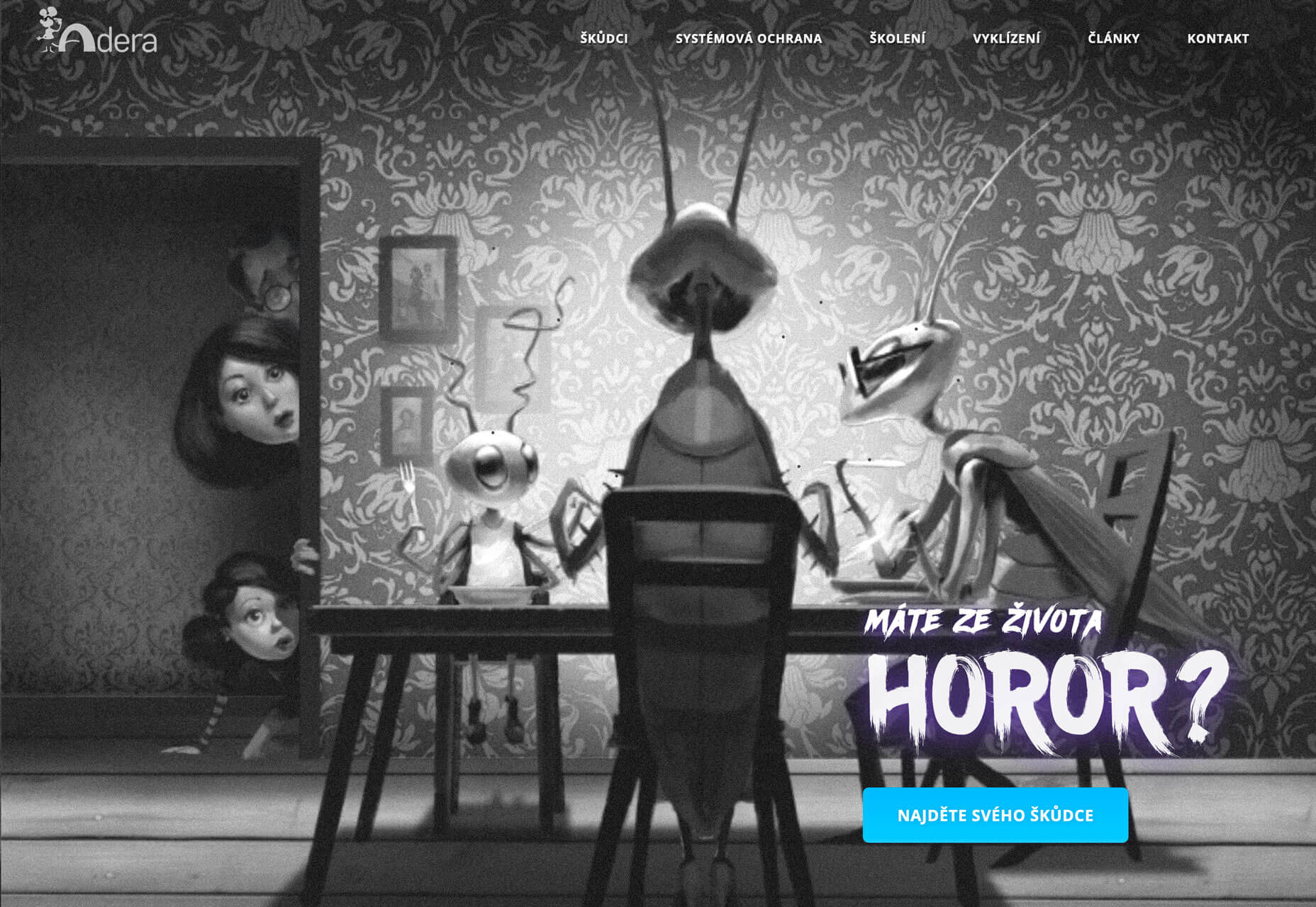
 Adera uses a simple blue button on a black and white image to create contrast and draw the eye to the active part of the design. The color palette flips on the scroll to a blue background with darker elements on top. Contrast is a vital factor here, helping dictate user flow and how to digest and interact with information on the screen.
Anything-But-Flat Scroll Transitions
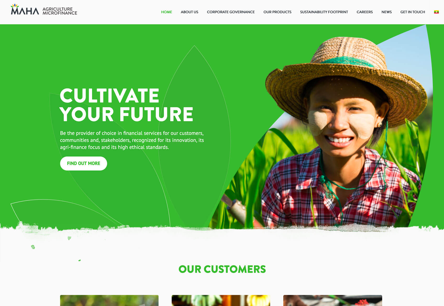
Disclaimer: I am totally in love with this trend and can’t get enough of it. Anything-but-flat scroll transitions is a versatile design trend that’s visually interesting and contributes to usability. (It’s a win-win!) This trend is exemplified by a transition element between “screens” or “scrolls” with a visual that isn’t just a box or flat line. Think of how most parallax designs or screen-based vertical viewpoints advance from one box to another. With this trend the transition is more fluid. The examples below do this in different ways: Oroscopo takes advantage of the blobs trend that’s been popular all year with blob elements that create waves between content elements. Contrast between light and dark backgrounds magnify this effect, while other blog shapes create visual consistency.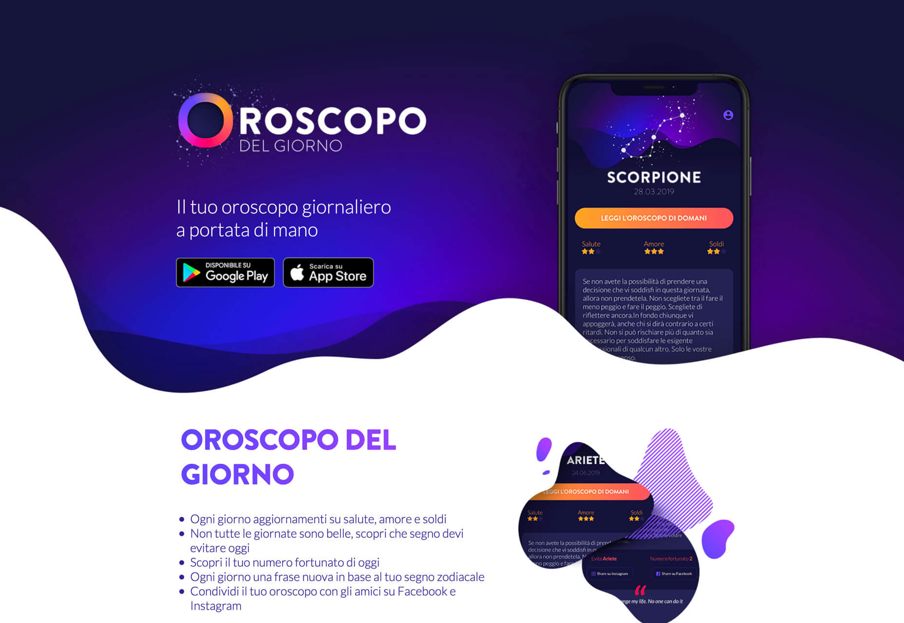 MAHA Agriculture Microfinance uses a simple line between scroll elements but it’s got a texture to it that makes it just a little more visually interesting that having a flat line between the hero image area at the top and the secondary content block.
 Akaru uses a pretty amazing animated fluid design to offset the branding in the center of the screen. The animation carries into the background of the content below the scroll. (You’ll want to scroll all the way to the bottom of this one to see the transition from the dark animation back to white.) The effect is stunning.
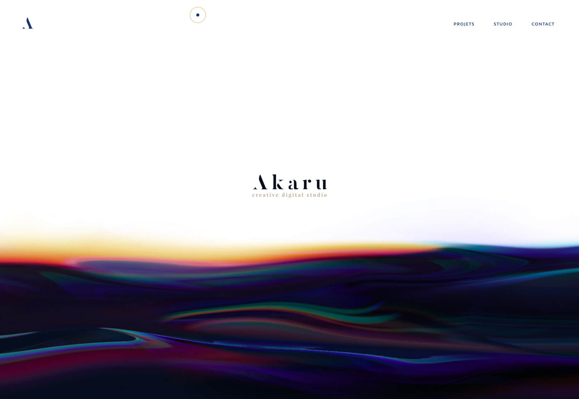 Here’s why this trend works so beautifully: The fluid transition is somewhat disruptive because the user doesn’t expect this visual and seeing the edge of a transitional element encourages scrolling. Whether the user scrolls to see how the transition changes or to preview more content is irrelevant as long as the interaction happens. It’s brilliant and beautiful, especially on desktop screens.
Conclusion
The best design trends are versatile enough that you can use them in new projects or incorporate them into websites that are already live for a little refresh. A custom illustration can add extra interest to a hero area or page within your website, a tweak to the color palette can create a brilliant black and blue combination, or a neat transition can help users engage with the scroll. If you want to spice up a project, these trends fit the bill for sure.Carrie Cousins
Carrie Cousins is a freelance writer with more than 10 years of experience in the communications industry, including writing for print and online publications, and design and editing. You can connect with Carrie on Twitter @carriecousins.
Read Next
15 Best New Fonts, July 2024
Welcome to our monthly roundup of the best fonts we’ve found online in the last four weeks. This month, there are fewer…
By Ben Moss
20 Best New Websites, July 2024
Welcome to July’s round up of websites to inspire you. This month’s collection ranges from the most stripped-back…
Top 7 WordPress Plugins for 2024: Enhance Your Site's Performance
WordPress is a hands-down favorite of website designers and developers. Renowned for its flexibility and ease of use,…
By WDD Staff
Exciting New Tools for Designers, July 2024
Welcome to this July’s collection of tools, gathered from around the web over the past month. We hope you’ll find…
3 Essential Design Trends, July 2024
Add some summer sizzle to your design projects with trendy website elements. Learn what's trending and how to use these…
15 Best New Fonts, June 2024
Welcome to our roundup of the best new fonts we’ve found online in the last month. This month, there are notably fewer…
By Ben Moss
20 Best New Websites, June 2024
Arranging content in an easily accessible way is the backbone of any user-friendly website. A good website will present…
Exciting New Tools for Designers, June 2024
In this month’s roundup of the best tools for web designers and developers, we’ll explore a range of new and noteworthy…
3 Essential Design Trends, June 2024
Summer is off to a fun start with some highly dramatic website design trends showing up in projects. Let's dive in!
15 Best New Fonts, May 2024
In this month’s edition, there are lots of historically-inspired typefaces, more of the growing trend for French…
By Ben Moss
How to Reduce The Carbon Footprint of Your Website
On average, a web page produces 4.61 grams of CO2 for every page view; for whole sites, that amounts to hundreds of KG…
By Simon Sterne
20 Best New Websites, May 2024
Welcome to May’s compilation of the best sites on the web. This month we’re focused on color for younger humans,…


