Less is (Almost) Definitely More: An Introduction to Hick’s Law for Web Designers
Hick’s Law describes how the number of choices you present to people affects the time it takes them to respond. This has important implications for UX and UI design, driving important metrics like bounce, engagement and average time on page.

What is Hick’s Law?
In simple(ish) terms, Hick and Hyman both found that, when people are presented with more choices, the increase in their response time is logarithmic. This just means that, as the number of choices increases, the response time increases at a decreasing rate. In the end, increasing the number of choices stops making much difference. Don’t panic, here’s a picture: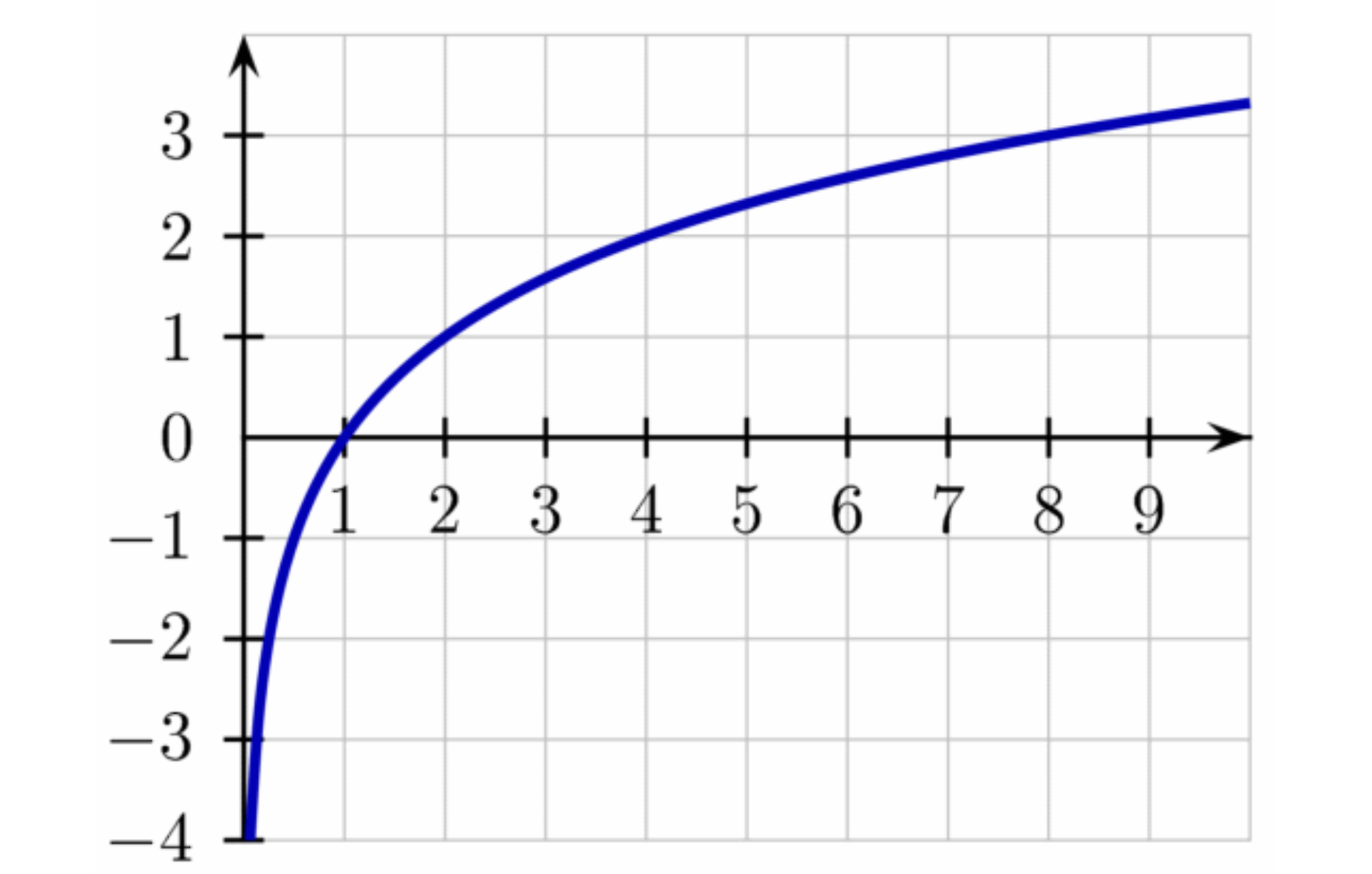 You can think of the horizontal axis as the number of items to choose from, and the vertical axis as time. Notice, that for 1 item, the choice time is 0. Adding more choices makes a big difference in the beginning, but much less towards the end.
This law really only applies for sorted lists and tends to break down as choices become more complex, as we'll see.
It actually describes a kind of binary search. Those of you who got further in computer science than I did will recognize that this means half of the remaining items are searched at a time. The remaining half is subdivided, one half of it is searched and so on. In human terms, it’s like narrowing down the search of, say a buffet table, by deciding if you’re going to start on the right or left. Then, having chosen the right side, deciding whether to start with soup or salad.
The law applies equally to the number of stimuli (say, menu items) and the number of responses. So a menu like this:
You can think of the horizontal axis as the number of items to choose from, and the vertical axis as time. Notice, that for 1 item, the choice time is 0. Adding more choices makes a big difference in the beginning, but much less towards the end.
This law really only applies for sorted lists and tends to break down as choices become more complex, as we'll see.
It actually describes a kind of binary search. Those of you who got further in computer science than I did will recognize that this means half of the remaining items are searched at a time. The remaining half is subdivided, one half of it is searched and so on. In human terms, it’s like narrowing down the search of, say a buffet table, by deciding if you’re going to start on the right or left. Then, having chosen the right side, deciding whether to start with soup or salad.
The law applies equally to the number of stimuli (say, menu items) and the number of responses. So a menu like this:
 will take more time to process than a menu like this:
 If you can’t break down the choices logically (because the list is random, for example), searching in a binary fashion won’t help. This is also true in situations where you’re familiar with the interface, or guess (correctly) in advance which choices you’ll be offered. These, then are exceptions to Hick’s Law.
It doesn’t really apply, for example, when deciding “how to manage your time”…
If you can’t break down the choices logically (because the list is random, for example), searching in a binary fashion won’t help. This is also true in situations where you’re familiar with the interface, or guess (correctly) in advance which choices you’ll be offered. These, then are exceptions to Hick’s Law.
It doesn’t really apply, for example, when deciding “how to manage your time”…
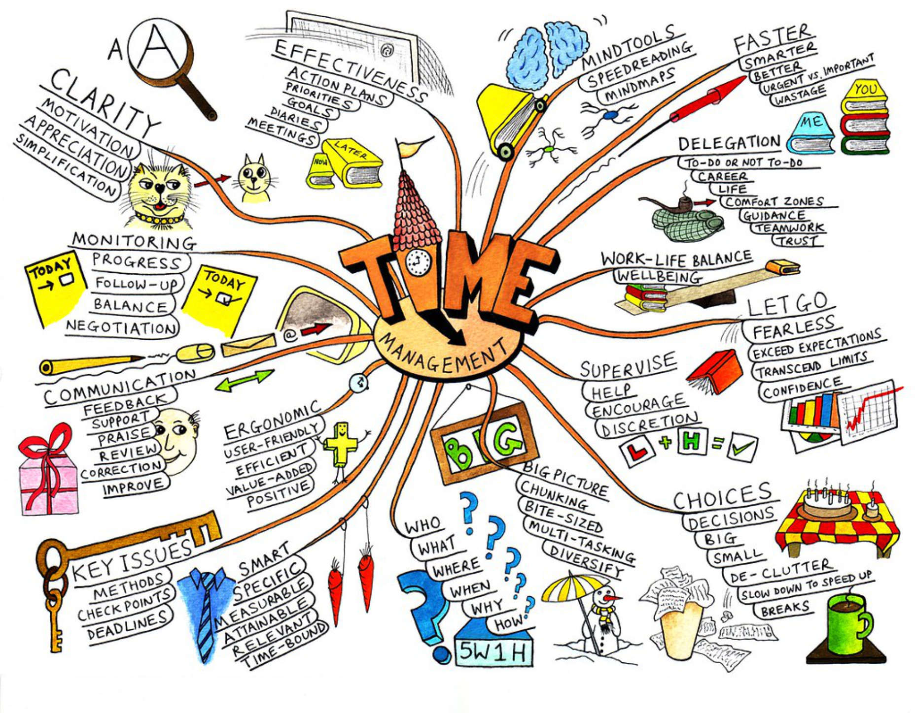 Time Management Choice by Jean-Louis Zimmerman via Flickr.
Relevance to Web Design
Here’s a simple rule: The longer it takes to make a choice, the easier it becomes to make no choice at all. Don’t be that designer! Most of the time, less is more. There are four performance metrics that are strongly affected by Hick’s law:- Bounce
- Engagement
- Average Time on Page
- Subjective User Experience
Bounce
The big problem here is information overload. If you arrive on a landing page and see something like this: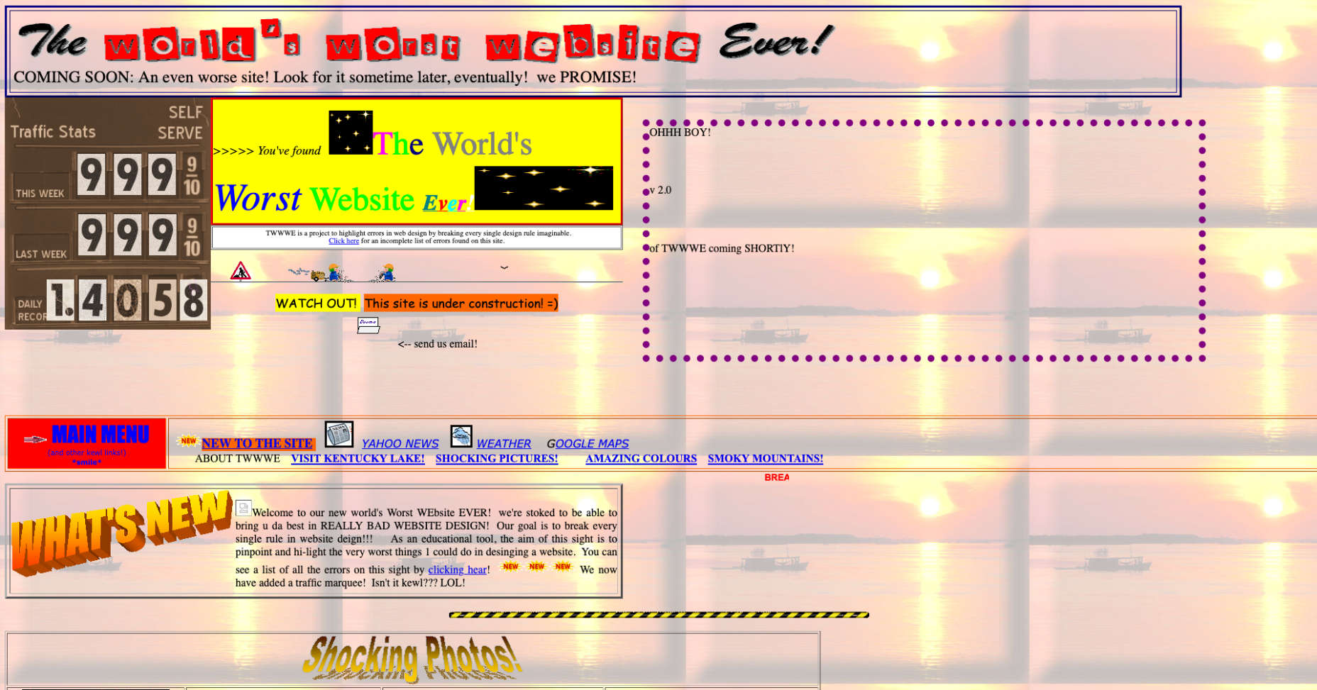 You “might” start by trying to make a decision about where to go next, but pretty soon you’re going to just, err… go. This is one good reason why less is more.
Engagement
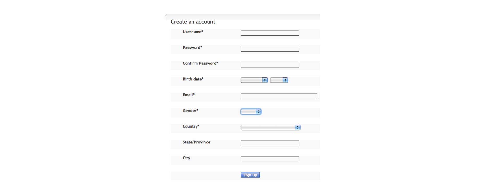
Users don’t want to be faced with tough decisions or to spend a lot of time getting through things like registration. They want to get to the content they’re looking for as fast as possible. If your sign up process looks like this: You’d probably be better off with something like this:
 Even if you then go on to ask them more information, you can do it in small chunks. If not you risk losing people halfway through.
Average Time on Page
This is one situation where less may not be more: the more items you have on the page or in a menu — as Hick’s law tells you — the longer they’ll spend on it. The gamble is that having too many items will risk a bounce.Subjective User Experience
In many ways, what users say or feel about their experience is more important than any hard metric. Take frustration for example. If you’ve never seen "User Inyerface" and/or never felt frustration, try it, it’s hilarious. And also not. From a Hick’s law point of view, User Inyerface illustrates three really important things:- If you can’t find an option, it doesn’t count as an option.
- Unless you use a consistent method for identifying potential choices (a mouse-pointer change or relevant label, for example), everything becomes a potential choice!
- Frustration is a powerful driver to abandon any activity, no matter how much you might want to complete it.
Important Uses for Hick’s Law
Hick’s law is powerful but doesn’t apply in every situation. As a web designer, you can exploit both these facts to your advantage.Group Menu Items Together
Using meaningful headings: product categories, for example, turns one massive choice into lots of smaller ones: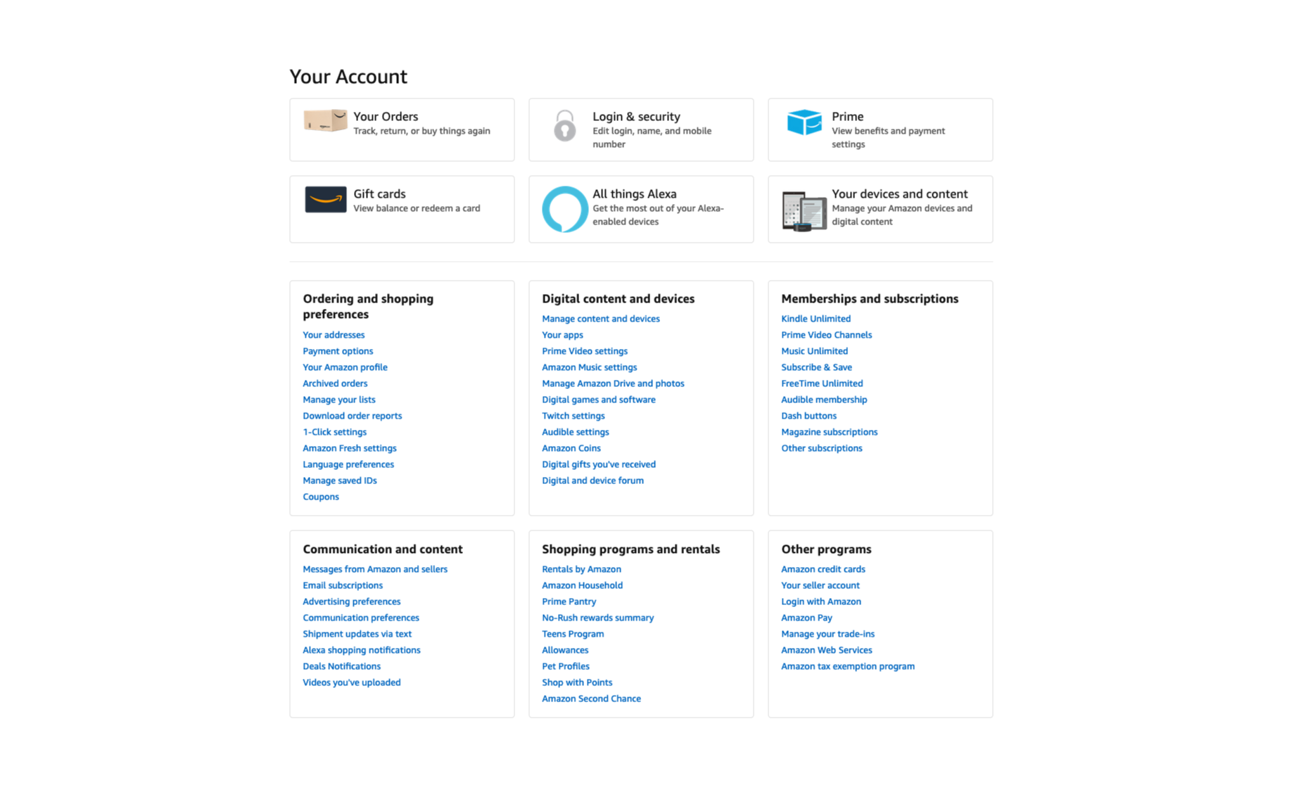 Decision times will be shorter, and your users will get a fast, breezy experience.
Consider Contrast
By using contrasting color, shape, size and texture, you can indicate choices more clearly. As well as a way of grouping similar or important options, this uses familiarity to decrease response times and improve user experience. A good example of this is in guiding users towards “safe” options to help them avoid negative outcomes.Think About Goals
Remember that the decision-making process always begins with a goal. Understand the most likely goals of your users. When ordering and grouping menus, think about how users will segment their choices. WhatsApp, for example, offers 5 “Frequent Contacts” before presenting an alphabetical list.
Research and Test
Don’t leave it to chance. Find out what works for other sites, and, more importantly for your users before going live.Exceptions to Hick’s Law
Exceptions to Hick’s law, aside from long, unordered lists (which you want to avoid at all costs), involve cases where there is familiarity, and users can guess what’s coming next.Meet Expectations
There are clear conventions for things like buttons, links, information hierarchy and standard icons. By adhering to these conventions you’ll allow your users to break Hick’s Law and save time in their decision making, even when there are a lot of options.Don’t Forget Your Users
You know your site or application really well so, in testing your own work, your experience will be much smoother than theirs. Get other people to test it for you before the client does.Key Points
Hick’s Law means that the more choices you offer to your users, the longer it will take them to pick one. In a web design context, long choice times tend to mean higher bounce, lower engagement and more user frustration. That’s why, in general, less is always more. The law is based on binary choice, so it’s important to segment the choices you present, and order them in clear, logical, user-centered ways. This will help to break large menus up into smaller “sub choices”. You can find creative ways to do this with things like color, shape and texture. Where average time on page is concerned, there’s a balance to be struck between decreasing choice time, and holding attention. Realistically, though, UX is more important than metrics.WDD Staff
WDD staff are proud to be able to bring you this daily blog about web design and development. If there's something you think we should be talking about let us know @DesignerDepot.


Read Next

15 Best New Fonts, July 2024
Welcome to our monthly roundup of the best fonts we’ve found online in the last four weeks. This month, there are fewer…
By Ben Moss

20 Best New Websites, July 2024
Welcome to July’s round up of websites to inspire you. This month’s collection ranges from the most stripped-back…

Top 7 WordPress Plugins for 2024: Enhance Your Site's Performance
WordPress is a hands-down favorite of website designers and developers. Renowned for its flexibility and ease of use,…
By WDD Staff

Exciting New Tools for Designers, July 2024
Welcome to this July’s collection of tools, gathered from around the web over the past month. We hope you’ll find…

3 Essential Design Trends, July 2024
Add some summer sizzle to your design projects with trendy website elements. Learn what's trending and how to use these…

15 Best New Fonts, June 2024
Welcome to our roundup of the best new fonts we’ve found online in the last month. This month, there are notably fewer…
By Ben Moss

20 Best New Websites, June 2024
Arranging content in an easily accessible way is the backbone of any user-friendly website. A good website will present…

Exciting New Tools for Designers, June 2024
In this month’s roundup of the best tools for web designers and developers, we’ll explore a range of new and noteworthy…

3 Essential Design Trends, June 2024
Summer is off to a fun start with some highly dramatic website design trends showing up in projects. Let's dive in!

15 Best New Fonts, May 2024
In this month’s edition, there are lots of historically-inspired typefaces, more of the growing trend for French…
By Ben Moss

How to Reduce The Carbon Footprint of Your Website
On average, a web page produces 4.61 grams of CO2 for every page view; for whole sites, that amounts to hundreds of KG…
By Simon Sterne

20 Best New Websites, May 2024
Welcome to May’s compilation of the best sites on the web. This month we’re focused on color for younger humans,…