1
Sometimes website design trends are strong and hit you in the face; others are subtle and require a second look. This month, you’ll get a little of each.
The first trend in our collection is a strong and subtle, trend No. 2 is mostly subtle unless you have a keen eye for typography, and trend No. 3 comes at you with full force.
Here’s what’s trending in design this month.
1. Strong Hero Images with Subtle Text
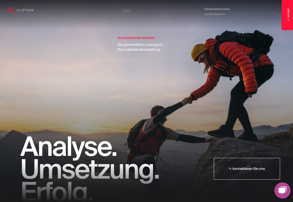
The contrast and yin and yang influence of strong and subtle elements in this trend results in a fantastic visual. These website designs which feature strong hero images (or video) with subtle typography draw the eye and create immediate intrigue.
Strong imagery pulls you in and the key to text elements that work is placed in a location that moves the eye through the image around the screen.
Each of these examples uses this trend in a different way, but each is engaging and makes you want to jump into the scene. Most of the “readable” information from the design comes from the image or visual presentation. The text serves as a secondary informational element.
It’s quite a shift from many of the oversized typography and hero treatments that have dominated website design for the last few years. The simplicity is fabulous.
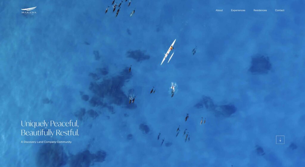
Makena Golf Club uses a video reel of the location to make you want to go there. The text element in the bottom corner never changes, and sticks with you as you look at the images.

TEDx TughlaqRd uses a striking black and white image to draw the eye with smaller text elements that explain what you are seeing. You might even go back to the image and recognize the iconic “x” after reading the words.

Under Lucky Stars might be the simplest example of the trend but it gives you everything you need. The slider shows a cityscape with and without light pollution. The small text element serves as an identifier.

2. Modern Serifs
Modern serif typography can be identified by the use of alternative thick and thin strokes in each letterform. The typography style has been popular with printed works for decades, such as newspapers and books, but is emerging as a lovely website type option.
Modern serif first emerged in the late 18th century and while many have extreme variances in thick and thin strokes, that is not always the case. When used for website projects, this contrast is often less pronounced.
This typography trend is likely emerging now because screen resolutions are high-quality enough to support it. Pixilation, backlighting, and small sizes can make modern serifs somewhat challenging to read on screens. But more of these concerns have vanished.
If you aren’t sure where to start with serif fonts, Typewolf has a nice collection of popular options and where to find them. The Top 10 trending list is updated regularly.
Modern serifs can inject a lot of personality into a project and are almost an art element of their own. Notice how each of the examples below use typography as the dominant element on the screen.
Altermind features a strong modern serif for center branding and identification with a subtle but interesting background. The white text on a dark backdrop is classic and encourages readability.

Widr Pay mixes a modern serif with an uber-trendy bright background for a super modern (and maybe a little bit retro) style. The contrast brings attention to the stacked text element.

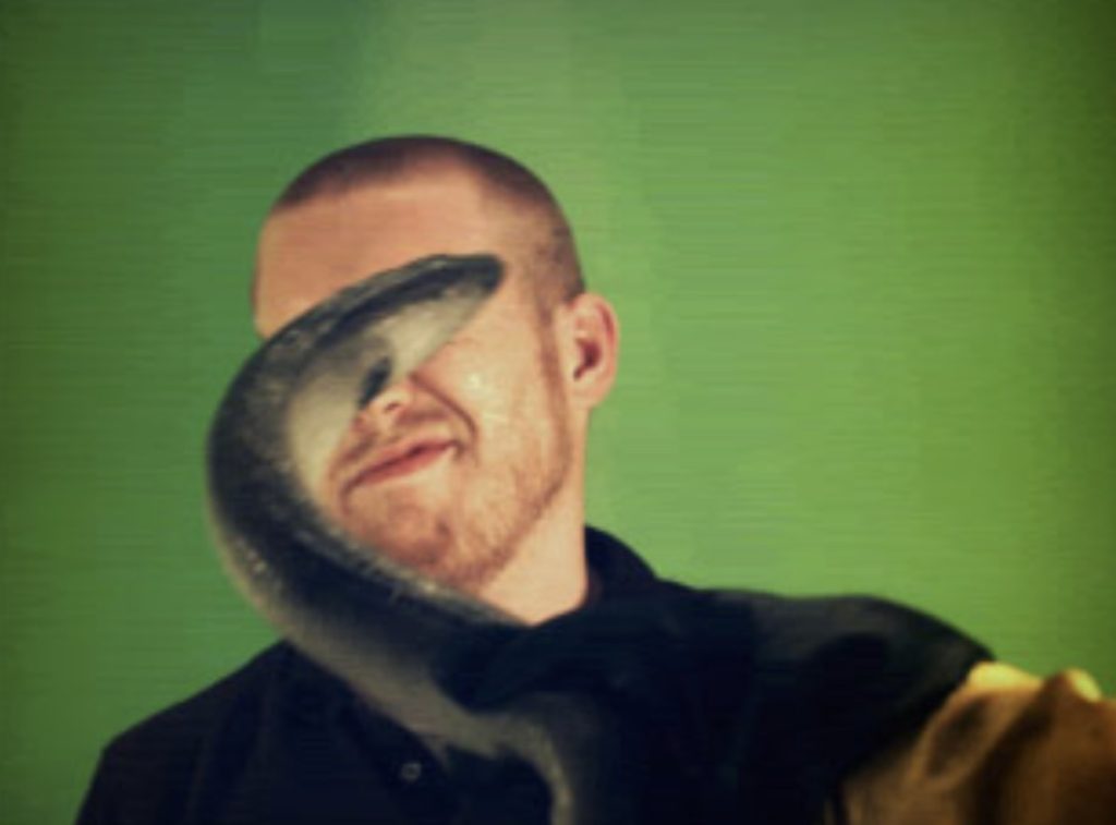
Thomas Bosc uses a text overlay on an image – admittedly somewhat challenging in terms of readability – to draw users into his portfolio. The animated hover trick is worth a click-through. (His face pulls to the front of the text.)

3. Brutalism Influences
Brutalism is one of those website design trends that seems to make an appearance then fade away again. These designs can be harsh and intimidating. You need just the right content to make it work.
The examples below show that using brutalism influences can be a workable middle ground, or help create a less garish aesthetic that is a little more user-friendly.
The influences here include boxy, sharp typography styles as well as monospaced fonts; visible pixels and sharp edges; dark color schemes; and almost glitchy animation.
Whether you are a fan of brutalism or not, you can appreciate the elements in these projects.
WeThem.Us uses a video real that has an 80s gamification and movie theme. Everything is sharp and low-res, with no real type elements other than the main navigation until the end credit screen. What this example shows is the emotional/generational connection that this style can convey.

Republish is interesting because the typefaces on the screen aren’t really brutalist, but the display and organization of information is. This is a neat way to use concepts of brutalism without overwhelming users with this design theme.

Uroboros Design-Art Festival is the most brutal of the examples, but there are hints of modernism in the crisp, round center animation. It’s not fully brutalist, but close. The information below the scroll carries the monospaced font, but a mostly black and white aesthetic is clean and sharp, much less jarring than the hero area on the home page.

Conclusion
One of the most fun things to look at when studying website design trends is how many elements overlap. Note the modern serif used with the strong hero/subtle text trend. Note how some of the text elements in the modern serif trend aren’t as oversized and bold as we have seen most recently.
Design trends such as these are nice because they are versatile and usable. While we aren’t seeing a lot of sweeping change right now, these tweaks are inspiring and interesting.
20 Useless Websites to Waste Your Time
The internet is usually a place for “getting things done,” but sometimes the soul just needs a little bit of high-quality nonsense. These websites aren’t trying to sell you a…
Exciting New Tools for Designers, February 2026
There are so many new – and good – tools for designers out there right now. From tiny bits of artificial intelligence to icons that delight, there’s something to help…
Exciting New Tools for Designers, March 2025
Spring into action this season with new tools to boost your workflows, facilitate creative thinking, and help you be a more efficient designer. This roundup is packed with new goodies…
Compilation: 15 Hilarious Google Flops
When it comes to tech, Google has been synonymous with innovation, success, and world domination (hello, Android and Chrome!). But even the mightiest giants trip over their own feet from…
3 Essential Design Trends, January 2025
Happy New Year! If the website design trends we are already seeing are any indication, 2025 is going to be a great year for visual communication. This month’s collection of…
Exciting New Tools For Designers, January 2025
Welcome to our first tools round up of 2025. It’s the first Monday of a new year, and many of you are back at work after a much needed break….