

What Are Mental Models?
Before we move on to examples, we’ll go through the definition real quick. Rooted in philosophy and psychology, the term mental model is now commonly used to describe human-computer interaction. It describes how the user already has an idea about how something works. In other words, it’s a representation of what the user knows about the website before they even start using it. [pullquote]it’s a representation of what the user knows about the website before they even start using it[/pullquote] Nielsen Norman Group, an acclaimed research institute, has examined the topic in more detail. They emphasize an important aspect of this definition: a mental model is not factual; it’s only based on the beliefs and predictions that come from the user’s previous experiences. Because of that, every user has different mental models. The background varies from person to person. Of course, it’s often similar, but never exactly the same. Now that you have an idea of what a mental model is, it’s time to move on to the main topic: how does this concept apply to web design?How Mental Models Affect Web Design
We use a wide range of digital products every day. Based on these interactions, our brains have developed a variety of mental models for interfaces. This is clearly visible in the case of kids who have been raised using touchscreens. You might have seen a small child that’s pretty fluent with a tablet and a mobile phone, but when you give them a book, they will try swiping too. It’s because they’re already familiar with one pattern and they’ll automatically apply it to other objects that look similar or have a similar function. As adults, we’re just as prone to similar patterns. We’re living with certain beliefs about web pages. Some of them have been with us for years, such as:- Links should be underlined or displayed in a different color;
- The logo of the company is in the top left-hand corner;
- The sign-up button is in the top right-hand corner.
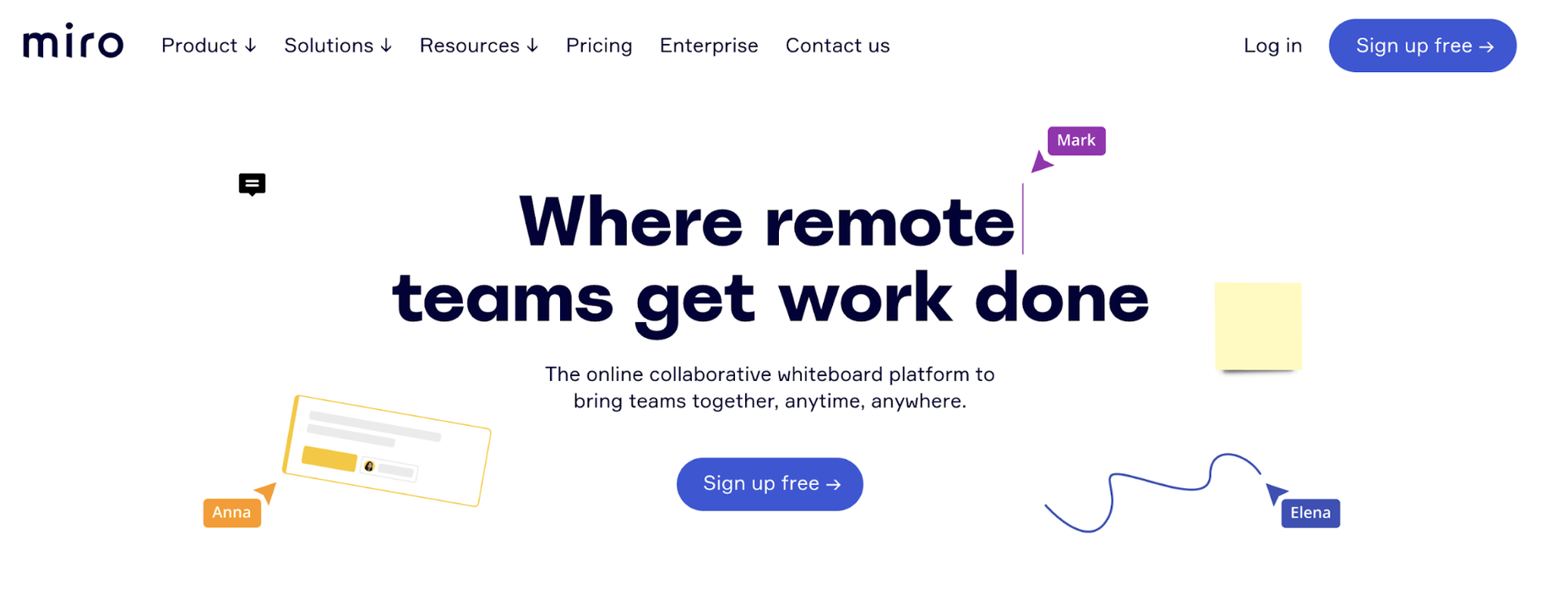
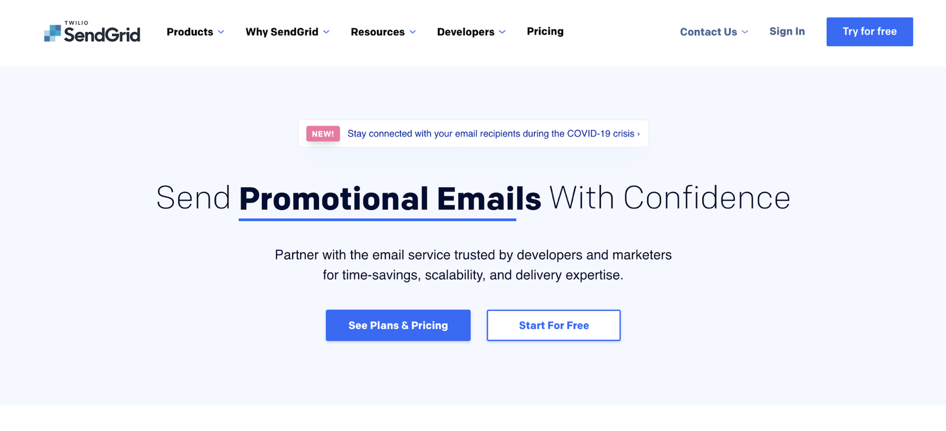
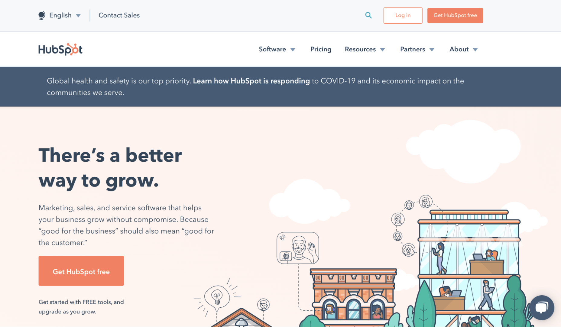 Although the placement of the sign-up button varies slightly depending on the design, these landing pages coming from top software companies prove that the Z-pattern is alive and well.
Mental Models and Jakob’s Law
No matter how much you love your creation, you need to face the facts: your users spend the majority of their time on other websites. This is the main idea behind Jakob’s Law, a principle created by Jakob Nielsen of the Nielsen Norman Group. Although it may sound like a limitation at first, this law is not a boundary to your creativity. Instead of being a restriction, it can make your work much easier. Jakob’s Law saves you from reinventing the wheel. You can stick to recognized solutions and focus on optimizing the little details that make the difference. Doesn’t that sound good? It’s like someone has already done the legwork for you. Apart from mental models, there’s still a lot of work to do, from content design to little visual touches.Mental Models in the Redesign Process
‘Better’ can be an enemy of ‘good’. Every redesign process comes with certain risks. Even though you’re doing your best to improve the user experience, every change means you’re challenging the user’s existing mental models. You may get it right, but you might also get it terribly wrong. One of the most prominent examples of redesign fails comes from Snapchat. As reported by TechCrunch back in 2018, they decided to change the whole navigation in the app: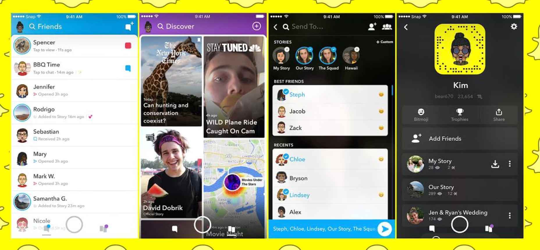 Most users were annoyed with the new information architecture. Public Stories got mixed with private Messages. What’s more, they weren’t displayed chronologically anymore. This new order caused confusion and led to huge frustration, resulting in 83% of App Store reviews being negative. The change turned out to be too drastic; it required the users to change their mental models quite dramatically.
Although not perfect, the old version of the app answered the users’ needs. There was no point in redesigning the whole experience just for the sake of creating something new. This decision also had a negative impact on Snapchat’s revenue. After a period of stable growth throughout 2017, the earning in the first quarter of 2018 fell by 20%.
There is another side to the story. Although Snapchat failed to focus on existing mental models, it has done a fantastic job when it comes to introducing new ones. The app was the first one to create the widely known interface for Stories:
Most users were annoyed with the new information architecture. Public Stories got mixed with private Messages. What’s more, they weren’t displayed chronologically anymore. This new order caused confusion and led to huge frustration, resulting in 83% of App Store reviews being negative. The change turned out to be too drastic; it required the users to change their mental models quite dramatically.
Although not perfect, the old version of the app answered the users’ needs. There was no point in redesigning the whole experience just for the sake of creating something new. This decision also had a negative impact on Snapchat’s revenue. After a period of stable growth throughout 2017, the earning in the first quarter of 2018 fell by 20%.
There is another side to the story. Although Snapchat failed to focus on existing mental models, it has done a fantastic job when it comes to introducing new ones. The app was the first one to create the widely known interface for Stories:
 Snapchat’s interface
This one was simple and intuitive – and that’s why Instagram and Facebook Messenger have both adapted it successfully:
Snapchat’s interface
This one was simple and intuitive – and that’s why Instagram and Facebook Messenger have both adapted it successfully:
 Instagram’s copy
 Facebook’s version
And so we’re faced with the big question: how do you get it right?
Facebook’s version
And so we’re faced with the big question: how do you get it right?
How to Learn About Your Users’ Mental Models
Honest research is the answer here. One of the most popular methods is card sorting. The idea is simple: users see a list of elements of the website, and they’re supposed to assign them to different categories. You can use different types of card sorting for your research:- Closed card sorting – You present the users with given categories that have been established before the exercise.
- Open card sorting – The research participants are supposed to assign the elements into groups that feel right. The difference is that the users create the categories and their names themselves.
- Hybrid cart sorting – In this case, users work with pre-made categories but they can also add extra ones if they think that’s needed.
 If you’re looking for other affordable yet effective methods, you might want to try session recordings. Session replay tools allow you to see how the visitors are interacting with your website. You can see mouse moves, scrolls, taps, and clicks, just like you’re sitting next to the user.
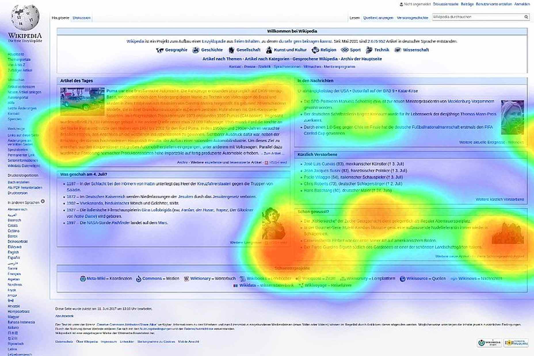
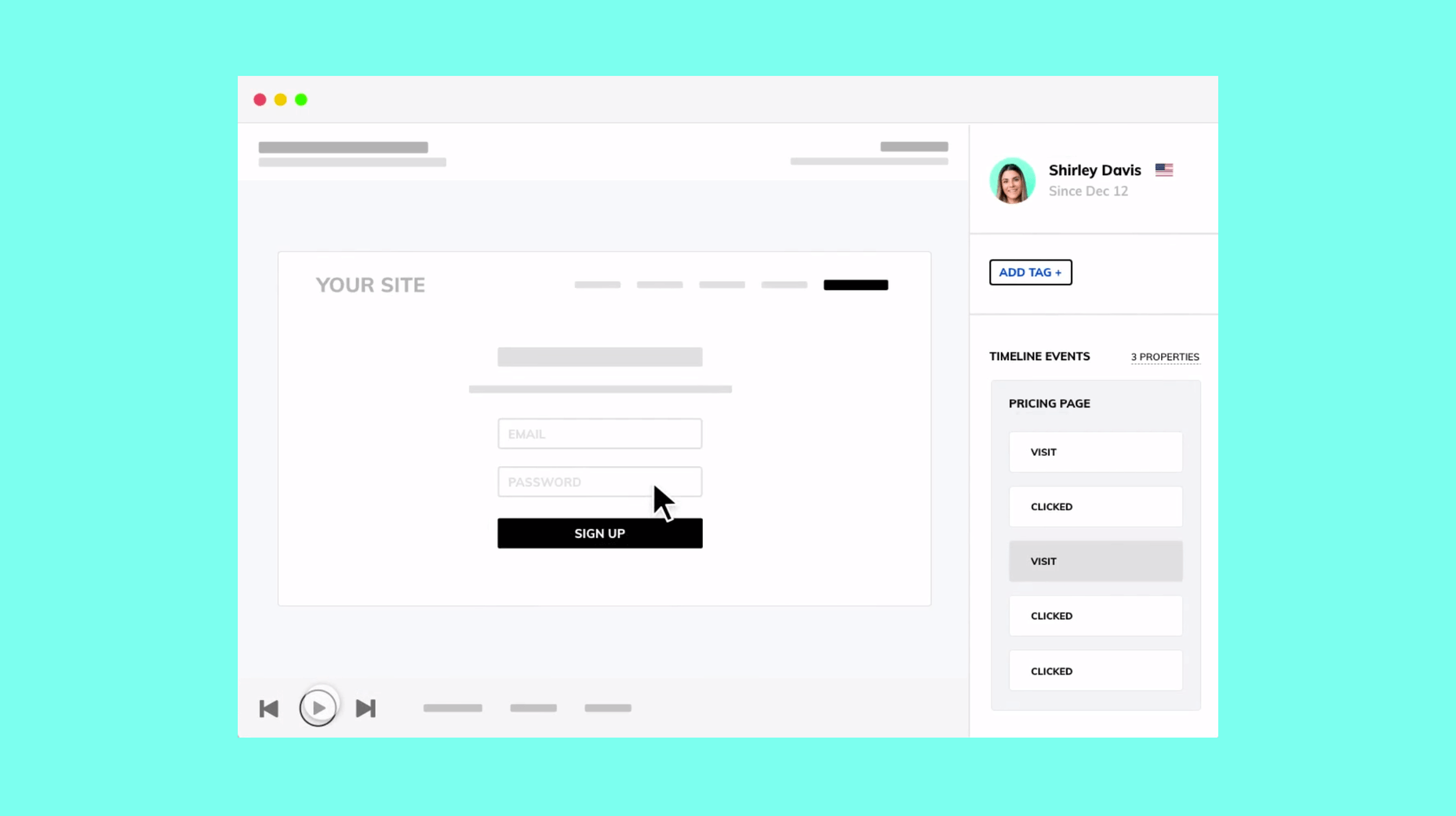 Apart from session recordings, you can also use heatmaps to see which parts of the website are most popular. As mentioned above, analytics tools track mouse movements and clicks, which allows for a quite accurate illustration of certain behavioral patterns.
 Last but not least, it’s always best to talk to your users. Surveys, user testing, or even focus groups are all goldmines of valuable information. Although this requires more effort, it’s sure to pay off in the long run. Users are often aware of their own mental models, and they’re more than happy to talk about their needs and habits.
Why not use this opportunity to make life easier for everyone? Researching mental models can be a source of interesting insights and inspiration too. I highly encourage you to dig deeper!
Featured image via Unsplash.
Last but not least, it’s always best to talk to your users. Surveys, user testing, or even focus groups are all goldmines of valuable information. Although this requires more effort, it’s sure to pay off in the long run. Users are often aware of their own mental models, and they’re more than happy to talk about their needs and habits.
Why not use this opportunity to make life easier for everyone? Researching mental models can be a source of interesting insights and inspiration too. I highly encourage you to dig deeper!
Featured image via Unsplash.
Kalina Tyrkiel
Kalina Tyrkiel is a content designer and UX writer based in Kraków, Poland. She’s currently working with LiveSession, a qualitative analytics platform for designers.


Read Next

15 Best New Fonts, July 2024
Welcome to our monthly roundup of the best fonts we’ve found online in the last four weeks. This month, there are fewer…
By Ben Moss

20 Best New Websites, July 2024
Welcome to July’s round up of websites to inspire you. This month’s collection ranges from the most stripped-back…

Top 7 WordPress Plugins for 2024: Enhance Your Site's Performance
WordPress is a hands-down favorite of website designers and developers. Renowned for its flexibility and ease of use,…
By WDD Staff

Exciting New Tools for Designers, July 2024
Welcome to this July’s collection of tools, gathered from around the web over the past month. We hope you’ll find…

3 Essential Design Trends, July 2024
Add some summer sizzle to your design projects with trendy website elements. Learn what's trending and how to use these…

15 Best New Fonts, June 2024
Welcome to our roundup of the best new fonts we’ve found online in the last month. This month, there are notably fewer…
By Ben Moss

20 Best New Websites, June 2024
Arranging content in an easily accessible way is the backbone of any user-friendly website. A good website will present…

Exciting New Tools for Designers, June 2024
In this month’s roundup of the best tools for web designers and developers, we’ll explore a range of new and noteworthy…

3 Essential Design Trends, June 2024
Summer is off to a fun start with some highly dramatic website design trends showing up in projects. Let's dive in!

15 Best New Fonts, May 2024
In this month’s edition, there are lots of historically-inspired typefaces, more of the growing trend for French…
By Ben Moss

How to Reduce The Carbon Footprint of Your Website
On average, a web page produces 4.61 grams of CO2 for every page view; for whole sites, that amounts to hundreds of KG…
By Simon Sterne

20 Best New Websites, May 2024
Welcome to May’s compilation of the best sites on the web. This month we’re focused on color for younger humans,…