

Looks Like You Need Iceland
Looks Like You Need Iceland is an incredible site that asks you to record a scream, that they’ll broadcast for you into the wide open spaces of Iceland as therapy. And then perhaps you’ll visit Iceland for real. It’s brilliant marketing for the Iceland tourist board.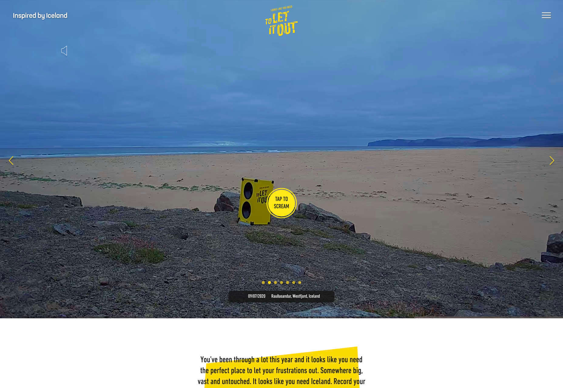
Riverlane
The abstract 3D animation on Riverlane’s site is a stunning introduction to a topic that’s hard to visualize. The rest of the site is equally well done, with great typography, slick brand assets, and a professional engaging tone.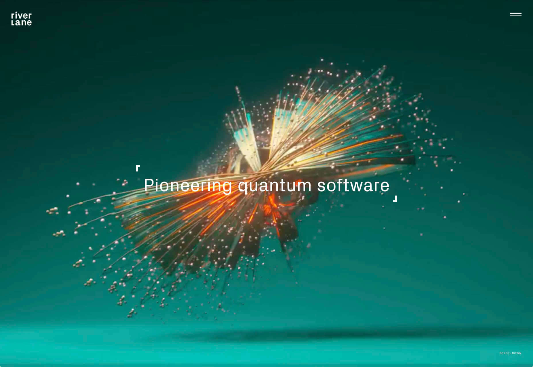
Monokai
Wimer Hazenberg’s site features a simple pixelated text column. But scroll down the page and keep an eye on the awesome text dissolve effect, it transforms this simple design.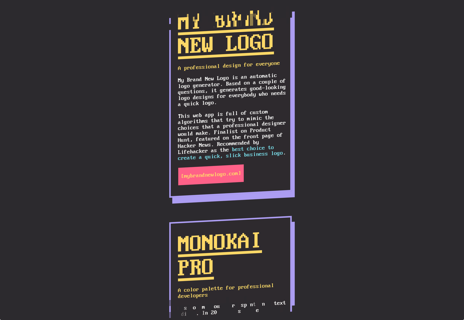
I Weigh Community
The I Weigh Community is a non-profit community activism initiative helmed by Jameela Jamil. It’s devoted to radical inclusivity, and it promotes its message on its site with striking graphics and bold, expressive typography.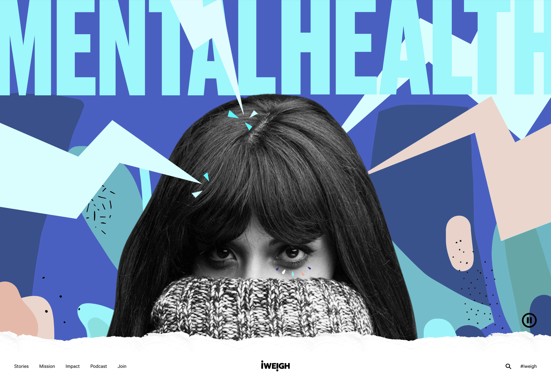
WAKA WAKA
Waka Waka is a design studio specializing in wooden furniture. The noise effect and the mid-century typography evoke the radical design of 60 years ago. The random rotations on the thumbnail hovers are delightfully disruptive.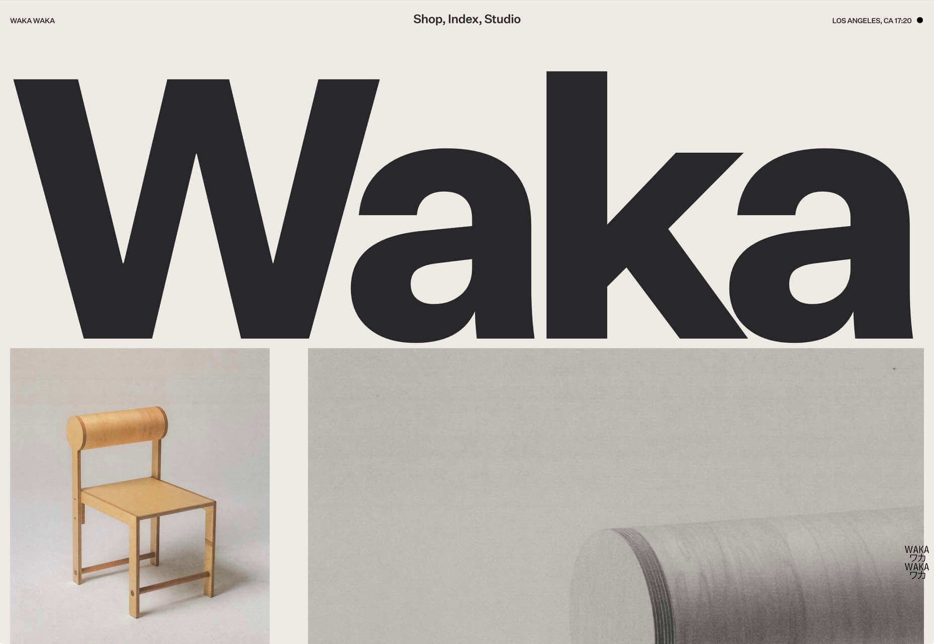
Dataveyes
Dataveyes is an information design studio that works with large datasets to give meaning to complex information. Its site features beautiful, full-screen animations that illustrate the type of information it specializes in.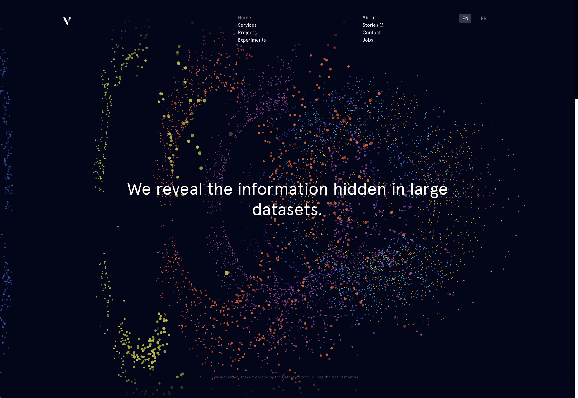
Year & Day
Year & Day is an ecommerce site that sells ceramics, glassware, and other choice pieces of tableware. It’s a colorful collection that perfectly complements your food and the stunning site takes its cues from the collection.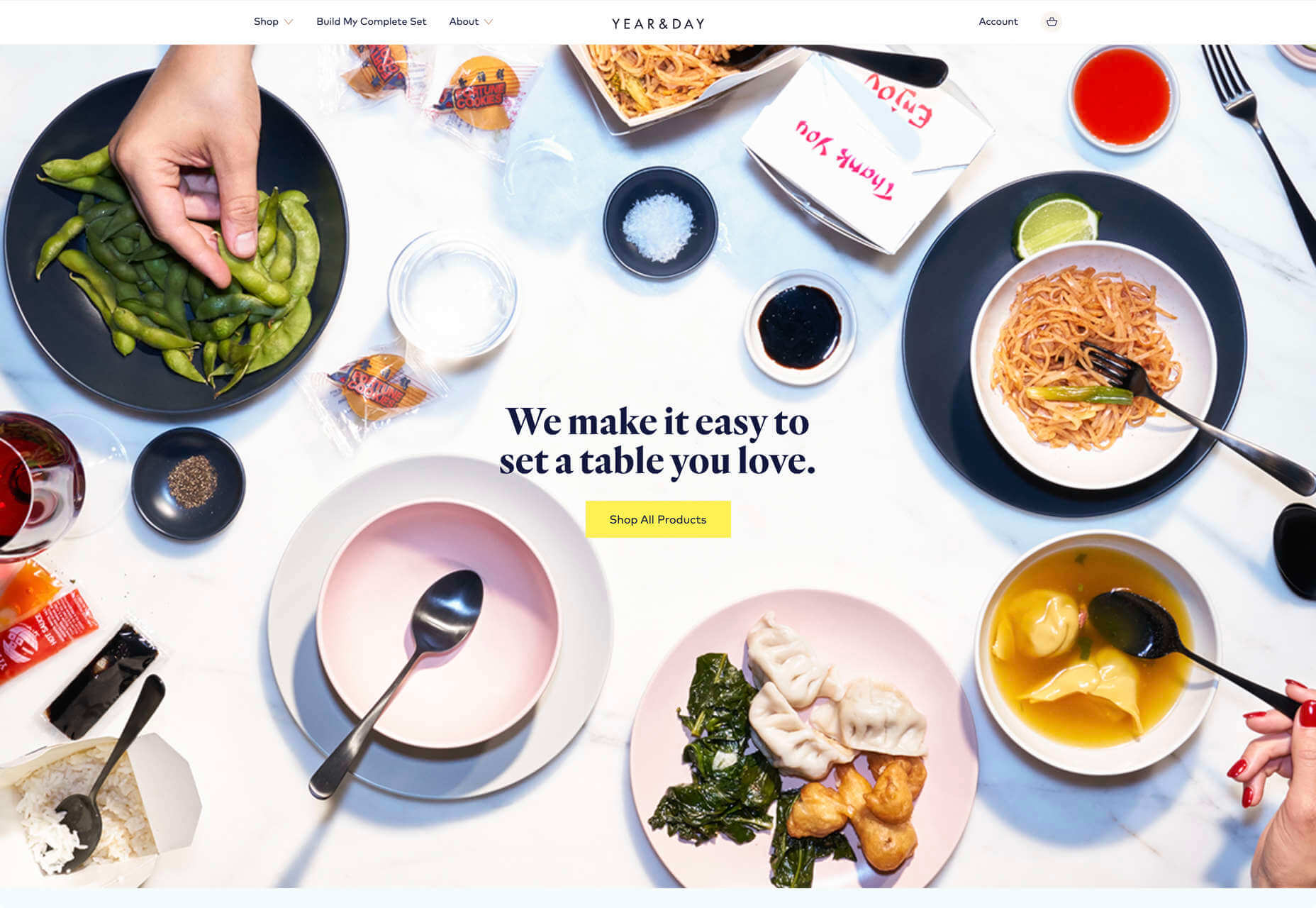
Dunderville
Dunderville is a motion design studio with an impressive portfolio of animation and live action films. Its site features a tactile paper fold detail, and as you would expect, some superb text, and vector animations.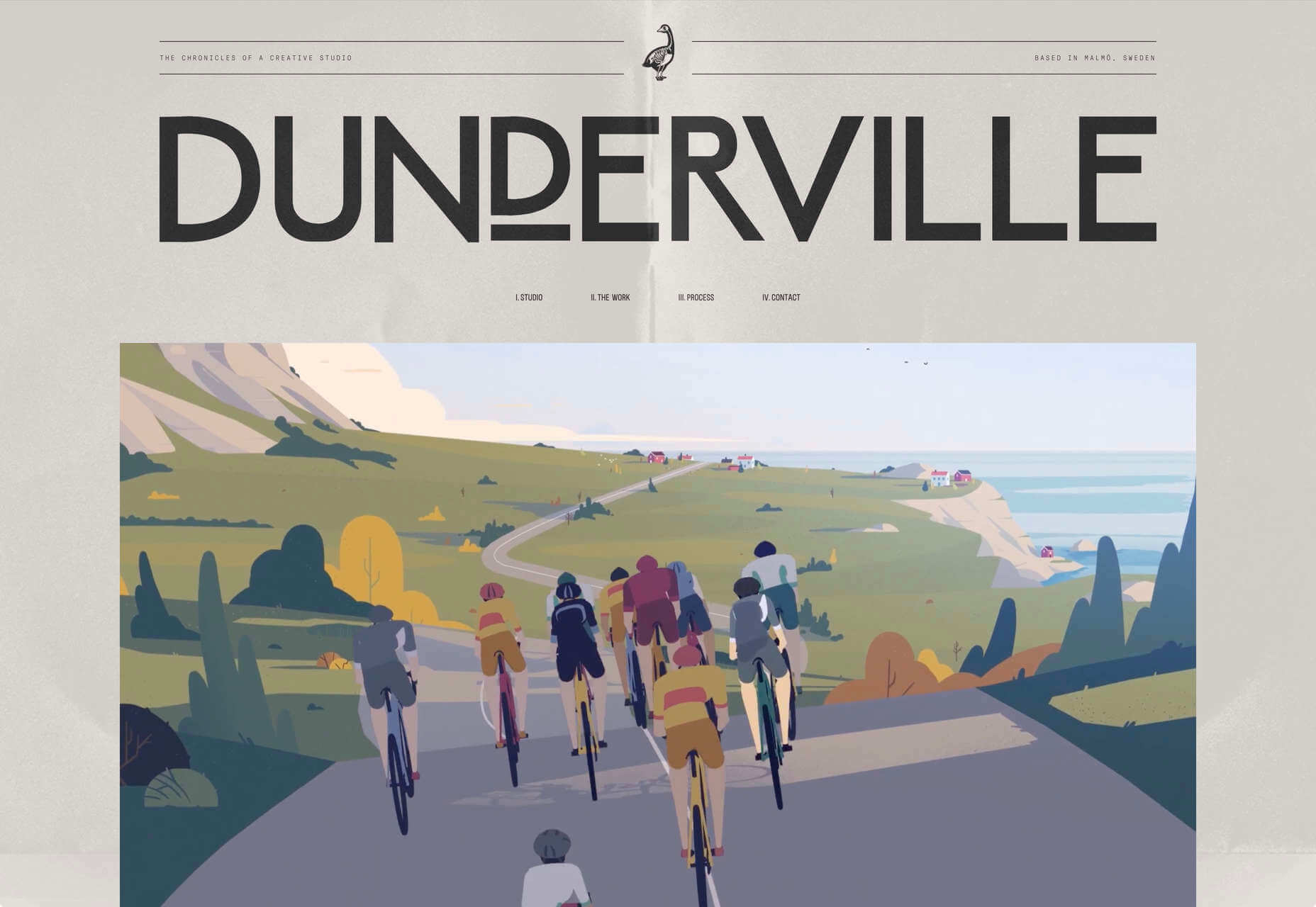
André Venâncio
It’s been months since we last saw a creative developer’s site with a liquid effect. André Venâncio revisits the idea with a cool oil bubble effect, hover over the thumbnails to see it.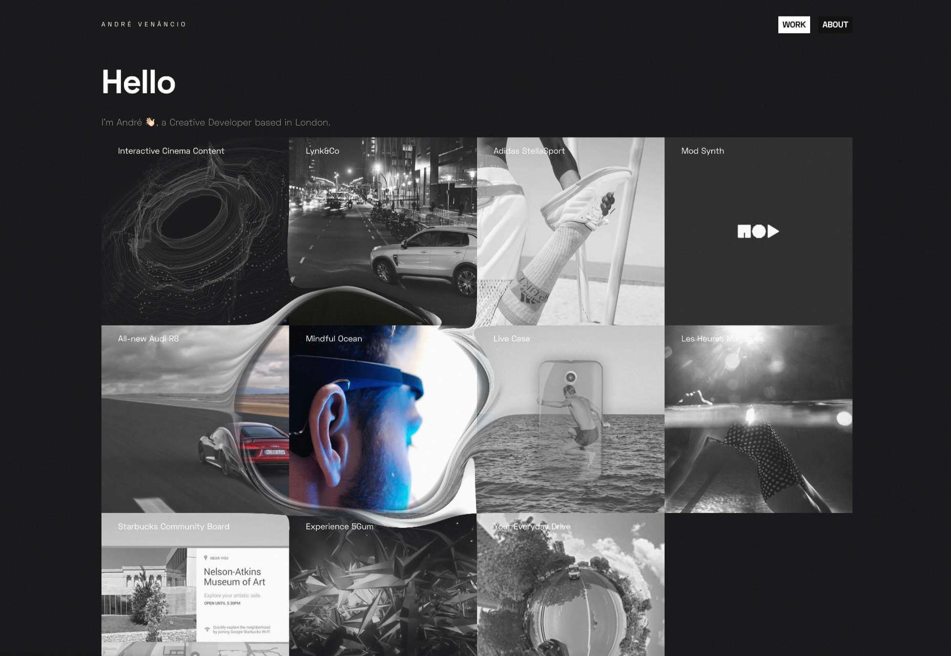
Thomas Prior
It’s not all 60s revivalism, pastels, and cute animations. There will always be room for minimalism, and nothing suits this style as well as portfolios for photographers; Thomas Prior’s site is a prime example.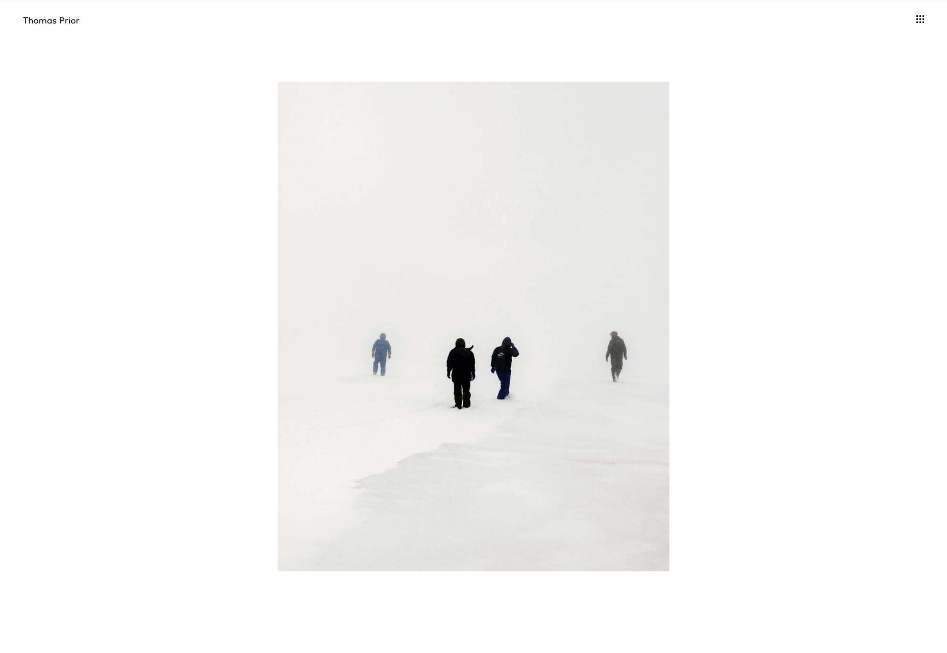
Serra
Serra’s site features a really beautiful high-contrast typeface that sits apart from the usual sans-serif. The product page is all colored product photography. It exudes luxury and distinction in a saturated marketplace.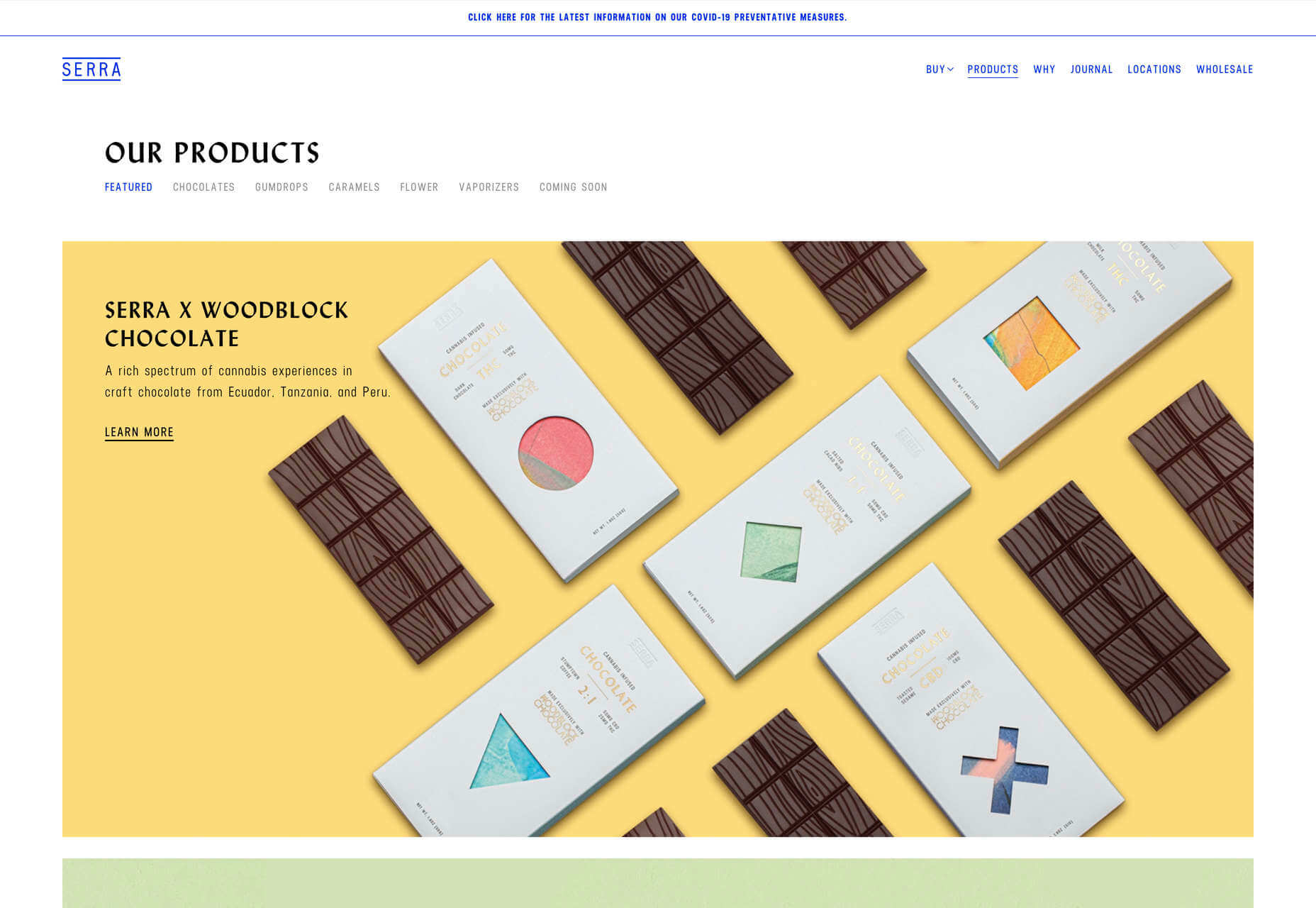
VYBES
VYBES is a CBD drink made in LA. Its site evokes the Californian spirit with baby pink brand colors and sun-bleached photography. It’s a cool, and ever so slightly Brutalist look for what is essentially a health drink.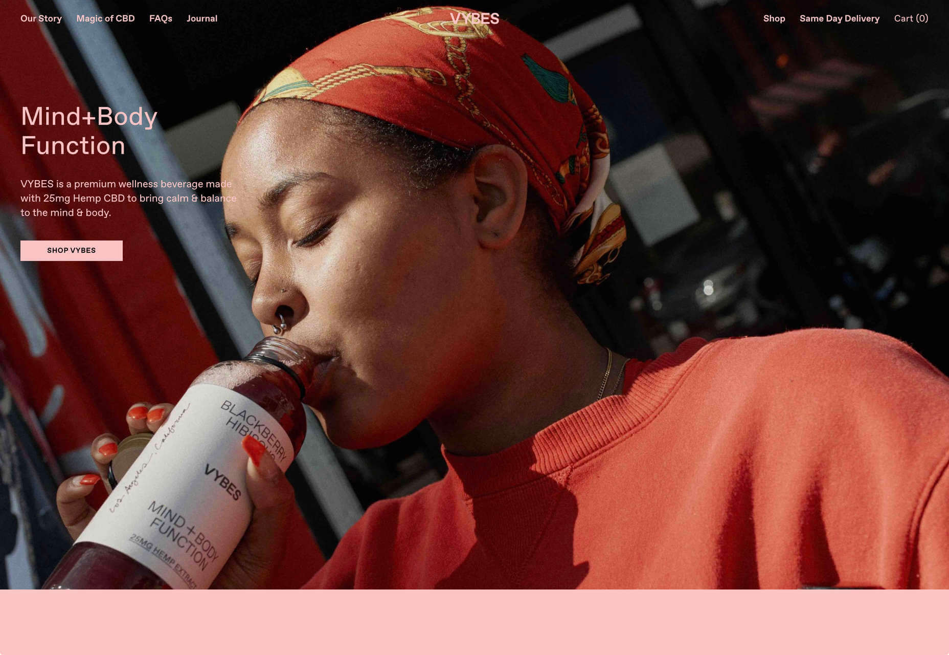
Karina Sirqueira
We love the simplicity of Karina Sirqueira’s portfolio. The desaturated rainbow leads to a simple slideshow of projects, and it’s refreshing to see a minimal site that uses bold serif-based typography. The content feels fresh and honest too.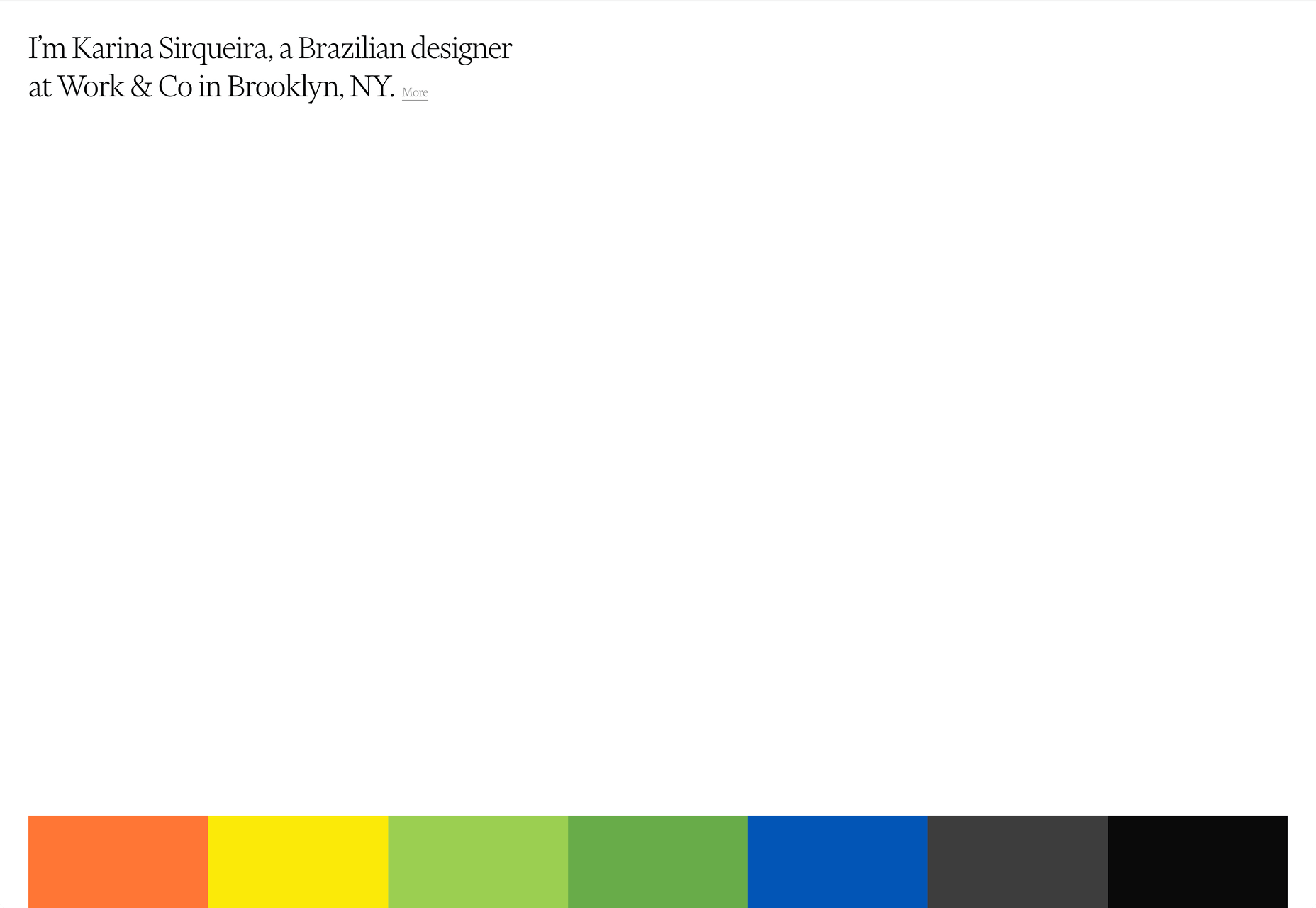
Smalls
Smalls produces healthy food for cats. The site, is packed with adorable pictures of kitties, which if you’re a cat person, is guaranteed to draw you in. There’s a definite Brutalist style to the site, and lots of color too.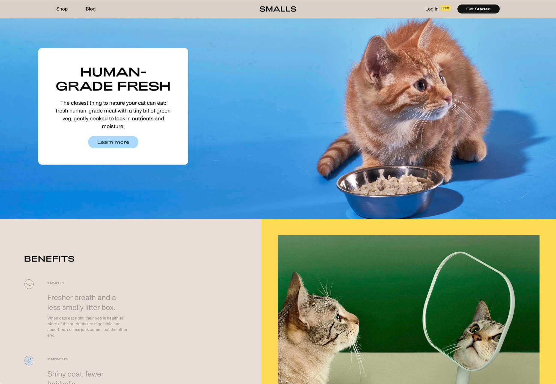
Wildist
There’s a clear aesthetic beginning to emerge in 2020, with pastels creating a soft background for desaturated primaries, and Wildist gets it exactly right with this youthful, site that features just enough animation to bring it to life.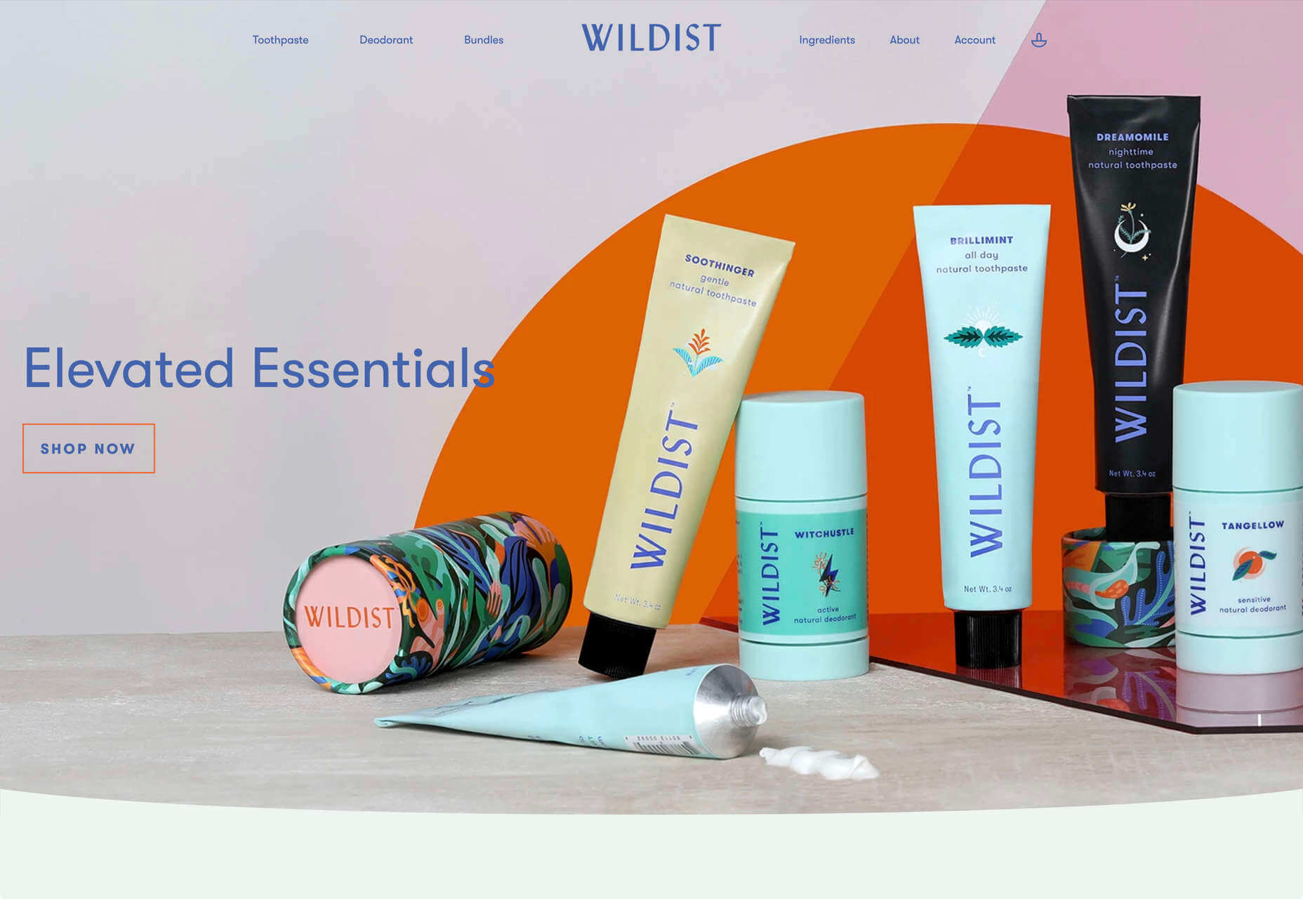
Kristen Kwong
We’ve seen a lot of OS-style sites recently, but Kristen Kwong’s is one of the slickest. It manages to take a simple metaphor for interaction and transform it with a vintage color scheme.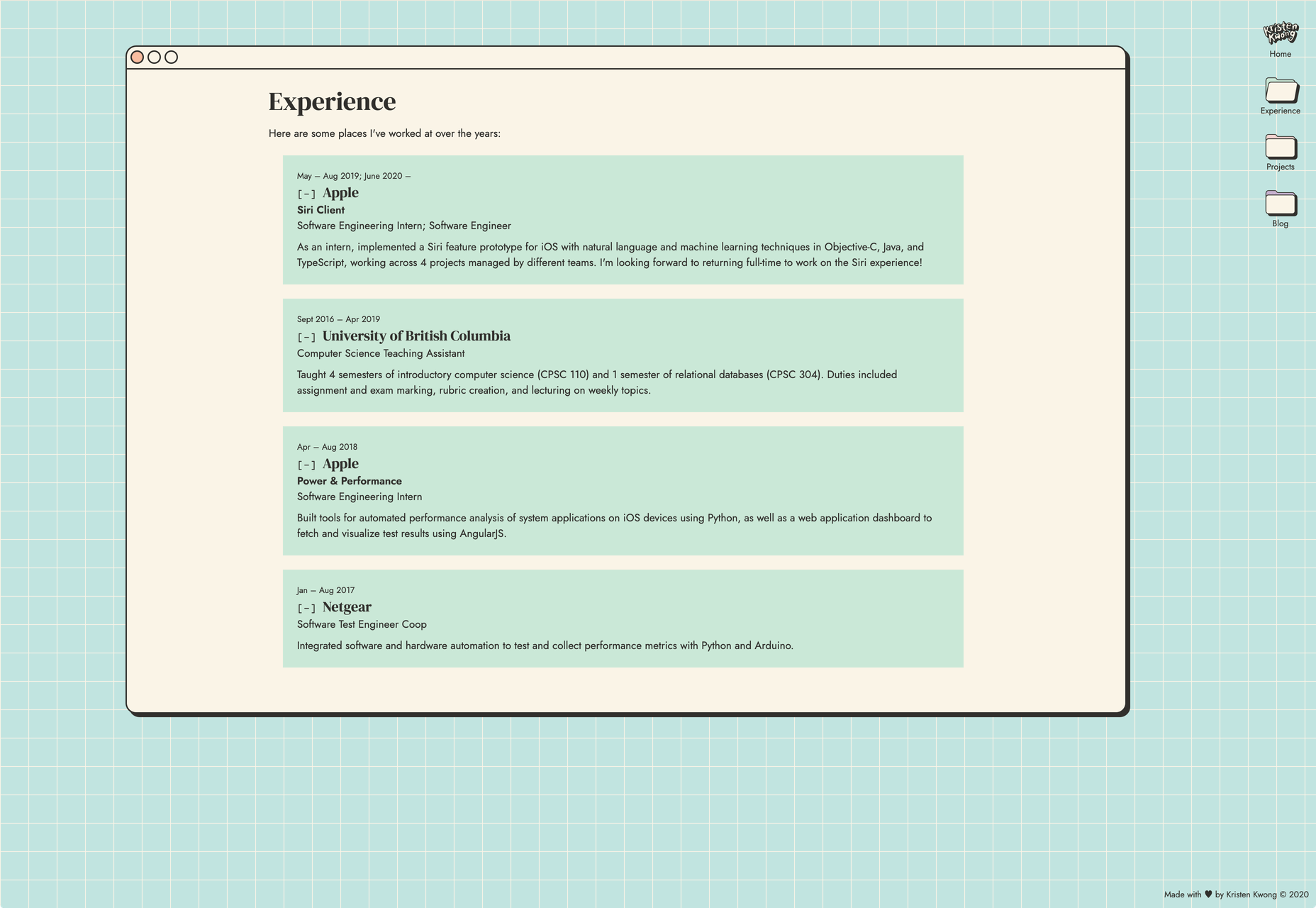
Stojo
Continuing the Miami-meets-Brutalism trend this month is the site for Stojo, a collapsable cup and bottle. The pastel shades block out a disrupted grid, but for our money it works better on mobile. The vintage typeface is a nice touch.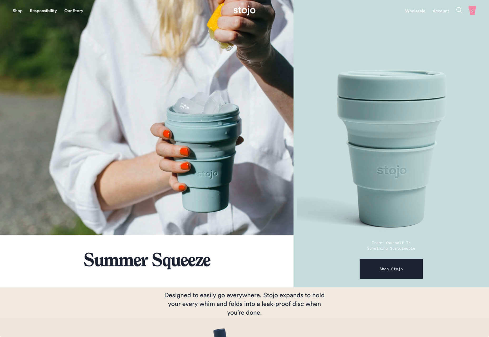
Hoang Nguyen
Hoang Nguyen’s site features a surreal 3D scene with mountains, a spinning planet, floating islands, a waterfall, and a floating dragon-boy. Click around the site and the scene transforms.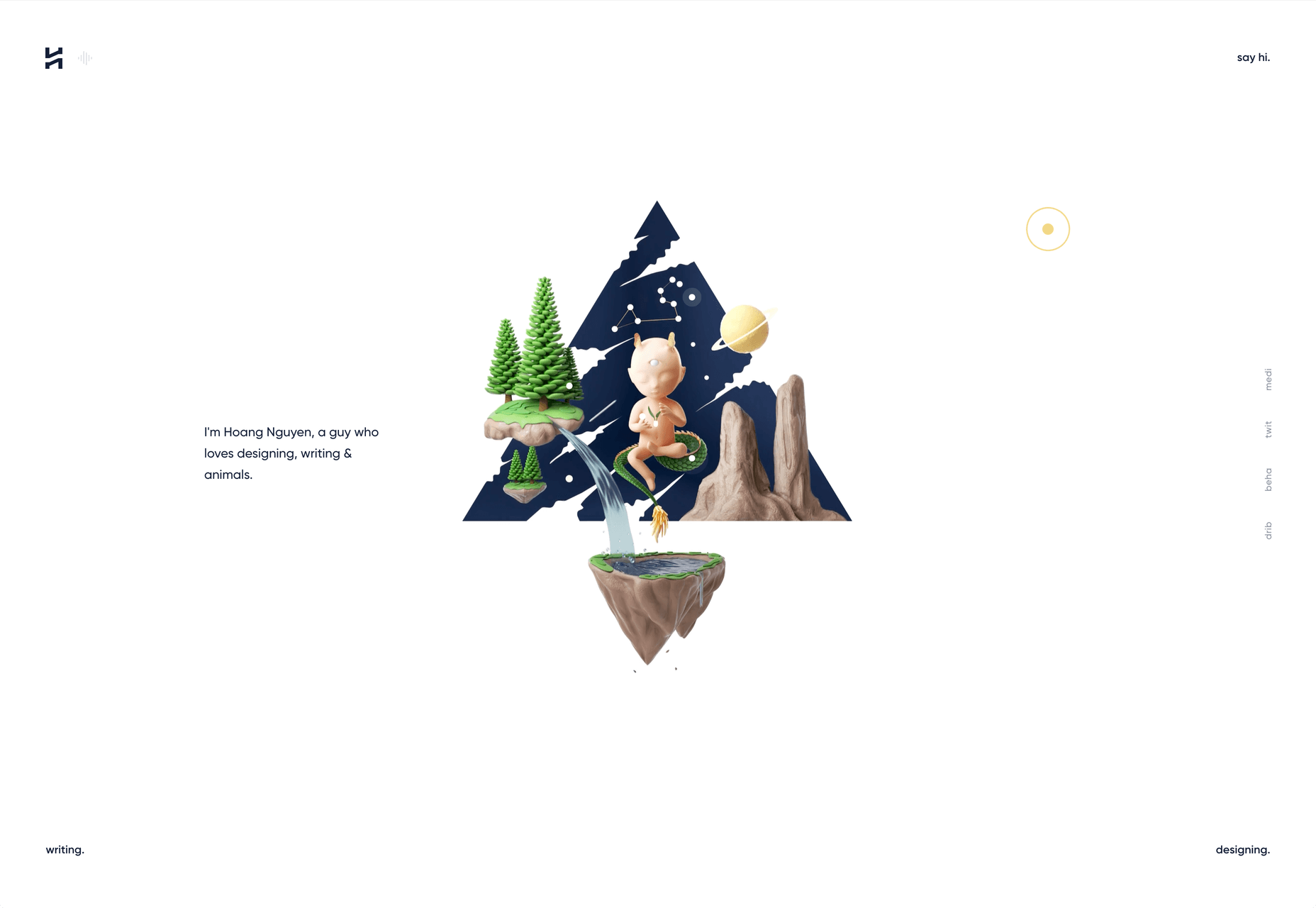
SMTH / Sam Smith
Sam Smith’s portfolio has a cool magazine style to it, with a nice blocky background on the text and a personality packed animated avatar taking centre stage.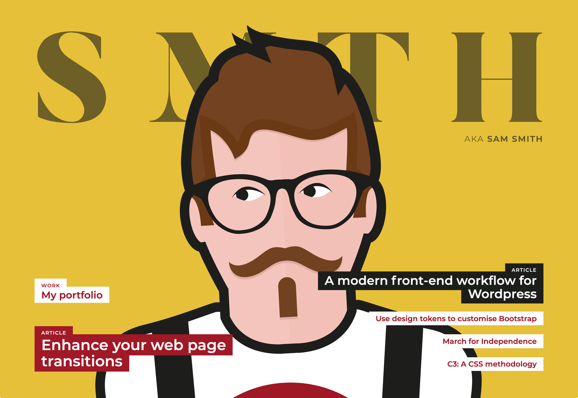
Then I Met You
Then I met You is a site promoting a range of skincare products. In this case, the usual pastel colors are replaced with an 80s-style gradient. Watch the products as you scroll, the lighting changes creating an awesome, subtle 3D effect.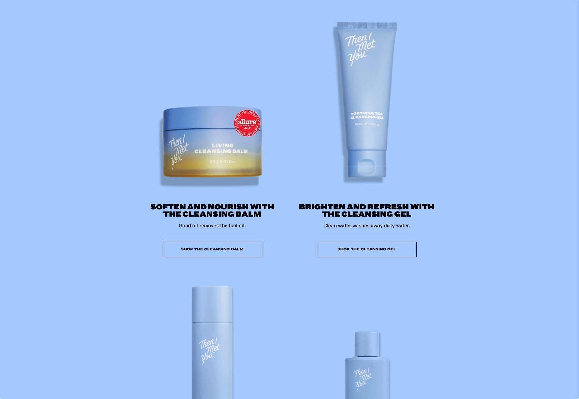
Paddi MacDonnell
Paddi MacDonnell is a designer and entrepreneur from Northern Ireland, follow her on Twitter.


Read Next

15 Best New Fonts, July 2024
Welcome to our monthly roundup of the best fonts we’ve found online in the last four weeks. This month, there are fewer…
By Ben Moss

20 Best New Websites, July 2024
Welcome to July’s round up of websites to inspire you. This month’s collection ranges from the most stripped-back…

Top 7 WordPress Plugins for 2024: Enhance Your Site's Performance
WordPress is a hands-down favorite of website designers and developers. Renowned for its flexibility and ease of use,…
By WDD Staff

Exciting New Tools for Designers, July 2024
Welcome to this July’s collection of tools, gathered from around the web over the past month. We hope you’ll find…

3 Essential Design Trends, July 2024
Add some summer sizzle to your design projects with trendy website elements. Learn what's trending and how to use these…

15 Best New Fonts, June 2024
Welcome to our roundup of the best new fonts we’ve found online in the last month. This month, there are notably fewer…
By Ben Moss

20 Best New Websites, June 2024
Arranging content in an easily accessible way is the backbone of any user-friendly website. A good website will present…

Exciting New Tools for Designers, June 2024
In this month’s roundup of the best tools for web designers and developers, we’ll explore a range of new and noteworthy…

3 Essential Design Trends, June 2024
Summer is off to a fun start with some highly dramatic website design trends showing up in projects. Let's dive in!

15 Best New Fonts, May 2024
In this month’s edition, there are lots of historically-inspired typefaces, more of the growing trend for French…
By Ben Moss

How to Reduce The Carbon Footprint of Your Website
On average, a web page produces 4.61 grams of CO2 for every page view; for whole sites, that amounts to hundreds of KG…
By Simon Sterne

20 Best New Websites, May 2024
Welcome to May’s compilation of the best sites on the web. This month we’re focused on color for younger humans,…