

Angles
There are so many ways to add and use funky angles in design projects. An angle with a color-block can be a great way to help add a place for a text element on top of an image or video to help ensure readability. Use a color for the angled element that contrasts with the background and text overlay for a striking visual or use a color that matches the background for a more subtle feel. Another bonus for using angles in the design is that they can help create a distinct eye-tacking pattern from one part of the screen to another to help create visual focus. On a smaller, more vertical screen (such as a mobile device), large angles can even serve a pseudo-split screen purpose and create a way for text and other elements to stack in more vertical orientations. Angles can come in all different degrees and sizes. There aren’t a lot of rules with how to use them. The common factor is that they make the design easier to understand. Alternatively, angles can be an independent design element that really has nothing to do with function or adding a text layer. That’s exactly what Aviaja Dance does with their design. The main use of angles comes from the fun “A” in the logo. It’s the main visual on the homepage above the scroll and is rotated in other locations throughout the design.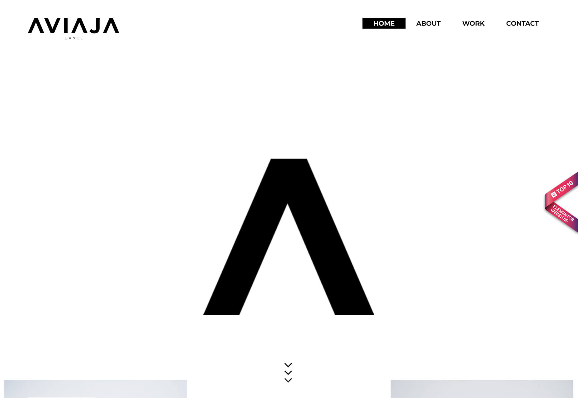 The next two examples use color-blocked angles.
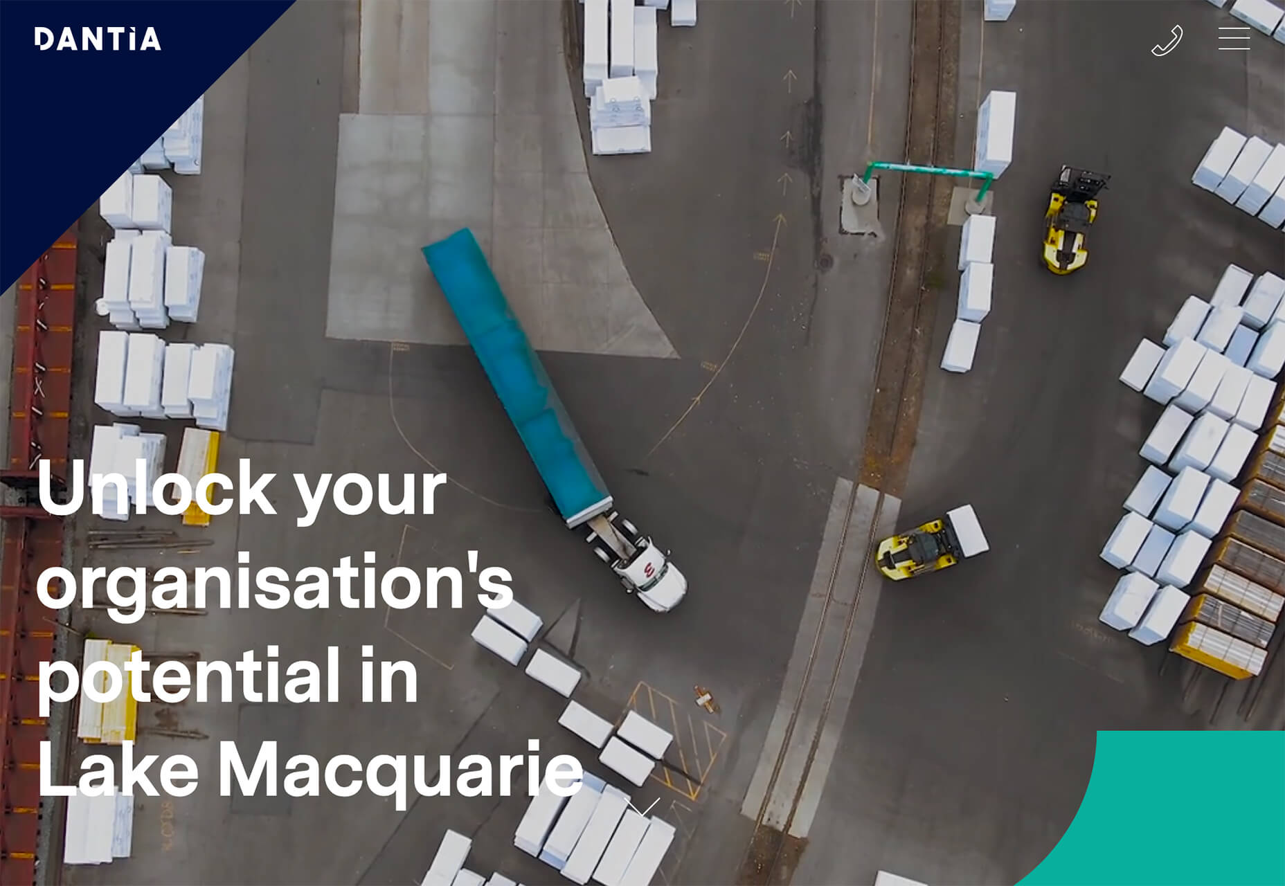
Dantia uses a small blue angle in the top corner to anchor the logo against video that uses a lot of different colors. This way the logo is always visible. Small triangles are used as bullets throughout the design to further emphasize this shape.
The next two examples use color-blocked angles.
Dantia uses a small blue angle in the top corner to anchor the logo against video that uses a lot of different colors. This way the logo is always visible. Small triangles are used as bullets throughout the design to further emphasize this shape.
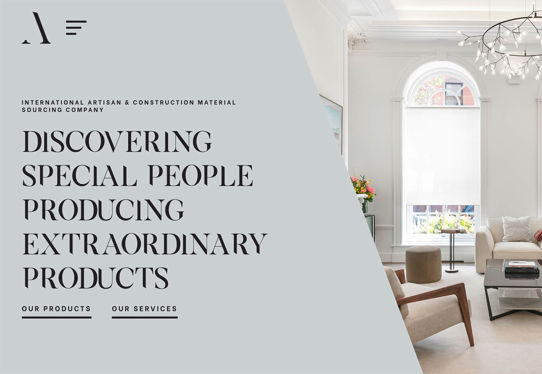
 Adige Design uses a large angle in a color that almost fades into the background to almost split the screen in half – part text, part visuals. This is a popular and effective use of an angle to enhance readability and add visual finesse.
Overprint Effects
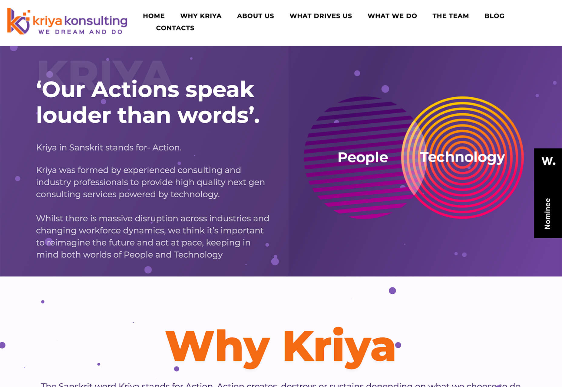
While overprinting is a print design technique, the visual it creates is popping up in plenty of digital projects. It’s a cool look that creates additional colorways and almost always has a funky vibe. When a design uses overprint, one color “prints” over another forming a mixed shade from the two hues. It has a certain elegance because as a print technique, it is often reserved for special projects. That same feel comes through in digital design as well. Sweet Punk uses a fun overprint with a bright orange circle and black and white image to create a lot of contrast in an interesting color effect. What makes it stand out even more is that the overprint slide is just part of a bigger set of moving images. It stands out because of the color choices and technique.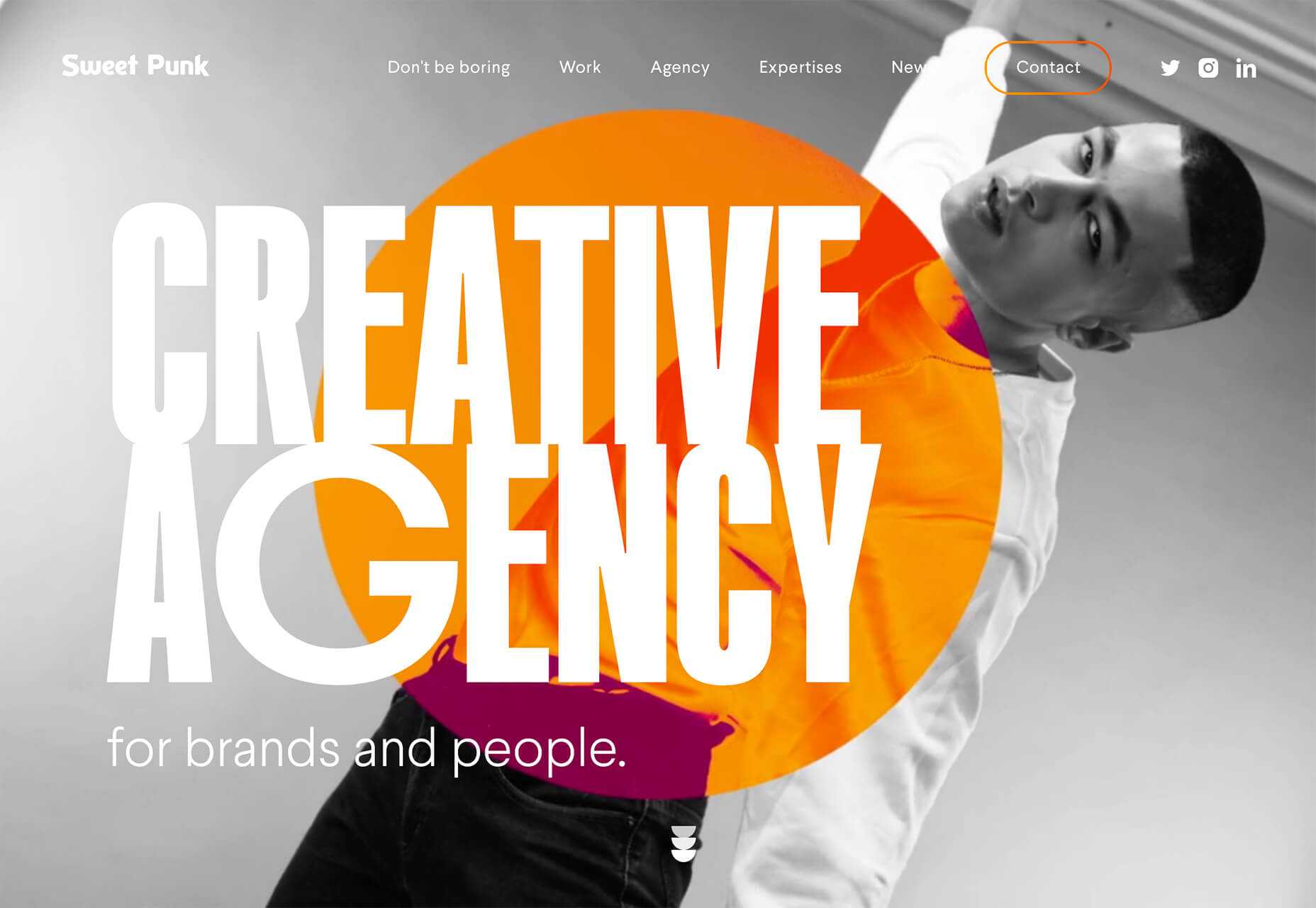 Kriya Konsulting uses a small overprint feature in a graphic to create a focal point away from text. The effect is subtle and with color and lines inside shapes, it gives you a lot to look at. The overprint graphic is just one of many circles on the screen that come together for a full effect. The interest of the overprint area serves as a starting point for the eye, which moves to other circular elements and text on the screen.
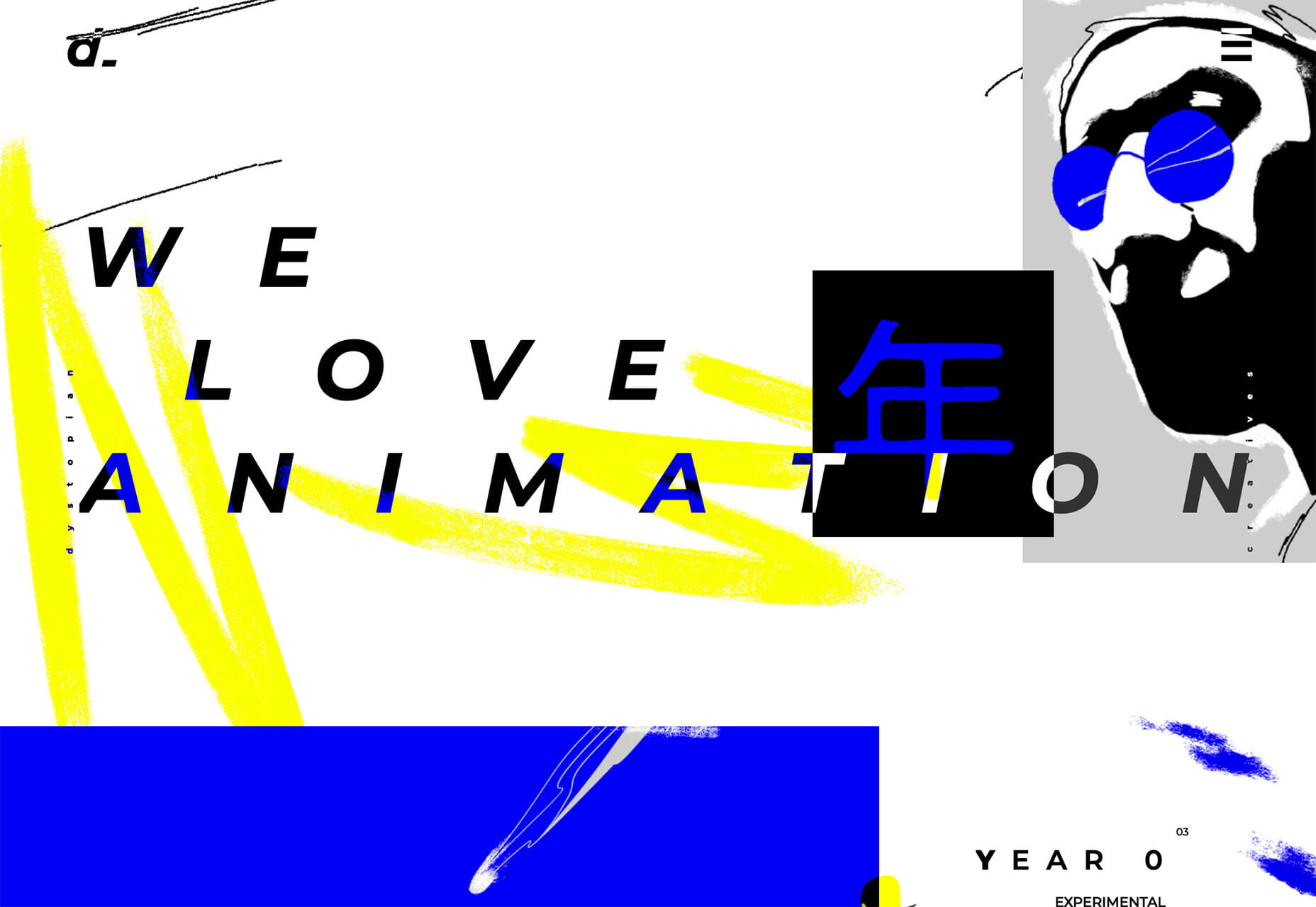
 Dystopian Creatives uses an overprint effect in a quick animation as the site loads and then in several locations on the scroll. It’s so subtle that you might miss it if you aren’t looking thanks to a pretty bold overall aesthetic.
Turn of the Last Century Typography
Tall, skinny, modern-style typefaces are in. Bonus points for using this trend in a way that evokes feelings of the roaring 20s (1920s that is). These font styles seem to mimic media posters from the era. While most of these typefaces fall into the category of modern serif, there are some sans options that create a similar feel. The primary commonality is the use of extremely tall x-heights, and strokes with distinctly variable thick and thin options. Most of these typefaces are rather condensed as well. Note how each of these examples takes a different approach. Better Half uses a modern serif with a dramatic x-height. Note the use of upper and lower-case letters for the headline. It brings attention to the high-drama of the typeface.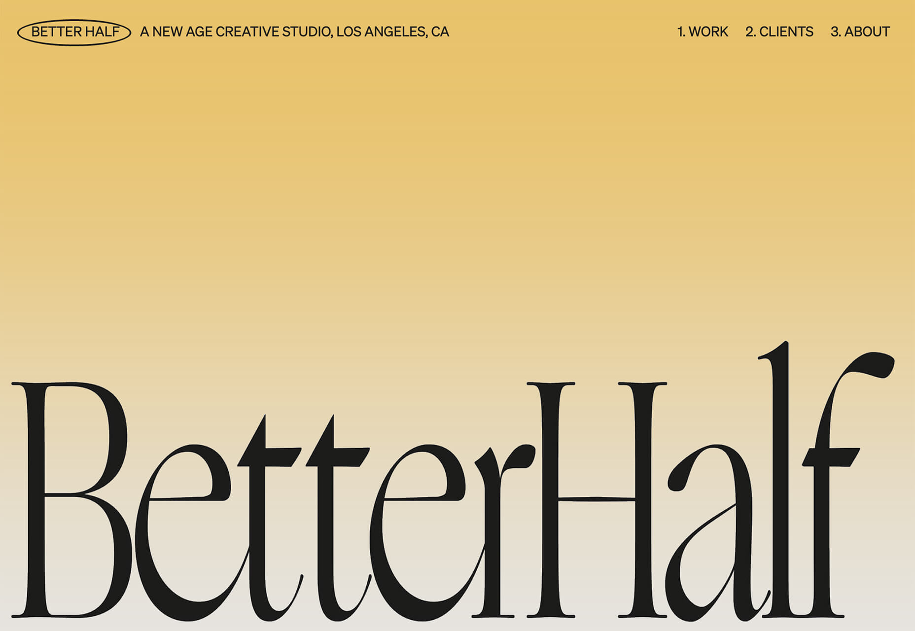 Chiara Luzzana takes the opposite approach with an all uppercase character set and mixes outline and filled lettering. The text is somewhat reminiscent of the title credits from “Stranger Things” with dual throwback vibes to the 1920s and 1980s. (Proof that everything that was popular once comes back around again.)
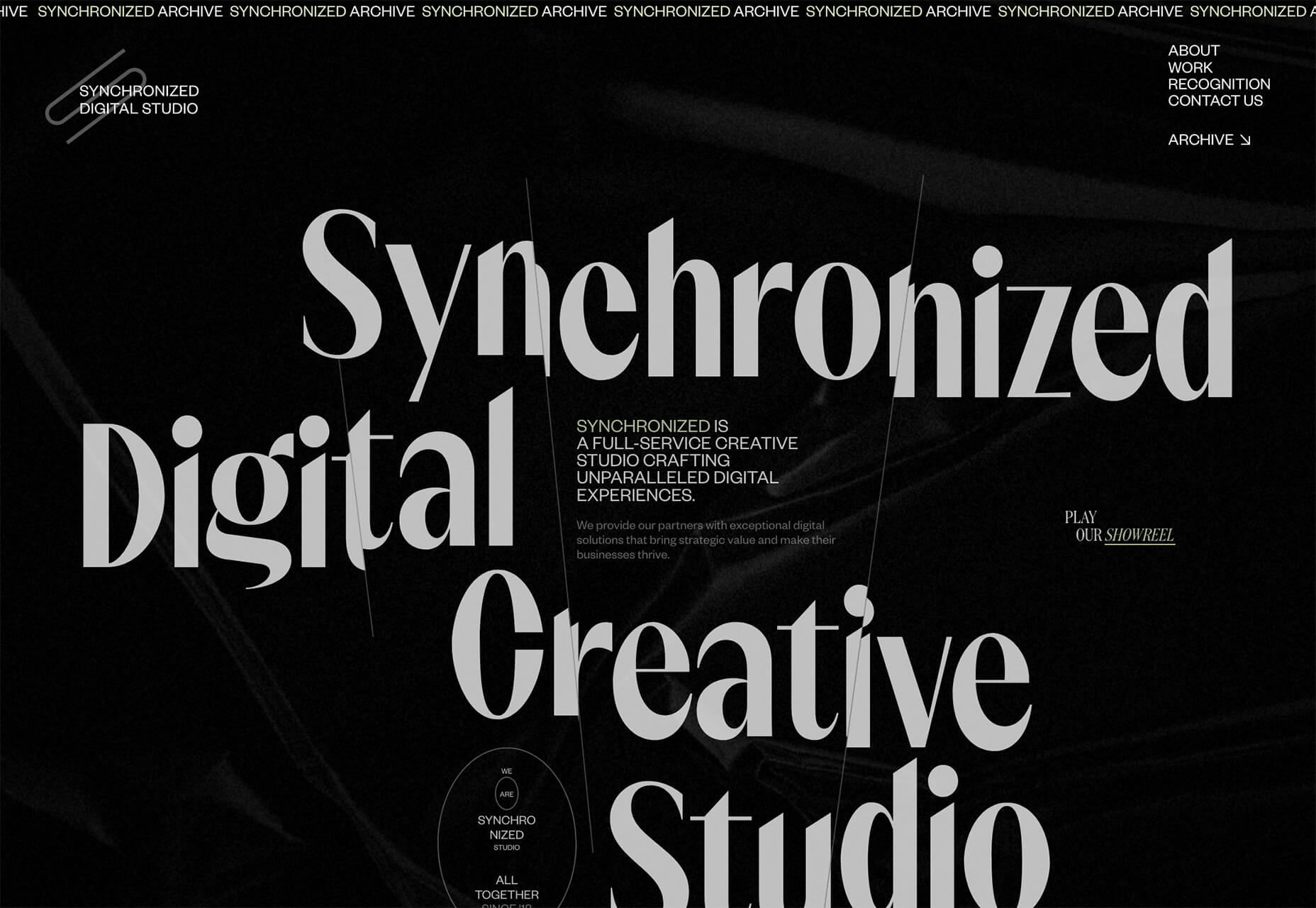
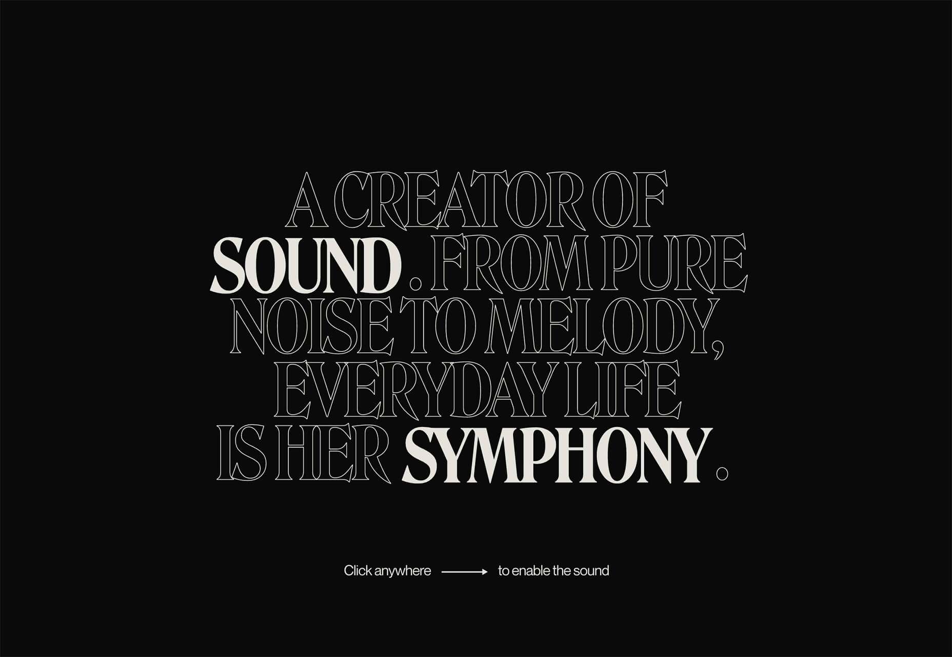 Synchronized Digital Studio goes another way entirely. While the text and design has a similar feel, they do it here with a modern sans serif. Note that the x-height is still quite tall and there are vast differences between thick and thin strokes.
 Each of these compact, yet bold typefaces are used to create a dominant visual. That’s the beauty of this style – the typeface is the art thanks to so much visual interest. There’s also the added bonus that these condensed styles allow for higher character counts without getting visually overwhelming. (So, if you need to use a long word at a large size in the main headline, this could be a viable option.)
Conclusion
Design trends that are fun (and functional) are some of the best. Using angles can make it easier to incorporate text elements that are easy to read, overprint effects add flair and a bit of an old-school feel, and turn of the last century typography feels modern and fresh with a hint of 1920s flair. Any of these design elements can be applied to websites without a complete overhaul and make a great refresh for the dog days of summer and beyond.Carrie Cousins
Carrie Cousins is a freelance writer with more than 10 years of experience in the communications industry, including writing for print and online publications, and design and editing. You can connect with Carrie on Twitter @carriecousins.


Read Next

15 Best New Fonts, July 2024
Welcome to our monthly roundup of the best fonts we’ve found online in the last four weeks. This month, there are fewer…
By Ben Moss

20 Best New Websites, July 2024
Welcome to July’s round up of websites to inspire you. This month’s collection ranges from the most stripped-back…

Top 7 WordPress Plugins for 2024: Enhance Your Site's Performance
WordPress is a hands-down favorite of website designers and developers. Renowned for its flexibility and ease of use,…
By WDD Staff

Exciting New Tools for Designers, July 2024
Welcome to this July’s collection of tools, gathered from around the web over the past month. We hope you’ll find…

3 Essential Design Trends, July 2024
Add some summer sizzle to your design projects with trendy website elements. Learn what's trending and how to use these…

15 Best New Fonts, June 2024
Welcome to our roundup of the best new fonts we’ve found online in the last month. This month, there are notably fewer…
By Ben Moss

20 Best New Websites, June 2024
Arranging content in an easily accessible way is the backbone of any user-friendly website. A good website will present…

Exciting New Tools for Designers, June 2024
In this month’s roundup of the best tools for web designers and developers, we’ll explore a range of new and noteworthy…

3 Essential Design Trends, June 2024
Summer is off to a fun start with some highly dramatic website design trends showing up in projects. Let's dive in!

15 Best New Fonts, May 2024
In this month’s edition, there are lots of historically-inspired typefaces, more of the growing trend for French…
By Ben Moss

How to Reduce The Carbon Footprint of Your Website
On average, a web page produces 4.61 grams of CO2 for every page view; for whole sites, that amounts to hundreds of KG…
By Simon Sterne

20 Best New Websites, May 2024
Welcome to May’s compilation of the best sites on the web. This month we’re focused on color for younger humans,…