

Your World Your Way
Your World Your Way is an interactive portal for the University of Auckland. An optional questionnaire customizes the experience, and clearly a lot of effort has gone into this in terms of the questions and possible answers, and the presentation. It is engaging and enjoyable to use, and the information provides links to the main University of Auckland website.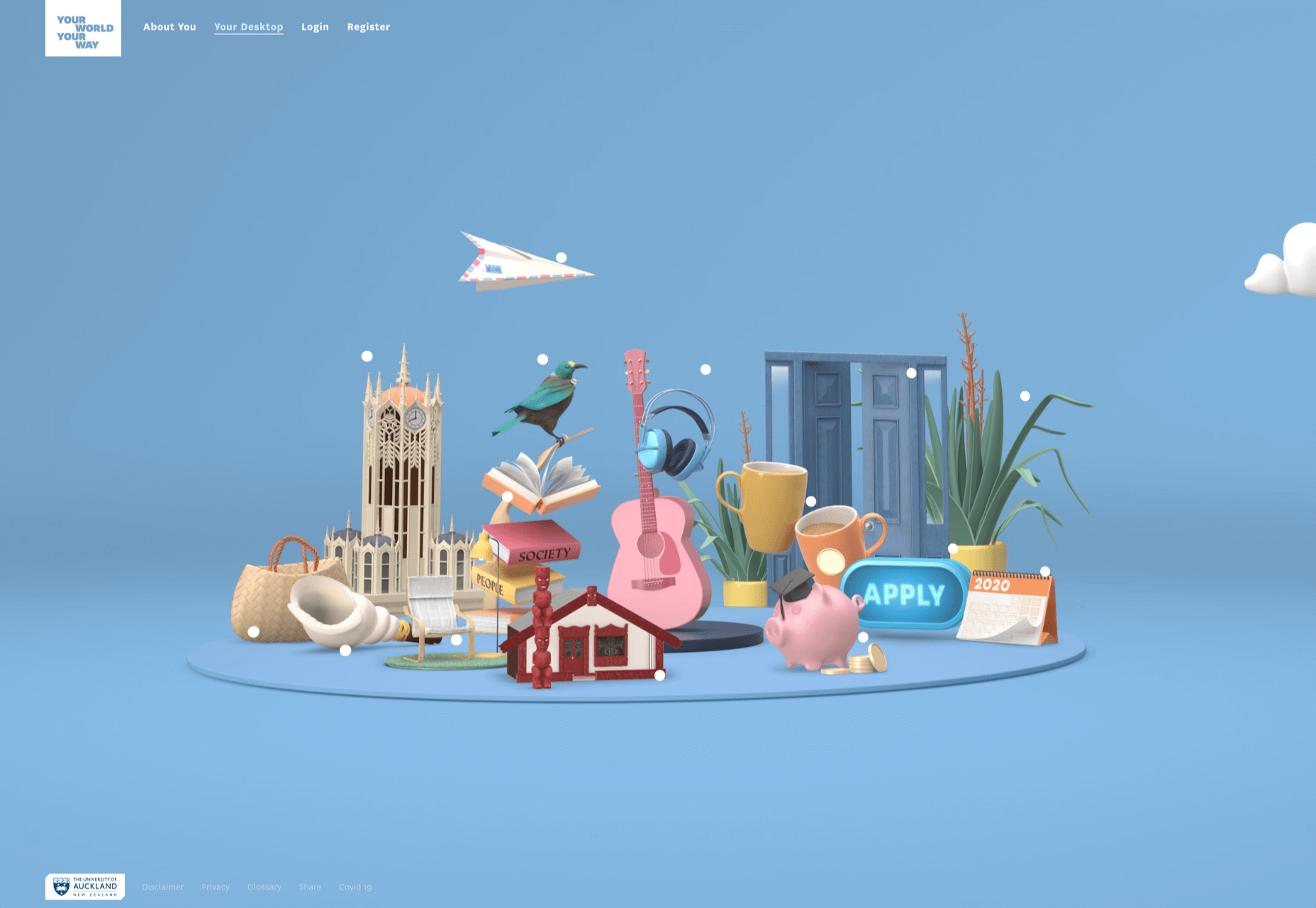
Blind Barber
This micro site is to celebrate 10 years of barber shop chain Blind Barber, which started as one shop with a bar in the back room, in New York’s East Village. An entirely black and white design provides a clean backdrop for color photos and videos, and some great scrolling animations give a pleasing flow to the content.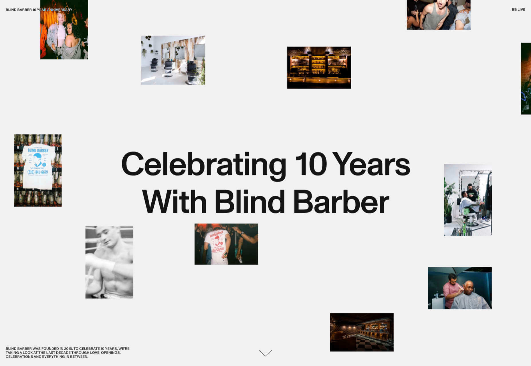
Brews & Grooves
Brews & Grooves pairs records with different beer. Although a ‘fun’ project, it is still a well designed piece of work with some vintage style typography and some pleasing rollover animation effects. It is an effective advert for those involved in creating it, as listed in on its ‘credits’ page.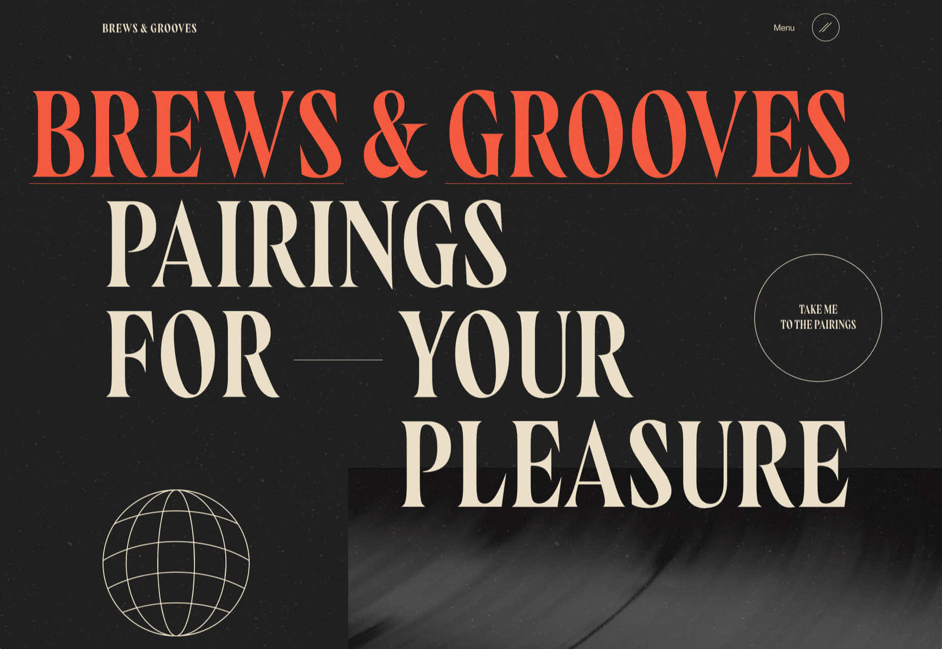
Gucci Bloom
As part of a new campaign to promote it’s ‘Bloom’ perfumes, Gucci have created a Gucci Bloom game. The player has to pick up flowers and perfume bottles, but miss a flower and the vines get in your way.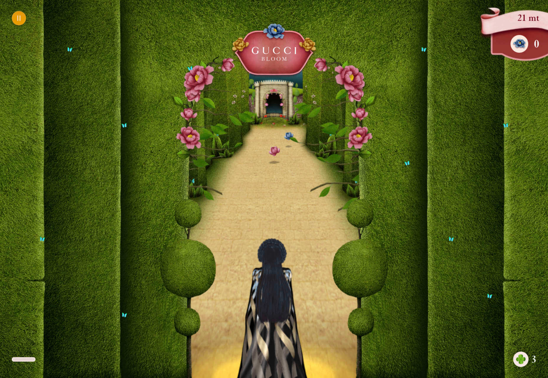
808303Studio
808303Studio is a digital musical instrument that emulates a Roland TR-808 drum machine and TB-303 bass synthesizer, created in conjunction with the Design Museum (London). It’s fully programmable and there is even short video tutorial with A Guy Called Gerald on how to use it.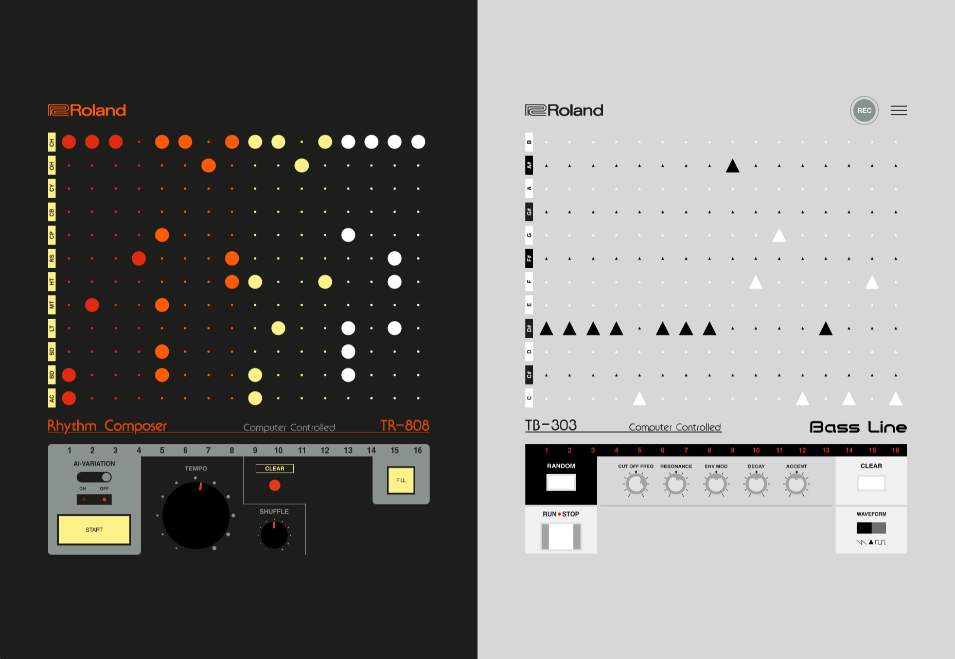
Aelfie
Aelfie is a home furnishings brand with a focus on bold patterns and bright color. Their site reflects this with its use of block color, irregular grid, drawings, and type that feels a little off-kilter. It creates a hand-made feel that embodies the brand aesthetic rather well.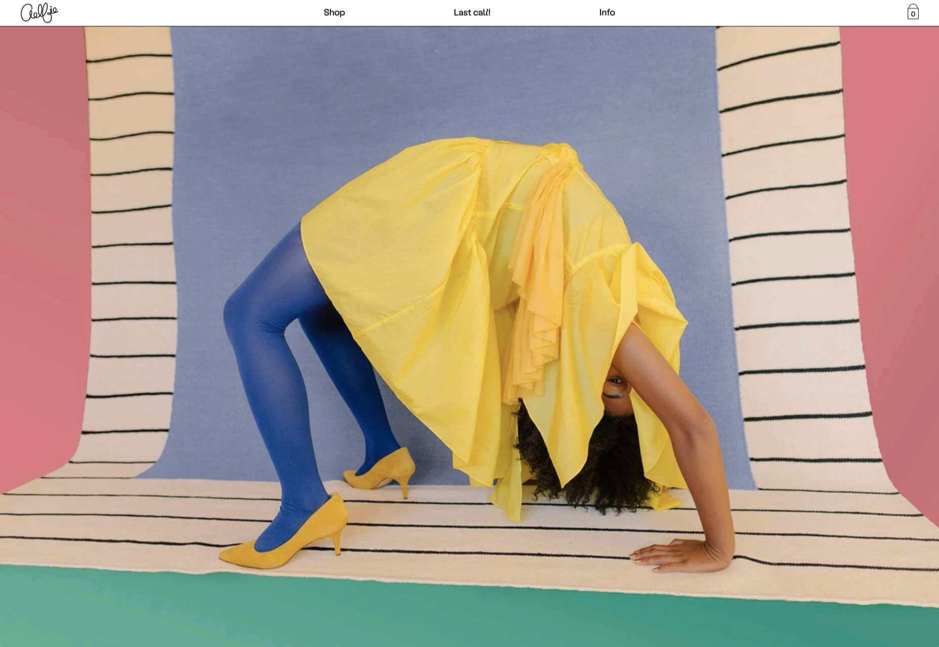
Media Election 2020
As we approach one of the most significant, not to mention acrimonious, elections in US history, Media Election 2020 uses AI to analyze the volume of media attention each candidate receives, in real time.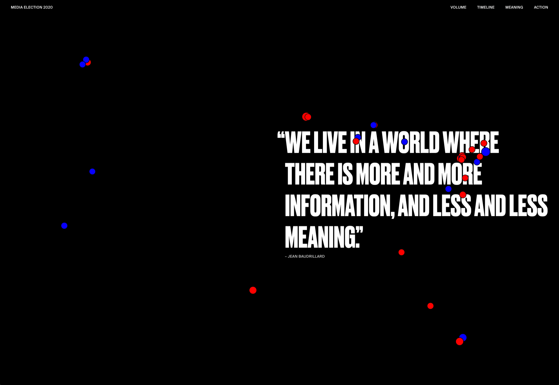
Curbed
Magazine website Curbed has now become a part of New York magazine, and had a redesign in the process. It follows a discernible grid, but distorts it just enough to create an edge. The highlighter color frames, and underlines on rollover, add movement and ‘cool’.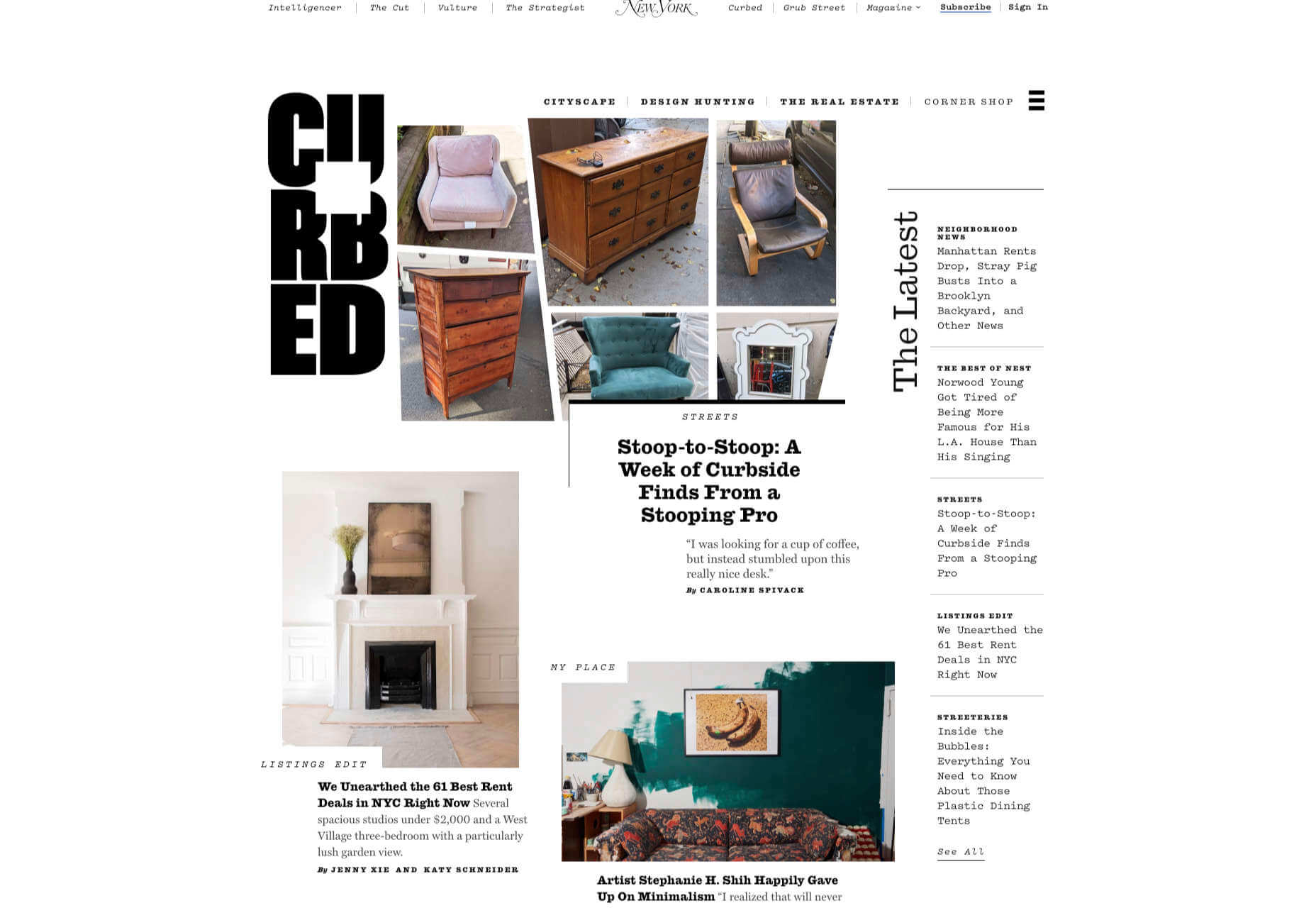
WFN
The WFN (Women’s Funding Network) is an alliance of funds and foundations working to promote gender equity and social change internationally. The site is clean, with strong typography and a sophisticated color palette.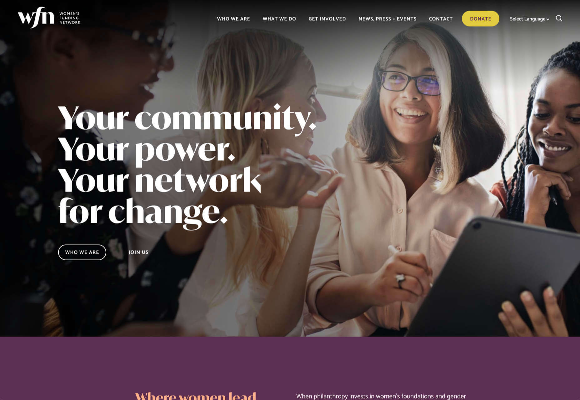
The Fabric of America
Internet, telephone and TV service provider Xfinity is behind the Fabric of America project. It is a collection of voice recordings, the idea being that each voice, and each person’s story, is a thread that makes up the flag that we see on the screen.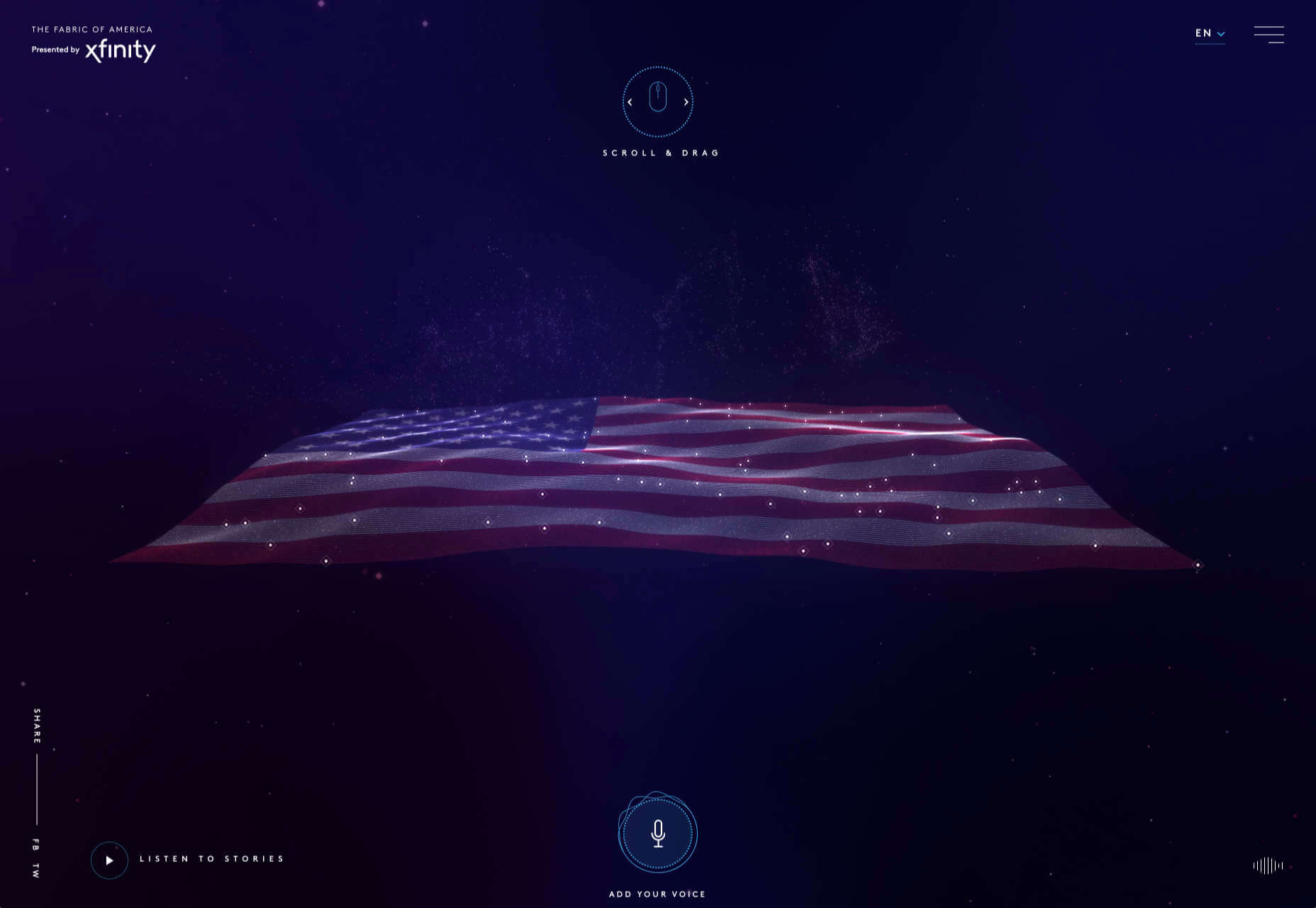
Minimal Ceramics
Minimal Ceramics is a concept site, showcasing the work of London based potter, Tom Crew. The design of the site reflects the simplicity of the showcased work, using great photography and simple typography.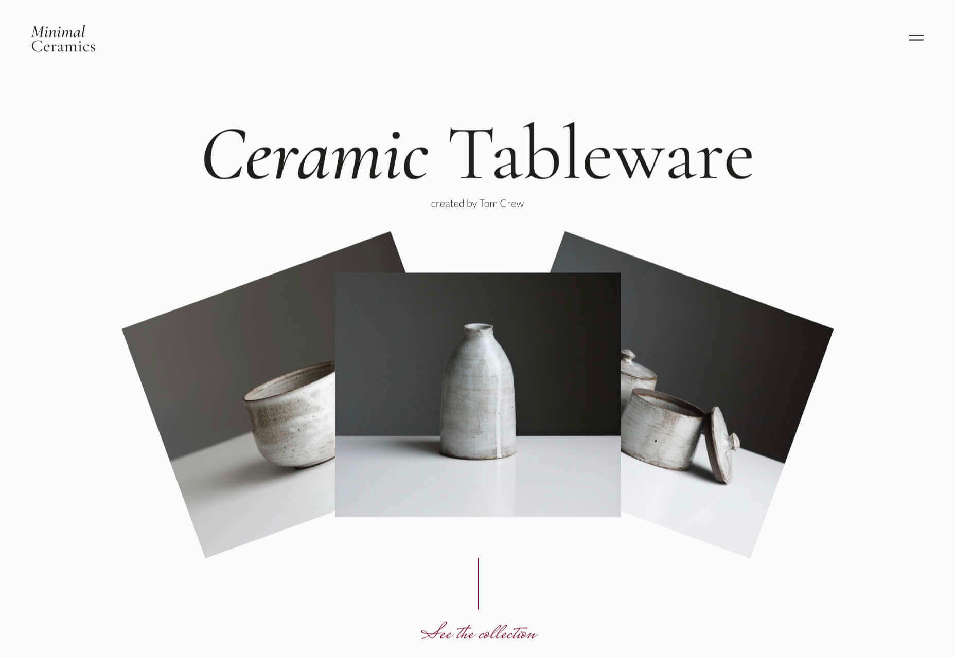
Normal Now
Normal Now is part of an awareness campaign to highlight to consumers the positives of electric cars. Taking a fun approach to engage consumers in a serious subject, it uses a fake retro tech style.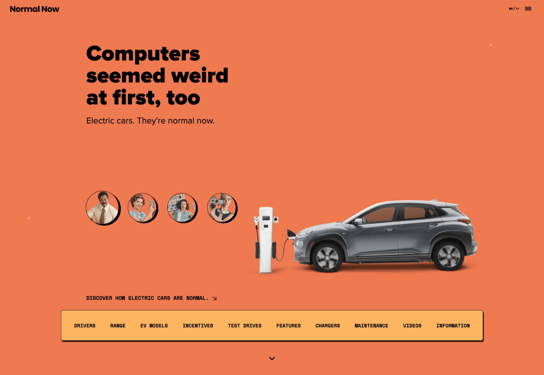
Superfood Gin
Superfood Gin is a gin made using superfood botanicals, that claims to be fruity and fresh rather than crisp and peppery. The soft color palette, along with the soft lines and curves in the background illustrations, reflect this well.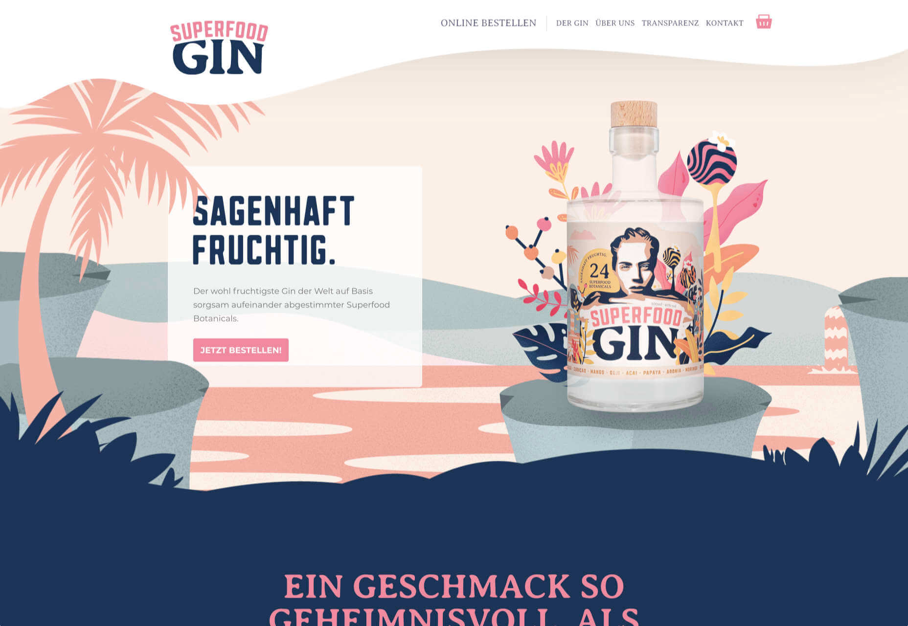
Maison Louis Marie
Maison Louis Marie is a natural fragrance company. While this site does nothing really groundbreaking, it does it well. Botanical drawings on a white background, along with clean typography, help create a refined, luxury feel.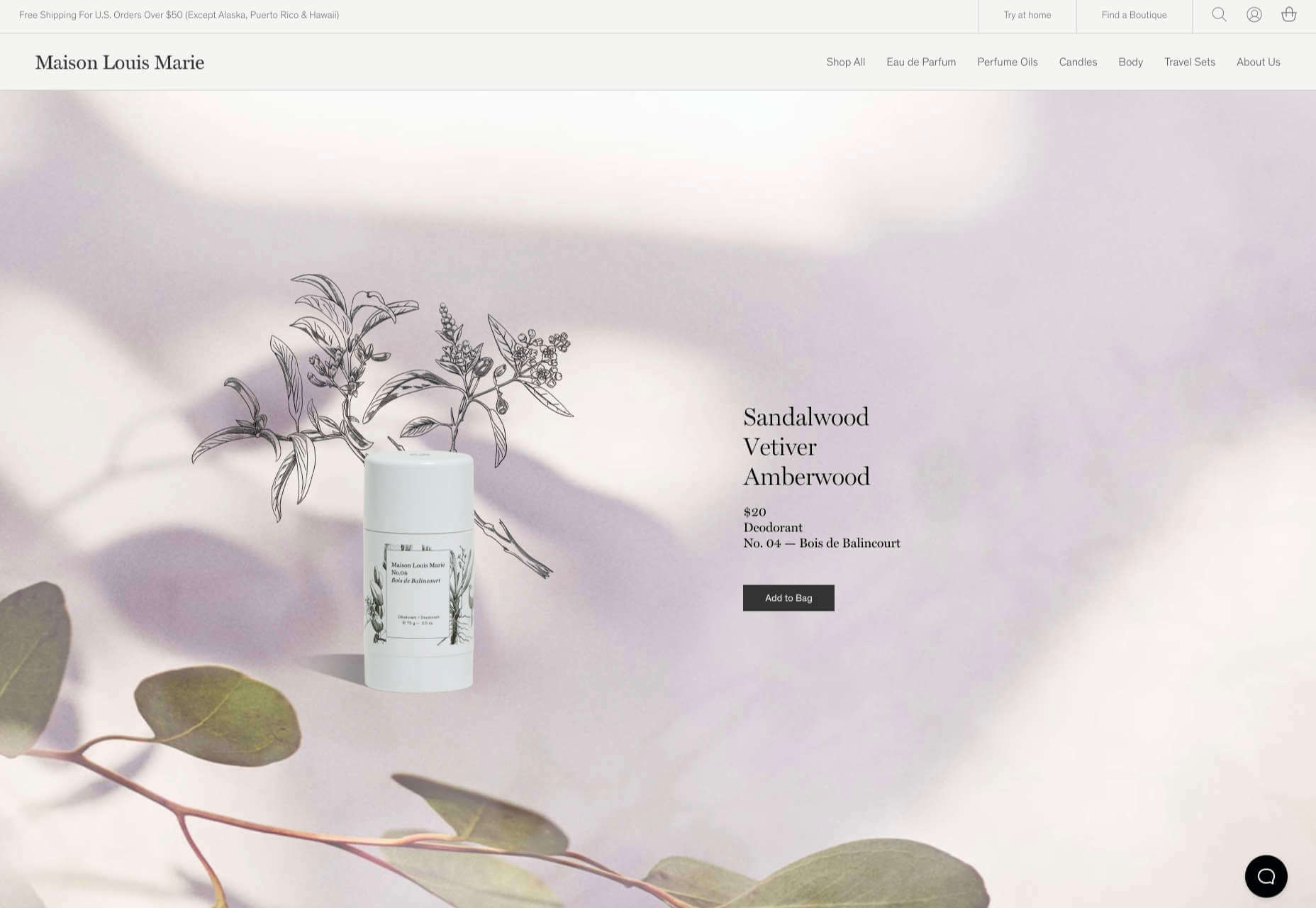
Think Economia
Think Economia is a platform taking a fresh look at economics and the future of economic growth. It doesn’t sound like the most exciting subject, but it is presented here in a playful and intriguing way.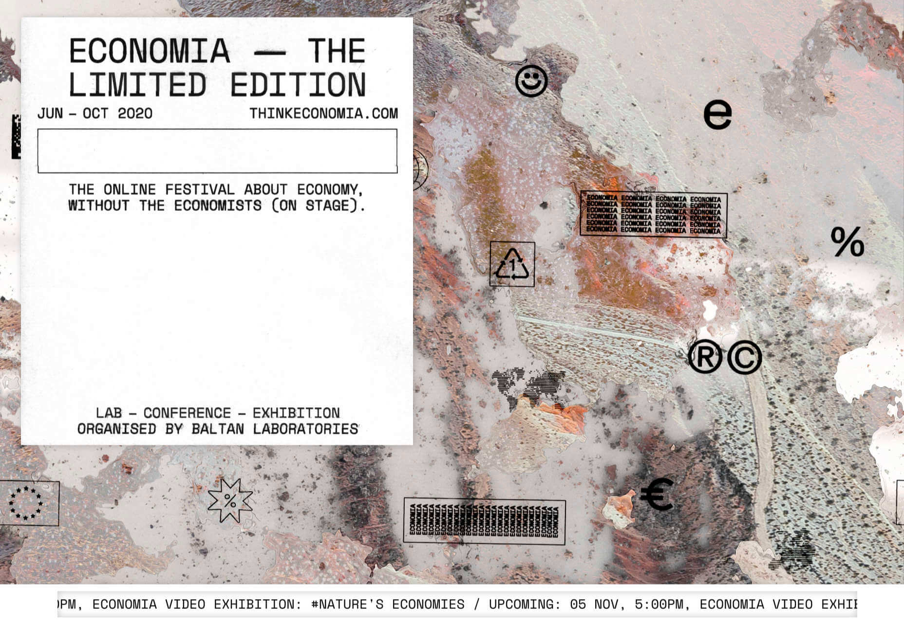
Chernobyl
From Uprock, a Russian design studio that also offers courses in web design, Chernobyl is a thought provoking exposition of the Chernobyl disaster. The design aesthetic is muted, allowing the images their deserved impact, and the brief sections of text to be absorbed.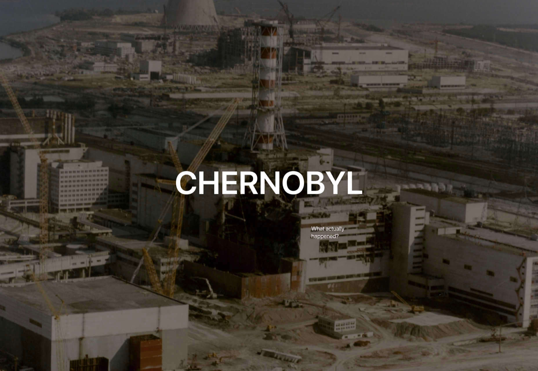
Declamatuus
Declamatuus is a lingerie company selling gift sets. What stands out here is what you don’t see — live models in underwear. Instead the outline of the body is created with animated particles.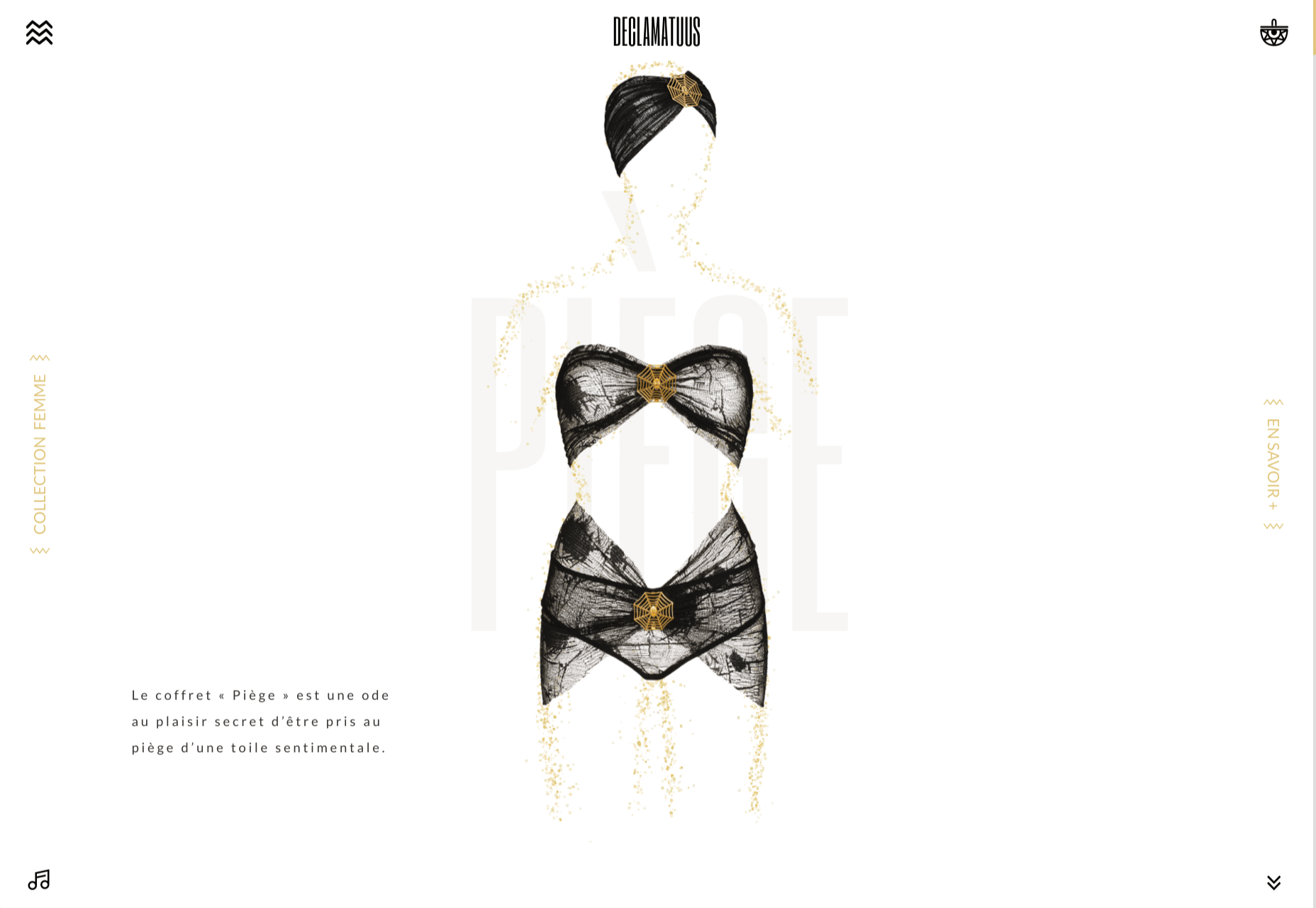
Odisea
Odisea Expedition is a documentary series following two friends, a surfer and a snowboarder, as they explore remote parts of the world. The photographs and video are everything here, and all other elements are kept minimal to avoid detracting from them.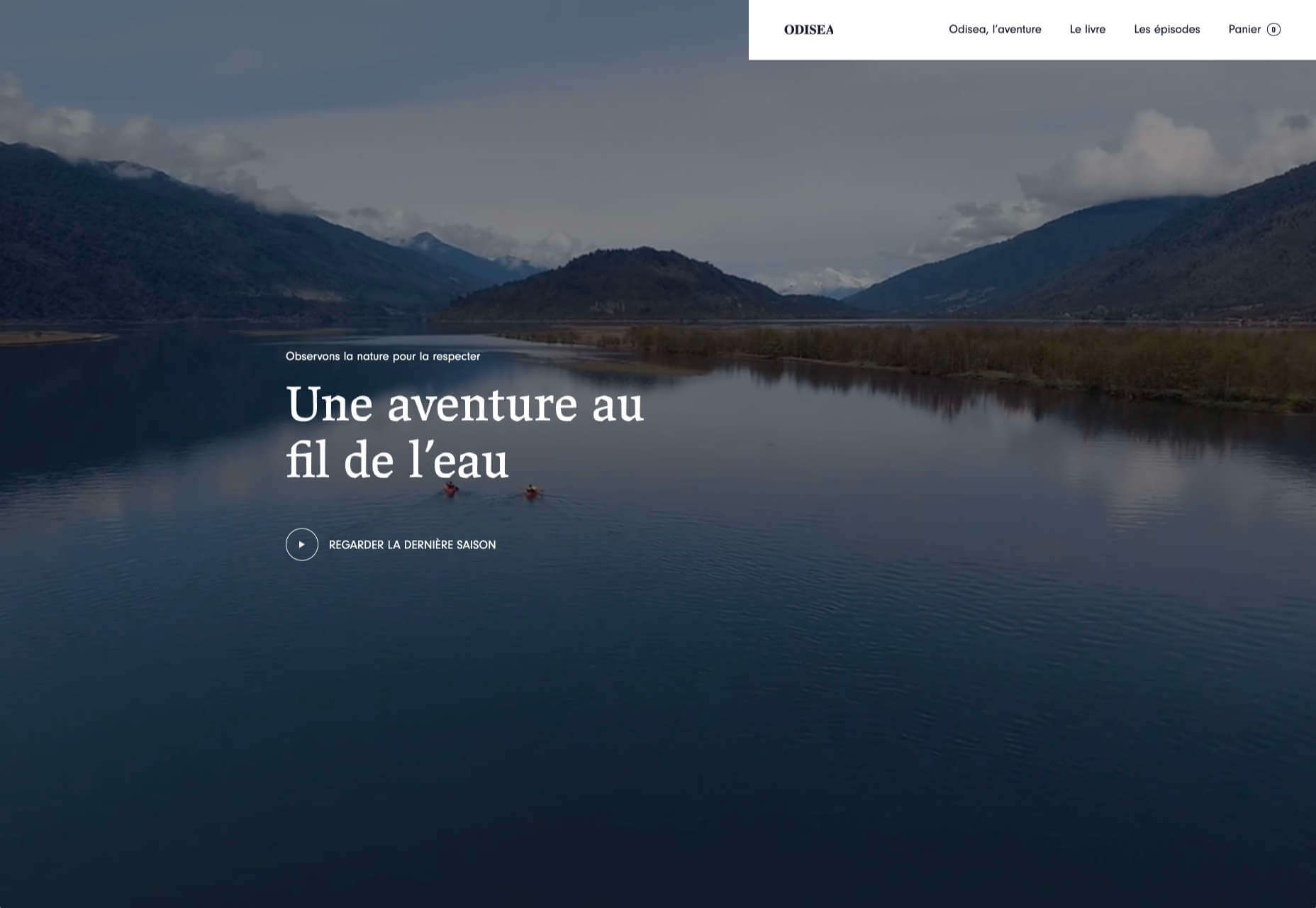
Riffyn
Riffyn Nexus is a ‘Process Data System’ for storing and analyzing scientific data for laboratories. It is a very corporate site and yet it is put together in such a way that doesn’t feel dull.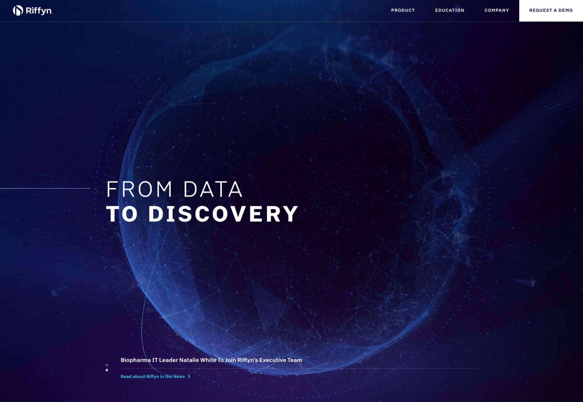
Maison du Net
This site for digital design agency Maison du Net takes a risk mixing corporate with cutesy, but it works. Offset frames and underlines create interest without overdoing it, and the very bright green is used sparingly enough to liven things up without being overwhelming.
Paddi MacDonnell
Paddi MacDonnell is a designer and entrepreneur from Northern Ireland, follow her on Twitter.


Read Next

15 Best New Fonts, July 2024
Welcome to our monthly roundup of the best fonts we’ve found online in the last four weeks. This month, there are fewer…
By Ben Moss

20 Best New Websites, July 2024
Welcome to July’s round up of websites to inspire you. This month’s collection ranges from the most stripped-back…

Top 7 WordPress Plugins for 2024: Enhance Your Site's Performance
WordPress is a hands-down favorite of website designers and developers. Renowned for its flexibility and ease of use,…
By WDD Staff

Exciting New Tools for Designers, July 2024
Welcome to this July’s collection of tools, gathered from around the web over the past month. We hope you’ll find…

3 Essential Design Trends, July 2024
Add some summer sizzle to your design projects with trendy website elements. Learn what's trending and how to use these…

15 Best New Fonts, June 2024
Welcome to our roundup of the best new fonts we’ve found online in the last month. This month, there are notably fewer…
By Ben Moss

20 Best New Websites, June 2024
Arranging content in an easily accessible way is the backbone of any user-friendly website. A good website will present…

Exciting New Tools for Designers, June 2024
In this month’s roundup of the best tools for web designers and developers, we’ll explore a range of new and noteworthy…

3 Essential Design Trends, June 2024
Summer is off to a fun start with some highly dramatic website design trends showing up in projects. Let's dive in!

15 Best New Fonts, May 2024
In this month’s edition, there are lots of historically-inspired typefaces, more of the growing trend for French…
By Ben Moss

How to Reduce The Carbon Footprint of Your Website
On average, a web page produces 4.61 grams of CO2 for every page view; for whole sites, that amounts to hundreds of KG…
By Simon Sterne

20 Best New Websites, May 2024
Welcome to May’s compilation of the best sites on the web. This month we’re focused on color for younger humans,…