8 Easy Ways to Improve Your Website Typography in Under 30 minutes

Typography is one of the most important elements of any site, having a measurably large impact on brand and experience.

So fundamental is it that making wholesale changes to your typography — opting for a new font, changing the measure, increasing leading — is complex and fraught with potential time-sinks.
But there are some simple changes that you can make to your typography that won’t break your grid and can be achieved in 30 minutes or less. Here are eight of the easiest.
1. Increase Color Contrast
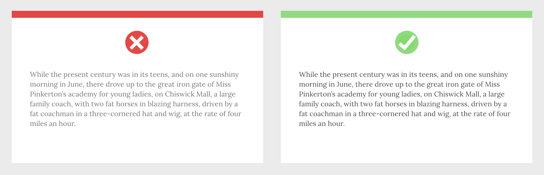
When laying out text, it’s common for designers to see text as a block within a visual design. A designer’s relationship to text is very different from a user’s; a designer positions text as a shape, a user reads it line by line. Consequently, designers tend to underestimate the amount of contrast text requires.
Light grey text is aesthetically beautiful but functionally useless. Text is meant to be read and needs to meet WCAG AA standards on desktop and WCAG AAA standards on mobile — or in any situation with many ambient light sources. The larger the text is, the more leeway you have.
Text should be thoroughly tested for contrast, but as a starting point, 18px text on a white background should never be lighter than #595959.
2. Tighten Heading Spacing
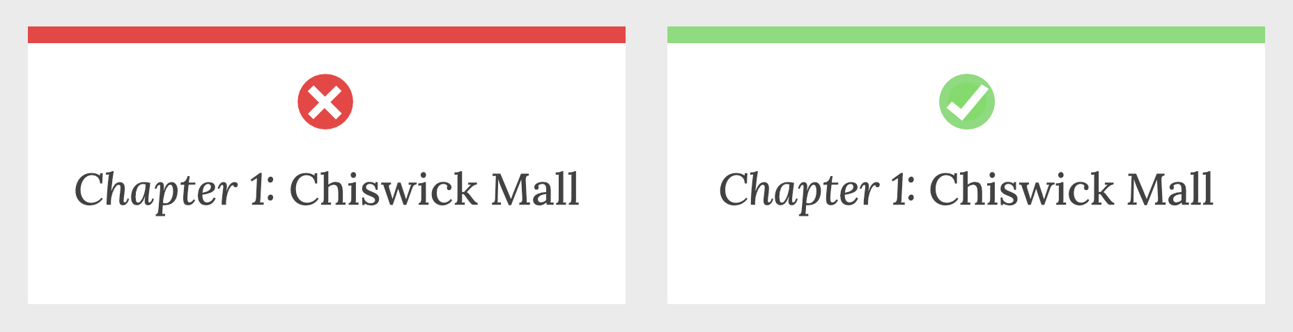
The vast majority of typefaces are designed for use as body text — large blocks of running text, multiple lines long. When the font was made, it was spaced for this use.
Unlike running text, headings tend to be short and are surrounded by more whitespace — especially above and below. Extra whitespace visually floods the negative space in the word shapes and forces letters apart.
To compensate, tighten the letter-spacing and word-spacing of headings by 1–5%.
3. Loosen Non-Word Spacing
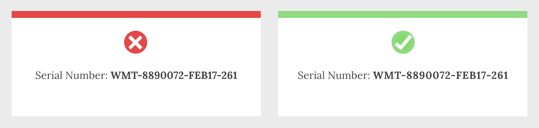
When we read, our brain doesn’t spell out words letter by letter; it recognizes word shapes and even word groups' shapes.
Most micro-typography is concerned with not disrupting those word shapes. However, there are times when you do want to prevent words from forming and allow individual characters.
Loosen the letter-spacing on any text intended to be read as a series of characters, such as serial numbers, tracking codes, and tabular data.
4. Use System Fonts for Inputs
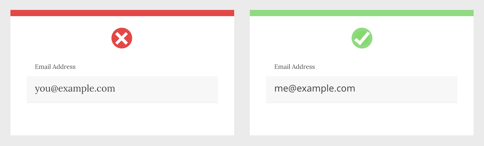
Privacy is a big issue for users. Anything you can do as a designer to reassure users their data is safe will increase your site's positive UX.
Style your HTML inputs to use system fonts — the default fonts set by the OS your user is accessing the site with. This creates a clear delineation between the brand data in the brand fonts and the user’s data in the user’s fonts.
Using system fonts in this way encourages the user to feel ownership of their data, builds trust, and increases conversions.
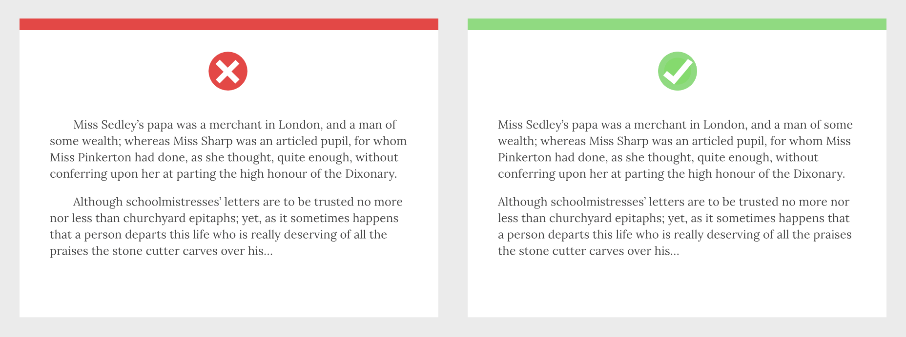
5. Mark Paragraphs Once
Paragraphs of text need a visual indication that they have begun. There are three ways in which this is normally conveyed: following a heading, with a vertical space before the paragraph, or indenting the first line.
Each paragraph should use one of these indicators and one only. Due to the nature of web content and the benefits headings have for quickly scan-reading content, for most sites, the best choice is a combination of following a heading and vertical spacing.
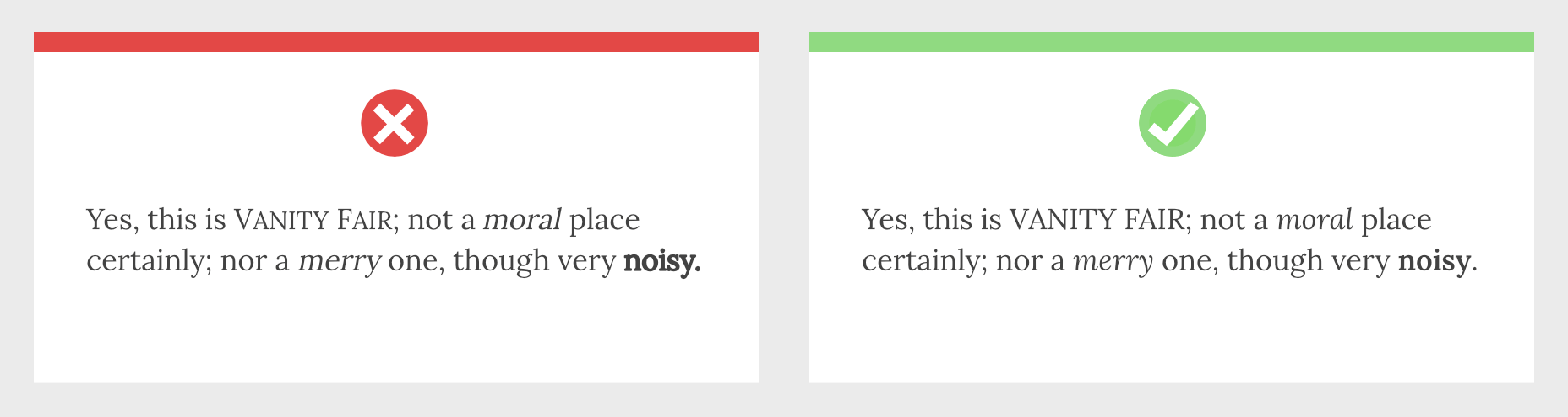
6. Use Genuine Styles
For various reasons ranging from the availability of fonts to aggressive optimization, it’s common for sites to fake alternative styles using CSS. Italics can be faked as obliques with a skew, bold weights can be faked by using the browser’s defaults, and small caps can be faked by setting text to uppercase and reducing the font-size.
These tricks do more harm than good, creating distorted word shapes that interrupt the natural flow of text.
If you cannot deploy genuine italic, bold, and small caps, then don’t fake them. Find alternative ways of creating emphasis, such as changing colors.
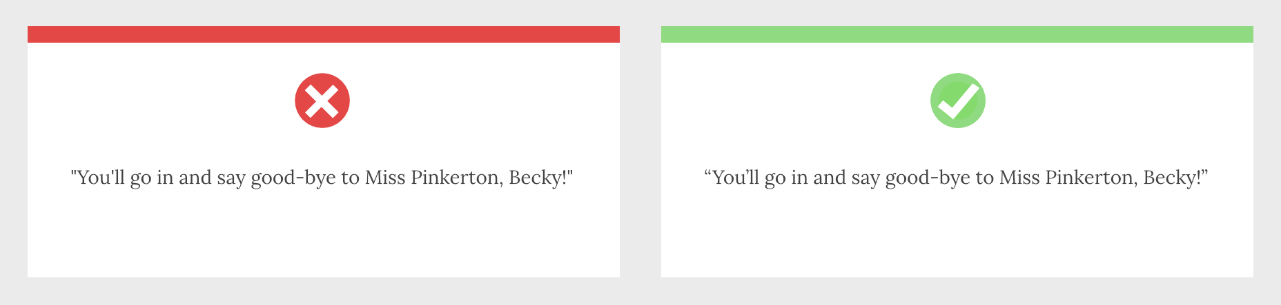
7. Use the Correct Quotes
Apostrophes, single, and double-quotes are specific characters. Most fonts provide a glyph for them that is distinct from the quick single or double-quote key on your keyboard.
These quote marks are most commonly referred to as “smart” quotes because word-processing apps usually have the option to be “smart” about which glyphs they use.
Using the correct quotes is one of the simplest ways to deliver a refined piece of text.
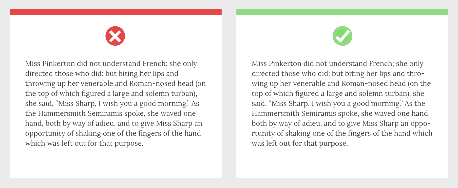
8. Hyphenate Text Properly
Hyphenation is the breaking of a word over two lines. It allows a less extreme ragged-right text, and it is vital on mobile devices where the available page width is relatively small compared with desktop.
The web has surprisingly poor support for correct hyphenation, but it is gradually improving, and it can be applied as a progressive enhancement.
CSS allows you to set hyphenation to none (no hyphens), auto (the browser inserts automatically), and manual (in which you specify where hyphens should appear using the soft hyphen character).
Typographically, a hyphen may be inserted in any word that is five characters or longer; there must be at least two characters preceding the hyphen and at least three following the hyphen.
You should never hyphenate three consecutive lines of text, but addressing this requires JavaScript. You can minimize this problem by increasing your measure.
Featured image via Unsplash
Ben Moss
Ben Moss has designed and coded work for award-winning startups, and global names including IBM, UBS, and the FBI. When he’s not in front of a screen he’s probably out trail-running.


Read Next

15 Best New Fonts, July 2024

20 Best New Websites, July 2024

Top 7 WordPress Plugins for 2024: Enhance Your Site's Performance

Exciting New Tools for Designers, July 2024

3 Essential Design Trends, July 2024

15 Best New Fonts, June 2024

20 Best New Websites, June 2024

Exciting New Tools for Designers, June 2024

3 Essential Design Trends, June 2024

15 Best New Fonts, May 2024

How to Reduce The Carbon Footprint of Your Website
