

Circle Animations
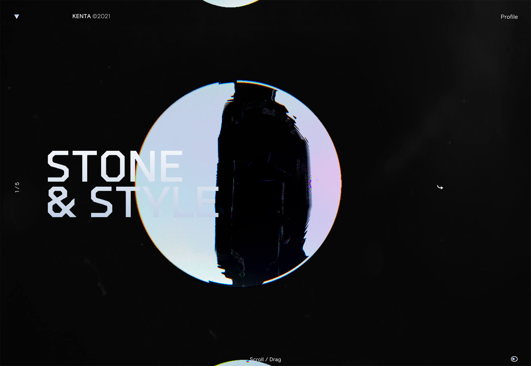
Circles are one of those shapes that never leave the design sphere. They have a lot of classical meaning and are flexible in terms of design options. Designers are having a lot of fun with this shape right now. From animations to text circles to image frames, they seem to be all over the place. More recently trending is more circle-shaped animations. This trend maintains a circle's properties as a unified and harmonious element with movement to create more engagement and make you look at the design just a little bit more. Each of these examples uses circles in a different but equally interesting – and animated – way. Universal Favourite uses a circular blob. It’s almost like a giant bubble. It wiggles and flows, and stretches within the space without any help from the user. It has a smoothly quality that makes you want to stare at it. The color here helps, with the circle and background not having an immense amount of contrast. Also, note the cute little circle button in the bottom corner.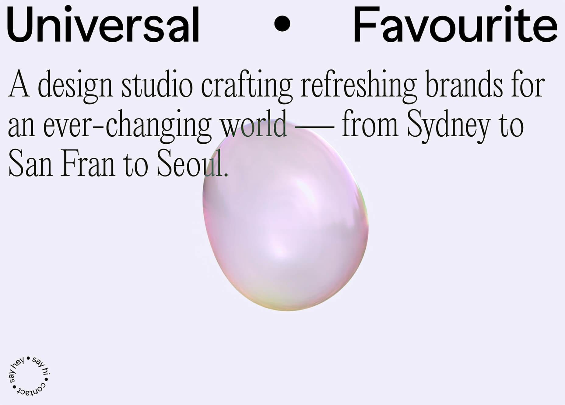 Kenta Toshikura put most of the subtle animation for this design inside the circle. With a hover state, the entire circle moves on the screen with a second layer of animation, and the cursor is also a circle that hops around the black background.
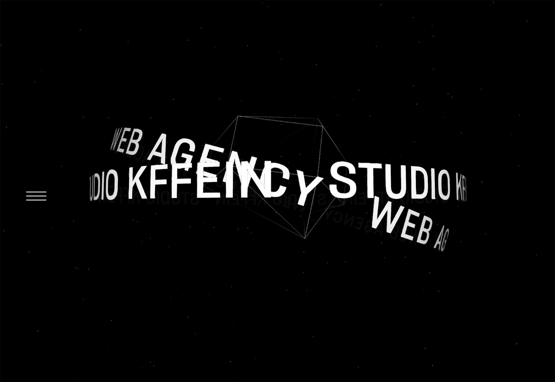
 Kffein takes a totally different approach with a circle made from the primary test elements. Identifying website information rotates in a circle around another geo shape on the main plane. Not only is there a circular animation, but an almost three-dimensional effect that happens due to the way elements are layered here.
Pink and Purple Palettes
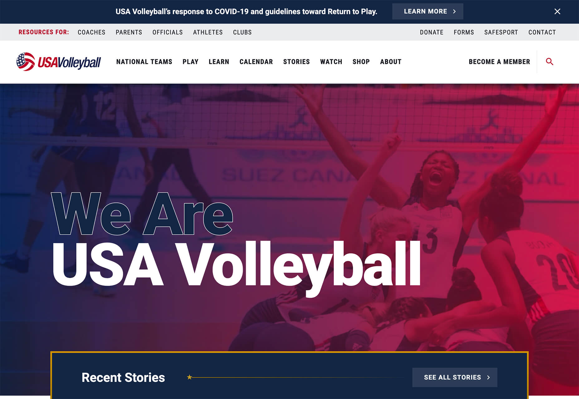
The prevalent pink and purple color combination isn’t for everyone – although you wouldn’t know it from the number of designs using similar colors. This bright combination almost screams “spring” and has a lightness to it that almost seems to lift the mood of any project. (Maybe color selection is a reflection of how we all want to feel.) What’s nice about these colors is that they flow into one another nicely. They can also be expanded to fall into neighboring hues on the color wheel, such as red from pink and blue from purple. Maybe the most popular use of this color pair is as a gradient. You can find pink to purple everywhere, from background gradients to image overlays to buttons and user interface elements. There’s no lack of use here. Each of these examples shows opportunities with this color combination. SMU uses bright pink, blue, and purple to create a giant “road sign” in the design that jumps out from the rest of the project. The sign almost seems out of place and doesn’t fit as part of the normal color palette. This is what draw you right to it.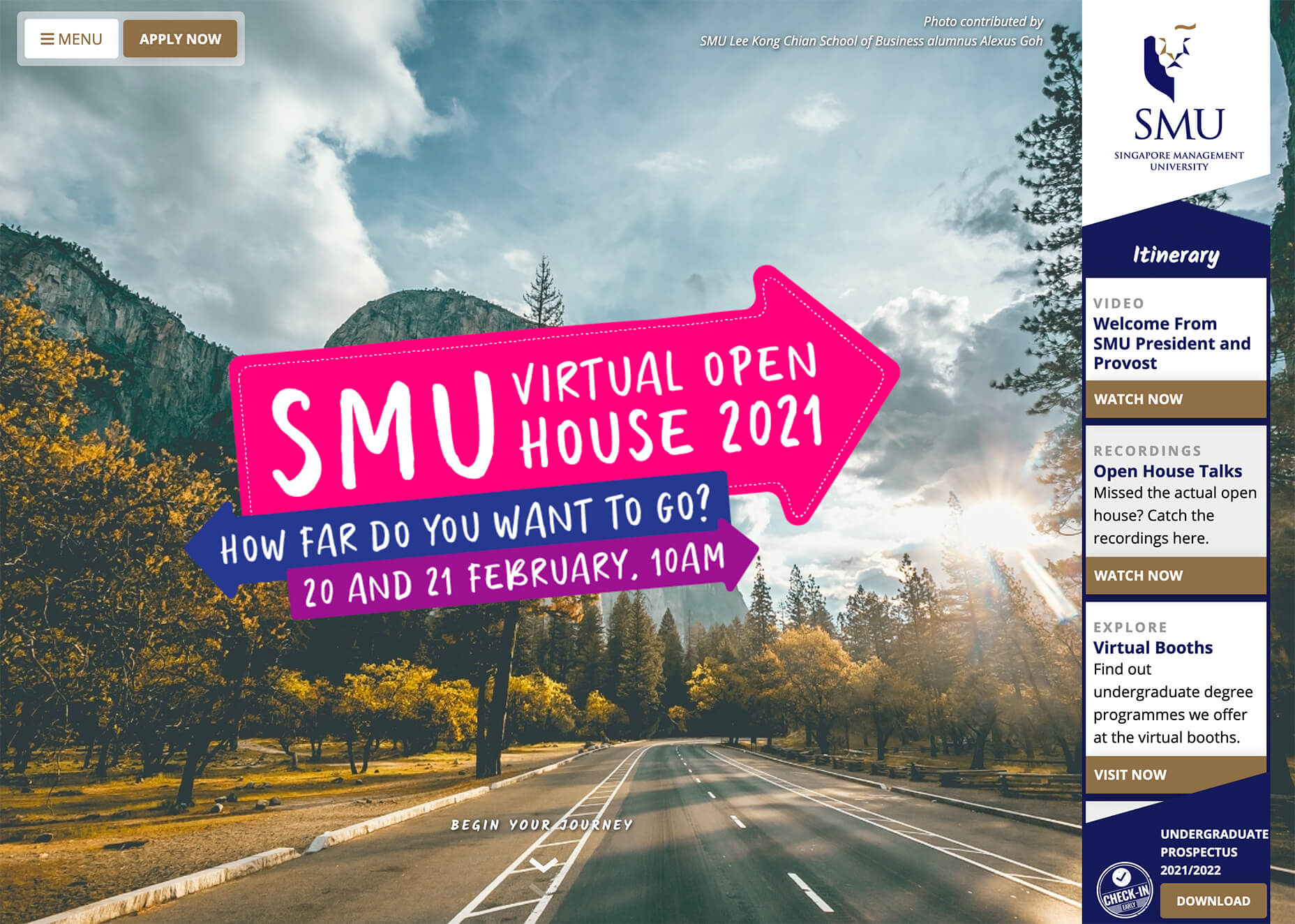 USA Volleyball uses the popular gradient option and extends the pink to the purple palette to hints of blue and red. What’s great about this design is that it uses a super trend element and color option and makes it work with their current color palette. You can almost imagine the design conversation when someone wanted to use a pink to purple gradient for a brand that features red, white, and blue. The gamble paid off, and it works beautifully without being off-brand.
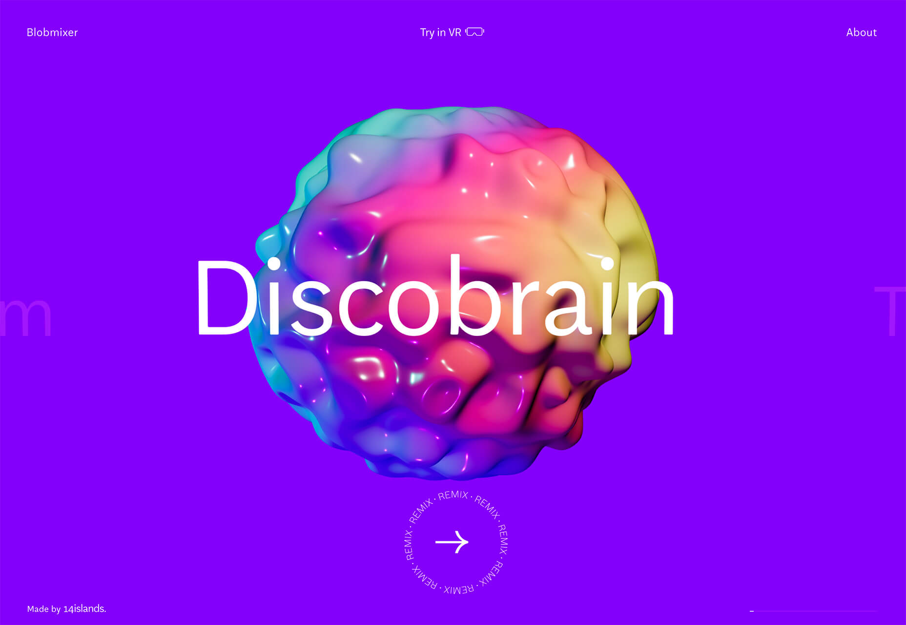
 Blobmixer uses purple, pink, and a few other bright colors – note the animated circles, too – to draw users into the design. The entire project is a fun, customizable experience that you can play with, and the color choices are what make you interested enough to try. This design also offers a great example of tactile animation and elements that feel real even when you interact with them using a mouse on the screen.
Faux Split Screens
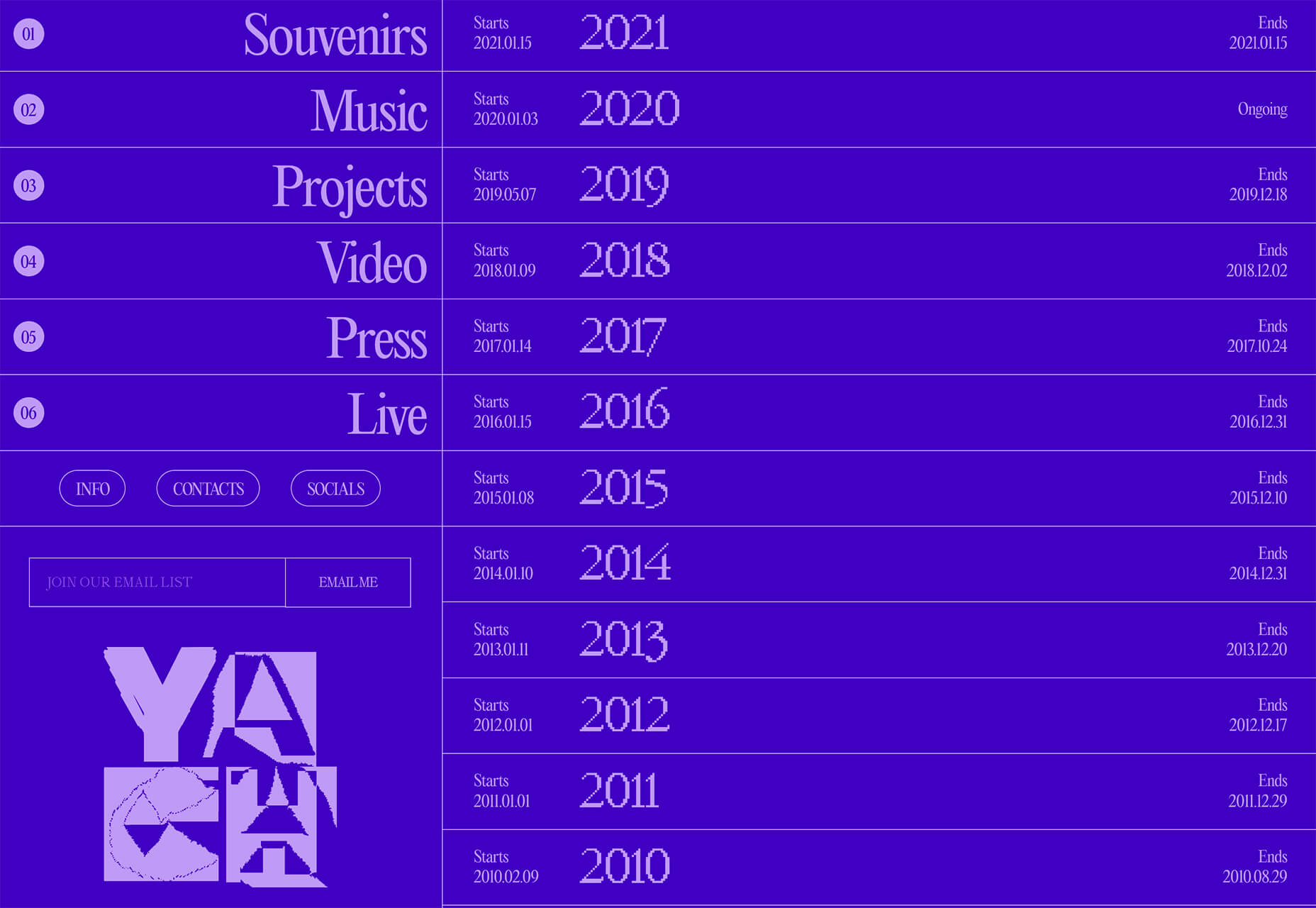
Split-screen designs were a huge trend for about two years. The aesthetic was also functional for content that required a this or that choice on the part of users. Now, we see the design elements but without the function. (Maybe because it just looks nice and creates a sense of balance without a symmetrical design.) These projects look like they might offer multiple gateways to content, but there is only one call to action on the dual-screen aside from navigation elements. What this design option does is help draw the eyes across the screen. One side will immediately appeal to you, and when done well, you’ll feel a subtle push of pull from the color, text, and images to look at the other side as well. Renaissance TV does it with heavy animation with “dancing dots” from an old TV that doesn’t work. But then you need to look at the green text to understand what is happening.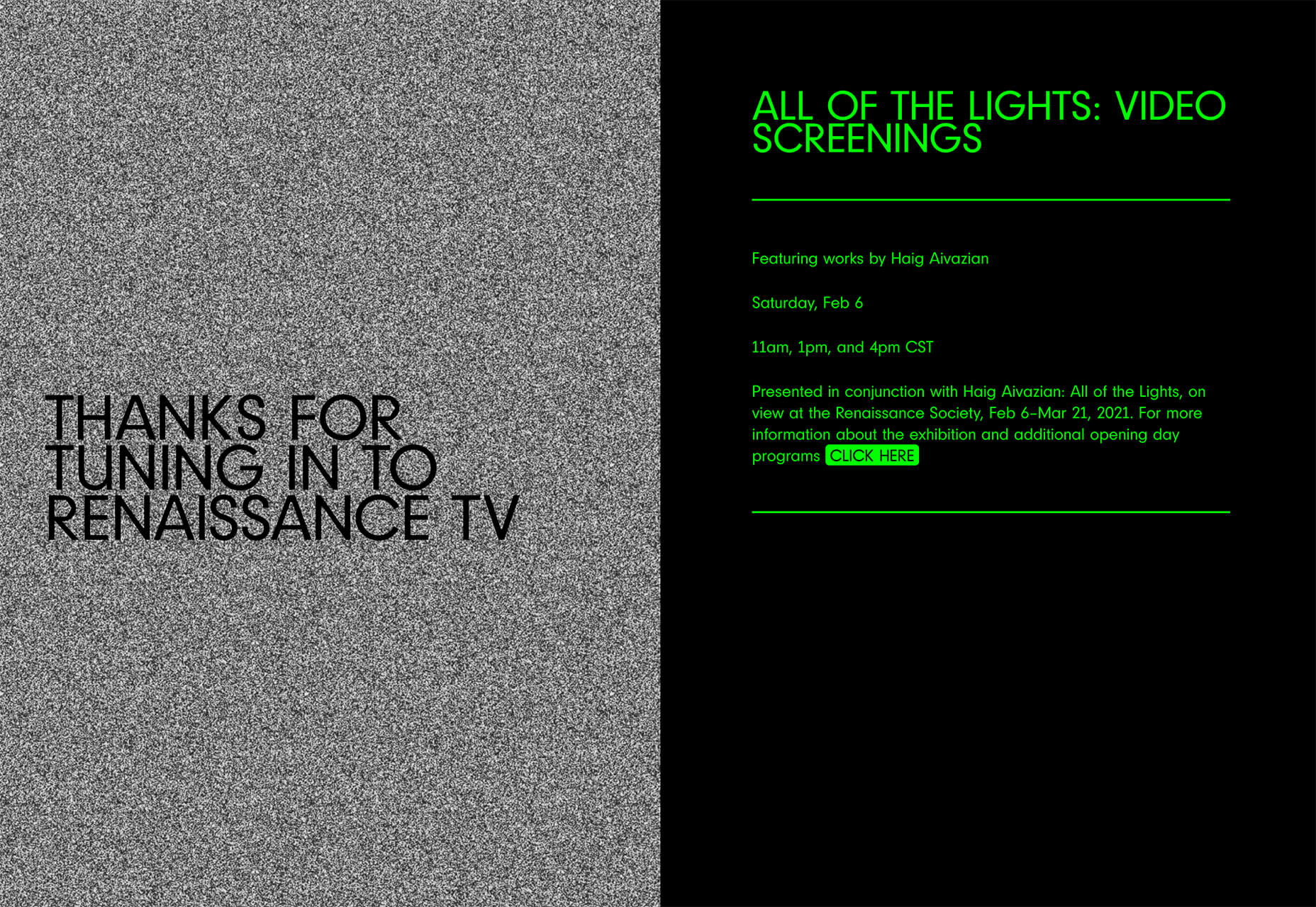 Yacht uses text weight and space to push the eyes across the screen. Almost everyone will go to the heavier areas first and then gaze across the screen through blocks of space to the final small text on the right side. And it all happens in a fraction of seconds.
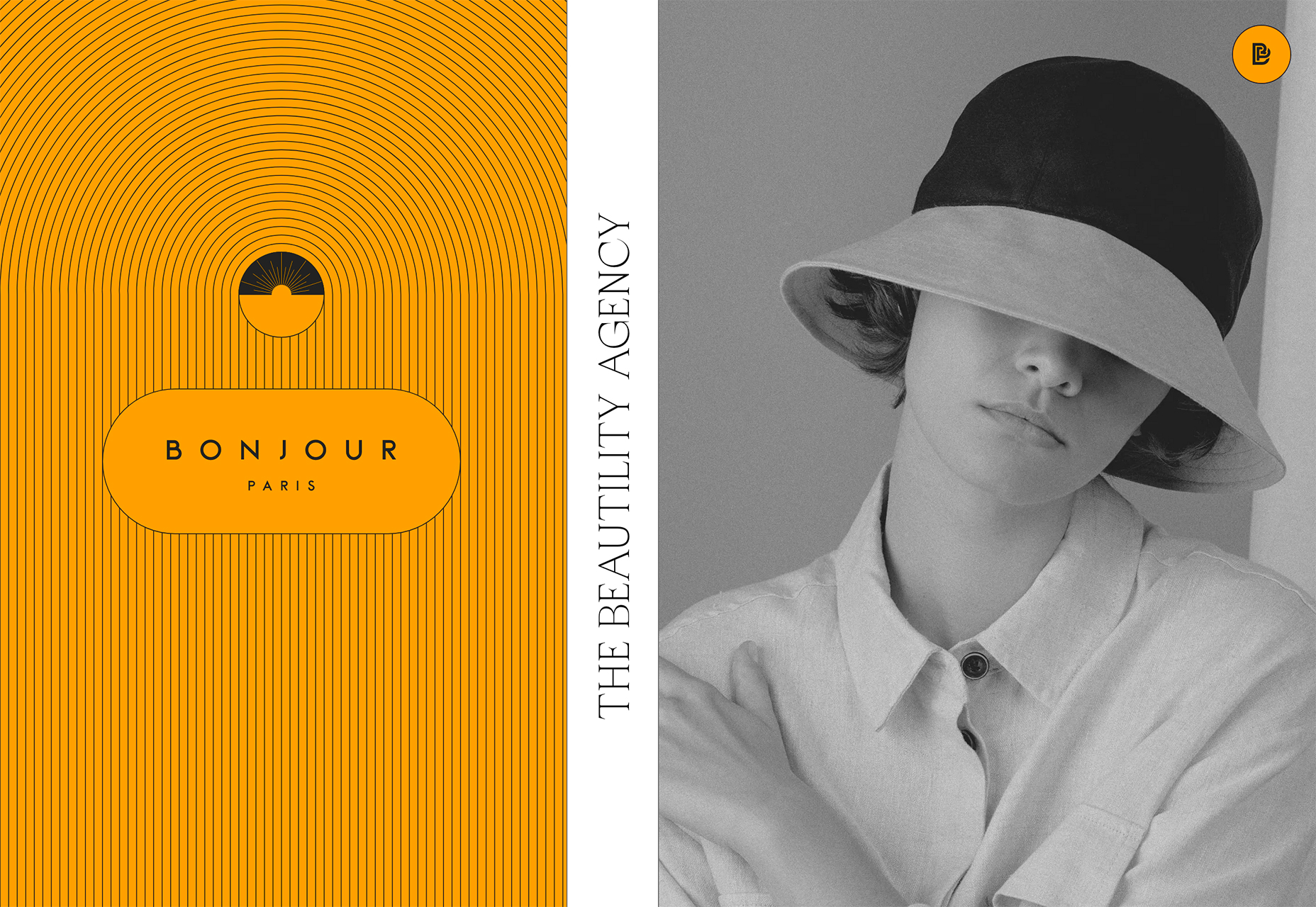
 Bonjour Paris pairs bold color with black and white images. You may look at either side first, depending on personal preference, but the other half of the screen is necessary for a complete understanding of the website.
Conclusion
While all of these design trends are evident in new and recent projects, the use of pink and purple color palettes – particularly with a gradient – seems to be everywhere you look. These color choices are popular and come in a lot of forms. Maybe the most obvious is with brighter pink and purple gradients, but other variations are also trending. It’s definitely one to watch in the longer term.Ben Moss
Ben Moss has designed and coded work for award-winning startups, and global names including IBM, UBS, and the FBI. When he’s not in front of a screen he’s probably out trail-running.


Read Next

3 Essential Design Trends, May 2024
Integrated navigation elements, interactive typography, and digital overprints are three website design trends making…

How to Write World-Beating Web Content
Writing for the web is different from all other formats. We typically do not read to any real depth on the web; we…
By Louise North

20 Best New Websites, April 2024
Welcome to our sites of the month for April. With some websites, the details make all the difference, while in others,…

Exciting New Tools for Designers, April 2024
Welcome to our April tools collection. There are no practical jokes here, just practical gadgets, services, and apps to…

How Web Designers Can Stay Relevant in the Age of AI
The digital landscape is evolving rapidly. With the advent of AI, every sector is witnessing a revolution, including…
By Louise North

14 Top UX Tools for Designers in 2024
User Experience (UX) is one of the most important fields of design, so it should come as no surprise that there are a…
By Simon Sterne

What Negative Effects Does a Bad Website Design Have On My Business?
Consumer expectations for a responsive, immersive, and visually appealing website experience have never been higher. In…

10+ Best Resources & Tools for Web Designers (2024 update)
Is searching for the best web design tools to suit your needs akin to having a recurring bad dream? Does each…
By WDD Staff

3 Essential Design Trends, April 2024
Ready to jump into some amazing new design ideas for Spring? Our roundup has everything from UX to color trends…

How to Plan Your First Successful Website
Planning a new website can be exciting and — if you’re anything like me — a little daunting. Whether you’re an…
By Simon Sterne

15 Best New Fonts, March 2024
Welcome to March’s edition of our roundup of the best new fonts for designers. This month’s compilation includes…
By Ben Moss

LimeWire Developer APIs Herald a New Era of AI Integration
Generative AI is a fascinating technology. Far from the design killer some people feared, it is an empowering and…
By WDD Staff