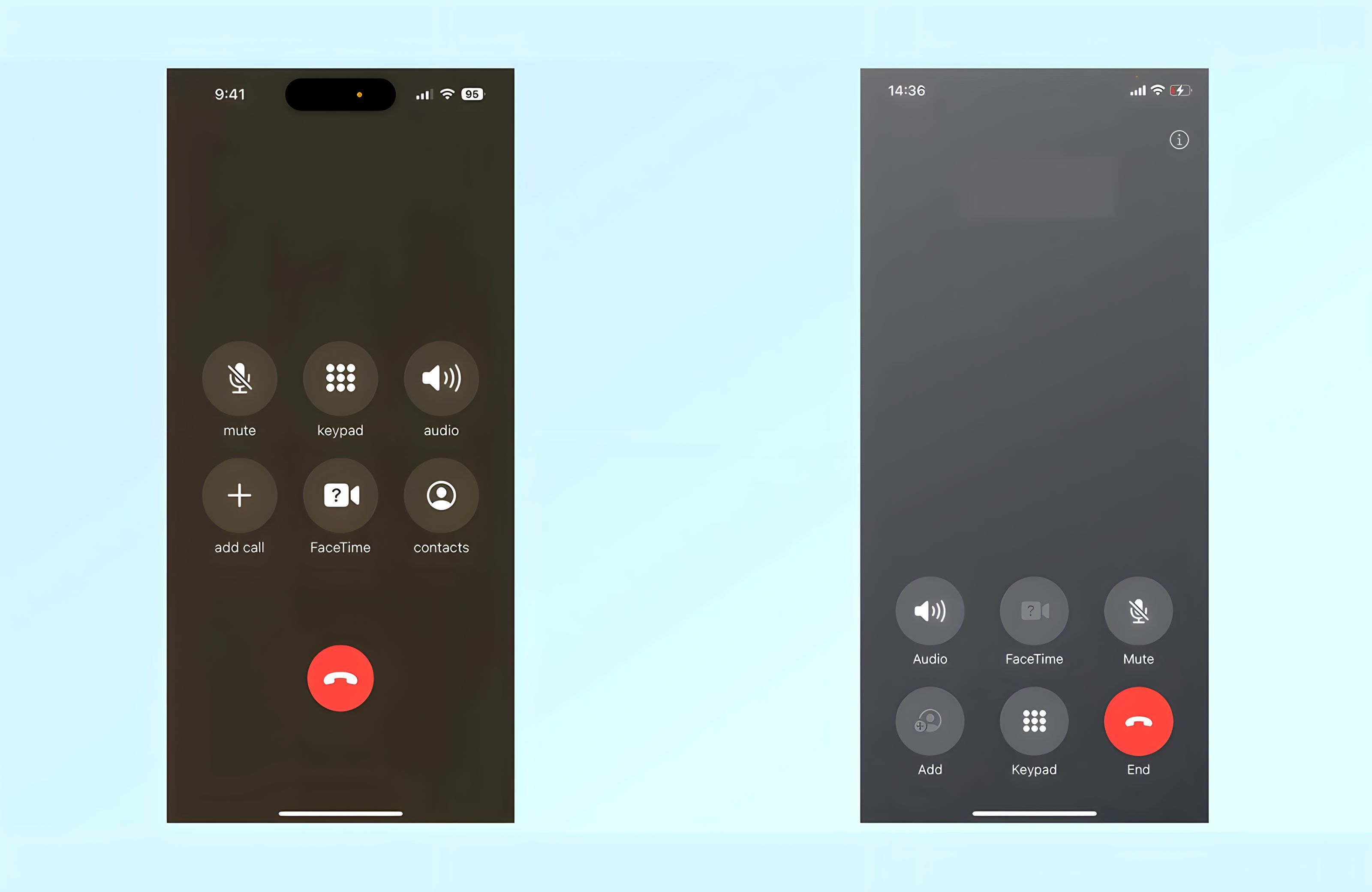
iOS 17’s New Call Screen Leaves the World Confused
Apple’s iOS17 offers a host of exciting new features, but users can’t get over the new look call screen. Are we just adverse to change, or do we have good reason to be horrified?

If you’ve used an iPhone for an extended period, as millions of us have, it’s natural you’re going to pick up a few muscle memory habits somewhere down the line. After years of social media use, you don’t even need to think twice when locating your YouTube, Instagram, or LinkedIn apps. It’s entirely ingrained. Perhaps that’s why so many of us spend our time unconsciously doom scrolling before remembering we should likely be working on that critical project.
The same could be said for Apple’s user interface. We’re all familiar with the iPhone’s in-call UI. It’s been the same way since 2007. No one’s ever complained, and we all appreciate being able to hang up a sales call in record time without looking twice at the screen. If it isn’t broken, why fix it?

Apple’s current call-screen UI (left) compared with the new UI in iOS17 (right). Credit: Apple
So, the question begs. Why, oh why, has Apple decided to change the position of their ‘end call’ button in iOS 17? The big red button was previously positioned front and center - easy to see, impossible to miss.
Now, it’s neatly tucked away at the bottom right of the screen. This may seem inconsequential, but as we’ve all been ending a call the same way for the best part of sixteen years, this change could take some getting used to.
And the kicker? Get it wrong, and you’ll accidentally Facetime the person you were just trying to hang up on. Brilliant!
Unfortunately, this tiny alteration is overshadowing some of the more exciting features of iOS17, such as real-time audio message transcribing and the ability to record video or audio messages when someone misses your FaceTime call. Ah, well. We’ll probably forget all about this once our brains get used to the change.
What’s the first rule of design? Purpose. If you’re going to change something, there needs to be a reason to do so. Unless I’m missing an ingenious motive behind Apple’s changes, this seems wholly unnecessary. Maybe Apple knows something we don’t. Time will tell. Perhaps they’re all playing chess while we’re playing checkers.

Max Walton
Born in Cardiff Wales, Max relocated to Brisbane when he was 12. He’s spent the last five years developing expertise in the Fintech industry. When he’s not posting about Web3, you’ll find him on a paddleboard.


