![]() A professional logo can enhance a company, an organization, or a product. On the other hand, an unprofessional logo can ruin a brand and mar an otherwise good designer's portfolio.
A professional logo can enhance a company, an organization, or a product. On the other hand, an unprofessional logo can ruin a brand and mar an otherwise good designer's portfolio.
Many logos in use are unprofessional and carry all the tell-tale marks of an amateur or a beginner. Everyone thinks they can design a great logo, but simply knowing your way around Photoshop is not enough.
Here are some insights into the process and workflow of effective and modern logo design. With these tips and your creativity, you can make your logo designs shine with the very best.
1. Design: Sketch and brainstorm
A lot of beginners jump right onto the computer to create a logo. However, more often than not, a lot of time is spent fiddling with special effects and filters. While this can be useful, it usually means that the thoughtful design and artistry of the logo itself has taken a back seat.
A better way to start is to get a fresh sheet of paper and a pencil. Think about the meaning and the feeling you want the logo to impart to the viewer. Is it for a high tech game company or a historic non-profit organization? Should it be complex or simple? As you are thinking, sketch and doodle your ideas. Don’t worry about making everything perfect. You just want to let your natural creativity flow without your computer software taking over at this stage.
As you sketch different options, start eliminating the designs that seem weak or inappropriate. When you are satisfied with your ideas, move to the computer. (For those of you with graphics tablets, you can try sketching your ideas directly on your computer, but try and keep away from special brushes and effects.)
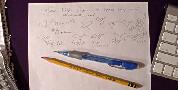
If you are designing a logo for a customer, keep in mind that they might not like all your ideas. So, before spending too much time on each design, you may want to present some work-in-progress designs to gauge their level of interest. This can be a huge time saver, especially if your customer has not given you a lot of direction or if they tend to be very particular.
2. Build: Vector graphics
Ah, the world of vector graphics. This is a topic that many beginners (and some professionals) find confusing. In recent years, some software such as Photoshop, Paint Shop Pro, and Fireworks have blurred the lines between vector and bitmap graphics.
Common image formats like GIF, JPEG, BMP, and TIFF are all bitmap formats. Digital photos are perfect examples of bitmap graphics (also known as a “raster” images) - because they are made of dots which are also known as pixels. Bitmap graphics have a specific resolution. If you zoom in on a digital photo, you will see the individual pixels. You can scale a bitmap down in size, and get some decent results, but increasing the size of a bitmap means that you are blowing up the pixels and you will get mixed results depending on the amount of enlargement. Photoshop, Pixelmator, Paint Shop Pro, and Painter are all good examples of applications that are primarily designed for bitmap graphic creation and photo editing. They are not the best tools for logo design.
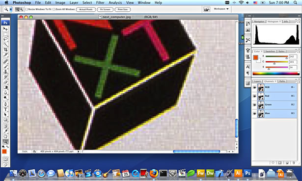
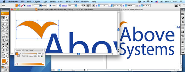
In contrast, vector graphic files are not made of dots or pixels. Instead, they are mathematical formulas for shapes. Vectors can be enlarged or reduced, to any size, with no loss in detail or sharpness. For example, the lines and curves of a vector graphic will look equally as sharp on a small business card as they will on a giant advertising billboard. Professional logos are made with vector graphics so that they can used for commercial printing, web sites, television, and all other forms of media. Vector-capable file formats include EPS (encapsulated postscript), PDF (portable document format), and AI (Adobe Illustrator).
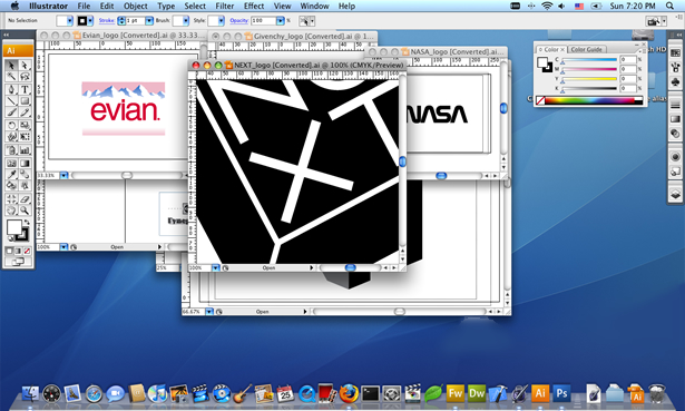
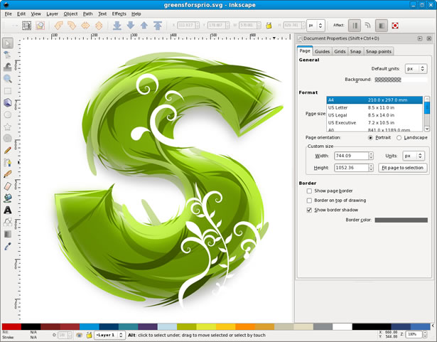
If you learn to use vector-specific drawing software to create logos, you will be able to create perfect straight lines, smooth curves, and accurate shapes quickly and easily. Excellent commercial vector drawing programs include Adobe Illustrator, Lineform, FreeHand, and Corel Draw. In addition, there are excellent free alternatives including Inkscape which is shown below.
Using your pencil sketches as a guide, use your vector drawing software to recreate a crisp version of your ideas. If you are new to using vector software, take a few moments to learn the basics of using the pen tool to create lines and "bezier" curves. Keep in mind that vector shapes can have a “stroke” of varying thickness (the outside line of the shape) and a “fill” color or pattern (the inside of the shape).
3. Decorate: Color schemes
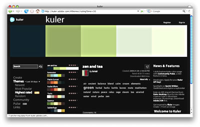
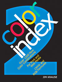
When thinking about “fill” and “stroke” colors, try and use color combinations that make sense for the logo. For example, you might not use bright pink and orange for an investment bank. For color inspiration, look online at Adobe’s free Kuler service or pick up a copy of Jim Krause’s Color Index 2.
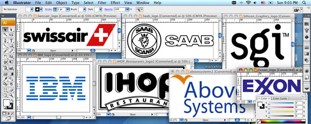
4. Versions: Black and white
After you’ve made brought your logo to life with color, consider how it will look when photocopied or faxed. If it looks muddy and incoherent when converted to black and white by a copier or fax machine, its time to get back on the computer and make a separate version of your logo that is purely black and white and ready for anything. The black and white version may differ somewhat from the original, but it should retain the overall look and feel. You may find yourself converting a solid shape to a hollow shape or vice versa.

5. Planning: Media
While developing a logo, keep in mind your target medium. For example, if a logo will only be displayed on a web site, you might jazz it up with multiple colors, fades, or even special effects. However, if a logo will also be used for commercial printing, you need to consider the complexity of the logo and the expense that multiple colors and effects will add to the printing costs. For some logos, you may want to create a web version and a less elaborate print version. In the printing world, each color is called a “spot” color and the more colors that are required, the more expensive the printing.
You should also take into consideration your “trapping” settings for your logo graphics. Trapping refers to the space between two colors. On a printing press, each color is usually printed separately and there can be some slight movement of the paper and machinery as each color is printed. These slight movements can cause thin hairline blanks between colors and even half of a millimeter will be noticeable if you have 2 colors that are designed to touch each other perfectly. This is equally important for colored shapes that are outlined in black. In your design, you can create an overlap (known as a “choke” or a “spread”) to occur between adjoining colors to reduce the chances that movement on the printing press will be noticeable.
However, if you look at a lot of professional logos, you will notice that different colors do not always touch and there is frequently blank space built into the designs. Blank space ("white space") is not only an important visual tool but it can also eliminate trapping worries.
6. Refine: Typography
Words that form a part of a logo are just as important as graphics. A lot of beginners will use any old font for a logo. However, the lettering style, fonts, and even the case (uppercase, lowercase, mixed) in a logo can have a dramatic impact. Never underestimate the need to use effective typography. Also, if your logo uses a font, use your software to convert the letters into shapes/outlines. That way, if you need to send the vector file to someone, they won’t need to have your font installed on their system.
Written exclusively for WDD by Derek Underwood, a professional web designer and software developer. You can read more about Derek and contact him at his website: http://www.derekunderwood.com
Feature image by Shutterstock
Logo design is interesting and challenging. Have you designed some logos? Share your logo designing experiences and tips.
WDD Staff


Read Next

15 Best New Fonts, July 2024

20 Best New Websites, July 2024

Top 7 WordPress Plugins for 2024: Enhance Your Site's Performance

Exciting New Tools for Designers, July 2024

3 Essential Design Trends, July 2024

15 Best New Fonts, June 2024

20 Best New Websites, June 2024

Exciting New Tools for Designers, June 2024

3 Essential Design Trends, June 2024

15 Best New Fonts, May 2024

How to Reduce The Carbon Footprint of Your Website
