 A few weeks ago I went to the movies to see the new James Bond movie: Quantum of Solace. The movie was nice, even though I'm not a really big fan of the series, however one thing that really caught my eye was the opening credits. I really liked the effects and the style.
The studio that did that animation was MK12 and I love the way they mixed sand and some sort of vector elements, it reminded me a bit of Apple's Viva la Vida ad.
In this tutorial, I will show you how I created the image inspired by the James Bond movie, in Photoshop.
Here's a preview of the final image:
Step 1
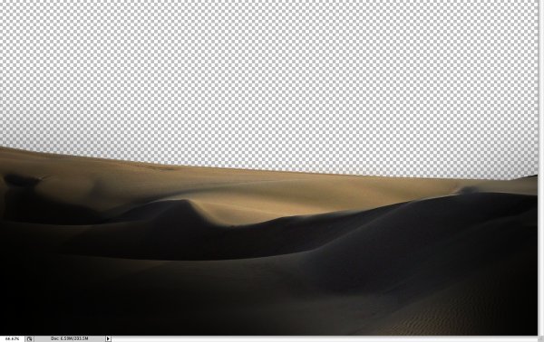
Create a new document in Photoshop, I used 1920x1200 pixels. Then place a photo of dunes. You can download the one I used here. With the Polygonal Lasso Tool (L), delete the horizon and leave just the dunes in the front.
Step 2
Go to Image>Adjustment>Brightness/Contrast. Reduce the Brightness to -150 and increase the contrast to 85. The idea is to make the darks really dark while preserving the highlights.
Step 3
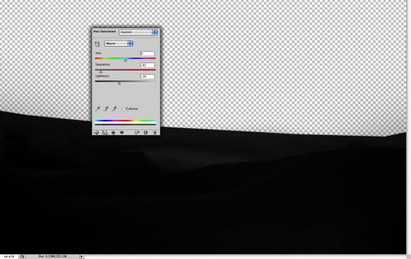
Next go to Image>Adjustments>Hue/Saturation. Reduce the saturation to -80 and the lightness to -20 in order to make the image less colorful.
Step 4
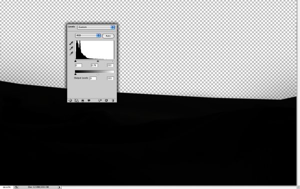
Go to Image>Adjustments>Levels. Reduce the Output Levels. I used 0 and 150.
Step 5
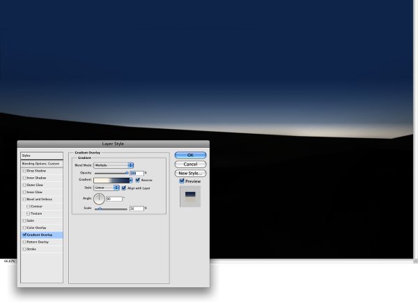
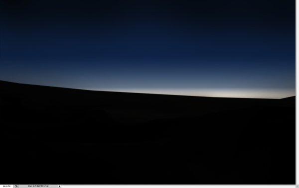
Create a new layer for the background. Then fill it with a gradient. Use a light beige such as #FCF7EA and blue #2A3E64 for the colors. Use the image below for reference, and make the horizon line much lighter.
Step 6
Now add another gradient, this time from black to transparent. The dark area will be at the top. Use the image below for reference.
Step 7
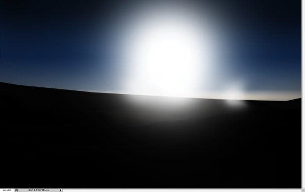
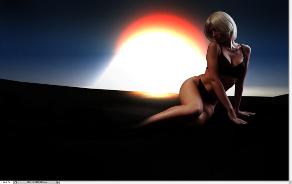
Create a new folder in the layer palette, rename it Sun. After that, create a new layer inside the folder and select the brush tool (B). Use a very soft brush (a rounded one with 0% hardness). Use white for the color and a large brush to create the sun.
Step 8
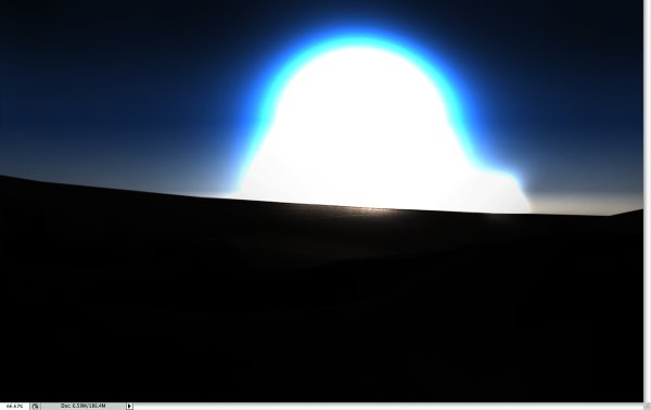
Change the blend mode of the Sun folder to color dodge and this should give you a nice light effect.
Step 9
Create another layer in the Sun folder, use the same brush but this time change the white color to an orange. Paint a bit on top of the other layer (1), in order to create an orange highlight. Also, add a new layer and once again let's use the brush tool, but with white. Reduce the size of the brush and paint a bit of the ground area (2).
Step 10
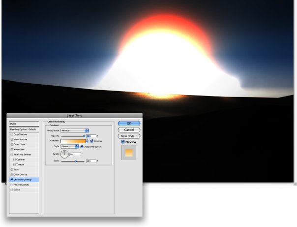
Select the first layer created in the Sun folder, the one we created in step 6. Go to Layer>Layer Style>Gradient Overlay. Use white and orange #F7AA33 for the colors and 90º for the Angle. This layer style will add a bit of color to the sun.
Step 11
Now lets add a photo of a woman to the design. I used one from iStockphoto. Cut out the woman from the background use the Eraser Tool(E) with a very soft brush and 0% hardness to delete the feet and a bit of the legs of the woman, just enough to make it blend with the dune photo.
Step 12
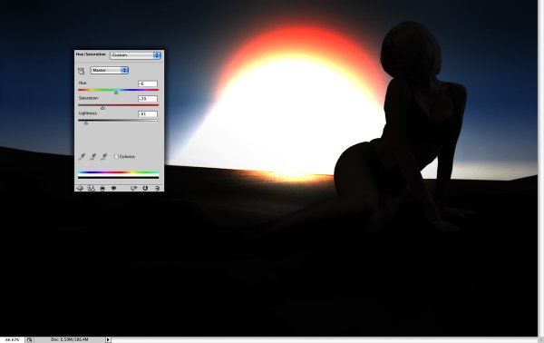
With the woman layer selected go to Image>Adjustments>Hue Saturation. Reduce the Saturation to -40 and the Lightness to -80.
Step 13
Now go to Layer>Layer Style>Inner Shadow. Use color dodge for the Blend Mode, 100% Opacity, 162º for the Angle, 38 pixels for the Distance, 0 for Choke, 68 pixels for Size. With this layer style, the idea is to illuminate the edges of the woman.
Step 14
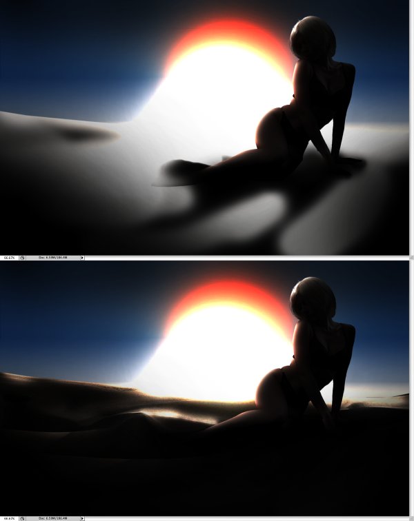
Create a new layer on top of the Dunes photo layer and fill it with black. Select the brush tool (B), use white for the color and a 0% hardness brush. Change the blend mode of the layer to color dodge and start painting some areas to make them really bright. Try different opacities for the brush using the number keys (1 is 10%, 2 is 20%...). If you change the blend mode of the layer to normal, you would have something like the first image in this step.
Step 15
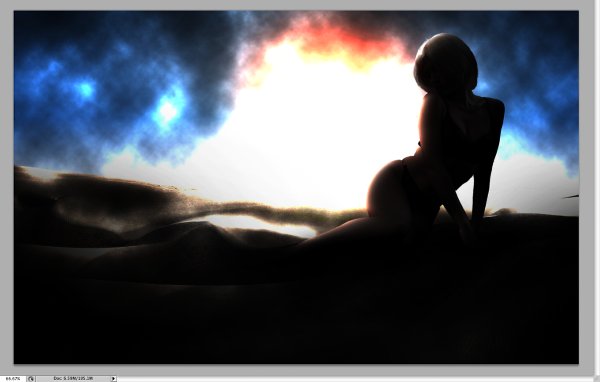
Create a new layer and go to Filter>Render>Clouds. Make sure you have black and white for the background and foreground colors. Then change the blend mode of the layer to color dodge.
Step 16
Go to Filter>Distort>Wave. Use the image below for reference.
Step 17
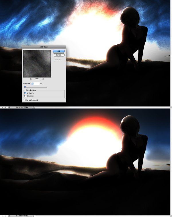
To create more sand like a sand storm, without being too strong I used the noise filter. Go to Filter>Noise>Add Noise. Use 12% for the amount and uniform for distribution. After that, with the eraser tool (E) and a very soft brush, delete some areas to make the sand effect less strong. Use the image below for reference. Also repeat the steps 14 and 15 in another layer and use screen for the Blend Mode. That will make the sand look more real.
Conclusion
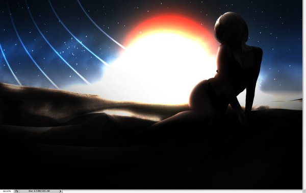
You can add some stars and create some lines using the brush tool like the image below however, the whole idea was to show how we can create sand using the clouds and noise filters. This showed me how important is for a designer to get out of the office and get some inspiration offline.
Written exclusively for WDD by Fabio Sasso. He is a Brazilian designer living in Porto Alegre. He produces an excellent design blog called Abduzeedo.
Have you followed the tutorial? Please feel free to show us your version below...


