 It's really easy to find yourself wondering how your CSS got to be such a mess.
Sometimes it's the result of sloppy coding from the start, sometimes it's because of multiple hacks and changes over time.
Whatever the cause, it doesn't have to be that way. Writing clean, super-manageable CSS is simple when you start off on the right foot and make your code easier to maintain and edit later on.
Here are 11 tips for speeding up the process, writing CSS that is slimmer, faster and less likely to give you a headache.
1. Stay Organized
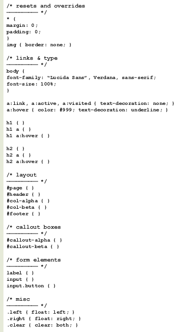
Just like anything else, it pays to keep yourself organized. Rather than haphazardly dropping in id’s and classes in the order in which they come to mind, use a coherent structure.
It will help you keep the cascading part of CSS in mind and sets your style sheet up to take advantage of style inheritance.
Declare your most generic items first, then the not-so-generic and so on. This lets your CSS properly inherit attributes and makes it much easier for you to override a specific style when you need to. You’ll be faster at editing your CSS later because it will follow an easy to read, logical structure.
Use a structure that works best for you while keeping future edits and other developers in mind.
- Resets and overrides
- Links and type
- Main layout
- Secondary layout structures
- Form elements
- Miscellaneous

2. Title, Date and Sign
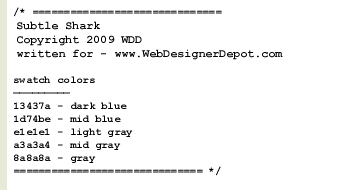
Let others know who wrote your CSS, when it was written and who to contact if they have questions about it. This is especially useful when designing templates or themes.

Wait a minute... what's that bit about swatch colors? Over the years, I've found that adding a simple list of common colors used in my style sheets is extremely helpful during initial development and when making edits later on.
This saves you from having to open up Photoshop to sample a color from the design, or look up colors in the site's style guide (if it has one). When you need the HTML code for that specific blue, just scroll up and copy it.
3. Keep a Template Library
Once you've settled on a structure to use, strip out everything that isn't generic and save the file as a CSS template for later use.
You can save multiple versions for multiple uses: a two-column layout, a blog layout, print, mobile and so on. Coda (the editor for OSX) has an awesome Clips feature that lets you do this easily. Many other editors have a similar feature, but even a simple batch of text files will work nicely.
It's insane to re-write each and every one of your style sheets from scratch, especially when you're using the same conventions and methodologies in each.
4. Use Useful Naming Conventions
You’ll notice above where I declared a couple of column id’s and I called them col-alpha and col-beta. Why not just call them col-left and col-right? Think of future edits, always.
Next year you may need to redesign your site and move that left column to the right. You shouldn’t have to rename the element in your HTML and rename the id in your style sheet just to change its position.
Sure, you could just reposition that left column to the right and keep the id as #col-left, but how confusing is that? If the id says left, one should expect that it will always be on the left. This doesn’t leave you much room to move things around later on.
One of the major advantages of CSS is the ability to separate styles from content. You can totally redesign your site by just modifying the CSS without ever touching the HTML. So don’t muck up your CSS by using limiting names. Use more versatile naming conventions and stay consistent.
Leave position or style specific words out of your styles and id’s. A class of .link-blue will either make more work for you, or make your style sheet really messy when your client later asks you to change those blue links to orange.
Name your elements based on what they are, not what they look like. For example, .comment-blue is much less versatile than .comment-beta, and .post-largefont is more limiting than .post-title.
5. Hyphens Instead of Underscores
Older browsers like to get glitchy with underscores in CSS, or don’t support them at all. For better backward compatibility, get into the habit of using hyphens instead. Use #col-alpha rather than #col_alpha.
6. Don’t Repeat Yourself
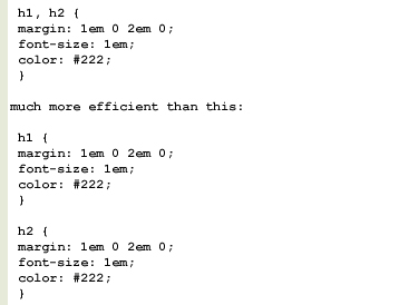
Re-use attributes whenever possible by grouping elements instead of declaring the styles again. If your h1 and h2 elements both use the same font size, color and margins, group them using a comma.
This:

You should also make use of shortcuts whenever possible. Always be on the lookout for opportunities to group elements and use declaration shortcuts.
You can accomplish all of this:

with only this:

It’s very important that you understand the order in which CSS interprets these shortcuts: top, right, bottom, left. A big clockwise circle, starting at noon.
Also, if your top and bottom, or left and right attributes are the same, you only need to use two:

This sets the top and bottom margins to 1em, and the left and right margins to 0.
7. Optimize for Lightweight Style Sheets
Using the above tips, you can really cut down the size of your style sheets. Smaller loads faster, and smaller is easier to maintain and update.
Cut out what you don’t need and consolidate wherever possible by grouping. Use caution when using canned CSS frameworks as well. You’re likely to inherit lots of bulk that won’t be used.
Another quick tip for slim CSS: you don’t need to specify a unit of measure when using zero. If a margin is set to 0, you don’t need to say 0px or 0em. Zero is zero regardless of the unit of measure, and CSS understands this.
8. Write Your Base for Gecko, Then Tweak for Webkit and IE
Save yourself troubleshooting headaches and write CSS first for Gecko browsers (Firefox, Mozilla, Netscape, Flock, Camino). If your CSS works properly with Gecko, it’s much more likely to be problem free in Webkit (Safari, Chrome) and Internet Explorer.
9. Validate
Make use of W3C's free CSS validator. If you're stuck and your layout isn't doing what you want it to do, the CSS validator will be a big help in pointing out errors.
10. Keep a tidy house
Separate browser-specific CSS to its own individual style sheet, and include as needed with Javascript, server-side code or conditional comments. Use this method to avoid dirty CSS hacks in your main style sheets. This will keep your base CSS clean and manageable.
Written exclusively for WDD by Jeff Couturier
Do you follow these methods when coding your websites? What other techniques do you use to create better code?


